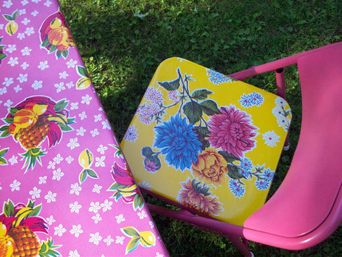
Archive for October, 2009

Lee’s Second Design Dilemma

Lee is still putting the finishing touches on her front room makeover (pics to come!) but she’s back for help with the 10 x 10 space right off of her kitchen. Here’s her letter:

We love the mood board you made for our front room (pics coming soon!) and we’re thinking that for the room off of our kitchen we’d like to go for a warm but casual style that still looks pulled together. When we first moved into the house it was a 10 x 10′ dining room but it quickly became a walkway between the front room and the new great room behind it. The great room has a dining room/eating area so this room no longer needs a table. The room has also become a very random (but visible) area for extra kitchen storage, water and soda bottles, extra spices, homework stuff, mail. A total hodgepodge. It’s open on three sides (to the front room, the great room behind it and the galley kitchen) yet is serving tons of purposes. I think it needs an identity and should catch up with the rest of the house in terms of design. Everything can go. It would be really great to have more counter space, a place to store water/soda bottles and more kitchen gear plus a place for mail maybe? It might be nice to have a little desk or counter for homework too. We had given thought to making it a breakfast nook but the wall sizes don’t allow for that. I’d also like a new wall color. I think we should stay with kitchen-like colors and something that will look uniform or coordinate since we want it to feel like an extension of that room. Mostly we want it to look far more presentable and pulled together than it does now. -Lee

Here’s a floor plan for you:

Here’s a shot of the room from the kitchen:

We’re excited to turn this mismatched space into a room with tons of function and form. Here’s the plan:

And now for the mood board breakdown.

Read the rest of this entry »

  Leave a comment

The Heart Wants What It Wants

Sometimes it’s fun for us to scroll through the photos on our House Tour page and try to pick out decorating similarities or patterns that we’ve never noticed before. Obviously there are blatant themes that we knowingly gravitate towards, like a light and airy look, neutral colors with some hits of soft blue and grass green, white curtains, dark wood furnishings mixed with white painted pieces and white ceramic animals (which I admit I like a little too much). But it’s also interesting to notice that we seem to have subliminal attractions that even we’re not privy to until waaay after the fact when we’re looking at the photos as a whole.

For example, in each of our three bedrooms we’ve chosen patterned bedding. We’re not huge on big graphic textiles in our home for the most part (although we love using them in mood boards for our color-loving clients, a lot of our house is decorated with subtle textures that have been layered, not bold prints and patterns around every turn). So of course we find this little graphic patterned bedding similarity quite interesting. Whatever it is about fluffy white bedding- which you’d think we’d be drawn to for all three rooms given our love of all things airy and white- was somehow rejected in exchange for a fun high-contrast geometric look in the guest bedroom…

… a softer graphic pattern in the master bedroom…

…and a detailed modern floral look in the third bedroom.

Heck, even the daybed in the sunroom is accented by graphic little geometrically patterned pillows, so clearly there’s some sort of attraction to bedding that’s a bit beyond basic. Go figure! I guess it’s possible to even surprise yourself.

Another more obvious pattern is our proclivity towards natural materials. We always knew we loved bamboo blinds (which we have in the living room, the laundry nook and the den) and jute rugs (as seen in the kitchen, the den, the third bedroom, and the master bedroom)…

… but it was funny to notice that even the tiny finishing touches and accessories that we introduce are often natural objects like woven baskets in the bathroom, corks as vase filler, planters made from natural fibers, even woven pillows in the den and the third bedroom. Interesting…

But looking closer what other patterns can we find? Obviously we like light slipcovered sofas and mocha floors (which we have throughout the house) along with lots of white frames (found in every single room- they’re handy for switching out since they all match each other) and white pedestal tables (we have one in the den and one in the sunroom). And we can’t forget leather storage ottomans for stashing everything from files and folders to paint decks (we have three in the den, two in the living room and one in the dining area). But we also noticed that we actually have a subtle animal theme going on. Not only are there the aforementioned ceramic animals living it up around the house, we also have a cow print pillow in the den along with curved ceramic horns on the mantel:

… a zebra pillow in the mini mudroom area:

… and various portraits and pictures of Burger throughout the house (including a formal little silhouette John had made for me based on Burger’s actual profile):

Then piggybacking off the natural theme (and overlapping a bit into the animal theme as well) we definitely have some sea-life patterns going on. From our bedroom and office botanical prints….

… to our clam shell in the kitchen and various starfish and faux-coral pieces that we have peppered throughout the house, they all work well with our airy and open theme. And I guess we’re just suckers for things that remind us of fun in the sun.

We also have a definite mirror fetish. Guess how many we have in the house? Let’s see, we have one in the sunroom, one in the half bathroom, one in the den, one in the living room, one in the bathroom, one little one layered over a giant one in the guest bedroom and an even bigger one in the master bedroom. So that’s seven mirrors in a house that only has nine rooms. Yeah, we like mirrors.

And speaking of those oversized mirrors, it seems as though we often select one noticeably large object to place in nearly every one of our rooms, maybe subliminally to add interest since we don’t use a ton of bold colors and patterns to keep things exciting. For example, there’s the giant clock in the sunroom, the huge hurricane next to the fireplace in den, two oversized jars on the coffee table and the console table in the living room, the giant greyhound next to the fireplace and a life-sized ceramic dog in the sunroom, two oversized frames in the laundry nook, a huge P monogram that we made for above the console table, and even the aforementioned giant clam shell in the kitchen.

Then we noticed the glass lamp thing. Would you believe that we have a glass pendant lamp in the kitchen above the sink, two glass-based lamps in the living room and one giant oversized glass gourd lamp in the guest bedroom? And if that doesn’t sound like much of a pattern to you, consider than we only own one additional table lamp in the entire house (the metal task lamp on our desk in the den). That’s three out of four table lamps that are glass! And you might say that we had to notice that trend, but we’re usually just attracted to something and we buy it. There’s not much thought other than “where will it go?” and “how much does it cost”- so we rarely think “do we have something else like this already?” because for some reason every time we fall in love with something we’re convinced that it’s different than anything else that has ever existed and we must have it. Especially if it’s on the clearance rack…

And on the subject of lighting, we just realized we’re a bit biased when it comes to lamp shades. We knew we preferred clean-lined drum shades, but we didn’t realize there was hardly a different shape in our entire house (the floor lamps in the den and master bedroom along with the two glass lamps in the living room and the glass lamp in the guest bedroom all have modern non-tapered shades- well, the one in the guest bedroom is a smidge tapered, but not by very much). Who knew we were such drill sergeants when it came to that?

Oh and we can’t forget about our fondness of subtle tone on tone stripes. We painted them on our porch floor, the walls of our half bath, and even snapped up two identical jute rugs with them for the third bedroom and the kitchen.

So are we lame-o losers for consciously and subconsciously stocking up on patterned bedding, jute rugs, natural objects, animal-related paraphernalia, beachy items, mirrors of all sizes, glass lamps, drum shades, and stuff with subtle stripes? We guess it could be considered a bit boring to some, but we just think that we like what we like, and sometimes repeated attractions to things indicates that you’re finally pinning down a signature style of sorts- so people will see something and immediately say “that’s so you”- which is always flattering (unless it’s some tacky Dolly-Parton-looking outfit or something). Take the amazing Nate Berkus and his love of latch-like hardware, textured linen, beat up old chairs, and black window sashes. Or the unparalleled Candice Olson and her love of luxe creams, soft blues, gleaming crystal chandeliers and opulent fabrics.

Plus sometimes similar materials, colors, textures, and styles peppered in many rooms throughout a home can actually keep things cohesive and help with the flow- especially in a modestly sized casa with modestly sized rooms like ours. That way it doesn’t feel like you’re living in a house made up of totally unrelated spaces that feel jarring when you exit one room and enter another.

Of course we also like switching things up with interesting elements that don’t occur anywhere else (a bright green quilted headboard here, a patterned yellow rug there, a painted green bookcase here, a capiz chandelier there) so we’re by no means suggesting that people get all matchy-matchy and formulaic (in fact here’s one of our favorite posts of all time about how NOT to do that). We just thought it was an interesting little study in our strange subconscious psyche (were we oversized sea-loving animals who liked looking in the mirror in a past life?). And we’d love to know what patterns you guys pick up when you look around your space. From purple velvet to oil-rubbed bronze, what can’t you guys get enough of in your house?

Psst- You don’t wanna miss this. Burger has selected his top semifinalists for his little online version of The Bachelor. And it’s turning out to be strangely entertaining.

  Leave a comment

Fab Freebie: I Touch My Surface

***This giveaway is no longer accepting entries***

No, the title of this week’s freebie isn’t meant to be perverse. It’s just the clearest way to identify the DuPont giveaway that has already popped up on some of our favorite blogs. And now it’s here on YHL (insert party kazoo sound effect here). Ladies and gents, we present to you: the DuPont iPod Touch giveaway. That’s right, DuPont’s gonna hook one of you up with a free iPod Touch. Monday just got a little better, eh?

DuPont recently launched a new free iPhone and iPod Touch app called mySurface that’s designed to help you pick a countertop from within their Corian and Zodiaq line of products. The fun interface would’ve been great back when we were redoing our kitchen, if nothing else just to give us a sense of how many options were out there. So even though technology’s a bit too late for our renovation, we’re still getting great bathroom inspiration ideas from mySurface’s photo gallery:

DuPont was even kind enough to hook us up with our own iPod Touch (now I’m almost as cool as my iPhone toting wife) to check it out and dig up some other helpful DIY apps to share with you guys. So here are the other home-improvement related apps that we’re digging:

We’ve been having lots of fun with Benjamin Moore’s ColorCapture app (also free). Using uploaded photos (or pics snapped with the iPhone’s camera) you find paint colors and color schemes to coordinate with your favorite fabric, painting or – well – photo of your dog on the beach. And though we haven’t used it yet, the 99-cent SwedeShop app is the unofficial Ikea organizer for the iPhone. So you can forget the golf pencil on your next trip- plus it automatically tallies your budget as you go.

We also got lots of tips about keeping notes and lists on your iPhone back on this post, so we’ve started to use Evernote (again, free). It’s like the Voice Memo and Notes tools that come already loaded on the iPod, but a bit more organized. Linked to an account on evernote.com, you can keep voice, text, photo and screen grab notes that can be labeled with tags, sorted by geo-tags and easily searched. We’ve also been enjoying craigsphone, the app version of craigslist. Nothing new in terms of content, but hunting for real estate, browsing local yard sales and perusing used furniture in need of a new home is almost easier on the iPod than the real web site. The app is free, but it certainly could end up costing us more as we discover new steals.

But enough jibber-jabber. Here’s how you can win your very own iPod Touch:

Get more info on our freebies at our Giveaway FAQs page. Images courtesy of Apple.

  Leave a comment