We’re back with a few more ways to clear the air at home. From house plants to air filters and even carbon monoxide detectors, there are a slew of ways to enhance your indoor air quality.
[ Read More ]
Home Decorating & DIY Tutorials
We’re back with a few more ways to clear the air at home. From house plants to air filters and even carbon monoxide detectors, there are a slew of ways to enhance your indoor air quality.
There’s something in the air- and it’s not good! Learn how easy care house plants can purify the air in your home. It’s pure magic.
We’ve finally posted a clip of our appearance on HGTV’s Rate My Space, so check it out here!
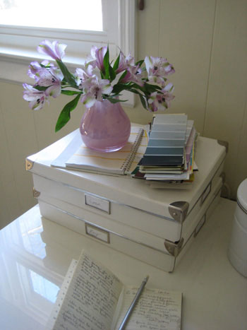
John promised me a year of flowers and gosh darn it he meant it. Check out our first January bouquet and tell us all about your flower rituals and bloom arranging tips.
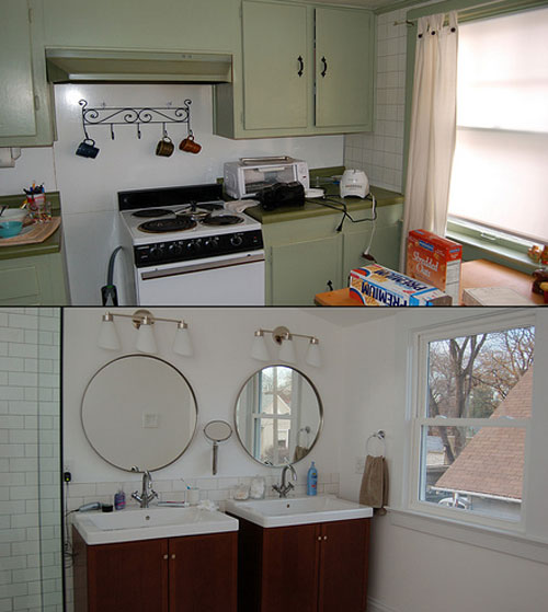
Talk about an extreme home makeover! Brooke and a few handy contractors completely transformed her second floor into an oasis of style and serenity to spare. In short: we’re jealous.
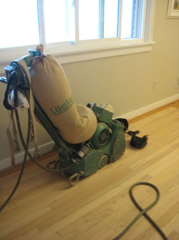
We’re back with more floor refinishing details as promised. First a reminder about why we refinished 600 square feet of our home’s 50-year-old yellowed wood flooring (to match the new prefinished mocha hardwood that we installed in the kitchen, den, laundry nook and half bathroom): Here’s the yummy after. So much better, right? When it comes to matching prefinished oak with refinished oak it doesn’t get much closer than that. In fact our wonderful floor guy mixed three batches of stain to come up with the perfect color. The main difference between factory prefinished oak flooring and refinished-on-site oak flooring is that the knots and veins in the wood are a bit more distinct in
A room’s not finished if your windows are naked, so we put together a little curtain hanging tutorial to get your windows dressed in no time. Happy hanging!