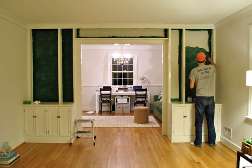
We’re back with the after pics of our freshly painted built-ins. As we mentioned in the last post, we went with an inky blue color with hints of green called Dragonfly from Benjamin Moore’s Affinity line (color matched to Lowe’s No-VOC Olympic paint for the bambino). We only needed a quart, and since we used objects that we already owned on the shelves this entire built-in makeover only ran us $10.97. You can read more about how we planned the shelf placement here. Oh and here’s a poorly lit progress pic from last night, just for fun. Yes John’s shirt does say “Talk Nerdy To Me” on the back. I love it.
But here’s what you really care about. The bookcases all painted! Picture us twiddling our thumbs while we waited for them to fully dry so we could put the shelves back on and load them up.
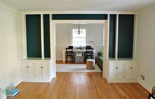
Of course by then it wasn’t as bright in our north facing room (hence the slight color variation from the last pic) but we LOVE it. It’s bold and high contrast and nothing that we would’ve have the guts to do in our last house.
We’re enamored with the color because it’s super moody and it reads as greener or bluer or darker or lighter depending on the time of day and the angle that you glance at it.
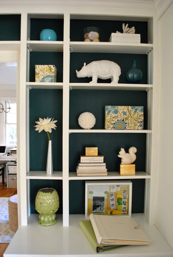
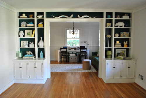
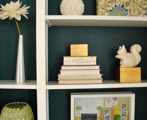
And of course all of my white ceramic animals (and other not-kid-friendly-so-I’m-glad-they-fit-up-there treasures) really pop against the saturated background color (which also makes the cabinets look crisper and whiter by comparison).
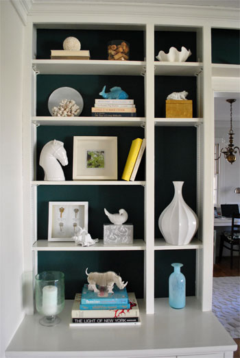
These two pics are probably the most true to life when it comes to the color (but of course how you see them really depends on your monitor):

Mr. Rhino (and his ceramic twin on the other side) likey. And we do too. Especially for under $11. In fact we love the color so much that we plan to work it into other parts of the house when we can (you know, to try to keep our whole house color scheme cohesive but not too “yawn”). We’re thinking it might be the perfect color for the base of the future island that we’d love to someday add to our kitchen – and would even work on a bathroom vanity. Should be fun…
Psst- Learn how we made those two fabric covered boxes on the right side of the shelf here.

Sara @ EcoVintageWeddings says
LOVE IT! :)
Lani says
Love it! I love the way the light blue pops against that dark blue….and the greens just give it that extra bit of color love! You guys are amazing!
Susan says
Love, love, love it! Inky blue is so sophisticated. What about switching the sofa and desk in the other room so when you look through those fantastic built ins you see a cool sofa instead of an office? Great job guys! Thanks for all the inspiration.
YoungHouseLove says
Hey Susan,
Thanks for the suggestion! We tried that layout but the long desk fits better on that wall. We also don’t mind looking in and seeing the desk because it’s an office so we don’t want it to be mistaken for a sitting room or something. We’ll be adding french doors down the line so it’ll be even more sectioned off so we can’t wait for that!
xo,
s
Kelly says
Great job! I LOVE it! I love that you are experimenting with bolder colors in your house. Looks great! Can’t wait to see what the next project is.
Emily B. says
I just got giddy again (which is like a daily occurance on your blog). Love it!
Nichole@40daysof says
Love it!
brianne says
I am so jealous of this! I’m tempted to build in built-ins just to make it happen!
Irina@CanDoGal says
It looks amazing! Do you plan what you want to do with the whole room before you tackle one aspect of it, or do you wing it as you go along?
YoungHouseLove says
Hey Irina,
We usually pin down a general idea (gray walls, bold backs of bookcases, adding a big round table and a light fixture over it, saturated curtains of some sort, etc) but we do like to take things on step at a time and go from project to project so we don’t get overwhelmed! So I guess a bit of planning mixed with a lot of winging it works for us.
xo,
s
Alison says
I wasn’t sure if I would like that color they way it was described but now that I see the pics – WOW! It looks great! And you must tell me where John got that t-shirt. My DH would love that!
sophie says
welcome to the vibrant colour club! it looks great, and here’s to more!
Oona says
That color is definitely in the running for our basement redo. It appears to be a slighter brighter shade than the Tarrytown Green that I have been staring at for months… Yum!
Mellissa says
Mr. Rhino likey. Me lovey!
Ericka says
WORTH THE WAIT! I never would be that brave, but you guys rocked this out!
Jena @ Involving Color says
I LOVE this color. I can’t wait to see what else you guys do to your new home!
Katie says
Love the color! Excited to see what you do for window treatments now to compliment it!
Christy Panzarella says
I want that squirrel!
AlaskanAlison says
oooooh pretty! Great color choice, I love it!
Marissa says
I have to admit when I saw the cutting in the previous post I was thinking to myself “wow that’s really dark, I’m not sure how that’s going to come out,” but I LOVE it! I looks fabulous!!
Lisa says
Love it! It’s so daring. I already love the direction your new house is taking!
Question (which hopefully you haven’t already answered): What are those wonderful curvy white sculptures above the doorway? Love!!!!!
YoungHouseLove says
Hey Lisa,
Those are ceramic antlers from Pottery Barn a while back. So in love with them. John calls them “the giant mustache.” Haha.
xo,
s
Jennifer K says
I absolutely love it!! I have to admit, when I read your first post about it, I was kind of “eh I’m not sure”, but of course was excited to see the results. It looks AMAZING!
Ingrida says
Looks fantastic! Usually I don’t like dark paint colors, but you just proved me that it can look great when done right. Pat yourselves on the back :)!
sara @ it's good to be queen says
oh my word, y’all are genius. i LOVE IT!!!!
livvy says
This looks great! You guys always make it look so easy. I still don’t know how you manage to do all these little projects with a baby.
catherine says
Love it! Seriously everything you decorate comes out fab!! I can’t wait to see more of your projects!
pam says
wow! it REALLY brings to life your ceramics!
Constance says
Love it! The color looks so rich in that 2nd to last pic that it almost looks like textured wallpaper. Nice choice.
Linda says
LOVE how it turned out!
Alison says
It looks great. I would hate to have to dust it and all the contents though.
Rebekah M says
Great job! The white accessories look great with the dark background.
bungalowbliss says
LOVE IT! Way to step out there with a daring color!
And I’m swooning over John’s shirt.
Gracie says
Love it! Would have never thought of that color, but it looks amazing! I also really like the idea of using it in other places throughout your house. Sounds cool as the base color to a kitchen island.
Sarah K says
Love it! I was really unsure about the color when you posted about it earlier today, but WOW, what a great choice!!
Mommy G says
I love that even though you used a dark paint color for the back, it does not feel dark at all because of all the light accessories you chose to put in. Lovely! Thanks for sharing!
Patti says
i really thought this topic was gonna be a yawn but wowza! what a difference, I love it! especially the green against the blue, wow. you never cease to impress me yhlovers!
Jane @ The Borrowed Abode says
I am seriously loving how this turned out.
Natalie says
The built-ins look gorgeous! And you’re right; your ceramic menagerie really pops against the blue/green back-drop. Nicely done!
Can’t wait to see this color and many others integrated throughout your new home!
Don’t forget to enter my CSN giveaway if you haven’t already:
http://lovelylittlenest.blogspot.com/2011/01/csn-giveaway-happy-new-year.html
:)
alison says
THIS.LOOKS.AMAZING!
Love the new bold colors! Congrats!
Mike @HA says
Real time house renovating! This is like watching 24. I’ve got my popcorn, what’s next?
Stephanie says
Wow. Gorgeous!! Thanks for inspiring us all – little things can make a BIG difference.
Shannon says
Yup – totally love it. When I read the prior post, I was thinking that it wasn’t going to work out.
But no – it’s awesome. Good job.
Caroline says
How pretty!! I love that color! I’m struggling to figure out how to incorporate color into our lower level (bedrooms + bathrooms) while breaking away from our black/white/red upstairs but still maintaining some cohesion.
Michael - Innkeeper says
wow! very bold choice.
until the rest of the room is finished it’s hard to tell. but the verdict is still out for me on this one.
as of right now… i think i liked the lighter color better. for me the lighter color was calmer … things looked less cluttered.
time will tell. can’t wait to see the rest of the room!
jodi says
it looks absolutely AMAZING!!!
Bethany says
That looks GORGEOUS! Wow! I am in love with that color.
Quick question: Have you ever tried to have paint color matched at Lowe’s and had them tell you that they can’t get the a very close match with the Olympic No VOC paint? The last couple times I tried with Valspar or BM colors, they told me the computer couldn’t make a close enough match for it to look right. Just curious.
YoungHouseLove says
Hey Bethany,
So odd! That has never happened to us! And we color match super light things (like the pink for Clara’s nursery) and super dark things (like the paint for these built ins). We also have done a variety of finishes. Wish we could be of more help but we haven’t run into that trouble.
xo,
s
r8chel says
The color looks great! It’s still a bit too squished and knick-knacky for my personal taste, probably because everything really stands out against the dark background now — and because I like to see plenty of books on shelves — but it really does look quite sophisticated! :)
Elizabeth says
LOVE IT!!
Catherine says
I am in serious love with this color. I have been wanting to incorporate a deep teal/peacock into my own apartment, and I am so excited you are going to be working with it! I feel some inspiration/idea stealing in the future :) It looks amazing with your shelves and decor. You guys rule.
Michelle says
Last Friday I found an awesome fabric with hints of that exact color. I covered some chairs with it, and decided it HAD to be an accent color in our new house! Good to know it will look awesome:) It is so much fun looking at your blog (and your allbowerpower friend’s blog) for inspiration and motivation. We close on our house in a couple weeks, which means I will have a big ole, fixer-upper project of my own! Yay! I can’t wait to see what other creative things you do in your new house, so I can try them in mine!
ErinEvelyn says
Whoa! Like my own living room built-ins! I have a similar white units and a few years go, I too painted the backs a gorgeous blue-green color. As soon as the paint dried, I knew it was the right thing to do! While similar in color, my blue-green is about 1/2 as dark as yours for a few reasons: 1) I have dark accessories (not white/light) and needed the contrast and 2) my built-in surrounds a window seat and the back-lighting on my wall means the shadows in the bookcases are naturally darker. Mine – and yours – is a color that I like to think of as a “Library Green”. Question: do you have an outlet inside one of those cabinets or anywhere nearby? I was lucky enough to get my hands on some PB bookcase scones (http://www.kaboodle.com/reviews/bronson-bookcase-sconce) to illuminate my built-ins w/o having to install pot lights in the ceiling. I can’t find the Bronson scones anywhere online anymore, but they may have been too deep for your shelves anyway. I’d bet you could DIY some similar scones to complement your own scheme if you were so inclined. Hmm…. John? ;)
YoungHouseLove says
Hey ErinEvelyn,
Sadly there’s no outlet in there, but that sounds amazing! Maybe down the line we can tackle our DIY version of it…
xo,
s
heyruthie says
LOVE how it ties in with the color of the sofa in the adjoining office–which you can just see a hint of through the doorway–even before you put up french doors. it looks good!