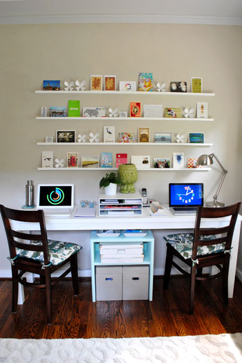
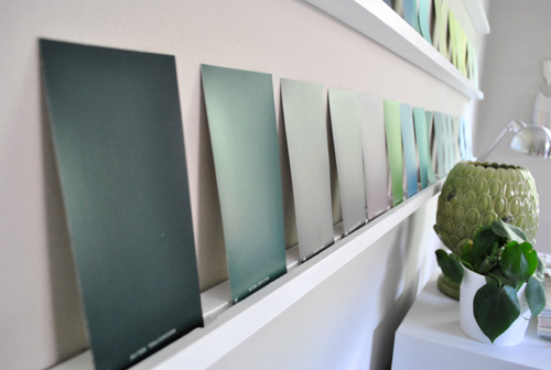
John and I were both staring at our stack of Martha Stewart paint swatches and almost simultaneously the light bulb went on. Why not have some fun with them on our postcard wall in the office? One of our favorite features about that wall is how easily it can be switched out at a moment’s notice. So here’s what the ol’ postcard wall looked like before we went swatch crazy:
And here it is now, after we added some fun rectangles of color for a nice change of pace:
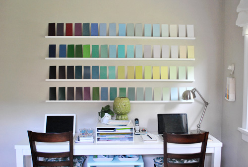
MMmmmm, I just love staring at all of those rich hues. Seriously, we’ve never been so inspired.
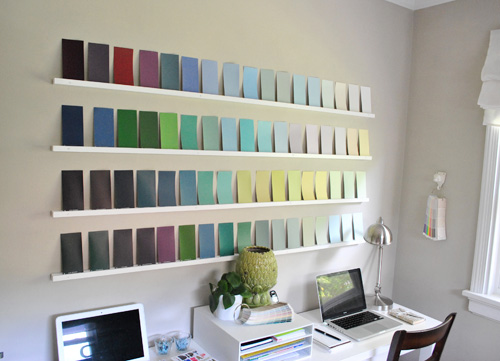
Of course the postcards will be back soon, since we love to rotate things around and keep it interesting in there. But for now we’re loving all the delicious hues that we stuck up for our enjoyment (for $0, which is always a plus).
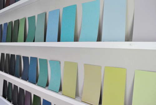
Oh and we just leaned them against the wall (and thanks to the notch that John routed with his Dremel they have stayed put) but you could also use white sticky-tack to keep them in place if you’re taking on a similar project and worry that they’ll blow around.
So what do you guys think? Do you have a favorite color out of the bunch? Have you created any free art or other home decor with paint swatches from your local home improvement store? Share and share alike.
Psst- Wondering how we made our post card shelves? Learn how here. And check out the full office makeover reveal here.

Bromeliad says
I think I like the swatches better than the postcards. But I’m kind of a minimalist.
Carrie says
This is SUPER cool! Love it.
Sarah says
ADORABLE!!! It’s very fitting b/c of what you do for a living too!
I read once that Martha’s black color was her best seller b/c it’s named after her pet!
Laura (Blogging Over Thyme) says
I love this! It’s so nice to have that wall as a canvas that you can pretty much do anything with. I almost (dare I say) like it more than the postcards!
Natalie says
Not a fan. It looks really cheap.
Allison says
So nice to have the versatility of those shelves! The paint swatches look like a work of art. I love how the dark to light colors blend together. Thanks for sharing!
Shelley says
Its funny, I just picked up the new paint sample booklet at Pottery Barn about an hour ago…I am obsessed with them too! I think your wall looks great and love the idea of being able to change things when the mood strikes you.
Watch out though, I have a feeling it may inspire you too much and you may end up re-painting another room again!
Beth @ bethcooks says
I think this may be even better than the postcards! Great idea guys….once again!
elizabeth says
clever, cheap, inspiring
Jill says
Dark to light…John’s side and Sherry’s side? Macho, John, rock…delicate, Sherry, flower. Ha! Free fun. I love it!
OwningSingle says
I like it! I need to check out Martha’s colors.
cappy says
I am really drawn to the peacock blue for some reason. I have a quick question for you both regarding your home color choices…Did your floors play a huge role in picking out your colors? Would you have choosen the same color palette if you had lighter floors say, a yellowish bamboo or maple? Just wondering how much floors play into a mood board. Thanks for such a great site!
YoungHouseLove says
Hey Cappy,
Good question! I think we would just use things like rugs and bedding and other upholstery to balance out the lighter floors and would probably recommend the same paint colors for the wall no matter what the floor color is. Of course there are always exceptions to that (and natural wood trim definitely calls for different wall colors than white trim). Hope it helps!
xo,
s
Elisa @ What the Vita says
This is a great idea — the minute I saw this, I thought people also could make DIY art out of this. They could glue all the color swatches on a large white canvas and then frame it… instant abstract art for practically free, other than the canvas and frame!
Stacy says
I love the look of the colors! I am going to go look at your how-to blog on the shelves right now to add to my house. What a great idea!!
Carrye says
I love this! By the way, I just stumbled upon this picture http://design-milk.com/friday-afternoon-inspiration-sallys-paint-chip-wall/ yesterday and spent the last 10 minutes searching for it so I could share. This would be a fun project too.
Kristi W. says
That is awesome!!! Seriously, what a great idea. It’s the perfect art work for a design area. You’ve inspired me to create my own paint swatch collage/art to hang in my work office. Nice job, Youngsters! :)
Emily Griffin says
I think this looks possibly better than the post cards! PS- I had this really weird dream that I was in your house and I was getting a tour. It was awesome. I am slightly obsessed and I guess creepy, considering I am dreaming about your house now too :)
Nichole@40daysof says
I just painted my guest bath with one of Martha’s colors: Magnolia Grandiflora. Love it!
http://40daysof.wordpress.com/2010/09/08/labor-day-aka-the-end-of-summer/
http://40daysof.wordpress.com/2010/08/31/green-i-mean-pink-bathroom-progress/
Monika says
Fun change to the post card wall! I’ve always loved the idea of decorating with paint chips and you have created a very sophisticated display. Looking forward to see your next ideas for the post card wall.
Monika
Elisabeth B says
We just repainted our master bathroom with her Nimbus Cloud color. It turned out great – especially with the crown molding we put up and the black frame around the mirror. I’ve had bad luck with gray paint over the past few years but this color worked. Light and airy – not sad and depressing.
Jenn says
Check out this post from Martha’s blog…Kevin Sharkey came up with an amazing idea for the main lobby of their building using swatches from the new line!
http://homedesign.marthastewart.com/2010/03/color-color-color.html
YoungHouseLove says
Thanks for all the inspirational paint chip related links guys. Love them!
xo,
s
alison says
this is awesome! were you just able to take all those at once or did you collect them over time? i knew it was only a matter of time before you started decorating your house like your favorite local home improvement store!
YoungHouseLove says
Hey Alison,
Yup, we snagged a stack when our Home Depot introduced the line since we wanted to refer to them for mood boards and future color schemes in our own house. Hope it helps!
xo,
s
Leigh-Ann says
Cute cute cute! Love the turquoise-y color in the middle of the 2nd row down!!
http://hipsterbrick.blogspot.com
Natalie (Rosey Rambler) says
I think I would stare at the colors all day and repaint my rooms all night! I love it, but I also loved the post cards as well…either way a conversational piece! Good thinking!
betty in munich says
OMG, the paint chips look so much better than the postcards! I thought the first thing you had going was so cluttery/busy looking. This looks so much more artsy somehow. Love it!
sophie says
unique and creative use of materials, but it would drive me up the wall. I *much* prefer the postcard wall, which has far more personality and character. I think that, for me, it’s about texture, form and diversity, which the paint chips just don’t have.
Krissy says
What a stroke of genius!! Your postcards looked really great, but this looks even better! It’s a little more cohesive and less busy now with all of the swatches being the same size.
Nicone says
Hey. I love the simplicity of this “project”. I’m sure it made a nice change of the atmosphere of the office. :-)
MLJ says
Thanks for the paint Yeppeee!!! Now I’m all excited about choosing the perfect color to cover up the white patch and some on that living room wall. It has been staring at me for 2 years. With 2 gallons maybe I paint another room too: the bathroon, kids room, garage, hall closet……..
Leah @ L4L says
Wow! I adore this idea! You always make me have house envy!
Emily @ The Happy Home says
prettyyyyy! i love the cascade effect that the colors have! our bedroom is painted a lovely martha shade, but i forgot its name! i think its the third from the right in the 4th photo, that lovely shade of blue!
Ashley M. [at] (never home)maker says
I agree with Julie M. — I like it better with the postcards. I definitely like the idea of what you guys did (always do!!!) — but wonder if it’d be fun to intersperse color swatches in with the postcards (and other items that add height, depth differences). However, as with any home project — it’s always super fun to change things up . . . it’d be cool if you came up with season specific color ranges, etc.
!!!
Rebecca (Craving Simplicity) says
I love this idea!!!
Sondra says
I don’t know if I could handle the temptation of starring at Martha’s colors everyday. I would need to paint something ASAP!
Lydia says
What a fun, frugal decorating idea!!
Handy Man, Crafty Woman says
Cute idea! I love the idea of rotating items on the shelves.
Leila says
I LOVE Martha’s new paint line. Such a great, well-edited bunch of colors. We’re actually using Morning Fog as our exterior siding color and Ground Pepper as our window sash and porch color for our house…and inside using Bone Folder for our master bedroom. Love!
Tiffany says
Love your chair covers cute office btw
XOXO,
http://outfitidentifier.com
Ann says
Yuck… definately don’t love it. Sorry…
Karrie says
What a fun way to switch up your wall! There’s just one thing bugging me with your set up–the dark swatches are on the left. Ok, maybe that’s just my problem of having worked in retail for too long–light to dark, left to right is so instilled in my brain that I can’t help but to notice anything that is not set up that way, haha.
Michael - Innkeeper says
so i’ve loved these shelves ever since i saw them. i love the new look, so inspired, but i do prefer the post cards and little flowers.
i do have a question for you …
do you have a problem with things flying off when a window is open … or when a door is open/closed?
YoungHouseLove says
Hey Michael,
Nope, we thought we would (and planned to use sticky-tack) but the window is open today – along with the door – and nothing has moved an inch. Hope it helps!
xo,
s
Rochelle says
I actually like the color swatches better than the postcards and stuff. I like the postcards, don’t get me wrong. I just love the cleanliness of the uniform cards and the interest in the colors going from dark to light and all that. It’s so appealing and fabulous. I wouldn’t get much work done, I’d just be staring at the color swatches. I think I’m going to have to do that somewhere in my house. I do like the fact that you guys switch it up all the time. I need to adapt that mentality with my home so it doesn’t become stale and I always have something “new” to hold my interest.
Jessalyn E says
I’ve used the paint chips with the graduated colors for teaching kids synonyms of words where the “least intense” word would be written on the lightest paint swatch, and the “most intense” on the darkest–a continuum of synonyms, if you will. For example, a paint chip card might progress from a pale wispy yellow “happy” to a deep bold goldenrod “ecstatic” and kids would use thesauruses and dictionaries to fill in the rest. Not really about home decor, but definitely brightened up the classroom once we hung our creations on the wall!
YoungHouseLove says
That’s so creative! Love it!
xo,
s
Mandy June says
That is very adorable! Honestly I’d be so distracted by all the fun colors that I probably couldn’t get my work done. And when Christmas season comes around, you guys can switch them out for Christmas cards! A very cute tradition indeed.
LizzieBeth says
Mother of god this is the best idea ever. I love it more then the postcards!
Julie at www.downtimeweblog.com says
The postcard shelves are a great idea. I am in love with postcards and am trying to figure out a good way to display them. This just might do the trick!
Jenny says
I love it! So pretty, and I like how well the colors go together!
I actually made “art” with paint swatches this week, too! I cut the swatches apart, then taped the backs together and put it all in a Ribba frame. I absolutely love it for the nice pop of color it adds, plus it was free. Can’t beat that!
Jennifer Boston says
Oh, I have used paint chips for the longest time for paper crafts! I love them!!! :)
Sarah says
I’d like to know where you keep your printer!
YoungHouseLove says
Hey Sarah,
You can see where the printer sits on a nearby bookshelf at the bottom of this post: https://www.younghouselove.com/2010/07/office-progress-getting-wired/
-John
Alicia Parinello says
This paint chip idea seems to be super inspiring for sitting at a desk! Great idea. I think its perfect for an office space, and you can change the colors out with the seasons!