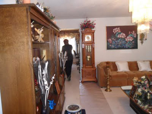
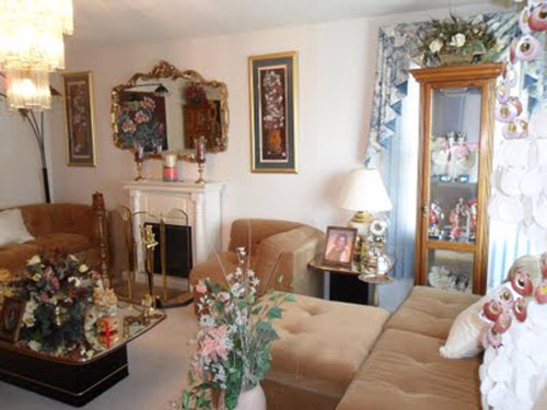
When Katie sent us pictures of her living room makeover, we couldn’t get over the difference between the before and the after. Here’s her letter:
Hi guys! I just wanted to share my living room redesign with you. When we first laid eyes on our house, the living room (well the whole house) was definitely not our style.
So among a few other major events since we moved (like having baby boy #3 last summer) it felt great to paint the room, switch out the lighting, and find some great pieces via Craigslist and garage sales.
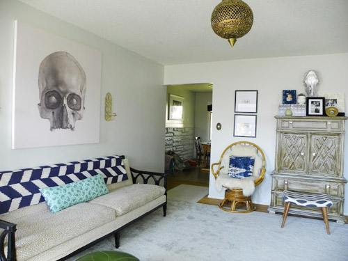
The drapes are from [my son] Isaac’s nursery with some pom pom trim added.
I’m also loving my new canvas (from Surface View). But now I’m thinking my walls should be dark. What do you think?? Navy blue, charcoal gray, aubergine, chocolate? Uh oh, gotta go the hubs is rolling his eyes at me! Hope you enjoy it as much as we do!! – Katie
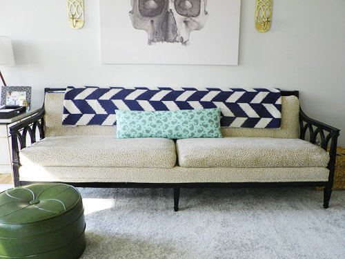
Thanks for sharing it with us, Katie! I should point that she also tells a great story about saving a bunch of money when it came to getting that big piece of carpet for the room, which you can read over on her blog. And as for the favorite-part game, mine is the graphic throw on the sofa and that skull art. Meanwhile Sherry loves the sconces, that great sofa, and – predictably – the egg chair.
Oh and what color’s your vote for the wall? Thought it would be fun to take an informal poll.

Rebecca @This Nest is Best says
Ooooh, that graphic throw! Love it! Can’t wait until our dining room has real before and after photos!
Katie Waddell says
The graphic throw is actually a flatweave rug from Urban Outfitters :) gotta use what you have huh!? ;)
Anele @ Success Along the Weigh says
Wow, that is certainly a big transformation!
Jess @ Little House. Big Heart. says
I have to say that I am seriously loving that brass chandelier! It feel so exotic!
And I’m a sucker for anything navy, so I’d go that way if I were Katie!
Emily says
Yeah, me too. I NEED that Moroccan chandelier!
I must be in the minority, I like the walls the way they are.
Anne @ Planting Sequoias says
I vote that they add a board and batten grid to the couch wall and paint it a matte black. But it is a striking change as it is!
YoungHouseLove says
Ooh that sounds like Chris & Julia’s wall! Fun!
xo
s
Katie Waddell says
Anne I would LOVE to do board and batten! One day when the budget can include it we probably will! :)
Erin says
I’m feeling the charcoal grey but a chartreuse or aubergine might be fun if they are looking for a pop of serious color!
Erin says
Oh, and I LOVE the skull art!!!
KL says
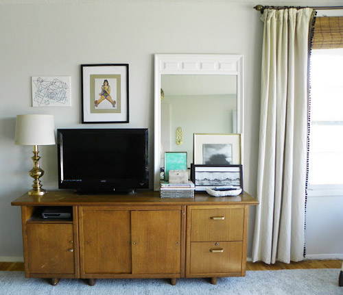
Agreed! And my favorite part is that vintage-looking console they have the TV on. Be still my heart!
Laura says
I’m thinking a really light blue / gray that would tie in to the pops of navy but still keep it pretty light and open.
Henna | HENNA BLOSSOM blog says
So unique…I love a good transformation! ;)
…and so this is silly, and TOTALLY OT, but love for you to check out my post today…it’s the “BABY MOHAWK unveiling.” Just making me smile today, and not a bad way to start the weekend. ;) ha
http://hennablossom.com/?p=1555
YoungHouseLove says
Oh my gosh, I cant get over how much hair he was born with! Clara was a baldie for years! Haha. He’s such a cutie.
xo
s
norma says
just found your blog this way. very beautiful! love your style!
Henna | HENNA BLOSSOM BLOG says
aw, thanks Norma! :)
And Sherry, so funny! Yeah, it’s pretty surprising to be handed a newborn with a full on hair-do! ha! :)
anne says
Looks fabulous! –Navy or aubgergine!
jackie says
I think a bold emerald, domino mag/lonny mag style.
Shannon says
OMG I’m OBSESSED with that skull art!!! and, i’m going through a light and airy phase, so i’m digging the light walls.
Samantha@Carnabys Letting Agents says
Believe me Shannon, you are not the only one, i spent the weekend looking for something similar, im not able to find anything slightly close, if i type light skull canvas etc on google i still get a range of dark options :(
… i must have it!
Briana says
I’m thinking a dark grey on the blue side would be rockin’ on their walls. I looooove that throw, too!
Jennifer H. says
Amazing! Also, I vote aubergine :)
Crystal @ 29 Rue house says
I love the sofa, the bench/seat, tv cabinet and the brass lamp.
I like the wall color as is!
Jessica says
Alas, poor Yorick!
Anyone?
Wrenaria says
Hamlet!
Elizabeth says
I knew him Horatio… ;)
That skull art! Not for me, but it looks wicked. Well played.
Jessica says
YAY For Hamlet allusions!
Yeah, the skull art isn’t for me either. I would just walk around calling my wall ‘a fellow of infinite jest’ all the day long. ; )
erica says
This looks so good. I’d love to chill out in that room! :)
I normally don’t really like ‘accent walls’ but I’m craving a white room with one deep navy wall – just like 2/3 of the way up and the top third white like the rest of the room. With kind of minimal style and a few color pops. I must have seen it on pinterest or something – I keep thinking of doing that in our bonus / guest room. Just an idea!
I love how bright and clean your room is but I also love the drama that some dark paint adds ! It’s worth a shot for sure.
Natalie says
I’m with you on the accent wall. I don’t normally like them, but I think it would be great in this room. Really make the (awesome!) skull canvas stand out, but still keep the overall feel of the room light.
Door Sixteen has been painting everything in BM Deep Space so I’ve got that dark grey on the brain.
Andrea says
A navy or aubergine accent wall would look amazing and give a nice pop! And as YHL has proved, adding grey or light blue paint to any room makes it look ah-mazing! :)
Allison says
Charcoal gray would be my vote, but I think any dark color would make it too cave-like. Doesn’t appear to have much natural light (possibly only one window?).
Megan @ Rappsody in Rooms says
I am loving that couch! I wonder if they scored that second hand. I have been scouring garage sales and Craigslist for a love seat but nothing yet! I’m waiting until that perfect piece, like it seems they found!
Katie Waddell says
Hi Megan! I actually bought this couch on Craigslist and painted and reupholstered it myself, you can read my post on it here:http://katiewaddell.blogspot.com/2012/09/vintage-couch-before-and-after-or-proof.html
YoungHouseLove says
Ahhh, isn’t that amazing?!
xo
s
Janice says
Megan – I was browsing their blog, and they did get the sofa second hand and redid it. Look at her ‘portfolio’ page. :)
Danielle says
I’m so in love with that green ottoman I can’t handle it!
KatyO says
YES!!! I was just about to say the same thing! LOVE the green ottoman. That is the perfect green. Maybe that could be a wall color?
Sherri J. says
The white looks okay, but you might want to mix it up with some charcoal gray(I believe someone else mentioned this). Also a suggestion would be painting one of the four colors a warm color, such as a red or brown.
This can definitely open the room up to the eyes of your audience and call attention to it.
Paige @ Little Nostalgia says
What a cool space! I hope they stop by and give us a breakdown of what was from Craigslist, and what was from stores. Also, I really want that graphic throw on the back of the couch!
Katie Waddell says
Hi Paige! The throw on the couch is really a flatweave rug from Urban Outfitters! :)
http://www.urbanoutfitters.com/urban/catalog/productdetail.jsp?id=24099624&parentid=A_FURN_RUGS
Ellen says
I’d love to know more about the re-finish on the chest,including the color.
Katie Waddell says
Hi Ellen! I painted the chest with Behr’s Rhino paint and the ‘glaze’ is actually a dark (Jacobean?) wood stain wiped on with a rag. The finish has been great with having kids, the more they beat it up the better it looks. :) Hope that helps!
Kate @ Magic City Thistle says
I love the transformation (I have the same little green pouf!). My vote is for charcoal, the skull art would really stand out.
Janelle @ Two Cups of Happy says
I love the natural light flowing in, so I would be hesitant to paint it dark. Maybe an accent wall? Moody gray or eggplant could be pretty!
Kearney says
color on the walls, for sure, but i’d want sherry to pick it out, maybe a blue/grey?
my fave is the tv console with the mirror & frames leaning on the wall.
Casey says
Why would Sherry need to pick it out? I’m sure the owners of this house would be happy to pick our a wall color that will be in THEIR house…They’re the ones that have to look it every day.
Ashley says
A couple of silver, metallic walls would be fab.
Audrey says
Looks great! I vote medium gray :)
Carrie says
I don’t care for the skull art, but the rest looks very nice. I would go with the navy blue.
Julia @ cuckoo4design says
I love that skull art too. That was the first thing I thought!
What an awesome before and after!
Rachel says
My favorite is the couch with the throw! I like the color of the walls now, but maybe an accent wall in navy would look good.
New Homes in Charlotte says
wow that skull certainly is an interesting touch….
ale norris says
i personally love the walls nice & bright like they are, espeically because the skull canvas makes it perfectly moody enough already. great job! psst. i love that throw, too.
Katie Waddell says
Thanks so much John and Sherry for featuring my living room! This has totally made my week!!! Oh and since I am so ADD when it comes to my own home that my living room has been rearranged about 3 times since I took these photos. ;) Plan to paint it real soon though, Swiss coffee walls and high gloss black doors. Thanks again!!
YoungHouseLove says
Wahoo!
xo
s
STEPHANIE says
i LOVE THAT GOLD FIXTURE! SUCH A COOL PIECE.
AND I VOTE FOR A NAVY/SLATE COLOR. DEEP DARK AND UBBER CHIC.
Kelly says
How about a charcoal gray bottom wall that is ombre…dark to light?
Stephanie, Sandpaper and Glue says
Ahhh- I love that skull art! love, love, love it.
janice says
Amazing difference! Thanks for sharing! I enjoyed browsing her blog. :)
erin says
I think a dark color would look great on her walls!! Since she has that large white canvas and sofa to break up the darkness. It think it would look fantastic!
lovely living room!
Deb says
Great transformation! I would paint just the one wall behind the couch charcoal grey – that would really make the skull art pop!
Kate says
Wow- talk about a big change. Such an amazing room- I love it… especially the chevron!
Megan Poletti says
That skull is AMAZING! I also love the green leather ottoman, I need to find something like that! The TV media cabinet is great, too. I’m loving this whole “vintage buffet or long dresser used as media cabinet” thing. I have one too! Got it for $40 at a resale store. It’s got these amazing starbursts carved into the wood. SOOO mid-century.
Angela says
Great transformation! I too love the throw. I also like how she added pom-pom trim to the curtains. I have found some great curtains at CurtainShop.com
They have all kinds of different ones, but lately I’ve been obsessed with getting simple, plain curtains and adding custom touches to them. (like the pom-poms, great idea!)
Katie Waddell says
Thanks Angela! Those curtains are old linen ones from Ikea that I added the greek key and pom pom trim too.
jeannette says
it all depends on whether or not that is a wayne thiebaud over the tv.
jeannette says
it is, and it should be 40 times bigger.
http://www.artchive.com/artchive/t/thiebaud/thiebaud_cone.jpg
Katie Waddell says
It is and actually it is just a page from a magazine! Art on the cheap!! :)
Katie @ Pintertesting says
I love how they took what they had a made it their own! On a sweet budget no less.
Props!
Katie Waddell says
Thanks Katie, you hit the nail on the head! We had virtually no budget! :)
Nan says
A huge difference – I love the ceiling light.
We just moved into a new to us house that has dark walls (navy, forest green & muddy brown) and I’m painting each and every one a lighter color. It just feels so dark and drab with all the dark walls.
Brooke says
It seems like they’ve already picked colours for their walls but I would have suggested painting Racoon Fur by BM just behind the sofa since it’s a charcoal grey that tends to look a bit navy and then either keeping the walls white or painting them a lighter grey/or another neutral.
Carol says
Maybe do an ombre color accent on the left and right sides of the canvas? Take a cue from the now-famous YHL chest of drawers book project, pick hues that will fade into your current color. Just something to make the canvas pop without going dark throughout. Awesome canvas. BTW, I think your house must L.O.V.E you for rescuing it from the Home Interiors overload.
Ellen says
I definitely think they should paint the room dark–I think it’ll add a ton of depth and help their beautiful art and furniture pop!
Such a fun makeover–the before pictures actually made me gasp, ha!
Brenda says
I could see the wall behind the couch having wide chocolate horizontal stripes. I have no idea if that’s good advice, but it could be fun. I do love the throw on the couch.
Christina says
Love it! I’ve been seeing lots of pom pom trim on drapes lately – loving that too!
M says
I couldn’t help but think that this house was decorated by pinterest influence. I like stuff I see on pinterest but is there a right way to do it…I want my home to be my home and not like any other Jane.