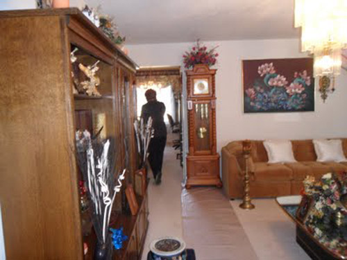
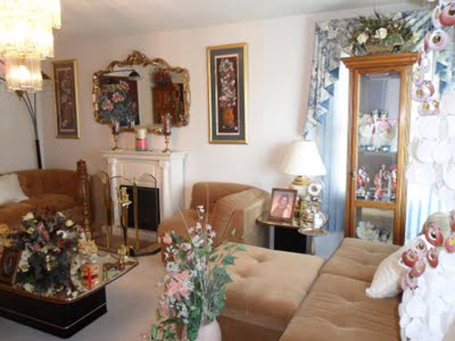
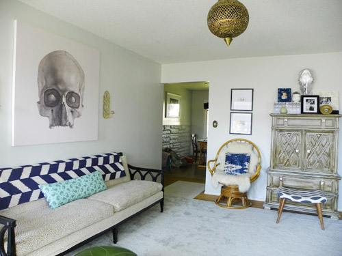
When Katie sent us pictures of her living room makeover, we couldn’t get over the difference between the before and the after. Here’s her letter:
Hi guys! I just wanted to share my living room redesign with you. When we first laid eyes on our house, the living room (well the whole house) was definitely not our style.
So among a few other major events since we moved (like having baby boy #3 last summer) it felt great to paint the room, switch out the lighting, and find some great pieces via Craigslist and garage sales.
The drapes are from [my son] Isaac’s nursery with some pom pom trim added.
I’m also loving my new canvas (from Surface View). But now I’m thinking my walls should be dark. What do you think?? Navy blue, charcoal gray, aubergine, chocolate? Uh oh, gotta go the hubs is rolling his eyes at me! Hope you enjoy it as much as we do!! – Katie
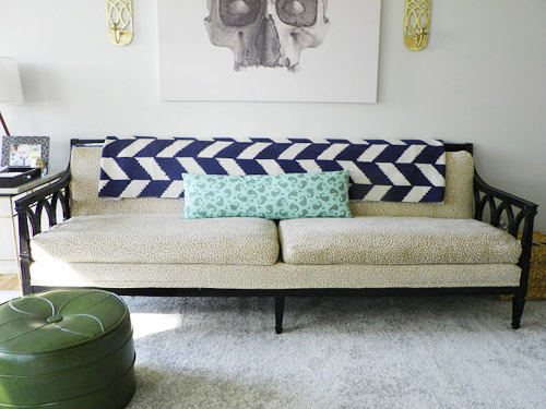
Thanks for sharing it with us, Katie! I should point that she also tells a great story about saving a bunch of money when it came to getting that big piece of carpet for the room, which you can read over on her blog. And as for the favorite-part game, mine is the graphic throw on the sofa and that skull art. Meanwhile Sherry loves the sconces, that great sofa, and – predictably – the egg chair.
Oh and what color’s your vote for the wall? Thought it would be fun to take an informal poll.

Nell @ Allbritton or Nothing says
I wouldn’t be afraid to do a color, not a background. You have a neutral floor, neutral furniture and blue accents. Why not test something in a coral or poppy color? John and Sherry’s Benjamin Moore colors have Moroccan Spice and Geranium, and BM Coral is gorgeous. Any paint store can dilute something 50% or 25% if you like the color and want it lighter. Be brave!
Wrenaria says
I very much want to steal that green ottoman. Looooove it.
Gabriella @ Our Life In Action says
WOW! What a difference! I love it!
michelle says
This room just seems wrong…in so many ways. Am I crazy or is this a joke?
Angela says
Love this space! It feels “Emily Henderson”ish but with their own, unique style!
N Shirley says
I think it looks very nice with the light colors and the graphic throw and selected accents.
clodia says
Lovely!
I’d go with a nice blue, myself. I’d be a bit concerned that navy might be too dark, but maybe a few shades down the wheel?
Lauren says
Charcoal gray or aubergine! What a fun room!
Crystal Breen says
Love this transformation! The skull picture and throw are amazing! I would have to vote for the charcoal gray wall color switch. We painted our living spaces a dark gray/blue and love how white accents and brighter colors pop against it.
norma says
I love the mid-century ottoman in front of the storage unit. Where did you find that? Also, the skull art– I have loved skulls since taking a human paleontology class. Where did you find that too?
Katie Waddell says
Hi Norma! The little bench in front of the chest was a cheap garage sale find that I reupholstered and the skull canvas is from Surface view.
Kate says
Did you know that the link to Katie’s blog goes to a page that doesn’t exist? Has she moved the post, maybe? Don’t worry about publishing my comment — just hoping you might update the link. :)
Thanks!
YoungHouseLove says
Oh no, the page must have moved. All fixed!
xo
s
Ashli @ The Sweat Revolution says
Love the egg chair! My vote would be to paint the walls a lighter shade of grey, I think it would look to dark and cave-like with charcoal grey.
Susan says
Thought you had a right to speak for yourselves about this conversation from Bower Power blog:
Angela:
John & Sherry of Young House Love have a strict policy on not accepting freebies, and it hasn’t hurt them. If anything, I find when they do endorse a product, I feel I can trust it more and am more likely to buy it myself.
Reply
Katie permalink*
April 11, 2013
True…they only accept monetary endorsement deals. It’s a completely different beast!
xo – kb
Reply
Linda permalink
April 11, 2013
Just curious, what have John and Sherry endorsed for a fee? I thought they’re reimbursed somewhat for curating Joss & Main collections, for example, and obviously they have sponsors, who are probably happy with their ROI, but I had the impression that YHL truly takes no swag. I agree – when YHL says A, B, or C worked for them, I tend to believe it, since they actually paid for it out of their own earnings.
Perhaps I misunderstood – but I’m another one that discounts reviews by bloggers who have received free items from vendors. Sorry.
Reply
Katie permalink*
April 11, 2013
They have stated on their blog that they get paid for appearances, for their partnership with Benjamin Moore, and their light collection with Shades of Light. They are very careful about getting freebies but they gotta make money too! We all have bills to pay!
xo – kb
Reply
.
Linda then left a comment that she didn’t think saying you guys accept ” monetary endorsements ” was a fair way to describe it, and I agree.
YoungHouseLove says
We definitely don’t accept freebies or write sponsored posts, and we always fully explain when something’s a side gig that we’re getting paid for (ex: in the Benjamin Moore post it clearly says “this partnership is just like any other side gig that helps pay the bills, like writing a magazine column or our book” along with fully explaining that in our lighting post. Even when we wrote our book we detailed how we make money from that in the form of an advance and hopefully royalties someday. We try to be really transparent with you guys about those side jobs that help us put money into Clara’s college fund. Hope it clears things up!
xo
s
Avone says
Everyone’s gotta eat. Who cares. The Bowers are not somehow “worse” than the Petersiks just because they choose different approaches to making a living. If you don’t like frog tape (which I have had absolutely horrible results with), then don’t use frog tape. But don’t throw Katie’s entire blog out the window. I recommend reading reviews for any product, not taking a bloggers word for it anyway.
YoungHouseLove says
There’s one thing that we know for sure – and it’s that we’re huge believers in “to each his own” in decorating, parenting, and blogging! We love that everyone can go their own way and do what works for them :)
xo
s
Angela says
Who are you that you have the time to investigate things like this? And why? Do you not believe that someone who reads YHL has a brain? Of course…they would have to make money some way….and the things they post are their opinions. Please. I better clarify…I do not know YHL personally nor have I ever talked to them and I am not being paid to say this.
Susan says
This is not a judgement of the Bower’s policy, it is a defense of the Petersiks’s. They deserve to have it represented fairly, not defensively. They work so hard on their ” label ” it should be presented accurately, which they did. I just wanted them to have an opportunity to speak for themselves, as opposed to myself or the Bower’s ( or anyone else).
Sophie says
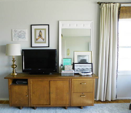
I am in love with her family room, and the vintage Danish modern tv stand is just to die for!
Avone says
I read that she has already made a decision about wall color, but there is something so great about white floors AND walls while letting everything else pop. I like it as is.
Emily says
I think a gray color would be great for the walls! What a great change, so cute! We redid our living room and it was so nice to get some paint on the walls, it makes a huge difference! It was my husbands house so I had to come in and change it into a home instead of a man cave :).
http://emilyandtylerglover.wordpress.com/2012/08/16/home-redecorating-ballard-style/
Mai says
hitting the bottom of the barrel YHL? This living room is bad. A few nice pieces but not YHL makeover quality. Looking forward to some better posts.
mp says
I’m a bit confused — were the before pics what she had in the room originally, or what the prior homeowner had in there? This wasn’t answered when I looked at her blog.
Also, I’ve noticed everyone who’s featured in Reader Redesign has a blog. Have I missed any non-blogger RRs?
YoungHouseLove says
I think those are from the previous owner, although things like the window treatments, lighting, and carpet conveyed :)
xo
s
Katie Waddell says
Hi mp, yes the before pics were from the first time we looked at the house with our realtor. Sorry it was kind of confusing! :)
Patty@homemakersdaily.com says
Awesome transformation! It looks amazing.
Mary | lemongroveblog says
Love it when y’all feature the reader redesigns! What a transformation.
YoungHouseLove says
Aw thanks Mary! We love sharing them with you guys :)
xo
s
Dani says
The before and after pictures remind me of that show (i don’t know if it’s on hgtv or tlc or what…) but where the people buy a house and redo it and then the previous owners come back and they video their reaction…anyway i’d love to see the previous owners who decorated with all that floral to come back and see the skull print on the wall. couldn’t be more different. definitely prefer the look of the after ;)
YoungHouseLove says
Oh yeah! Moving Up! That show always made me so uncomfortable for everyone! EEKKS!
xo
s
Erik says
Speaking of “Moving Up”
Sherry & John, I have always wondered, but haven’t seem to come accross it on your blog; but do the previous owners of your house read your blog, or have they peronally seen the wonderful transformaion you have done?
YoungHouseLove says
The previous owners of our current house do read our blog and they’re so sweet! They say they like watching us do all the work! Haha! And the owners of our first house don’t read the blog but they just resold that house to another family, so it’ll be fun to see if we ever hear from them! We love that little house :)
xo
s
Katie Waddell says
Haha!! The woman we bought the house from was a shut-in and hadn’t left (or cleaned-yuck!) the house in almost 15 years. She might have a heart attack if she saw it now! ; )
mum of all trades says
Love this room, I like the wall colour and I don’t think I would go for a darker one.
Gene says
Would that skull art not have terrified anyone else when they were a child? I remember a tiger prowling through the jungle painting at a family friend’s house that had my number when I was little.
Katie Waddell says
Oh no! Don’t worry none of my boys are frightened by it and if they were I would take it down in a heartbeat! ; )
Angela says
Love this!! Really, love this. Pink must have been THE color amongst the women in the age range of 60-75. My mom’s house looks like the “before”. I am in LOVE with White…but since our remodel last year…we adopted a 7 year old boy and we have a fairly big dog so I guess I wasn’t thinking when I went all white. Anyway…guess I’ll just have to repaint, because I’m not going back!
Kaija says
When I moved out of the house where I grew up, my mom redecorated my room – all in dusty pink! Should I read something into that???
Kaija says
Instead of painting, I would add crown molding.
My livingroom is sunny yellow, which I love, but now I’m thinking light grey (one of YHL greys :) ) and adding crisp crown molding. But removing the popcorn from the ceiling just seems daunting, however, it’s time to do it!
K (Barking Babymama) says
I like the walls white! But I LOOOOOOOVE the TV console and arragement – I love the how TV looks like a part of the frame/mirror arrangement, and isn’t the only focus
Betsy says
The transformation is really lovely, but what on God’s green earth is that skull canvas? That would give me nightmares as a child. Heck, as an adult, too.
Avone says
haha. me too! People seem to love or hate it. To each his own. ;)
Ethne @ Wom-Mom says
I love how eclectic the room is in general. I vote Rockport Gray on the walls…haha. Gray was my first choice tho, I was just making the color choice easy for Katie and fam.
Penelope @ A Word With Penelope says
I vote for a green wall- like a Spring green.I can’t believe (!!!) how ugly this room was before you re-did it- you have great vision!!
I just posted my own living-room redesign today- Dark teal wall, inspired by none other than YHL…
Liz says
Wow, what a transformation! I love the artwork over the couch!
Hallie says
Hey there, John and Sherry–
Thanks for the reader redesigns feature. I enjoy seeing them.
On an off-topic note, I’m not digging the provocative “me undies” ad. It’s a bit risque for me, and definitely for my little nephews who like to check in on “Clawa” and her mommy and daddy.
Thanks for being you!
Hallie.
p.s. I just noticed that there are more than one. Can’t say I like any, but I was particularly referring to the one with the teenage girls.
YoungHouseLove says
Oh no, those sound weird! A few ads on the sidebar are served by google, and those vary by region, demographic, etc (you might see something I never see, for example, I’ve never seen “me undies” ads – eeks, they sound terrible!). If you have a url or a link or a screen grab of them it really helps me (since I can’t see them) block them and get them off the site for good. Thanks Hallie!
xo
s
Kathy S says
I think the walls should be kept light, but they can change the color if they want — rooms with few light sources should be light to reflect the most light.
jennifer p says
that skull art is SCARY.
Juleen Kenney says
I love the skull art and whatever that antique looking piece is next to the egg chair! I think the walls would look great painted a medium gray. A nice neutral to go with all their fun pops of color!
Jean says
Normally, your choices for reader re-design are striking and chic transformations. This one is a fail. What was an upscale middle class, charming and full of personality has been reduced to an unfinished bland junk shop of mismatched and just plain ugly furnishings. Why do I have to like this? It doesn’t follow any good design principles, and it is so disingenuous to praise this … mess. Sorry.
Jenny says
Surprised to find I’m in the minority, but I am seriously creeped out by the skull, I just don’t get it. Everything else is great.
Becky says
The simplicity of the current wall color (or lack there of) is a graceful backdrop for the unique pieces throughout the room. The room has a natural beauty.
Sheila S. says
I also love the skull art and Surface View, too – I have 2 of their mural and they’re just gorgeous!
In this room, I’d like to see more contrast between the canvas and the wall but it’s hard figure out without a better sense of the whole room but I’d do a darker/lighter combo of some flavor. Not so differentiated as an “accent wall,” contrast, but a bit more subtle.
Jack says
Hi.. Why not consider adding some colour with an accent mural or mural from Surface View, rather than having to go through the stress of a repaint. This could add a nice contrast that would look brilliant alongside your canvas in your wonderfully decorated room. http://www.surfaceview.co.uk/shop/walls/accent-mural
Lesli devito says
oooooohhh Love the transformation. Here is my two cents. I would paint JUST the wall, with the cabinet and round cane chair a Benjmain Moore color called
Pale Avocado”…I just SEE IT there!!!!
"Lucy" says
I’d love to see the room navy blue! It would unify everything. How she interprets navy blue is up to her, for example, wallpaper, paint, stencils etc….
Kimberly says
I love the pom-pom fringe on the curtains–I was considering doing that for my living room curtains as well, so it’s nice to see the possibilities first. I was afraid it might look too frilly, playful, or little girl-y for such a formal-ish public space, but I can see that it works fantastically here! Bravo!
I also love that graphic throw on the sofa, and the sofa itself–love those arms!
I agree, a darker color, even on just on the wall behind the skull art would look fantastic and really make it pop. Perhaps the same aubergine color that it’s in the armchair (not shown here, but on the blog). Or maybe even an ultramarine or prussian blue.
My only other suggestion would be to pull the sofa away from the wall and instead put a slim console table under the skull art. That way, the seating would feel more cozy and conversational, and no one would have to walk through the seating area to get to the rest of the house from the front entry. Right now, all the furniture is pushed up against the walls and feels like they are all playing the role of “wallflowers” at the high school prom. :P
But…fantastic decorating! Where did that cute fireplace go that I spied in the “before” pictures? I think it would fit right in with how you’ve got the room styled now–fresh, quirky, and modern.
Kristin says
I really think painting that couch wall a deep color would be great. I’d leave the white walls elsewhere to bounce some of the light around. If you don’t like the starkness of an accent wall then you could fade to white at top to keep things light.
I just did this in a bathroom where I wanted it light on the ceiling, but still wanted a bold color, but also didn’t want stripes, which might be distracting with the great art you’ve got there.
http://www.thirdstory-ies.blogspot.com/2013/03/icing-on-cake.html
Chris says
I dont get this either. They didn’t move any walls. They just put different furniture in the room and not very nicely arranged either. Its all against the walls. I dont consider his a redesign, but to eaches own,
Jenn R. says
Woah! I love this room transformation and Katie’s blog. I love even more that as I poked through it, I realized we live in the same town! Love it!
WTW says
Sorry. But yuk.
I can’t be the only one who thinks this. Maybe I’m just the only one who isn’t a yhl sheep!
Deb says
Not loving the canvas so much but art is in the eye of the beholder! But what a transformation and I do agree that some color might be nice on the walls. Love that mid-century tv cabinet also!
Samantha@Carnabys Letting Agents says
I must have that wall piece, any ideas where i can get something similar?
x
Charlotta says
Love the scull canvas, and the candle holders. And seeing the dramatic change is encouraging!
Jennifer says
What a great makeover guys! Good work and hats off to you Katie! I really wouldn’t paint the walls myself, but I like the idea of a deep, chic blue, and would love to see someone else try it! : ) Is that the Ikea Sheepskin rug lining the egg chair? I’m seeing that thing everywhere I go nowadays… I think it’s a sign I need to get one.
Katie Waddell says
Thanks Jennifer! I actually got that faux sheepskin at Target last summer on a clearance rack! :)