Yup, after months of working on a little behind the scenes blog makeover (not kidding, this stuff literally takes us months) we’ve FINALLY let ‘er rip. Like any project, there were unexpected delays: mysterious coding glitches, inexplicable site crashes (thanks for your patience on those, btw), an earthquake and even a hurricane to round things out. But before we let another excuse get in our way, we decided to just go for it. It’s not 100% done. It may crash the site again. There could be a blizzard next week. Who knows.
It’s actually surprising to us that we haven’t done this sooner. We’ve had the same exact blog look/background/layout since the spring of 2008 (if you can believe it). It seemed silly that we’ve been through so many room re-paintings, furniture re-arrangings, and even a move to a whole new house… but hadn’t so much as changed the background pattern for three whole years. So it was definitely time. It just sort of felt like we were wearing old clothes that didn’t quite fit anymore. So although we know there are probably folks out there who will miss the old look (we’re sentimental creatures too) we’re excited to finally put on a fresh new outfit.
Here’s a little bit of what we were hoping to accomplish with the new design:
- Update the look (colors/patterns/typefaces) to be more reflective of our design choices in the new house
- Make the header more inclusive of the things we blog about (folks kept saying it just represented the “house” part of our name)
- Lighten up a bit, since the old color scheme was feeling a bit dull & heavy at moments
- Improve navigation and help you guys discover content more easily
- Overall just make the site feel fresher, more 2011 and less 2008
So this is what our amateur web designing skills came up with. So far we really love it, even though there are definitely things we’re still trying to finesse. We’ve been tweaking it for the past several weeks, so we’re kinda used to it by now – but we understand if some of you are still skeptical of the change. Think of it like rearranging a room or painting a wall – you might just need to give it a few days to get used to it.

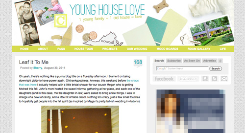
When it comes to the actual header, we photographed a collection of objects that had special meaning to us on white cardstock outside (you know we love keeping things personal). In case you can’t figure it all out on your own, here’s the meaning behind each item:
- Photostrips have always been something we’ve enjoyed, hence their appearance at our wedding
- Clara and Burger are as much a part of this blog as any DIY project, so their picture was a must
- A little wooden “C” block for Clara and a small bone-shaped dog treat (on the other side) were another way to tie them in
- Sherry and I met in 2004 when we lived in NYC, so the little wooden skyscraper and taxi cabs remind us of those early days
- We’re cheap. So we save our pennies. Hence the change, which actually adds up to seven cents – which is a lucky number of ours (plus the dates on each of the pennies are 2007, which is when we started this little ol’ blog)
- We live in (and love) Richmond. So we tossed in a little Richmond magnet. Represent.
- Paint swatches and fabric samples = our idea of a good time. So we picked a few that felt like our current house/style
- There’s not a much more sentimental object than the key to our house (although we altered the tip of it in Photoshop because we’re paranoid)
- Of course we also squeezed in a photo of our current house (had to have that happy yellow door in there somewhere)
- A white ceramic rhino is kind of our mascot at this point (at least behind Burger and our dearly departed ceramic dog).
When it comes to the background, we actually created that as an homage to our previous logo (you know that little YHL heart? the background is actually just a gazillion of those laid out at all different angles to make an abstract-ish pattern). And as for the actual functional changes that we made, here they are:
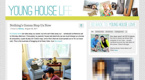
1. We added a new side-deal called Young House Life (see the “Life” title under the header on the right?) to serve as sort of a “mundane everyday happenings area” where we mostly share Clara & Burger pics/videos along with behind the scenes blog stuff and other odds and ends that aren’t beefy enough for a dedicated YHL post over here (you know we love to over-share). But don’t worry, it doesn’t mean Clara, Burger, and other life stuff (vacations, anniversaries, etc) will suddenly be gone from the main site. Those things have always been a huge part of who we are, so they stay. Just think of Young House Life is a little “bonus footage” spot. Oh and it has a separate feed address for you to subscribe to as well (if you’d like to get those updates on your reader).
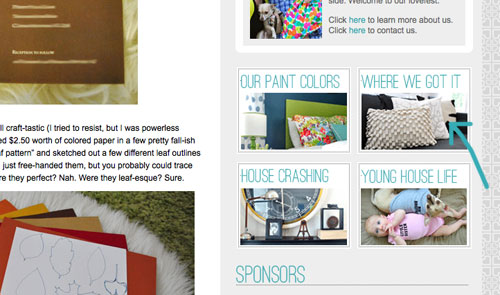
2. We finally made a paint color page about all of the ones we’ve used in this house and linked to it from our sidebar (like this one that we made for our first house).
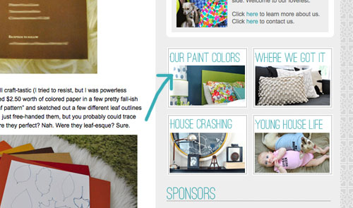
3. We also made a dedicated source list for where we got nearly everything in this house (like this one that we made for our first house) and also linked that up on the sidebar.
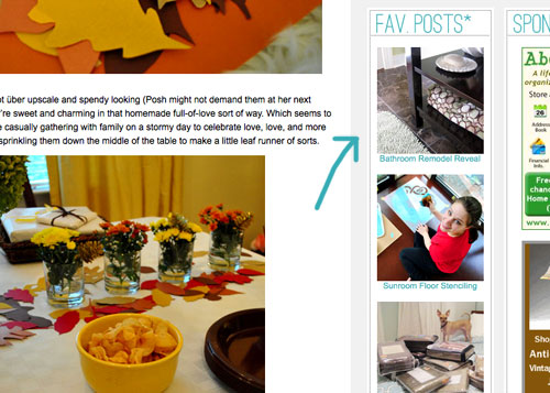
4. We tossed in a Fav. Posts button, also on the sidebar (with little thumbnails and links). We intend to update it every month or so with new faves (since we’re fickle folks and because we’ve also heard from a bunch of readers who’d love to see more archive stuff, but aren’t sure what’s worth digging around for).
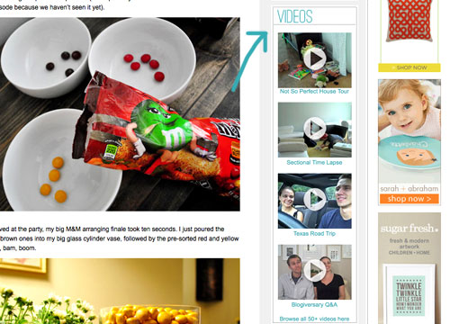
5. We also added a Videos button on the sidebar, which shows thumbnails of a few of them. All of our videos used to be accessible from the bar under the header, but we moved some other stuff up there and thought videos could breathe better down below – so now you can access them all by clicking the link at the bottom of this button.
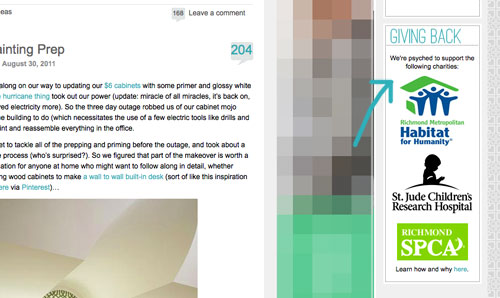
6. We added a Giving Back button to share the love for three charities that we’re thrilled to support, each of which were chosen because they represent stuff we love (homes, kids, & dogs). We make an annual donation of $1,000 to the Richmond Habitat For Humanity along with $500 to St. Jude Children’s Research Hospital and $500 to the Richmond SPCA (and we definitely encourage others to check them out – you can donate here, here, and here or find a local Habitat for Humanity or SPCA in your area here and here).
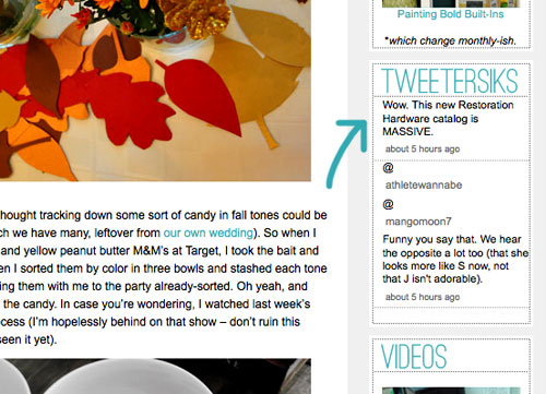
7. We retooled a lot of other buttons that have always been on our sidebar (like the House Crashing one) with some updated pics/type/colors. But that’s more decorative slash fun than functional. As is the new Twitter button which now goes by the name of Tweetersiks. Oh yeah, we officially out-punned Mr. Tom Petersik (my dear old dad).
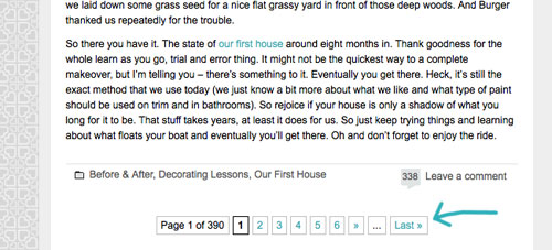
8. Oh and we were inspired (by Kate over at Centsational Girl) to add a nice thorough pagination capability (so you can click back to the very first post in our archives, you know in case you have a year to spare reading 2,000+ of them).
So there it is. Of course we still have a bunch of stuff on our blog-to-do list, so here are just a few things that we’re hoping to roll out in the next few months (or years, you know how long these things can take us, haha):
- Completely “renovate” our Projects page so it has some images instead of just a ton of crazy links (can you believe we’ve tackled over 500 projects?)
- Update the designs/header on the Mood Boards and Room Gallery pages (since they’re still rocking the old tan stripes)
- Add about 100+ other makeovers to our Room Gallery (we have so many amazing Reader Redesigns in our archives to toss in)
Should keep us busy for a while. And we do have our $6 cabinets to finish. Might switch back over to DIY for at least a little bit. Web stuff is kind of fun (when you’re in the zone), but there’s nothing like paint under your nails and sawdust flying. Hope you guys like the new look. Has anyone else done a little site tweaking lately? Any new color schemes or functionality that makes you giddy in that “it’s 2:52 am and we’re still working on this post way?” Not that we are. That would be irresponsible parenting.

Britton says
I love the new blog look especially your paint colors link!! I am loving the green and navy room!! I am a fairly new follower and I love reading!!!
Elisa @ What the Vita says
Beautiful, fresh, and young! I love it. Header shows up fine, I’m using Firefox, if that helps any.
Elisa says
So THIS is what warranted your 3am bedtime! It looks great guys! Definitely feels more like your current house. :)
Bobbie Brown says
Oh my godness I love it! It’s like a breath of fresh air! Ahhhhh! (not that there was anything wrong with your old one! But this one does rock!)
Emily says
LOVE IT!
Alisha H says
I lurve the background made up of the yhl hearts! Seriously, I could see this in a lightweight fabric on some pillows or maybe some curtains.
YoungHouseLove says
I know right? We might have to make something on spoonflower with it. Actually that’s not a bad idea. YHL pillows for everyone!
xo,
s
Amanda says
I’d buy that fabric! Please do it! Or I will. Mwahahahha.
YoungHouseLove says
Done deal! Haha.
xo,
s
Ali says
I love it! It’s a good transition.. thanks for not moving too much and confusing us all! The colors seem to fit well with the style of your current house, where the old layout kind of followed the theme of the old house. Great job :)
YoungHouseLove says
Haha – that’s what we thought too! John kept saying “we don’t have any tan, cream, and sage in this house- why does our site still look like the old house?” – and when my mom actually hinted that it was time for a blog update we were like “ok, ok – we’ll do it!” – haha.
xo,
s
Kate says
I LOVE the Young House Life page! It’s really a great way to make everyone happy–those that are only ready for the DIY posts and those (like me!) that enjoy a good first haircut post thrown in every now and then. Great job, Youngsters!
Ashley E says
Agreed!
Melissa @ HOUSEography says
Looks great! Nice work (at 3 a.m.).
Derk says
So, is that key in the header your *actual* house key? I’d be a little wary of that if I were you. Keys can be duplicated from photos alone. Seriously, google it.
I realize it’s a suuuper long-shot, but I know you guys are sticklers for privacy and security.
YoungHouseLove says
Thanks for the tip Derk! We changed the little bumps in Photoshop! Haha. We’re crazy people.
xo,
s
Derk says
I must be crazy too! I would’ve done the same thing.
YoungHouseLove says
Haha- it felt kind of weird to do, but you can’t be too careful! Haha.
xo,
s
Corinne says
I first thought I had gone to the wrong website! I think the changes are great, and from the sounds of it, I’ll really enjoy digging through older posts and videos later this weekend when I have the time to kill. The header is so YOU!
My blog is rather “blah” in the design scheme, so I might just work on something over the weekend. I kind of neglect my site because it’s so blah! That needs to change.
Nadine says
It looks really good! Great job!
Diane@Longaberger Lifestyle says
What a fabulous makeover!!!! I love it! And it’s truly worth all the effort and setbacks you’ve had! Your new banner is so very fun!
justine says
loving the new look, it really fits you guys. and reminds me of the colors in your house (which i’m sure was no accident!)
Torrie @ a place to share... says
Love the changes!
Karen says
LOVE the new features! What programs do you use to design your blog? I’m trying to transition from wordpress.com to wordpress.org and I don’t even know where to start!
YoungHouseLove says
We use wordpress.org along with a wpremix template and a whole lot of trial and error when it comes to coding the colors and graphics. We also rely on photoshop and a text editor program and a good ftp file uploading program (both of which might be available through your web host’s cpanel). Hope it helps!
xo,
s
Ivette says
LOVE it! I think it bright and refreshing!
Erin says
It looks awesome! So fresh and bright! I’m a sentimental fool and always liked the old setup, but I must say this is fantastic!
Chrissy Henry says
OMG LOVE IT!!!
Ashley says
LOVE it! Seriously. FANTASTIC update!
molly says
Love the new look! Just a FYI- I noticed that there are now two spots where the comment numbers show up. It looks a little confusing when at the top of a post as to which one to click on to leave a comment for that particular post. Just wanted to let you know! Also, love the Young House Life section! So cute!
YoungHouseLove says
Thanks for the tip Molly! A bunch of readers actually requested a way to comment on a post at the bottom (instead of having to scroll all the way back up to the top- you know we ramble and posts can be long, haha) so we added that little comment bubble at the bottom a few weeks ago. Hope that makes sense!
xo,
s
CandiL says
Love all of the colors!! Great job guys!!
Rebekah says
Looks great, guys!! Love the Young House Life tab. :)
erin says
almost every time a blog changes its header i think “eh, i liked the old one.” but this one looks great! love the font used for “young house love” especially.
i, too, was wondering about the late night tweet! totally worth it!
Elizabeth says
LOVE IT!!!!!
Lindsey says
Love, love, love it!
Jon Senge says
Looks great, guys!
Julie (from Pocketful of Joules) says
I think it looks amazingly awesome! I did a blog update awhile ago and I was so afraid that I was going to scare people away… but I’m pretty sure I’m the only person who noticed it!
Kassie says
Love the new look! What great timing too because the last few days I couldn’t figure out how to go back to posts from a long time ago so I was just adding a slash then page # after the url to go back. This is much easier! Great job. I love the behind the scenes photos too.
Seriously Sassy Mama says
Love the new look. Light and bright like you guys.
Manda says
I love it you guys! You had me at the white ceramic rhino in the header. And I love the new Young House Life section (cannot get enough of adorable Clara videos) and Where We Got It. Congrats!
Jessica says
The first thing I thought when I saw this was, “This background looks like their grey curtains!” hehe
The website looks great, very refreshing and nice :)
YoungHouseLove says
Isn’t that so funny? John “invented” the hear background and I said “sold! it looks like our living room curtains!” – haha.
xo,
s
Braelin says
Yes, you should totally do the same thing that you did with Clara’s name fabric and make actual fabric of the background design. What’s that site called again, Spoonflower or something like that (could be totally off on that…)!
YoungHouseLove says
That would be so much fun! Seriously, I’m all over it.
xo,
s
Vonda says
Looks fabulous!! It’s so light and new and I love the background design with your old hearts. So creative.
Once I get some decent shots of our new house I will change our header. It’s still sporting a shot of our old house, though we still own it so we should keep it, but add the new one too.
Iomay says
It looks wonderful! The colors are way more refreshing than the last and you are right, this is more 2011 :)
Pshaw on anyone who dislikes it! :)
Allyn says
I have to say, if you guys get a blizzard next week, I’m going to the store and stocking up on bottled water and twinkies. Come on, who doesn’t (secretly) love twinkies?!
YoungHouseLove says
Haha, I hear those things can last decades without spoiling.
xo,
s
Nikki says
you guys! it looks so awesome! i can’t see the hearts in the background and the white-on-yellow is tough to read at the top, but that kind of stuff happens with a lot of sites on my not-so-great pc browser at work. can’t wait to get power back so i can look at it on my mac at home. the header is amazing, and i adore the new color scheme. you did such a great job!
Teresa says
Rock star!!!! I LOVE the new design, so fresh and inviting. :) I’m still a fairly new follower, so the “old” design wasn’t old to me..but I do love this one! And thanks for some of the adds – like the pagination, its the little things.
Paige says
I love the heart pattern that you did for the sides of your site! Fabulous idea, and much lighter and brighter than your last theme. I do think that you should put Sue the napkin up in your header, I mean, she did inspire much of your color scheme in the new abode…
Also props on the Young House Life section, tons of cute moments over there.
YoungHouseLove says
Haha – we really wanted to include the corner of Sue but actually worried it might be an issue if the fabric is copywrited by Merimekko or something (photographing it on the blog would be ok, but making it “part of our logo” might not be). It’s probably paranoid of us, but we just decided to draw color scheme inspiration from Sue instead of photographing her. Haha.
xo,
s
Sarah says
I love all the personal touches! It really looks amazing! At first, I thought I was on the wrong site! =)
Elizabeth says
I love it! It’s new and fresh!
Allison says
It looks AMAZING! I’m a sucker for a blog design update and you guys did it well.
Bravo!
Maddie says
This is a perfect time to make a Fergie “2000 and late” reference, which means it’s about time you changed things up :).
But really, the first thing I noticed was the Rhino, and I couldn’t help but fall in love with the new design. The light colors give the site so much room to breathe.
Also, I love how in your comment replies, the image of you two grows when you roll over it. Nice interactive touch :).
YoungHouseLove says
Oh my gosh. How did we miss the chance to reference Fergie? Haha. Love it.
xo,
s
Melissa Irvin says
I so thought about Fergie on that bullet point too!! :)
lizzy says
whoa! i was JUST thinking to myself yesterday that you guys should consider brightening up the rest of the page to match the newly yellow-fied header! this works too. very fresh!
one teeny tiny suggestion though – i liked how your old page had a darker background so the daily post seemed “more separate” from the add/links on the right side. the post and the adds/links on the new page seem to mush together.(sorry if i’m not making sense but my brain doesn’t usually wake up until several hours after the rest of my body!)
looks great though!
YoungHouseLove says
Yeah, I know what you mean. We played around with how dark we wanted to go with the gray area around the posts, and we ended up liking the airier look without as much contrast (so things didn’t look as chunky and boxy). Who knows where we’ll end up down the line though! It’s definitely a work in progress!
xo,
s
Sara says
LOVE the new layout! I’m trying to re-vamp my own blog to hopefully get some advertisers involved so this is a big inspiration and help!
Julia says
Amazing. So will you guys be doing blog design anytime soon? Not that you need more on your plate – but this looks fantastic!
YoungHouseLove says
Haha, I think we’ll stick to doing our own site. We have our hands full here! Haha.
xo,
s
Joanne says
LOVE IT! And Young House Life is awesome! Well done (again) you two!
Tyson says
The new look is super sweet and clean. Just a quick suggestion when it comes to re-working your “project section”. It would be great if you could have an area within the projects tab that lists projects in chronological order; that way we could easily find any new projects that you post. Just a thought!
YoungHouseLove says
Ooh that would be fun! We’d love to have a more easy-to-search layout for sure!
xo,
s
The Catty Cat Lady says
I was wondering if you could share some of your other recommended design books. I have the domino book but I’m wondering what others (besides your upcoming book) are worth investing in.
YoungHouseLove says
Here’s a post about all of my faves: https://www.younghouselove.com/2009/03/lucky-seven/
xo,
s
Natalie says
The first thing I thought was, “Where is the little heart?!” Then I saw it in the background….yay!
Natalie says
BTW I love being able to look back at your earliest posts. It’s funny seeing a post with only 4 comments! My how things have changed!!
YoungHouseLove says
Haha, we always joke that we were blogging to no one for at least the first 100 posts!
xo,
s
Chrissie says
Well, 100 posts give me more breathing room than X months, being a weekly blogger, rather than daily =p seriously though, I love that you guys enjoy what you do so much, your site looks fantastic :-)
Kelly Mann says
It looks fabulous!! Don’t you just LOVE a fresh new look? I know I do! :)