We finished painting the guest room. And boy is it bold. Seriously, it’s like no room we’ve ever painted before. And we luuurve it. With a capital urv. This is probably the most accurate pic (well I guess it’s as accurate as your monitor) of the dark teal that we went with:

The color was of course inspired by none other than Sue the Napkin. It’s kind of similar to Dragonfly (the color that we painted the backs of the built-ins in the future dining room) but when we held up a ton of swatches in the guest room we preferred this color (Dragonfly was darker and greener).
It’s called Plumage by Martha Stewart, but of course we got it color matched to Olympic Premium paint since it’s No-VOC (even the colorants they add are now VOC free). We went with an eggshell finish (so it’s a bit more wipeable and durable than flat but not too shiny since it’s such a deep tone, which can show lots of flaws and imperfections when it’s glossy). Lowe’s actually had a bit of trouble getting a good match, so if your paint pro can’t get it close enough – our lady finally got it within .03% accuracy – Olympic’s Azalea Leaf is an extremely similar alternative. Of course you can also just go with Martha’s Plumage and not color match it to any other base to avoid matching worries completely.
But back to the whole room painting process. Let’s just say that as soon as we started rolling it on there were some oh em gee moments. And a fair amount of melodramatic nail biting.

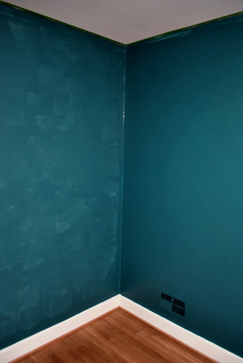
But after we got to the second coat, the coverage was great and it was looking deep and rich and bold and fun. See how much more coverage coat two gave us below (the wall on the right has two coats while the wall on the left just has one). Pardon the semi-odd coloring in this shot and the one above, they were taken at night so the rest are more accurate thanks to daylight.
After we completed that second coat we were sold. Seriously. We got all hyper and slap happy. There’s just something about pairing in your face color with crisp white trim that makes you giddy. And amazingly enough, we got ‘er done with just one gallon of paint (with some to spare actually) since it only called for two coats – probably thanks to the tinted primer we used beforehand.
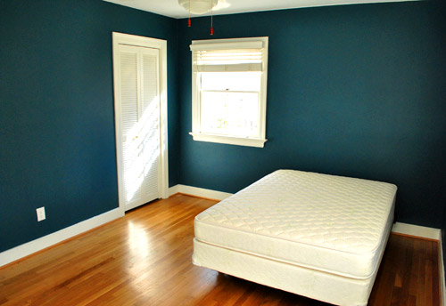
The first thing we did this morning was run into the guest room to admire it in the daylight. How can a $22 paint job make such a difference? It’s amazing. We were about to snap some after pics for you guys when the doorbell rang. It was our new guest bed arriving 30 minutes early. So it ended up in the pics since we didn’t have a moment to take any without it (more details on our mattress buying adventures later). Anyway, here’s the view of the room from the adjoined guest bathroom:
And here’s a shot of it from the hall:
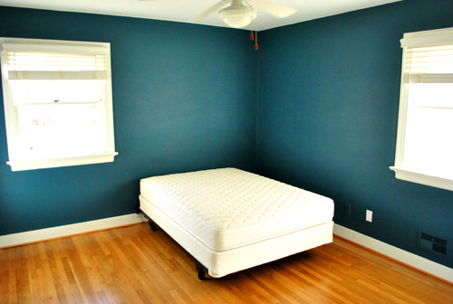
The off centered windows are definitely going to make the floor plan interesting, but we’ll share how we land on our final layout when we, uh, land on a final layout. We’re just going to play around with things until we figure out what we like best.
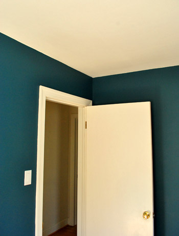
Oh and you’ll notice that we painted over some of the wall warts (as they so lovingly call them) like the vents and an old Bell Atlantic phone jack to the left of the white outlet plate above. They were already painted over by the previous owners so we repainted them to match the new wall color. We did keep all of the unpainted outlets unpainted though.
Speaking of painting over things, after a surprising number of requests I finally remembered to make a cutting in video, so you can enjoy the riveting play by play below and see how I use my favorite brush to get a nice clean line next to baseboards and trim:
As for down the road projects, we’d love to add crown molding and possibly paint the ceiling a lighter tone than the wall (or at least freshen it up with crisper white paint along with the trim). But that’s definitely not something we have time for with my mom & stepdad rolling into town this Thursday.
So there you have our dark teal guest room. Now we just have to hang the headboard, dress the bed, get a shower curtain and bath mat, change out the toilet seat (it’s old and rusty), hang curtains (if we have time), and figure out the side table & lamp sitch (might not get to that either). Should be an interesting few days…

Amelia says
Although everyone has covered this, I just had to add in my two cents: I LOVE THE COLOR! It’s absolutely stunning. And just fun – although I adored what you’ve done with lighter tones, I just think it’s great to have you both experimenting with some color – you completely succeed in that also! Can’t wait to see what next you do!
kristy says
I love it! I think it brings out the wood floor nicely!
bmeri1 says
Beautiful! After we had painted our bedroom a deep cranberry-red with white trim, (we nearly had heart failure putting it on the wall!) one of our friends (who is a professional painter) remarked “Wow, it takes so much courage to paint a room that color…….”
So, here is to you (sound of clinking glasses).
jodi says
GORGEOUS!!!
Katrina says
Random question (I may have missed this if you ever mentioned it previously) – which direction do the windows in this room face? Also, what direction does Clara’s room face? And, while your at it, your bedroom? We’re picking out colors for our daughter’s “big kid” room, which is on the northeast side of our house. I love this color, but I always wonder what impact the side of the house would make to it. Would you go this dark in a less sunny room of your house?
YoungHouseLove says
The windows in the guest room face south & east, the windows in Clara’s room face north and east, and the windows in our bedroom face south, east, and west. We would go that dark in any room, as long as it has more than one window and isn’t super dark. Hope it helps!
xo,
s
Katrina says
Thank you! I’ve been wondering how your house is oriented in comparison to ours. I had a swatch similar to what you both just painted this room among the options for my daughter’s room and my husband almost had a heart attack. After looking at these pictures I’m tempted to put that swatch back in the mix, except that we’re not planning on painting our wood colored trim right away and I think that it will lose the impact that you have achieved here.
I do have celery sticks up and it has survived the first round, along with a deeper spring green and two teal gray-blues. Which direction did Clara’s room face in the last house? I’m in love with celery sticks in the daylight, but I lose some of the love in the evening (granted, currently the room has horrible lighting, which we are working on improving).
BTW – I really appreciate your response to the million of questions that you receive on your site. I love the friendly brainstorming that goes on here!
YoungHouseLove says
Her room roughly faced south-west in the last house. Hope it helps!
xo,
s
KDB says
It looks nice!
We have off-center windows in our small bedroom, and we tackled them by hanging a long curtain rod from one edge of the window, extending about 4 feet past the other side of the window. We hung a long curtain, which is not see through, but allows SOME light to pass through, and put our bed (centered) in front of the curtain. It fakes the look of a larger window or double set of windows being behind the bed, and it still allows plenty of light into the room.
diane says
Love that color and the guest room is the perfect spot for it since no one will have time to grow weary of it. Crown molding will really finish it off and make the transition to the ceiling so much nicer. Great job guys!
Kady says
HILARITY! We currently have this color swatch up in our spare…picked it up Sat night from the Depot.
This…plus the lust of my lifetime: Chinoiserie Duvet Set by DwellStudio will make this room, well, perfect!
Thanks for helping us make up our batty minds.
~kd & sam
Alissa says
Normally I am not a blue person, but the richness of that shade (and perhaps the second coat?) make it seem like this really fantastic deco hotel I stayed in right on the wharf in San Francisco. It’s bold, but there seems to be a nice swankiness to it. Can’t wait to see the room when it is all turned out. Way to go! You guys have a really great eye for selecting the right color for the space…
Chris @ Our Corner House says
Ok, now this is just weird! Another blogger told us to check out your post-weekend post and it’s nearly identical to our post-weekend post. How strange is it that we both painted our guest rooms plumage??? And that we both had it mixed into another brand of paint? We went with one accent wall, but still…it’s weird, right? It looks nice, if I do say so myself. :D
http://ourcornerhouse.wordpress.com/2011/02/21/into-the-blue/
YoungHouseLove says
Haha, that’s too funny! Great minds think alike!
xo,
s
Sheryl J says
I love the color! It looks like something you would see in a magazine.
Mrs. Taylor says
I’m so glad you decided to paint outside your comfort zone! The room looks amazing!! Hmmm…maybe I can talk the hubbs into using this color somewhere in our house…I’m off to ponder an effective bribery method!!
Jennae @ Green Your Decor says
I desperately want to paint a room dark blue, and now I remember why! I can’t wait to see how it will look once the room is complete :)
Lauren says
I love this color! It was one of my wedding colors (along with a bright apple green) and we have some accents in our house painted in a similar color!
Rachel says
Love it, guys!! Beautiful color!!!
Adam says
Wow, what a rich and saturated color!
Nicole says
Beautiful!! Such a deep rich color. Love the change! Taking a risk can be sooooo rewarding!
Holly says
Sorry for the dumb question that you’ve probably answered already, but:
I noticed that you taped the ceilings. Did you remove the tape after each coat before the paint dried and retape, or did you leave it on through all three coats and then take it off at the end? If you left it on through all of the coats did you have any problems with it peeling away bits of the new paint since it had time to try onto the tape? Hope that makes sense – I’ve had this problem in the past and can’t seem to get a good answer; seems like all the experts I know just don’t tape at all.
Thanks!
YoungHouseLove says
We just apply that ceiling tape once and remove it the second the last coat is applied (since that last coat sort of re-wets the coats under it for a clean line when it’s pulled off). Hope it helps!
xo,
s
Kate L. says
I have a question for you guys about the paint coverage and number of coats applied. I’ve been doing a lot of painting in my home lately (two bedrooms and one bathroom), and I’ve found that one gallon of paint in a very light color doesn’t cut it when I need two coats. I’ve been priming first, then painting, and wondering the whole time how anyone can make one gallon of paint last for two complete coats. Maybe my rooms are bigger than I thought, but how do you guys do it? I’m curious!
YoungHouseLove says
Our rooms are pretty small (the guest room is less than 11×13′) but a lot can have to do with your walls. We have plaster walls, but sometimes drywall can call for more paint (especially unprimed drywall). So sorry it’s taking you more coats than you’d like, but it’s all worth it in the end!
xo,
s
Nicone says
Wonderful. Don’t know why we aren’t more bold when it comes to choosing the color of paint, seeing as it’s so easy to redo it if it doesn’t turn out well. Yours looks gorgeous.
Carla says
I LOVE the color! I also love cutting-in, it is WAY better than taping.
Kelly says
I LOVE the guest room paint color! I also love that the new Olympic colorants are VOC free – thanks so much for that info.! By the way, have you guys heard about the Rustoleum transformation cabinet kits? I will be painting my yucky oak cabinets this spring, and just heard about this product. Do you know of anyone who has used it? Trying to decide whether to give the kit a try, or go the traditional painting route.
YoungHouseLove says
We’ve heard nothing but good things about that kit! We do expect that it’s a pretty fumey process so we’re probably going to look into low-VOC primer and do it the old school way.
xo,
s
Jen says
Saw this a few weeks ago. Hope it helps:
http://www.centsationalgirl.com/2011/02/a-new-solution-for-transforming-your-cabinets/
Ashley says
Woot! Two main rooms in our house are this color!!! My husband was really worried at first but it turned out gorgeous!
Sarah@StyleandCentsability says
Great Color- I love this shade with pops of lime green! Kind of like my latest green find here:
http://styleandcentsability.wordpress.com/
Autumn says
Gorgeous! I don’t know if I’m brave enough to go that bold in my house but it is really tempting now. Can’t wait to see it all put together!
Serina Shook says
GORRRGEOUS!!! I painted my living room Behr’s Caribe, it’s on the bluer side of teal, but very similar (you can check out a pic if you’d like http://applesforolive.files.wordpress.com/2010/10/dscf12255.jpg).
I also looove how the bold color pairs with yellow, so I can’t wait to see that rug and other pops of yellow in the room! So glad yall are going bold!
Serina Shook says
oops, the parentheses got in there with the link…
http://applesforolive.files.wordpress.com/2010/10/dscf12255.jpg
YoungHouseLove says
Love it! Thanks for sharing the link!
xo,
s
Pam says
I also cut-in without taping and it has saved me a ton of time, not to mention the cost of the tape. That stuff’s not cheap!
If I could add one thing to your tutorial, it would be this: While running the brush along the edge, keep your eye ever-so-slightly ahead of where the brush meets the edge of the trim. In other words, watch what you’re about to paint, not where you’re currently painting, or where you just painted.
I have no idea why this works, but once I discovered it my cutting-in skills improved immensely.
Love the color, by the way. Great job!
Kate says
LOVEEEEEEEE the color!!! I wish I had painted a room in my home that color, but we just finished painting the last room yesterday. :'( Alas, I shall live vicariously through you! It’s B-U-T-ful!
Michelle says
I wish I had the nerve to do this to our guest bedroom. This might have totally switched my current plans. Beautiful color!
Catherine says
I’m a day late, but I just had to say I’m LOVING this! It’s basically exactly what I want my home office to feel like. I love me some dark, glamorous rooms. :) Bravo you two, way to step out of your comfort zone!
Jenny B. says
What kind of paintbrush do you use/recommend for cutting in?
YoungHouseLove says
We linked to it in the sentence above the video. It’s a 2″ angled short handled brush from Sherwin Williams. More details if you follow that link. Hope it helps!
xo,
s
Kim S says
Love the teal! Our guest bedroom is dark blue (the same rich saturated tone as your teal but without the green hue) and I love how it looks with the white trim and white bedding we have in there. Can’t wait to see how you accessorize it!
r8chel says
Wow – that looks great! I’m finding myself really drawn to that color recently, but it’s mostly showing up in my wardrobe, not my house!
Jessica CVR says
Ahh! I LOVE the color. We’re actually talking about painting our den/office/guest room the exact same color (we blogged about it here: http://oneyearincali.wordpress.com/2011/02/12/a-serious-case-of-the-blues/ )
Do you guys feel like it made your room feel significantly smaller/darker? Ours is a small room and the hubs is slightly worried that it’s going to make it feel like a cave.
YoungHouseLove says
Honestly the room feels bigger, but we’re not sure if it’s just because it’s not full of frames and doors anymore and there’s a bed in there now. Either way, we’re sure that going bold definitely didn’t make it feel dark and small at all! It’s only an 11 x 13′ room (well, slightly smaller than that) so it’s hardly a big space to begin with. Hope it helps!
xo,
s
erin says
Been a lurker for a looong time but had to come out of hiding to say “thank you” for using this color! Want to paint hubs’ office plumage but was scared. It goes great w/a painting we have. Now that I can see it in your room I’m sold! Looks great!
Adrianne says
Great job you two! Your vision is on it’s way to completion. This is a very calming and yet invigorating color. Strange to get two feelings in one color but it truly is both! This is similar to an accent color we have recently begun using in our living room and we love it!
Jessica says
I am SO EXCITED to see what you end up doing with the layout in this room because my bedroom looks like an exact replica of this one and I can NOT figure it out!
Kerstin says
Great choice, I love the color. We are renting since four years now and I have to say I am sick and tired of the same old eggshell/tan/pale yellow (whatever you want to call it, it’s hard to define) color in the whole apartment… I long for bold colors such as this one!
Erin@His & Hers says
We just bought a house and over the weekend painted our dining room a similar color–Underwater by Behr–it has slightly more greeny/gray undertones, though. We love it, and your room looks great, as well! Definitely agree about the white trim with the bold color!
Erin@His & Hers says
Looks great! We just painted our dining room in a similar color and also used the Olympic no VOC paint and tinted primer. It worked beautifully to cover up the orangey red walls left by the previous owners!
Dawn says
LOVE, LOVE, LOVE it! So bold but sooooo pretty. Just in case it makes you feel better…I did just see this SAME color on an episode of “Deserving Design” on HGTV. So you’re hip…you’re in…you’re the cat’s meow…;)
Kristin Zamora says
Boy, when you guys decide to go for color, you make it look good!
The color in this room is inspiring. I love it.
The bold color compliments the white trim perfectly.
Can’t wait to see it with some decor, and furnished.
Lauren says
Love Love LOVE this color! It is so vibrant, but not overbearing. We’re re-doing our guest bathroom, and I might steal this color from you.
Jen says
We went from our usual bland color scheme to a dramatic one in the first floor of our house — we ended up with “Caribbean Teal” from one of the competitor low-VOC paints in the “parlor”. We love the now-named “Peacock Room”! Only problem we’re having is finding window dressings / furniture to match — we kind of want to subtly play up the peacock theme.
Tricia says
I’m so glad to see I am not the only crazy person with this color in their guest room. I was motivated by trips to mexico and our hawaiian wedding. I originally purchased it for our masters and than decided against it in our room but for th guest room. We paired it with crisp white, a mirrored side table and other chic accessories.
I think this color is so versatile and it could be paired with chic, modern, traditional, tropical decor. Can’t wait to see the room finished.
Megan says
Thanks for the video! I did a ton of cutting in over the weekend, with the same brush, but a different technique – I press the brush harder to get the bristles to fan out, and I feel like that gives me a sharper line. Perhaps it’s because I’m a lefty? I guess that’s a lesson to try several different ways, until you find the one that works for you.
Megan says
Forgive me if someone has asked this already in the tons of pages of comments but is there a color equivalent to Plumage that you would suggest in Benjamin Moore? I’m looking to do this color but my paint store can’t match Martha Stewart into a NO VOC paint…arg. Any ideas?
YoungHouseLove says
Benjamin Moore’s Affinity line has a similar color called Dragonfly (in our light it’s a little greener and a little darker). Or you might want to try buying a tester of the actual Martha Stewart Plumage color and painting a 2×4 that color (outside so it’s not stinky). Then bring that 2×4 to the paint desk, and they might have better luck matching it that way. Good luck!
xo,
s
Alana says
Hello,
I wanted to let the two of you know that I watched your video on cutting in when painting with out using tape. My husband and I always used tape when painting and spend an hour or so each time just taping. After watching the video I braved the edging with just a brush using your technique. It turned out great! Thanks for the great tips.
YoungHouseLove says
So glad! Wahoo. I’m seriously happier for you than I should be right now.
xo,
s
Elana says
I love how this color turned out! I know that in your first home you all had much lighter colors throughout your home. Did you all choose bolder colors just to have a change or do you prefer these colors over lighter shades? Also do you think lighter colors make rooms seem more crisp, clean and uncluttered?
YoungHouseLove says
Isn’t it funny how things like color and pattern preferences have changed since our last house? Our evolution can best be described here: https://www.younghouselove.com/2010/10/the-benjamin-button-ization-of-our-style/
Essentially we were playing it safe (and loved the serene look) for a while since we felt like “we’re adults now so it shouldn’t look crazy like a dorm” and then we had Clara and it awakened this joy and this excitement for bright pops of color that make us smile! Who knows where we’ll end up, but we’re loving things so far!
As for lighter colors making a room feel crisp and uncluttered, I generally believe that. But we just painted our guest room a deep teal color but thanks to white curtains and bedding it still feels pretty crisp. And since there’s not much clutter in there (just a bed, night stand, two chairs, and a bookcase) it doesn’t feel busy or cramped at all! So you don’t have to stick with white or tan walls if you’re jonesing for something a bit more bold!
xo,
s
Allie says
I came across ths living room, and it reminded me so much of your house! The bookcases, the wall color, the great ‘feel’ of the room. I think the gold may be a great accent in this room or your hall bath. Love what you’ve done so far!
http://emilyaclark.blogspot.com/2010/04/extreme-makeover-bookcase-edition.html
YoungHouseLove says
GORGEOUS! I love it.
xo,
s