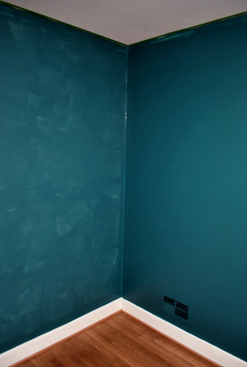
We finished painting the guest room. And boy is it bold. Seriously, it’s like no room we’ve ever painted before. And we luuurve it. With a capital urv. This is probably the most accurate pic (well I guess it’s as accurate as your monitor) of the dark teal that we went with:

The color was of course inspired by none other than Sue the Napkin. It’s kind of similar to Dragonfly (the color that we painted the backs of the built-ins in the future dining room) but when we held up a ton of swatches in the guest room we preferred this color (Dragonfly was darker and greener).
It’s called Plumage by Martha Stewart, but of course we got it color matched to Olympic Premium paint since it’s No-VOC (even the colorants they add are now VOC free). We went with an eggshell finish (so it’s a bit more wipeable and durable than flat but not too shiny since it’s such a deep tone, which can show lots of flaws and imperfections when it’s glossy). Lowe’s actually had a bit of trouble getting a good match, so if your paint pro can’t get it close enough – our lady finally got it within .03% accuracy – Olympic’s Azalea Leaf is an extremely similar alternative. Of course you can also just go with Martha’s Plumage and not color match it to any other base to avoid matching worries completely.
But back to the whole room painting process. Let’s just say that as soon as we started rolling it on there were some oh em gee moments. And a fair amount of melodramatic nail biting.

But after we got to the second coat, the coverage was great and it was looking deep and rich and bold and fun. See how much more coverage coat two gave us below (the wall on the right has two coats while the wall on the left just has one). Pardon the semi-odd coloring in this shot and the one above, they were taken at night so the rest are more accurate thanks to daylight.
After we completed that second coat we were sold. Seriously. We got all hyper and slap happy. There’s just something about pairing in your face color with crisp white trim that makes you giddy. And amazingly enough, we got ‘er done with just one gallon of paint (with some to spare actually) since it only called for two coats – probably thanks to the tinted primer we used beforehand.
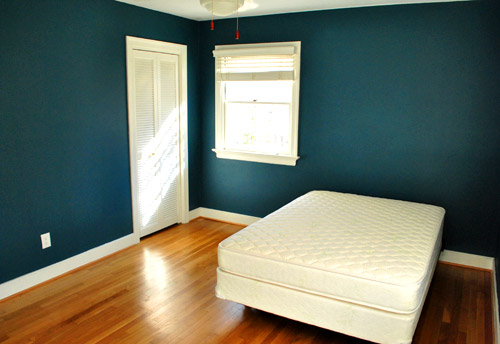
The first thing we did this morning was run into the guest room to admire it in the daylight. How can a $22 paint job make such a difference? It’s amazing. We were about to snap some after pics for you guys when the doorbell rang. It was our new guest bed arriving 30 minutes early. So it ended up in the pics since we didn’t have a moment to take any without it (more details on our mattress buying adventures later). Anyway, here’s the view of the room from the adjoined guest bathroom:
And here’s a shot of it from the hall:
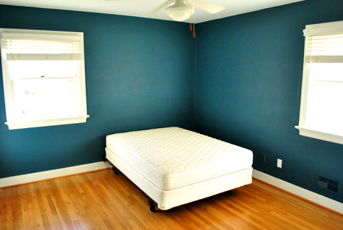
The off centered windows are definitely going to make the floor plan interesting, but we’ll share how we land on our final layout when we, uh, land on a final layout. We’re just going to play around with things until we figure out what we like best.
Oh and you’ll notice that we painted over some of the wall warts (as they so lovingly call them) like the vents and an old Bell Atlantic phone jack to the left of the white outlet plate above. They were already painted over by the previous owners so we repainted them to match the new wall color. We did keep all of the unpainted outlets unpainted though.
Speaking of painting over things, after a surprising number of requests I finally remembered to make a cutting in video, so you can enjoy the riveting play by play below and see how I use my favorite brush to get a nice clean line next to baseboards and trim:
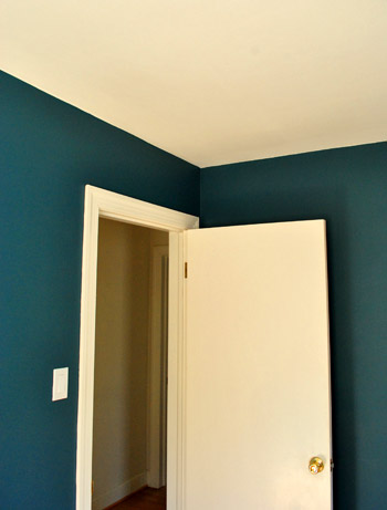
As for down the road projects, we’d love to add crown molding and possibly paint the ceiling a lighter tone than the wall (or at least freshen it up with crisper white paint along with the trim). But that’s definitely not something we have time for with my mom & stepdad rolling into town this Thursday.
So there you have our dark teal guest room. Now we just have to hang the headboard, dress the bed, get a shower curtain and bath mat, change out the toilet seat (it’s old and rusty), hang curtains (if we have time), and figure out the side table & lamp sitch (might not get to that either). Should be an interesting few days…

Hilary @ My So-Called Home says
Looking great! I think your yellow rug will be a nice bold contrast, and of course motivate you to get another to replace it with. You think you’ll add another hint of color so it’s not all blue-yellow?
YoungHouseLove says
Oh yes- we’re planning a smorgasbord of colors in there, just because a lot of the things we have are brightly colored items (which aren’t all blue and yellow). Can’t wait to see how it all comes together!
xo,
s
Sarah @ Comfort and Joy says
What a beautiful color! Yay for taking risks. :)What is the rest of the color scheme for the guest room?
I’d love to see bright yet not matchy-matchy. Maybe these- http://goo.gl/1TptM which coordinate nicely with the floor tones. And some cool thrifted furniture? :)
YoungHouseLove says
We’re definitely planning to work with some things that we already have (like the bedding and head board from our last guest room) along with some already existing art and furniture. Should be interesting…
xo,
s
Sarah says
I painted my kitchen this color a year and a half ago and still LOVE it. Your guest room looks great!
Rachel says
Love the Color! But on a totally random note… When I read that you luurve it?!? I have literally been saying that word for months and my hubs never believed it was a word… You better believe I immediately sent him this link :-) haha many thanks!
YoungHouseLove says
Wahoo! Confirmation. It’s totally a word.
xo,
s
Robin says
I say that too!
gk says
it was also used in “annie hall”. (and you know, if it was used in a movie, it’s totally real!)
paintergal says
Gorgeous!
I admire your steady hand with the cutting in. I’ve tried it sans-tape and have come to realize that I don’t have what it takes. Frog Tape is my new best friend.
kelley@paperdollmn says
I stinkin’ LOVE the new color! And I agree with a bold color against white trim.
Melissa says
What a great color…I’d never have the guts to go that dark, but it looks great!
Laur says
I love love love that color!! I’ve been thinking about something in the dark teal family (Totally Teal from Glideen)for my living room, but everyone keeps telling me it will be too dark. . . now I just have to point them towards this post to prove them wrong :)
Liz says
LOVE this post and love the wall colour! So bold and daring, I now want to repaint a room at my place. :)
Wendy says
Our master bedroom has similar window placement and I have been struggling with where to position the bed. I’ve considered 2 different options:
1.having the bed come out of the corner between the two windows (not sure how if I would then put a nightstand on each side?)
2. Center the bed on one outside wall, and one of the nightstands would be underneath the window while the other would not.
I can’t wait to see what you do with the placement!
Jessica says
The paint color looks beautiful! I am sure you have already seen this project but I still thought I would share. These nightstands would look great with the guest room: http://aubreyandlindsay.blogspot.com/2009/09/side-table-project.html
YoungHouseLove says
Love it! Thanks so much for the link!
xo,
s
Paige says
OMG. Yes. Especially with the white trim and wood floor.
Snaps for you guys!
ruth says
It looks great. I can’t wait to see the final product.
Michelle says
LOVE the bold color. So pretty!! Our family is down with the flu so this weekend we’re living through you two in the home projects dept. Your blog is terrific!
Cheri says
I LOVE this color. I like blue but don’t know how to decorate with it but I am thinking (since we are moving and I have a whole house to paint) that I might just have to try this color. Where…I am not sure but I LOVE it.
Casey says
Absolutely love it!! Great choice guys! Can’t wait to see the room dressed and in-law ready.
Jayna says
Oooh, I was betting (with myself) that you’d either go with the dark teal or a deep chocolate brown. I’m so glad to see the dark teal on your walls! Against the bright white trim it looks stunning.
I’ve been hunting for the right color to put on our bedroom walls- and I jump between this color and a softer gray/blue similar to your master bedroom. What made you decide to put this in a guest bed instead of your own? Too dark with the fancy duvet I know that much- but do you think the dark teal is too dark to have in the room you sleep every night?? Perhaps better for those short trips- which is why we love drama in places like hotel rooms and friends’ guest bedrooms. Hmmm thanks for sharing this! I still don’t know which to paint- I might just have to go for it and see!
YoungHouseLove says
We would totally sleep in a bedroom this color. We’re in love with it! We just went with something softer for the new duvet (and also really like that color too).
xo,
s
Nicole says
So pretty! I watched your video on cutting in…I don’t think I’m steady enough!
Heather says
omg! i love it! that is an awesome color! i cant wait to see the finished room!!
Ashley says
Love the color and I can’t wait till I am done with work to watch the video on cutting in. That is always my job and I am horrible at it still any advice or pointers will help!
Christine says
This is exactly the color I was guessing you’d go for! ‘Plumage’ is such a great name for it, since it reminds me of peacock blue. Gorgeous, moody and enveloping, like any great guest room! I bet it looks sooo cool at night.
linda says
GORGEOUS!!!!!!! i absolutely love it!
monica says
I’ve had the “Plumage” swatch for months, debating about whether or not to use it on two walls. After seeing it here, I’m SOLD! Thanks.
Rosa @ flutterflutter says
That wall color looks fabulous with your flooring!! Beautiful!!
Sarah K says
LOVE LOVE LOVE IT! Haven’t been on the internet since Friday morning, and I couldn’t believe you guys went so bold in the guest room – it looks AMAZING! Can’t wait to see how this room turns out.
Marie says
Lovely color! That definitely takes guts but it looks awesome. I’ll be excited to see what you put together for the layout–my bedroom has almost that exact same awkward window placement. I ended up centering the bed on the longer of the two windowless walls (the one with the slatted door in your pictures), but I don’t think it’s a great solution.
Jill Stigs says
The fabric used in Clara’s 40 week pic looks like it could go in here…………GREAT color!!
Kari says
LOVE it!! So glad you guys got out of your “light and airy” paint color scheme and went for something more daring! I bet this room is going to look straight out of a magazine when you’re done with it! Cannot wait!!
Tiff Morrison says
Looks awesome! I’m a big fan of the bold colors too.
carey says
LOVE LOVE LOVE!!!!!!!!!!!!!!
georgia says
I LOVE the colour!!! its so rich and lovely!
Have you thought about putting the bed diagonal from the corner of where it is? like coming away from the wall in the middle of the two windows, then maybe putting a nice large lamp behind the bed to use as a night light?
Would make the layout quite quirky and hotel like i think :)
YoungHouseLove says
Yup, we’re definitely planning to try all sorts of layouts (the diagonal suggestion seems to be really popular today). Who knows where we’ll end up!
xo,
s
Christina says
I love it! I painted my office Pacific Ocean Blue by Ben Moore and it looks like it’s exactly the same color. Or I should say exactly as your color appears on my monitor- which is calibrated.
Erin L says
It looks great! How were you inspired to use this color? Was it from your napkin or from decor photos online and such? It’s always so hard to tell what a room is going to look like just from browsing the swatches in the paint section!
YoungHouseLove says
Yup, Sue the Napkin was mostly to blame. We also had an inspiration room with an accent wall that was similar in color. And we brought home a bunch of swatches and just liked Plumage best, so a lot of it was trusting our eye.
xo,
s
laurenjanelle says
It really is bold. It looks so beautiful! The white trim softens it. I’m excited to see it decorated.
jodi says
Gorgeous!!! I think the room is going to be amazing!
Annie says
It looks fabulous! Our “master” bedroom (currently storage room) is actually roughly the same size, with the same weird window placement, and even the door to the hallway and bathroom is the same! The only thing different is that our closet is behind the door to the hall, not further down towards the back.
Anyway the point is I can’t wait to see how you arrange it because we’re getting ready to convert ours from storage into an actual bedroom. The layout is definitely tricky, but you always seem to find a great one!
Katie @ Newcomb Home says
I love it! I painted my master a medium teal color over yellow paint – boy do I wish I used a tinted primer! It took lots of coats to completely cover the yellow. Thank you for the tip!
Adriane says
::HEART::
I love the way it plays against the yellow in the hardwood. BEAUTIFUL!
Tiffany says
I love it.
Melissa says
Love the color!! I can’t wait to see your room design since two of the bedrooms in the house we are moving into have that exact same interesting window layout!!
CourtneyOutLoud says
Well I love the color, but then I am bias since I painted my pantry the exact same shade:
http://courtneyoutloud.wordpress.com/2011/01/27/pantry-reveal/
It really makes a bold statement but it also acts as a neutral in my opinion.
The room looks beautiful!
YoungHouseLove says
Thanks so much for sharing the link! So much fun.
xo,
s
Lindsay says
I LOVE this color! While borwsing the blogs, I saw this picture over at Effortless Style:
http://blog.effortless-style.com/2011/02/down-under-design/
It has the same dark walls, but the room feels airy and bright. Although they use orange accents, your yellow rug would look just as awesome!
Michelle says
I found you today through Jen Lancaster’s site and haven’t been able to get a lick of work done since! I’m going to get one of those little brushes before I tackle my next painting job. Love love LOVE that color, I’m a sucker for anything saturated like that.
Quick question, I have dark woodwork in my 60’s ranch. Some clown “stained” the original wood with a walnut wash of some kind and it’s messy and uneven. I’m slowly going over it all with the latex equivalent of Hershey’s Syrup. When painting walls a light color would it be best to do the moulding or walls first?
YoungHouseLove says
So glad you found us! As for trim vs. wall painting, it’s kind of a chicken or the egg situation. It can definitely work either way, though many people prefer to paint trim first (so if they go out of the lines they can correct it when they paint the walls next). You can kinda do the same thing the other way (paint walls first and then correct oops moments with trim paint during your next step), so there’s not really a right answer. Good luck!
xo,
s
Delana says
I love it. I’m just curious though, you say you like flooring to be the same throughout a house to make everything integrated. Do you not feel the same way about paint color? I love how everything comes together in your home, but I’ve always been afraid to paint rooms different colors, mostly because I’m too lazy to paint that many times, but also because I like everything to be seamless.
YoungHouseLove says
We definitely feel like the paint color scheme throughout a home should “go” but it obviously doesn’t have to be the same in every room (you know the whole “go” oesn’t have to match thing?). Here’s a post about landing on a whole house palette that feels cohesive but not too boring or chaotic.
https://www.younghouselove.com/2010/02/our-homes-recently-expanded-color-palette/
Hope it helps!
xo,
s
Amanda says
Love the new color, and am totally impressed with the photography! I just invested in a new Nikon, but haven’t mastered the ability to capture a room with natural light flooding in from outside. Any tips on how to do this without washing the room out? Would be nice to bring more accurate snapshots along when I’m hunting through HomeGoods, Marshalls, etc!
YoungHouseLove says
We like shooting in A mode (and manually white balancing). Hope it helps!
xo,
s
shannon says
So beautiful! I am very inspired!
susan says
Love the color. Grab a table from the porch or patio to use by the bed until your guests leave. susan
Renee M says
Such a rich color. I love it! Great choice!
Julie White says
This colour is fab and matches the UK Dulux range’s Teal Tension. I have matched this in my kitchen with pale cream units, glass worktops and this gorgeous wallpaper by Sanderson (don’t know if you get it in the USA) – see it here in the fabric http://www.retrotogo.com/2009/03/1950s-dandelion-clocks-wallpaper-fabric.html
YoungHouseLove says
So pretty! Love it!
xo,
s
Jess says
I just noticed this but in the ‘nail biting’ picture the top of the wall doesn’t look cut in yet. What is your painting routine? I don’t know why I assumed that you (Sherry) cut in top and bottom and then John rolls in between the two.
YoungHouseLove says
I always like to cut in first (it results in the most seamless effect) but for the first coat the whole order thing doesn’t matter, so John will do one side of the room while I do the other. Then when it comes to the final coat of paint I always try to cut in before John rolls an area.
xo,
s