We finished painting the guest room. And boy is it bold. Seriously, it’s like no room we’ve ever painted before. And we luuurve it. With a capital urv. This is probably the most accurate pic (well I guess it’s as accurate as your monitor) of the dark teal that we went with:

The color was of course inspired by none other than Sue the Napkin. It’s kind of similar to Dragonfly (the color that we painted the backs of the built-ins in the future dining room) but when we held up a ton of swatches in the guest room we preferred this color (Dragonfly was darker and greener).
It’s called Plumage by Martha Stewart, but of course we got it color matched to Olympic Premium paint since it’s No-VOC (even the colorants they add are now VOC free). We went with an eggshell finish (so it’s a bit more wipeable and durable than flat but not too shiny since it’s such a deep tone, which can show lots of flaws and imperfections when it’s glossy). Lowe’s actually had a bit of trouble getting a good match, so if your paint pro can’t get it close enough – our lady finally got it within .03% accuracy – Olympic’s Azalea Leaf is an extremely similar alternative. Of course you can also just go with Martha’s Plumage and not color match it to any other base to avoid matching worries completely.
But back to the whole room painting process. Let’s just say that as soon as we started rolling it on there were some oh em gee moments. And a fair amount of melodramatic nail biting.

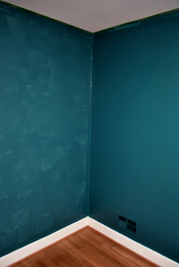
But after we got to the second coat, the coverage was great and it was looking deep and rich and bold and fun. See how much more coverage coat two gave us below (the wall on the right has two coats while the wall on the left just has one). Pardon the semi-odd coloring in this shot and the one above, they were taken at night so the rest are more accurate thanks to daylight.
After we completed that second coat we were sold. Seriously. We got all hyper and slap happy. There’s just something about pairing in your face color with crisp white trim that makes you giddy. And amazingly enough, we got ‘er done with just one gallon of paint (with some to spare actually) since it only called for two coats – probably thanks to the tinted primer we used beforehand.
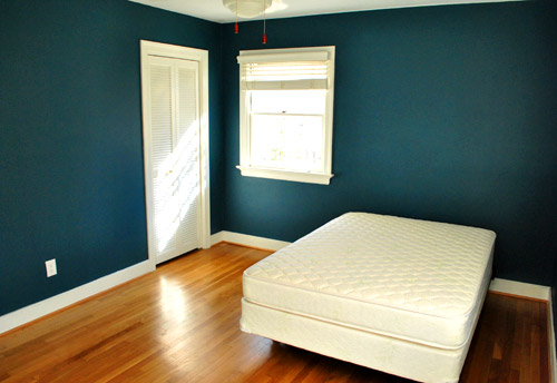
The first thing we did this morning was run into the guest room to admire it in the daylight. How can a $22 paint job make such a difference? It’s amazing. We were about to snap some after pics for you guys when the doorbell rang. It was our new guest bed arriving 30 minutes early. So it ended up in the pics since we didn’t have a moment to take any without it (more details on our mattress buying adventures later). Anyway, here’s the view of the room from the adjoined guest bathroom:
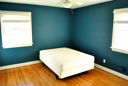
And here’s a shot of it from the hall:
The off centered windows are definitely going to make the floor plan interesting, but we’ll share how we land on our final layout when we, uh, land on a final layout. We’re just going to play around with things until we figure out what we like best.
Oh and you’ll notice that we painted over some of the wall warts (as they so lovingly call them) like the vents and an old Bell Atlantic phone jack to the left of the white outlet plate above. They were already painted over by the previous owners so we repainted them to match the new wall color. We did keep all of the unpainted outlets unpainted though.
Speaking of painting over things, after a surprising number of requests I finally remembered to make a cutting in video, so you can enjoy the riveting play by play below and see how I use my favorite brush to get a nice clean line next to baseboards and trim:
As for down the road projects, we’d love to add crown molding and possibly paint the ceiling a lighter tone than the wall (or at least freshen it up with crisper white paint along with the trim). But that’s definitely not something we have time for with my mom & stepdad rolling into town this Thursday.
So there you have our dark teal guest room. Now we just have to hang the headboard, dress the bed, get a shower curtain and bath mat, change out the toilet seat (it’s old and rusty), hang curtains (if we have time), and figure out the side table & lamp sitch (might not get to that either). Should be an interesting few days…

Angie K says
It looks amazing! I really can’t wait to see the rest of the room come together :)
Melissa says
Since last summer (when I remember dragging a friend around downtown toronto looking for a teal purse) I have been infatuated with teal. I never did end up getting a purse ’cause they just weren’t right but lordy lordy, that room is (can I say sexy?) sexy.
I love bold anything and that is just lovely and so appropriate for a guest room. A person comes and stays for a few days, if they hate it… they get to go home again. Perfecto.
Bob says
Two thoughts:
1. I’ve never understood the use of primer. It’s supposed to cut down on the number of coats. However, it’s a coat or two in itself. Granted, you needed two coats of the dark color to get coverage, but you also did at least one coat of primer. You could have gotten great coverage in 3 coats of dark paint. Sure, it was a little cheaper (primer being cheaper than paint), but I still don’t get primer. I would have tried 2 coats of the dark (it would have covered fine I think) and then added a third if needed.
2. I’m amazed by how amazed people are about the dark-ish color. Your readers would likely faint in my house!
Annie Lee says
Primer is also used as a ‘prep’ for your walls. Some people are not fortunate enough to just be able to slap paint on a wall. For example, there could be stains on the wall from water or greasy hands. A simple wash-down won’t get rid of those and they may bleed through the fresh paint. Also, any patched holes are prepared for paint, since spackle takes paint differently and a coat of primer would unify the wall. Factoring in the previous paint also determines whether or not to use primer. Along with preperly covering up the previous color, flat paint under any finish works great, but gloss paint to something else might just slide off… well, not adhere as nicely. Primer is the prime example (pun intended) of the ‘better safe than sorry’ philosphy.
And, you’re right, bold colors can be daunting to most, but a natural element to others.
Bob says
You’re right, AL. For adhesion purposes, primer makes sense. But a lot of people prime their walls and tout that it resulted in only needing 2 coats of paint for coverage. In reality, it’s 3-4 coats. It’s just a silly little thing that bugs me.
YoungHouseLove says
Ours was three coats of primer + paint total. One coat of primer and two coats of paint. It sure beat spending $44 on two gallons of paint (which we’d need for three coats of it if we didn’t do that one $12 coat of primer instead). But to each his own!
xo,
s
Bob says
That big $10 savings will come in handy when you find your next ceramic animal!
YoungHouseLove says
Seriously!
xo,
s
Jessica @ The Southern Belle Baby says
I love it! The color is almost identical to my master bedroom color, so I commend you for your excellent taste!
Ashley @ sunnysideshlee.com says
Nice! Can’t wait to see how it all pulls together! And I hope your family is enjoying watching you get the room ready for their arrival! :)
Ro says
Worth the anticipation.. I love that color!
Andrea B says
Very nice! Love the contrast. Makes me wish we had gone a step or two bolder on our own teal room (our living room).
Andrea says
I LOVE it! Yall knocked this one out of the park. Kudos for being bold enough to select such a vibrant color.
Sadie says
It’s amazing! Can’t wait to get the rest of the details. I hope you’re going to take several days off from blogging (not that I don’t love absolutely love reading your posts!) to enjoy time with your mom and step dad. I’m sure they’re going to love the new digs!
Danielle says
Oh I LOVE it! Great job!
KOS! (Keep On S'myelin!) says
Love it! It’s one of my favourite colours (love it with white, black and chocolate brown. I have a Lug bag in a colour similar to that.
Amy in Pittsburgh says
I LOVE LOVE LOVE it! We painted our front door this exact color and it’s such a pretty, unique, and striking shade. Can’t wait to see how the room comes together!
kate says
The color is gorgeous guys!
Samantha @ Mama Notes says
I love the bold color!!
Lindsey says
Yes, yes, yes! LOVE and all kinds of adore. This is absolutely the color I envision for my furture living room—perfect with our beige leather sectional and accents of teal or orange (perfect with yesterday’s Anthropologie pillow I posted on YHL Facebook, no??)
Congrats on going bold : )
JennyC says
awesome!
Megan says
LOVE the color you choose!! So pretty!
Do you have any problems painting in the winter time? The one and only time I’ve painted was during warm weather time so I could have the windows open for ventilation…do you not run into issues having the windows closed??
YoungHouseLove says
We’ve actually been having 60-70 degree weather here in Richmond so we were able to run the fan and crack both windows. Worked like a charm! We also use no-VOC paint so even if we paint on a cold day and can’t open the windows it’s still not very fumey or stinky. Hope it helps!
xo,
s
Anna @ Take the Side Street says
Ohh, it’s wonderful. If I was brave or had any natural light in my shady little house I might go for a dark color, because I loooove contrast between walls and trim. For now I’ll just look at these pctures and pine away ;)
K (BarkingBabyMama) says
Looks great! Reminds me of the mood board you did for a bedroom a while ago, with the pops of tangerine! I know you are bringing in the yellow rug, but I think tangerine would be a fun accent color in here!!
Christa M says
Bell Atlantic…HAH Haven’t heard that in EONS! The color looks absolutely stunning! I love it!
megan @ a life's design says
Love! Love! Love!
Rachel H. says
WOW!!! It’s absolutely stunning! You guys did a fantastic job, as usual. Beautiful!
Barb says
Love the room, can’t wait to see it take shape this week!
Have you guys had any luck contacting the tennessee painting specialists about taking down your nursery pictures from the old house? It make me wonder how many of those comments on their site are fake….
YoungHouseLove says
We actually haven’t had a moment to reach out to them yet (guests coming to stay in a few days take priority!). But here’s hoping it’s quick and painless when we do.
xo,
s
Andie says
AWESOME color choice! The room looks amazing!!!!
Smarts Magazine says
LOVE the color! Definitely a bold choice but it looks great. Can’t wait to see the next phase.
Jane says
What a gorgeous color! Love it.
Megan Tisdale says
Gorgeous! Your guests are going to love dreaming in such a dreamy room.
We painted our guest bedroom about 3 months ago something similar, Martha Stewart Schoolhouse Slate, it is so rich and lux feeling!
I bought sale curtains at West Elm that are pretty sheer and gauzy and I’m starting to think that I need big bold print to handle the walls, any thoughts? Thanks!
YoungHouseLove says
Sheer gauzy curtains could be really nice (especially if there’s still bedding and art and crisp trim to break things up). We’d definitely give them a try before shopping for something new!
xo,
s
Jess says
Love. It. Glad you guys do too!
The color is similar to one I’m dying to use in our dining room/kitchen (the color I want to use is a touch brighter), so it’s really nice to see it up. Our floors are close in color as well, so that helps.
Spring says
I love the new color!
Amy V says
It looks great! But honestly, only $22??!! With such a dark color paint and a tinted primer? surely you had to buy at least a gallon of each. Let us know your secret!! :)
YoungHouseLove says
Oh just the paint was $22 for the gallon (we mentioned the primer was $12 for the gallon in that post on Saturday). So it was 34 beans total. Hope it helps!
xo,
s
Jackie says
I think this looks amazing!! I love the color choice.
Dana says
you two made a great choice by color matching martha’s paint to olympic. i learned the hard way that even though she has great paint colors, her paint has terrible coverage. you would end up using atleast twice as much of her paint to get coverage, and even when i used her WHITE paint (4 coats plus primer) it STILL looks streaky. luckily it was only on a small section and you can’t tell unless it gets direct sunlight. after i started painting my walls with a sample of a darker color (calabash), it looked like your picture of john biting his nails! i went to get it color matched to behr premium and got flawless walls in one coat!
cynthia says
That is a bold color but quite pretty. I LOVE it too! :)
MelissaG says
Looks great! What I love best is your and your husband’s ability to make a decision and go with it! That’s my downfall….if it doesn’t jump out at me immediately (and it RARELY does that)I’m all indecisive. That’s why my main living areas are still white (after painting over the crazy PINK that was everywhere before moving in). That and my husband being totally against painting ANY wood white!
Ashley says
Bravo! It’s beautiful! It’s wonderful that you’re making new choices for your new house. It keeps things spicy! Are you planning on keeping the gold hardware on the doors or will you spray paint it/replace it?
YoungHouseLove says
We’d love to try to refresh it (with spray paint) or replace it down the line, but it’s sadly nothing we’ll have a chance to tackle before Thursday!
xo,
s
Kelley says
I like it guys! I continue to enjoy the different way you’re going with this house. Isn’t it fun to be bold!?!
Jade says
It’s so beautiful. I’m was not sure whether to go with a dark colour for my bedroom but seeing this has tipped the balance in its favour.
Can’t wait to see how the final room looks.
Holly says
LOVE!!! I can’t wait to see it all dressed up :)
Ashlee McClung says
La la love it! Good choice! :)
Megan says
Absolutely love that color! Looks great!
Jill says
Looks amazing!
Kristy says
I love it! Especially with the white trim. Gorgeous, and well done!
Krysta says
Me gusta!!! We actually had a similar paint color on the wall in our office when we first moved in. I was too lazy to decorate around it so I painted it a boring beige. I’m sure you all will make me regret that decision. Can’t wait to see how it turns out!
Jenn L says
OHMYGOSH you guys have balls of steel! I LOVE it but would have been biting my nails and stressing hard core until I saw the finished project just out of fear of color overload! But it looks GREAT — i’m so happy you guys went mucho bold with it! <3
xoXOxo
JennPeas & Crayons
Kandace says
That is ABSOLUTELY beautiful against the hard wood floors and the white trim!
Victoria says
Color is gorgeous! Make sure u consider placing the bed on a diagonal between the two windows. Future nightstands will fit well on both sides and your guests will have plenty of room to get in. I have done this in my master due to odd windows and I love it.
Jessica says
Beautiful! I love bold colors, and while I usually shy away from blues and greens, this color went straight to my inspiration folder. Y’all rock!
Steph says
Hey guys,
Love the color. A few years ago, I was inspired by Betty Draper’s living room on Mad Men and painted my dining room that color. I think her walls had texture though.
http://www.lulainc.com/blog/2009/12/6/37-weeks-killing-two-birds-with-one-stone.html
Then I painted my bedroom (including the ceiling) the exact same color. It reads so differently, but I love it all the same.
http://www.lulainc.com/blog/2011/2/2/back-it-up-sister.html
I have better pics of the dining room I can send along if you’re interested.
Happy painting!
Love,
Steph
YoungHouseLove says
Wow- gorgeous! Thanks for sharing the links.
xo,
s
Leslie C. says
Ive been thinking about painting the shoe moulding white in the rooms with hardwood floors, so that the trim looks chunkier. Any thoughts on this?
YoungHouseLove says
It’s totally personal preference. We prefer to leave ours matching the floor since it’s like that throughout the whole house and we like consistency (it also saves us work, and tends to be more scuff and ding-proof than something painted would be). We also left it unpainted at our last house (since it was that way already, and looked great with our floors). But some people love that painting it makes the baseboard look chunkier, so that approach also works!
xo,
s
Gracie says
Now when you guys get ready to have all of your hardwood floors stained throughout your house, will you have them redo/stain the shoe moldings too? Or, will you just paint over them then? It seems like it would be really expensive to have them sanded and stained to match the floors???
YoungHouseLove says
Our floor guy (who we’ll probably use again) did all of our shoe molding in the last house for free (he is an amazing guy- very honest and sweet). So we might just leave it wood toned if we can (it definitely holds up to dings and dirt better than white molding does, so it’s a nice low-maintenance choice.
xo,
s
Stephanie says
Soooo in love with this! That first color is absolutely gorgeous with the contrast between the white trim and the dark walls. Don’t you just love painting a room a new color and just walking in there and staring at it?! Especially when it’s a dramatic difference like this. I totally think you guys can still achieve the airiness of your old house with the bold colors of this one!