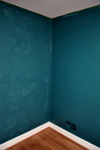
We finished painting the guest room. And boy is it bold. Seriously, it’s like no room we’ve ever painted before. And we luuurve it. With a capital urv. This is probably the most accurate pic (well I guess it’s as accurate as your monitor) of the dark teal that we went with:

The color was of course inspired by none other than Sue the Napkin. It’s kind of similar to Dragonfly (the color that we painted the backs of the built-ins in the future dining room) but when we held up a ton of swatches in the guest room we preferred this color (Dragonfly was darker and greener).
It’s called Plumage by Martha Stewart, but of course we got it color matched to Olympic Premium paint since it’s No-VOC (even the colorants they add are now VOC free). We went with an eggshell finish (so it’s a bit more wipeable and durable than flat but not too shiny since it’s such a deep tone, which can show lots of flaws and imperfections when it’s glossy). Lowe’s actually had a bit of trouble getting a good match, so if your paint pro can’t get it close enough – our lady finally got it within .03% accuracy – Olympic’s Azalea Leaf is an extremely similar alternative. Of course you can also just go with Martha’s Plumage and not color match it to any other base to avoid matching worries completely.
But back to the whole room painting process. Let’s just say that as soon as we started rolling it on there were some oh em gee moments. And a fair amount of melodramatic nail biting.

But after we got to the second coat, the coverage was great and it was looking deep and rich and bold and fun. See how much more coverage coat two gave us below (the wall on the right has two coats while the wall on the left just has one). Pardon the semi-odd coloring in this shot and the one above, they were taken at night so the rest are more accurate thanks to daylight.
After we completed that second coat we were sold. Seriously. We got all hyper and slap happy. There’s just something about pairing in your face color with crisp white trim that makes you giddy. And amazingly enough, we got ‘er done with just one gallon of paint (with some to spare actually) since it only called for two coats – probably thanks to the tinted primer we used beforehand.
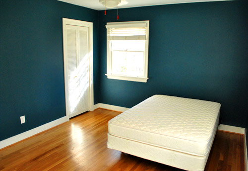
The first thing we did this morning was run into the guest room to admire it in the daylight. How can a $22 paint job make such a difference? It’s amazing. We were about to snap some after pics for you guys when the doorbell rang. It was our new guest bed arriving 30 minutes early. So it ended up in the pics since we didn’t have a moment to take any without it (more details on our mattress buying adventures later). Anyway, here’s the view of the room from the adjoined guest bathroom:
And here’s a shot of it from the hall:
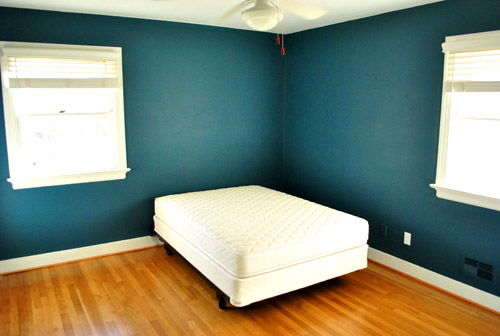
The off centered windows are definitely going to make the floor plan interesting, but we’ll share how we land on our final layout when we, uh, land on a final layout. We’re just going to play around with things until we figure out what we like best.
Oh and you’ll notice that we painted over some of the wall warts (as they so lovingly call them) like the vents and an old Bell Atlantic phone jack to the left of the white outlet plate above. They were already painted over by the previous owners so we repainted them to match the new wall color. We did keep all of the unpainted outlets unpainted though.
Speaking of painting over things, after a surprising number of requests I finally remembered to make a cutting in video, so you can enjoy the riveting play by play below and see how I use my favorite brush to get a nice clean line next to baseboards and trim:
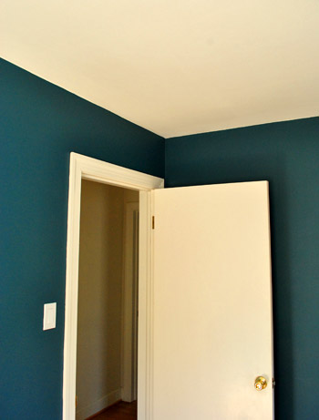
As for down the road projects, we’d love to add crown molding and possibly paint the ceiling a lighter tone than the wall (or at least freshen it up with crisper white paint along with the trim). But that’s definitely not something we have time for with my mom & stepdad rolling into town this Thursday.
So there you have our dark teal guest room. Now we just have to hang the headboard, dress the bed, get a shower curtain and bath mat, change out the toilet seat (it’s old and rusty), hang curtains (if we have time), and figure out the side table & lamp sitch (might not get to that either). Should be an interesting few days…

Jason says
I love the color!
And I can’t wait for SUGGESTIONS ON OFF CENTER WINDOWS. My room is the same way! Your bed is to the left of the window, which only leaves room for one night stand in front of the window and then a tiny one on the other side and the whole thing looks lopsided due to the curtains on the window side! What to do?
Liz says
I feel like we’re painting the exact same house. I just used Dutch Boy’s Teal Decadence (E4-1) to paint my new nook office, and it’s almost exactly the same color as your Olympic. First the duck, now this! Where’s the camera? ;)
YoungHouseLove says
Haha, it’s hidden in the duck!
xo,
s
debbie c says
LUUUV the color!! Looks great!! Can’t wait to see it all finished!! Wondered how you thought the Olympic paint rolled on vs Ben?? I only use Ben and recently visited my local Lowes to see if perhaps it was worth trying something else to save a little money. The paint dept person told me that Olympic was in his words “crap”. What is your experience with it vs any other brand??
YoungHouseLove says
We have used pretty much every brand of paint out there (except for the super fancy stuff like $60 Farrow & Ball) and we have found that high quality paint like Ben Moore is definitely better when it comes to coverage. But for example, with Ben Moore we always need a coat and a half for great coverage. With Behr, Glidden, and Olympic we need two coats. That’s not a big enough difference for us to justify the price difference. So we just apply our extra 1/2 coat of paint and are happy to have saved the loot. It’s definitely a personal call though. Some people have no tolerance for non premium paint once they’ve used the good stuff, which we totally understand!
xo,
s
Danielle says
I have used many brands myself (BM included) and actually found it to be the worst as far as coverage goes. Perhaps it was just my experience, but I will never justify spending that much money again.
Sara says
I’ve used Sherwin Williams, Benjamin Moore, Valspar, Glidden, Behr, and even cheap paint from Wal-Mart and Sears. While the more expensive paint does go on a bit smoother, I don’t think it is worth the extra price because the difference is pretty slight.
Glidden is the only brand of paint I wasn’t as crazy about the coverage. Behr seems to me to be the best overall as far as price and coverage so that’s what I usually use, but I’m not as worried about VOCs and I’ve never tried Olympic.
ellis says
The Lowes guy told us he’d heard the Olympic No-VOC could be watery, but we decided to go for it anyway. As my fiance said to the paint guy, “Well, she reads this blog, and they say…” Ha.
Anyway, we loved it! Loved the low (almost no!) smell, thought it went on nicely, wouldn’t call it watery at all. Shrug.
YoungHouseLove says
Yeah Olympic reformulated recently and I think they did a great job! They might still not have a good reputation with the paint guys- but they probably just haven’t tried the latest version of paint they make.
xo,
s
Stewart says
What’s a half coat of paint??? i guess less paint on the roller?
YoungHouseLove says
Sorry, that’s our shorthand for when there’s just some touch-ups a bunch spots, but not necessarily a full pass on all areas.
-John
Trudi says
I used Plumage on our twin boys’ bunkbeds, and I loved it. Looks even better on walls, though. Hmmm…Maybe a new paint project for me…
Loren says
Looks beautiful! I’m sure its a long way off but the crown molding will really look fantastic in here.
Jennifer says
Love it!! Especially how the light reflects on the walls and creates a beautiful change in shade :)
Lauren McCormick says
loooooove it! you go, youngsters!
pam says
Outstanding!! I absolutely love it!
Jess says
Love it! That color really makes your floor look gorgeous. Can’t wait to see the room all put together! :)
Corie says
Holy Wow! That looks amazing! Seriously, what a super job, the paint job looks flawless in these pics!
I’ll admit, I wasn’t a huge fan of the darker colors and the whole jewel-toned thing, because I loved the light & airy feel of your first home so very much… but I’m quickly coming around. Take me further into the dark side, YHL! :)
YoungHouseLove says
Haha, the dark side. We’re cracking up over here.
xo,
s
Amanda says
Love the color. It’s pretty amazing and I wish I had a spot in our home that needed painting right now so I could use it!
Lauren says
We have windows with similar placement and I hate their awkwardness. I put up curtains in a similar color to kind of blend into the wall, made the bed centered in the room, and made everything around the bed super symmetrical. Big bold headboard, matching side tables, pair of big lamps, and a large price of art centered over the bed. It works okay… I still wish the dang window were just centered though.
Sarah says
I don’t think we could get away with that dark of a color in our home, but I love the crisp contrast between the walls and the trim with so much sunlight flooding into the room. I wonder how that bed would look angled out of the corner with something like a triangular bookcase or cupboard behind it – always fun working around awkwardly placed windows :-).
Kristine says
Doh! I was wrong. I guessed plum, but you used teal. Nonetheless, it still looks beautiful! Great cutting-in, Sherry! The first picture really looks like out of a painting catalog. So perfect!
callie grayson says
Absolutely Gorgeous!
I love that teal colour, trying to get my sister to be so bold and paint my nieces room that colour on the walls and mix with navy blue, chartreusse and pink! I will direct her here to take a look at your guest room!
xx
callie
Katie @ Epistle says
Oh when you guys hinted you were going dramatic I thought this might be what you do! Love it!
rebeccable says
Awesome! Although I’m sure you have tons of plans already, I can’t help but notice the red-orange pull-string-ends (technical term…) hanging from the fan, and I think they look awesome with that wall color…like a poppy red or something. Anywho, just my two cents :)
YoungHouseLove says
Amen! Although details like that might not get tackled before our first guests come…
xo,
s
Gloria says
Took my breath away. It’s gorgeous! I have been seeing this color everywhere and driving my teenage daughters nuts pointing it out. Did you see Secretariat? The color of Secretariat’s jockey’s clothes is similar to this! I’m painting my bedroom a cream color and want to use this color and some red as accents. Please, please post some rugs, art, lamps, and other decor items in this color as you find them. Thanks!
YoungHouseLove says
Haven’t seen that movie yet! We’ll have to add it to our Netflix queue!
xo,
s
Jenn says
Gorgeous!! I’m loving the bolder colors.
Melissa Irvin says
Turned out absolutely beautiful!!!!
Stephanie M. says
LOVE, LOVE, LOVE!!!!! Beautiful and the white trim looks SOOOO crisp and gorgeous. I might have to steal this idea.
Sarah R. says
I love the color. I went dark and bold for my living room (blue gray slate by Behr) and I really like it. The layout for your guest bedroom is nearly identical to my master bedroom – same window size and placement and the closet door is in the same place. I’ll be interested to see how you arrange the room. :)
Emmy says
How long did it take to get out your gear, paint, and then clean up?
I have to paint all my rooms in our new house and so far I have only gotten the foyer done & the dining room. It is so much work to paint the trim, windows (ack!) and ceilings!! And I know you are not painting the trim, which I might have to resort to when my out of town guests come!
YoungHouseLove says
We primed the room on Friday (took about 2 hours from start to finish since we just did one coat) and painted the room on Sunday (two coats took us about 3.5 hours from start to clean-up). Hope it helps! It definitely can take a lot longer when you have to use drop cloths (on carpeted rooms) or plan to paint ceilings or trim. Good luck!
xo,
s
Katharine says
Oh my gosh that is a fantastic color. I kinda want to hug it, or pet it, or something. I’ve never been brave enough to paint walls that dark, and I can’t imagine my husband would go for it. But WOW.
Karla @ {TheClassyWoman} says
Thanks for the cutting in video, a friend who is a painter showed me what to do but my technique is still not perfect. Gonna try what you suggested.
Crossing my fingers that you guys get everything done in 3 days, although with painting behind you, hopefully it will be smooth sailing. You guys are brave, dark colors scare me. LOL.
mya says
I love the color!! Are you guys going to do something to the floor?Do you think its complementing each other?
Mya
http://inlieuif.blogspot.com/
YoungHouseLove says
Eventually we’d love to refinish all the hardwood floors in the whole house (the wide plank, skinny plank, and parquet) and stain them all a rich mocha color so they feel seamless and a lot more integrated (not so disjointed) but for now the floor in the guest room actually looks great with the walls!
xo,
s
mya says
The color reminded me of the photo i saw few days backs.I loved that bedroom too.Check it out here.
http://www.flickr.com/photos/8230585@N06/3425143293/in/photostream/
Mya
http://inlieuif.blogspot.com/
YoungHouseLove says
Ooh that’s so pretty with the magenta/plum colors. Thanks for sharing!
xo,
s
Jill @ Mission Decorate says
I knew you were going teal. I could sense it! Teal is my obsession right now. I am putting it in my master as we speak. The accent color choices are endless!
Sarah @ The Strength of Faith says
Holy Moly! I LOVE IT! Congratulations on being bold and daring – the gamble paid off!
Tracy says
I love it!!! I think it’s a great way to try a color for a secondary room—you guys definitely enjoy color, you just haven’t gone crazy for it on walls. I’d say just keep it balanced, clutter-free, and bright in other areas! I love it!
Danielle says
Love the color! I have a feeling that after finding (and loving) all these saturated colors, you’re never going to want to go back to neutral! :)
Megan says
LOVE it!
Erika says
Usually I don’t like such dark rooms, but that looks really good!
Cheryl says
Don’t forget you can place the bed on an angle across the corner…it would allow easy access to both sides of the bed.
Deanna says
Love the new color! How bold, but what a beautiful statement it makes! I also purchased your favorite brush, and it is definitely my favorite brush too! I am so happy I don’t have to tape off my rooms anymore!
Kate says
This looks amazing! I have to admit, you totally got me on the last post! I was appalled… Mouth wide open! So glad that was just the primer. Bet you can’t wait for this week to be over!
Andrea says
Have you ever tried the paint that includes the primer? There are a couple of different brands, and they tend to be a little pricier than regular paint, but I’ve found that they save a TON of time. I’ve used it 3 or 4 times, and even with a really dark blue (Patriot Blue by Ben Moore), I only needed one good coat and then a quick run over with the roller to fill in some sparse areas.
YoungHouseLove says
We’ve heard nothing but great things about them, but since they aren’t VOC free we opted to do a bit of extra work to keep the beanette (and the pooch) extra safe.
xo,
s
dana828 says
love, Love, LOVE the color!! I’ve been trying to talk my son into a deep teal for his room, so I’m thrilled to see how great it looks in your room. Can’t wait to see what else you do with the room!
Michelle says
don’t have much to say except for that i love it! it’s a gorgeous color. for what it’s worth – i know you normally prefer to paint your ceilings tones related to the wall color, but i love how the white trim and ceiling pop. i think it creates drama and sophistication. are you thinking of going bold with wall color in any other rooms? or have you not thought that far yet?
YoungHouseLove says
We’d love to go bold in the kitchen (we’re thinking about a bright color but not necessarily a dark color in there, paired with white cabinets). And in the hall bath we still would love to do something bold (although we’re leaning away from another blue tone now that we went teal in the guest room…)
xo,
s
Veronica says
Love it! That’s pretty much the same color as our master bedroom. I wanted something dark and bold for the walls, I wake up easily with any light in the room and this color (along with thick curtains) keep the room dark and cozy! After we painted it I freaked out a little with the color and especially when my dad said that it looks like the San Jose Sharks (hockey team) uniform! Not the look I was going for, thanks dad! But now I love it. Great to see you guys using some bold colors! Can’t wait to see the rest of the room.
tiffany says
i am totally putting this color “in my hat” for when we have a house again, and not just our little
airstream! love how it turned out, thanks for sharing!!
KK says
It looks fantastic! So proud of you guys for going bold. The color will calm down as soon as you put all of your fun stuff in there. As always, I can’t wait to see the finished product.
nikki says
gorgeous. just gorgeous.
thinking of the floor plan, while it’s hard to tell from the picture just how much room you’ve got, can you center the bed between the windows if you place it diagonally in the room…
Courtney says
I’m a big fan of the new color, but I might be a little biased considering I painted my dining room this a couple months back ;) Like you all I tend towards painting with more open and airy colors so Plumage was a major leap for me. Now I’m sold on the power of carefully thought out bold walls though!
KathyG says
That’s simply gorgeous! I’m painting later today -DE “graham cracker”. Yep, it’s the color you’d imagine. Yummy.
What is it about you guys and dreams? Here’s mine – both of you were shopping in my little hardware store (no I don’t have one). At the register, you were arguing, because John wanted you to pay for your purchases only with $1 dollar bills. Weird, I know. HA
YoungHouseLove says
Hahaha. Sounds like a pretty good thing to argue about. Hilarious.
xo,
s
Annie says
I totally had a dream about J and S one night, too. I had a dream that I was visiting my sister (who lives in Herdon) and for some reason, happened about Casa de Petersik instead. They were all like, “Hay-aaaaay! It’s cool for you to stay here. Wanna tour?” and I’m all like, “I don’t need one, I follow your blog and I know the house!” Totally obsessive and borderline lunacy, no?
YoungHouseLove says
Haha, love it. At least we weren’t fighting over $1 bills. Haha.
xo,
s
Sara says
Glad to know I’m not the only one who has had dreams with John and Sherry making an appearance. I’ve dreamed that I visited your house before and another time that you visited mine to help me pick out paint colors.
YoungHouseLove says
Haha, at least those are kind of on topic to the blog. The funniest ones to us are dreams where we work at a McDonalds drive through or something. Haha.
xo,
s
Jess@Zocal Creative says
Love it! No…Luuurve it!
Emily B. says
Love it! Now off to paint my house all over again!
OMG-YHL says
Gorgeous! When you said you were going for a dark color, I guessed it was going to be in either the blue or grey color family, and I was right! Isn’t this similar to the color you were going to paint the bathroom?
YoungHouseLove says
Yup, now we have to figure out a new color for that room (don’t wanna get too blue heavy) so that should be interesting…
xo,
s
doahleigh says
Wow I love it so much. Dark teal/turquoise is one of my favorite colors anywhere, not just paint, so bravo, this is great!
Luisa says
Nice job – really like the color – especially in combo with the yellow. I was wondering if you are going to think about changing out the white switch covers. Rejuvenation in Portland, Oregon has a variety of different finishes you can select from
http://www.rejuvenation.com/catalog/electrical.html?iqg=642b60ac8a5be69399f700e3e82e1488828c00e0
Or I bet you can find something funky from Etsy…
Looking forward to seeing the rest.
YoungHouseLove says
Ooh that’s fun! Maybe someday…
xo,
s
Carly says
Rejuvenation is a wonderful company. We purchased their Whale Tail pulls in ORB for our hallway linen closet and have received several compliments. Quality products!!
Tami says
LOVE it!!