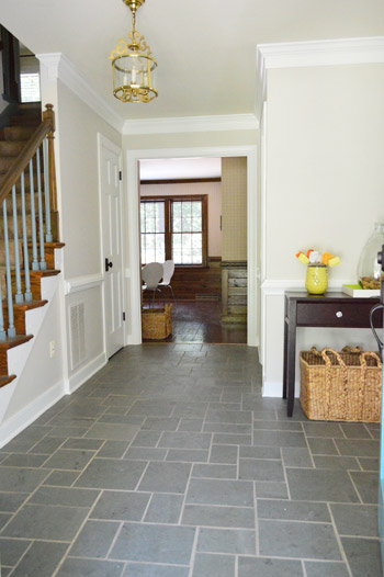
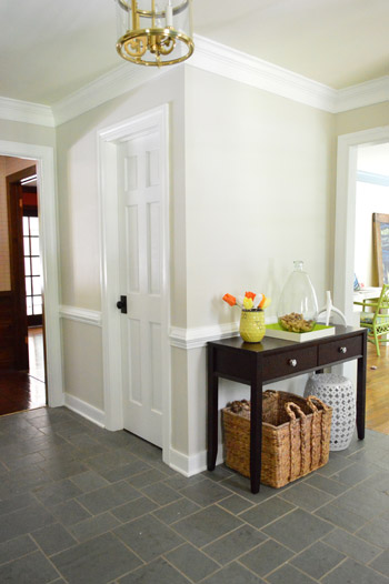
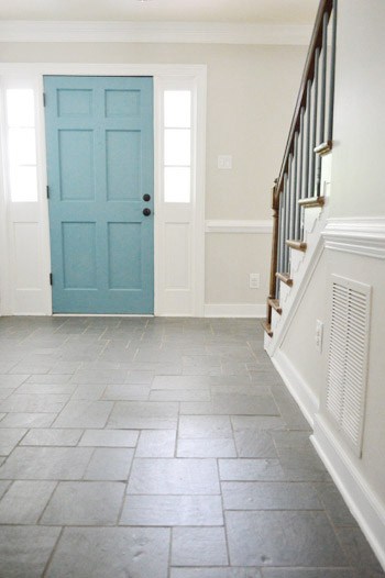
The deed is done. Behold, our freshly painted foyer:
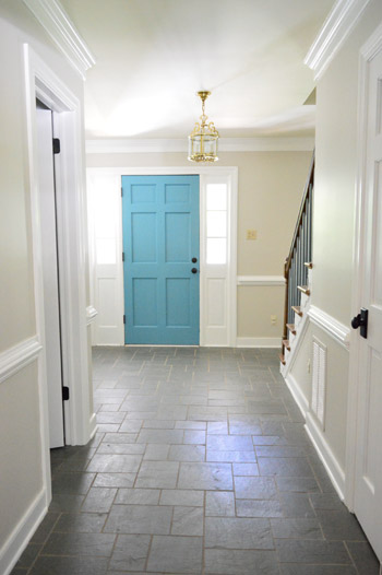
It feels about a foot taller and at least two feet wider than it did before. Ah, the power of paint.
This shot’s probably the most accurate when it comes to color. It’s definitely one of those soft neutrals that shifts throughout the day, but I’d say it’s one part sand and one part greige. Not too cool and not too warm. And pretty darn beautiful with white trim.
As for choosing the color, we mentioned a bunch of swatches we were loving in this post, and shared this little makeshift palette:
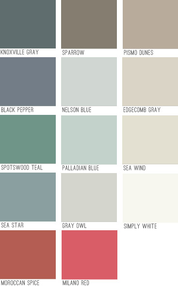
Can you guess who ended up in the foyer?
Good ol’ Edgecomb Gray. The funny part about that swatch is it’s not really gray (it’s warmer, more like a greige). Another pretty hilarious thing about it is that it looked terrible in our last house, but here it’s gorgeous (it’s crazy how differently a swatch can read depending on the lighting situation, what direction your room faces, etc). So in a sea of paint chips it was an easy choice. Which is nice because it’s a pretty big commitment.
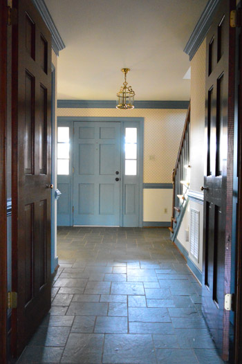
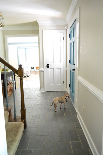
The foyer leads to four downstairs rooms as well as flowing up the stairs and into the hallway up there which leads to six additional rooms – so we knew that whatever we chose would have to work well with any other wall colors we’d be choosing for all ten of those spaces that will connect to it.
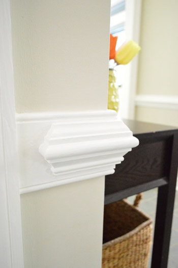
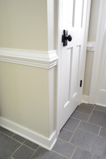
As for getting it up on the walls, first we filled in a few nail holes with spackle and then primed those spots as well as any areas that had raw drywall (from our wallpaper peeling adventures).
Then it was painting time. It thankfully only took two coats (as opposed to the trim, which took four). We went with an eggshell finish in BM’s no-VOC Natura stuff, so John got his roll on and I cut in – yes, around chair rail, crown molding, baseboards, and seven (!!) doorways.
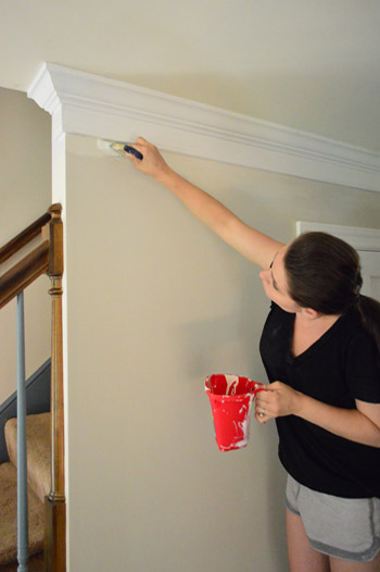
As you can imagine it took John about one tenth of the time to roll that it took me to cut in around all of those edges, but it was totally worth it. I love the new wall color so much that I could do a musical number about it. (Seriously, don’t tempt me – I’m a terrible dancer).
It’s one of those colors that changes throughout the day and feels so airy and breezy, like the sky at the beach. Some moments it’s like the lightest part of a platinum cloud, and other moments it’s warmer and richer – like coffee with lots of milk swirling around in there.
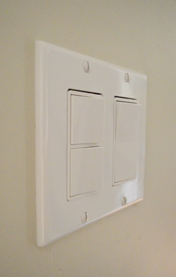
We have a devoted post all about this paint color if you want to see more photos of Edgecomb Gray in our house & read why we love it so much. Oh and after our paint job, we switched out the old yellowed outlets and switches for crisp new white ones. Such a cheap fix, but just like fresh paint, they go a long way in making the room feel updated.
Can’t wait to get some art going on. Oh yeah and paint the other fifteen rooms in our house (note to self: don’t think about that, just focus on your musical number).
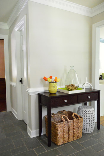
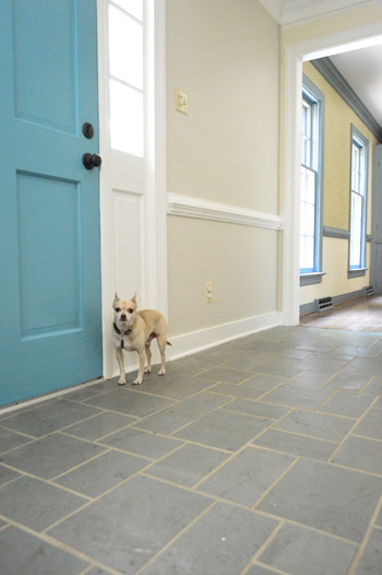
It’s nice to have a pop of color in the door since all of the white trim and doors around it seem to temper it while the neutral walls and the dark floors and door hardware ground things. And you know the light fixture is on my ORB list.
I like this shot because the blue spindles leading up the stairs almost look black instead of periwinkle blue. Although I think we’re leaning towards white for those spindles (when we can work up the energy to do four coats on them) and eventually we’d love to ebonize the top part of the railing to go with the dark door hardware everywhere. Sort of like this or this.
In the meantime we’re just soaking up the victory of completing a whole lotta trim, doors, chair rail, crown, and getting some fresh paint on the walls in there.
Change is good.

Danielle says
Yay – it looks great! Congrats on getting the job done – and good luck with the next 15 rooms! :)
nicole chiles says
We just bought our new dream ‘straight-out-of-the-60s-wall-paper-everywhere’ home!! And we are very excited to be behind you in this process as we will let you guys make all the decisions and just copy paint colors/finishes as we begin our overhaul! Thanks in advance!!!!
Laura says
WOW! It looks great. It reminds me of a beach house (especially with the beautiful blue door!). Surprisingly though, the first thing I noticed was the floor. It looks completely different now (in a good way). I love it!!! Thanks for so many inspiring ideas :)
heather says
Edgecomb is a nice neutral. It’s what we painted our kitchen in when we needed a quick facelift before an appraisal and it hasn’t failed us. You are totally right about the color though. It’s a lot less gray and a lot more like a milky tan color, and it totally changes throughout the day. Another awesome color is Revere Pewter. I’m trying to find a place to repaint it within the renovations because I love it so so much, but it’s a little dark which makes it hard to put anywhere and not have it overtake. It’s a BM color though, check it out! If you like Edgecomb you’ll probably like Revere Pewter too.
YoungHouseLove says
Thanks Heather! I have that swatch in my “loves” pile too. So pretty! You’re right about it being darker but I would be so pretty in a bedroom I think!
xo
s
heather says
It would definitely be pretty in a room that got a lot of natural light. I was actually thinking it would be a great compliment in your dining room, especially once you open it up to the kitchen. That said, one never knows where the paint brush will take them! Haha.
Jeanna says
It looks so pretty :) I could have sworn you used Sea Wind. It really does look so much bigger, and brighter. One thing I now notice is how gorg your trim really is. The quality really shines now that it’s not covered in country blue paint!
Megan @ Rappsody in Rooms says
Paint is pretty much the best DIY tool out there. It really is amazing how much it can change the look of a house! The foyer looks beautiful! Great color choice!
Beth says
Maybe it’s a photo illusion, but I love the way the new wall color brings out the same (similar?) grout color in between the flag stone!
Sandra Padilla says
I have been checking in with anticipation all morning. It looks amazing!!..I knew from following your blog that when you would transform this house into an almost unrecognizable version of itself, but to see it wow. I love the hardware and the new color selection on the door . I have serious creative envy how do you both do it!!…LOVE IT. I hate to ask but can’t help it…why does the foyer light look off center from the front door? maybe it’s the picture angle? The O.C.D. in me (diagnosed by DH) couldn’t help noticing…Can’t wait to see what’s next!!!
YoungHouseLove says
Good question! The foyer light is centered in the foyer (the exact mid-point of the ceiling) but the door isn’t centered due to the stairs – so there’s more foyer room to the right of the door as you face it. It’s hard to describe, but in person the light being centered in the room makes more sense than centering it on the door. It’s sort of like how in a bedroom or dining room the light is centered in the middle of the room but the doors and windows might be off to one side or another.
xo
s
Amanda B says
You guys are reading my mind. I have almost the same color palate in our house and I’ve been looking at colors very similar to this for the last four days for our entry/stairwell.
robyns says
the new paint color seems to coordinate with Burger really well too! Is that a design rule…..color palettes must look good with the pets?!
YoungHouseLove says
Always!
xo
s
Lisa says
Please ebonize the railing! I have been tempted for years in my own home but I have no idea where to start with process or what order I should go in. It would look so nice your home too!
Barb says
Ta-Da!!!
Genius!
Ann says
I think it looks great. How brave to use a color you used in your other house when it didn’t look good there. I’m not sure I would have chosen it again. I just had my bathroom redone (not DIY, I had professional gut it and remodel it) and I choose BM Moonshine for the walls and it looks fabulous. If you want pictures, just let me know how to send them to you.
YoungHouseLove says
I always love seeing pics! You can upload them to our FB wall for everyone to see, or upload them to a free photo sharing site like Flickr and link to that album in the comments.
xo
s
paintergal says
Love it so much! I think I’m ready to go neutral in our next house, which I hope will be very soon! Thanks for the inspiration.
Chelsea in Richmond says
Beautiful!
Annie says
I think you picked the perfect color and as you can tell from my previous comments I’m not a “yes it looks fantastic” commenter on every project (still think that there’s too much going on with roof, brick, shutters to make your outside door color work). Here the door color works well because it’s a true “pop” of color.”
I also LOVE the plan for the black and white stair case. Truly gorgeous.
Wondering about the light fixture. The hall looks so fantastic and fresh, that the fixture sticks out to me like a sore (or really old) thumb. It seems to me that it would be worth it to upgrade soon.
YoungHouseLove says
Oh yes, I mentioned that in the post. It’s on the update list for sure!
xo
s
Katie K says
Oh my GOSH, you guys! That looks so. much. better! I have been loathing the 90’s builder oak trim that is making my house so dark for the 2 years that we’ve lived here…this is making me so itchy to get it painted! I can’t wait to see what you pick out to replace that fixture in the foyer (don’t take offense, but that brass/gold business has got to go!). ;)
Lindsay says
Love! And PLEEEEEESE don’t paint the stare railing. I actually like that pop of wood along there.
Laurie says
Holy cow you guys! HOLY COW! Would it be weird and inappropriate to have a party just so you can show off the foyer?
This little space is such an inspiration for me. I have all dark trim and doors through my house and I’ve just lived with it thinking it wouldn’t make a big difference but you’ve got me FIRED UP to change them!
Fired up I tell you. Watch out.
YoungHouseLove says
Lookout world! Laurie’s fired up. I love it. Good luck, girl!
xo
s
Rik says
Love the Rocker panel switches, where did you buy them, we have toggle ones in our home, is it an easy change?
YoungHouseLove says
Oh yes, very simple change. Just be sure to turn off the power to the whole house to be safe. As for where we got them: Home Depot!
xo
s
cheri s in iowa says
This may not be typical of all rocker light switches, but it seems they are notorious for shorting out. Just a heads up before you replace them all! Ours all needed replaced within 10 years. Maybe by then we’ll be “switching” back to cream. The horrors!
YoungHouseLove says
Thanks for the tip Cheri! Never heard that before!
xo
s
Shannon says
It looks fantastic! I can’t wait to see it dressed up with some art! Such a huge change! It’s definitely inspiring as well…I am not waiting for my husband anymore and I am going this week to get paint for my kitchen!! (walls only, the cabinets will have to wait. Sigh.) I have one sample wall done and I can’t wait to finish it!
Erin @ DIY on the Cheap says
Looks great! Love the wall color and I love that front door too!
Missy Homemaker says
Love the new wall color and I do absolutely LOVE the floors. I hope you can work with them.
Miyu says
$30 in paint is one of the best ways to add value back to the house! Your gorgeous trim was being done absolutely no justice in that blue whale color. The trim in my house was a tan/light brown puke color… didn’t even mimic wood. White made the place pop so much more :)
Michelle Carter says
I love how fresh it looks! Do you not tape off when you cut in? I absolutely hate taping but I can’t figure out how to not get paint everywhere on adjacent walls or trims without doing so.
YoungHouseLove says
Over the years I’ve practiced enough to not need to tape off, and my secret weapon is my short-handled 2″ angled brush. Gives me so much more control than a traditional long-handled paint brush.
xo
s
Annelies says
Love the colour ! And you are so lucky you don’t need to tape off, imagine the additional work that would have been !
Really curious to see how you will use the other colours, but I love your palette.
Jessica C says
Looks amazing. I love the contrast with the door. The new paint job even makes me feel some floor love now too (at least from the pics). It’s so much less dungeon-esque.
Amy says
It looks sooooooo good!You two are just amazing—-never gets old seeing the “after” of what you take on!
Manda Wolf says
I am still crushing on your door color btw. I am planning on making a liquor cabinet for my front room and it may get painted this color.
YoungHouseLove says
Thanks Manda!
xo
s
Paula says
Amazing what a difference paint makes! Funny too, that your floors look so much nicer with the new paint job. I actually like the floors now. Can’t wait to see what you do wwith this space (rugs, pictures, etc) because you have such a nice canvas to work with!:)
Brit [House Updated] says
Looks so great! Can’t wait to see where you put Milano Red, that color looks awesome.
Eri says
Wow. Bright, beautiful, sophisticated. I can’t believe that is Edgecomb Gray. I like the color from the swatch, but it looked like cocoa milk drink every time I tested it on our walls. Yours looks, at least on my monitor/browser, grayish white, a warm-and-cool-at-the-same-time kinda grayish. A magic of lighting…
Stephanie says
Ohhhhhhhh, I love it. I think the white spindles with top handrail will look amazeballs in that room. When do you plan to do that?
Also, I think the tiles look so good in the foyer now with all the paint upgrades. Have your feelings for them changed? Do you think you’ll keep them or do you have something else in mind.
One last thing – I like how you brought in some wood tones through that basket. Really completes the look (along with some eventual art and that gorgeous stairwell).
YoungHouseLove says
Thanks Stephanie! We’d love to work with the floor if we can repair a few damaged spots and refresh the grout. As for the stairs, we’re not sure when we’ll tackle them. Hopefully within the next few months. We have so many to-do list items swirling around in our heads we just don’t know which ones we’ll do next, but they’ll hopefully all get done over time.
xo
s
Ashley@AttemptsAtDomestication says
Love that color! It’s absolutely gorgeous! The space looks totally different now!
Julia says
LOVE this color. We just painted our whole living area (minus the kitchen)downstairs Edgecomb Grey and absolutely love it! Great minds think alike!
Melissa @ HOUSEography says
Looks great! Looking forward to seeing the rest of your foyer edits… Do you think you’ll salvage the light? the shape looks interesting but would be better with ORB of course. sassy brassy is making a major comeback I hear! :)
YoungHouseLove says
I’d love to ORB that baby!
xo
s
Sarah W. says
It’s amazing what a little paint (or four coats on the trim and two coats on the wall)can do to spruce up a space. It looks totally different! Congrats on your progress so far.
Kelsey says
I tried a sample of Edgecomb Gray in my house, and it looked TERRIBLE with the floors and lighting. It looks beautiful in your foyer, though! Funny how colors can change like that.
I meant to ask on the post about painting the trim, but I forgot: why is it that you need two coats of primer on your trim? I’ve always used just one coat of primer and two coats of paint. Is it just that the blue is really hard to cover up, or am I missing something?
YoungHouseLove says
Yup, the blue is just really stubborn and shows through, so since primer is cheaper than paint, it was less of a paint waste to use two coats of primer and two coats of paint instead of one coat of primer and three coats of paint.
xo
s
Kelsey says
Gotcha. Still, what a pain. Painting the same thing over and over again feels like running in place. It’s a good thing it makes such a huge difference when you’re done!
keisha says
It’s just beautiful.
Rachel says
I am doing revere pewter at our new (old) house, which I think is just one shade darker than edge comb gray. It changes color throughout the day too, but I really love it. Nice work, Petersisks!
Christine says
Oh, I am going to have to add this color to my list for our living room. Right now it is a dark gold and I am beginning to hate it with a passion! It is a huge room but feels so closed in with this dark color.
I love how a can of paint(or two) can totally change a room.
Sarah says
hey – back to the ORB topic… Ever thought of ORBing (that is a word right?) the stair case spindles?! I bet with that spray paint it wouldn’t take 4 coats….probably would take one or two.
YoungHouseLove says
I think to spray paint them we’d have to remove them or so intricately tape them off that it might take ten days, so I’m leaning towards paint applied with a brush for those babies, but we’ll have to see where we end up!
xo
s
Cassie A. says
We just put some finishing touches on our sons room this weekend. That included changing out the outlets and switches from bisque-colored to white. What a difference it makes! Why would anyone want bisque-colored outlets? They just look so nasty! I can’t quite wrap my head around it. This room looks great! Keep it up!
Lena says
Wow guys, this looks great! I’m surprised how different it looks from the swatch. Now I’m curious though. In your first house, I remember you saying if Clara were a boy you’d paint her nursery the same colors, and then you had pink in the second house. If Clara had been a little boy in this house, what color would you have painted her room? One from this houses swatch List? I think all of them look great.
YoungHouseLove says
Maybe one of the dark blue tones? Or Sparrow? I think anything except for the accent colors from the palette could be awesome on the wall of a kids room!
xo
s
Sara says
Ahhh–I love the foyer! I also love that you have the same penchant I do for the screws all facing vertical on light fixtures and outlets! It drives me bonkers when they don’t face the same way!
Evie says
I just ran Burger through ChipIt, and he came out Edgecomb Gray. Hahah, not really, but I bet it would be close! Love how this looks! Definitely time well spent, guys!
YoungHouseLove says
HILARIOUS!
xo
s
Shell says
Are you painting in your pjs? :)
YoungHouseLove says
Inside out shorts and a t-shirt = painting clothes for me.
xo
s
Hailey says
Holy Moly. I just had to comment. That looks A.Maz.Zing. What a different – a musical number is totally warranted. You could sing it while doing the cabbage patch every time you come home and open the front door or every time you walk through that space to get to another room. I’m not say’n. I’m just say’n. The musical number – seriously. Think about it.
Holly says
At first glance, I thought you had used the same color from Clara’s big-girl room in your old house. I can’t wait to see how the railing turns out and to know that your stairs carpet will finally be gone.
Do you think you’ll have to worry about smoothing out the stair surfaces after pulling up staples?
Congrats on finishing up some walls! It’s got to feel great!