Q: First of all I love your site. It inspires me to fix up my own home (you make it look so easy!). But if there was a class called Paint Picking 101 I would be getting a big fat F. So far every room I’ve painted in my new house is either too bright, too dark, too dirty looking and just plain ugly. I’m having the worst time finding a perfect tan tone and I’m even messing up colors like light blue and cream, which I never thought was even possible! Do you have any foolproof colors you can recommend? A favorite blue? Cream? Tan? White? Yellow? Gray? I know natural light and other factors can change the way paint looks substantially so it’s probably not 100% foolproof, but I’d love to know your favorite paint colors so at least I have a shot of living in a house that doesn’t make me feel like a total paint failure! Thanks so much for your help! – Meagan
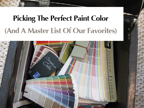
A: Picking the right paint color can often be a doozie, so don’t get down on yourself! Take comfort in the fact that repainting, while annoying, is super inexpensive and it can instantly transform your room from wrong to oh-so-right in an afternoon. And thanks to the transformative power of paint, we’re the proud owners of an entire storage ottoman full of paint decks and swatches. Name any color or any brand- it’s all in our little paint chip library of sorts. But although we have quite a slew of selections we still find ourselves reaching for some tried and true favorites again and again when it comes to doling out room recommendations.
As you mentioned, paint colors can look very different under different lighting circumstances, but for the most part there are a bunch of practically error-proof tones that we find ourselves recommending again and again. Some of them are bright and fun (better suited for only one wall or even a punchy piece of furniture) while others are classic and serene- perfect for an entire room or even an entire home. Here’s the swatch suggestion scoop:
White- Benjamin Moore Decorators White, Glidden Dove White, Behr Cascade White, Sherwin-Williams Alabaster.
Cream- Glidden Antique White, Sherwin-Williams Creamy, Benjamin Moore Muskoka Trail, Benjamin Moore French White, Benjamin Moore Natural White.
Red- Benjamin Moore Million Dollar Red, Glidden Red Delicious, Behr Firelight, Valspar Fabulous Red (great for a front door- might be too bright for inside).
Pink/Coral: Sherwin-Williams Comical Coral (shown below), Benjamin Moore Wild Aster, Sherwin-Williams Animated Coral, Behr Be Mine, Behr Silk Sheets, Behr Coquette.
Brown- Benjamin Moore Branchport Brown, Benjamin Moore Woodacres, Benjamin Moore Stampede, Sherwin-Williams Cobble Brown, Sherwin-Williams Van Dyke Brown (shown below), Behr Traditional.
Yellow- Benjamin Moore Hawthorne Yellow (it is the be-all end-all of yellow paint, which is notoriously hard to get right).
Green- Glidden Fennel (no longer available for swatches, but still in the computer so they can whip it up for you), Glidden Celery Sticks, Benjamin Moore Mosaic Glass, Benjamin Moore Hibiscus (great for a cheerful kid’s room with white trim and brown furnishings), Benjamin Moore Soft Fern, Benjamin Moore Silken Pine, Benjamin Moore Sweet Pear, Benjamin Moore Dune Grass, Sherwin-Williams Lime Granita.
Purple- Glidden Silver Plum (no longer available for swatches, but still in the computer so they can whip it up for you), Glidden Delicious Plum (amazing eggplant color for a front door), Glidden Black Tulip (the deepest moodiest purple-black that’s dripping with drama) Benjamin Moore Nosegay, Benjamin Moore Violet Pearl, Benjamin Moore Iced Lavender.
Blue- Glidden Gentle Tide (no longer available for swatches, but still in the computer so they can whip it up for you), Benjamin Moore Quiet Moments, Benjamin Moore Saratoga Springs, Restoration Hardware Silver Sage (it has green undertones but looks blue-gray in most rooms), Behr Pensive Sky, Behr Flint Smoke, Behr Grand Rapids.
Navy- Benjamin Moore Spellbound, Benjamin Moore French Barret, Benjamin Moore Hudson Bay, Sherwin Williams Grays Harbor, Sherwin-Williams Naval.
Black- Glidden Onyx Black, Benjamin Moore Graphite.
Tan- Glidden Sand White (no longer available for swatches, but still in the computer so they can whip it up for you), Glidden Water Chestnut, Glidden Cafe Latte, Benjamin Moore Baja Dunes, Benjamin Moore Davenport Tan, Behr Harvest Brown.
Orange- Benjamin Moore Beverly Hills, Benjamin Moore Lion Heart, Benjamin Moore Corn Husk, Sherwin-Williams Marquis Orange, Sherwin-Williams Mandarin (shown below).
Gray- Benjamin Moore North Hampton Putty, Benjamin Moore Light Pewter, Benjamin Moore Stonington Gray, Benjamin Moore Nantucket Fog, Glidden Silver Dust.
Beige- Benjamin Moore Clay Beige, Benjamin Moore Green Brier, Sherwin-Williams Ancient Marble.
Greige- Benjamin Moore Tapestry Beige, Behr Ocean Pearl.
Oh and a word of warning: you don’t want one of each of these colors in your house! Here’s how we learned that a tighter color scheme can make your home feel bigger, more open, and a lot more cohesive and welcoming. Of course it doesn’t have to feel expected or monochromatic since you can bring in different accent colors with art and accessories in each space to make them feel unique and interesting!
And a second word of warning: Paint colors look different in every room (due to lighting and other ever-changing factors) so we just suggest grabbing a bunch of the swatches above and bringing them home to see which ones look best on your wall. We can’t recommend a specific color for your specific situation with any great accuracy since we have no idea how it’ll “read” in your home (your eyes will be much better than ours since we’re not right there in your space). Just tape up a variety of swatches and pick the one that looks best to you (and get a few test pots of paint if you’re still not sure)! That really is the best way to get it right every time.
What about you guys? Any words of warning or paint color advice? Do you have some favorite hues that have worked out wonderfully for your casa? Any that were terrible that you’d love to warn others about? Let’s all help Meagan out by dishing the paint picking dirt.

Beth says
I just bought a bright (i.e. cool as opposed to warm) red sectional for our downstairs playroom. Our house is contemporary and I’m wondering what color to paint the walls. The carpet is a very neutral mocha color and there’s no other colors in the room. We have two boys so I want it to be fun, yet masculine. Was thinking of a robin’s egg blue but I don’t want it to lean towards feminine.
Thanks,
Beth
Hannah says
HELP! I’m having a major dilemna. Our new two-story house has a dark gray roof, and white siding and trim. However, our shutters and front door are country blue (gag). We are going to switch out the old shutters for new black ones, but are completely stuck on the front door. There seem to be so many possibilities, but I don’t want our house to look too generic. I thought of a plum color, but I can’t decide. We’re also going to switch out the hardware for oil-rubbed bronze, so we don’t want something so dark that you can’t see the hardware. Any suggestions??
YoungHouseLove says
OOh plum would be awesome! Go for it! Or bright yellow or teal or emerald green. The possibilities are endless!
xo,
s
Hannah says
Thanks for the suggestions! I’m still leaning toward plum, but you’ve got me thinking about emerald green too. I’ll send in a before and after once the country blue is completely wiped out. Love you guys!
Joy says
Hi, I have a family room that has one whole wall that is a brick fireplace with hearth (house was built in the early 70’s) It makes the room look dark & dated. I was thinking of painting it because I thought it would be easy and budget friendly. Can you give me any ideas on colors or other ideas. The rest of our walls are white so we want to paint them also.
YoungHouseLove says
We love a glossy white brick fireplace with tan, blue, green, cream, or warm yellow walls. Just grab a bunch of the swatches that we recommend in this post and bring them home to see what you like best!
xo,
s
john says
My son has chosen SW Knockout Orange for an accent wall. I desperately need a nice gray for the other walls. I started painting using SW Serious Gray and hate it! Too dark & too blue! Please help!
YoungHouseLove says
The best thing you can do is bring home a ton of swatches and see what they do in your space since lighting makes paint read differently in every house. Don’t be afraid to buy test cans of paint if you’re still not sure. Good luck!
xo,
s
Aroha says
Hi,
W recently had our windows replaced from wood to white vinyl. I want to change the color of the exterior walls of the house which are currently shades of light green and pale green. Could you please suggest a color scheme that would go well with the white windows?
YoungHouseLove says
Any of the paint swatches that we recommended in the cream, tan, blue, green, yellow, gray, or brown categories here would look amazing with white. Actually every single paint swatch that we recommended would look nice with those white windows. You can’t go wrong!
xo,
s
Y says
Hi! You guys are so sweet and patient, answering 16 pages of questions! It is much appreciated!! I am painting my horrid maple cabinets white. I am using all SW paint, I am thinking of using bright white for cabinets; should I go less bright? Also, I am putting in a pewter colored countertop and want a gray-blue(-green) color that will look pretty in all lights – not too dark. Any suggestions?? Thanks SO much!
YoungHouseLove says
Bright white is always a lovely choice. Just bring home a few swatches in different colors of white to see which one you prefer. Love the scheme you mentioned!
xo,
s
Y says
Any specific SW gray-blue-green colors to suggest? I noticed lots of your favorites in those tones are Glidden or BM. Thanks!
YoungHouseLove says
Feel free to get any of our paint suggestions color matched to any paint that you prefer! We just use BM and Glidden often so we’re familiar with them!
xo,
s
Diane says
Great site! We have a large kitchen/entry area with a lot of hunter green counter tops and light oak cupboards & trim. We just added in a back door that is also oak. My current color is a rusty color and now it just kind of blends in with all the oak. I am looking for a color suggestion that would help make the oak stick out more. Leaning towards a yellow but not sure how that would go with the hunter green. Any suggestions?
YoungHouseLove says
Yellow would look great as would a soft celery green (very light so it complements the counters but doesn’t match them since they’re so dark). Good luck!
xo,
s
Chrissie Ochocki says
Wow! I can’t believe you’re selling your home, but I also can’t wait to see what you do with your next one! I LOVE your blog and want to encourage you guys to keep doing what you’re doing!
You have helped me with curtains in the past. Now I have a painting question that I hope no one has already asked. I am planning on painting my living room in Glidden’s Sand White (thanks to you guys), but I was wondering what you thought about getting it colored matched to a cheaper paint? I’m on a tight budget and the area I’m painting may require 4-5 gallons of paint. I know Wal-Mart sells paint for $8/gallon, but I wasn’t sure about the quality or if you guys have an opinion on something like this?!
Sorry for being so long-winded!
Thanks!
Chrissie
YoungHouseLove says
We have never tried Walmart paint so we don’t know about the color matching accuracy or quality there. Perhaps you can google around to see what people are saying about it? Good luck!
xo,
s
Jenny says
We have black furniture in our living room and tan colored furniture, we also have a rug that has different browns and blue squares (from JC Penney’s). We are trying to figure out if we should go a brown, blue or both in the living room. What Sherwin Williams colors would you recommend?
Thanks!
Jenny
YoungHouseLove says
A soft muted blue would look really pretty. We don’t have specific SW paint recommendations, but you can try picking up the blue swatches we recommend in this post and color matching them to SW paint. Good luck!
xo,
s
Lori says
Hi – I’m in a time crunch to pick out paint colors for my new home. HELP! Its a completely open floor plan, entry, dining, kitchen and great room are all connected with the great room being 2 story and lots of windows. I want it to feel cozy since the ceiling is so high. I have no time for paint samples as our painter has a tight schedule. I’m looking to do a very neutral light tan that is a true tan with no undertones of any color for most of the walls and then was thinking a few shades darker for the 2 story wall which is also connected to a wall in the kitchen. I plan on throwing in pops of color in other ways and I’m so nervous the colors I choose will have green, pink or peach undertones. We are using sherwin williams super paint in flat. I also need a trim color thats a warm, soft white to compliment the walls. The floors are dark stained and cabinets are antique cream with brown distressing and the island is espresso cabinets. Countertops are light as well. Thank you SO much in advance!!!
YoungHouseLove says
Hey Lori,
So sorry you’re in a time crunch but you’ll likely end up with bad results unless you take the time to grab a bunch of sample cards and hold them up in your house since different lighting situations can make true tans look green or pink or peach depending on the light and the direction of your rooms. We recommend bringing home a bunch of the tan swatches that we called out here as our favorites and seeing what works in your space (you can have them color matched to Sherwin Williams if you’d like). Good luck!
xo,
s
stacey says
uug :( new floors are brown saltillo tile. most walls are white, but added a few accent walls. chose SW sensational sand b/c the floors looked to be the colors of the 2 darker shades on that strip. looked good on the strip, but.. once on the walls.. it appears much more peachy (especially in the loight). really wanted more tan/brown to show off the floors. have taken a bunch of swatches from paint places & cannot decide. please help!
YoungHouseLove says
We honestly can’t suggest anything since colors read differently (ie: more pink, gray, etc) in different lighting situations. Our best suggestion would be to look at a bunch of swatches in comparison to each other and eliminate the ones that look too peach and then you’ll be left with a more cool undertone that you’ll probably like better. Oh and those little paint testers can be your friend. For just a few bucks they can save you lots of painting and repainting!
xo,
s
Laura says
Hi Sherry,
Your website is great. I just discovered it and am enjoying it very much.
I do not like the colors of my rooms downstairs. We have beautiful trees in front of our home and behind us which gives us great shade but low on natural light. The interior paint color is mainly one that looks like coffee on my walls downstairs in our living room and hallways. Our dining room is a tan that has a yellow undertone which I’m not wild about. These color choices make my downstairs look drab and dull (our furniture is dark too!) Since our rooms are a little dark, would you suggest a specific cream or tan color for the living room and hallways? Or any other color? I love blues and greens as well but don’t know if these would work for the main den/hallways.
Thank you for any thoughts you may have.
YoungHouseLove says
Since lighting can vary in every house we actually just recommend pulling the cream, blues, and greens that we recommend here in this write up as our favorite and holding them up in your space to see which ones read too dark and which ones look just right. Good luck!
xo,
s
Katie Shively says
Question.. we are painting our living room/dining room (open floor plan that flows together) Benjamin Moore Quiet Moments. But we have a chair rail in the dining room, a little confused as to what to do as far as paint color below the chair rail?
YoungHouseLove says
You can always do the same color on top and on the bottom (for a more seamless and modern look that’s less broken up). Or you can go a shade or two darker (just slide down the paint chip) on the bottom for fun. Good luck!
xo,
s
Jill says
Hello, Wondering if you can help with trying to choose a laminate floor color for my livingroom/diningroom. Our diningroom table, chairs and china cabinet are oak and our livingroom furniture is black leather. It is an L shaped room with bow windows in each room so there is alot of lighting. The walls are sage green but think I would like a change with that too. I do like the look of a darker floor but was advised against it with the black furniture. Do you have any suggestions on either what to lean towards or what we should stay away from? I would appreciate any help,
Thanks
YoungHouseLove says
You can definitely do a dark floor with dark furnishings if you use a rug to break things up so that’s one option. You could also do a medium mocha shade which would complement the oak and the darker stuff without feeling too heavy!
xo,
s
Tessah says
Hello Wonderfuly DIYers:)
I’m trying to find a good deep shade of espresso paint for our upstairs bathroom vanity. It was a light oak color, and we’ve already primed it so sadly staining is out. I’ve splurged on gorgeous teal Anthropologie knobs, and I think they’ll really pop on a rich, warm, espresso (Maybe something like the media hutch you suggested for Laura’s Living Room?) . But for all the paint chips I’ve poured over, I’m yet to find any! Maybe in all your painting adventures you know of some? I’m crossing my fingers that beautiful espressos don’t require expensive hardwood/stain…
Thanks for being so crazy helpful- our 1st home is really looking up thanks to you two!
PS) I hope you don’t have to answer duplicate questions all the time but I can’t get my browser to view all the comment on your paint color page (probably because you all are too awesome for chrome). I’ve been stalking your site like crazy to find my answer and still no luck – sorry!
YoungHouseLove says
Benjamin Moore’s Coconut Grove 1029 is great!
xo,
s
Lindsay says
I am painting my kitchen and trying to pick the paint color! I have dark, espresso cabinets and “pauline grey” granite counters. I was thinking of lime granita, but also was thinking of a Tiffany Blue Box color? I am the worst at picking paint! My living room is a light gray.
YoungHouseLove says
Just grab some of the blue and gray paint colors we recommend in this very post and hold them up to your cabinets and counters to see what works best with them! Good luck!
xo,
s
Heather says
What is a comparable color to the mythic color you used on your nursery ceiling? Preferably in glidden or behr or something comparable….thank you!
YoungHouseLove says
Hey Heather,
Benjamin Moore’s Quiet Moments is sort of similar (and you can have that color matched to Behr or Glidden). Hope it helps!
xo,
s
Tara says
Ok need some help.. we just moved in to a split level. Our family room flows into our dining room and upstairs hallway. The wall between our dining room and kitchen has been removed to open it up (all one room). Currently our sofas in the living room are a chocolate brown. Sticking with Benjimin Moore colors, I was thinking of going with a sandy shade for the living room, but wasn’t sure if I should carry the same color into the dining room and upstair hall way. Or perhaps use the chair rail in the dining room to split the color. Any suggestions?
Thanks,
Tara
YoungHouseLove says
We’d carry the same color all the way up and around. That’s just us though- we love when things look open and cohesive! Good luck!
xo,
s
Ali says
Hi – would love your advice, please!
We are looking to repaint our living areas and kitchen. Our floors are timber laminate in a golden brown and sofas are “raisin” (which is inbetween dark brown and grey). I would love to go for the Aussie equivalent of Glidden Water Chestnut, perhaps half strength, but I’m not sure that colour would go with the sofas/flooring.
P.S. Thank you for all your hard work. This website is amazing to say the least!! So inspiring.
YoungHouseLove says
Oh yes, any soft neutral like Glidden’s Water Chestnut will go with nearly anything! Seriously, it’s a perfect color for the room you describe. At full strength or half strength. Good luck!
xo,
s
Claire says
Hi, what a great and helpful site! We are repainting our house and stuck on how to do master bedroom/bathroom. Thinking of using a light tan (BM baja dunes or alpaca) but don’t know what to do with the bathroom. We were going to go darker brown for coziness and warmth but it’s a small bathroom with angled ceilings and wonder if a lighter color would be best. I’d appreciate any suggestions! Thanks!
YoungHouseLove says
You could go dark and make it a little jewel box in there or slide a tone or two lighter on the swatch and go lighter (even a light blue would complement a light tan if you’d like). Good luck!
xo,
s
Chebbie says
Great site!! What color would you recommend to go with light colored maple cabinets? The kitchen is in one room with the family room. Therefore we figure one color for both rooms.
Thx
YoungHouseLove says
Soft sage, celery, or artichoke greens are so pretty with maple. Hope it helps!
xo,
s
Blythe says
Love your blog!
We just moved into a new house and there are terra cotta coloured tiles in the kitchen, extending into the hall and powder room. Removing the tiles isn’t in the budget right now, but I’d like to redo the powder room. Do you have any suggestions for paint colours that would work with this orangey tile??
YoungHouseLove says
Coolish colors like greeny-gray tones can look great with terra cotta tile along with soft taupes, browns, mochas, etc. Just bring home a bunch of swatches in those color families and hold them up to the tile to see what you like!
xo,
s
Susan Sportsman says
Help please before I end up spending $100 on paint samples! I’m on my 8th paint sample and still cannot get it
right! I have been trying putty and gray tones but nothing looks right with the cabinets and the hallway paint color. I may need to go in a new direction but don’t know which way to turn.
My kitchen has cherry cabinets, cream laminate countertops and red oak hardwood flooring stained in a light golden color. The kitchen adjoins a hallway which is kind of a russet red color, a living room which is yellow and the family room which is artichoke green. It is not an open floor plan but the rooms do connect by hallways.
I’m thinking of repainting the family room a blueish/grey slate color. I need a kitchen paint color which would flow with the new color of the family room yet would still coordinate with the colors of the hallway and living room.
Am I asking the impossible? Specific brand/color suggestions would be greatly appreciated. I am not adverse to repainting the hallway but would like to leave the living room alone.
YoungHouseLove says
Hey Susan,
We’d suggest sliding one or two shades lighter than the artichoke color in the family room (just ask them to “half the formula with white” for something lighter that still coordinates). Soft artichoke green looks great with cherry cabinetry and red oak flooring, plus it’ll flow with the rest of the stuff going on and keep things feeling open. Good luck!
xo,
s
Nikki says
Your site is so inspiring. I end up getting sucked in for hours at a time just perusing through all your wonderful projects. :) Such talent – thank you for sharing it with us.
Am starting to get our house together to put on the market in the next few months. Am interested in a color scheme for the guest bedroom. I want to put up a chair rail, with either plain wall below or white v-groove/beadboard. I would love a nice white paint color for both the trim (baseboards/molding/window trim) and bottom half of wall (or beadboard if we choose to install it.) Should the whites be the same or should they be different, but complimentary? In addition, what’s a good neutral color for the part of the wall above the chair rail? The room is a smallish rectangular shape with 2 windows. Not much too it. Thought I’d add a little charm. :)
Thanks in advance for your help!!!
YoungHouseLove says
We’d use the same white for consistency- and we love Benjamin Moore’s Decorators White. It’s perfect. As for a good neutral color, check out the section in this post full of tan tones. We love them- they’re crisp and classic. Just bring home a few of our suggestions and pick the one that looks best in your space. Good luck!
xo,
s
Sheila Pearson says
I am really struggling to pick a color for my living room.
Can you suggest an easy to live with neutral that would go with the yellow-orange tone of my wood floor?
YoungHouseLove says
Any of the colors in the tan category should work- just bring them home and hold them up to see what you like best.
xo,
s
Erin says
Hi….I am struggling with a paint color for the upstairs bedrooms of my house. Unfortunately, when we bought the house, we also inherited brand new forest green carpet that is throwing me off with what to do color wise. I was thinking a cream? Do you have any other suggestions? Thanks so much and I absolutely love your website!
YoungHouseLove says
Cream would look great! Forest green carpet is hard, since you don’t want to do anything like sage or celery or you’ll end up with a giant green box of a room. So anything on the other side (a neutral tan, a light gray, a soft cream, a warm wheat tone) will work to hopefully diffuse all that dark green on the floor. Good luck!
xo,
s
Dani says
Looking for a warm,goldie tan. Do any of the tans mentioned above match these requirements?
YoungHouseLove says
Hey Dani,
Yes, a bunch of them are warm and some of them are cool. We’re recommend bringing home a bunch of them and seeing which one you prefer!
xo,
s
Tiffany says
Hi there,
Off hand, do you know a comparable colour to Glidden Celery Sticks in Benjamin Moore paint?
Thanks! Keep up the awesome work!!
YoungHouseLove says
Not offhand, but they can color match any swatch. Hope it helps!
xo,
s
deonne says
Want to paint my 16 yr dtrs room as a complete make over. Her furniture will be brown and she wants the room brown (1 accent wall – perhaps the one that her bed is on) and the remaining walls some shade of teal/blueish green. Also, her bathroom is inside her room. Currently the room and bath are lavender. Please help….she has had 8 surguries in the last 3 years and I really want to complete this for her really soon. We are looking at purchasing sherwin williams paint.
YoungHouseLove says
Hey Deonne,
Since the lighting in every house is different (so paint looks different in different lighting situations) we recommend picking up some of the brown swatches that we recommend right in this post and seeing which ones you like best. Even if they’re not the paint brand you want to use, every store can “color match” so the swatch brand doesn’t matter since you can bring it to the store and have any paint mixed up to match it in your desired brand.
You also can check out some of the blue and green swatches we’ve suggested to see what you like and get those color matched. Then for the bathroom you can make that a soft mocha or tan color to coordinate (again, grab some of the tan swatches that we recommend and hold them up in your space to see what you like). Or you can make the bathroom a lighter shade of teal or blueish green (just slide down on the color swatch to a shade or two lighter to be sure that it coordinates). Good luck with everything!
xo,
s
molly Roberts says
Hope you can help….we are searching for the right color for our living room and kitchen/breakfast nook. Our kitchen and breakfast nook open into our living room and our living room opens into our dining room. However, there is a wall between the kitchen and dining room. We added wainscoting with a dark stain to our dining room and painted it a light green like the inside of an avocado. The kitchen has light oak cabinets with cream and tan tiles on the floor and white counter tops. The living room has offwhite carpet and the dining room has a darker oak laminate. Eventually we would like the flooring to flow better. We would like help choosing a good shade for the kitchen/breakfast nook and living room. We like warm colors, but want it to work with the green in the dining room as we do like this color but don’t want it throughout. We are also planning on putting thin brick in the kitchen as a backsplash (reds and browns). Our style is old world, country french. Also we need help deciding if we should use the same color in both areas.
Thanks for your help.
YoungHouseLove says
Something warm and mocha like Glidden’s Water Chestnut would be pretty. It’s a nice goes-with-everything-and-feels-fresh neutral color. It would look great in both areas. Hope it helps!
xo,
s
misha says
Hello to you both!
let me first start out by saying that i am a YHL junkie! I love this site and have enjoyed reading your tips and tidbits.
ok so here is my “dilema”…we just moved into our first home and have a pretty nice palette picked out thanks to Sherwin Williams (think site white, gray screen, mariner blue)! The only place that is causing some grief is the master bedroom. In one hall our we have all of the bedrooms…our daughter’s room is a tiffany box blue and her study is a candy apple green (thanks PB TEEN) and my husband is stuck on everything flowing. While I agree to a degree I don’t want to get boxed in. we thought about an eggplant (Benjamin Moore or Martha Stewart) but weren’t sure if that was too much…he even mentioned a red but I don’t equate that with a peace. Any words of advice?
YoungHouseLove says
OOoooh eggplant sounds lovely, and it totally works with tiffany blue and apple green. I think it’s a really nice little color scheme actually. Good luck!
xo,
s
Jennifer says
Hi! Your house is beautiful and love your site! Question for you. Do you think it would be too much to paint our entryway (which goes into one wall of our dining room, downstairs hallway, up the stairs and the upstairs hallway Benjamin Moore Saratoga Springs. All of these walls flow into eachother. If you think it might be a good idea, can you recommend colors to do other rooms of our home that would complement Saratoga Springs.
Thanks so much for your time!
YoungHouseLove says
It sounds lovely! We can’t blindly recommend colors that work with certain hues because lighting in your house varies, so it might look like a great combo in ours but a terribly combo in yours. Our suggestion would be to pull some of the colors we recommend right here in this post (in categories that you love) and hold them up in your space next to a Saratoga Springs swatch and see what looks good! Good luck!
xo,
s
Nancy says
Hi – I love your site and your home is lovely. I need some help with a bathroom. Tiles are cream, fixtures are kohler bisque, counter is corian cream and cabinet is white (I think melamine). All are in decent condition so I do not want to replace at this time.
I am will to paint the cabinetry.
Any suggestions for a color scheme?
Thanks so much for your help.
YoungHouseLove says
That’s such a neutral palette that anything goes! You could do a mocha or a tan tone, a gorgeous sage, celery, or khaki color, a pretty amber or golden hue, a soft yellow, a light and airy blue tone and beyond! Just pick up a few of the swatches that we recommended in this post in a few of those color categories and hold them up to see what works best!
xo,
s
Dawn Burgess says
Hello Sherry and John,
First, I want to say I LOVE LOVE LOVE YHL! My husband and I purchased our first house in October and it has everything we wanted, nice big rooms and an open floor plan downstairs.
We are having a problem picking out a color for our living room/kitchen combo. It’s open the carpet is a cream color in the living room and the kitchen has cream countertops with medium brown stained cabinets and white appliances. Since it’s a major portion of our downstairs (half of it to be exact) we want a neutral color along with a “wow” factor to accent the rooms and break them up a little. We thought of painting the fireplace wall a shade or two darker. Any color ideas/advice?
Thanks for a wonderful DIY resource!
YoungHouseLove says
Something golden tan might be nice since it won’t feel super beige or cream (the gold undertone will keep it neutral while letting it pop). Just grab a ton of swatches and see what you like! As for the accent fireplace wall, just slide a square or two darker on the paint swatch to be sure it coordinates. Another option would be a celedon or a gray blue (both of which can feel really neutral if they’re muddy enough and not too bright). Good luck!
xo,
s
Ellen says
Hi Sherry and John – I am thinking of biting the bullet and covering over my 50’s wood paneling which runs throughout my house. We have oak floors and a big granite fireplace. Our furniture is mostly gold, orange and light green. Any idea for what color to paint the paneling and trim?
YoungHouseLove says
We always like lighter paneling (like white, cream, soft celedon, buttercream, etc) since it feels airy and sort of looks like beadboard (which is traditionally painted in light colors). And it’s hard to beat glossy white trim. Hope it helps!
xo,
s
Laura Benware says
The past year we have been working on updating our newly purchased 40 year old raised ranch. I’m having trouble with choosing colors for the lower level room, which will be our family room. It is a fairly large room with 3 full size windows and a full slider, however, the entire lower half is covered with beautiful dark wood paneling. We would like to paint the paneling to brighten the room and bring it out of the 70’s. Would I paint the entire wall the same color, or the wood paneling a shade lighter or darker than the sheetrock areas? Any suggestions?
YoungHouseLove says
We’d go with the same color everywhere to unify things and make the space seem airier and more expansive. Good luck!
xo,
s
orangesugar says
I was just at Banana Republic the other day and absolutely loved their wall color paired with cream trim. I just googled it and according to Casa Sugar the paint color is Sherwin Williams Balanced Beige. I also called to ask and that is what the employee said as well. I referred to my swatchbook and it definitely looks darker. I’m skeptical and will be comparing next time I go there. But their nice high ceilings and lighting is probably what makes the difference.
YoungHouseLove says
Oh yes- lighting and ceiling height can change how a color reads dramatically, so that’s probably what it is!
xo,
s
Brooke says
Hello! I just found your site and I love it… My family is moving into a new house in two weeks and I’m struggling from sleepless night syndrome worrying over the paint colors. The carpet in our living room/family room combo is a charcoal gray color, but the room flows into the kitchen which has warm wood cabinets. I’m having trouble coming up with a color that for the walls that will work with both the gray carpet AND the wood. We can only afford to paint for right now, so changing out the flooring isn’t an option. Any suggestions? Thanks!!!
YoungHouseLove says
There are great gray-beige colors that are both warm and cool at the same time, so maybe try bringing home a bunch of swatches to find something that works. Soft celedon and sage colors also look great with wood and gray (as does yellow) so those are good choices as well! Oh and gray-blue also could work. Good luck!
xo,
s
Cynthia says
Hi! I’am having a major dilemma choosing a color for my kitchen. My bright YELLOW kitchen is between my living room and dining room. My living room we painted Behr’s Harvest Brown and my dining room we painted Behr’s Fossil Butte (we chose this color because we have enormous windows with beautiful views and get plenty of light). Our kitchen we never touched since we move in it last year and the color never really bothered me until I recently painted our dining room. Now it feels kinda choppy and I want my house to have a flow. I kinda have ideas but not confident in myself…You guys have any suggestions? I would so love that!
p.s
My kitchen has all white cabinets and nuetral ceramic floor.
p.s.s
I love your site been a fan for about 2yrs ;)
YoungHouseLove says
You could pick either of the wall colors that you have on either side to add instant flow and cohesion. Or you could slide a swatch or two lighter for the kitchen (so it’s slightly lighter than the dining room or the living room). Hope it helps!
xo,
s
Stephanie says
Hello! I love your site!! I’m wondering if you have any recommendations on wall color when there is golden/brown trim around doors and windows. Can I stick with the above recommended colors? Or is there something I should be watching out for? For instance, we painted our bedroom (by accident) a horrible yellow. I think it would’ve looked ok if we had white trim.
Any thoughts?
Thanks for your time and this site!!
YoungHouseLove says
Soft sage greens and celery colors look great with golden brown trim- as do golden or wheaty warm colors (but yellow might have been too sunny). Hope it helps!
xo,
s
Tami says
I’m looking for a soft, warm, tan or caramel paint color for my living room/dining room. My dining room gets some light, but living room is quite dark. I need the new paint to match up with a beige tone in our entry and hallway. The trim is all white and there is an archway between the rooms that could use a darker accent. Any ideas?
YoungHouseLove says
We always love Glidden’s Water Chestnut. Hope it helps!
xo,
s
Tami says
Thanks for the suggestion — I do like Water Chestnut. Would any of the browns mentioned above work as an accent color, or would one be better than the others?
YoungHouseLove says
That’ll really depend on your lighting situation, so we’d recommend grabbing a bunch and holding them up to see what works with Water Chestnut in your house. Good luck!
xo,
s
Jennifer says
I also love Benjamin Moore’s Barley and Summer Harvest for Yellows, and Sherwin Williams’ Dockside or Pool side for blues. Beautiful, calming colours that are present without being “bossy.” I like to tape up the swatches in various areas of the room and look at them in all lights over a period of one or two weeks (natural sunlight, natural overcast light, night time lamp light, etc.), then eliminate the ones I don’t like in various lights until I am left with only one or two. When I take the time to choose a colour this way, I almost never regret it. If you do think you regret it, though, live with it for 6 months before repainting. It might grow on you! ;)
emily says
hi YHL! i love your blog. do you have a favorite (interior) paint brand? whatcha think about behr vs glidden? thanks so much! p.s. lovin your “bolder” color scheme for your new house :)
YoungHouseLove says
Hey Emily,
Our new favorite is Olympic Premium (it’s affordable, no-VOC, and they can color match anything!). When it comes to Behr vs Glidden, we like both of them! Pretty comparable actually- along with Olympic.
xo,
s
Jessica R. says
I’m a long-time reader, first time commenter. We’re redoing our first floor so that it’s a large open floor plan. The wall along one side of our house is actually unbroken (no corners or other breaks) along one entire (long) side of the house. My husband wants to do a light blue color on this long wall, but I think that might be too cool of a color, and would prefer a neutral tan or beige. Any tips? Am I wrong that blue might not be the right choice for such a huge expanse of wall, that will dominate our first floor? THANK YOU!!!!
YoungHouseLove says
We love blue so it could work! Just do something muddy (with some gray or beige in it) so it’s not too little boy looking! You could also go with something like soft celedon green for a bit of color that still feels neutral
xo,
s
Jessica R. says
Thanks so much — really appreciate it. Will look for some gray/beige type blues. Thanks!
Ann says
Have been searching FoREVER for a blue gray that is classic looking without looking “nursery like”for a living room and dining room. Most of the furnishings are pottery barn-esgue, very neutral so I thought painting the walls that are now shaker beige could give it the little punch of color that its thirsty for! Help, please.
YoungHouseLove says
Benjamin Moore’s Quiet Moments is a gorgeous blue gray that doesn’t look nursery-ish at all (and definitely feels Pottery Barn-esque). It’s one of our favorite colors ever.
xo,
s
lexipedia says
I love that you guys go back to old posts, and I thought that I’d try my luck with a paint colour question: We live in one of those new-style condos with floor-to-ceiling windows in EVERY room. The light is great, but it tends to make colours look cool and washed out so, in an attempt to make the place feel warmer, I painted as soon as we moved in… too many bright colours. It’s felt wrong for a long time, and after seeing the latest paint “floor plan” for your old house I figured it out – the colours don’t transition. We painted the outside rooms (hall, LR and DR) a butter yellow, the only colour in the house that I like. We have a bedroom and an office left to paint and I’m stumped. I loved your final colour scheme, do you have any suggestions of what to pair with our yellow?
YoungHouseLove says
We love mocha, and chocolate with yellow, but you could also do a lovely soft platinum gray and even a stony darker gray blue as well. Just bring home lots of paint chips and hold them up to your yellow one to see which pairings look best together!
xo,
s