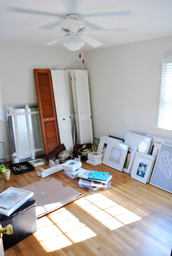
As scheduled, our local Habitat for Humanity ReStore picked up our donation items yesterday. That, combined with us moving tons of frames and accessories into the future playroom (for now), meant the guest bedroom went from this:
To this:
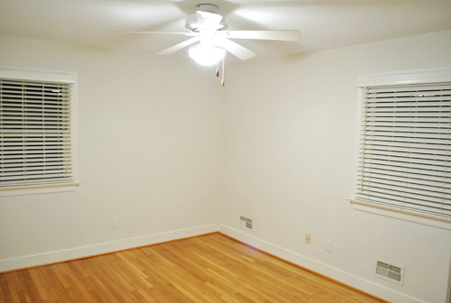
Not exactly ready for the inlaws (who are arriving on Thursday – yikes) but at least it’s no longer a junkyard.
The reason that photo was taken after dark was because once Clara went to bed last night we decided to earn ourselves some brownie points and paint the room. Yup, we’re total suck ups who love extra credit. We figured it’d be easier to paint while it’s empty (the new bed is coming early next week- details on that soon) and with Clara asleep we figured we’d seize the day night.
So by morning the room was looking a bit more like this:
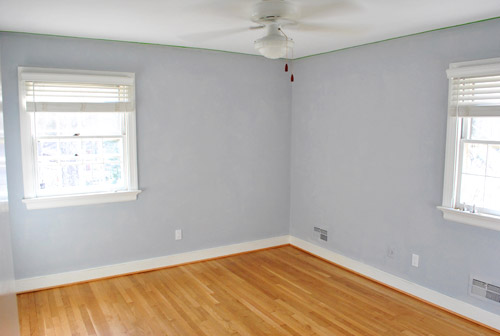
The color is sort of a stoney pale blue, that has hints of purple in some lights. We figured it was neutral enough to not offend any guests and if we ever had a baby boy down the road we’d already have the nursery walls ready. Gorgeous, right?
Okay, we’re totally joking. That’s not paint, it’s just tinted primer. Did we get you? Sorry, we just couldn’t resist the momentary fake out.
But as you’ve probably figured out already is that tinted primer = dark paint. We’ve been itching to try a dramatic dark color somewhere in the house so we figured we’d just go for it in this room. Why not be a bit adventurous for a guest, right? We figure a dark enveloping room would be nice to sleep in (some of our favorite hotel rooms have been deeply saturated), and thanks to having two walls with windows (plus another window in the adjoined bathroom) the room actually gets a fair amount of light.
Let’s just say the color is very dark and very outside of our comfort zone, but we’re geeky excited about it for some reason. Probably because it makes us want to wet our pants. Just a little. For now we’ll leave our choice a mystery (oooh, secrets) until we get the room painted this weekend and have pictures to share. Descriptions of colors can be tricky, so we’d rather just show it to you anyway.
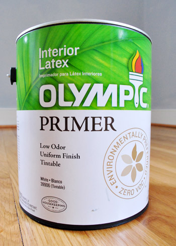
Oh and this is actually our first time using tinted primer. With such a deep color on the agenda, we knew it would probably help with coverage and the richness of the color that we end up with, so we went for it. We chose Olympic Premium Primer because it’s 100% VOC free (and just $12 for a gallon). It was pretty easy to use – not nasty like the oil-based stuff, and not very smelly at all. But it was a little thin, so we had to be extra careful to avoid drips or wipe them up when they occurred (which might actually be the case with all water-based primers since we’re comparing it to our run-ins with the oil-based stuff from back in the day). Fingers crossed that it does the trick. You know, so we don’t find ourselves needing ten coats of paint to get the deep rich tone that we’re going for. We only got one gallon of paint so we’re hoping that’s all we need…

Leave a Reply