Decorating
Here are a bunch of decorating tips and tricks to upgrade any home and makeover rooms on a budget. From curtain hanging tips to what kind of rug to get (and how to mix patterns) there's a lot of info to discover.
New Video House Tour!
How To Make Ikea Curtains Look Expensive
Colorful Paint, Cabinet, & Tile Picks For The Duplex
Three Bedroom Makeovers For Three Deserving Kids
Staging Tips For Selling (Or Just Simplifying!) Your House
Updated Beach House Tour!
10 Home Items We’ve Had For 10+ Years

Our Son’s Bedroom Update
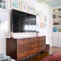
How To Hang Frames Around A TV
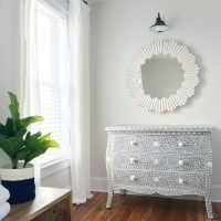
How To Repair Broken Or Cracked Inlay Furniture

Holiday House Tour – Come See Our Christmas Decorating
- « Previous Page
- 1
- …
- 4
- 5
- 6
- 7
- 8
- …
- 34
- Next Page »