Every time we post a photo that includes the frame collage above our living room’s console table like this…
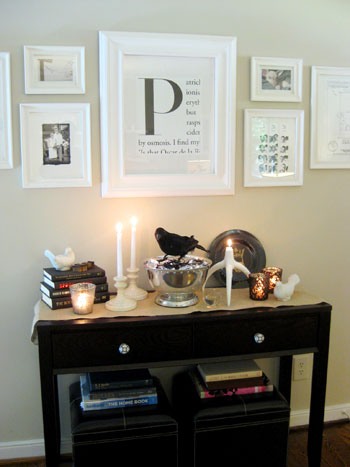
…or this…
…. or this…

…. we get a slew of emails asking where we bought or how we made the big P print that’s front and center. Well, it’s actually just the first letter of an article in a magazine that we cut out in a neat little 1 x 2 inch rectangle and had blown up around 300% at Kinko’s. You know how some articles start with one large letter and the rest of the first sentence followed? We just cut out that rectangle, enlarged it a bunch, and framed it.
Making it huge and putting it behind glass instantly created a customized monogram with very little work on our part, and we love how it came out! Just flip through magazines until you find your initial and head over to Kinko’s. A few dollars later it should be ready to frame (they look especially great with giant mats and pretty hefty frames to dress them up).
So you too can master the P (get it? Master P? no?) or any other letter that you’d like…
Psst- Looking for more easy DIY art ideas? Check out the bevy of links on our How To page in the “Artsy Ideas” category. And if you’re searching for framing arrangement ideas, this little video tutorial should have you covered.

Meaningfulgrrrl says
I made my own (inspired by yours) using Microsoft Word Publisher. http://meaningfulrevisions.com/2009/09/06/september-goals/ In case you don’t want to have to track down magazines that fit your last name. The image is a little blurry from uploading from Publisher to my blog, but it’s a perfectly clear on the print out.
YoungHouseLove says
Awesome job Meaningfulgrrrl! We love that you DIYed your own version!
xo,
s
LizzieBeth says
I love this idea. I was planning on doing this and giving it to my fiance as a little engagement gift ;)
LB
Sue says
I’ve only just done something like that this weekend, using your P as an example! I will snap some pics and put them up shortly. Great work.
Amy Kelly says
I love this idea for some inexpensive DIY art. The hubby and I have lived in our apartment for a year now and our walls are still so bare. I am planning on trying this out soon!
Samantha says
“So you too can master the P (get it? Master P? no?) or any other letter that you’d like…”
Sherry….I love you. :) You crack me up! And I am so happy you gave a how-to on this. I was one of the people that emailed you about this! I can’t wait to make one! :)
Ashley says
Yep, I’ll be adding this to my “to-do” list. :)
Asia says
This is so awesome! You wouldn’t believe how hard it is to find an “A” monogram anything! I guess there are a lot of “A” namers out there.
Notesfromthegrove says
I painted our master bedroom yesterday and googled the paint color this morning to send my mother-in-law an online swatch. Turns out, I used Behr’s Harvest Brown, just like you guys did in this room! How awesomely random is that???
YoungHouseLove says
Hey Notesfromthegrove,
We actually used Glidden’s Sand White in the living room. But Behr’s Harvest Brown sounds lovely (and I’m sure has a very similar look). Hope it helps!
xo,
s
Karla D. says
You know, I was just thinking about this project again this weekend. Right now I have a black shelf with large black K and P initals on either side of a piece of framed art with (reddish-orange coral inside to be exact) but the pieces are smaller than I’d like and I’ve been wanting a large frame with the letter “D” for our last name. I can’t wait to display this on our new hallway shelf! I have a couple filmstrip black & white photos and may copy that idea that you have up as well. ;)
One question-I love the white frame with the large mat that you used. Where did you get yours? Ikea, Target, Michaels?
YoungHouseLove says
Hey Karla D,
Ours was actually from Ikea. Great guess! We’re not sure if they sell the exact frame and mat anymore (we’ve looked for them recently and haven’t seen them) but they definitely have similar options (along with Target, Michael’s, Bed Bath & Beyond, etc). Hope it helps!
xo,
s
Leigh says
Yay!!! I am so going to do this. I have such a hard time finding an “F” monogram. I find every other letter except the one I need. I guess that’s how it goes. I think I can DIY this though.
Kristal says
I have one of these hanging in my home, but I DIY’ed it on Word. I just typed a big F for our last name, and then typed up a random sentence along side the large F. Very easy!
http://goodfoodgoodfriendsgoodlife.blogspot.com/2009/05/time-for-little-bit-of-miscellany.html
Katie says
Hi guys!
This is so funny that you posted this today, I actually made a trip to IKEA this weekend to gather some fun decor items and frames, one with the intention of recreating your “P”! THANK YOU! we love your site, keep up the good work!
Liz R says
I think the last link to the scanned image is wrong? “Current Events in DSS”?
YoungHouseLove says
Hey Liz R,
Thanks! All fixed.
xo,
s
Sugar Cookie says
I have admired this monogram many times and will probably make one of my own to contribute to me and my husband’s current “B” collection. My maiden name also began with a B, so I love the monogram and any form I can display it in around our house. Thanks for the cute idea!
doahleigh says
I need a Z, and sadly not too many articles start with Z. That I’ve seen. If anyone finds a great Z block letter, let me know!
jbhat says
I think I just found my sister’s birthday gift (Her’s will be a S). Thanks!!!
Laura Lynn says
Hi!
Last year I bought one of the monogrammed art pieces from your shop. We all like it so much that my kids all want one in their rooms.
So, I am sure we’ll be working on this DIY project soon-thanks for the inspiration!
KT says
So maybe I am totally dumb….but I am still not getting how you do the rest of the print….I get the large monogram but what about the rest of the print? Where is that from? Thanks so much! LOVE the blog-it’s a daily must read for me! I can’t wait to see what cute decor ideas you guys have lined up for Fall/X-mas :)
YoungHouseLove says
Hey KT,
If you look at the rectangle drawn on the sample magazine article above, you’ll see that the entire print comes from the magazine (the letter along with the smaller words around it). Just clip it out and blow it up, pair it with a wide mat, and you’ll have something nearly identical to our big P above. Hope it helps!
xo,
s
LindsayB says
I love the magazine monogram idea! I made my own “B” in Photoshop using an article on bourbon as a template for which words to use. I’m still not crazy about the font I used though. I’ll have to keep flipping through my fonts for a more magazine-y feel so I can make another one. Thanks for the inspiration!
Jacci says
Thanks for the info, guys!!! We’re painting the foyer later this month and I’m taking all kinds of cues from you all for the wall arrangements. I’m thinking of doing this little initial project as well as working on some random number sign photos to showcase our wedding date – kind of like that giveaway you all did a few weeks back. I can’t do ALL of the foyer this month, but that we’ll give us a jumpstart :) I’ll let you know if I actually get to it.
Thanks for the easy and inexpensive inspiration!!!
XO,
Jacci
Notesfromthegrove says
OH! Looks like you guys used the Harvest Brown on your front porch, not your living room. I should really learn to read, lol! Thanks for the love!
Amy says
Thanks for showing this. I was trying to figure out how y’all got that just the other day.
Ele says
I am so going to make one of these!
Which magazines are the best to go to for this kind of lay-out? Thank you!
YoungHouseLove says
Hey Ele,
Good question! We’ve found that most mags from Vogue and Elle to Time and Fast Company use a big initial to start some of their articles. Hope it helps!
xo,
s
Rachel says
Easy and elegant, I love it! I’ll be linking. Thanks so much for the great art idea!
Jenni says
Super cute idea!!!! Can’t wait to see more great ideas with your new giftcard!
Christian T says
I think you read my mind!! I was going to e mail you about getting a “C” like your “P” for my BFF’s first anniversary this week! Thank you so much for the “How To”… I am heading to Kinkos in the morning!
Arenda says
Hey guys, great post again! I just wanted to let you know that I actually imitated framing the large letter a while back, but I did it all myself! Here’s how:
When you open a program like MS Word it’s fairly easy to select or download a font you like, enlarge the letter you like, use text wrapping then add words around the large letter. To create the cutoff effect I drew two more boxes, filled them with white and made the textwrapping so that the white box sits in front of the text… effectively cutting off the words and creating the same magazine cut-out effect. The just print it off on some good quality paper and frame it!
It’s a little bit more hassle, BUT the cool part is that I did it with our initials and added words that describe us, rather than random words from an article. That way it’s entirely personalized. =)
Ciao!
Megan says
Thanks for the how too! This is a great idea and right in time for christmas. I know what my gifts will be this year.
Lindsay says
Wow, this is scary! Are you stalking my “history” in my computer? Just last night I was trying to copy your “P”. I was thinking, “now where did she find that”? I was trying all kinds of different Google searches. Thanks for the tip!
abby says
I love your magazine monogram. I showed it to my husband last spring and he made me an “S” monogram just like it using powerpoint in about five minutes. We just printed out right at home and I framed it. I have it hanging in our kitchen and I love it!!
sabrinaandsoul says
you are showcased in AT. but its not necessarily a good thing! take an educational peek!
Ashlee says
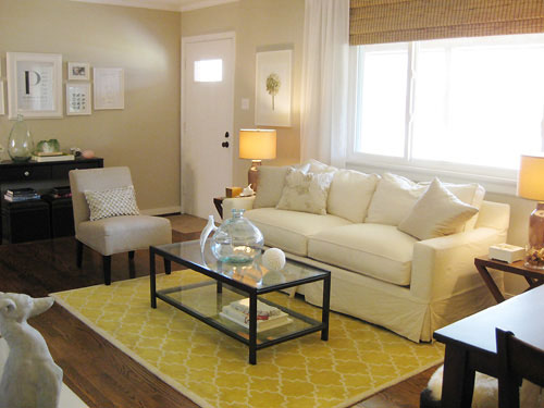
What a clever idea! I would love to do something like this for my little girl’s room. By the way, I NEED that rug in your sitting room (the yellow/marigold colored one). Where can I get it? Thanks!
YoungHouseLove says
Hey Ashlee,
The living room rug is actually the Moorish Tile rug from Pottery Barn but it’s no linger available through them. Maybe try eBay? Good luck!
xo,
s
Liz Z. says
Great tip, let me know if you ever see a “Z” !!
shannon says
I LOVE this… what a great idea! I just found your blog and am going to have to sift through it now. You clearly are an amazing decorator!
Natalie says
I just found your blog through the Lettered Cottage and I love your style!! I just finished making my own “G” art last night on my computer. I can’t wait to look all your ideas!
Bailey says
Love it! I did a google image search for “drop cap” and found a bunch that are cute.
If you want something splashy and colorful, check out
http://dailydropcap.com/ so pretty and fun!
I love this idea and I think I’m making one for everybody for Christmas. Gotta love the DIY holiday goodness!
Jessica says
I made my own and posted it to my blog! of course some props were given, check it out! http://myquarterlifecrisisjmu.blogspot.com/2009/10/diy-magazine-monogram-art.html
(my blog is like a week old, so im still working on gaining a following, haha, im not a total loser i promise!)
Belinda says
This has nothing to do with your “P” (although, i love it and am going to make one of my very own..!) but I am wondering whether your console table and the ottomans underneath are black or a very dark brown?
Thanks, i’m loving your blog-keep up the awesome work!
Belinda :)
YoungHouseLove says
Hey Belinda,
Both the ottomans and the console are dark brown. Hope it helps!
xo,
s
Rachel says
J & S – am officially beyond obsessed with your blog…just like everyone else on here!
I’m planning to do this with an H for my last name…but I want to do it in MSWord. When you took it to Kinko’s, how big did they blow it up? I know you say 300%, but what size frame do you have it in?
Love it!
YoungHouseLove says
Hey Rachel,
Good question! Our frame has a 19 x 15″ opening and we blew our monogram up to roughly 13 x 11″ and then just mounted it with a large white mat around it to fill up the rest of the frame. Hope it helps!
xo,
s
Tarnya says
I also made mine on MS Word, I took a cutting to get blown up but it kept coming out blurry (especially the big capital letter)and a bit dirty looking, not sure what I was doing wrong but it looks much better this way.
Yours looks great in the photo guys, the photocopiers over there must be better than the ones here in Aust…lol!!
Rebecca Foxworth says
Another option…go to http://www.dailydropcap.com and copy the letter, then paste onto your word processing program for an approximately 5-inch letter. Print in color or black and white and take it to your local printshop to be enlarged. There are a year’s worth of letters, so if you don’t like the first time you see your letter, keep searching the archives. My take on this? I set it as desktop wallpaper…instant decorative drop cap whenever the computer screen is on…no printing involved.
YoungHouseLove says
Love it! Thanks for sharing the link and the idea!
xo,
s
Jaclyn says
Sherry,
I love this idea! I was just wondering what kind of paper you printed on. And did they have it a Kinko’s or did you have to bring it in with you?
YoungHouseLove says
We just used the stock paper at Kinkos that they already had loaded in their printer. Easy as pie. And a large frame with a substantial mat really dresses it up (and makes it look beefy and high-quality). A few years later ours still looks great. You could also bring heavier weight paper if you’d like a more hefty end result. Hope it helps!
xo,
s
Adam says
this is the best design on this site. Thank for this!
Crystal says
hey J & S,
I tried the method of cutting out an image and then blowing it up, but the kinko’s I went to didn’t blow up the image very well. Granted, I did print out the letter instead of cutting it from a magazine, so that might be why the image was a little pixilated, but do you have any suggestions for other options?
YoungHouseLove says
Hmm, maybe you could try finding it in a magazine instead of printing since printed letters can be harder to blow up super cleanly? You also could try printing the letter as large as possible at home before blowing it up (ex: if you print it close to 8 x 10 at home and blow it up 80% it’ll look clearer than printing it smaller and blowing it up 300%). Hope it helps!
xo,
s
Sue Gibbs says
what are the other words in the frame with the large “P” ?
YoungHouseLove says
They’re just words from a real article in the fashion magazine that I snipped it from (Vogue). You can see the top of Oscar De La Renta’s name at the bottom. Funny right? The main thing was the big P for our last name: Petersik. Hope it helps!
xo,
s
Nicole Zoe says
Hi John and Sherry, I have been searching EVERYWHERE (even resorting to google images) for a Q for our monogram print for a few months now. As you can imagine, not many stories have an opening line that starts with a Q. Do you have any suggestions of where to look, or key words I might use? I wish I had seen when you guys were selling these in your shop!
YoungHouseLove says
Oh no that’s tough! Maybe you can make a fake one yourself in Photoshop or Word (just mimic the ones we show above and cut off sentences for the same look). We know of a few readers who made their own that way (without having to flip through magazines or blow things up at Kinkos) so it’s definitely doable! Good luck.
xo,
s
Bob says
Easy, Novel and Attractive.
Thanks!
Sheela says
I just made one of these as a housewarming gift – I needed a letter K and it took a while to find one in a magazine. I finally found one in Cook’s Illustrated, which is a great source for a variety of letters in a very traditional “magazine” look. All of their articles are laid out with the large beginning letter, and the type is all black, which makes it easier to copy.
Just wanted to let everyone know about a great letter source! And this is such a cute idea – thanks for sharing it!
YoungHouseLove says
Thanks so much for the tip!
xo,
s
Anne says
Just found your blog! LOVE IT! Where did you get the adorable rug in your living room! Thanks for all the great tips and advice!
YoungHouseLove says
It’s the moorish tile rug from Pottery Barn. They no longer sell it so you might want to try ebay. Hope it helps!
xo,
s
Carie says
To Nicole Zoe who couldn’t find the letter “Q”: Try the Question and Answer section of magazines, I found a nice “Q” (as in Question) in Redbook in that section.