Q: First of all I love your site. It inspires me to fix up my own home (you make it look so easy!). But if there was a class called Paint Picking 101 I would be getting a big fat F. So far every room I’ve painted in my new house is either too bright, too dark, too dirty looking and just plain ugly. I’m having the worst time finding a perfect tan tone and I’m even messing up colors like light blue and cream, which I never thought was even possible! Do you have any foolproof colors you can recommend? A favorite blue? Cream? Tan? White? Yellow? Gray? I know natural light and other factors can change the way paint looks substantially so it’s probably not 100% foolproof, but I’d love to know your favorite paint colors so at least I have a shot of living in a house that doesn’t make me feel like a total paint failure! Thanks so much for your help! – Meagan
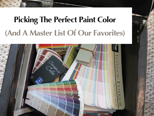
A: Picking the right paint color can often be a doozie, so don’t get down on yourself! Take comfort in the fact that repainting, while annoying, is super inexpensive and it can instantly transform your room from wrong to oh-so-right in an afternoon. And thanks to the transformative power of paint, we’re the proud owners of an entire storage ottoman full of paint decks and swatches. Name any color or any brand- it’s all in our little paint chip library of sorts. But although we have quite a slew of selections we still find ourselves reaching for some tried and true favorites again and again when it comes to doling out room recommendations.
As you mentioned, paint colors can look very different under different lighting circumstances, but for the most part there are a bunch of practically error-proof tones that we find ourselves recommending again and again. Some of them are bright and fun (better suited for only one wall or even a punchy piece of furniture) while others are classic and serene- perfect for an entire room or even an entire home. Here’s the swatch suggestion scoop:
White- Benjamin Moore Decorators White, Glidden Dove White, Behr Cascade White, Sherwin-Williams Alabaster.
Cream- Glidden Antique White, Sherwin-Williams Creamy, Benjamin Moore Muskoka Trail, Benjamin Moore French White, Benjamin Moore Natural White.
Red- Benjamin Moore Million Dollar Red, Glidden Red Delicious, Behr Firelight, Valspar Fabulous Red (great for a front door- might be too bright for inside).
Pink/Coral: Sherwin-Williams Comical Coral (shown below), Benjamin Moore Wild Aster, Sherwin-Williams Animated Coral, Behr Be Mine, Behr Silk Sheets, Behr Coquette.
Brown- Benjamin Moore Branchport Brown, Benjamin Moore Woodacres, Benjamin Moore Stampede, Sherwin-Williams Cobble Brown, Sherwin-Williams Van Dyke Brown (shown below), Behr Traditional.
Yellow- Benjamin Moore Hawthorne Yellow (it is the be-all end-all of yellow paint, which is notoriously hard to get right).
Green- Glidden Fennel (no longer available for swatches, but still in the computer so they can whip it up for you), Glidden Celery Sticks, Benjamin Moore Mosaic Glass, Benjamin Moore Hibiscus (great for a cheerful kid’s room with white trim and brown furnishings), Benjamin Moore Soft Fern, Benjamin Moore Silken Pine, Benjamin Moore Sweet Pear, Benjamin Moore Dune Grass, Sherwin-Williams Lime Granita.
Purple- Glidden Silver Plum (no longer available for swatches, but still in the computer so they can whip it up for you), Glidden Delicious Plum (amazing eggplant color for a front door), Glidden Black Tulip (the deepest moodiest purple-black that’s dripping with drama) Benjamin Moore Nosegay, Benjamin Moore Violet Pearl, Benjamin Moore Iced Lavender.
Blue- Glidden Gentle Tide (no longer available for swatches, but still in the computer so they can whip it up for you), Benjamin Moore Quiet Moments, Benjamin Moore Saratoga Springs, Restoration Hardware Silver Sage (it has green undertones but looks blue-gray in most rooms), Behr Pensive Sky, Behr Flint Smoke, Behr Grand Rapids.
Navy- Benjamin Moore Spellbound, Benjamin Moore French Barret, Benjamin Moore Hudson Bay, Sherwin Williams Grays Harbor, Sherwin-Williams Naval.
Black- Glidden Onyx Black, Benjamin Moore Graphite.
Tan- Glidden Sand White (no longer available for swatches, but still in the computer so they can whip it up for you), Glidden Water Chestnut, Glidden Cafe Latte, Benjamin Moore Baja Dunes, Benjamin Moore Davenport Tan, Behr Harvest Brown.
Orange- Benjamin Moore Beverly Hills, Benjamin Moore Lion Heart, Benjamin Moore Corn Husk, Sherwin-Williams Marquis Orange, Sherwin-Williams Mandarin (shown below).
Gray- Benjamin Moore North Hampton Putty, Benjamin Moore Light Pewter, Benjamin Moore Stonington Gray, Benjamin Moore Nantucket Fog, Glidden Silver Dust.
Beige- Benjamin Moore Clay Beige, Benjamin Moore Green Brier, Sherwin-Williams Ancient Marble.
Greige- Benjamin Moore Tapestry Beige, Behr Ocean Pearl.
Oh and a word of warning: you don’t want one of each of these colors in your house! Here’s how we learned that a tighter color scheme can make your home feel bigger, more open, and a lot more cohesive and welcoming. Of course it doesn’t have to feel expected or monochromatic since you can bring in different accent colors with art and accessories in each space to make them feel unique and interesting!
And a second word of warning: Paint colors look different in every room (due to lighting and other ever-changing factors) so we just suggest grabbing a bunch of the swatches above and bringing them home to see which ones look best on your wall. We can’t recommend a specific color for your specific situation with any great accuracy since we have no idea how it’ll “read” in your home (your eyes will be much better than ours since we’re not right there in your space). Just tape up a variety of swatches and pick the one that looks best to you (and get a few test pots of paint if you’re still not sure)! That really is the best way to get it right every time.
What about you guys? Any words of warning or paint color advice? Do you have some favorite hues that have worked out wonderfully for your casa? Any that were terrible that you’d love to warn others about? Let’s all help Meagan out by dishing the paint picking dirt.

Val says
I can only vouch for one yellow that has done amazing things for my home. Glidden’s Bryant Park Gold looks stunning in my tiny, almost windowless 1930’s rancher. The rich color demanded four coats on my walls, but I get compliments on how gorgeous it is all the time.
However, I am biased. My fiancee used to paint homes professionally, and now manages a Glidden/ICI/Dulux Paints store here in the RVA. My paint comes with a discount! And a free painter! :)
Megan says
I am totally with her on picking colors. We learned our lesson when we painted our dining room blue. The next day, it looked like we had stepped into a carnival. It was a bit too bright! It is hard to judge from a sample on the wall what it is going to look like when it is all over.
I love the choices that you picked, and your rooms do flow together seamlessly.
http://www.thesouthernnest.blogspot.com
Kelly says
BEST POST EVER! I’m not planning on painting any rooms right now (we’re renters) but I’m pretty much planning on bookmarking this post for a reference tool for the rest of my life. I’m terrible at picking the right paint colors! Thanks again J&S
Wendy D. says
I flip houses, so I needed a good neutral color. The color had to be one that could work in any house and helped to make the house feel large and comfortable. I ALWAYS use Benjamin Moore Bleeker Beige. I use it in every room in every house, even my own. It always looks clean and open whether in a room that has alot of light or one that doesn’t.
One other suggestion is that if you like a certain color but don’t like that brand of paint (or have a coupon for another store), you can always ask one store to whip up another store’s colors. I often buy from Sherwin Williams because they give me good prices, but I use the Benjamin Moore paint color. They have all of the competitor’s colors in their computer so I just tell them the name and they get to it.
Lee says
My favorite favorite green is Silver Sage by Restoration Hardware.
Years ago I had spent months trying to find the perfect green for my living room and always ended up with colors that were too minty or too grey. Then one day at the mall I spied this in the window and have been faithful ever since.
My favorite yellow is Benjamin Moore’s Montgomery White. Not sure why it’s called ‘White’ when it’s really a lovely and creamy yellow.
LeilaMac says
LOVING this list – thanks for compiling and I am definitely bookmarking this! If I might chime in a few faves…
– Gold: Benjamin Moore Dijon (warm, not too yellow, not too bronwn, juuuuust right)
– Green: Benjamin Moore (Aura) Agave (kinda avocado-y but the perfect shade of green, promise)
– Chocolate Brown: Ralph Lauren Manchester Brown (this color has “MAN ROOM” written all over it)
– Tan/neutral: Benjamin Moore Monroe Bisque (warm creamy neutral color)
john says
Monroe bisque in some light is a mustard yellowish color but its nice
LeilaMac says
And I forgot the perfect nursery pink: Benjamin Moore Pink Cloud! It is perfection.
Kim says
After years of living in rental places with white walls we couldn’t paint, we went crazy with color when we bought our house. You could see the glow from the street. Not good. Now we like neutrals and pale yellows. We’ve tried Behr, Sherwin Williams (Jonquil was good for a big room), but actually, my favorite yellow is one we got at Ace Hardware, whatever their brand of paint is called, in Woven Basket.
abbey says
I’m sure you will get a ton of responses from this posting. I absolutely hate painting! It gives me a headache, it makes me naueous having to try and pick out colors. I think we’ve painting every room in our house at least 2-3 times. The worst is when you find a color that you like and then it looks like crap when you paint it on the wall. I’ve learned to stick with the neutrals cause you can’t go wrong with them. Thanks for a great post!
Carmil says
I agree– its tough to get the right paint color, but when you find one, hold onto the swatch card! We have a tan beige/yellow, soft green thing going through out our house and there are now 8 people and counting who have used two of our colors! Check out Sherwin Williams card #18– Believable Buff (I love almost every color on this card, our MB is in Camelback) for a wonderful beige/tan. 6 of the afore mentioned 8 have used this successfully!!! Then go to card #24 for Svelte Sage– a perfect green in a variety of settings. I found it by matching one of the greens in my dining room oriental carpet — its below the chair rail in my DR with Believable Buff on the top. Crisp white trim sets the whole thing off.
Although these colors are SW– the paint we have been using is called Graham, from a line of paint stores called Devoe. I know they are a little more obscure than the big box brands, but the quality is unbelievable. Very similar to the Pratt and Lambert $60/gallon paint that we couldn’t afford to put throughout our house when we moved in a year ago! If you ever see Graham paint, I HIGHLY recommend it!!!
Rebekah says
I also went to a different, cheaper store for BM paints… unfortunately they whipped up a slightly different shade than what I requested — I’m guessing they just typed it in wrong? Anyway, we went back for more paint (which was made correctly this time) and the two paints were just slightly off. Ugh! When we realized, we received free cans of the incorrect color to finish the walls.
So, the color on my walls are not really what I wanted (just a slightly greyer yellow/gold), so I ultimately want to repaint!
I’m sure it’s NORMALLY perfectly safe to buy BM paints from non-BM stores though.
Lindsay C. says
I love Benjamin Moore (all colors are BM) Sulfur Yellow, Danville Tan is great (green undertones, though), Lenox Tan, Ashley Gray, Old Salem Gray (greige green), Acadia White, Fernwood Green, Shaker Beige, Caliente (a nice, deep red), and Montgomery White (yellowy cream) are all great colors I like to recommend in my business. It’s true how you can use those tested colors over and over, and some you just want to ask “why??” :)
I’m definitely going to be ordering swatches of all of the BM and SW colors you recommended to file away. And not to plug my blog, but I just joined a Paint Color Blog Party last week through the 320 Sycamore blog and it is a great way to find some great colors! :)
YoungHouseLove says
Lindsay C,
A Paint Color Blog Party sounds like a good time! We’ll definitely click over and check it out (for those wondering, her blog is: likelydesign.wordpress.com).
xo,
Sherry
Liz says
I’m with Wendy D. on this one – my hubby and I are doing our first flip right now and we’re sticking with an awesome, neutral tan throughout the entire house – Pittsburgh Paints (Toasted Almond). It’s fab, and we used it in several rooms in our own house – we love it!! Here’s a post from awhile back that talks about each paint used in our house, how we picked our colors, etc: http://itsgreattobehome.net/?s=paint+by+numbers (and YHL is mentioned in it!!)
Teresa says
You obviously use all different brands of paint….but do you have a favorite? (not color, but actual brand)
Averill says
Great selections! Some of my other favorites are BM’s Morrocan Red (great orange-red), BM’s Phillipsburg Blue (a saturated gray-blue), and BM’s feather gray (a lovely blue-gray).
Notesfromthegrove says
This post is going to come in SO HANDY when we move into our new home later this year. There’s a room in our new place that I’ve dubbed “the Ronald McDonald room”. I’m sure you can figure out WHY. I can’t wait to get in there with a bucket of Behr Harvest Brown or something, lol!
Abby says
I love paint. I have tons of swatches picked up from random places. I’m so jealous of your fan decks – where do you get those. I often have swatches that I can’t tell where I got them.
My fave color for our house was Behr Brown Teepee. It’s in our living room, foyer and hallway/stairs. It’s a great rich, cafe au lait color that makes our old, craftsman-esque home feel warm and inviting. I’m also in love with the punchy green we chose for our kitchen – it’s Wild Artichoke by (i think) Martha Stewart.
Right now, I’m trying to find the perfect cool tan for our home’s exterior and I’m really struggling. I sit surrounded with swatches and they all seem to blend together.
Holly says
Hey Sherry (& John),
What would you recommend for painting a ceiling blue? I’ve got 10′ ceilings in my kitchen and would love to paint them a moody blue-gray color (the wall color will be a creamy tan w/ black cabinets). Do you have any suggestions?
Thanks!
YoungHouseLove says
Teresa- Alas, asking us to pick a favorite paint brand is like asking someone with twenty kids to pick their favorite child! We really love Behr for the quality and price point, Glidden for the surprisingly fabulous colors (they also reformulated their paint very recently for improved quality), Benjamin Moore for the amazing coverage (no drips, fewer coats), Valspar for the wide range of colors and Sherwin-Williams for their quality and color choices (so many choices). And that’s just the tip of the iceberg!
Abby- We actually get our paint decks from the manufacturers (they’re not free- usually around $20 a pop) but they really come in handy for whipping up custom mood boards, doling out paint suggestions, and of course adding color to our own home’s walls and furnishings.
Holly- Blue ceilings, eh? We love that idea (in fact we have two ceiling projects currently in the works- stay tuned…). You definitely want a bit of gray in the color so it’s not too “baby’s room” and you don’t want anything too dark or “heavy” on your ceiling so we would suggest Benjamin Moore’s Arctic Gray or Sleigh Bells for a hint of blue-gray magic. Hope it helps! Happy painting…
xoxo,
Sherry
Holly says
And thanks for this post… I needed it! My Dad declares that my old room at home shrunk several times with all the painting I did in there!! (I once painted it seven times before I found what I wanted)
Lindsay C. says
PS – Pottery Barn catalogs and colors are great – I order swatches of all the BM colors they recommend as how great do they look in their catalog?? I love when catalogs and magazines list the paint colors they use. It’s a life saver!
Yvette says
I’ve been really happy with the colors we have chosen in our home and would totally recommend them! A lot of our color inspiration came from Pottery Barn catalogs.
Family room and kitchen – BM Nantuckey Gray — its a grayish green but not a pastel sage kinda color.
Bathroom – BM Shanendoah Taupe — its a yummy muddy color.
Living room – BM Shaker Beige with a Red accent wall — BM Maple Leaf Red.
Rebecca says
i would love to know where you got all those swatch books!?
seriously…do you buy them online? i would love to have actual books instead of the little sheets that I always lose!
YoungHouseLove says
Hey Rebecca & Kristi,
We actually get our paint decks from the manufacturers (some sell them in their stores like Ben Moore and Sherwin-Williams while others like Behr and Valspar can be obtained on their websites). They’re not free (usually around $20 a pop) but they really come in handy for whipping up custom mood boards, doling out paint suggestions, and of course adding color to our own home’s walls and furnishings.
xo,
s
ellis says
The only word of advice I have, which I’ve found to be true time and again (I can’t claim it though, since I read it in a paint design book), was that for most colors (so not so much tan, etc, but blue, red, orange, yellow, green, etc), the best rule of thumb is to pick the color you want the wall to be, then find that paint swatch and then actually choose a paint that is a shade or two less intense. Like if you want a red wall, picking an actually red paint will just look garish when your eye perceives the saturation on the wall- and it won’t look like the red you wanted- but if you pick a red that’s less intense, once it’s on the wall the saturation of all that color over a wide area will actually make it look like the red you have in mind.
Kristi W. says
Great idea for a post! Behr Sandstone Cove is probably my favorite light tan color. It’s neutral and light enough to keep a room bright an airy, yet has enough pigmentation to create some contrast with white trim.
Sherry – How did you manage to get those cool books of all the paint swatches? I’d love to have those on hand for decorating projects (we have a lot of work to do on our first home). Did you order them from the paint companies? I’m that person that’s always at Home Depot madly grabbing paint swatches with glee. Hehe.
rachel says
sherry! this is the most helpful blog post ev-ah! wish i’d had it before i painted my bedroom a brown that’s just a touch too dark …
xoxo.
Erin says
I just checked out your old post about repainting your house…When I moved into my house two years ago, we painted the family room a warm, but bright yellow, and the kitchen (which you could see from the family room) was green. The rest of the house was/is beige, but now I am ready to tone down the yellow family room and I am painting this weekend! I still want some pops of color, but with pillows and accessories, rather than on the walls…
Jill Stigs says
VOTED (of course) this morning.
I love color! Luckily I talked my landlord into allowing us to paint. He provided a “diluted” terra cotta and olive green for my kitchen (no clue what the colors are) but I went with Sherwin Williams for the rest. Our small bedroom is Down Home SW6081 in an eggshell finish, our bathroom is Camelback SW6122 in a semi-gloss, and our 10 yr old daughter’s room is Fussy Pink SW6853 in flat (think Pepto—LOL). All the rooms feel a lot more cozy than “apartment offwhite” it was!!
http://www.roomzaar.com/rate-my-space/gallery.esi?&userSearchString=Jiller53150&sortOrder=1&loc=http%3A//www.roomzaar.com/rate-my-space/multigallery.esi
Wendy D. says
The color swatches can be FREE if you buy alot of paint. If you are purchasing alot of paint at once, they won’t think twice about throwing in the swatch book.
Cheryl Balmas says
Great suggestions everyone. (I keep my fan decks in the ottoman too!) Some resources: myperfectcolor.com gives you all the top selling Benjamin Moore colors in various categories (you can search by top selling beiges, blues, etc.). Also check out goodbonesgreatpieces.com/blog and look under the topic Color Theory where the decorators have listed 6 or 7 of their all time favorite whites, blues, beiges, greens, reds, etc, etc. Don’t forget about the handy dandy pocket guide House Beautiful Colors For Your Home 300 Designer Favorites. I love this book but I will caution that I have compared swatches from the fan decks with the color swatches in the book and there are differences due to the printing process. Some blues look more greens, some beiges more grays, etc. Use it as a guide, not as a true-to-match bible because that would be impossible due to printings. I am soooooooo color obsessed that I just spent the past month gathering all of my loose swatches, putting them in page protectors and in a 4″ binder with notes by all the favorites. Yes, I am unemployed at the moment and yes, I have waaaay too much time on my hands. LOL But in addition to the fan decks, I now have a binder that I can just open to the color section of my choice and pull out what I need and the notes remind me of why I added that particular color for future use. Always test colors either on the wall or on poster boards. I like using poster boards so that I can move them around the room and view in different lights throughout the day and night. Thank you for this post…I love hearing what works for others!
Ann R. says
I find the House Beautiful Colors for your Home 300 Designer Favorites useful as well. Thanks for your tip on the slight color changes due to printing.
sallie says
We just bought a new house and all the walls AND ceilings are painted a tan color very similar to Behr Harvest Brown (pictured above). It’s a very nice color but I still want to paint the dining room and kitchen a very soft blue or green color. My question is whether we should paint the ceiling white or leave it the tan color? I feel like a white ceiling would go better with different wall colors especially since the baseboards are a crisp white. But would I need to paint ALL the ceilings in the house white in order to keep consistency? Thanks!
YoungHouseLove says
Hey Sallie,
There’s no right or wrong answer as any number of paint combos can work, but we’d suggest taking the ceilings back to white in the rooms with the soft blue and green in them (to work with the crisp white trim) and we actually think you can keep the tan ceilings in the rooms with the tan walls since they’ll look seamless and it’ll all make sense in the end. Hope it helps!
xo,
s
Jackie says
Great choices. Love the cream color pictured.
We just painted our bedroom Behr Gentle Rain and adore it. (it’s grey)
Jill says
Does Behr Gentle Rain have any blue or purple undertones on your walls? Getting ready to paint our family room and, with about 20 different samples on the way, I think I’ve narrowed it down with Gentle Rain as one of the top contenders. Thanks!
Danielle says
Picking a paint color has a lot to do with decorating and the room in general. I think it’s more of a vision. I think you can make a color work as long as you accessorize it right. If you already have accessories you like in the room, I would put paint chips up to those for inspiration.
Kristi W. says
Thanks, Sherry! Sorry I didn’t see the post right above mine before I asked about the paint books.
Martha says
Greatest post ever! I am going to print a copy of it and keep it with my swatches. I usually use BM or SW paint. Most of our first floor is BM Standish White, HC-32 and it is a lovely soft yellow, very neutral.
Cheryl Balmas says
P.S. I also go to the websites of the HGTV dream homes, Midwest Living Idea homes and Coastal Living idea homes. They always list the colors used throughout the homes and I like to see what the designers are using. I don’t always agree with their color choices for my home but it helps to see how they do color combinations and color flow throughout the entire house.
P.S.S. Get those loose swatches and put them in a binder. I paperclip mine to card stock and slip them in a page protector. Then I have easy access to them and they are easy to remove and take with me. I use post it notes or jot notes on the actual swatch to remember why I liked it, where I might use it and sometimes the source so I can go back and view it in a room. Sounds time intensive but actually once the binder is set up it beats digging through a drawer or box for that missing swatch.
ann says
AMEN on Hawthorne Yellow. It is the perfect yellow — it looks great in all different lights. So cheerful.
I’d also throw in a recommendation for C2 paints if they’re available in your area. They have an amazing palette and go on like a dream.
Lorrie says
This is one of your best posts….great info! Thanks!
micah says
What a great post! Wish I would have had this list when we repainted our whole house a few months ago :) We had a really hard time finding the right neutral tan/taupe/beige color, but we ended up going with Restoration Hardware Cappuccino and it turned out great.
Dianne says
Sherry,
The one thing we kept in mind when selecting wall paint was maintaining a sense of flow within our house. Alot of rooms are open to each other so it’s easy to get carried away with color and then your house starts to look like a “circus”. So to avoid that problem, we made sure all the colors we selected (and we chose 10 in all) have the same tone to them. Our colors are not intense due to the “muddy” undertone to them. So when you enter/leave a room, your eye is NOT shocked. It also helps if you maintain the same flooring throughout (we have medium toned hardwood floors) Some of my favs:
BM Waterbury Cream
BM Prescott Green
BM Sag Harbor Gray
BM Scarecrow
BM Muskoka Trail (for the trim and ceilings)
MsAmanda says
Mmm, I love color suggestions. I simply and utterly adore Skylark from the Martha Stewart Collection at Lowe’s. It is a warm, chocolate milk tasty khaki color. It look good with just about any color I put next to it.
I’ve had a lot of luck using the Martha paint colors. If you find a color you like, it includes two complementary colors (usually a neutral and a color). You can follow your way through the complementary colors to find colors for other rooms.
Cheryl Balmas says
My ps and pss don’t make sense since my last post ended up in cyberspace!!! Sherwin Williams Latte, Nomadic Dessert and Kilim Beige (strip 16) are in my great room with Sherwin Williams Alabaster (white) trim. I’ve had this for almost 10 years (!) and have no plans to change it except for rolling fresh coats now and then. May sound boring but we love it…crisp, clean and you can accessorize with anything. More favorites: Sherwin Williams strip 19, Ivoire, Blond and Restrained Gold, neutral beigy golds that look very elegant yet relaxed. Other ideas: myperfectcolor.com lists all Benjamin Moore top selling colors by color and by room! Great resource. Also check out goodbonesgreatpieces.com/blog and look for topic called Color Theory; the decorator lists her fave 5-6 colors for whites, beiges, blues, greens, reds, yellows, etc. I also love Pottery Barn colors. And don’t forget House Beautiful Colors for your Home 300 Designer Favorites, a handy, dandy pocket guide to color. Be aware that the color swatches in the book do not always match the color swatches in the fan decks due to the printing process, yet its still a handy guide and gives you some direction.
Alli says
My absolute favorite color is Sherwin Williams Coastal Plain. It’s a gorgeous sagey green with a hint of grey blue in it. Of course it looks different in different lights, so I have it in my office and in our downstairs bathroom (no windows, so no natural light) and it looks completely different, but I still love it in both rooms. It almost makes the blue-grey fixtures in our bathroom tolerable! haha!
Brandi says
Another wonderful warm-white is Linen White from Benjamin Moore. Heard Nate Berkus rave about it when he first started coming on Oprah, and now I use it a lot!! It’s a great not too yellow, not too stark warm, creamy white. Perfect for cabinets or even trimwork in some houses.
Julianne Hendrickson says
This is incredible!! We are currently house hunting (for our first home). Paint is one of my most favorite things in a home…it makes such a difference in a room! Thank you so very much! :)
Amy says
This is why I love your site, questions to the answers we are all looking for!
What do you think of Olympic’s “Going Gray” for a living room with white vaulted ceilings? I am afraid it’s going to be too dark. I do love the new blue-gray colors out there but want something thats subtle. Have any great blue-gray swatches??
Nikki Lattanzi says
Amy,
Try swatch number 34 from Sherwin-Williams. Great Blue-Gray tones.
Nikki
Teresa says
This is a timely post for me. I’d like to paint all of the main rooms in our home, starting in the family room (which needs it the most) with a good flow in mind. I tend to like a neutral palette, but I don’t want to use the same cream and/or beige in every room. There are paint patches and little color cards everywhere. I’m waffling and driving everyone nuts. :)
Quick question about one of the pictures you posted, Sherry: Under the cream list you have a picture of a kitchen using Benjamin Moore’s Paris Rain. But that’s the color on the cabinets, right? I happened to be checking out greens online this morning {trying to branch out from neutrals!} and Paris Rain is a shade lighter than Cheyenne Green… definitely not cream. If I’m mistaken, I’m blaming my monitor. ;) If not, do you happen to know the paint color on those walls? It’s such a pretty room.
Thanks!
YoungHouseLove says
Teresa- Great catch! We must have been loopy from all that paint swatch staring. It’s actually BM’s Natural White with Paris Rain on the cabinets just as you suspected. Hope it helps!
Chacha- How could we be so crazy as to forget Water Chestnut? Consider it added. And we’re so glad that you love Fennel as well. It’s definitely one of our go-to recommends.
xo,
s
chacha says
What, no shout-out to Glidden Water Chestnut? :o) Thankfully they kept that one in the swatches.
I second Glidden Fennel – it is awesome. I have it in one of my guest rooms.
Behr Nurture is another fav of mine – very light blue with a hint of grey.
Meghan says
My sister in law told me about Malaya Red from Ralph Lauren paints and I painted my kitchen that color years ago – we loved it!
Great post – thank you!
Barbara says
I just copied and pasted your colors to my Palm, so now I can take it with me to the stores. Yippee, and much thanks!
My favorite local hardware store sells Martin-Senour paint. Any thoughts on how quality compares to Behr?
YoungHouseLove says
Hey Barbara,
We actually don’t have any experience with Martin-Senour paint but I’m sure you can try it out on a room or two and see how you like it! Happy painting…
xo,
Sherry
r8chel says
A few months ago I decided to finally paint my guest bedroom, and since I love the pictures of your rooms that have been painted with Glidden’s Sand White, I decided to go with that. For whatever reason, it ended up looking more gray than beige… and I don’t love it. It’s definitely a big improvement over the pastel yellow that was there previously (can you say Baby Nursery?), but I’ll probably end up repainting it someday.
Over Memorial Day weekend, I repainted my master bedroom. I had previously painted it tan/brown to cover up the hideous blue and orange paint chosen by the former owner, but the room felt too dark, especially since I also have hardwood floors. I figured that paint is relatively cheap, so I repainted it a lighter beige — and I’m much happier! Now if I can just find the time to paint the trim… It’s currently light blue, which makes the room look like a country cottage. NOT the classy look I’m going for! :)