I know it sounds kinda crazy, but after painstakingly removing five different wallpapers from this house… we’re considering putting some up. I think I even passively mentioned it in this post about the nursery mobile.
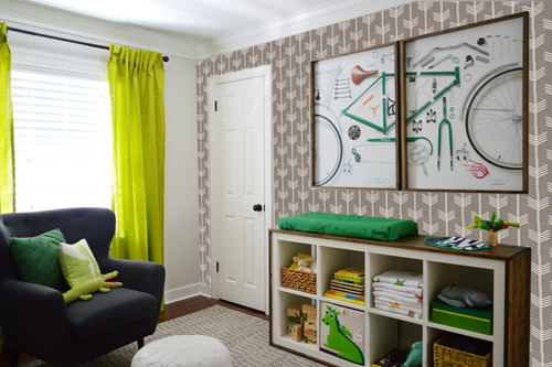
Ever since we imagined the idea of these built-ins, we pictured making the space between the two of them sort sort of accent – either with a color or pattern or treatment of some sort (in our first post we even mentioned a planked wall). Those ideas fizzled a little bit after completing the built-ins and realizing they had a lot of stuff on them (so we didn’t want to clutter up that space between them above the crib too). But neither of us could quite shake the idea of still doing an accent of sorts somewhere in the room. And one night while perusing possible wallpaper ideas for the showhouse, this puppy caught John’s eye.
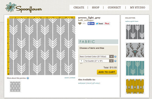
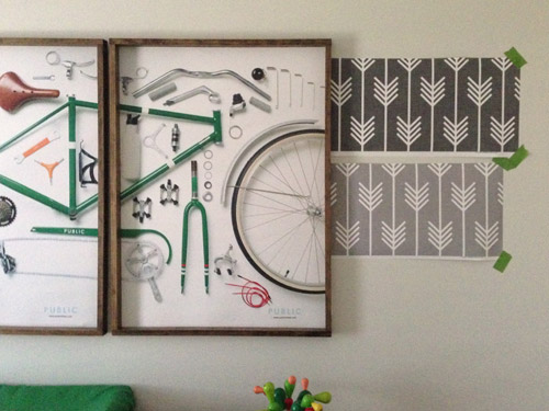
He went rogue and without even consulting yours truly (cue your outraged gasps) and ordered a sample of it and its darker counterpart, for $5 each. With tax and shipping it was $13 total. Thirteen bucks that would either earn him a sour look from me, or make him a hero.
Well, he got the sour look alright – not for the $13, but because I can still vividly remember the claw-hands I had from wallpaper peeling. The good news is that when he explained that Spoonflower wallpaper is removable, all was right with the world again. And I really liked the pattern too (it feels like something that could grow with the bun, and not be too fleeting or “young baby”). The hero part is still TBD though.
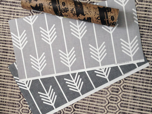
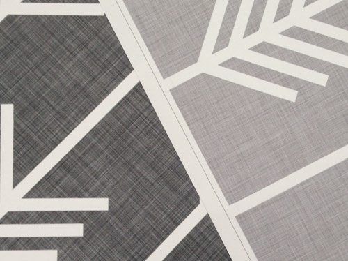
The samples arrived a couple of weeks later. They’re nice and big, and they revealed a detail that John hadn’t detected online: a subtle linen-like texture in the gray tones that I also thought was a nice touch.
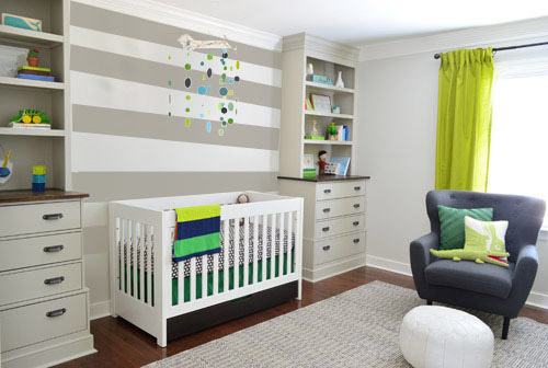
We ran upstairs to tape them up on the walls, just to get a feel for them in the room, and John went rogue again and put them on the wall with the bike prints. He must be getting braver (I think it’s the beard, guys). Since we’re both less tempted to mess with the look of the built-in wall, he said he thought that wall might be the answer instead. Forgive the terrible phone pic.
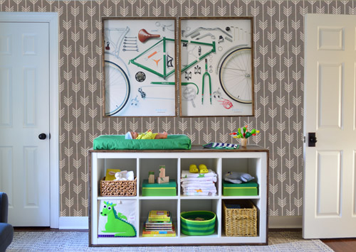
We snapped that with my iPhone so I could mock-up a full-wall version of the space in Photoshop. For those wondering how I did it, I just dragged the photo I shared above into Photoshop and laid it over another picture I took of (almost) the full wall. Then I just adjusted the size of the overlaid detail photo of the wallpaper until the patterns matched up and were the same size (I had the opacity of the top layer down a little so I could see when that happened).
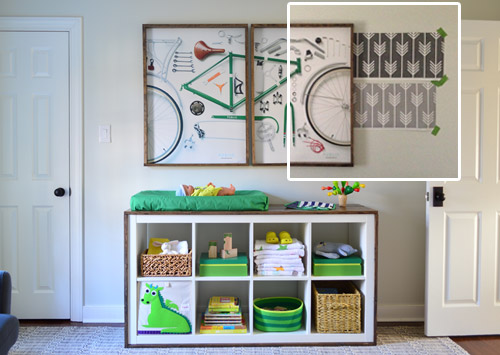
Once I knew the wallpaper pattern was the right scale, I put the opacity back up to 100% and cut out the rest of the iPhone pic so I was just left with a rectangle of wallpaper that I could manually tile until it filled the whole picture. Lastly, I cut out around the objects like the frames, doors, and the changing table (which were still in the image behind the tiled wallpaper) so as I deleted the wallpaper in front of them, it appeared to run behind them.
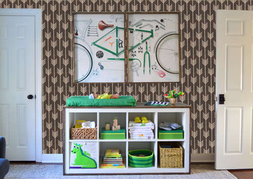
I also tried a version where I adjusted the color to look like the darker sample that John also ordered, but it was pretty clear to both of us that we preferred the lighter one.
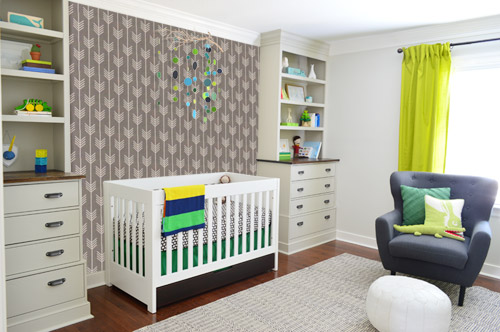
I thought it was a little hard to judge without seeing a plain wall meeting the accent wall to give it context, so I used the same technique to mock things up on this photo that I already had of the room. The colors probably aren’t perfect (the curtains look neon here), but it definitely helped us to picture everything – and it confirmed that the light version wouldn’t clash with the wall color or anything.
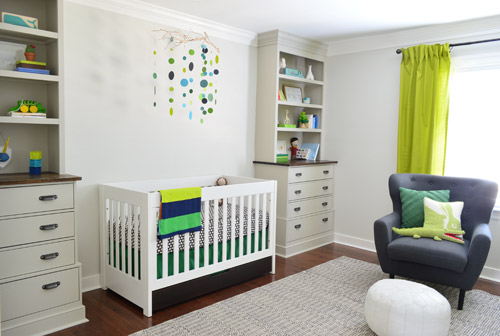
I still wasn’t convinced that was the right wall for an accent (I feared it might look too busy with the bike art in real life) so we also mocked it up on the crib wall to see if our original idea was better. We stared at it for a second, but I think we both prefer the bike wall. It just felt too crazy over the crib with all the items on the built-ins, the mobile, the patterned crib skirt, etc.
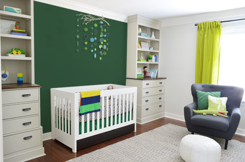
I also tossed some bold green up there just to see if a hit of that above the crib would be fun. It’s not great photoshop (looks pretty flat) but we didn’t really love it.
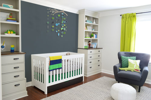
I also tried something sort of charcoal-ish to balance the chair out. This one made both of us do that “eh, not bad” face while staring at the computer. It looks kinda nice with the white crib and the mobile.
To add yet another possibility to the ring, a sweet reader named Annie had emailed us this quick mock-up she did with some chunky stripes painted behind the crib, which also gave us pause. You know we love a striped wall…
We’re still sort of letting things simmer, but we’d love to hear what you guys would do. Would you go for the wallpaper on the bike art wall? We like that it’s removable, so it’s not too much of a commitment. Do you prefer a solid wall of green or charcoal or even some stripes behind the crib? Or should we just stop being crazy and leave things the heck alone? Part of us is really excited to add one more layer of interest into the room (we’ve never put up wallpaper so that would be a new adventure – and most of the elements in here are really neutral). Then again, we still want this room to be a mixture of playful and cozy (as opposed to that’s-just-straight-up-crazy). What do you think?
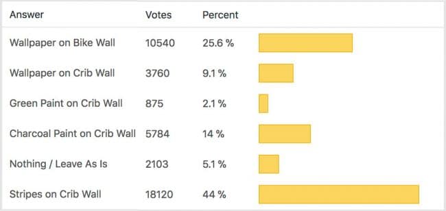
VOTING ON THIS POLL HAS CLOSED

Emily says
What about green or charcoal on the bike wall? I think a color would be great on there, but the wallpaper pattern is a bit busy with the bike prints and the changing table. A solid color would give an accent, but be less frenetic.
LibraDesignEye says
Here’s a completely new twist. The focus definitely wants to stay on the crib,but I definitely see the fun in this paper. What if you run the arrow wallpaper horizontally like the stripes on the crib wall? You get alignment with the horizontal shelves, pattern and focus where it belongs and the arrows won’t fight with the circles / branch. Guess I love the idea of barnacle getting to lay in bed and trace out arrows too . . . . but over on this wall, have to say I like the darker paper better because it picks up the chair tone and makes for a better contrast with the painted wood / paint colors.
Liz Cupcakes says
I like the wallpaper but I think it’s too ‘serious/mature’ for a nursery, maybe for when the bun is a little older. I like all the other options.
Susan says
Ever since I saw the wall between the bookshelves, I thought stripes would look cute there. I wish I had photo shop because I came up with an idea that might be fun … I’ll try to explain it, but no promises. What if you guys created a flat wooden bow tie to hang on the wall (but make it big!) and then paint the bow tie to look similar to a real tie. I’m picturing varying shades of green and/or gray/blue stripes at a diagonal. That would add a pop of color and stripes without overtaking the entire wall. If you look at Emily Henderson’s instagram feed, she just posted some wooden bow ties. Also, Ikea is selling the perfect green, brown, blue striped rug that you could use for color inspiration. Sorry this got so wordy! P.S. I voted for the wallpaper on the bike wall … I love that look!!
Desiree C. says
You guys, this is probably my favorite room you’ve done to date. The mix of wood tones with subtle grays and green accents is awesomesauce. I voted for the wallpaper behind the bike art, but I LOVE the stripes, too. My reasoning for voting for the wallpaper behind the bike art is because I feel like the built-ins, crib, and mobile provide a nice symmetry for that side of the room if you add the detailed wallpaper to the less-accessorized side of the room. However, you do have two doors on the bike art wall mimicking the same shape formation as your furniture pieces on the crib wall. They are both amazing options and now that I write all of this out (sorry), I think both options are great. You have a big decision to make! Good luck!
Kerry says
I just bought some upholstery fabric in this pattern (in the aqua color) to recover the seat of an awesome chair scored on Craigslist! Love it!
Kelly Goldman says
Please tell me it’s completely normal that I almost started crying when I saw you featured my project? Right? Normal? Thanks. For real.
Also, I LOVE the light grey on the bike frame wall.
YoungHouseLove says
You’re so sweet! Of course, Kelly!
xo
s
Stephanie says
I LOVE those Holli Zollinger prints at spoonflower… I’ve had my eye on that same print in fabric to make some crib sheets or a boppy cover for our son due in July.
I vote for arrows behind bike prints AND stripes on crib wall. Make it fun. Mix those patterns! :)
Susan says
Have you considered putting the wallpaper on the window wall? I think it would tie the two “busier” walls together. If not, I like the strips or plank ideas!
Becki @ The Uncommon Common Law says
Wallpaper on the bike wall! So good.
Kate says
Love the stripes! It’s an accent but it’s still really cohesive with the other 3 light colored walls. The horizontal lines also connect the built-ins to one another. I like the wallpaper design but I don’t think it connects well to the other elements of the room as an accent wall and it looks a bit busy.
Gillianne says
How about chunky stripes on the crib wall but with the lighter stripe being darker than the wall color, so you’re adding the pattern with less contrast–dark stripes with medium-intensity stripes that are darker than the other walls? Or even the reverse, with 2 light and subtle stripes?Am I making sense?) Frame the wallpaper sample and treat it as a mat and put something fun in the fame. Then, if you and John still sigh for the wallpaper, put it in the closet as a sweet surprise to you and the bun whenever that door’s opened. As if you didn’t have enough options, right? :)
Susan says
Have you considered papering the window wall? I think it might bring the two “busier” walls together. If not, I like the strips on the crib wall or planking!
Kateri says
Distressed stained planks on crib wall, slate/navy on the backs of bookshelves and possibly the same paint on closet door to balance things out. :)
Rachel says
I would do the bike wall, AND the crib wall! Love the wallpaper too:)
Kateri says
Oh and you could always frame the sample pieces to put on bookshelves and/or make a small frame gallery collage or to make a name banner or something.
Suzi says
Stripes all the way!
BrookeJ says
My vote is for “other”–what about wallpapering the window wall? To me, both sides of the room seem fairly balanced with the built ins/crib on one side and the doors/changing table on the other. Love the idea of walking into the room and seeing that wall with the green curtains popping infront of the wallpaper. BTW, that paper is super cute!
Alice says
Sorry if I’m repeating someone else’s suggestion, but when I first saw the mobile hanging over the crib, I thought of Clara’s rain drop wall and wondered what it would look like if her little bro had a spotted wall behind his crib, to compliment the mobile? Just thought I’d share! I like the wallpaper pattern and could see it working on the bike art wall, too! Regardless, I’m excited to see whatever you choose. : )
Gen says
I love all the options. Its gonna be tough for me to decide! But…is there a world where those arrows point UP?
YoungHouseLove says
Yes! There have also been votes for horizontally pointing! So many fun options. Thanks to everyone for sharing their thoughts and suggestions :)
xo
s
April says
Love both the light stripes behind the crib and the lighter wall paper on the other wall. With that closet door painted a bright green of course. So all three;)
Kristen says
Love the idea of keeping the wallpaper behind the bike wall and also doing the striped wall in a matching light gray behind the crib – BUT if you could rotate the wallpaper so the arrows are traveling horizontally (like the crib wall stripes), I think it would bring it all together more cohesively! :)
mads says
Thank you for explaining the Photoshop wallpaper process. I wonder how hard it will be to do on an angled wall.
Bea says
Let’s be honest. 9 times out of 10 wallpaper is a bad idea. It easily gets outdated, you get tired of looking at it, it’s a pain to remove. In theory, it looks great, but in reality…not so much
Kristi says
Oh my gosh, LOVE the stripes! Do that! I feel like the wallpaper would work if it were super-subtle, like, 10% gray with white arrows.
Raquel says
I love the stripes and I like the lighter colored wall paper on the bike wall, but I am unsure if both would be too much together.
heyruthie says
I voted stripes behind the crib because it just blew me away.
Then, take the two pieces of wallpaper and frame them in Ribba frames, and make a set of artwork to put on the wall somewhere in the room–to the left of the window, maybe? Stacked on top of each other? As “mats” for newborn photos of barnacle?
That $13 will make a nice accent piece for the room somewhere!
Anu says
How about decals..I love this company’s aesthetic:
http://www.wallsbymur.com/
the lady says
NO ON STRIPES–it has been done to death and is kind of over. The wallpaper is divine, and the look I love now is a printed wallpaper with art hung on the paper (did it in my dining room)-the bike art has enough white space to make it work, it’s a lovely layered look. NOT TOO BUSY that’s an old way of thinking. Wallpaper–way to go!
Erna says
Please please please get rid of the curtains,,, any of the wall options would work wonderfully, but those curtains (not just neon because of these pics) just look way too crazy, you need something not so….bright! I am a longtime reader so I am not trying to be snarky but those…really really are too bright, and if you’re readers really loved you, they wouldn’t jump all over me for saying so, because I love you guys too.
Maggie @ The Spiffy Company says
I’m actually loving the stripes. Of course I’m always a sucker for a striped wall but I think it’s a great way to add some visual interest without looking too busy.
On a side note, have you seen this video of these parents’ killer lip-syncing to Frozen’s Love is an Open Door? Immediately made me think of you guys…although I feel like Clara would be much more involved! :)
http://sploid.gizmodo.com/amazing-parents-perfectly-lip-sync-to-frozens-love-is-1542621446?utm_campaign=socialflow_gizmodo_facebook&utm_source=gizmodo_facebook&utm_medium=socialflow
YoungHouseLove says
So funny!
xo
s
Suzanne says
I really like the stripes. While I like the elements of the room (built ins, the wood wrapped expedit), I’m not crazy about the color scheme. Nothing about beige and neon green are especially “nursery” to me. But the stripes definitely give it some panache and make it seem more like the room for a baby, yet it is sophisticated enough that he won’t grow out of it by 3 years old.
Suzanne says
Oh, sorry I also meant to add, maybe put the wallpaper as backing to the built ins to give them a little more panache.
Susan B says
I like the arrow wallpaper but you had me at stripes on the wall! I vote those stripes on the wall behind the crib AND stripes on the bike print wall.
Amanda says
What about the wall with the curtain/chair? Stripe or wallpaper. It would draw you in.
Jes-ka says
Maybe I’m weird, but I think there is already a lot going on for both walls.
1) I would leave the bike wall alone. 2) I would paint the space between the builtins a shade of gray.
I think the darkness level depends on how it looks with some samples, but I think the wallpaper/stripes/green make it too busy right there. The mobile adds a nice bit of color that is balanced by the items inside the builtins, so a different shade of gray (possibly in the family of the chair or maybe the crib sheets) would give the middle section the ability to stand out without competing with the lovely greens of the mobile/builtin items.
I hope that makes sense. :D
Nikki Olson says
Two words…REMOVABLE WALLPAPER.
Check out chasingpaper.com (I love the WILD print) or there are a lot of options on etsy.
It is seriously easy to remove and put up!
YoungHouseLove says
Thanks Nikki! This stuff from Spoonflower is removable too! So excited about cool options like that now a days!
xo
s
Robyn says
Just a question about what you ordered. Did you order the decals as your “swatch” to order the wallpaper later? Are they the same material with the decal just being smaller in size and sticky? I don’t see an option for ordering samples.
YoungHouseLove says
We got the wallpaper sample. It was a dropdown menu so we just selected that. Maybe it’s being glitchy now? Anyone have tips for Robyn?
xo
s
Carly says
It is possible to turn the wallpaper around? Making the arrows go upward? Especially if you’re adding crown molding, it may draw the eyes upward.
Rhonda says
The bold stripes on the crib wall will be visually stimulating for the babe. Great for brain development!
Kathy says
I know you want to feel done with your list of to-do items before the baby comes, but maybe you want to take a deep breath and have a cup of tea before you tackle this. I like the white space on the walls. Once the baby is born, you may have a sudden inspiration for what you want to put there, so give yourselves some time to let it all flow naturally. Maybe a huge photo of the sunrise on the day he’s born, or of the sun through a gorgeous green tree leafing out in the spring, just as he’s joining your world. What does Clara say about the room? She’s weighed in on other things already. She might have your best answer. Remember that he won’t appreciate what you’re doing for a long time, so it’s going to be what you love to have around you when you’re in the room with him. There’s a beautiful photo journal called “On the Day You Were Born” that might inspire you. Best wishes!!
Betsy says
I love the light wallpaper on the bike print wall, but I feel like it needs something to tie it over to the other side of the room. What about lining the backs of the built-ins with it, so that there’s a hint of it on that side too? That would leave the space directly behind the crib open so as to not look too busy.
Sam says
It should be curtains for those curtains!
Tammy says
Being a fan of simple modern design, I have to say that I think it will be too busy with wallpaper or stripes. Huge fan of the charcoal wall though. I think it ties in the chair too.
Evie says
Sherry, I haven’t decided what I like best yet (love them all at this point!), but I wanted to suggest you make the closet door green in your photoshop pics. You’ve been talking about painting that door…an idea I love, especially since Clara’s door is painted!
Emily says
I’m not sure if this has been suggested but I like the idea of leaving the crib wall as is and painting stripes on the bike art wall!
Sylvia says
I think wallpaper on the bike wall, and then maybe color match the gray in the wallpaper and paint that solid color between the built ins to balance out the wallpaper!
Paula says
Well since you asked….I hate anything on the bike wall. That artwork is busy enough all alone. In fact, my biggest problem is I don’t even like that bike art. It looked better in your last house. Remember you did ask. I voted for the wall paper on the crib wall
Kelsee says
I personally loved the stripes for the nursery. I think you should do a mock up with the stripes on both the built in wall and the bike wall. Since they are opposite walls they may compliment each other.
I do love the wall paper! I think you should definitely use it somewhere in the house. But I think the stripes fit this space better.
Katie says
I think you should do the dark gray above the crib, but make it chalkboard paint. Even if you write noting on it now, when baby outgrows the crib, it will be super fun and useful. Perhaps now you. Old write love notes to ttHe baby or have everyone who visits the new baby leave a love note or a hope or blessing for the baby as a visual guest book and an uplifting boost for you on those no-sleep or everyone is sick or teething days.
Lisa P. says
I didn’t read all the comments so someone may have already suggested this….how about wallpaper on the window wall?
I feel like the busyness of the wallpaper competes with the bike artwork.