I know it sounds kinda crazy, but after painstakingly removing five different wallpapers from this house… we’re considering putting some up. I think I even passively mentioned it in this post about the nursery mobile.
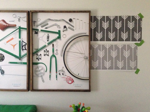
Ever since we imagined the idea of these built-ins, we pictured making the space between the two of them sort sort of accent – either with a color or pattern or treatment of some sort (in our first post we even mentioned a planked wall). Those ideas fizzled a little bit after completing the built-ins and realizing they had a lot of stuff on them (so we didn’t want to clutter up that space between them above the crib too). But neither of us could quite shake the idea of still doing an accent of sorts somewhere in the room. And one night while perusing possible wallpaper ideas for the showhouse, this puppy caught John’s eye.
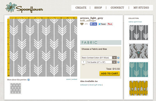
He went rogue and without even consulting yours truly (cue your outraged gasps) and ordered a sample of it and its darker counterpart, for $5 each. With tax and shipping it was $13 total. Thirteen bucks that would either earn him a sour look from me, or make him a hero.
Well, he got the sour look alright – not for the $13, but because I can still vividly remember the claw-hands I had from wallpaper peeling. The good news is that when he explained that Spoonflower wallpaper is removable, all was right with the world again. And I really liked the pattern too (it feels like something that could grow with the bun, and not be too fleeting or “young baby”). The hero part is still TBD though.
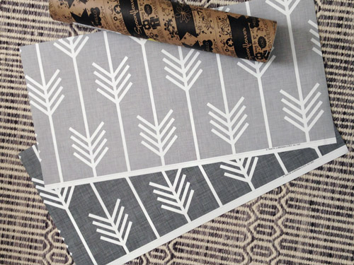
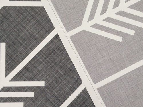
The samples arrived a couple of weeks later. They’re nice and big, and they revealed a detail that John hadn’t detected online: a subtle linen-like texture in the gray tones that I also thought was a nice touch.
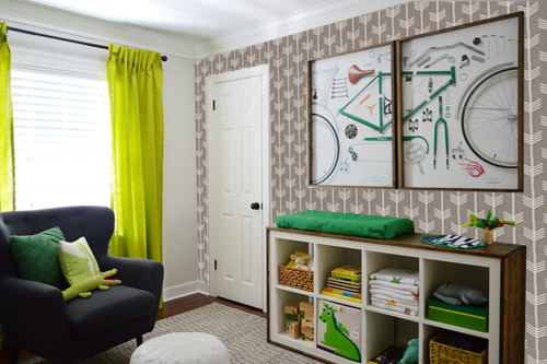
We ran upstairs to tape them up on the walls, just to get a feel for them in the room, and John went rogue again and put them on the wall with the bike prints. He must be getting braver (I think it’s the beard, guys). Since we’re both less tempted to mess with the look of the built-in wall, he said he thought that wall might be the answer instead. Forgive the terrible phone pic.
We snapped that with my iPhone so I could mock-up a full-wall version of the space in Photoshop. For those wondering how I did it, I just dragged the photo I shared above into Photoshop and laid it over another picture I took of (almost) the full wall. Then I just adjusted the size of the overlaid detail photo of the wallpaper until the patterns matched up and were the same size (I had the opacity of the top layer down a little so I could see when that happened).
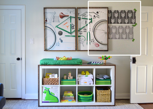
Once I knew the wallpaper pattern was the right scale, I put the opacity back up to 100% and cut out the rest of the iPhone pic so I was just left with a rectangle of wallpaper that I could manually tile until it filled the whole picture. Lastly, I cut out around the objects like the frames, doors, and the changing table (which were still in the image behind the tiled wallpaper) so as I deleted the wallpaper in front of them, it appeared to run behind them.
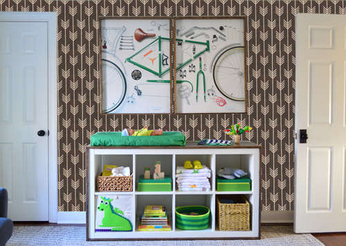
I also tried a version where I adjusted the color to look like the darker sample that John also ordered, but it was pretty clear to both of us that we preferred the lighter one.
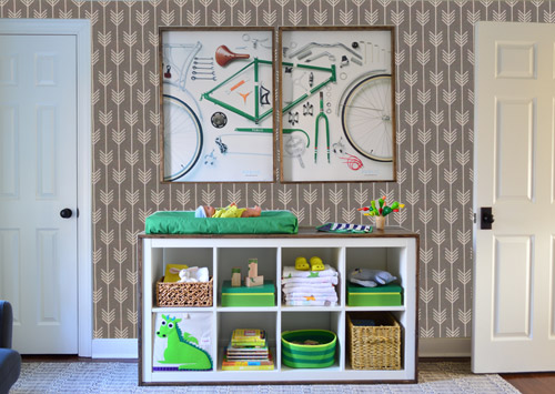
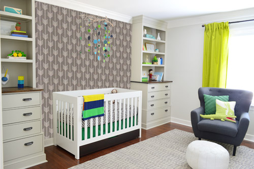
I thought it was a little hard to judge without seeing a plain wall meeting the accent wall to give it context, so I used the same technique to mock things up on this photo that I already had of the room. The colors probably aren’t perfect (the curtains look neon here), but it definitely helped us to picture everything – and it confirmed that the light version wouldn’t clash with the wall color or anything.
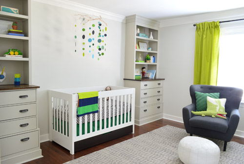
I still wasn’t convinced that was the right wall for an accent (I feared it might look too busy with the bike art in real life) so we also mocked it up on the crib wall to see if our original idea was better. We stared at it for a second, but I think we both prefer the bike wall. It just felt too crazy over the crib with all the items on the built-ins, the mobile, the patterned crib skirt, etc.
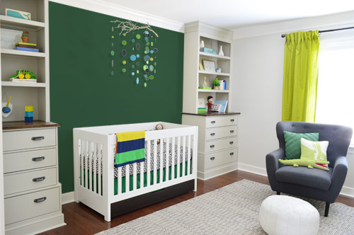
I also tossed some bold green up there just to see if a hit of that above the crib would be fun. It’s not great photoshop (looks pretty flat) but we didn’t really love it.
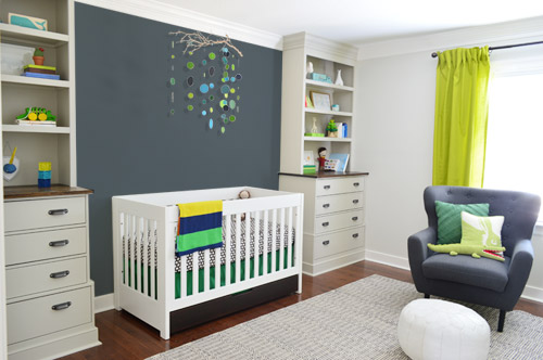
I also tried something sort of charcoal-ish to balance the chair out. This one made both of us do that “eh, not bad” face while staring at the computer. It looks kinda nice with the white crib and the mobile.
To add yet another possibility to the ring, a sweet reader named Annie had emailed us this quick mock-up she did with some chunky stripes painted behind the crib, which also gave us pause. You know we love a striped wall…
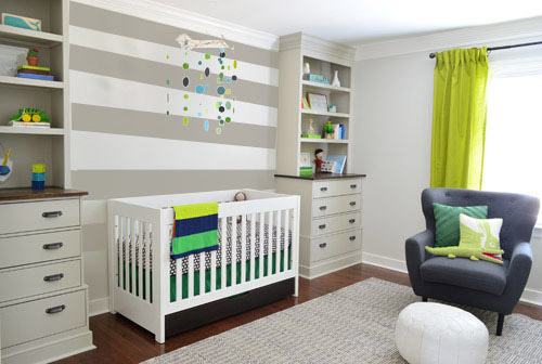
We’re still sort of letting things simmer, but we’d love to hear what you guys would do. Would you go for the wallpaper on the bike art wall? We like that it’s removable, so it’s not too much of a commitment. Do you prefer a solid wall of green or charcoal or even some stripes behind the crib? Or should we just stop being crazy and leave things the heck alone? Part of us is really excited to add one more layer of interest into the room (we’ve never put up wallpaper so that would be a new adventure – and most of the elements in here are really neutral). Then again, we still want this room to be a mixture of playful and cozy (as opposed to that’s-just-straight-up-crazy). What do you think?
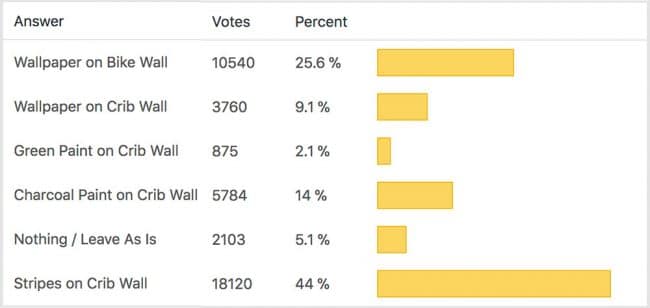
VOTING ON THIS POLL HAS CLOSED

Bethany says
I like the stripes behind the crib. I feel like that wall still needs SOMETHING but the wallpaper was too busy. I think the other solid colors, like the green or charcoal, still look a little plain. Like the wall would still need some hanging art or something (but it looks like the mobile would be too compete-y with any art above the crib). Can’t wait to see where you end up!
Lorelei says
What about painting large arrows on the crib wall? They would mimic the arrows on the opposite wall but on a much larger scale.
Joe says
Wallpaper is dope but the stripes make the mobile pop. Looks really good.
Michelle says
Wallpaper on the bike wall with the charcoal-blue color on the crib wall for balance!
Erin {Home Everyday} says
So many options. Honestly, I like them all, but the stripes are my favorite. I just added stripes to a bathroom not that long ago, and I love them and I know if I get sick of them I can just paint over them. The reason I didn’t choose the wallpaper even though it is so cute is because I feel like I wouldn’t want to use up my wallpaper card in the nursery. I feel like wallpaper is like a one time shot thing (maybe twice) in a house. You cannot use too much and if I was going to go through and use it I would like to use it in a room where a lot of people would see it. If that makes sense.
Cloe says
Hi guys!
I have a question about the link to the Spoonflower website… The link you included in your post brings me to the fabric option of the arrow design. I’m sure you purchased a sample of the wallpaper but I noticed they also have decals with the same design (and you said it was removable) so I’m just curious if you purchased the actual “wallpaper” sample or the “decal” sample or even a “fabric” sample (since that’s where the link brings me to). I’m definitely considering ordering some – thanks for sharing!
YoungHouseLove says
Sorry, we got the wallpaper (not the decal or fabric). It’s a dropdown menu, so you select which type you want :)
xo
s
Amber says
Here’s a crazy thought….what about the ceiling? Barnacle might love looking at it.
Christiane says
What about paint behind the crib AND wallpaper behind bike frame?
I am OBSESSED with the wallpaper behind the bike frame. At first glance, I liked the darker print, but then when you showed them… ahhh, that light one! LOVE IT!
But if you’re only choosing one, then I say paint behind the crib. Everytime I see it, I love it, but it looks incomplete. That big white wall needs something. The mobile is too small, but I agree with what you said a few weeks back that it’s the perfect size for the mobile so it doesn’t need to grow, but it does need something. The stripes are too much IMO. I love me some paint stripes, but with your cutie dot mobile it got too busy looking. When you guys showed even the Kelly green that you hated I gasped because I liked it. I think you hit the nail on the head with a plain color (like the charcoal that you guys liked) behind the crib. When I see those pictures, the room then looks complete.
However, like I said, I’m also obsessed with John’s foray into wallpaper and if it were me I’d seriously consider charcoal behind the crib AND the fun wallpaper on the other side of the room.
:)
Jenn Rush says
I absolutely love that wallpaper! But I agree with some of the other comments, that it looks too busy with the bike art. The bike art is so graphic, and so gorgeous! But it’s really lost on that wallpaper.
As for the crib wall, I voted stripes! I love the mobile, but it seems like it’s way too small scale (at least in the pictures) and the wall looks so sad and bare.
I can’t wait to hear/see what you guys do!
Leslie says
This is not really on the list of options, but what about the wall with the window on it? When you have a very bold or busy pattern, putting it on a wall that has very little exposed wall space keeps the pattern from being too overwhelming. It also makes you window and curtains really pop.
BTW, I want that wooden cactus, and I dont even have a kid! :)
Vivian Foster says
Let me just throw a wrench in the whole deal! I noticed that the wallpaper also had an animal head version … What???!!! I would put that on the crib wall and the lighter arrow one on the changing table wall and then call that room “cooked”.
Removeable wallpaper is awesome and not your grandma’s nightmare to remove.
I do think the room needs one more layer so whatever you decide will be the bomb.
Thanks for letting us chime in with our opinions ….
Lulu Chin says
Well…. actually I think the one wall without a lot going on is the one with windows. What about having a huge wall with the wallpaper (which is great stuff)? The crib wall has a lot going on. The bike art wall has a lot going on. The one in the middle might tie everything together. Could you mock that up and let us see that?
YoungHouseLove says
We’ll definitely try that wall too. With the off-center window and the built-ins cutting in on the left we thought it might not be ideal as an accent – but you never know!
xo
s
Koliti says
How about if you decide how to accent the built-in wall FIRST since this is the main focal point of the room with the baby and is the “headboard” area? Something that is interesting and that will compliment your gorgeous mobile. Then after you have the built-in wall done see what else might be needed to coordinate with it on the bike-art wall.
Tricia K. says
I tried to check all that applied as suggested, but it just wasn’t working for me. I actually think it would look great if you do the light colored wall paper on the bike wall, and also do the stripes above the crib, perhaps with the green instead to add more color. Just a thought. But I like kind of complicated! We are expecting a baby girl in May, and I made my husband (much to his chagrin paint a polka dotted wall) I think he has finally forgiven me for this horrible task! I can’t wait to see what you guys choose!
Rebecca | the lil house that could says
Hm I’m going to go with the write in vote of solid navy on the crib wall :)I’ve mentioned this before, but I think it would look great with the white & brown crib, green skirt, built-ins and other 4 walls!
Rebecca | the lil house that could says
Though I should add that the charcoal looks sort of blue-ish on my monitor so I like that too!
Jenn says
That wallpaper is fabulous!! But my hesitation with wallpaper has always been with VOCs in the adhesive. I know you guys are very eco-friendly, so may have already looked into this. I’ love to figure out a “green” way to use wallpaper. :)
YoungHouseLove says
This wallpaper is “just add water to stick it up” so it’s a lot less fumey than adding harcore glue or adhesives (I think because it’s removable it’s more like a water-based backing that gets soft when wet to stick and then can be peeled off, unlike a real glue or epoxy). They say it’s eco-friendly, durable, and that they use PVC-free paper.
xo
s
Jenn says
That’s awesome!! Totally going to be checking out their products now :)
Amanda says
I like, and voted for, the green wall behind the crib, but I think it would only really make sense if you swapped out the curtains & made sure the crib skirt, curtains, paint & changing pad cover were all the same shade of green. I love the idea of a green accent wall to tie the room together, but it doesn’t work with all those competing shades of green.
Willo says
I like the idea of the charcoal-ish color on the crib wall but as the stripped version and not a solid wall. I think it would complement all of the colors and textures already in play in the nursery. I like the wall paper a lot but don’t like how it mixes with the greens. Whatever you do, do what you like!!
Anne says
Although I like the wallpaper behind the cot, I’m surprised no one has mentioned that your son might love pulling it off the wall when he’s a bit bigger… I have a few friends whose children ended up having their cot in the middle of the room…
For this reason I would go with the stripes! And they look cool!!
Thais says
Oh this is true! My daughter’s room in our previous house had a lovely wallpapered accent wall where her cot and then toddler bed rested. Even though the wallpaper was very well installed, she managed to peel a seam and rip a massive chunk. And in her defense she has never been a child who likes to “destroy” things, like drawing on the walls. I guess it is just normal toddler curiosity.
Heather says
I love the lighter wall paper on the crib wall. I think having a slightly darker sleeping area will be so cozy for him (the light colours and bright greens give the rest on the room that playful feeling). Especially with the linen texture. I can see it being a little bit like Clara’s canopy, if you know what I mean?
Personally, I think with the darker gray and green items in the rest of the room, the striped accent wall won’t be the accent that you’re looking for. I think it’s also going merge with the stripes that you’ve kind of got going on in that space already (horizontal built-ins and vertical crib bars) and overall it’ll feel a bit blah.
karen says
i like the light wall paper out of those options.
this would look cool, maybe with more of a grey stain…so tone on tone:
http://www.pinterest.com/pin/284993482643754106/
and, prob not your style but i am a sucker for checks:
http://www.pinterest.com/pin/284993482643137498/
Tessa says
I LOVE that wallpaper… but it feels a bit busy to me on the bike wall – the art has a lot of pieces + the open storage of the Expedit. I voted for the stripes, but I hope you find the right spot for that wallpaper! Maybe their bathroom? Or did you try a mock-up of the window wall?
YoungHouseLove says
I chatted about the window wall on the second page of comments (I think) – we’ll have to try mocking it up but since the window is off-center and the built-ins cut into the left side (making it asymmetrical and not even a full rectangle) we didn’t know if it made for the best accent). We could totally change our minds though, so we’ll give it a spin!
xo
s
Jessica says
I love the wallpaper but I personally think it is too much on the bike wall and behind the crib. I do think it would look awesome on the wall with the windows. I think with the curtain color and chair color it would be beautiful. Not to crazy cluttered but still have that fun element in the room.
liz @ btb on etsy says
I’m torn between the charcoal and stripes. The charcoal works perfectly with the chair, but the stripes add whimsy.
Manda Wolf says
I voted Stripes on Crib Wall. I am a big sucker for horizontal stripes. It might look cool do to it on the crib wall and the bike art wall (they are across from each other right?). I think the paint idea is better so it isn’t an issue to change it up several times as he grows and it into differant things.
Amanda M. says
I like the wall paper on the bike wall, but I also like the look of something on the crib wall. Doing both with either the charcoal or the stripes above the crib would look really nice.
Sarah says
Definitely stripes behind crib, and I love the wallpaper behind the changing table, too. Hard to tell if that would be too much for the room, but I’d love to see you do both!
Kelly says
The stripes seem to tie-in the shelves on built-ins… they could be aligned to the be same spacing as the shelves to really pull that wall together as one piece?
Deidra says
Stripes! They just make the white pop!
Ammie says
Hi! Out of curiosity, what does the wall directly to the left of the door look like (I guess technically it’d be the wall that has the door on it)? We see the right wall w/changing table, the wall straight across with windows, and the wall on the left with the crib/built-ins. I was just thinking maybe you could use that wall as your accent wall without busying up another space (although I do love the stripes on the crib wall!).
YoungHouseLove says
The wall with the door just has the door to the room on the left as you face it and the built-ins cutting into it on the right – so there’s not much room for a lot – maybe just some small art or a little toy/play area.
xo
s
amanda says
Wallpaper on bike wall AND stripes on crib wall!
Lindsay says
I like the idea of the stripe behind the crib, but wondered how it would look if the stripes were two gray tones as opposed to the gray and white? Still adds interest, but less contrast and allows the crib to be the star.
Debra says
I love the look of the charcoal on the crib wall. It makes the colors in everything else come to life. What about using charcoal chalkboard paint? It could just look like a charcoal colored wall for now, but could be a fun place for him to draw and be creative as he grows. And I love the wallpaper but agree about it being a bit busy and competitive with the other visual details you have going on. What about using the wallpaper inside the closet, for a bit of fun in there? Or even on the closet door? Hmmm..
Suzanne says
I LOVE the darker wall paper on the bike wall. Did I say LOVE because I really really do!!
Jessica says
What if you did a mirror over his crib? Didn’t you do that with Clara? Then it could reflect the mobile, plus whatever you do on the other side without getting crazy busy. I agree with a lot of people that both walls need something to feel more balanced, but it seems like you guys want to do one or the other. So maybe a mirror would be a nice compromise..? Or maybe some more curtains, hanging between the built ins, around the crib? Kind of like how you guys did in your master in the first house? It could add some pretty texture and balance things without taking all the attention.
Tara says
LOVE the stripes on the crib wall. I think it’s just enough accent without going over the top. While the wallpaper is nice, I think it adds to much busyness to the nursery and the space is more calming the way it is. Maybe keep it in mind for when the bun is older and you’re transitioning it into a little boys room? Or, as somebody else suggested, use it in the closet for a nice little accent.
Lauren says
Can I vote for none of the above? I think you need some texture behind the crib, not pattern. Something like a linen or grass cloth wallpaper, or a planked wall. It’s too busy with pattern, but it does need something. Just my opinion :)
Sara says
My vote could be for stripes on the bike wall! I love the stripes but think they would balance better on the bike wall.
Heather says
Hi Guys!
I like adding wallpaper into a room… It adds a layer of
texture that just paint can’t do! (speaking from personal experience here;)
I would suggest doing the paper on the bike art wall and painting in between the built ins a little bit darker gray than the wall paint to give a little more depth behind the crib … Just a suggestion:} Have fun with the new baby!
-Heather
Sarah says
I love that wallpaper, and have also admired the prints from that shop on spoonflower, BUT I don’t think it’s working for this. It’s overkill. I like the big bold stripes behind the crib or nothing at all. Maybe you could buy a few yards of the pattern as fabric, and find another way to work it in. Maybe accent pillows, blankies, some little storage pouches, I dunno. Make it be a small touch that adds depth to what you’ve already got going on, rather than camouflage all of your efforts with that bold print. I’m sure you guys will make it work, however you go!
Jaime says
I’d do the dark paint behind the crib, since the built-ins are crazy busy. Maybe the stripes on the bike art wall, but I’d probably just leave that alone. No offense to John, but I hate that wallpaper. Lol
Jess says
I love that wallpaper…just not on either of the walls you mentioned. It seems much to busy for both the built-in wall and the bike art wall. Maybe the wall with the window would be a good location?
I absolutely love the stripes! That rendering looks great!
Good luck with your decision! I’m sure it’s just as challenging as it is fun!
Hannah says
Just to be different, how about another colored door like in Clara’s room? Or maybe a striped or wallpapered door? Or maybe that would be the ugliest thing ever? Haha. Can’t wait to see what you decide!
YoungHouseLove says
Love all the ideas guys! Thanks for chiming in!
xo
s
Audrey says
I love the stripes on the crib wall option. When I was scrolling through the post I was looking at all the options thinking “they all look pretty good how would I choose” but as soon as I got to the stripe wall it was a no brainer. I would choose that option without hesitation. PlusI think the wallpaper looks a bit busy with the bike prints. Also I think with the built-ins you already made the crib wall the “feature” of the nursery. I think its better to stick with making that wall the focus rather than splitting the focus by making the opposite wall the “feature”.
Wendy says
Love the wallpaper! I vote for down arrows. It feels more natural and goes with gravity. Up arrows, in my opinion, would feel forced. What about a darker gray in the back of the built-ins? You can always fill the space behind the crib with a photo wall once the mobile is down or make a patterned headboard when the bun is older. It’s fun watching the progress!
Jess says
Huzzah to the wallpaper!! Holli Zollinger is one of my absolute favorite fabric designers and I’ve bought several of her fabrics on Spoonflower for throw pillows… I’ve been toying with the idea of some of her wallpaper for a while. So I vote a resounding YES for the wallpaper, no matter where you decide to put it :-)
Debbie says
If you do the arrow wallpaper, I would vote for a wall color that is similar to the wallpaper. It’s a small room for different wall colors. Love the different options, the stripes option may be overdone in the blog world. But if you love them it does not matter.
Courtney says
You should have allowed for more than one vote! I think stripes between the built ins and wallpaper on the opposite wall.
YoungHouseLove says
We actually had the poll set to allow more than one vote (see the first page of comments) but it wasn’t working, so we had to set it on one entry only. Boo!
xo
s
Kim says
I would have definitely voted for charcoal paint by the crib AND wallpaper by the bike frames if I could have :) I think that would look awesome!
Ally says
I’d do the wallpaper on the bike wall…but I do agree it leaves the crib wall somewhat bare. So I suggest painting the crib wall a solid gray the same color or a shade lighter than the wallpaper to balance it out. Any way you go will be great! I love the choices you’ve made so far! :)