I know it sounds kinda crazy, but after painstakingly removing five different wallpapers from this house… we’re considering putting some up. I think I even passively mentioned it in this post about the nursery mobile.
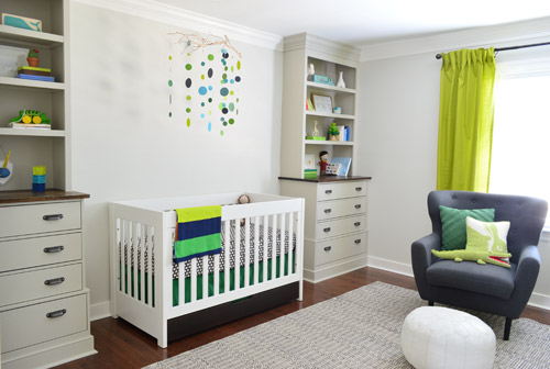
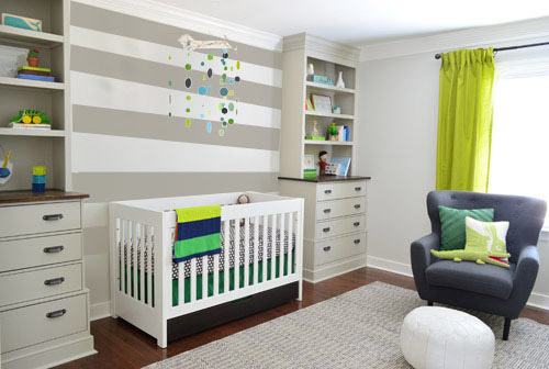
Ever since we imagined the idea of these built-ins, we pictured making the space between the two of them sort sort of accent – either with a color or pattern or treatment of some sort (in our first post we even mentioned a planked wall). Those ideas fizzled a little bit after completing the built-ins and realizing they had a lot of stuff on them (so we didn’t want to clutter up that space between them above the crib too). But neither of us could quite shake the idea of still doing an accent of sorts somewhere in the room. And one night while perusing possible wallpaper ideas for the showhouse, this puppy caught John’s eye.
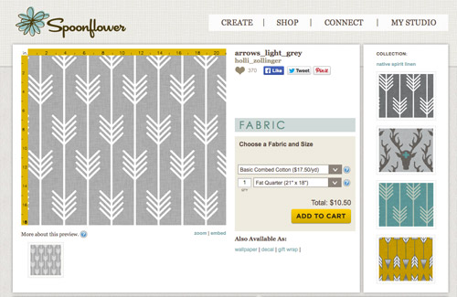
He went rogue and without even consulting yours truly (cue your outraged gasps) and ordered a sample of it and its darker counterpart, for $5 each. With tax and shipping it was $13 total. Thirteen bucks that would either earn him a sour look from me, or make him a hero.
Well, he got the sour look alright – not for the $13, but because I can still vividly remember the claw-hands I had from wallpaper peeling. The good news is that when he explained that Spoonflower wallpaper is removable, all was right with the world again. And I really liked the pattern too (it feels like something that could grow with the bun, and not be too fleeting or “young baby”). The hero part is still TBD though.
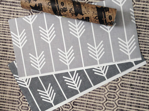
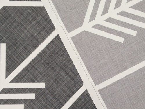
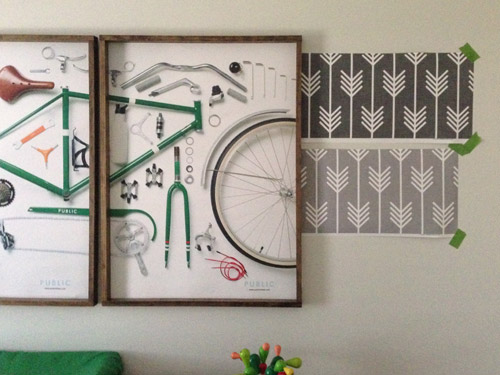
The samples arrived a couple of weeks later. They’re nice and big, and they revealed a detail that John hadn’t detected online: a subtle linen-like texture in the gray tones that I also thought was a nice touch.
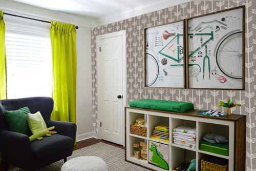
We ran upstairs to tape them up on the walls, just to get a feel for them in the room, and John went rogue again and put them on the wall with the bike prints. He must be getting braver (I think it’s the beard, guys). Since we’re both less tempted to mess with the look of the built-in wall, he said he thought that wall might be the answer instead. Forgive the terrible phone pic.
We snapped that with my iPhone so I could mock-up a full-wall version of the space in Photoshop. For those wondering how I did it, I just dragged the photo I shared above into Photoshop and laid it over another picture I took of (almost) the full wall. Then I just adjusted the size of the overlaid detail photo of the wallpaper until the patterns matched up and were the same size (I had the opacity of the top layer down a little so I could see when that happened).
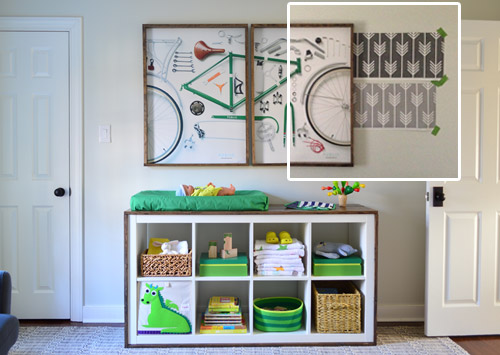
Once I knew the wallpaper pattern was the right scale, I put the opacity back up to 100% and cut out the rest of the iPhone pic so I was just left with a rectangle of wallpaper that I could manually tile until it filled the whole picture. Lastly, I cut out around the objects like the frames, doors, and the changing table (which were still in the image behind the tiled wallpaper) so as I deleted the wallpaper in front of them, it appeared to run behind them.
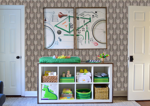
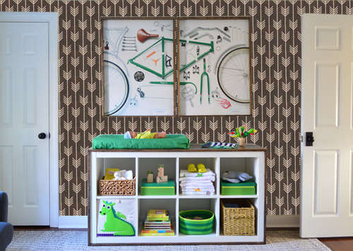
I also tried a version where I adjusted the color to look like the darker sample that John also ordered, but it was pretty clear to both of us that we preferred the lighter one.
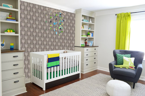
I thought it was a little hard to judge without seeing a plain wall meeting the accent wall to give it context, so I used the same technique to mock things up on this photo that I already had of the room. The colors probably aren’t perfect (the curtains look neon here), but it definitely helped us to picture everything – and it confirmed that the light version wouldn’t clash with the wall color or anything.
I still wasn’t convinced that was the right wall for an accent (I feared it might look too busy with the bike art in real life) so we also mocked it up on the crib wall to see if our original idea was better. We stared at it for a second, but I think we both prefer the bike wall. It just felt too crazy over the crib with all the items on the built-ins, the mobile, the patterned crib skirt, etc.
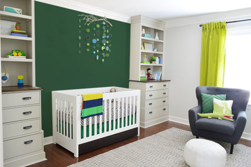
I also tossed some bold green up there just to see if a hit of that above the crib would be fun. It’s not great photoshop (looks pretty flat) but we didn’t really love it.
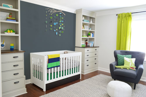
I also tried something sort of charcoal-ish to balance the chair out. This one made both of us do that “eh, not bad” face while staring at the computer. It looks kinda nice with the white crib and the mobile.
To add yet another possibility to the ring, a sweet reader named Annie had emailed us this quick mock-up she did with some chunky stripes painted behind the crib, which also gave us pause. You know we love a striped wall…
We’re still sort of letting things simmer, but we’d love to hear what you guys would do. Would you go for the wallpaper on the bike art wall? We like that it’s removable, so it’s not too much of a commitment. Do you prefer a solid wall of green or charcoal or even some stripes behind the crib? Or should we just stop being crazy and leave things the heck alone? Part of us is really excited to add one more layer of interest into the room (we’ve never put up wallpaper so that would be a new adventure – and most of the elements in here are really neutral). Then again, we still want this room to be a mixture of playful and cozy (as opposed to that’s-just-straight-up-crazy). What do you think?
VOTING ON THIS POLL HAS CLOSED


Pippa says
I love the idea of making the bike wall a bit more lively. Have you considered stencils rather than wallpaper? Same effect, but easier to remove!! When I saw that wallpaper I immediately thought of this Scandinavian stencil shop on Etsy, which I love:
https://www.etsy.com/uk/shop/StenCilit
eclaire says
Consider that if you plank the wall and paint it white or the same color as the wall, you’ll create some visual interest, “texture”, a neutral background for future “hangings” of pictures, collections, etc. It will also give you flexibility to change and grow with your boy as he grows/matures/ and his interests change. Everything thus far is stellar and is a visual treat.
Jessica says
I think both walls need an accent, maybe the arrows on the bike wall and something subtle on the crib wall. Side note, I really feel like the bike prints needs to be spaced just an inch or two farther apart, and the mobile a little lower. The pictures make me feel like I’m four feet tall looking up, ha!
Amy S says
My vote is totally for the wallpaper on the bike art wall. I DO love the stripes behind the crib, but really feel that the wallpaper on the bike art wall lends the space some warmth and masculinity that a baby Bun needs! Good luck!
Amy @ southernclassysassy.blogspot.com/
Erin says
I love the thought of adding more of that green, but I do love that wallpaper too. It’s hard to decide I’m sure. We do have a fern (yellow/orange tree) wallpaper in our nursery but I used it on our window wall which is like yours, opposite the door.
What would green stripes look like above the crib? That was my other thought. I think if you did the gray stripes it may look nice to do them on the bike wall too.
Allison says
I think that the darker color arrow print actually looks better on my side of the screen. Here’s why:
– It picks up the warm brown in the bike seat
-it picks up the warm brown in the floor
– it picks uo the warm brown on the bookcases and the Ikea piece
Also, the graphic impact will be awesome for the baby to look at from the crib!
As to the empty, unbalanced feeling over the crib I actually think that a larger scale mobile is needed (which crushes me to say because I love the sweet DIY you did!). But if the mobile had more visual weight I don’t think a print on that wall would be necessary. Or the opposite could be true as well. No mobile and a print would work.
Jude says
A random thought here, but would the arrows do better to be facing up, shooting upward instead of down to the ground?
YoungHouseLove says
There were actually a bunch of votes for that! It would be more optimistic I think. Thanks to everyone for the ideas and suggestions!
xo
s
Sum says
Hi I don’t often comment but honestly and honestly? I kept thinking about this nursery and wanting to give u my opinion on it but I didn’t feel comfortable – however since u actually asked I would live to add my suggestion – I love all what u have done but I do feel its a bit TOO matchy-matchy have u thought about having one or two random colors thrown in there somewhere … I don’t know right now it’s so matchy – sorry cant get a better word. I LOVE Clara’s room it’s my fav and I think u guys really have a knack for children’s decor/toys/ kid stuff in general- and love that her room has a colour scheme without being too matchy there goes that word again! Lol xxx
Brittany Springle says
If you guys end up going with the arrows, I saw a changing pad cover on Etsy with matching fabric. It might be too matchy-matchy depending on where you put the wallpaper. It was cute though.
Kathleen says
I haven’t seen if someone already said this (so I’m sorry if this is redundant), but I was wondering if it’s possible to get a photo angle where you can see the crib wall and the bike wall in the same picture? It might make it easier to tell which idea or idea combination looks too busy and which one’s perfect. Any one of those options will be great, though!
YoungHouseLove says
Here’s an older shot of that angle – it’s from before we added the changing table/toy cubby, but we hope it helps to show the whole room :)
xo
s
Mia says
Instead of grey & white stripes – same concept but a white & grey chevron
Jolene says
Just thinking… when it comes time to ditch the mobile, the crib wall might be a good spot for some large scale art. For this reason I’d keep the wallpaper on the bike art wall. As others have suggested, a matching grey on the crib wall will tie the whole room together but still leave plenty of options for when you take out the crib and mobile. Love the room, and all the layers you’re putting into it!
Kristin says
I vote wallpaper on the window wall…
The stripes are nice in theory, but it bothers me that they kind of clash with the horizontal “stripes” created by the shelves…and aligning them would probabl just be too much.
Ashley says
What if instead of the stripes, you painted an extremely enlarged version of the wallpaper behind the crib? : )
Rebecca says
Good idea!!!
Michelle says
Love the wallpaper on the bike wall AND the stripes on the crib wall. Either/or would look excellent.
I had a mere slight heart attack at the beginning of this post. Not to be graphic or anything, but young children have been known to get messy things on walls next to their cribs. A “linen-like texture” may not be the most forgiving for cleaning something like that.. just sayin’.
catherine coughlin says
I would like to purchase Katharina Prills apple green wallpaper for my upstairs hallway,saw it awhile ago.how should I go about it
YoungHouseLove says
Not sure- maybe try googling it? We don’t have any connection to that company. Good luck!
xo
s
Rebecca says
So funny! I tend to “go with the crowd” but my fave is the wallpaper behind the crib…and so few people went this route! I’m sticking with it. I went back and looked at the images again and I still agree. :P
Caroline says
At first I thought a combo of the wallpaper on both the bike print wall and the crib wall would look awesome but then I thought that it would be too much. The print is really, really nice but it detracts from the amazing bike prints and the neat mobile. Then I thought stripes but they also detract from the mobile. I find the charcoal wall really ties in the chair and makes the mobile, crib and built ins really pop, but at the same time is still neutral enough. If the wallpaper was lighter, maybe it could work or trying charcoal stripes might be nice…It is looking awesome though! Great job!!
Donna says
I’m not sure what it’s called, but what about that solid grassy wallpaper, so you get a pop of color and texture, but nothing too crazy? Nursery looks great, though!
Jenn G says
I’d do the light wallpaper on the bike wall and then add some text to the crib wall…maybe some vinyl cut letters of the bun’s name…or a cute saying. The letters could be subtle, even shiny on matte or just a slightly darker colour than the wall. There are tons of vinyl colour options out there. If you can’t find the vinyl, painted wood letters would work too.
Robyn in Chicago says
This is a really tough call. I LOVE the stripes on the crib wall, but you have done stripes before…which made my final vote be for the wallpaper on the bike print wall. I am IN LOVE with that wallpaper by the way….GREAT choice! xo
Denise says
i’m really surprised you guys aren’t stenciling that pattern instead of going with wallpaper. it seems like and easy stencil given what you’ve done before.
kat says
1)The wallpaper as is fun & fresh buut it does seems a bit busy with the bike print (although, in real life I might think differently) & agree with the idea of balancing crib wall with matched color/plain version of the paper, if you do go with it. 2) Def add color behind the crib for more depth and to create a more cozy little nook there. I vote for matching to the chair, but a shade or 2 lighter/softer than the photoshop image (maybe lighten w/ a bit of the cabinet paint color?) Consider adding some soft texture in there too — is there any way you might actually hang a light charcoal-blue linen-like fabric on that built-in wall? Hmmmmm….
Cameron says
Love the wallpaper option. Where did you find that adorable rugby striped crib blanket? It would be perfect for my son’s nursery!
YoungHouseLove says
That was a gift from a friend, but I think it’s from Nordstroms?
xo
s
shawn says
How about another kind of stripe behind the crib wall?… Like the one used here: http://www.seespaces.com/?p=1564.
I can see it placed about 2/3 of the way up the wall. It’d allow you to incorporate all of the awesome colors from the room and has a little bit of motion to it(in keeping with the bike art, of course)! Maybe you could add it to the bike wall, too??? Very ‘boy-ish’, to boot!
Karen says
Had to show you this nursery with branch mobile.
http://www.simplysalvage.com/nurseryrevealorangeandnavywoodland/
YoungHouseLove says
So charming! Love that! And thanks so much to everyone for sharing their thoughts and ideas :)
xo
s
Jennifer Warren says
Hi, I was wondering where you got the lovely green crib skirt. We are using the same colors (I just found your blog and didnt know we picked the same colors!) and yet finding anything in a bright color is almost impossible!
jennifer and baby boy
YoungHouseLove says
We made that actually! If you search hem tape crib skirt that tutorial should pop up for ya!
xo
s
Alix says
YOU GUYS I literally had a dream last night about this wall I saw via Amber Wills’ blog last YEAR and then I woke up thinking “Nursery wall!!” and then I had to go find Amber’s post, the original post (via ShiftCtrlArt), and then find this one! Anyway, it was way too much legwork to then not share with you! :D http://shiftctrlart.com/BlogPost/ukss
I love it! (Seriously far too proud of my subconscious.) The big arrows make it less busy than the wallpaper (which I absolutely love, btw), and plus you could do something really cool and two tone as you’ve established with all your greys and taupes (greige??) already in the nursery!
So weird that I dreamed about this last night – what is wrong with me?! I think I need to take a step back from the blogs, my friends! (Ha, as if!) <3!
YoungHouseLove says
So much fun! I love that you dreamed about that!
xo
s
Anna Townsend says
I know that the voting is already in & I’m not sure what you’ve decided but I thought I’d comment anyway.
1st, I like the wallpaper on the bike wall with a solid wall behind the crib but I think a lighter gray than shown might be better.
2nd, I like the striped wall behind the crib too.
3rd, this DIY painted wall is cool too: http://www.betzdesignstudio.com/diy-stamped-wall-patter/#more-642