I know it sounds kinda crazy, but after painstakingly removing five different wallpapers from this house… we’re considering putting some up. I think I even passively mentioned it in this post about the nursery mobile.
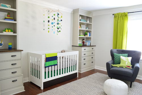
Ever since we imagined the idea of these built-ins, we pictured making the space between the two of them sort sort of accent – either with a color or pattern or treatment of some sort (in our first post we even mentioned a planked wall). Those ideas fizzled a little bit after completing the built-ins and realizing they had a lot of stuff on them (so we didn’t want to clutter up that space between them above the crib too). But neither of us could quite shake the idea of still doing an accent of sorts somewhere in the room. And one night while perusing possible wallpaper ideas for the showhouse, this puppy caught John’s eye.
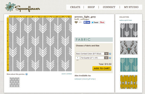
He went rogue and without even consulting yours truly (cue your outraged gasps) and ordered a sample of it and its darker counterpart, for $5 each. With tax and shipping it was $13 total. Thirteen bucks that would either earn him a sour look from me, or make him a hero.
Well, he got the sour look alright – not for the $13, but because I can still vividly remember the claw-hands I had from wallpaper peeling. The good news is that when he explained that Spoonflower wallpaper is removable, all was right with the world again. And I really liked the pattern too (it feels like something that could grow with the bun, and not be too fleeting or “young baby”). The hero part is still TBD though.
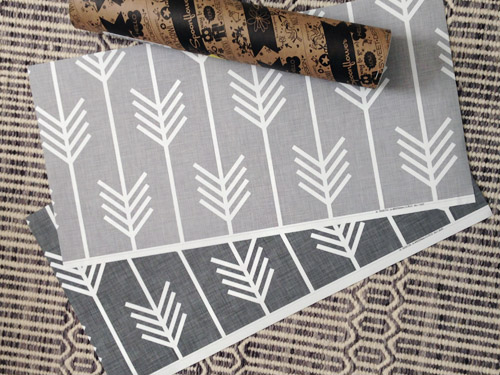
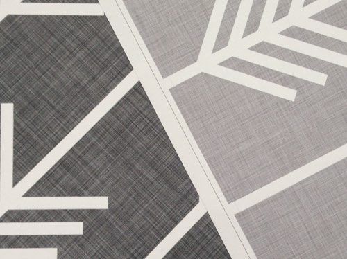
The samples arrived a couple of weeks later. They’re nice and big, and they revealed a detail that John hadn’t detected online: a subtle linen-like texture in the gray tones that I also thought was a nice touch.
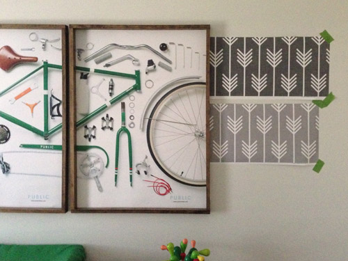
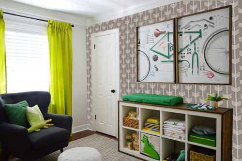
We ran upstairs to tape them up on the walls, just to get a feel for them in the room, and John went rogue again and put them on the wall with the bike prints. He must be getting braver (I think it’s the beard, guys). Since we’re both less tempted to mess with the look of the built-in wall, he said he thought that wall might be the answer instead. Forgive the terrible phone pic.
We snapped that with my iPhone so I could mock-up a full-wall version of the space in Photoshop. For those wondering how I did it, I just dragged the photo I shared above into Photoshop and laid it over another picture I took of (almost) the full wall. Then I just adjusted the size of the overlaid detail photo of the wallpaper until the patterns matched up and were the same size (I had the opacity of the top layer down a little so I could see when that happened).
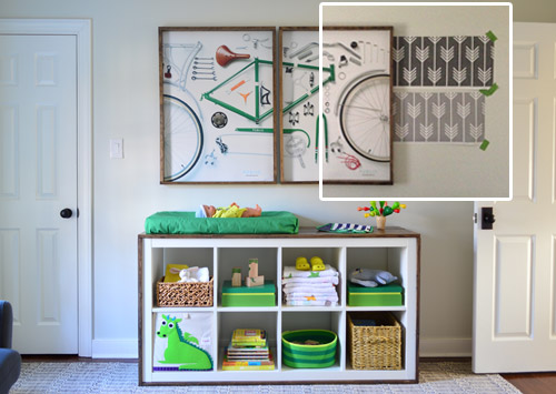
Once I knew the wallpaper pattern was the right scale, I put the opacity back up to 100% and cut out the rest of the iPhone pic so I was just left with a rectangle of wallpaper that I could manually tile until it filled the whole picture. Lastly, I cut out around the objects like the frames, doors, and the changing table (which were still in the image behind the tiled wallpaper) so as I deleted the wallpaper in front of them, it appeared to run behind them.
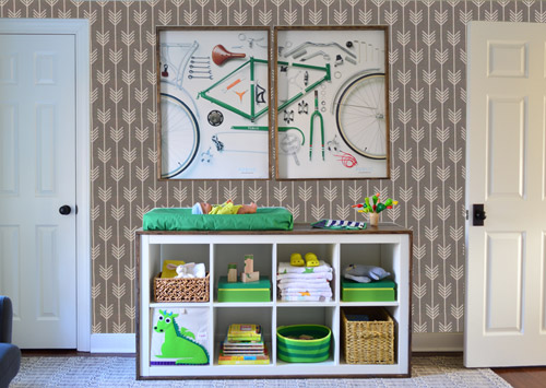
I also tried a version where I adjusted the color to look like the darker sample that John also ordered, but it was pretty clear to both of us that we preferred the lighter one.
I thought it was a little hard to judge without seeing a plain wall meeting the accent wall to give it context, so I used the same technique to mock things up on this photo that I already had of the room. The colors probably aren’t perfect (the curtains look neon here), but it definitely helped us to picture everything – and it confirmed that the light version wouldn’t clash with the wall color or anything.
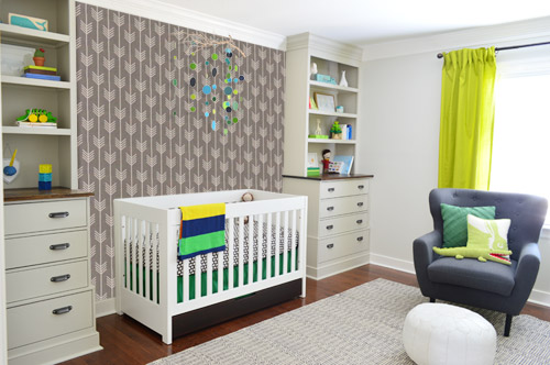
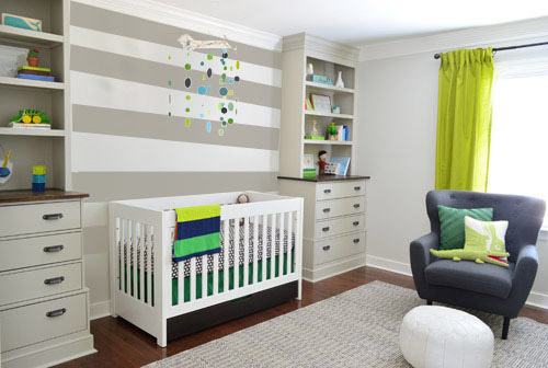
I still wasn’t convinced that was the right wall for an accent (I feared it might look too busy with the bike art in real life) so we also mocked it up on the crib wall to see if our original idea was better. We stared at it for a second, but I think we both prefer the bike wall. It just felt too crazy over the crib with all the items on the built-ins, the mobile, the patterned crib skirt, etc.
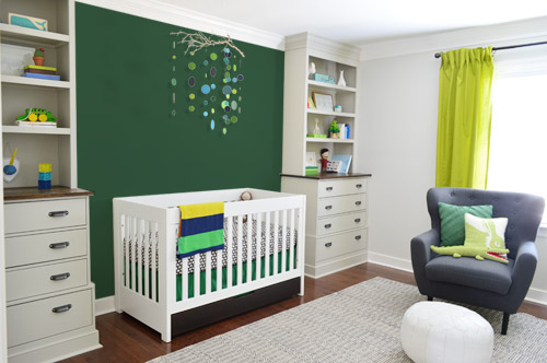
I also tossed some bold green up there just to see if a hit of that above the crib would be fun. It’s not great photoshop (looks pretty flat) but we didn’t really love it.
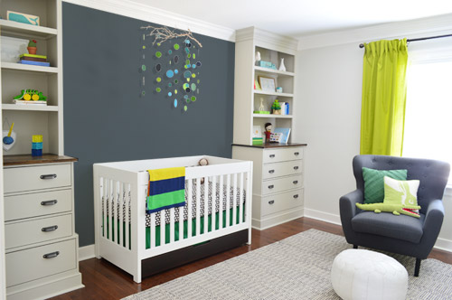
I also tried something sort of charcoal-ish to balance the chair out. This one made both of us do that “eh, not bad” face while staring at the computer. It looks kinda nice with the white crib and the mobile.
To add yet another possibility to the ring, a sweet reader named Annie had emailed us this quick mock-up she did with some chunky stripes painted behind the crib, which also gave us pause. You know we love a striped wall…
We’re still sort of letting things simmer, but we’d love to hear what you guys would do. Would you go for the wallpaper on the bike art wall? We like that it’s removable, so it’s not too much of a commitment. Do you prefer a solid wall of green or charcoal or even some stripes behind the crib? Or should we just stop being crazy and leave things the heck alone? Part of us is really excited to add one more layer of interest into the room (we’ve never put up wallpaper so that would be a new adventure – and most of the elements in here are really neutral). Then again, we still want this room to be a mixture of playful and cozy (as opposed to that’s-just-straight-up-crazy). What do you think?
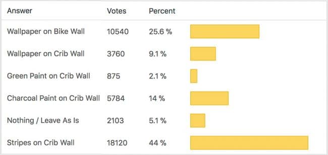
VOTING ON THIS POLL HAS CLOSED

Taylor says
I voted… but what I really would say is I think you need something on both walls! Wallpaper both is my vote.
Ellen Tillery says
So I voted “stripes on crib wall” because I think that space needs something else, but I also love the light gray wallpaper on the bike art wall. Would both be too much? If the stripes were super subtle, painted with the same color as the built-ins, they would just provide a whisper soft accent while the wallpaper on the bike wall would add balance to the other side of the room.
Love this room overall & can’t wait to see what you decide!
Emily says
I think I agree with everyone else…a twofer is in order here!!!
pam says
Oh one other thing. Looking at the bicycle wall with the wallpaper. I don’t like how you can see the wallpaper between the two pictures. It is suppose to be a single picture of a bike and the design of the wallpaper takes away from that. JMO
Hillary says
I’m so torn! I LOVE the wallpaper but I think it does look a tiny bit like too much going on with the bike print and everything on the changing table. But I love it. On the flip side, I feel like the crib wall is empty without anything in that space, like it’s missing something. I liked the charcoal wall you did until (dun dun dun) the striped wall. I LOVE LOVE LOVE it. It’s light enough not to seem busy but it’s not boring because it’s striped. As the results show, I think everyone else does too! Obviously it’s your decision but I really hope you go with the stripes and use that awesome wallpaper elsewhere (like the dining room)! You wanted moody if I remember correctly and that’s got the gray with some added fun!
Hillary says
I’m so torn! I LOVE the wallpaper but I think it does look a tiny bit like too much going on with the bike print and everything on the changing table. But I love it. On the flip side, I feel like the crib wall is empty without anything in that space, like it’s missing something. I liked the charcoal wall you did until (dun dun dun) the striped wall. I LOVE LOVE LOVE it. It’s light enough not to seem busy but it’s not boring because it’s striped. As the results show, I think everyone else does too! Obviously it’s your decision but I really hope you go with the stripes and use that awesome wallpaper elsewhere (like the dining room)! You wanted moody if I remember correctly and thats got the gray with some added fun!
Laura B says
I love the light gray patterned wall paper for the diaper changing wall and the charcoal paint behind the crib. I think its important to us a lot of contrast and print in a nursery to stimulate the baby and give him things to look at. Yes, he has the mobile, but he won’t be able to see the items on the book shelf from his crib. I can also see the gray colors working nicely with a more mature boys room down the line with orange and aqua accents.
Brooke says
I would vote for the wallpaper on the bike side AND a charcoal or a grey tone in between the bookshelves :) That way you have interest and balance for the room
Cathy Ropiski says
Hi Sherry and John,
I was really torn on how to vote for the best wall for wallpaper as I feel both the crib wall and the bike wall look fantastic with the wallpaper you chose! I would like to see both walls in wallpaper, but that was not a choice. I know I have only seen the two walls separately and perhaps two walls with wallpaper would be overwhelming in that room. Keep up the great work! You all are awesome!
lindsay says
What about wallpapering the window wall instead, since it’s the least busy wall in the room? Too many choices…
Rachel H. says
Forgive me if you have already answered this question somewhere, but, do you have any plans to paint the tops of the built-ins white to match the white trim going around the room?
YoungHouseLove says
We’ve seen it done both ways, but here’s a room where the trim matches the built-ins, which we liked more. We just pictured a white stripe at the top and bottom of them looking funny – kind of like the middles are floating. So we liked the idea of grounding them with same-toned baseboards and elongating them by continuing that color on the crown.
xo
s
Patti says
Another vote for stripes on the crib wall and wallpaper on the bike wall. Or is that gonna look crazytown?
Courtney says
Stripes on crib wall + wallpaper on bike wall! LOVE the mixture of patterns!
Yancey says
How about stripes on the ceiling. I think this room is so charming…
http://www.stylemepretty.com/living/gallery/picture/1397846/
YoungHouseLove says
That could be fun too! Thanks for all the votes, suggestions, and links everyone!
xo
s
Kandice says
I normally love stripes and am still trying to find a place to do it to my house, but I really don’t like it behind the crib. I find that is even busier than the wallpaper. If it was just a crib without the bookcases, it would be beautiful, but the fact that the stripes compete with the same lines as the bookcases (and don’t match up perfectly) makes it too busy in my opinion. I do like the idea of the solid linen texture behind the crib though (or even in the closet like someone mentioned above). Either way you do it, it’ll look great, I am sure.
Kelly says
What about the wallpaper on the the wall with the door to the hallway?
Steph Nelson says
Woah, lots of opinions on wallpaper!! :) (De ja vu, I’ve said this before)
My first thought was “I want to see the arrows facing UP” (???) Did you consider that? Kinda draw the eye up kind of thing??
I love the stripe combo, good idea from your reader!
Robin W says
I love the wallpaper, lighter gray, I think I would hang it so the arrows are going sideways. If you wanted to do stripes on one of the walls as well it would tie it together more.
It’s looking great in there already!
Amanda says
I like the idea of an accent wall but I think the paper still looks busy behind the shelf-though I do love the paper. I think the crib wall looks fine as is. I think it would be too much to add something to that wall unless you did something a bit more subtle like painting it a couple of shades darker than the rest of the room. That might be weird though if you add another accent wall. Might start to look crazy town with all the walls different.
Wendy says
I think the wall accent needs to go to the focal point of the room…which is the crib wall. Putting an accent wall somewhere else just draws your attention to multiple places in the room and makes it feel less focused to me.
Kelly says
I love the idea of having the crib wall as the focal wall. I love the stripes idea but have you thought of perhaps larger scale triangles? Maybe something like this but boyish colors? mostly gray and whites but a few green ones as well maybe? http://greenweddingshoes.com/siennas-nursery/
Either way you guys have impeccable taste!
Carla says
If you must use wallpaper with an arrow design, definitely consider a larger pattern. Larger means more restful and less hyperactive.
Kimberly says
I love the gray stripes on the crib wall. We actually just painted stripes like that on a wall in my son’s room a few weeks ago!
Kristen says
The nursery is really coming along beautifully! I like all the options, but I think a plank wall behind the crib would be stunning. You could stain the planks the same color as the tops of the built-ins (and bicycle frames, I believe?), plain white, or white with randomly painted/colored planks? It would then act as an efficient headboard when the lil guy gets a big boy bed in the future! Just a thought :-)
Claudie says
I really love the wallpaper, but I don’t think it works well behind the bicycle prints. Maybe if the Expedit had doors so there was more white to balance it out? I like the stripes though and that could work on either wall, I think. You could even paint some arrows going in opposite horizontal directions if you want arrows somewhere in there.
The more I think about the wallpaper, I think it would work better if the light grey was lighter or the pattern had more negative space.
Can’t wait to see what you guys decide!
Carla says
The nursery feels very monochromatic and safe.
Again, as much as I love the excellent craftsmanship, those builtins are too towering and restrictive. They just feel overbearing and are already presenting design problems.
So naturally you want to jazz up the crib wall. But I don’t think that’s the solution. It will be interesting for a while, but eventually that wall is going to start nagging at you, as you come across cute furniture pieces and better shelving options, I think you’re going to see what I mean.
Austin Sullivan says
Agh, the ceiling, do the wallpaper on the ceiling!
Ali says
I was going to suggest the wallpaper on the window wall as well. The big windows would help to break up the print a bit so it wouldn’t be so overwhelming. It would still add interest though. Just as the bike prints add interest to that wall.
As for the crib wall, have you considered a different shade of blue? Instead of a charcoal type blue, what about picking up on a more saturated blue from the mobile or another accent in the room. Or color from the bike print to help balance the color in the room from that aspect.
Carla says
Okay, telling it with my usual straight up honesty. After browsing some of the comments, here’s the lowdown on the arrow wallpaper.
It is too hyperactive and yang. You need a calming, pleasant balance between yin and yang. Also, the arrows are pointing downward. It feels like a heavy downward bombardment of energy, aimed straight at your baby. This is not healthy.
As I suggested above, if you must have arrows, choose a larger pattern so that they feel more restful. Although really if you’re going to do anything in that room, repaint the builtins a nice crisp white and put the white and light gray paper behind the shelves.
Mary says
Wow! Borderline. You can be “straight up honest” without being rude.
Mary says
Here is what I would do…. Wallpaper on bike wall and VERTICAL charcoal stripes by the crib. I’m sure someone has already commented with this idea (have they?). Can’t wait to see what you guys will do. It’s going to look awesome.
Michelle | Birds of Berwick says
My vote is for arrow wallpaper on the bike art wall and the dark charcoal color on the crib wall. I love how it makes your built-in’s and mobile pop more.
I love that wallpaper… I really hope you use it!
Jenny says
I haven’t read the previous 564 comments, so it’s probably already in there, but why not put the wall paper on the wall with the window so you can see it from the hallway and leave the other two walls alone? That way each of the three walls you see from the hallway have something of interest to catch the eye?
Rose says
What about using a stencil instead of wallpaper?
http://www.remodelista.com/posts/diy-stenciled-bedroom-walls-for-kids-room
Vanessa says
I think stripes on the ceiling would look great! Something like this: http://www.stylemepretty.com/living/gallery/picture/1397846/
and
http://www.pinterest.com/pin/241505598742338783/
I think if you would do it in the complimentary gray color it would look best. Plus, being on the ceiling will give baby something to look at while in his crib, in addition to the mobile.
Samanthathyme says
I would totally do the wallpaper. In fact, We did this wallpaper from spoonflower http://www.spoonflower.com/fabric/733746 in our living room as an accent wall. It is a wall with a lot going on, there are two metal bookshelves, a Besta cabinet from Ikea used as a bar, and giant piece of artwork on the wall. It looks awesome and gives the room so much life!
A couple of things about the Spoonflower wallpaper. In the directions it says to start at the top when applying it. DON’T DO THAT! it was a huge mistake. Start at the bottom like you would with any wallpaper. Other than that, it was pretty simple. We put it up ourselves and we’d never done that before. It looks Amazing! I really love the wallpaper you were looking at, it was one of my other options, but my spouse really loved the plus sign wallpaper.
YoungHouseLove says
Love the tips! Thanks!
xo
s
Kim says
I think the wallpaper looks great on the crib wall, but I and everyone I know who papered their nursery had babies (and toddlers) who painstakingly peeled the wallpaper at the seams. I would stick with paint on that wall.
Sue says
Hi guys. Was just thinking that if you guys did the wallpaper on the bike wall, what about using some of the leftover wallpaper for a little framed in accent above the crib. You could use some stained moulding for the frame (maybe the same stain as on the dressers). Then you could add in some non-busy art on top of the framed in wallpaper. Or, a giant letter with his initial. Just a thought.
It would be a nice way to tie the walls together, but it wouldn’t be too busy over the crib.
willow says
Wallpaper on the bike wall AND green paint on the crib wall!!! It will balance out without being too matchy matchy (which I think it would be with stripes on the crib wall).
Laurel m. says
I love a wallpapered closet. Just an idea.
Katherine says
One thing that you might want to consider, is if the wallpaper would be too overstimulating for the Barnacle. The wallpaper is really cool, but he might get easily overwhelmed by all of the high contrast pattern going on there. It might pose a problem if he is trying to fall asleep at nap time if it is above his crib. Good luck with the decision!
Lisa says
I am sorry, but I really dislike the nursery so far. It looks bland and like an old computer. I would get rid of the terrible curtains, paint the reader-suggested stripes all over the room to make it look more childlike and I would repaint the builtins in navy (maybe only the back of the shelves?) and white. And I would rather use the wallpaper for the inside of the closet or not at all. If you got rid of the curtains, you wouldn’t be so limited anymore and could paint the closet door kelly green.
Finally, I have to ask: poor John has to ask whether it is ok to spend 13 bucks?! Really now?
YoungHouseLove says
Oh he didn’t get the sour look for spending $13 on samples, it was the idea of hanging wallpaper after all the time we spent clawing it off in five rooms of this house over 8 months! Before I knew it was removable I looked at him like he lost his dang mind. Then I learned it wasn’t permanent and all was right with the world again ;)
xo
s
Alex says
I love the wallpaper (lighter one) on the bike wall, but the crib wall definitely needs something too. Maybe a textured but not busy wallpaper (like grasscloth) or a grey ombre wall?
Katherine says
I agree with several others- my choice would have been both lighter wallpaper on bike wall AND stripes on the crib wall. There would be extra interest and balance. Who cares if it’s a little busy, it’s a KIDS room after all! Your little guy will have so much to look at! I love the choices you are making so far and can’t wait to start decorating our baby boy’s room too(arriving July 20).
Jen R. says
Can you frame the two samples and still get the look but not so much of it? I really liked the stripes behind the crib. Very cute room!
Julianne says
I actually quite like the arrow wallpapers, just seem a little busy with all of the beautiful work you’ve done so far though….
The stripes are gorgeous! We did a tone on tone taupe & beige in my son’s nursery with paint, too. LOVED it and I noticed that our old house is on it’s 3rd sale and the nursery walls have still been left the same. I guess it was a hit ;O)
Paint is always easier to change than wallpaper, too…another bonus!
Kate says
I voted for the stripes because 1) I love stripes and I’m STILL trying to convince my husband that we have to do a horizontal stripe somewhere in our house, and 2) the reader that suggested it is named Annie, and that’s what we named our now 16-month-old daughter ;)
As for the wallpaper… I’m torn. I’d love to see some funky wallpaper somewhere (it’s really actually kind of fun to put up! We had to wallpaper a hallway and stairwell in our old house to get it ready to rent (the plaster walls had a layer of awful wallpaper and a layer of textured that our cats destroyed, so we replaced the textured) – it was pretty quick, too! Even with needing to match the patterns. I’d say it was quicker than painting once we had a system down!
Kate says
Whoops – I said I was torn but then didn’t really elaborate beyond trying to convince you to put wallpaper somewhere. Anyway, I think wallpaper is easy and fun, but I don’t necessarily think that one striped wall and one wall of arrows in the nursery would be the best option… I think it’s kind of a one-or-the-other situation in there. Maybe a fun accent wall in the guest room?? (with something other than the arrows)
Sara wutzke says
Removing ugly paper is so not the same as putting up amazing paper! I am still searching for the perfect wallpaper for an accent wall in my 1.5 year old’s nursery. I have an accent pillow with that arrow pattern and love it!
Liz says
Whoa. Just because you bought the sample, doesn’t mean you have to buy the roll. Just sayin’
HeatherM says
I agree with many of the other comments, that the striped crib wall is a nice touch. I’m sorry, but I think the wallpaper looks hideous and incredibly outdated. And I don’t mean outdated in a classic or timeless way. I don’t know why you would add something like that to the room when you are trying to update the room and get rid of outdated gaudy features in the house. I’m not opposed to all wallpaper, and that wallpaper looks great up close, but NOT in the full wall mock-up.
Jill says
How about chunky chevron stripes in grey and cream/white behind the crib? It just seems like the wall with built ins is the logical feature wall but perhaps the wallpaper is too busy. Chevron stripes feel less busy but a similar design to the wallpaper that caught your (or John’s) eye that might work well. Or maybe paint the crib wall grey in flat paint then an eggshell or satin chevron in the same color so the chevron is just a sheen, you know?