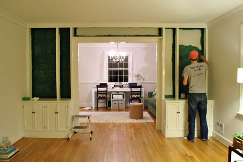
We’re back with the after pics of our freshly painted built-ins. As we mentioned in the last post, we went with an inky blue color with hints of green called Dragonfly from Benjamin Moore’s Affinity line (color matched to Lowe’s No-VOC Olympic paint for the bambino). We only needed a quart, and since we used objects that we already owned on the shelves this entire built-in makeover only ran us $10.97. You can read more about how we planned the shelf placement here. Oh and here’s a poorly lit progress pic from last night, just for fun. Yes John’s shirt does say “Talk Nerdy To Me” on the back. I love it.
But here’s what you really care about. The bookcases all painted! Picture us twiddling our thumbs while we waited for them to fully dry so we could put the shelves back on and load them up.
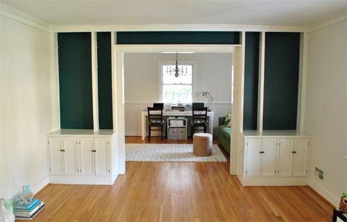
Of course by then it wasn’t as bright in our north facing room (hence the slight color variation from the last pic) but we LOVE it. It’s bold and high contrast and nothing that we would’ve have the guts to do in our last house.
We’re enamored with the color because it’s super moody and it reads as greener or bluer or darker or lighter depending on the time of day and the angle that you glance at it.
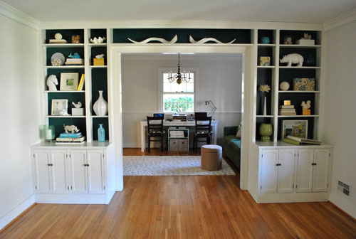
And of course all of my white ceramic animals (and other not-kid-friendly-so-I’m-glad-they-fit-up-there treasures) really pop against the saturated background color (which also makes the cabinets look crisper and whiter by comparison).
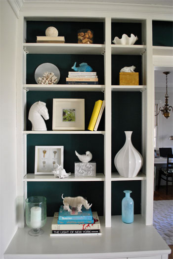
These two pics are probably the most true to life when it comes to the color (but of course how you see them really depends on your monitor):
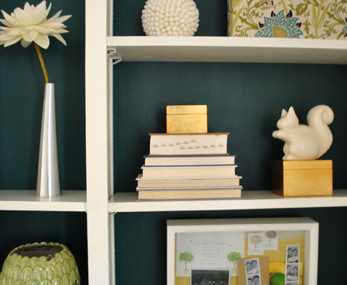

Mr. Rhino (and his ceramic twin on the other side) likey. And we do too. Especially for under $11. In fact we love the color so much that we plan to work it into other parts of the house when we can (you know, to try to keep our whole house color scheme cohesive but not too “yawn”). We’re thinking it might be the perfect color for the base of the future island that we’d love to someday add to our kitchen – and would even work on a bathroom vanity. Should be fun…
Psst- Learn how we made those two fabric covered boxes on the right side of the shelf here.

Renee says
Love the color!! I just might try to work something like that into my living room. It could be just what that console table needs. Hmm, maybe even the inside of some shadow box cubes too. Thanks for the inspiration!
Melissa says
WOW, what a difference! I would not have thought of going that dark with the paint color, but I love the results.
LIZ says
Looks great!
And I wanted to add – that I love the new/old format for your blog… of more real-time updates, instead of the “wham” presto -finished… style. :) Did that make sense?
Mrs. Davis says
SUPERB!!!
Sarah (Sarah Learns) says
wow, that looks awesome! taking the risk definitely paid off this time! congrats.
amelia says
love it! looks so good…i need to use this colour in my house! lol
Christin says
BEAUTIFUL! I really love it. Good for you guys stretching your comfort zone! It turned out fantastic. Also, love the placement of the shelves. In the first pic in the other post when you said it was cluttered, I didn’t really think it was, but then totally love how much more spaced out it all is in how you changed them a bit. Way to go. : )
Elizabeth says
I must know…what is in those albums on the far right cabinet? The ones in front of your shadow box and artichoke?
YoungHouseLove says
Hey Elizabeth,
They’re wedding albums that we made. One is full of wedding pics and one is full of black and white photo strips from the photobooth. We have to have them out somewhere (as opposed to hiding them in a closet) because we love to look at them!
xo,
s
Leah says
Love it! And I love seeing darker, bolder colors (my favs) used in a room that still seems so light and fresh!
I have one question that is completely unrelated….I am in the market for a wireless printer and I went back and found that you guys got the HP PhotoSmart C4780 – Do you like it? Was it easy to set up? Is the ink very expensive?
Thanks!
YoungHouseLove says
Hey Leah,
We love it! Very satisfied indeed.
xo,
s
Chrissy says
This might be a stupid question, so forgive me, but what’s the deal with no-VOC paint? Why is it necessary for the baby and how does it differ from regular paint?
YoungHouseLove says
Hey Chrissy,
It’s totally not a stupid question! VOC stands for volatile organic compounds, which can be found in many paints. They’re tied to that fumey smell which can cause headaches and long term health problems – especially in infants. So low-VOC, or better yet, no-VOC alternatives are always recommended for health reasons. Plus we’ve learned that you don’t have to sacrifice color or coverage and it’s the same price so why not! Oh and they’re better for the earth too. Less air pollution and all that. Good stuff!
xo,
s
celestte says
LOVE the color — looks great! I love how the white ceramic animals pop.
Tara says
Love the new color!! I always want color like that in my house, but don’t like it for an entire room. Great idea using it for behind the built-ins. Now I just need built-ins!
Any ideas on color choice for repainting old 70s cabinets in a small we’re-saving-money-for-a-huge-reno galley kitchen without much natural light? I’m not so much for white on cream on white, and I just can’t stand the cheap looking wood anymore! Any help would be appreciated!
YoungHouseLove says
Hey Tara,
We love soft celery greens and gentle gray-blues which can still be light and pretty. Hope it helps!
xo,
s
Roshni says
Looks amazing! It really helps that your display stuff is largely just one or two colors. For folks who have display stuff which are of more that two colors, what would you suggest?
YoungHouseLove says
Hey Roshni,
Hmm, well editing could be the key. Maybe look at all of your items and pick two or three colors (like white, blue, and yellow- which all show up on our bookcases) and display things with other colors en masse somewhere else? It could help things from looking too chaotic. Although we’ve seen bookcases with a rainbow of items on display that look amazing too, so maybe just play around with it and see what you like?
xo,
s
Emily @ Merrypad says
SO NICE. Really love the color choice… definitely a pick that I would include in my palette someday.
Lorie Smith says
WOW, this makes me want to go home and paint something! I love it and I really like your color choice too. I don’t have anything that bold in my house, but I think 2011 is going to bring some changes to the decor in my home and I’m going to try my hand at more DIY’s (painting and recovering, no building things, don’t think I’m ready for that yet). :) Love it, can’t wait to see more!
Lorie
therobynnest says
Someone in Brooklyn once painted an entire gigantic wall of my apartment that color. I could see it through the open door of my bedroom and always thought that in the morning light with the sun’s rays dappled on it, that it was like being at the bottom of a pond, looking up through the moss. I loved it.
Erika says
Looks great! Love the contrast with the white.
Angelica L. says
Beautiful! I love that color, and it certainly makes all the white pop. Still crisp and clean, but with a little bit of drama. Good pick.
Elizabeth says
I thought they might be wedding photos! Cool that you keep them out, I am obsessed with other people’s wedding albums. Perfect little time capsules of happiness.
Justine says
Wonderful color choice, way to be daring! The white really does pop now. I may have to consider a color behind my built in bookcase now.
Abode Love says
Holy Cow! I loved it white– and was a little hesitant, but you two know exactly what you’re doing! That color is amazing- I love that it changes colors depending on how you look at it– and it really makes all of your fun display items stand out!
Did I miss where you announced the color and brand of paint? I am thinking I want to use this luscious color somewhere in my abode! Thanks!
abodelove.blogspot.com
YoungHouseLove says
Hey Abode Love,
The color and brand info is in the first paragraph of this post. Hope it helps!
xo,
s
Inka says
LOVE IT. I have a similar colour lying around in my basement and was wondering what to do with it and now have the bravery to paint the back of my built ins that colour. Thanks for all the inspiration :) x
Catherine says
I LOVE that color, it is so gorgeous! Now I’m going to start making a mental checklist of all the things I want to paint that color.
Becky says
Beautiful!!! I also love how the color coordinates with the color of the couch in the office!
Witty Wife says
Looks gorgeous!
(Lori, I agree with Sherry too. I love shooting almost anything in aperture mode on my DSLR (I have a Sony Alpha).)
Paige says
wow–I’m in love with that color…it looks awesome! Can’t wait to see more of your projects.
Vorpaks says
It looks amazing! What a great frame for the room beyond too!
Ami @ beyondpeasandcarrots says
Love Love Love this!!!!
JennyB says
Wow, looks beautiful! Great, now I have to start adding bold colors to MY home ;)
melarse says
Worth the wait! So VERY beautiful!!!
Shannon says
I’m so thrilled you guys went dark. I love love love that color and your built-ins look phenomenal. And um, not saying my husband is a big nerd or anything and that the shirt would be perfect for him, but where’s that shirt from?
YoungHouseLove says
Hey Shannon,
That’s from John’s fraternity days (Phi Sigma Pi) – they made it. You know John loves a good DIY…
xo,
s
emily @ the happy home says
those are absolutely STUNNING. you just upped the design of that room with one coat of paint. floored!
Leslie says
Love it! The color has such a rich, almost textured, look! The shelves and pieces “pop” now. :)
erica says
I LOVE ME SOME DRAGONFLY color! Excellent! And makes me wish I was still living in my old house so I could build some built-ins hehe. Honestly, reading your blog has totally opened my eyes to what I want in my next home. I can’t wait till that day comes. Till then, I will swoon on yours and live vicariously.
As for the camera tip : shoot manual. Usually 800 or 1600ISO with all your window blinds opened for as much natural light as possible. Then play with your settings until you get the right aperture for your lens. You will NEVER go back. Trust me, I’m a pro ;)
YoungHouseLove says
Thanks for the tip Erica! We’ll give it a shot. Har har.
xo,
s
Kristy says
I love it! That colour is gorgeous! I like the way the teal plays with the yellows and greens on the right side of the built-ins. And with grey paint on the walls (that is what you said you were planning on, right?) – I’m sure it’ll look amazing.
I feel the need to paint something now…
Catherine says
Oh my gosh, I love this color! New favorite! Off to find my Affinity deck so I can inspect it more closely.
I’m so excited about the new direction your design is headed in!
Nicole P. says
GORGEOUS!! Love, Love, Love it!
Laura @ Starting Out Fit says
LOVE it! great job, as always! ;)
misa says
it looks so awesome! between you two and anna (@ d16) i am now desperate to repaint something in a very dark color.
Molly P-H says
Um, Burger hasn’t been in a photo in, like, four days?! Seriously though, that color?! I. Die.
E @ Oh! Apostrophe says
Love it! I used to be afraid of dark colors, but after a few experiments I don’t hesitate anymore. We did our (small!) bathroom in Vermont Slate by BM which looks similar to the color you have there and I love it. The only paint color choice I regret is a gray which I wish I had done much darker. The darker the better I say :)
Krystle says
Looks fabulous! I love how your white ceramic just pops out!!
Anna says
This makes me wish we had built in shelves in our house somewhere so we could do this!!
GreenInOC says
Oh my gosh, I SO wouldn’t have chosen that color.
And what a fool I would have been, no?!
It looks fantabulous and is just one more piece of evidence pointing to the fact that the two of you are artistic geniuses!!
Jennie says
Can I ask where you found the cardboard Mr. Rhino? We have a few crumbling foam dinosaurs that might look nice replaced by their cardboard twins…
YoungHouseLove says
Hey Jennie,
He’s from http://www.cardboardsafari.com. Love their stuff!
xo,
s
D says
I am so happy that you’re using some bold colors! I love it!! My fave color palette.
Sarah says
Hey Lori and all,
One of my other favorite blogs, The Pioneer Woman, has some super easy DSLR tutorials, if you’re looking to get more out of your camera. I walked myself through them when I started a new PR job and needed to take all my own pics.
Also, love love love the inky blue! It really ties everything together and brings out the white pieces! Way to be awesome.
Jenn L @ Peas and Crayons says
I’m sure it’s even more vivid in person =) What a bold color! I’d probably be too chicken to go this dark but I have to admit, it’s beyond amazing!
xoXOxo
jenn
amanda says
That’s a really pretty color! It looks a lot more green on the ben moore website. Is it more green than blue in person? I have a lot of teal swatches taped to my living room wall at this very moment… I like Behr’s Observatory, but it’s almost not saturated enough. I really like how that dragonfly color looks in the pictures — but is it an illusion???
YoungHouseLove says
Hey Amanda,
It’s probably more blue than green but it definitely has some green in it. Dark moody teal is actually a really good description. Hope it helps!
xo,
s
Emily says
LOVE it you guys!
This is my current favorite color! So glad to see you using it. I just got some Ikea curtains in this color to bring it in to my room, but I love your built ins!!