Note: Our heads are still spinning from the terrible tragedy in Connecticut on Friday. We’re sending lots of love to everyone up there and holding Clara close. Our friend Roo, who has three small children and only lives a few towns away from Sandy Hook wrote a post about how we can help, so for anyone looking for ways to make a small difference, here’s that link.
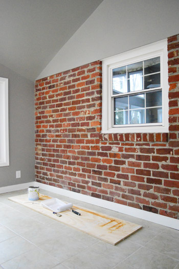
Some brick-painting happened in the sunroom…

Which we don’t think will surprise/sadden nearly anyone on the interweb since we heard so many war cries of “paint that brick!” after sharing our last sunroom post…
We even got a bunch of more passionate and detailed pleas like: “I’m never one for painting brick but that’s such a weird shape that’s cut off at the top and doesn’t look good from the living room at all… so paint that brick!”
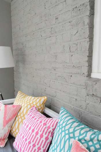
This used to be the view from the couch that I stared at every. single. night. for the last 2+ years, so… I was ready.
So after considering everything from whitewashing it to distressing it (which would make it more of an accent then just letting it fall back and blend in) it was time to PAINT! THAT! BRICK! Feel free to shout that a la Ty Pennington’s MOVE! THAT! BUS!
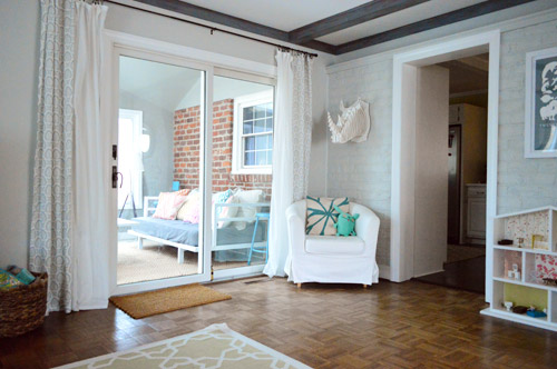
As predicted, it looks a lot better from the living room now. Whew.
Oh and this view demonstrates why we didn’t feel like drywalling over the brick in the sunroom to hide it, since:
- that’s a lot of work/dust (plus it wouldn’t match up perfectly with the drywalled lip above it anyway)
- there’s still painted brick in the adjoined living room anyway
- we actually love the texture of painted brick, which we had on two walls of our first house’s den
Holy cow, check out the dollhouse in the two pictures above. Not a thing has moved in the almost-a-week between this paint job and that last picture. But the floor mat near the slider along with Clara’s Uglydoll are nowhere to be seen. Better remind Clara that the dollhouse is still there (and it’s a better toy than moving the floor mat around, haha). She’s been pretty into playing in the sunroom now that it’s not full of hazards and old furniture anymore, so maybe that has been taking the focus away from her “furniture rearranging skills” (aka: the dresser-and-bed-switching/throwing/hiding Olympics that her dollhouse provides).
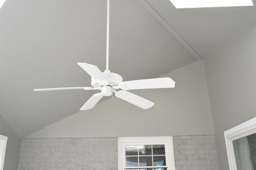
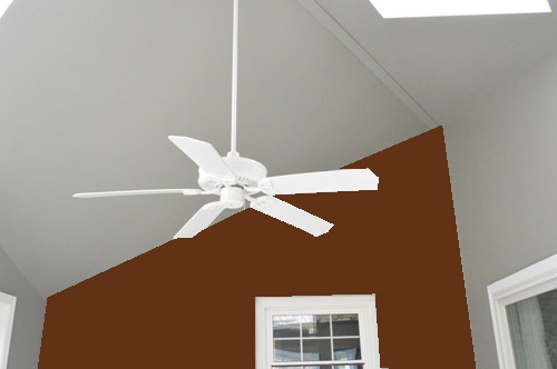
Oh and we got a few questions about why we didn’t just clad the whole wall in wood or make some sort of rustic accent on the triangle above the brick, but the major thing that we’re trying to downplay about this room are all the crazy angles. See how the ceiling slopes waaaay to the right on that wall?
Well if you turn around it slopes to the left. So yes, it’s basically a spaceship of a room with a diagonal peak in the ceiling that slopes from corner to corner. As in it looks like someone glued an angular and modern room onto a flat little brick house. So we want to downplay those zany angles and help everything flow so it feels like it belongs here with the rest of the house. Which is why a nice blanket of gray paint over all the walls and ceilings was the name of the game.
For all of you visual folks, this is what it would look like (per some bad photoshop) if we had accented it somehow – with wood, brick, etc. See how it would emphasize that weird slope? Which would totally fit into a super modern house with other slopes and lofted rooms (like Gloria and Jay’s house on Modern Family), but we just didn’t think it would go with the rest of our non-slanty-or-futuristic house.
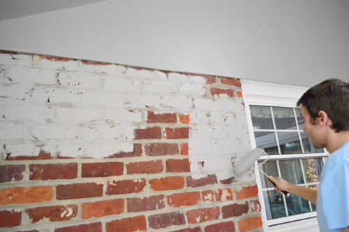
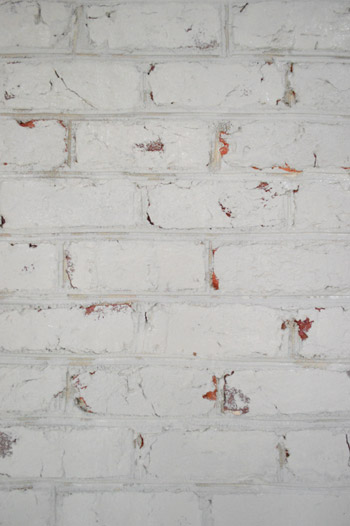
So grease paint was the word. And in some insane gift from the home improvement gods, it only took two coats (brick suuuuucks up paint, so we thought it would take four, which is our usual experience with it). We didn’t use any sort of primer – since we didn’t back when we painted the brick in our den and that worked out for us – and as usual I wielded the brush (for getting into all of those cracks – yeah, there were about a million).
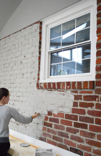
My name is Sherry and I paint cracks by the dozen. Meanwhile John rolled using a nappy roller, which helps to coat textured surfaces more than a super smooth one does.
We actually got nearly the whole thing done during a Clara nap, so you can go ahead and file this under “Christmas miracle.” And my hope for anyone else who is painting brick is that it’s as quick and painless as this job was. Even all that crack painting could have been muuuuch worse (painting every crack twice beats painting every crack four times, if you know what I mean).
Here’s what they looked like before I got to them with the brush, but after John rolled. They were sneaky little buggers.
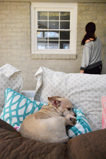
And just for fun, here’s what Burger does while we work away in the background (don’t mind my inside-out-sleepwear-as-painting-clothes). #hubbahubba
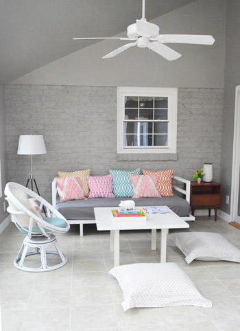
The good news is that the nice even coverage that we eventually accomplished made a huge difference. Now when you’re in the room it feels more cohesive and a lot less chopped up. And we think adding some nice art to that wall will further take the focus away from any difference between drywall and painted brick (our first house’s den had two walls of paneling and two walls of brick, but once it was all painted with furniture and art and curtains it was barely noticeable).
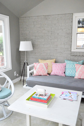
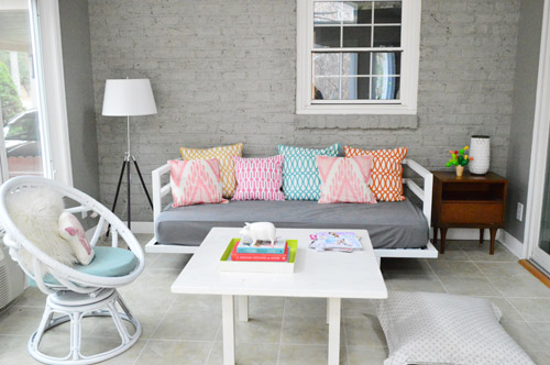
Just to save you some scrolling, here’s the full after of that wall again. It’s definitely a lot of gray, but we’re just getting started…
And here’s what it looked like before.
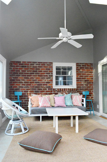
Why didn’t we do this sooner? Over two years of staring at a weird U-shaped brick blob in the next room is two years too long.
I can’t wait to hang some art on the brick wall to make that off-center window fit right in. Sing it with me: “white frames, white frames, whatcha gonna do? Whatcha gonna do when they come for you?” Thought you guys would like some Inner Circle on a Monday morning. No? How about some more bad photoshop then? And actually, I think we might work some wood frames/items into the mix too. Might be fun and eclectic.
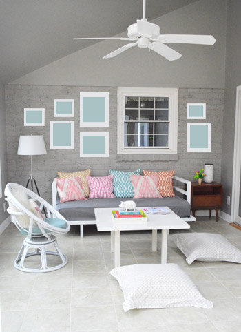
But even without any frames, it’s a definite improvement just to have broken out some fresh paint. Basically blanketing this room in taupey-gray has done five things:
- it draws the eye out the windows to the pretty trees outside (the windows/view are definitely the stars of this room)
- it downplays all the crazy ceiling angles and the choppy-looking brick-cut-off conundrum by unifying everything
- it allows things like the colorful cushions on the daybed to stand out in a way that they couldn’t when they had to compete with the dark brick
- it makes the floor look a lot less yellowed and old (brings out the gray undertones instead of the yellow ones)
- it makes the white window trim and molding pop like crazy, so the room feels crisp and updated
Of course we still have a long way to go when it comes to the furniture arrangement. We’re just using things we already have in the meantime, but eventually I’m sure a lot of things will get moved/upgraded/painted/etc. And we still have to bring in a rug, art, and all that jazz. And don’t mind that sad wrinkly sheet on the daybed of those orange slabs of wood along each slider where it meets the floor. Let’s just say that a ton of things are just waiting to be “attended to.” But the middle makes no sense anyway! Haha. What did you guys do this weekend? Can you tell I’m all jittery and weird? We’re hosting Christmas dinner for the first time ever (for fifteen people – four of which are under the age of four!) so it should be a whole lotta crazy. As expected, I can’t wait. You know I love the crazy…
Psst- To see this little sunroom makeover from the beginning, click here to read about phase 1 (planning, furniture placement) and here for the details on phase 2 (painting the lofted room and ceiling).
Psssst- Speaking of paint, one of the most freeing things about writing our book was that it allowed us to chose paint colors that don’t necessarily have to fit right into our house, so we’re over here chatting about stretching our color comfort zone.

Debbie says
So nice that I don’t even notice weird angles and off-center windows…great job!
Sarah k. says
Hey guys. Looks great! What about a long ledge running across the top where the brick meets the wall for Knicks knacks….ahem, porcelain animals, or plants or whatever. Seems such a shame that such a high wall go to waste. Sorry if anyon else suggested this. I probably should have read through the comments first.
YoungHouseLove says
That’s another fun idea! We don’t know if we want to draw the eye up to the sloped ceilings (or if a shelf sitting right on a window is weird) but it’s something to think about for sure!
xo
s
Ashley says
Love it! It flows way better from the adjoining room now. I almost feel like you should add a long wall to wall shelf right above the window. I know the idea was probably to blend the two in, and you did and it looks fab. But the texture is different.. I don’t know. I saw it and was like “art shelf/ledge!”. Looks great regardless <3
YoungHouseLove says
That’s another fun idea! We don’t know if we want to draw the eye up to the sloped ceilings (or if a shelf sitting right on a window is weird) but it’s something to think about for sure!
xo
s
Darcy says
I LOVE IT!!
Kate says
First time I’ve seen your blog. I’m in love. Not sure what else to say…
Kate says
I have just seen this blog for the first time. I am in love. Not sure what else to say…
YoungHouseLove says
Aw thanks Kate!
xo
s
brett says
Looks great! Isn’t it amazing how something like that can make such a difference (you wonder how on earth you lived with it for all these years!)
One question – how do you intend to affix your pictures? I’ve got a similar situation and want to hang some things without damaging the brick, but I’m fearful of the 3m sticky things given the weight of glass framed paintings (OK, it is a metal deer head with antlers – there, I admitted it).
YoungHouseLove says
We’re going to drill them in! Full details when we get there :)
xo
s
grace Nielsen says
Fantastic!! The wall looks SO great and I adore the way the Easter Egg-ish pillows pop on the daybed!! Lookin’ good!! You are a bright spot in a dreary feeling world today – and always. Thank you!!
Elizabeth@ Food Ramblings says
it does look much better :) and the throw pillows are awesome!
Sweet Sarah says
So pretty and BRIGHT! I love it :)
-Sarah
http://www.sweetandsavorylife.com
http://www.facebook.com/sweetandsavorylife
Creativity | Inspiration | Heart-to-Hearts
Stephanie @ Legally Blinde says
Wow, that wall looks great!! I definitely think you made the right decision. And I’m really loving those bright pillows on the daybed. Nice job, guys!
Carrie S. says
Where do you get your white frames from?
YoungHouseLove says
Most of them are from Ikea or Target or yard sales. Hope it helps!
xo
s
Jessica G. says
Ooh, it looks so West Elm-y! Very nice. I think that room is just begging for a big ol’ potted tree. (Maybe that’s just my inner gardener longing for a sunroom.)
YoungHouseLove says
Ooh yes that would be awesome!!!
xo
s
Laura says
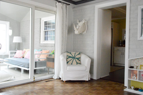
Okay, three pictures down, what is that through the doorway? It’s like a cabinet nook? I just can’t place it. Which is surprising because being a long time reader I feel like I know every thing about this house! YHL you still mystify me!!
YoungHouseLove says
Through the doorway on the right in the third and forth picture is our kitchen. That’s where our kitchen connects to the living room (through that doorway). Hope it helps!
xo
s
Laura says
Oooooh! Now I see! Thanks!
Robyn in Chicago says
I la la LOVE it! Looks so cute in there already. And loving all the pillows too.
Trude says
It turned out gorgeous! The white trim pops even more than I thought it would. Love!
Christian says
I feel like adding a piece of molding that matches the profile from the inside would really finish it off.
YoungHouseLove says
That’s another great possibility!
xo
s
Sara says
its too late now, but i think if the room was painted something in a red tone, the brick wall wouldn’t have looked as ackward. maybe a terracotta or different light reddish tone. the brick would have seemed to blend in more with the rest of the room and the slanted ceilings wouldnt have been as noticable. i dont think a sunroom has to match the colors in the rest of the house as it is almost outside of the house. i think it could have given the room a more warm feeling as apposed to the cold/ serious/ plain grey. you guys are such great decoraters that once the rest of the furniture goes in there, i bet it will seem warm and cozy again, so i cant wait to see it!
kimberly says
Hi, Love your sunroom! May I ask where you got the pillows? Or who makes the fabric? This is the perfect color scheme for my daughters room!
Thanks!
YoungHouseLove says
They’re all from HomeGoods and Bed Bath & Beyond. Hope it helps!
xo
s
Jamie says
Just came across this page on pinterest. Looks amazing! Well done :o) I absolutely love your bright cushions. Where did you get them or did you make them?
YoungHouseLove says
Thanks! They’re from HomeGoods and Bed Bath & Beyond. Hope it helps!
xo
s