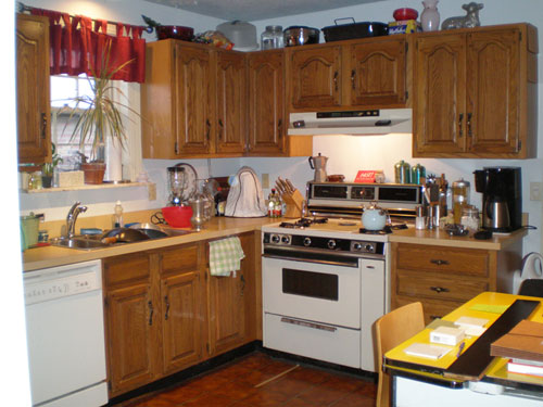
When Amanda and her husband Ken sent over the amazing before and after photos of their kitchen, let’s just say our mouths literally watered. Here’s their letter:
I really enjoy your blog and your knitty-gritty do-it-yourself attitude, so I thought you might be interested in our own kitchen remodel. We live in a little brick house in St. Louis, built in the 1930’s. The kitchen had been redone in the 70’s and the cabinets were kinda shoddy- plus, we needed A LOT more storage. Last summer we took the plunge and decided to tackle it. My husband and I are both graphic designers and very particular about design but the room came together so smoothly, with very little head-butting. The cabinets are IKEA and go all the way to the ceiling to add much needed storage. The wall with the new island was previously empty, so those 12 inch deep cabinets almost double our availability. We also widened the “nook” where the fridge is by two inches to squeeze in an actual pantry. We hired a friend to do the electric, my brother installed the floor and the tile backsplash, and the counters were professionally done but everything else is our own doing! We had NEVER done a project of this scale. Not bad for learning on the fly, right? It adds so much value to our home and we enjoy every minute of using it. Hope you like it! -Amanda and Ken
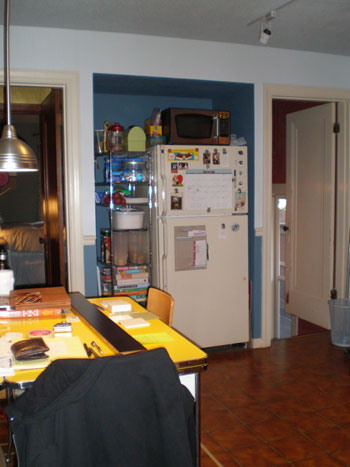
Here’s their kitchen before the major overhaul:
And here’s the same space after they worked their makeover magic:
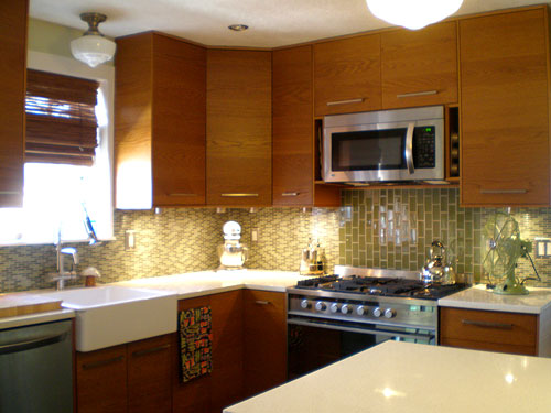
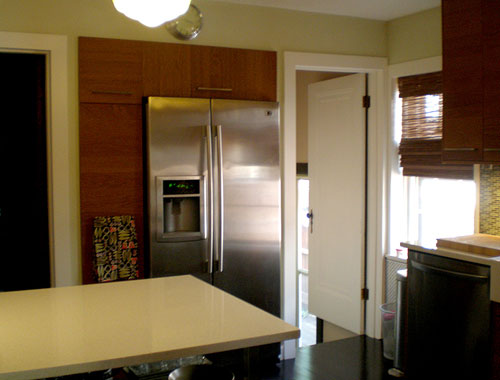
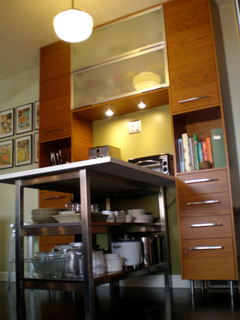
Can you believe that upgrade? Amazing. We love how they maximized every inch of space with ideas like building in that pantry near the fridge and adding that island (flanked by even more built-ins) to extend their workspace. This kitchen just goes to show that if you put a lot of thought into optimizing the space that you have you can end up with about 100 times more function and available stash space without sacrificing an ounce of beauty. Oh and here’s a handy little source list from Amanda & Ken:
- Cabinets and island table: IKEA
- Flooring: BR111 from Lowes
- Lights: Schoolhouse Electric (we live behind a school so we thought it appropriate)
- Appliances: Fisher & Paykel range, LG microwave, dishwasher and fridge
- Counters: HanStone quartz in Swan Cotton
- Backsplash: Glass Blox
So what do you guys think? Didn’t they do a fantastic job selecting those luxe looking finishes and layering both function and form into a formerly blah kitchen? We love that they were able to come together to create something they both adore while doing a lot of the work with their own four hands. And of course we’re obsessed with that gorgeous backsplash of theirs. Yes please.

ittnyc1 says
I love it! Ikea seems to be getting better and better. The glass tiles look great. Where did you get them?
YoungHouseLove says
Ittnyc1-
Check out the source list in the post for the tile info. Hope it helps!
xo,
s
Jennifer says
The pictures to the left of the built-ins in the last pic look really cool. I love the colors. Are they new and if so, care to share where they’re from?
Kelly says
Wow, I love it — and that’s because this looks a LOT like my kitchen! We also did an Ikea re-do, with the same style of cabinets, about 2 years ago now. Our kitchen has a very similar layout with the sink/stove combo, at least in the first picture. And, we also chose glass tiles, but different color/size. We made some different choices overall, but you might be interested in seeing how ours compares/contrasts. What is really funny is that I have a window above my sink also — and the same matchstick blinds.
Great minds, you know! :-)
Shelley says
Love the light fixtures! Very cool!
Sadaf K says
I love the backsplash, its very modern. I actually want to do something like this but am having trouble picking out the right color. Can you suggest any glass tile shops online that are not so pricey (other than the glass mosaic shop)?
YoungHouseLove says
We don’t know about other online tile shops aside from the two on our sidebar, but you can probably google around for a bunch. We also saw a surprising collection of glass mosaic tiles at Home Depot so that’s another place to look (they have even more options on their site). Happy hunting…
xo,
s
Kristi @ Life at the Chateau Whitman says
That is amazing! They did such a great job, truly inspirational. I wish we could see the wall with the nook and refrigerator too.
christine says
hi, what a wonderful gorgeous combo!! Love the design!May i ask where you got the blinds in the kitchen from?
Barbara says
Love ut! Do you happen to know what paint color they used?
YoungHouseLove says
We’re still waiting on Amanda and Ken to stop in and answer all the questions. Stay tuned!
xo,
s
plan B bria says
This kitchen has really messed me up! i like too many differnet styles of kitchens!!! somebody help and just choose one for me?!?!
Roeshel@The DIY Show Off says
Wow! What an amazing transformation! I love the tile and how everything came together. So beautiful and modern. Great job Amanda and Ken!
Hi Sherry & John! Have a great rest of the weekend.
steve says
Great job guys for first timers! When is the office coming for the graphics work? :)
julie says
@ Sadaf… We ordered glass tiles through http://www.modwalls.com The price was great and shipping was reasonable/quick.
Amanda Z. says
MY KITCHEN!!!! It looks amazing online! Thank you Sherry and John for featuring it! Thank you everyone for your wonderful comments! Sorry for the delay in checking in, life with a newborn has kept me away from the computer. It looks like I have a lot of questions to answer.
The shades are $25 each from Home Depot and I don’t remember the exact style name.
The paint is Olympic from Lowes. The lighter green is River Reed, the darker green within the island nook is Sweet Annie.
The over-the-range microwave is also the vent hood and is enough power for our stove (unless we have every burner on full blast).
The artwork to the left of the island are actually soup recipes that I found in my grandmother’s stash. They are titled Modern Meal Planning with Soup from Campbells and have recipes on the back. The are hole punched to go into a binder so I assume they were some sort of promo. I can’t find a date on them but they are quite old, and we just put them in diploma frames from Target.
The size of our kitchen is 11×11, which I think is huge for a city house. To answer heyruthie’s question: what we did was put masking tape on the floor (which you can see in the before pics) to see exactly where the island would be and where the oven door would open to make sure everything worked out.
We went with the school house lights because we live behind an historic school building, and can see these exact lights hanging in their stairwells from our front door. They also tie into the age of our house, plus they are handmade in original molds and very affordable. We think they are perfect.
The grand total cost of this renovation, floor to ceiling, with appliances, was $16,000. Not so bad when you consider the average is $40,000+. I LOVE my cabinets, my efficient appliances, and how everything is put away in a place of its own. This kitchen was worth every penny and has increased the value of our house much more than our investment.
Ken is working on a photo gallery to show the process start to finish so I will comment with a link as soon as it’s ready to go.
THANK YOU!!!!
YoungHouseLove says
Hey Amanda and Ken,
Thanks so much for stopping in with that info. We’re so glad tons of people are loving your kitchen as much as we are!
xo,
s
JoDi says
Wow, nice job! I loved the simple lines and retro modern look of everything and how well it works together! The glass tile backsplash is awesome!
I wasn’t loving the white globes on the lights at first. I guess I was expecting something a little cleaner-lined, but they really do add to the retro feel when you look at the room as a whole.
Ken Zarecki says
The tile for the backsplash is Glass Blox from http://www.crossvilleinc.com – color = Olive Mist
Amanda Z. says
Here is the link to the photo gallery documenting our renovation. Enjoy!
http://picasaweb.google.com/arezarecki/KitchenRenovation?feat=directlink
Barry Brown says
Love the pin lights under the cabinet.. for me that’s what made their kithcen. The tile pattern looks like snake skin, im not a fan though of the sudden break behind the stove.
Erin @ Domestic Adventure says
Extending our cabinets to the ceiling is something I dream about every day. This is great design inspiration; thanks for sharing!
Lorena says
Great job Amanda and Kim. BUT WHERE is that yellow table now? I have a red and white one like it=) LOVE IT!
Heyruthie says
Thank you, Amanda, for answering my question! You have solved my dilemma! Our kitchen is only 9 feet wide, which is a BIG difference! Of course it is 20 feet long, so that KIND of makes up for it, but also KIND of just makes for a really long, skinny, weird shape! Our “blank wall” (like the one you had) is over 10 feet long, but it faces the oven, so anything that juts out inhibits opening the oven, and also is just way too cramped. I’m going to keep trying to maximize our space, though! Your recs about the masking tape are perfect, and I’ve even had one friend suggest stacking boxes within the perimeter of the tape and living with them for a while to see how they work. Thank for the pics!
emily at thirtyeight20 says
Great vision guys! Lots of people can’t see the potential in a given space, but you did a great job of seeing past what was there and making it great. Two thumbs up from over here!
Julie says
Amanda…LOVE the new kitchen. The transformation is amazing. I love the cabinets you put around the fridge and wanted to ask you what the sizes are of the pantry cabinet and the cabinets on top of the fridge. Our fridge is over by itself in a similar way so I want to do something just like you did to make it feel more cohesive. Again, great job!
Cassi says
We are renovating our kitchen right now and I’m in LOVE with farmhouse sinks. Did you find a good deal on one? I know Ikea has a cheaper version, but it’s also ceramic instead of fireclay. What did you guys decide to go with?
Amanda Z. says
Lorena: The yellow table has become a work/craft/project area in our basement. It is too awesome to get rid of. Plus it was the very first christmas gift I gave to my now husband when we first started dating.
Julie: The pantry is 15×79, it includes the square door at the top. We had to build a little 4 inch platform for it to sit on to fit, and then faced it with cabinet material flush with the door. The door above the fridge is a 12 inch deep horizontal cabinet that we had to cut down to fit (the cut is on top of the door where you can’t see it). We also left the bottom off the cabinet so that the fridge had some room for ventilation. The things stored up there simply sit on the fridge itself.
Cassi: The sink is actually the single DOMSJO sink from IKEA. Nothing fancy there!
Thank you for your questions!
Sarah says
I had to scroll up and down a couple times…. All the while saying that can’t be the same room… This was fantastic!