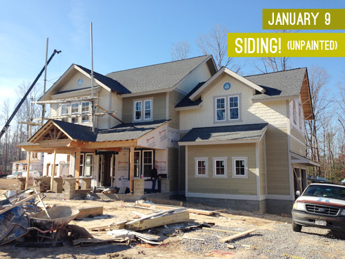
When we last updated you on the progress of the showhouse that we’re working on for Habitat For Humanity (you can read more about it here, here, and here), its exterior was largely complete and it was awaiting some paint. Well, then it snowed for three weeks in a row, which is a complete rarity in Richmond, so while we continued to scurry around finalizing materials like light fixtures, tile, and cabinetry (more on that here), we weren’t able to update you on our color choice. UNTIL NOW! Can you tell I’m EXCITED?! Get those jazz hands up, y’all.
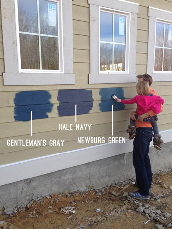
We knew from the get-go that we wanted it to be in the navy family with crisp light trim and some rustic touches (like chunky wood porch beams and some stone around the foundation). The builder was completely on board when we pitched him our navy concept, so we were tasked with choosing the shade so his guys could get painting. Our first step was to bring a ton of swatches that we thought could work down to the job site and hold them up against various planes of the house (the front, the side, etc) just to see how they looked in different lighting situations. Here are the nine swatches that we brought:
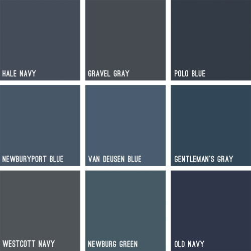
Some immediately eliminated themselves (Gravel Gray and Polo Blue looked almost like black when we held them up, Westcott Navy looked a smidge too gray, and Van Deusen Blue oddly read much lighter – like a medium blue). After a little more debating, we whittled our collection of swatches down to just three contenders:
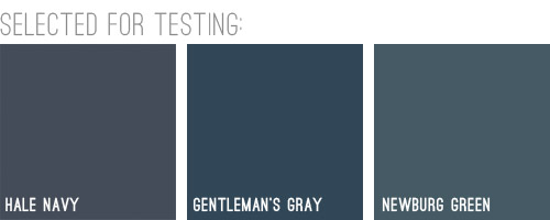
We liked that Hale Navy had some charcoal-ish undertones, Genteman’s Gray was pretty pure in that “it’s just navy” scheme, and Newburg Green was a smidge lighter with a hint of a green undertone (you can learn more about paint undertones here). Between the three of them, there was a nice range (unlike getting test pots of three identical navy colors) and we honestly thought all three of them could work, which was comforting. So off to the paint store we went…
We came back with three test pots to apply right to the house’s siding. Clara helped with the mixing:

We just brushed them right on, being sure to remember which one was which. After each one dried we applied a second coat and waited for that to dry so we could get a true read on each color.
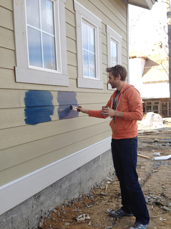
Clara even got in on the action at the end. Start ’em young.
These are just iPhone pictures on a cloudy day, so they don’t really capture all the nuances that we could see in person, but after two coats of each color had dried, it was clear to us that Hale Navy and Gentleman’s Gray were slightly darker and more intense, while Newburg Green was a bit less “midnight-ish” and a little less serious and formal, if that makes any sense at all.
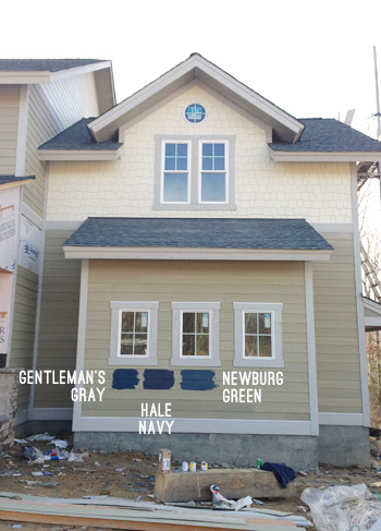
It’s weird to describe colors as being more or less formal, but something about Newburg Green felt more casual and friendly in person. Gentleman’s Gray and Hale Navy certainly would have been handsome, but Newburg Green was just calling our names a little louder. We also thought it would have a bit more contrast with the roof (we worried the other two might blend in with it too much since they were darker/grayer).
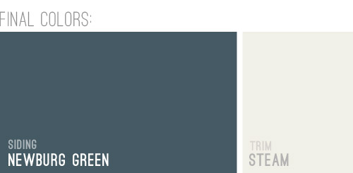
And so it was decided. Newburg Green was IT. And after holding up a bunch of trim swatches, we ended up with Steam as our trim color of choice. It would still read as a nice clean white on the house, but it wasn’t too stark or blinding, which we liked.
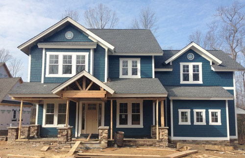
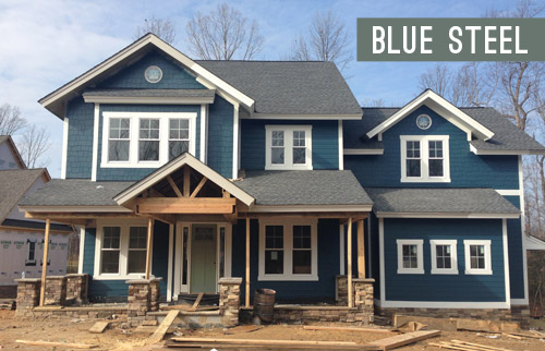
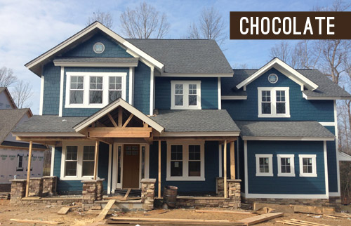
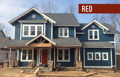
And here she is all painted and lovely! We’re really happy with how it looks with the tone of the roof and the Steam colored trim. And aren’t those two round windows in those peaks adorable?! The paint color really seems to emphasize the pretty architecture, thick trim, and sweet details like those windows. Of course there are still a bunch of unfinished elements going on (we have awesome chunky columns that will be going in above each of those stone pillars around the porch, and then all of that wood will be sealed, which will give it a slightly deeper but still warm & rustic tone).
And we can’t forget how much of a difference a little landscaping will make. It’ll take the look from “The House That Sprung Up Out Of Nowhere” to “The House That’s Integrated With Its Surroundings.”
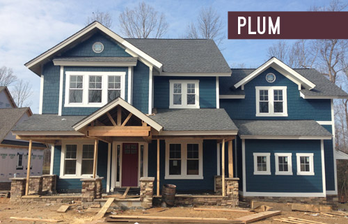
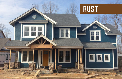
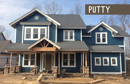
But let’s look at the front door for a moment. We’re currently debating a bunch of colors for it, so we thought it would be fun to have you guys weigh in too. It arrived in this tone (we didn’t paint it this color, but it isn’t able to be stained), so we messed around with a bunch of color options in Photoshop (over two dozen!) and these were the ones that seemed to work the best with the other elements that we had going on. Some of the nixed colors surprised me (I’ve always loved navy houses with yellow doors but it just looked too crazy on this house) and the ones that we ended up liking also surprised us (who knew we’d ever even consider a blue-gray-green door on a navy house?). So without further ado, here are our six finalists:
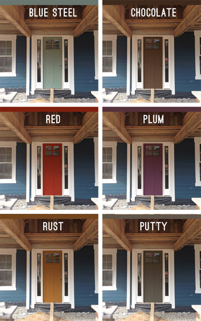
Note: Photoshop is not real life – so the door will most likely look a lot more dimensional (and generally better) than these fake renderings when it’s actually painted.
But let’s zoom out and break things down for a hot second (although the colors are generally a lot easier to see in the up-close grid above). First we have a paint color we’re affectionately calling Blue Steel, which is a greeny blue-gray. None of these are real colors from a paint deck (we picked all of them in photoshop), but we’d choose a swatch that has the same undertones if we opted for any of these choices.
Next we have something in the chocolate range. Sort of like this:
Another color we considered was red, for that nautical, all-American look.
We also played around with the idea of a rich plum door, although this one’s a lot easier to see in the zoomed-in grid above.
We thought something in the rust family could be a nice nod to the natural tones in the stone and the porch beams (which will end up a bit richer/darker than they are now, but should still feel warm as opposed to cool).
Lastly we have putty, which ties into the tones in the roof and some of the colors in the stone around the porch.
So don’t be shy, we’d love to see which way you guys lean! We can’t finalize the door color until the porch beams are all installed and sealed, but we’re hoping that’ll be pretty soon.
VOTING ON THIS POLL HAS CLOSED

As for the inside, exciting stuff like tile and hardwoods are going in and we’re beginning our furniture/rug hunt along with trying to pin down a bunch of interior paint colors, so we can’t wait to share that progress. Hopefully in the next week or two!
Psst – Wanna see the finished showhouse? Click here for Our Full Showhouse Tour, which includes final pictures of every room, the floor plan, budget info, a video walk-through, and shoppable showhouse furniture & accessories.

Megsy says
I’d stick to having the door match the trim. The colour of the siding already makes such a statement, plus you’ve got wood and stone, adding another colour will make it too busy and draw the eye away from that gorgeous siding.
Mary says
I know you’re the experts, but can I throw in another color? I have my sons room that color and mustards look phenomenal with it! Had to give my two cents!
YoungHouseLove says
Thanks Mary! I tried making different yellow tones make sense in Photoshop (including mustard) but it didn’t look great – could easily have been my photoshop skillz though! Haha! Once the beams are installed and sealed we’d love to hold up swatches and check to see if it’s any better in person :)
xo
s
Jayme says
I think white would be the best option, if you add a kickplate to the bottom of the door you dont even have to worry about skuffs. Also if you get a composite material as opposed to a wood door (idk what the door you have currently is made of) the cleaning is supper easy if it does get dirty… you just hose it down
I love the color you chose for the house! It was the one I would of gone with as well, like a slight twist on a classic color
Catherine says
My kitchen cabinets are Newburg Green. It’s my first house and I braved painting them inspired by your kitchen cabinet painting posts. I never would have thought of it on the exterior of a house, though – looks fantastic!
YoungHouseLove says
LOVE the idea of that color for cabinetry! I bet it’s gorgeous!
xo
s
Kristen says
Is this a regional thing? Painting siding, especially on a new house? Why not order siding in that color? Did I miss something?
YoungHouseLove says
I think it depends on the type of siding. Here you order certain types (like aluminum or vinyl) in a certain color and it gets put on in that color, but siding options like Hardie Board get painted in place (like this house’s siding choice).
xo
s
Ana says
Love it! il looks really nice, I’m now considering the color combo for my own house. Regarding the door I voted Red, love the contrast with the navy and it has a fun and classic look. But for something a little out of the ordinary I think Plum would look great, one doesn’t see a lot of houses with Plum doors while all of the other colors (even red) are more common.
Kate says
Can you tell me where the door is from? Is it fiberglass? We have a Craftsman Bungalow in desperate need of a door upgrade and this one looks great.
YoungHouseLove says
I think it is fiberglass (it’s not stain grade wood). Here’s hoping Justin or John The Builder drops in with that info!
xo
s
Mary says
Navy would have been a lovely choice. It’s great that you like the color you ended up with, but it’s definitely teal/peacock blue, not in the navy family. I understand how that happens, having been through a color choice myself where I ended up with a color that turned out brighter than I expected. I really wanted a brightly colored door, but it just wouldn’t have looked right and I think that’s the situation here. A black door or a door the color of the trim would look better than any of the choices provided.
Netty says
RED RED RED!! :) Great Feng Shui! :) Love the house so far. :) Is navy and white the new gray and yellow? I’m starting to be drawn to that combo quite a lot recently. :)
HeatherM says
I love the paint color. But I have to ask- what is up with the bizarre little inlet between the garage and the main part of the house (just to the right of the front porch in those pictures)? It seems like a really poor use of space. The owners can’t really grow grass or plant bushes or anything there, because it doesn’t get any sunlight. So it will basically end up being a constant mud pit in that spot from the way it looks now. And (I know I’m easily spooked) but if I lived there I would probably be a little creeped out that someone could easily hide in that spot and jump out. Since it looks like an aspect that could frustrate the owners for years to come, do you have any creative plans to liven up that bizarre unsightly nook?
YoungHouseLove says
I think it’s just how the house’s exterior was designed by the builder and the architect (we love the dimension of everything not being all one plane). Perhaps a little rock bed there for drainage with a cute rain chain will work to keep it from getting muddy. We can’t wait to meet with the landscape architect to hear all of their ideas! They work with new constructions with similar exterior layouts a lot, so I’m sure they’ll have some fun options. Here’s hoping!
xo
s
susan h. says
Like quite a bit of what you do but have to say that painting a house any color of blue was a terribly bad idea. Bad for looks and bad for resale.
YoungHouseLove says
Thankfully we chatted with the realtor for this house about our color choice before it was painted and she was all for it, as was the builder. Apparently she even told him that his last house would have sold faster if it was this color. Isn’t that funny?! There are many homes in Richmond in this tone with white trim, so maybe it’s a regional thing?
xo
s
Amanda H says
Oh my goodness, I cannot wait to walk through this house and gawk at everything you guys have done!! I love the plum door with the navy but I realize it might not be every gentlemen’s cup of tea so my second fave is the putty. But seriously, whatever you guys choose is going to look freakin awesome!
YoungHouseLove says
Thanks so much Amanda!
xo
s
Tina says
I love the color choice – I may use I for my own home! Love all of the door choices as well – I don’t think you can go wrong with any of them!
YoungHouseLove says
Aw thanks Tina! Send pics if you end up painting your house something similar! Would love to see how it looks on other homes :)
xo
s
Tonya says
What brand of paint swatches are these? I LOVE the Steam color for my kitchen cabinets!!
YoungHouseLove says
Thanks Tonya! They’re Ben Moore.
xo
s
Sassafras says
It looks lovely. Having had a house that was painted navy before (bought house it was gray, went back after closing and the seller [a rent house flipper] had painted it navy for us without asking as a ‘favor’ UGH), I have to say that navy sucks up a lot of heat and made the cooling costs quite high. We know because we later painted it out in a light color and summer electricity costs plummeted. FWIW. I do think it looks nice though! :)
YoungHouseLove says
Thanks Sassafras! Someone in a really hot climate said that too (I think it was Phoenix or Houston). So interesting! Here in Richmond there are a bunch of darker homes, so I wonder if our milder climate or coastal weather might help? The builder also chose a ton of energy efficient materials (special insulation, an efficient heating/cooling system, low-e windows, low-water toilets, and energy star appliances) so we hope that’ll help with home maintenance costs :)
xo
s
Cara Jeanne says
First I was all about the rust, now maybe blue steel or white thanks to the comments. Will you wait for the beams
And maybe some landscaping to be done before you paint? Tht might make a decision even easier.
YoungHouseLove says
We’re definitely waiting for the beams to go up and get sealed before making any final decisions. Not sure if we can wait for landscaping since that might be really late in the game, but we hope to meet with the landscape expert and chat about planting plans so we can factor those into the door decision even if we have to paint the door before planting starts :)
xo
s
Ashley says
As an English teacher, I find your writing to be very distracting. I actually used it in my class as an example of why it is so important to select precise words so as not to lose or irritate the reader. Granted, my high school honors English students are not quite your demographic as they are not yet, for the most part, interested in decorating. However, even their young brains found the frequent use of “ish” and “-y” to be rather juvenile for professional bloggers.
As an assignment, I asked them to come up with constructive feedback, and the overwhelming responses were to utilize a thesaurus over relying on the repetition of some of your favorite words AND to be more conscious of selecting exactly the right word over relying on add-on suffixes to convey your meaning. They also suggested that you edit your stream of consciousness, rabbit trail style of writing in favor of being more direct. Overall, they enjoyed your voice (although some of them termed it “Try-hard”), and they appreciated all of the photos to illustrate the topics you write about.
Personally, I enjoy much of your content, although I do believe my astute, fabulous students were on point in their recommendations (which I did promise to pass on).
YoungHouseLove says
Thanks Ashley! We’re certainly still learning when it comes to everything that we do (from decorating to our photography and of course how we write/blog), so thanks for the feedback.
xo
s
Shona says
As an English teacher, I find Ashley’s comment to be insufferable.
Barbara says
I also teach English. I’ll never claim to know everything there is to know about my native language but I found that the comment regarding the writing style adopted by John and Sherry was unfair even if unintentionally so.
Words like ‘juvenile’ and ‘try-hard’, whether used by teenagers or adults, are hurtful and judgmental rather than constructive in their connotations.
Also, the writing style appropriate to a personal blog is not that which would be appropriate to a broadsheet newspaper or perhaps even a magazine. I would think that blog posts are interesting for their similarities to English as it is currently spoken.
I really enjoy John and Sherry’s writing and find its suits the medium wonderfully. Keep up the great work :)
Jennie says
As a fellow teacher, albeit in a different subject and at a different level, I understand the urge to correct, or to suggest improvements to things at odds with what you teach in the classroom. However, as a previous commenter noted, John and Sherry’s writing is on point for this medium. I am sure if they were writing for a formal or scholarly publication they would abandon the casual tone, but it works quite well here. While you wanted to offer the notes listed here as constructive criticism, I feel that it was a missed opportunity to demonstrate gracious critiquing for the young minds in your classroom. A personal email to Sherry and John, modeling politeness, would have been much more appropriate for this type of feedback if you felt utterly compelled to share it.
kathleen says
I have a light sage green green that I love with light yellow house. I had a dark green door that was too dark for full sun and would bubble and peel.
what direction does the house face– if full sun– maybe a sage green ie kittery green or a light grey would be nice!
YoungHouseLove says
Love all the suggestions guys! Thanks so much for weighing in!
xo
s
Tanya says
1st choice super glossy black…
2nd choice super glossy red…
When I lived in the Netherlands many of the doors on the old houses were painted in a high gloss color and it really makes the doors pop.
Tanya says
Just googled this…
http://www.remodelista.com/posts/palette-paints-high-gloss-dutch-doors
sarah says
I voted for Rust, because I am biased toward yellow…we JUST (well, within the last year) renovated our whole house and we chose blue siding, white trim and a bright yellow door! (I believe it was called Pencil from Benjamin Moore)you can see it on my instagram account rumtum77 I was going against the popular vote when I decided on the yellow, but I was inspired to go bold from your blog, so thanks!
YoungHouseLove says
Love that!
xo
s
Cecilia says
I would paint the door yellow.
Anouk Faure says
Hello!
I do love the blue and that off-white trim color that you have chosen for the house. But for the door, What about keeping it simple (simple is sometimes the best solution ;) ) and painting it either in a blue color that would go well with the Newburg Green, but have it contrast it a little bit, like a lighter blue!? Or, just simply painting it the same off-white as the trim!?
Can’t wait to see how the project evolve!
YoungHouseLove says
Thanks Anouk! White like the trim has been a huge write-in vote, so we’re definitely considering that too! You’re right about simple being awesome in many cases!
xo
s
MichelleB says
Love, love, love the color! Love the door choices as well – voted for rust, but love the plum too!
Darcy says
Alright ya’ll, I voted for the “Red” door, but I like the “Plum” too. But, for the love of all that is holy…please don’t go with the rust. First reason being is that it is the exact shade of newborn poop. Ick. Second being, it competes way too much with your lovely, rustic wooden beams.
Aside from that, I love your magnificent shade of blue for the exterior. It’s actually making me reconsider my first choice that I have clung to for a while in painting our home.
YoungHouseLove says
Aw thanks so much Darcy!
xo
s
Brooke says
Hi Sherry! The house looks great, I love the color!
I had a question for you. My mom and I are trying to paint the cabinets in our bathroom. We sanded them down and followed your instructions on how to paint cabinets, but when we actually started painting, there were bubbles and blistering. We were wondering if we didn’t sand it enough, or if it has anything to do with it being particle board, and not real wood. Thanks so much!!!
YoungHouseLove says
Hmm, that sounds like a bad reaction. Did you use primer before going to paint? I would use oil-based primer in case there’s some sort of oil-based poly and then use good quality paint (can be latex) in a semi-gloss finish.
xo
s
Rachael says
I don’t know if it’s been suggested, but what about keeping the door a natural warm wood color? Stained and similar to the rust tone, but a less opaque.
Otherwise, also love the deep plum color!
YoungHouseLove says
Thanks Rachael! The door is unfortunately not able to be stained, so we have to choose a paint color for it.
xo
s
Brooke says
Thanks so much for responding, Sherry! We didn’t even think to use primer. We will definitely try that! Thanks for the help!
YoungHouseLove says
Good luck!
xo
s
Susan says
There’s a very similar house in my neighborhood with the same exterior color and your signature yellow door. Why didn’t you choose yellow?
YoungHouseLove says
We actually chatted in the post about how surprised we were that we didn’t like any yellow options in photoshop (we usually love navy with a yellow door) but we think since there are green undertones in the paint it was looking too compete-y and circus-y with our house color, even when we tried a very light tone or a mustardy-yellow one. Might just be bad photoshop though, so in real life once the beams are in and sealed we’ll hold up a bunch of swatches and even do some test spots on the door before making a final decision :)
xo
s
Allison says
Love the house color you chose! We just painted our garage BM “Flint” – a really dark blue/gray, and we love it. Hopefully this spring we will reside and paint our house to match. Of course, I’m partial to the red door because we just painted our door red. Looking great!
YoungHouseLove says
Sounds gorgeous!
xo
s
emily D. says
Yall are seriously so talented, what a great job! But people are cra cra if they think rust looks best, no way jose! :) Dont do it. I vote white too, or really anything but rust. Since the color of the house is so fun something more chill on the door might be worth testing out?
YoungHouseLove says
Oh yes, we’re planning to wait for the beams to go in and be sealed and then we’ll do test swatches and pots of paint most likely- gotta get the builder on board too, so there’s still more testing to go – this is just our little beginning-brainstoring session :)
xo
s
Sara says
We recently painted our home and when I saw your color choices, I zoomed down to see your final choice…hoping it would be the Newburg Green!!! It is really similar to what we went with to paint our NorCal Ranch cottage style home.
BEHR
Body: Polaris Blue PPU13-6
Trim: Snowy Pine PPU10-13
Door: Jackfruit PPU6-7
Hope you pick the more yellow option for the door. ;)
YoungHouseLove says
Sounds really pretty Sara!
xo
s
Emily @ Life on Food says
I really like the rust color although I am surprise the plum doesn’t have more votes. Not something I would typically pick but for a project like this I think it really pops. Our house is a blue gray and this summer we will be painting our front door. We were going with a light yellow but now I kind of what to branch out a bit more. Hope the washer arrived.
YoungHouseLove says
Wahoo! It came! I’m singing and dancing while doing laundry now!
xo
s
Abby says
The color is so different and fun! Love it with the putty colored door!
Abby
Thepreppycoxswain.blogspot.com
Kathleen says
Hey! Loving the house! Just wondering, how did you guys decide on the siding? I would have assumed everyone nowadays would choose vinyl since it’s so low maintenance. Thanks!
YoungHouseLove says
The architect and the builder make all of the structural & building material choices like that, but I believe in our area Hardie Board is favored since it’s more easily re-paintable and known to be extremely durable & low maintenance (vinyl is usually harder to repaint I believe). John’s sister has a new house and she also went with Hardie Board over vinyl siding, so maybe it’s a regional thing?
xo
s
Naveen|soldering gun says
Hi,
Rust and plum both colors look good on door as per my opinion. Very nice home.
Viviana says
Oh wow! Those are the same tones I want for my house! I am just not sure if my HOA will approve them. I personally would choose the plum door. My interior is gray walls, dark wood floors, white kitchen cabinets and purple accents. That is looking so good! Great job!
Gotch from Plush Rugs says
Its good to see someone with similar taste Sherry. Last year I opted for a combination of white and westcott navy.
YoungHouseLove says
Sounds really pretty!
xo
s
Gretchen says
I LOVE the look of a blue house with a yellow door. Our house is Duxbury Grey and our door is a lightish teal – not nearly enough contrast. We’re planning to paint the door yellow this spring to brighten up the front a bit.
Here is a nice example:
http://www.pinterest.com/pin/213287732325714007/
YoungHouseLove says
I love navy and yellow too! It’s one of my favorites – in fact that’s why I shouted out that I was shocked we didn’t like the look in photoshop. We’re not sure if it was just a photoshop issue (user error, haha) or if our navy has greener undertones that made it look too compete-y but we’re definitely going to hold up swatches when the beams are in and sealed to be sure it doesn’t work before finalizing anything :)
xo
s
Lindsey says
Love the navy!
My husband and I were debating which door color to vote for. He likes the red (and oh my goodness, so do I) but I really like the rust too. I ended up voting for red for my husband and because it was a color that we both liked. But now after reading the comments I think a white door would work perfectly too! Whatever color you choose will look fantastic.
JoDi says
I like the red and rust best. I voted for rust, but after going back and forth between the pictures some more I think I like the red better. It just seems to pop the most in the shadows of the porch. I wonder if a less muddy color than the finalists might work even better. That trim is so nice and crisp against the moodier color of the house that a nice crisp color on the door might work well too. Can’t wait to see what you pick!
Ally says
The house colour is PERFECT and Blue Steel is the winner for me. I see that Rust is leading the way right now, but like a few of you, I feel it fights with the wood. You guys must be having so much fun, but are probably terrified at the same time with all the choices you have to make. Trust yourselves, you are good at this! And keep having fun! Ally :)
YoungHouseLove says
Haha, that’s the perfect way to describe it! It’s crazy exciting yet terrifying. We’re learning so much and love our little “team” (the builder, the architect, and other people working on the house with us are so full of interesting ideas and fun lessons – it’s the best).
xo
s
Needle little Balance says
Since the house has such a strong color -that reads teal to me btw and I love teal!- I would choose a more neutral color on the door like putty. I would also consider a door in the color of the roof for a sophisticated look.
Jenni says
Wow, that blue was my least favourite colour from the swatches but when painted I was totally converted! I like the rust coloured door, it gives a really nice contrast.
Neeta@Relax says
Very beautiful home. Siding color is very nice and plum color goes well with the door. Even putty also matches as the roof color goes in contrast with it.
Samantha says
This is sort of related to the house you guys are building. I know you guys like to do phases and live with the rooms that are more expensive to renovate before making huge decisions. How is that playing into building from scratch and not being able to wait? How do you know or at least feel comfortable you are making the right decision? We are closing (hopefully!) very soon on a foreclosure that is literally like starting from scratch. It’s so torn up that a conventional loan is not allowed we had to use an fha 203k to even buy it. I’m so concerned with making decisions in the kitchen without being able to live there first. Any helpful advice or tips for us? We’ve been logging serious time on Pinterest and online looking at kitchens to see what we really like and our contractor has been super helpful as well, but still so frightening spending that much money and not knowing if it’ll flow right for our family!
YoungHouseLove says
You’re doing exactly what I would suggest! Spend as much time looking at inspiration and even playing around with kitchen planning software (Ikea has some for free) just to get a feel for what you might prefer (ex: deep drawers over lower cabinets). Hopefully you’ll hit upon a few “this is it!” things that will get you nice and confident. It’s hard for us to do that with all rooms all at once (especially since we don’t have the budget to tackle them all, so that’s why we just sort of move along and go room to room over time). But in your case there are many rooms you just have to choose the wall color and perhaps the light fixture or flooring (ex: bedrooms) so I’d do what you’re doing and focus on planning the more decision heavy rooms (the kitchen and the bathrooms) and give yourself a break about what you’ll do in other casual spaces like bedrooms and living rooms, etc – since those can evolve over time. Good luck Samantha!
xo
s
JebberJay says
I vote for any colour that is bright enough for the door to pop a little. In the pics, the portico looks like it shades the door area. A brighter colour would help the door be highlighted as a feature.
It’s all looking good!
Robin says
The Rust is just gorgeous! I would have never picked it without seeing it on the house! It looks amazing with the stone and blue siding.
Tricia says
Forgive me if you posted, but is that fiber cement siding or vinyl siding? Love the color!
YoungHouseLove says
It’s Hardie Board :)
xo
s
Amy says
I agree with some of the other posts that yellow would be pretty, I know you tried it out but it just seems sooooo right. like a good lookign man in a blue shirt, khaki pants and a yellow tie ;)
The house looks good you guys! Thanks for letting us have a vote! Of the options i think the blue door is so soft and sophisticated!
Kathleen says
The plum door really pops–and where I live, in Austin, TX, having plum, purple, or eggplant trim with blue homes is really popular, especially among young homeowners. Also, it really looks great with landscaping. White, purple, or even yellow flowers, Japanese maples, variegated, blue grey or even purple foliage–really, whatever landscaping you might be planning would look great with the plum door. And as purple is complementary to yellow, the plum also looks good with the warm tones in the stone and wood.