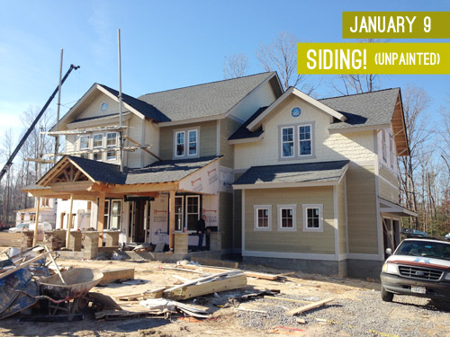
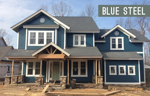
When we last updated you on the progress of the showhouse that we’re working on for Habitat For Humanity (you can read more about it here, here, and here), its exterior was largely complete and it was awaiting some paint. Well, then it snowed for three weeks in a row, which is a complete rarity in Richmond, so while we continued to scurry around finalizing materials like light fixtures, tile, and cabinetry (more on that here), we weren’t able to update you on our color choice. UNTIL NOW! Can you tell I’m EXCITED?! Get those jazz hands up, y’all.
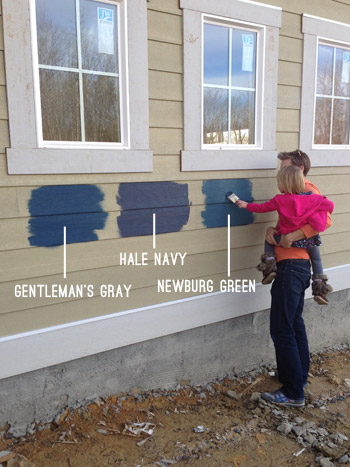
We knew from the get-go that we wanted it to be in the navy family with crisp light trim and some rustic touches (like chunky wood porch beams and some stone around the foundation). The builder was completely on board when we pitched him our navy concept, so we were tasked with choosing the shade so his guys could get painting. Our first step was to bring a ton of swatches that we thought could work down to the job site and hold them up against various planes of the house (the front, the side, etc) just to see how they looked in different lighting situations. Here are the nine swatches that we brought:
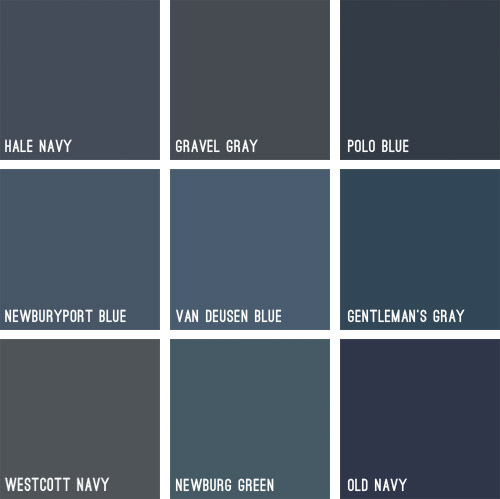
Some immediately eliminated themselves (Gravel Gray and Polo Blue looked almost like black when we held them up, Westcott Navy looked a smidge too gray, and Van Deusen Blue oddly read much lighter – like a medium blue). After a little more debating, we whittled our collection of swatches down to just three contenders:
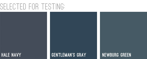
We liked that Hale Navy had some charcoal-ish undertones, Genteman’s Gray was pretty pure in that “it’s just navy” scheme, and Newburg Green was a smidge lighter with a hint of a green undertone (you can learn more about paint undertones here). Between the three of them, there was a nice range (unlike getting test pots of three identical navy colors) and we honestly thought all three of them could work, which was comforting. So off to the paint store we went…
We came back with three test pots to apply right to the house’s siding. Clara helped with the mixing:

We just brushed them right on, being sure to remember which one was which. After each one dried we applied a second coat and waited for that to dry so we could get a true read on each color.
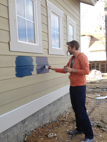
Clara even got in on the action at the end. Start ’em young.
These are just iPhone pictures on a cloudy day, so they don’t really capture all the nuances that we could see in person, but after two coats of each color had dried, it was clear to us that Hale Navy and Gentleman’s Gray were slightly darker and more intense, while Newburg Green was a bit less “midnight-ish” and a little less serious and formal, if that makes any sense at all.
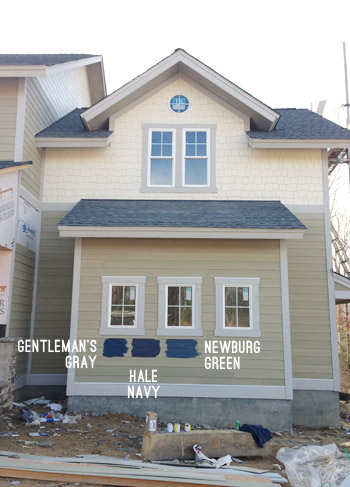
It’s weird to describe colors as being more or less formal, but something about Newburg Green felt more casual and friendly in person. Gentleman’s Gray and Hale Navy certainly would have been handsome, but Newburg Green was just calling our names a little louder. We also thought it would have a bit more contrast with the roof (we worried the other two might blend in with it too much since they were darker/grayer).
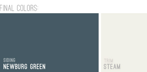
And so it was decided. Newburg Green was IT. And after holding up a bunch of trim swatches, we ended up with Steam as our trim color of choice. It would still read as a nice clean white on the house, but it wasn’t too stark or blinding, which we liked.
And here she is all painted and lovely! We’re really happy with how it looks with the tone of the roof and the Steam colored trim. And aren’t those two round windows in those peaks adorable?! The paint color really seems to emphasize the pretty architecture, thick trim, and sweet details like those windows. Of course there are still a bunch of unfinished elements going on (we have awesome chunky columns that will be going in above each of those stone pillars around the porch, and then all of that wood will be sealed, which will give it a slightly deeper but still warm & rustic tone).
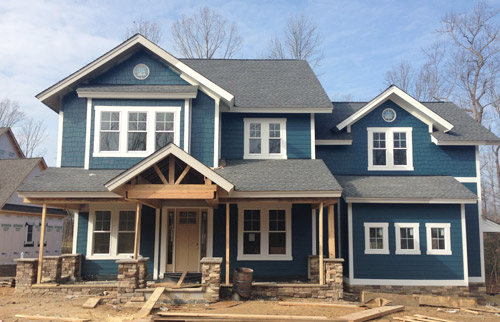
And we can’t forget how much of a difference a little landscaping will make. It’ll take the look from “The House That Sprung Up Out Of Nowhere” to “The House That’s Integrated With Its Surroundings.”
But let’s look at the front door for a moment. We’re currently debating a bunch of colors for it, so we thought it would be fun to have you guys weigh in too. It arrived in this tone (we didn’t paint it this color, but it isn’t able to be stained), so we messed around with a bunch of color options in Photoshop (over two dozen!) and these were the ones that seemed to work the best with the other elements that we had going on. Some of the nixed colors surprised me (I’ve always loved navy houses with yellow doors but it just looked too crazy on this house) and the ones that we ended up liking also surprised us (who knew we’d ever even consider a blue-gray-green door on a navy house?). So without further ado, here are our six finalists:
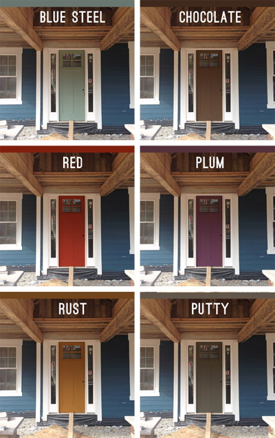
Note: Photoshop is not real life – so the door will most likely look a lot more dimensional (and generally better) than these fake renderings when it’s actually painted.
But let’s zoom out and break things down for a hot second (although the colors are generally a lot easier to see in the up-close grid above). First we have a paint color we’re affectionately calling Blue Steel, which is a greeny blue-gray. None of these are real colors from a paint deck (we picked all of them in photoshop), but we’d choose a swatch that has the same undertones if we opted for any of these choices.
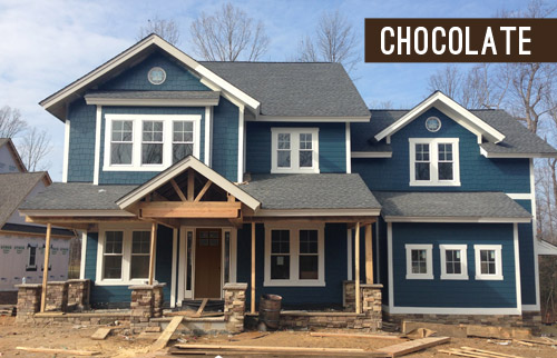
Next we have something in the chocolate range. Sort of like this:
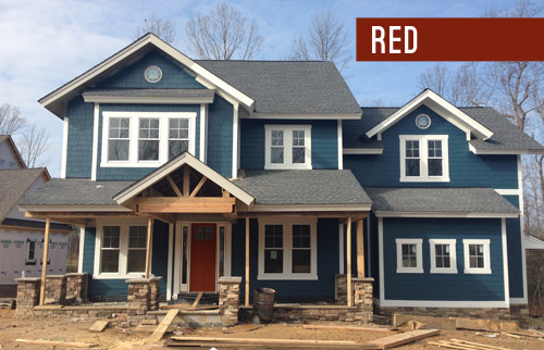
Another color we considered was red, for that nautical, all-American look.
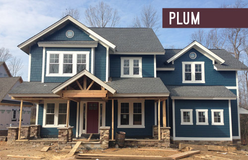
We also played around with the idea of a rich plum door, although this one’s a lot easier to see in the zoomed-in grid above.
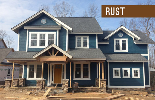
We thought something in the rust family could be a nice nod to the natural tones in the stone and the porch beams (which will end up a bit richer/darker than they are now, but should still feel warm as opposed to cool).
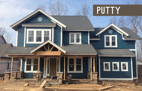
Lastly we have putty, which ties into the tones in the roof and some of the colors in the stone around the porch.
So don’t be shy, we’d love to see which way you guys lean! We can’t finalize the door color until the porch beams are all installed and sealed, but we’re hoping that’ll be pretty soon.
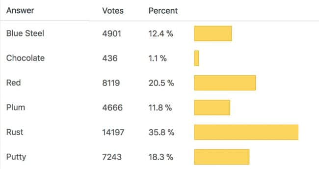
VOTING ON THIS POLL HAS CLOSED
As for the inside, exciting stuff like tile and hardwoods are going in and we’re beginning our furniture/rug hunt along with trying to pin down a bunch of interior paint colors, so we can’t wait to share that progress. Hopefully in the next week or two!
Psst – Wanna see the finished showhouse? Click here for Our Full Showhouse Tour, which includes final pictures of every room, the floor plan, budget info, a video walk-through, and shoppable showhouse furniture & accessories.

Bunny says
I vote red! The Rust on my monitor looks a bit like – ahem – poo.
Heidi P. says
Guess what! I’m helping my parents remodel their kitchen! And it’s all thanks to you guys!! I’ve learned so much from reading your blog. I also have to buy a new car (mine got totaled from being rear-ended – so sad!), and I told my dad that I’m more excited about their kitchen than I am about getting a new car! He laughed and said he didn’t think I had my priorities straight :). I’m seriously so excited about the kitchen!! Thank you so much!!
YoungHouseLove says
That’s so sweet Heidi! I’m so sorry to hear about your car (glad you’re ok!) but so excited to hear about your parents’ kitchen! Have so much fun and send us pics!
xo
s
Sally says
I’m torn between Rust and Putty. I think it depends what color the stained rustic beams will be.
sp says
honestly, not in love with any of those door colors. maybe a cool light gray? (without the green). would have also thought yellow but it sounds like that’s already been ruled out.
Lynne says
love this post, we have a blue house… not as navy as this, i wish it was buuutttt the darker you get the more expensive in the sidings we had to choose from, unfortunately! anyway we ended up with a medium blue with a bit of grey in it… and it has been really tough to choose a door colour. i finally settled on a butter yellow but have yet to paint as i’m up in canada and we have winter for about 7 or 8 months a year. i actually considered a burnt orange for a while, it was tough to decide to go lighter or darker… i think with the navy i would for sure go lighter! anyway love the renderings, got me re-inspired to paint if it ever gets warmer up here!
YoungHouseLove says
That sounds so pretty!
xo
s
Tatiana says
I think the mustard – RUST one is the best choice for the front door, it warms up the house, providing a nice contrast with the cool hues and it will enhances the tones on the wood and stones more. Reading your post have been the highlight of my day lately. xo Tatiana
Rachel says
I love the house color you chose! Honestly when I saw the samples painted on the siding I thought wow they are all so bold but I definitely liked the one on the right best and that’s the one you chose and it looks AMAZING! Definitely a lesson to me to go with a little more color than I think I can handle lol. Looks great. You are doing awesome with this house – what a great thing :-)
YoungHouseLove says
Thanks so much Rachel, you’re so sweet!
xo
s
Melissa says
I LOVE the navy! My fiance and I actually just bought a house in the Home-a-Rama neighborhood (first home buyers=excited and terrified), so we have been looking at our color options in terms of siding, doors, and shutters. The fiance wants something different in terms of siding, so no tan or beige, so when I saw the navy, I immediately emailed it to him. What color shutter could you use though? It looks lovely with the white trim, and I especially love the plum front door. :)
YoungHouseLove says
Aw, thanks Melissa! Maybe try a deep charcoal shutter since that’s so nice on the roof tone? Good luck with everything!
xo
s
Jennifer Laura says
that mustardy rust color is perfect! Go Rust!
Liz says
So I’m just wondering, is dark teal really the best color for a half million dollar home? I’m just thinking a more formal/traditional color would’ve worked better for the potential buyer/neighborhood. And my two cents: ditch the colored door and go for a wood-toned one. It would tie in really well to the reclaimed beams.
YoungHouseLove says
We chatted with the realtor for this house about our color choice before it was painted and she was all for it, as was the builder. Apparently she even told him that his last house would have sold faster if it was this color. Isn’t that funny?! There are many homes in Richmond in this tone with white trim, so maybe it’s a regional thing?
xo
s
Marie@normaleverydaylife says
I like the red, rust, or putty! It’s a hard decision and I can’t wait to see which one you pick!
karen says
so nice to see a blue home with white trim!!! that is one of our choices for our build. a midnight blue with cream white trim, a stained front door with stained french doors flanking it…or a grayish green color. so hard to bite the bullet. my heart is leaning towards blue..so this was nice to see!
YoungHouseLove says
So glad! Good luck with everything Karen!
xo
s
Megan Frank says
What about a natural wood stain to match the beams? Everyone seems to be picking rust, but it’s close enough to wood color, that I’d choose natural wood over rust paint.
I still hope for blue steel though :P
YoungHouseLove says
Thanks Megan! The door isn’t stain grade, so we can only paint it, but we chose some colors that were similar to those wood tones in the stone/beams (like rust & chocolate).
xo
s
Diana says
LOVE that blue with the white trim!! We did a similar color when we painted the outside of our house (note: never buy a house with wood siding!!). Valspar’s Belle Grove Victory Blue. Different shade and undertones but from your pictures looks similar!
http://www.myperfectcolor.com/en/color/74268_Valspar-93-20B-Belle-Grove-Victory-Blue
YoungHouseLove says
Such a pretty color!
xo
s
Leila says
Love it! I voted for the rust door but red was a close second for me.
But it did get me thinking that landscaping incorporating both red would be really pretty… not sure how much input you have on the landscaping (and what works well here in So. California might not in your climate), but red and gold kangaroo paws, red or yellow Japanese Maples, and Fireworks ornamental grass, along with silvery Dusty Miller and blue fescue would be stunning!
YoungHouseLove says
Thanks so much Leila! There’s a landscaping expert that the builder works with all the time who will work with us to help us understand which plants would work where and help us with layout stuff. That should be a really fun part of the process since we’re such noobs about plants. Haha!
xo
s
Elizabeth K says
I really like the Plum, followed closely by the Red! I agree with one of the other comments that the Rust doesn’t seem to go with the wood as much. I would love to see a rendition of white as well.
Adrianne D says
Love those choices, it was hard to pick just one.
Just a FYI, you can download the Benjamin Moore color palette for free for Photoshop. ;-)
YoungHouseLove says
No way! So smart!
xo
s
Heather says
If you pick a colour door, make sure to plant a whole stack of flowers or plants that feature that colour. For example if you go with a red door, choose some red tulips, roses etc to plant in the front gardens. That will really make the door pop.!
YoungHouseLove says
Love that!
xo
s
Jolene says
I actually did a little silent scream of happiness with wiggle knees and everything when I saw the painted house! It looks GREAT! As far as front door – it was really hard to choose. They all have good points, depending on the overall design scheme. So good luck with it – I think it will be great, no matter what.
YoungHouseLove says
Aw thanks Jolene!
xo
s
Cindy says
I’m really surprised that green wasn’t one of the options. I’ve seen some gorgeous apple green doors with dark blue/Charcoal exteriors.
http://www.pinterest.com/pin/162481499030108933/
http://ciaointeriors.com/wp-content/uploads/2010/07/frontdoor7.jpg
http://www.pinterest.com/pin/139189444706419728/
http://www.theemptynestmom.com/wp-content/uploads/2011/09/front-door-windsor.jpg
http://www.pinterest.com/pin/18436679697220062/
You always seem to pick great colors, Good luck with your decision!
YoungHouseLove says
Love those doors so much! I really wanted to include a green option but we couldn’t get it to look good in photoshop! Might have been user error though, so we’ll have to hold some swatches up and see how it looks! With some fresh green landscaping I can totally see how much fun that would be if we could make it work :)
xo
s
Marie says
I’m so happy you didn’t choose Hale Navy! We painter our home Benjamin Moore Briarwood with Hale Navy shutters. Our exposure has made the Hale Navy look like blueberry since day one and I have never liked it. As soon as Michigan warms up my husband will be up on a ladder removing those shutters for a color makeover.
YoungHouseLove says
Oh no! Good luck with your new color pick Marie!
xo
s
Karen says
WOW, guys, that house is stunning with that navy you chose! And thanks for including us for the choice of door color!
YoungHouseLove says
Thanks Karen!
xo
s
Thanushka says
I love the red or the plum. Not just for the happy contrast but because I’m sbit of a feng-shui nut. Red doors bring good luck, it seems.
Kelli says
The house color is gorgeous! What a sweet surprise–a blue house!
When we had our new home built in Texas a couple years ago, we had to pick a paint color that would go on every wall in the interior–from a little swatch in the design center. Being one that usually likes to test colors first, I panicked and came straight home and googled the paint color we chose in hopes that someone in the universe had it on their walls so I could see it. And that’s how I found your blog! I immediately saw you guys had good taste and had the same paint color in one of your rooms. I slept well that night. :) And I’ve been a faithful reader ever since. Thank you for sharing your paint colors with us!!!!
YoungHouseLove says
You’re so sweet Kelli! I love that story!
xo
s
Kristin F says
You had me at Blue Steel, Zoolander!
Honestly, I was torn between it and Rust but eventually cast a vote for the Steel. I can envision it once there’s some greenery and pretty yellow and red flowers in the beds out front. Makes it seem much less Nantucket, which that house is screaming to me right now. After seriously debating this..in my head…I felt like Rust would make it a bit too “RUSTic” . Does that even make sense?
Kristen says
My parents house where I grew up (and where they still live) has a white door – and it was one of those doors where you’d push the lever on the door handle and then KICK! When I was in high school, I put a fresh coat of paint on it ONCE. And it would get a wipe down in the spring…if that… Always looked great! even with the constant kicking. No screen door/storm door, etc
YoungHouseLove says
That’s awesome Kristen! Thanks so much! You guys are so helpful with the white door 411 ;)
xo
s
Kristen says
Also – I live in FL and we went back and forth with our HOA forever to let us paint our house a light color (white basically) for heat purposes. (since it wasn’t an “approved color combintaion” that we wanted) They finally gave in and the house looks, and feels, great!
YoungHouseLove says
That’s so awesome! Glad they let you go for it!
xo
s
Elizabeth says
I voted for Putty on the front door. Once green grass is installed, I think the olive tone will play nicely with a brighter lawn and add some depth to the palette. I like the rust too, since blues and oranges are complimentary. However, I think when the lawn is dormant, it would look a little one-dimmensional.
Love the house color! Spot on!!
YoungHouseLove says
Thanks Elizabeth!
xo
s
qs777 says
Love the blue house color!
I vote for a brightish orange (which is maybe what you mean by rust, although it doesn’t look very orange on my monitor.) Isn’t orange a complement to blue? Can’t wait to see what you do on the inside.
Ann says
If I have to pick, Plum. But – if it was my house, I would want it the same as the trim – just because I love the look of fun wreaths and things hanging and I wouldn’t want to compete with a door color when there is already such a great color going on.
Julianne says
Great choice! As I was reading through, I was expecting a poll & low and behold…I chose the same colour! My design sense doesn’t suck too much after all, lol!! :O) Love the door colour choices, too. A nice, stained solid wood door would be a nice option, too.
Brandy says
Oooohh… I love Steam. I painted the cabs at my old house Steam and they were gorgeous. White, but still not TOO white, too glaring. Perfect. Bright white with depth, if that makes sense?
Goes great with the color you chose. Reminds me of Plumage from ur old guest room or the back of your old built-ins, but bluer. Very Petersik:)
I love it!
Red door, red door! I think people are voting Rust bc it’s “safe” looking, it matches the wood tone, but I think the red is classic, fun & a lot like great lipstick for a house, ya know? It’ll make the white trim pop even more, just like red lips make teeth look white! My 2 cents;)
Becky says
All of them look great and I know you will choose a beautiful shade with all the right undertones with whatever selection you make. But honestly with the way the rust color is showing on my screen, all I can think of when I see that color is a newborn’s diaper. (can you tell I am a mother?!?) For that reason alone- I vote Plum!
Rachel Laree says
I picked the same blue-green. It’s the same color as my house. Our’s is a 100 year old remodeled victorian cottage. It’s got a rustic feel even though its one of the old houses down town (practically). I just recently painted our front door after seeing you paint yours blue. I painted it a rustic red with an orange undertone. It stands out the best, and it matches the rustic red we stained our sidewalks and the red brick foundation (that’s 105 years old to be exact). I should take some pictures for you all to showcase. Maybe this summer I will get around to it. I picked the red color for your showhouse.
YoungHouseLove says
Sounds so pretty! Would love to see it!
xo
s
Tami says
I love Rust! I was leaning blue steel but I think that the rust will just pop so much better once the landscaping is in. It also complements the rustic beams (which I loooooooooove) and helps draw your eye there but puts the attention on the beams whereas I think blue steel puts the focus on the door itself. Plus, I think that when guests walk up to the door that rust will just make the navy dreamy. *swoon* I LOVE this house so far!
Lisa says
The rust color looks very mustardish on my monitor! Mustard and navy are so hot right now and are great contrasts!! :)
Valerie says
Black door!!! I feel like the contrast would look fantastic. :)
Mere says
I like the rust out of all the colors you’ve given, but I think I like it the most because what I think would really look good is a natural, stained door. Especially if you do a stain on the wood. Then it recalls kind of a modern arts and crafts feel. Love the overall color that you chose! So perfect!
Kathleen says
I’ve been meaning to write this for quite awhile, and today, well today is just the day. I check your site *daily* and read each article. THANK YOU for being excellent writers. You know when to use “its” and “it’s,” “complimentary” and “complementary,” and you know that “intact” is one word. How refreshing that is in blogland. I love, yes, love your literate yet FUN writing style. Both of you have “a good eye” for beauty, “a good ear” for language and music, and “a good heart” for fun communication. Kudos!
Now, ahem, I do have one suggestion regarding door color. It’s a usability argument. Yeah, really. Pick the simplest color. Many visually impoverished people cannot identify more than the eight basic crayon colors. Aubergine? Melon? Putty? Mauve? What the heck are we artsies talking about?
Pick a simple color as an easy way to differentiate this house from others on the block and to help with directions. “Our house has the red door.” My two cents.
Happy Friday!
kathleen
YoungHouseLove says
Aw thanks Kathleen!
xo
s
Anna says
I was reading day’s post in my blog reader with my three year old daughter on my lap.
“Who’s that?”
“That’s Clara. I think she’s four.”
“Is that her mama and papa?”
“Yes.”
“She is a beautiful painter, and I think she’s my friend.”
“She lives near your grandparents, and she’s helping design a house.”
“Yes, she is completely my very good nice friend. And bigger than me.”
YoungHouseLove says
So CUTE! I’m going to read this conversation to her as soon as she’s up from her nap :)
xo
s
Jaime says
Sorry I haven’t been following this project, but this is a Habitat for Humanity house?! Things must be different in Minnesota…this would be an $800,000 house in a wealthy suburb of Minneapolis.
YoungHouseLove says
Sorry for the confusion! It’s not a house that’s being designed for a Habitat family. These seven showhouses are sort of upscale “inspiration homes” for Richmonders to explore and then for some lucky folks to buy, but a chunk of money from the sale of our house is going to Habitat (thanks to our awesome builder), along with a chunk of the ticket sales for the event, and we’re also donating our design fee to them. So we hope they’ll have a lot of money coming their way to make a nice difference on the homes they’re working on!
xo
s
Lo says
I didn’t read the other comments, so this may have been said already, but I really liked the green-er door color, until I tried the idea of it with the green grass/landscaping that would be there, and then it got lost for me.
If you’re painting the door before the landscaping, don’t forget to factor that in.
YoungHouseLove says
Great tip!
xo
s
Syl says
Love the siding colour, I think that was a great choice!
As for the door, I voted for Blue steel, but I think a butterish yellow (with the light trim and the wood-coloured accents) would be even better.
Isabel says
Love the blue exterior! Rust got my vote, but I really liked some of the suggestions in the comments (the bright green was so fun, and can’t go wrong with a white to match the trim!). The only color I’m not a fan of is red, because as patriotic as I can be, to me it makes the house read a little too “Born on the 4th of July.”
Just curious (I looked back on previous posts, might have missed this), how big is the lot? And will you guys be working on the front/backyards or is that under a committee/HOA-type thing?
YoungHouseLove says
Good question! Maybe Justin or John The Builder can drop in with the lot size? We are helping with the landscaping in the front, sides, and back (as well as some hardscaping stuff like paths and patios) but there are some awesome experts that we’ll be leaning on (like masons for the hardscaping and landscape experts for the what-to-plant-where info).
xo
s
Meg says
We learned that picking an exterior color is alot different than picking an interior one when we started our house painting project this past spring. http://18preston.blogspot.com/2014/01/progress-on-exterior-primed-before.html
We’ll blog about it in the spring, but we went with a color called Go Go Green. (it will go on the house like go go gadget, right?!)
I love the Navy you picked out! Dark, rich colored houses are my favorite!
YoungHouseLove says
So exciting! I love your list with all of those crossed off lines. Congrats!
xo
s
Noelle says
Love newburg green, that’s the accent wall in my living room with the other three in white. It’s such a great shade of blue :)
YoungHouseLove says
Love hearing that! I bet it’s gorgeous indoors too!
xo
s
J Bagley says
I love the rust, and the idea of a white door, but is it possible to have a natural wood door to match the other wood features planned? Don’t know if this has been asked/suggested yet.
The blue/green is so warm and inviting – perfect blend of classic and casual.
YoungHouseLove says
We’re working with the existing door, which isn’t stain-grade (so it has to be painted) but we had fun trying some paint colors to pick up on the natural tones in the wood/stone (like chocolate and rust).
xo
s
Jessi says
I love the plum, much more unique and modern and such an easy change down the road. I love that there are so many great viable options with the siding color!
Melissa says
I hate to suggest another color – BUT – what about yellow or goldenrod? Yellow looks great with Navy. Just a suggestion. :-)
YoungHouseLove says
I actually shouted out yellow in the post since I usually love it with navy but in photoshop it just looked crazy (I think it might be that we went with a blue with green undertones instead of a darker/grayer charcoal-based navy?
xo
s
DawnSC says
Interesting – Hale Navy was my first choice, as I didn’t like the swatch of Newburg Green. But this seems to be one of the few times seeing a larger area painted makes me like a color that I wouldn’t initially have chosen (usually, sadly, I have the opposite problem that a larger area makes me dislike the color I chose :-P)! So good choice on siding.
Our house is blue with a red door, so I’m of course partial to that. Although, the style of our house is VERY different from this – we’re in a small little modified bungalow style house in SoCal. I would LOVE this one, it looks absolutely gorgeous so far! Unfortunately, I don’t have the gazillion dollars it would cost to buy out here. haha :)
Melissa says
The house color is gorg! I know you have already gone through door colors and I am kinda loving the RUST, but did you try a light springy green like fresh baby grass or the first leaves of spring. I think it would make an unexpected and playful punch of color against the navy, putty and maybe yellow, green and white landscape plants. (Daffodils, white azaleas and other light spring-green foliage plants maybe?)