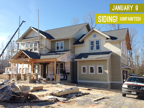
When we last updated you on the progress of the showhouse that we’re working on for Habitat For Humanity (you can read more about it here, here, and here), its exterior was largely complete and it was awaiting some paint. Well, then it snowed for three weeks in a row, which is a complete rarity in Richmond, so while we continued to scurry around finalizing materials like light fixtures, tile, and cabinetry (more on that here), we weren’t able to update you on our color choice. UNTIL NOW! Can you tell I’m EXCITED?! Get those jazz hands up, y’all.
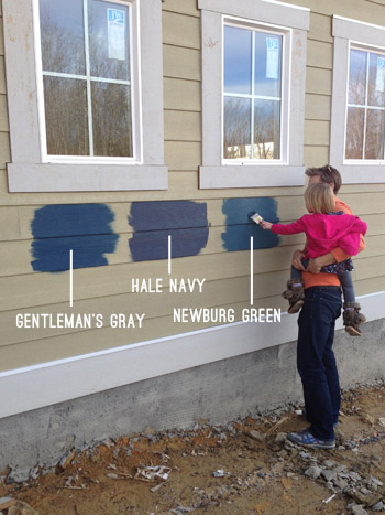
We knew from the get-go that we wanted it to be in the navy family with crisp light trim and some rustic touches (like chunky wood porch beams and some stone around the foundation). The builder was completely on board when we pitched him our navy concept, so we were tasked with choosing the shade so his guys could get painting. Our first step was to bring a ton of swatches that we thought could work down to the job site and hold them up against various planes of the house (the front, the side, etc) just to see how they looked in different lighting situations. Here are the nine swatches that we brought:
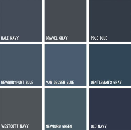
Some immediately eliminated themselves (Gravel Gray and Polo Blue looked almost like black when we held them up, Westcott Navy looked a smidge too gray, and Van Deusen Blue oddly read much lighter – like a medium blue). After a little more debating, we whittled our collection of swatches down to just three contenders:
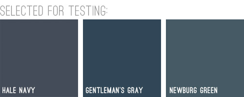
We liked that Hale Navy had some charcoal-ish undertones, Genteman’s Gray was pretty pure in that “it’s just navy” scheme, and Newburg Green was a smidge lighter with a hint of a green undertone (you can learn more about paint undertones here). Between the three of them, there was a nice range (unlike getting test pots of three identical navy colors) and we honestly thought all three of them could work, which was comforting. So off to the paint store we went…
We came back with three test pots to apply right to the house’s siding. Clara helped with the mixing:

We just brushed them right on, being sure to remember which one was which. After each one dried we applied a second coat and waited for that to dry so we could get a true read on each color.
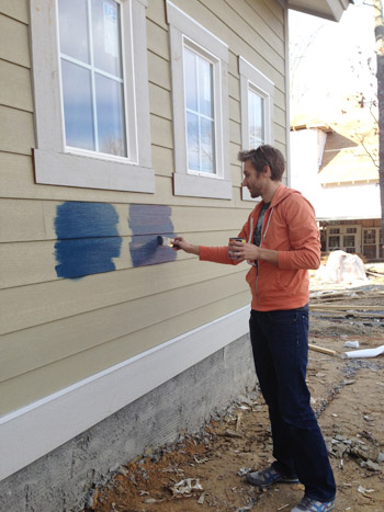
Clara even got in on the action at the end. Start ’em young.
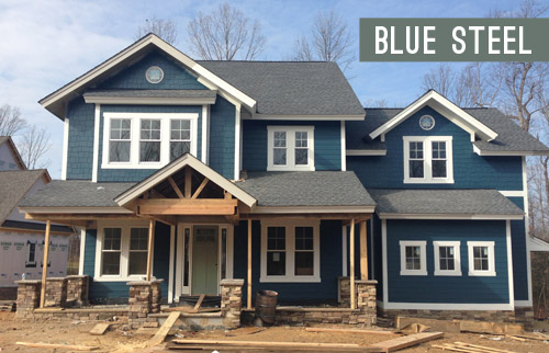
These are just iPhone pictures on a cloudy day, so they don’t really capture all the nuances that we could see in person, but after two coats of each color had dried, it was clear to us that Hale Navy and Gentleman’s Gray were slightly darker and more intense, while Newburg Green was a bit less “midnight-ish” and a little less serious and formal, if that makes any sense at all.
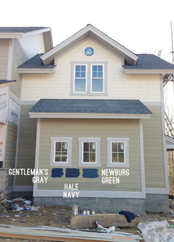
It’s weird to describe colors as being more or less formal, but something about Newburg Green felt more casual and friendly in person. Gentleman’s Gray and Hale Navy certainly would have been handsome, but Newburg Green was just calling our names a little louder. We also thought it would have a bit more contrast with the roof (we worried the other two might blend in with it too much since they were darker/grayer).
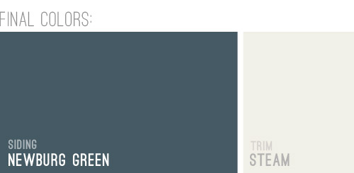
And so it was decided. Newburg Green was IT. And after holding up a bunch of trim swatches, we ended up with Steam as our trim color of choice. It would still read as a nice clean white on the house, but it wasn’t too stark or blinding, which we liked.
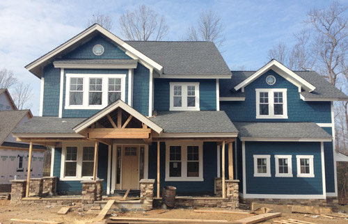
And here she is all painted and lovely! We’re really happy with how it looks with the tone of the roof and the Steam colored trim. And aren’t those two round windows in those peaks adorable?! The paint color really seems to emphasize the pretty architecture, thick trim, and sweet details like those windows. Of course there are still a bunch of unfinished elements going on (we have awesome chunky columns that will be going in above each of those stone pillars around the porch, and then all of that wood will be sealed, which will give it a slightly deeper but still warm & rustic tone).
And we can’t forget how much of a difference a little landscaping will make. It’ll take the look from “The House That Sprung Up Out Of Nowhere” to “The House That’s Integrated With Its Surroundings.”
But let’s look at the front door for a moment. We’re currently debating a bunch of colors for it, so we thought it would be fun to have you guys weigh in too. It arrived in this tone (we didn’t paint it this color, but it isn’t able to be stained), so we messed around with a bunch of color options in Photoshop (over two dozen!) and these were the ones that seemed to work the best with the other elements that we had going on. Some of the nixed colors surprised me (I’ve always loved navy houses with yellow doors but it just looked too crazy on this house) and the ones that we ended up liking also surprised us (who knew we’d ever even consider a blue-gray-green door on a navy house?). So without further ado, here are our six finalists:
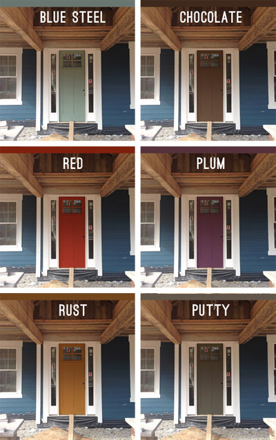
Note: Photoshop is not real life – so the door will most likely look a lot more dimensional (and generally better) than these fake renderings when it’s actually painted.
But let’s zoom out and break things down for a hot second (although the colors are generally a lot easier to see in the up-close grid above). First we have a paint color we’re affectionately calling Blue Steel, which is a greeny blue-gray. None of these are real colors from a paint deck (we picked all of them in photoshop), but we’d choose a swatch that has the same undertones if we opted for any of these choices.
Next we have something in the chocolate range. Sort of like this:
Another color we considered was red, for that nautical, all-American look.
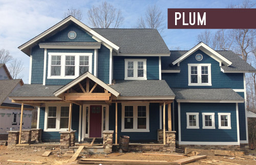
We also played around with the idea of a rich plum door, although this one’s a lot easier to see in the zoomed-in grid above.
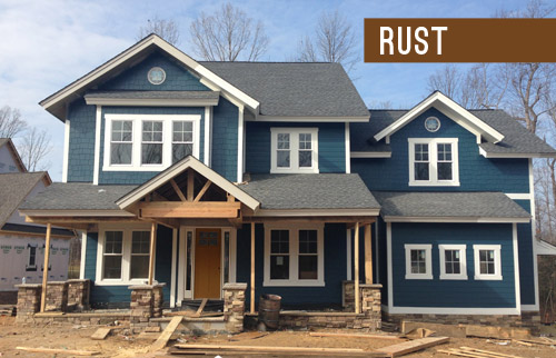
We thought something in the rust family could be a nice nod to the natural tones in the stone and the porch beams (which will end up a bit richer/darker than they are now, but should still feel warm as opposed to cool).
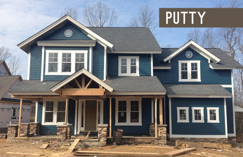
Lastly we have putty, which ties into the tones in the roof and some of the colors in the stone around the porch.
So don’t be shy, we’d love to see which way you guys lean! We can’t finalize the door color until the porch beams are all installed and sealed, but we’re hoping that’ll be pretty soon.
VOTING ON THIS POLL HAS CLOSED

As for the inside, exciting stuff like tile and hardwoods are going in and we’re beginning our furniture/rug hunt along with trying to pin down a bunch of interior paint colors, so we can’t wait to share that progress. Hopefully in the next week or two!
Psst – Wanna see the finished showhouse? Click here for Our Full Showhouse Tour, which includes final pictures of every room, the floor plan, budget info, a video walk-through, and shoppable showhouse furniture & accessories.

Dessica says
We painted our house the same blue color and will be painting the door this summer. I am leaning towards a bold yellow or orange.
jb says
I’m not crazy about any of the possible door colors. How about something brighter? Maybe yellow??
YoungHouseLove says
We actually shouted out yellow in the post as being something I always love with navy, so it surprised me that it looked so bad in photoshop! I think it was the green undertone in the siding, but it was competing a lot. I think with a color like Hale Navy (with more charcoal/deeper tones) it might have looked awesome though!
xo
s
Diane says
In the close-ups I was liking the red door, but after looking at the whole-house views, I pick putty. I like how it ties in with the roof!
Karen L. says
I liked the Newburg Green from the git go. Nice contrasting trim. Bold presentation deserves a bold door. Red is traditionally good feng shui and I love red so it’s a red door for me. – But you might try several different colors of red and see what really pops for you. you might need something a little more in the orange tones of red for the house. Also, I would consider looking at historical craftsman colors since the detailing on your porch has a craftsman feel to me. Sleep on it. What really speaks to you? Look at the pictures before going to bed and allow it to be revealed to you in your dreams. Also, I like the stonework on the front of your home. Can’t wait to see the posts you have chosen.
Lindsey P says
Just had to say that I LOVE these types of posts. Its like a challenge from the get-go to see if I pick the same color that you do. So the list at the beginning and then the reveal after a few clicks down is WAY too much fun for me. BTW, I won my game and picked Newberg green from the start. Boom.
YoungHouseLove says
Haha! I love that!
xo
s
Gretchen@boxycolonial says
Our master bedroom is Newburg Green, and I absolutely love it. We’re more than a year in, and I still adore it more every day. In other words, great choice!
YoungHouseLove says
That’s awesome to hear! I bet it’s really pretty inside too!
xo
s
Liz @ btb says
Love the progress! And I’m definitely a fan of the “rust” colored door!
Dy says
Oh man, to me they all look really muted and somewhat blah… I wish you’d picked a green to go with that blue color for a little pizzoww! Especially once the landscaping gets put in :) But, erm…I think plum wins it for me out of this batch :)
YoungHouseLove says
I really wanted to include a green option but they all looked weird to us. Maybe it’s just our bad photoshop skillz, but they all looked strange (from light mint to kelly green to deep emerald). Once the porch columns are finalized we’re hoping to hold up a ton of swatches (and also do some test pots) so maybe in real life it’ll sneak back into the running!
xo
s
Barb says
I expected a green option too after seeing the post a few weeks ago on the tile selections and then picking green paint for the kids bath vanity. Someone else mentioned it too – I like the idea of the front door giving a hint of what lies beyond.
Lindsey says
I chose Putty, but I’m a neutral gal so I’m sure a brighter option would look great too. You should (as I’m positive you already are) consider the interior color scheme especially the rooms you’ll see the door from. When the door is open you’ll obviously see it from the inside and it might clash with what’s going on in there :)
YoungHouseLove says
Great tip!
xo
s
Rebecca says
Poll was a great idea! Would love to see more interaction like this! :-)
YoungHouseLove says
We’d love to do more of them as we go, for sure!
xo
s
Karen says
Good job on the paint color… it looks great!
My vote is for a yellow door.
http://media-cache-ak0.pinimg.com/736x/3b/a2/71/3ba271885d42a7404efda256547f8d29.jpg
YoungHouseLove says
That’s so charming! We actually tried a bunch of different yellow tones and it didn’t work as well, maybe since our navy is less gray-blue and more green-blue? It looked a little too compete-y for us, at least in our photoshopping attempts :)
xo
s
Laura says
First, love the house. One of the things I love about my old home neighborhood (read: no or little vinyl siding) is the range of colors that people choose to paint their houses. It makes the street unique and beautiful.
On the door, I chose rust, but I might change my mind once the wood is stained. The rust may clash with the stain chosen. If it does, I would go with the red, personally.
Can’t wait to see how the inside progresses :) You guys should be so proud of what you are doing, both in design and working with such a great organization!
Caroline says
The house color is really fun and bold, but to me, because the house is such a “color” and not a neutral background, I think a glossy black door would look fabulous. Some of the bolder door colors start to look a little busy and rainbow-y to me.
Julia Kent @ The Domestic Blonde says
Red for putty for sure!!! The rest don’t look quite right.
Julia Kent @ The Domestic Blonde says
I mean red OR putty. They would both look good!
Barb says
I voted for red, but in reality I prefer raspberry to real red. Given all the options I probably pick black or white. There’s enough other stuff going on and everything doesn’t need to be the star. Once the stone, wood and landscaping are in I think a door that just holds it’s own but doesn’t scream for attention may be just the ticket. If a decision can wait for the stone and wood to be completed the answer may be more obvious.
Amelia says
Ah! I can’t believe rust is winning! It looks like cat puke. Perhaps that is just because I cleaned some up this morning, but yeah, cat puke.
Katie Rose says
Agreed! And I feel like people are just choosing Rust because it is closest to yellow. Honestly though, been there done that. The world has enough navy/yellow combos.
I am campaigning for Plum! It is different but somehow wonderfully works with this house. I have NEVER seen a purple-toned door on a house and I think it could be “the new thing” if you guys put it on your show house!
Steph Connor says
I vote rust or steel blue from the door! The house color looks great!
Shannon says
I really like the chocolate door and the putty door!
Alex says
I love the Rust door, but can also definitely see Chocolate or Putty working well. I think the Rust ties back into your fondness for yellow doors on navy houses without screaming too crazy bright.
Sarah @ Sarah's Daybook says
I love Putty. I think that it would look sooo nice. Personally, I think that the Rust color looks off from the rest of the house and sort of dated.
Can’t wait to see what you choose!
Seriously CAN’T WAIT UNTIL TOMORROW!!!!!!
Sarah
http://www.sarahsdaybook.blogspot.com
YoungHouseLove says
Wahoo! We’re so excited about tomorrow too! See you there! I’ll be the one with the big belly :)
xo
s
Abigail says
I love the Newburg Green for the exterior!
I have Hale Navy in my LO’s nursery, and I LOVE it. The ceiling is painted navy, and the walls have wide (18″ or so) vertical navy and white stripes. I just love the way it turned out. Great “true” navy color for anyone looking for that!
YoungHouseLove says
Sounds really pretty!
xo
s
Bethany says
I definitely ooohed and ahhhed out loud sitting at my desk (think goodness I’m tucked back in my own corner at work) when I scrolled down to the picture of the house all painted- LOVE the color. I’m a huge fan of navy and I think it looks really charming on the house. My vote for the door is rust- it’s a unique front door color for sure! I loved getting to vote- thanks :)
Tiffany Bolton says
Red or Rust!
Terri says
I choose rust, but with more red than the photoshop color. If it had been an option, deep cranberry (dark and moody in shade) would be my first choice.
caroline says
Ha! I was going to vote for rust and I see it’s the favourite for now, just wanted to suggest (if you do end up going for that kind of tone) something a little lighter, maybe even mustard coloured? I can imagine how a bright yellow would look washed out next to that blue, but a nice deep mustard sound just right to me ;)
Good luck with all the choices! Sounds like so much fun!!
xx
Caroline
YoungHouseLove says
Thanks for all the suggestions guys! This is so much fun!
xo
s
lizaanne says
While I was really tempted to vote for RUST, I had to go with the RED team. I think it is because I really love a yellow door on a blue house, and the rust was looking a bit yellow on my screen and I don’t think it probably is that yellow in real life (or why would they call it rust??). So going with my gut — loving the red door!!
Also — with the large and deep looking alcove on the front porch, a darker color is going to make it look like a cave, and not draw the eye into the doorway. I think the red does a great job of brightening up that space.
(Big yellow planters would still look fab on the porch!!) :-)
Oh — and I LOVE the blue!! I am not a fan of blue, generally, but it really suits this house very well. Great choice!
Megan Frank says
As I was reading this, I thought “no, no! that blue color is too crazy!” And I say that from years of experience of picking fun colors that look way aweful once it encompasses a whole wall. And yet, this color turned out great for you! Well done. I voted blue steel b/c my fav color is green.
Anyway, my question: is it killing you at all to design a house that you don’t get to live in? I would have such a hard time giving that house up! It’s gorgeous!
Megan Frank says
p.s. brilliant thought about taking the roof color into consideration!
YoungHouseLove says
I think it would be hard if we weren’t weirdly obsessed with our own house (we’re like, unhealthily in love with our house and our neighborhood) – so it’s a really fun challenge to get to work on this house, and as much as it feels like one of our babies at this point, we have always been creating it knowing that it’s for someone else, so it’s not too hard to let it go someday. I hope! Haha!
xo
s
Christine G says
Is that Newburg Green from Benjamin Moore? I’m loving that “casual” navy feel and it’s now in the running for the eventual attack (aka repainting) on my horribly beige shutters, front door, and garage door (against off-beige siding, gag). The H4H house is looking fabulous!
YoungHouseLove says
Yes sorry, it’s Ben Moore. Happy house painting!
xo
s
Makrina says
I’m surprised that the Rust door is so popular, because I see that color on a wall/door/etc. and all I think is poo. But maybe that just says something about me?
Stacy says
LOVE the color you chose for the house – I love dark houses with bright white trim.
Will you be painting the inside of the front door the same color as the outside? I personally love the rust door, but it seems like it might be difficult to find another color for the interior that will look good with it (without being too dark – I am having a hard time imagining it with a lighter color) for the entry hall if you go that route. I’m sure you’re up for the challenge, though :)
YoungHouseLove says
I think the inside will be white unless we went with something like red or the steel-blue-green, which might work better inside.
xo
s
Sarah Z says
The house color is absolutely gorgeous!! Wow. With that chunky trim… amazing! I voted for Blue Steel on the door, but Putty is my second choice :)
Emily says
Well, as much as I wanted to vote “Blue Steel” (insert Zoolander pic), I’m singing Rust! Rust, baby! And I loooooove the siding pic. Stunning! Wtih some darker stained columns…omg, swoon!
Rosemary says
I’ve been so excited about the built-ins, I’d practically forgotten about the show house! It’s beautiful and seems like magic how quickly it’s coming together. My husband and I are living in NYC and planning on moving back home to dear old Charlottesville within a year or two… would you mind organizing something similar and designing us a house? :)
On a serious note, I’ve never heard of these projects in other areas! Do they happen all over the country, or is Richmond just that wonderful?
YoungHouseLove says
I believe if you search “Parade of Homes”, “Homearama”, or “Street of Dreams” they do tend to happen in many cities. The charity component seems to vary (some are just home shows without much of the donation component, and some are much more intertwined like this one is with Habitat or like Street of Dreams shows often are).
xo
s
Marisa g says
Love the navy! I think the blue steel door looks great, it’s my favorite!
Melissa says
Definitely blue steel, works best with the stone and the color of the house. I think it’s too green to have red or purple, and I don’t like the brown colors at all.
Emily says
I am a huge sucker for a red door. My mom has always had our door red.
Emily
eageremily.blogspot.com
wordshipper says
The nicest contrast is always the opposite on the color wheel. I think you’re on the right track with the red but it’s too bright. Mute it down. How about cranberry?
YoungHouseLove says
When we got a little darker with the door in photoshop under that awning it just started to look brown, so we lost the red-tones a lot since it’s in shadow. Will have to hold up swatches or do test pots of paint to be sure what color will really do in real-life though!
xo
s
Kelly says
I say Red or Plum for the front door! Those two really make the house pop and add fun character to it.
Janice says
oh my gosh! The house looks AH-MAZING! My first exterior choice was Hale Navy but I love the end result with Newburg. Looks FAB-O! :) My door pics are Red and Rust. I haven’t read what everyone else is saying – an actual poll would have been fun to watch the results come in!
Sorry about the washer – but HEY! As long as it’s here before the bouncing baby boy – it’s probably all good. :)
YoungHouseLove says
Oh no, is the poll not displaying for you?! There’s one embedded in the post. Maybe it’s not showing up on certain devices?
xo
s
Mollee says
If rust wins (go rust!), maybe you should rename it “rustard” since so many people say it looks mustard-y. Rustard could be the new grellow! ;)
YoungHouseLove says
Hahah!
xo
s
April says
I’m surprised at myself that I like the rust so much, usually I am not a fan of that color. The one I like the least, plum, is usually one of my favorite colors, so good job mixing it up so well and keeping it interesting!
Janice says
oh shoot – I see there IS a poll! didn’t show up in my reader! :)
YoungHouseLove says
Thanks up for the heads up that it’s not displaying in Reader! Will add an update to the post to help others click through and find it :)
xo
s
Annie says
I vote plum!
Kelly H. says
I surprised myself by LOVING the chocolate door right off the bat!
Sarah says
I’m just laughing at “Blue Steel” — all I can think of is Zoolander…. The colours looks great though!!
Bethany says
I am not crazy about any of the door colors. I like the putty the best but wish it was a darker gray like BM graphite
http://www.benjaminmoore.com/en-us/paint-color/graphite
YoungHouseLove says
That’s a fun suggestion too! Thanks to everyone for weighing in!
xo
s
Marianne in Mo. says
I voted for rust, but have to say, IMO, wasn’t crazy about any. (Maybe it was the Photoshop colors?) I wonder about a pale yellow? I know you said yellow was weird with the siding color, but maybe if it were pale? It would tie in with the lighter stones. I love color on a front door! I tried out turquoise on mine, but ended up hating it. Now it’s white, and not at all hard to keep clean. Our porch is covered like this one, so doesn’t get hit with rain and snow. It’s a semi-gloss, so any soil wipes off with a quick swipe.
YoungHouseLove says
It might have just been a photoshop thing, but any color that got too pale under the shade of the awning from far away just sort of looked like a dirty white color. Like it clashed with the white trim/sidelights but wasn’t saturated enough to be its own color if that makes sense. Could totally have just been a photoshop byproduct though, so we hope to hold swatches up and even do test pots of paint once the beams are up and sealed so we can make final decisions and share all the intel with you guys :)
xo
s
Jennifer R. says
Based on your decorating style, It seems that only rust or blue steel would lend itself to feeling cohesive with the interior. Maybe I’m wrong. I voted for blue steel, it is so fun and inviting… and I imagine whoever would purchase the home that is decorated YHL style will adore that character of a sweet steel blue door. :)
I think another consideration would be what the door will open to and if the back of the door will be painted the same color as the front.
YoungHouseLove says
Thanks Jennifer! We think the inside of the door will be white unless we go with a color like the Blue Steel or even the red or plum, which we think we could integrate into the foyer/house in cheerful ways so that it’s all cohesive and related.
xo
s
Jennifer R. says
Fingers crossed you guys choose blue steel – I think a splash of color inside the house from the back of the door is so cheerful.
Have a great weekend!
Kim says
Oooo I love it! There is a navy house with white trim in my neighborhood and every time I walk by it, I think how beautiful it is!
I think our house’s paint colors are pretty cool too though. We just bought the house a few weeks ago (!!!) and I’m smitten. :)
http://instagram.com/p/iont7SkXJn/
YoungHouseLove says
Love that house! Gorgeous!
xo
s
Sara says
I vote plum or blue steel!
heatherb says
I picked plum, but rust was a close 2nd. Looking really good!