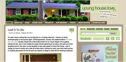
Yup, after months of working on a little behind the scenes blog makeover (not kidding, this stuff literally takes us months) we’ve FINALLY let ‘er rip. Like any project, there were unexpected delays: mysterious coding glitches, inexplicable site crashes (thanks for your patience on those, btw), an earthquake and even a hurricane to round things out. But before we let another excuse get in our way, we decided to just go for it. It’s not 100% done. It may crash the site again. There could be a blizzard next week. Who knows.
It’s actually surprising to us that we haven’t done this sooner. We’ve had the same exact blog look/background/layout since the spring of 2008 (if you can believe it). It seemed silly that we’ve been through so many room re-paintings, furniture re-arrangings, and even a move to a whole new house… but hadn’t so much as changed the background pattern for three whole years. So it was definitely time. It just sort of felt like we were wearing old clothes that didn’t quite fit anymore. So although we know there are probably folks out there who will miss the old look (we’re sentimental creatures too) we’re excited to finally put on a fresh new outfit.
Here’s a little bit of what we were hoping to accomplish with the new design:
- Update the look (colors/patterns/typefaces) to be more reflective of our design choices in the new house
- Make the header more inclusive of the things we blog about (folks kept saying it just represented the “house” part of our name)
- Lighten up a bit, since the old color scheme was feeling a bit dull & heavy at moments
- Improve navigation and help you guys discover content more easily
- Overall just make the site feel fresher, more 2011 and less 2008
So this is what our amateur web designing skills came up with. So far we really love it, even though there are definitely things we’re still trying to finesse. We’ve been tweaking it for the past several weeks, so we’re kinda used to it by now – but we understand if some of you are still skeptical of the change. Think of it like rearranging a room or painting a wall – you might just need to give it a few days to get used to it.

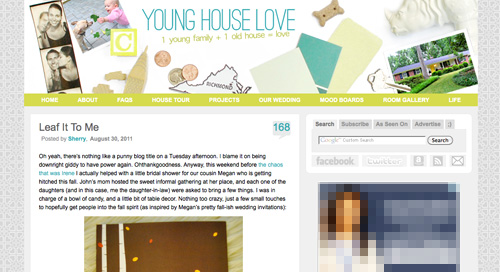
When it comes to the actual header, we photographed a collection of objects that had special meaning to us on white cardstock outside (you know we love keeping things personal). In case you can’t figure it all out on your own, here’s the meaning behind each item:
- Photostrips have always been something we’ve enjoyed, hence their appearance at our wedding
- Clara and Burger are as much a part of this blog as any DIY project, so their picture was a must
- A little wooden “C” block for Clara and a small bone-shaped dog treat (on the other side) were another way to tie them in
- Sherry and I met in 2004 when we lived in NYC, so the little wooden skyscraper and taxi cabs remind us of those early days
- We’re cheap. So we save our pennies. Hence the change, which actually adds up to seven cents – which is a lucky number of ours (plus the dates on each of the pennies are 2007, which is when we started this little ol’ blog)
- We live in (and love) Richmond. So we tossed in a little Richmond magnet. Represent.
- Paint swatches and fabric samples = our idea of a good time. So we picked a few that felt like our current house/style
- There’s not a much more sentimental object than the key to our house (although we altered the tip of it in Photoshop because we’re paranoid)
- Of course we also squeezed in a photo of our current house (had to have that happy yellow door in there somewhere)
- A white ceramic rhino is kind of our mascot at this point (at least behind Burger and our dearly departed ceramic dog).
When it comes to the background, we actually created that as an homage to our previous logo (you know that little YHL heart? the background is actually just a gazillion of those laid out at all different angles to make an abstract-ish pattern). And as for the actual functional changes that we made, here they are:
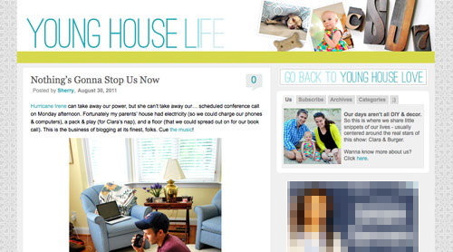
1. We added a new side-deal called Young House Life (see the “Life” title under the header on the right?) to serve as sort of a “mundane everyday happenings area” where we mostly share Clara & Burger pics/videos along with behind the scenes blog stuff and other odds and ends that aren’t beefy enough for a dedicated YHL post over here (you know we love to over-share). But don’t worry, it doesn’t mean Clara, Burger, and other life stuff (vacations, anniversaries, etc) will suddenly be gone from the main site. Those things have always been a huge part of who we are, so they stay. Just think of Young House Life is a little “bonus footage” spot. Oh and it has a separate feed address for you to subscribe to as well (if you’d like to get those updates on your reader).
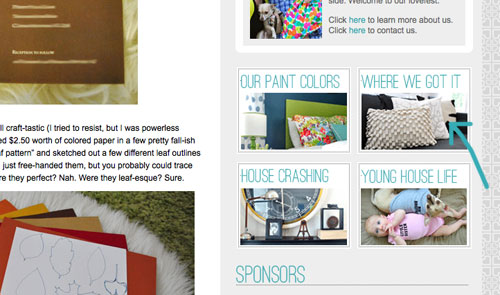
2. We finally made a paint color page about all of the ones we’ve used in this house and linked to it from our sidebar (like this one that we made for our first house).
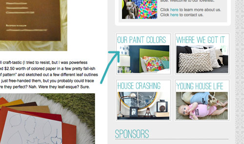
3. We also made a dedicated source list for where we got nearly everything in this house (like this one that we made for our first house) and also linked that up on the sidebar.
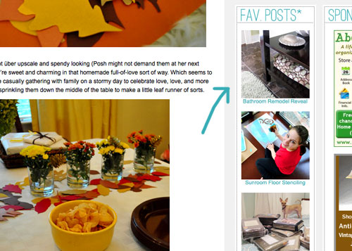
4. We tossed in a Fav. Posts button, also on the sidebar (with little thumbnails and links). We intend to update it every month or so with new faves (since we’re fickle folks and because we’ve also heard from a bunch of readers who’d love to see more archive stuff, but aren’t sure what’s worth digging around for).
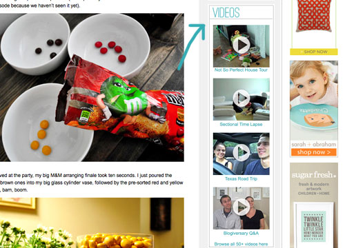
5. We also added a Videos button on the sidebar, which shows thumbnails of a few of them. All of our videos used to be accessible from the bar under the header, but we moved some other stuff up there and thought videos could breathe better down below – so now you can access them all by clicking the link at the bottom of this button.
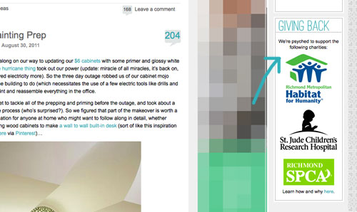
6. We added a Giving Back button to share the love for three charities that we’re thrilled to support, each of which were chosen because they represent stuff we love (homes, kids, & dogs). We make an annual donation of $1,000 to the Richmond Habitat For Humanity along with $500 to St. Jude Children’s Research Hospital and $500 to the Richmond SPCA (and we definitely encourage others to check them out – you can donate here, here, and here or find a local Habitat for Humanity or SPCA in your area here and here).
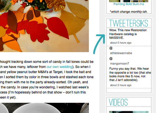
7. We retooled a lot of other buttons that have always been on our sidebar (like the House Crashing one) with some updated pics/type/colors. But that’s more decorative slash fun than functional. As is the new Twitter button which now goes by the name of Tweetersiks. Oh yeah, we officially out-punned Mr. Tom Petersik (my dear old dad).
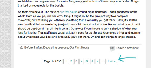
8. Oh and we were inspired (by Kate over at Centsational Girl) to add a nice thorough pagination capability (so you can click back to the very first post in our archives, you know in case you have a year to spare reading 2,000+ of them).
So there it is. Of course we still have a bunch of stuff on our blog-to-do list, so here are just a few things that we’re hoping to roll out in the next few months (or years, you know how long these things can take us, haha):
- Completely “renovate” our Projects page so it has some images instead of just a ton of crazy links (can you believe we’ve tackled over 500 projects?)
- Update the designs/header on the Mood Boards and Room Gallery pages (since they’re still rocking the old tan stripes)
- Add about 100+ other makeovers to our Room Gallery (we have so many amazing Reader Redesigns in our archives to toss in)
Should keep us busy for a while. And we do have our $6 cabinets to finish. Might switch back over to DIY for at least a little bit. Web stuff is kind of fun (when you’re in the zone), but there’s nothing like paint under your nails and sawdust flying. Hope you guys like the new look. Has anyone else done a little site tweaking lately? Any new color schemes or functionality that makes you giddy in that “it’s 2:52 am and we’re still working on this post way?” Not that we are. That would be irresponsible parenting.

abbey says
Different and I always like to see things change and evolve but too much white space for me. Are you dumping the heart logo?
YoungHouseLove says
The heart logo is actually the new background! We just tiled it to make the pattern! It’s also our flavicon (although not everyone can see it- still working on that) and it’s hidden in a few other places. We’re sneaky. Haha.
xo,
s
Emily says
I have wanted to go back and start reading from the beginning. Adding the last tab makes it so much easier. In general the website looks great!
Lelia says
I didn’t think I could love your blog anymore – now its even better!!! I have discovered new projects thanks to your new “favorite post” link!!
eilene says
Love it! It’s a true reflection of what you’re all about. Man, you guys are motivated. Can I have some?
I thought I was on the wrong page as well. Not sure why, but my eye is always drawn to the dog bone first… and no… I’m not hungry!
Trinity says
I LOVE the Young House Life area and how every bit of your header means something.
Carolyn says
It looks great! I love it. I KNOW how long it takes to do this, as I do it everyday for other people. Coding can be a huge time suck, so job well done and happy new outfit!
YoungHouseLove says
I give all the credit to mah main man John. He has worked so hard – still is working right now actually (we definitely have a few more things to tweak/de-bug). So glad so many folks seem to be loving his heroic coding efforts! Haha.
xo,
s
Amy @ Lovely Nest says
It looks great! I love the new color palette and updates!
Heather says
Ah! I love it! It’s so fresh and happy and reminds me of the bright personality that shines through all of your posts. Great job :)
Georgia says
I LOVE the changes. GREAT work!
Azure says
Looks awesome! You guys put so much thought into this. Thank you!
Feel free to ignore me — I would straighten the slogan “1 young family + …” just because its not crooked enough to say “I’m askew on purpose” like in the original. It’s more like “I’m pushing up against the title for some unknown reason!” With all of the other beautiful elements randomly placed, it would be nice to have the title *and* the slogan straight. Of course, you’re the design experts so as I said, feel free to ignore! :)
YoungHouseLove says
Thanks for the suggestion! We definitely messed around with it less and more skewed (more skewed looked hard to read and less skewed seemed to make all the white area under it look kind of… blank). Hope that makes sense! We’re definitely still tweaking a bunch of things though, so you never know where we’ll end up!
xo,
s
ESBlondie says
The header was not showing up for me this morning (just the blue strip). I just refreshed my page (right click, refresh page) and now I have the header! Yay!
YoungHouseLove says
Oh happy day! So glad it’s fixed for most folks. Is there anyone who still can’t see it?
xo,
s
Stephanie says
I couldn’t see it earlier either, but now I can. Looks great!
YoungHouseLove says
Wahooo! Thanks so much for telling us. Serious sighs of relief over here!
xo,
s
karen says
I love it guys!!! Very fresh and happy. So happy you guys used the ‘heart’ from your old header! Clever Petersiks! Love the Young House Life too!
kristin says
I love it! But Sue the Napkin should be featured in your banner!!
YoungHouseLove says
Haha- we worried using her in our “logo” might get us in trouble since it’s a Merimekko design. So we drew some heavy inspiration for our entire new blog color palette thanks to Sue instead! Haha.
xo,
s
Sharee A. says
Love the “fresh” new look. Has a lighter, airy-er feel. Sometimes change is a good thing.
kelley says
i’ve been reading your blog for about 3 years now, and it just keeps getting better and better – new look included!
Emily says
I think this reflects your style much better. The other layout looked like it was a few years old. So well done!
Inka says
Love, Love, Love the new design :) but what happened to the see more Clara pics? Or am I just completely blind and missed it :(
YoungHouseLove says
We put that button over on Young House Life (since we figure all of the Burger & Clara lovers will hang out there too- haha).
xo,
s
carissa says
Love the new design guys!!!
Have you thought about writing a post for new bloggers on how to create a site of their own??? I am very inspired by your site and would love one of my own to keep my family in the loop on our lives, but have NO IDEA where to start designing a site, especially one as awesome as yours. I bet a lot of people would appreciate that type of information. I know I would!!!
Great job again, absolutely fits you all perfectly :)
YoungHouseLove says
John is excited to share a post like that (just about simple site setup and coding stuff) for our upcoming blogiversary!
xo,
s
Amanda M says
*Love* the new set up! I liked the old one as well, but I think you’re right; it’s always nice to freshen things up a bit. :) You guys are awesome!
carolinaheartstrings says
Love it. It truly represents the “who” you are! Great job.
Amanda @ The Fix-Its says
I love the redesign! I think YHLife is my favorite part. Plus, I feel all super cool that I added up the change and got the 7 reference right away. Then I realized that, no, that does not make one “cool”.
YoungHouseLove says
Haha- yes it does. You’re officially cool. $herdog says so.
xo,
s
Carol N. says
Great job, John! I do this for a living and I know how time consuming and draining it can be to work on – as well as keeping up the daily posts! Now I can go back to the beginning of it all very easily. Two “woot” salute!
Kim @ girlevolving says
I love it! The gray patterned background is awesome, and I love how the header contains meaningful things to you guys – the biscuit for burger, Sherry’s obsession with ceramic animals, etc.!
Tara S says
Love the change! I love that you put so much thought and personality in the design. Totally fits with the whole theme of the blog. I do have to say that I adore the “life” addition. I have a family blog that has a very similar theme. Day to day family updates with lots of pictures of my daughter. I am sure your families will love going to that new portion.
I do have one request (if you are taking them), could you bring back the “see all” button in the comments? Not sure if this is something difficult to add back. I really enjoy reading the comments and learn a lot from all your wonderful followers. Maybe I am lazy by admitting that I miss the “see all” button.
YoungHouseLove says
We miss it too, Tara. Sadly when we opted to add threaded comments (i.e the “reply” button) to help organize the conversation it became impossible to display all of the comments on one page without it freezing up or just not loading at all. I guess the code that processing comments can only handle so much!
-John
Tara S says
Thanks for you response, John. I thought it might have something to do with the threaded comments because that is when it disappeared. You win some, your lose some. The addition of the “reply” button is a big win though.
kate says
Love the new look! It’s easy to navigate, and I’m already smitten with the ‘Young House Life’ section.
Jules says
Header worked great for me at home on my Mac at 8 am, here at work (I checked back in for an afternoon post) it’s loading fine but the spacing is off but every blog I read at work has always been like that, except your old one. We run on a really old Windows at work so I think the old with the old header were compatable, but I do think it’s working fine for me or at least as it should be.
YoungHouseLove says
Thanks for the tip Jules! Still sad it’s off on the work computer, might keep playing around to see what else we can do…
xo,
s
Jill says
Love the new look, love the Young House Life section, and love how incredibly hard you work all the time to keep the blog useful and fun and pleasing to the eye for all your readers, without losing yourselves in the process (‘cuz you can’t please everyone all the time). I do miss the original YHL logo with the heart, so I’m glad you incorporated the heart into the background!
Nicole says
Lookin good! Quick question for you – We are repainting all our trim decorator’s white… my existing curtains are a creamy base though with a pattern on top. Do you guys think it’s ok to mix whites? Or do I need the trim in the room with the curtains to be creamier to match the curtains?? Thanks!
YoungHouseLove says
Oh yeah, those will layer together really nicely!
xo,
s
Ekaterina says
I LOVE the makeover! However this light blue font on the white background is a bit hard to read. I don’t have perfect vision, but it is not THAT bad. However I really have to work for this light blue fonted links. Sue the napkin had some dark purple and rich dark turquoise that might work better for slightly vision challenged YHL fans like me :) Lots of love!
YoungHouseLove says
We definitely didn’t account for things looking lighter on different monitors, so we hope to up the contrast and strike a balance that hopefully “reads” well on every screen. Here’s hoping…
xo,
s
Lauren Spekkers says
Holy smokes! I love it! It totally makes my heart smile! The colours are fresh, and all the little pictures of you guys plus Clara and Burg are the cutest. I especially love all the various things scattered around, especially Sherry’s beloved Rhino! I have to say though – I had a slight panic attack when I couldn’t get my daily – no, let’s be honest – hourly YHL fix. Glad everything has worked out! It looks fab-u-lous! <3
Layla says
I like it a lot! It kinda fits with the whole Benjamin-Button-ification of your style… this new website looks younger and more playful than the old one. In a good way! =) I LOVE the sideways heart background! The only thing I kinda miss is the old header font, becasue I loved how in yhl the y and the h were the same thing, only upside-down. =) But I’m sure I just need some time to get used to the new font. Yay change!
Alisa Decatur says
Looks great!
megan e says
Oh, you should definately get some fabric made with the new background as the pattern for one of the Clara pics! Love the new layout and the “life” page addition.
mercedes says
I know you guys aren’t here to please me but I don’t like the site that much. Well, let me rephrase that. I do like the site I just don’t like changes. It’s going to get used to. I used to know the old site like the back of my hand but now I feel lost!
amanda says
Everything looks awesomesauce! I heart the new features!!!
Caroline says
2 Thumbs Up!
Megan says
I’m at home with a 4 yr old, 2 yr old and infant twins all day. Each day at 2pm, I hide in a quiet, childless corner and scramble to checkin on my favorite blogs. When I saw the new digs at YHL, it felt like a jolt of energy and excitement! What a fun surprise in an otherwise ordinary day! It reaally LOOKS and feels like we’re at the house with you now. Amazeballs!
YoungHouseLove says
Aw thanks Megan (and everyone else who is saying such kind things). We’re so happy you guys enjoy the new “outfit.”
xo,
s
Krystle @ ColorTransformedFamily says
I really like the update. I am aslo impressed that y’all did the update yourself. I figured with such a big blog it was managed by a company or something. I don’t know if I feel that confident to start tweaking with mine yet. I really like the hearts in the backgroud… kinda like branding. Can’t wait to explore it.
Andy says
I think you should have fabric made of the new background & make it into a duvet cover for your bed.
YoungHouseLove says
Oh my gosh that would be so much fun…
xo,
s
Lisa says
Looks great! Nicely done :).
Kate M says
I love the new look! I was expecting to see a little bee image Photoshopped in your header to round out the YHL themed objects :)
Since you brought it up….I know this sounds ridiculous, but I’ve actually been going back to read through all your archived posts. I’m totally addicted to your blog. I’ll let you know when I’ve made it through!
Lisa says
Oh – and I have one suggestion about leaving comments. Have you considered adding an option so that commenters can choose to be notified automatically via email if people respond to their comments? You spend so much time responding to people’s comments, but in order to see your responses, users have to remember to go back and find their comments to see if you’ve written back. I’ve also replied to other commenters before, and wonder if there’s any way they’ll ever see what I’ve written. (Apologies if you’ve already addressed this!)
YoungHouseLove says
We would love to add that capability but sadly have tried a bunch of times and it always crashes our site! Hopefully we’ll figure it out one of these days!
xo,
s
Kathy says
Hi, just wanted to let you know that mast head is not showing on AOL. It shows and empty teal box.
I tried it on Mozilla Firefox, and I could see it fine.
Weird….but I like the new design when I can see it!
YoungHouseLove says
So sorry about that! We’ll have to see if we can get to the bottom of it.
xo,
s
Lizbeth says
Snazzy! It’s so welcoming- like coming into a person’s house, curling up on their couch, and thumbing through the photo album that lives on their coffee table. And, of course, I love the Pinterest widget too. :)
Sandra says
I dig it. Good work! :)
Debbie says
There’s a weird gray shadow behind some of the items in the banner if you look at it from an angle. Straight on, it looks white, but from an angle, it looks sloppy. You might want to check that out! I love the idea, though!
YoungHouseLove says
Thanks Debbie! We both have flat screen laptops so we think that’s more visible on curved monitors (duh, forgot to check that before launching) so it’s definitely on the to-do list!
xo,
s
dinah says
LOVE the background and how you incorporated the genius logo of yours into it.
I’ll be honest though.. the header is a little plain? too much white space making it seem flat I guess? BUT I love that you put all those pics of stuff that’s meaningful to you. It makes it feel like I’m reading something personal and fun as opposed to reading a professional but generic website.
And props to you for working on this secretly! I know that coding and stuff can be quite painful trying to get things to work when it refuses to. Why are you so amazing at multitasking?? :)
amymargaretc says
Love the change and the subtly of the heart patterned background. Love the “Young House Life” tab… perfect for us folk who like a little more detail.
great job!
Azure says
I saw these capital map letters at Urban Outfitters and thought of Burger and his missing “B.”
http://www.urbanoutfitters.com/urban/catalog/productdetail.jsp?itemdescription=true&itemCount=80&startValue=241&selectedProductColor=&sortby=&id=20636288&parentid=A_DECORATE&sortProperties=+subCategoryPosition,+product.marketingPriority&navCount=25&navAction=jump&color=&pushId=A_DECORATE&popId=APARTMENT&prepushId=&selectedProductSize=&isSoldOut=
These etched letters are pretty cool too.
http://www.urbanoutfitters.com/urban/catalog/productdetail.jsp?itemdescription=true&itemCount=80&startValue=241&selectedProductColor=&sortby=&id=16403909&parentid=A_DECORATE&sortProperties=+subCategoryPosition,+product.marketingPriority&navCount=25&navAction=jump&color=&pushId=A_DECORATE&popId=APARTMENT&prepushId=&selectedProductSize=&isSoldOut=
YoungHouseLove says
Cute!
xo,
s
Caitlin Wallace says
I love it! I was wondering when you all were going to update your look! It definitely seems to match your style so much better now! :)
-Caitlin