Yup, after months of working on a little behind the scenes blog makeover (not kidding, this stuff literally takes us months) we’ve FINALLY let ‘er rip. Like any project, there were unexpected delays: mysterious coding glitches, inexplicable site crashes (thanks for your patience on those, btw), an earthquake and even a hurricane to round things out. But before we let another excuse get in our way, we decided to just go for it. It’s not 100% done. It may crash the site again. There could be a blizzard next week. Who knows.
It’s actually surprising to us that we haven’t done this sooner. We’ve had the same exact blog look/background/layout since the spring of 2008 (if you can believe it). It seemed silly that we’ve been through so many room re-paintings, furniture re-arrangings, and even a move to a whole new house… but hadn’t so much as changed the background pattern for three whole years. So it was definitely time. It just sort of felt like we were wearing old clothes that didn’t quite fit anymore. So although we know there are probably folks out there who will miss the old look (we’re sentimental creatures too) we’re excited to finally put on a fresh new outfit.
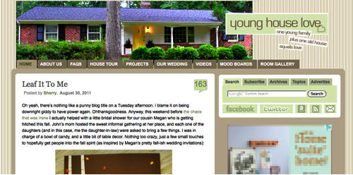
Here’s a little bit of what we were hoping to accomplish with the new design:
- Update the look (colors/patterns/typefaces) to be more reflective of our design choices in the new house
- Make the header more inclusive of the things we blog about (folks kept saying it just represented the “house” part of our name)
- Lighten up a bit, since the old color scheme was feeling a bit dull & heavy at moments
- Improve navigation and help you guys discover content more easily
- Overall just make the site feel fresher, more 2011 and less 2008
So this is what our amateur web designing skills came up with. So far we really love it, even though there are definitely things we’re still trying to finesse. We’ve been tweaking it for the past several weeks, so we’re kinda used to it by now – but we understand if some of you are still skeptical of the change. Think of it like rearranging a room or painting a wall – you might just need to give it a few days to get used to it.

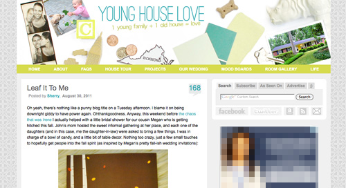
When it comes to the actual header, we photographed a collection of objects that had special meaning to us on white cardstock outside (you know we love keeping things personal). In case you can’t figure it all out on your own, here’s the meaning behind each item:
- Photostrips have always been something we’ve enjoyed, hence their appearance at our wedding
- Clara and Burger are as much a part of this blog as any DIY project, so their picture was a must
- A little wooden “C” block for Clara and a small bone-shaped dog treat (on the other side) were another way to tie them in
- Sherry and I met in 2004 when we lived in NYC, so the little wooden skyscraper and taxi cabs remind us of those early days
- We’re cheap. So we save our pennies. Hence the change, which actually adds up to seven cents – which is a lucky number of ours (plus the dates on each of the pennies are 2007, which is when we started this little ol’ blog)
- We live in (and love) Richmond. So we tossed in a little Richmond magnet. Represent.
- Paint swatches and fabric samples = our idea of a good time. So we picked a few that felt like our current house/style
- There’s not a much more sentimental object than the key to our house (although we altered the tip of it in Photoshop because we’re paranoid)
- Of course we also squeezed in a photo of our current house (had to have that happy yellow door in there somewhere)
- A white ceramic rhino is kind of our mascot at this point (at least behind Burger and our dearly departed ceramic dog).
When it comes to the background, we actually created that as an homage to our previous logo (you know that little YHL heart? the background is actually just a gazillion of those laid out at all different angles to make an abstract-ish pattern). And as for the actual functional changes that we made, here they are:
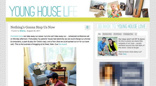
1. We added a new side-deal called Young House Life (see the “Life” title under the header on the right?) to serve as sort of a “mundane everyday happenings area” where we mostly share Clara & Burger pics/videos along with behind the scenes blog stuff and other odds and ends that aren’t beefy enough for a dedicated YHL post over here (you know we love to over-share). But don’t worry, it doesn’t mean Clara, Burger, and other life stuff (vacations, anniversaries, etc) will suddenly be gone from the main site. Those things have always been a huge part of who we are, so they stay. Just think of Young House Life is a little “bonus footage” spot. Oh and it has a separate feed address for you to subscribe to as well (if you’d like to get those updates on your reader).
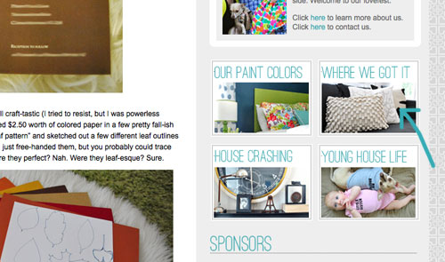
2. We finally made a paint color page about all of the ones we’ve used in this house and linked to it from our sidebar (like this one that we made for our first house).
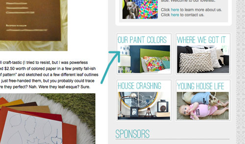
3. We also made a dedicated source list for where we got nearly everything in this house (like this one that we made for our first house) and also linked that up on the sidebar.
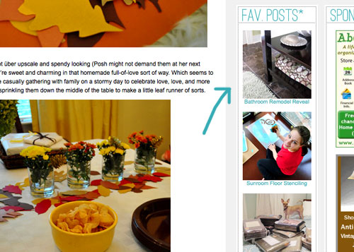
4. We tossed in a Fav. Posts button, also on the sidebar (with little thumbnails and links). We intend to update it every month or so with new faves (since we’re fickle folks and because we’ve also heard from a bunch of readers who’d love to see more archive stuff, but aren’t sure what’s worth digging around for).
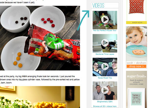
5. We also added a Videos button on the sidebar, which shows thumbnails of a few of them. All of our videos used to be accessible from the bar under the header, but we moved some other stuff up there and thought videos could breathe better down below – so now you can access them all by clicking the link at the bottom of this button.
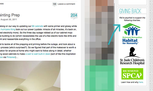
6. We added a Giving Back button to share the love for three charities that we’re thrilled to support, each of which were chosen because they represent stuff we love (homes, kids, & dogs). We make an annual donation of $1,000 to the Richmond Habitat For Humanity along with $500 to St. Jude Children’s Research Hospital and $500 to the Richmond SPCA (and we definitely encourage others to check them out – you can donate here, here, and here or find a local Habitat for Humanity or SPCA in your area here and here).
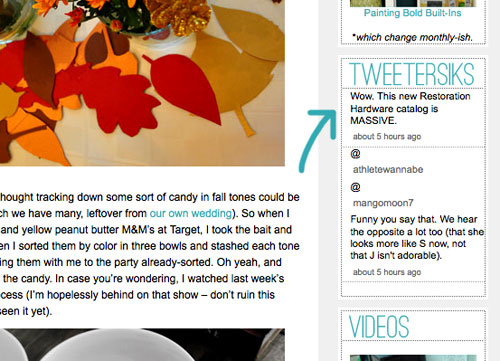
7. We retooled a lot of other buttons that have always been on our sidebar (like the House Crashing one) with some updated pics/type/colors. But that’s more decorative slash fun than functional. As is the new Twitter button which now goes by the name of Tweetersiks. Oh yeah, we officially out-punned Mr. Tom Petersik (my dear old dad).
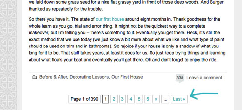
8. Oh and we were inspired (by Kate over at Centsational Girl) to add a nice thorough pagination capability (so you can click back to the very first post in our archives, you know in case you have a year to spare reading 2,000+ of them).
So there it is. Of course we still have a bunch of stuff on our blog-to-do list, so here are just a few things that we’re hoping to roll out in the next few months (or years, you know how long these things can take us, haha):
- Completely “renovate” our Projects page so it has some images instead of just a ton of crazy links (can you believe we’ve tackled over 500 projects?)
- Update the designs/header on the Mood Boards and Room Gallery pages (since they’re still rocking the old tan stripes)
- Add about 100+ other makeovers to our Room Gallery (we have so many amazing Reader Redesigns in our archives to toss in)
Should keep us busy for a while. And we do have our $6 cabinets to finish. Might switch back over to DIY for at least a little bit. Web stuff is kind of fun (when you’re in the zone), but there’s nothing like paint under your nails and sawdust flying. Hope you guys like the new look. Has anyone else done a little site tweaking lately? Any new color schemes or functionality that makes you giddy in that “it’s 2:52 am and we’re still working on this post way?” Not that we are. That would be irresponsible parenting.

Jen says
“LOVE!!” was my first impression after I hopped onto your page. This makeover is awesome! I am a big fan – it’s almost inspiration enough to start a blog of my own :)
Crystal says
I love it! It’s very fresh! (though of course it wil take a while to get fully used to…as I think we all loved the old layout too!)
In other strange news I totally had some dream about being in Home Depot last night…which morphed into a segment where I was trying to help you photograph Clara and Burger! Except they kept rolling around on the grass and not looking at the camera and then bizarrely Burger poured a glass of water on Clara’s head and it was all over…and yes I know Burger does not have hands…I’m going to blame it on that whole pregnancy dreaming thing… =) So I guess if Burger develops opposable thumbs any time soon you will have been warned!
YoungHouseLove says
Hahah- hilarious dream. As in, I’m jealous it wasn’t mine.
xo,
s
meghan says
LOVE!
Begoña says
I love this new look, i never thought the previous one looked dated at all, but this changed it’s truly like painting a room you liked before and just realized how much it needed that paint. Got the comparasion? no? LOOOOOOVVVEEEEEEE!!!!
Wom-mom Ethne says
2:52 a.m. is not irresponsible parenting – sometimes it’s the only time kids allow you to do your own thing (ie, they’re sleeping like angels)! We always pay for it in the morning tho, huh? Anyway, love the new look. My bff’s and my blog is a little behind in its updates too – we want to better link our posts to the tabs we have. Someday, when the kids are sleeping like angels… Now get to the office furniture cuz I can’t wait to see what you do with it.
Bboss says
Looks very nice. I like the idea of refreshing things on a web site. Mixes thing up a bit and keeps you coming back (very important). Sounds like you were like the geeks in “The Social Network”: Plugged in.
Quiana says
Congratulations! I’ve been slowly updating my blog too and I appreciate the inspiration. Like John, my husband’s slowly learning code to help make changes. We talked about hiring someone, but we think it’s good to DIY so we can have full control going forward. Knowledge is power!
Shauna says
I love the new look! One thing though, it’s hard to read the white-on-yellow links on the very top bar!
YoungHouseLove says
Thanks Shauna! We’re learning that those colors are reading really differently on certain monitors (on ours it’s a deep yellowy-green so the white really pops). So we’re definitely planning to make some tweaks so it hopefully looks clearer on all computers.
xo,
s
Laura says
Hey Petersiks! Nice job on the redesign… really fresh and I like the new features. One small piece of constructive criticism: Love, love, love the new background, but the white middle section doesn’t quite “pop” on it. Maybe some kind of medium gray or a shadow effect on the edges would make your main content area stand out a bit more?
But I do REALLY love the new design! Nice job!
YoungHouseLove says
Thanks so much for the tip Laura! We’re learning on some monitors things look a lot lighter and more subtle (hard to read) so we’ll definitely be making some tweaks!
xo,
s
Beverley says
LOVE the new design! I think it’s definitely more reflective of what the entire blog is about :)
Kathi says
Love the new look! The only thing missing in the new collage header is a bee! :-)
Heather says
I LOVE it!!! Its so bright and fun. It looks just like yall. Thanks for being an awesome blog!
Amanda B. says
Just another kudo on the site design, but I also wanted to say thanks for having one of the best-organized blogs ever. I love your site, not just keeping up with your day-to-day, but the ease of browsing your history and old projects is so awesome. Thanks for creating a great community around loving our homes!
YoungHouseLove says
Aw shucks Amanda B, that’s so sweet. You’re very welcome. We love you guys.
xo,
s
heather says
WWWOOAAAHHH!!! I thought I was at the wrong blog! I love it you guys!
Faith says
Love it! Looks so fresh and inviting…much like your personalities. Great job!!
Jen says
I love it! So light and fresh. I love that your responses are now blue. And “Tweetersiks” made me laugh right out loud. And the patterned background makes my heart flutter. You guys rock!!
Meredith says
Love it!! I also love that even your reply box has been updated to a pretty blue. :)
After hearing your radio interview last week (which was great!), it made me a little sad to hear you say that you guys still don’t spend as much family time together as you’d like because you’re on the blog so much. With that in mind, I can’t help but notice how many comments on here are actually questions that are answered somewhere else on the blog.
I have found the google custom search at the top of your page to be very useful when I’ve had questions. And now that you have new source lists, perhaps you can add a little blurb directing people to those resources (and the FAQ page) to the notes when you leave a comment. (The section that starts “We love hearing from ya.” I guess you can’t see me pointing to me screen? haha) Perhaps that will save you half an hour here and there from answering questions you’ve already answered.
Also, great idea for incorporating archive posts! I remember that when you were painting the paneling on the kitchen, it was fun to think of you guys working on that and knowing that a post would be up soon. I didn’t even need to read something new while that was happening, so those posts were like bonus readings to me. Maybe once every few weeks or so, you could take a day off from posting something new, and just say something like “We’re working on (insert awesome project here) today, so send us good vibes as you enjoy this old post!” Maybe you can even make a different post appear each time you refresh the page. Unless that would crash the site. That would be sad.
Again, awesome job on the new layout!
YoungHouseLove says
Aw Meredith, you’re so sweet! Great suggestions one and all!
xo,
s
heather says
Lack of family time = boo! I was surprised to learn you guys posted twice a day on T/Th. Have you ever considered going down to just one post each day to give you guys most time alone (away from the blog world?). I think most YHL readers would totally understand.
YoungHouseLove says
Yeah, it’s a delicate line because for everyone who is ok with less there are folks who want more. I guess we just feel the pressure to keep people happy since this job pays the bills for the entire family, so a lot rests on it, ya know? But we love love love what we do. Wouldn’t have it any other way!
xo,
s
Erin says
Ahh… I can’t see it either- at least not the top header, but I like it from the pictures. It’s probably because I’m using my computer at work, shhh! All your changes look totally fresh- very hip and fun. You guys are so creative and motivated, it’s super inspiring! And by the way, Clara is looking extra precious these days- what a doll!
Meredith @ La Buena Vida says
Cool changes! I really like that you’ve added the Young House Life tab!
I hope the reveal is going well and that all the glitches are easy fixes–it sucks to be so excited and then have a ton of people say “I can’t see anything!”
YoungHouseLove says
Still working away on some solutions over here. Haha. We fully expected this though, so we braced ourselves. Haha. We actually thought the site might crash, so this header stuff is a pleasant surprise!
xo,
s
Lindsay B says
Kudos on the new design! It really does reflect the style and color scheme of your new house, as well as your personalities. I LOVE it!
Alissa says
Nice work! I especially like your “Life” section. Still exploring, but a heads-up that your paint color page doesn’t include your office. Though maybe that’s because it’s in progress? ;o)
YoungHouseLove says
Oh yeah- duh. We haven’t painted in there so maybe that’s why it slipped my mind. Soon though I hope!
xo,
s
Jenn says
Ha! No offense to ye ol’ blog look, but yesterday I was on here thinking “I hope they update their look sometime, I’m ready for a new banner at least”. I can’t even believe what I’m seeing today – love it!! Haven’t even read the entry yet…brb…
Barb says
Brilliant!!!
LauraC says
Wow. Huge shock. I’ll come around, I know. I do love the blue accent color, but I’ll be in mourning for awhile. I’m not a change-lovin’ gal over here, just takes me awhile. Your old site was like a favorite sweater, comfy and cozy; knew it inside and out.
Alana of CasaBella Studios says
I LOVE the new look! I definitely looks more like you guys than the previous one. I also love that you are simplifying how to navigate the site.
I’ve revamped my blog too {more in the content department than its looks, though}. Hope you can stop by and say hello. The url is http://www.casabellastudiosblog.blogspot.com.
YoungHouseLove says
So cute! And that black & white pencil skirt and closet full of shoes had me at hello.
xo,
s
Aliesha says
Beautiful design! It feels fresh and young! Love it.
April says
I like it! Makes me think of that Black Eyed Peas song lyric “I’m so 2008, you’re so 2000-late!” Except ya’ll are so 2011, not 2000-late.
Kara says
I looooooooooooove the colors!!! It’s like a little Christmas in August gift for my eyes! :)
Mrs Rosie Posie says
LOVING the new look – well done!!
x
Amanda- Hip House Girl says
I admit I was skeptical at first, but after spending about 10 seconds looking around, I now love it. You won me over in record time.
Well done! I love the hearty background (it probably would have taken me forever to notice the hearts if you hadn’t explained it). I also love the Fav. Posts section. Bravo!
Melissa says
Once again you guys amaze me!
Lindsay L. says
Love it! My favorite are the YHL hearts that make the background because I’m a sucker for grey and white. I just wish I could rotate the house picture and make it straight! But seriously, beautiful new look!
CherylM. says
There’s no header just a solid turquoise band.
YoungHouseLove says
We’re on it (for some reason it’s not loading in certain versions of IE)! Thanks for the warning!
xo,
s
Jill @ Craft in Northern Town says
Love it! I love that the font colors match the colors you are using in your house. It looks fresh and clean. Can’t wait to start digging around!
Kaitlin says
The new blog facelift is very cool and refreshing! I’d agree that it does reflect your more colorful palette in the new house. The images at the top are awesome…I feel like it’s what we’d see if Sherry dumped out her purse, so very personal!
YoungHouseLove says
Haha, I love that description. I just dumped out my brain. There it is.
xo,
s
gk says
wow, the comments here are just exploded so i haven’t read them all. the new design looks fantastic. also, i really like that y’all added the “giving back” section. it’s important to support organizations that you really care about, so i think it’s awesome that you make that happen in your budget and that you encourage others to do the same.
off to go explore the new site!
elaine says
I feel like I got a sneak peek! Due to the time difference (I’m in Vancouver Canada) I was reading yesterdays post last night yet the header was your new one! You must have just switched over at that time. I laughed as a quick scan of the comments saw no alarm bells which gave me a good idea that I was the recipient of a ‘secret’ reveal. I had a pretty good idea about what today’s post would be about! Love the changes and love your blog. Favourite blog ever – hands down. :)
Autumn Van Weir says
You know I didn’t realize how the old site layout didn’t really reflect your upbeat personalities until the new one flashed across my screen! It came outso wonderfully, it’s perfect you guys! I LOVE it! Really enjoying the new color scheme too!
Janelle says
I love it — well done! Will you still be using the little sideways heart for your favicon, or is there something even more fabulous lined up for that?
YoungHouseLove says
It’s actually already set up as our favicon, but only certain browsers show that for some reason. So sad. Anyone have ideas to fix that glitch too? I bet it’s Internet Explorer’s fault again. Haha.
xo,
s
Janelle says
It’s showing up for me now. It wasn’t before. (I use Firefox.)
YoungHouseLove says
YYYYYYYYAAAAYYYY! John is working his tail off over here. Feel free to update us (anyone else?) if your header pops up!
xo,
s
KristenH says
I love love LOVE all the new changes! The color scheme totally rocks my world! And I absolutely love your “pagination” concept because that’s actually what I’ve been doing! I’ve read your blog off and on for the past year or so, but a couple weeks ago I started at the very first post and I’m almost caught up now, I’m up to November 2010! You guys are so inspiring, and keep me motivated to update my blog regularly and you’ve given me tons of great ideas for our home… keep up the great work!
Bridgett says
Looks great! I love how every item has a symbolic meaning. I’m a recent stumbler on to your site and am now reading daily! We have so many projects that we are in the middle of. i think our hardest thing is to just finish a project before moving on to the next one. Right now I’m working on preparing to redo my daughter’s room in preparation for my 1yr old son to share the room with her. I’ve taken some of your advice and started a budget, been researching and planning my purchases. Now we have a big trip to IKEA planned, and once Baba (Slovak for grandmother) shows up, then we’ll kick kids and Baba out of the house and redo the room. Whew!
Redoing a website…difficult. I created ours from scratch in 2007 when I was on maternity leave. learned dreamweaver from scratch. Website was not that great. Earlier this year, we used a portfolio service and spent many many late nights getting a new website. Working so much better for us. but oh the stress! http://www.studiothomasphoto.com
YoungHouseLove says
Gorgeous site. Gorgeous pics. Love it.
xo,
s
Katie G says
Looks great from the screenshots, but I can’t see the header now :(
I was able to see the old one, I guess it was just a change in format. Good job though, it looks nice and fresh! It probably helps that my favourite colour is blue :)
YoungHouseLove says
We’re hoping to fix that asap. it seems to be something to do with Internet Explorer (but only some versions).
xo,
s
J.D. says
All the changes look great! Question for you, do you have any recommendations for online sources to learn how to do the “coding” you guys are using to freshen things up? I’m working with WordPress themes as well but want to eek out a bit more personal control that coding will allow. It’s just too many sources out there and I’m really looking for something user friendly.
I’ve built our website. I freshen things up seasonally. The blog is integrated with our residential interior design firm website and I modified the header photo to look like a gallery wall showcasing “framed” photos of our work, our logo and such. I have it setup so that I can change out the background wallpaper periodically to change up the look. I also add and subtract photos as new client projects are completed.
I love, love, love your blog, it’s such an inspiration. I’m still lagging behind on the whole post regularly thing, but we are moving Friday into our new forever home and hope to have plenty of fodder to fill the blog with. We just bought a 1907 American Foursquare in the downtown of our small hometown for the business and our home. We hope to catalog our changes, remodels, etc through the blog as well, hence the whole “you’re an inspiration” thing.
Yeah, so probably a long enough comment. Thanks again for the content, love your stuff!
YoungHouseLove says
I wish we had some awesome online urls to send your way but we pretty much just google things and do the whole trial and error thing. Occasionally we reach out to other bloggers or friends who might know more about something that has us stumped (which is pretty much everything- haha). Hope it helps! And good luck with your big move!
xo,
s
J.D. says
Thanks, we’re pretty organized (read that as anal) so the move should be the easy part. The problem is all that unpacking after we just finished packing!
I pretty much follow your path with the whole googling and trial and error. That’s how I taught myself.
I will share a link with you. If you ever need HTML help, like for formatting blog posts, check out http://www.webmonkey.com/ for great development tools and primers. They have lots of great information and it’s free! I have used that source since I built my first website back in 1995 before themes existed.
YoungHouseLove says
Thanks for the link JD!
xo,
s
Diana says
Looks great. If i might make one suggestions — pick a darker background color (I know Sue the napkin has some!) for the horizontal menu bar — white writing on light celery green is nearly impossible to read.
YoungHouseLove says
Yeah- we’ve learned that certain monitors have that stuff looking too washed out, so we definitely plan to tweak it so it helps everyone else!
xo,
s
Laur says
I thought I had clicked over the the wrong blog for a moment. Love the new look, super playful.
Rachel Tatem says
What a lovely and friendly change!
Kim @ Yellow Brick Home says
You smarties, you! With your little heart background and all…
Love the new look. I didn’t really think your old blog background reflected your fresh home(s), and now it fits you like a glove. Beeaauutiful!
ruthy says
wowzers! love the new look. As many readers have suggested…would love a DIY on html. I’ve tried multiple times to update my site, but I’m so scared I’m going to lose everything–so all my changes are very basic!
Jane says
Wow, I just clicked on my saved tab, as I do every morning, to check your site, with a cup of coffee on hand. And I was “did I click on the wrong link?”. I almost knocked down my cup. The hurricane really came and mixed things up. I love it! It’s fresh, it’s new, it’s light and it reflects a young couple/family. Ok, ok, I must confess it took few minutes for me to love it but after I clicked around and observed the new changes, I really like it.
Lauren says
I actually let out an audible gasp when I clicked on my YHL bookmark this morning (the girl in the cube next to me asked me what I was so surprised by).
I LOVE IT! It looks fantasmical! Thanks for putting in so much hard work on it. It’s a winner!