Yup, after months of working on a little behind the scenes blog makeover (not kidding, this stuff literally takes us months) we’ve FINALLY let ‘er rip. Like any project, there were unexpected delays: mysterious coding glitches, inexplicable site crashes (thanks for your patience on those, btw), an earthquake and even a hurricane to round things out. But before we let another excuse get in our way, we decided to just go for it. It’s not 100% done. It may crash the site again. There could be a blizzard next week. Who knows.
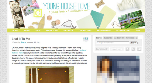
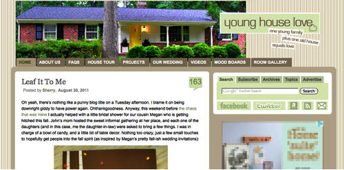
It’s actually surprising to us that we haven’t done this sooner. We’ve had the same exact blog look/background/layout since the spring of 2008 (if you can believe it). It seemed silly that we’ve been through so many room re-paintings, furniture re-arrangings, and even a move to a whole new house… but hadn’t so much as changed the background pattern for three whole years. So it was definitely time. It just sort of felt like we were wearing old clothes that didn’t quite fit anymore. So although we know there are probably folks out there who will miss the old look (we’re sentimental creatures too) we’re excited to finally put on a fresh new outfit.
Here’s a little bit of what we were hoping to accomplish with the new design:
- Update the look (colors/patterns/typefaces) to be more reflective of our design choices in the new house
- Make the header more inclusive of the things we blog about (folks kept saying it just represented the “house” part of our name)
- Lighten up a bit, since the old color scheme was feeling a bit dull & heavy at moments
- Improve navigation and help you guys discover content more easily
- Overall just make the site feel fresher, more 2011 and less 2008
So this is what our amateur web designing skills came up with. So far we really love it, even though there are definitely things we’re still trying to finesse. We’ve been tweaking it for the past several weeks, so we’re kinda used to it by now – but we understand if some of you are still skeptical of the change. Think of it like rearranging a room or painting a wall – you might just need to give it a few days to get used to it.
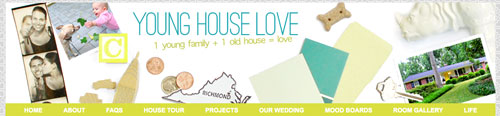
When it comes to the actual header, we photographed a collection of objects that had special meaning to us on white cardstock outside (you know we love keeping things personal). In case you can’t figure it all out on your own, here’s the meaning behind each item:
- Photostrips have always been something we’ve enjoyed, hence their appearance at our wedding
- Clara and Burger are as much a part of this blog as any DIY project, so their picture was a must
- A little wooden “C” block for Clara and a small bone-shaped dog treat (on the other side) were another way to tie them in
- Sherry and I met in 2004 when we lived in NYC, so the little wooden skyscraper and taxi cabs remind us of those early days
- We’re cheap. So we save our pennies. Hence the change, which actually adds up to seven cents – which is a lucky number of ours (plus the dates on each of the pennies are 2007, which is when we started this little ol’ blog)
- We live in (and love) Richmond. So we tossed in a little Richmond magnet. Represent.
- Paint swatches and fabric samples = our idea of a good time. So we picked a few that felt like our current house/style
- There’s not a much more sentimental object than the key to our house (although we altered the tip of it in Photoshop because we’re paranoid)
- Of course we also squeezed in a photo of our current house (had to have that happy yellow door in there somewhere)
- A white ceramic rhino is kind of our mascot at this point (at least behind Burger and our dearly departed ceramic dog).
When it comes to the background, we actually created that as an homage to our previous logo (you know that little YHL heart? the background is actually just a gazillion of those laid out at all different angles to make an abstract-ish pattern). And as for the actual functional changes that we made, here they are:
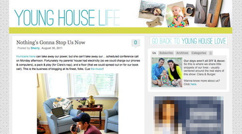
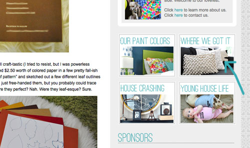
1. We added a new side-deal called Young House Life (see the “Life” title under the header on the right?) to serve as sort of a “mundane everyday happenings area” where we mostly share Clara & Burger pics/videos along with behind the scenes blog stuff and other odds and ends that aren’t beefy enough for a dedicated YHL post over here (you know we love to over-share). But don’t worry, it doesn’t mean Clara, Burger, and other life stuff (vacations, anniversaries, etc) will suddenly be gone from the main site. Those things have always been a huge part of who we are, so they stay. Just think of Young House Life is a little “bonus footage” spot. Oh and it has a separate feed address for you to subscribe to as well (if you’d like to get those updates on your reader).
2. We finally made a paint color page about all of the ones we’ve used in this house and linked to it from our sidebar (like this one that we made for our first house).
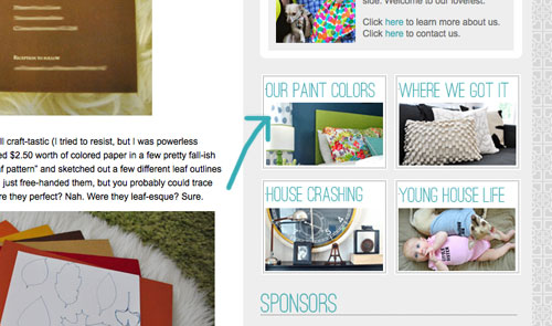
3. We also made a dedicated source list for where we got nearly everything in this house (like this one that we made for our first house) and also linked that up on the sidebar.
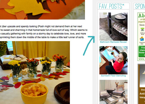
4. We tossed in a Fav. Posts button, also on the sidebar (with little thumbnails and links). We intend to update it every month or so with new faves (since we’re fickle folks and because we’ve also heard from a bunch of readers who’d love to see more archive stuff, but aren’t sure what’s worth digging around for).
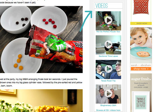
5. We also added a Videos button on the sidebar, which shows thumbnails of a few of them. All of our videos used to be accessible from the bar under the header, but we moved some other stuff up there and thought videos could breathe better down below – so now you can access them all by clicking the link at the bottom of this button.
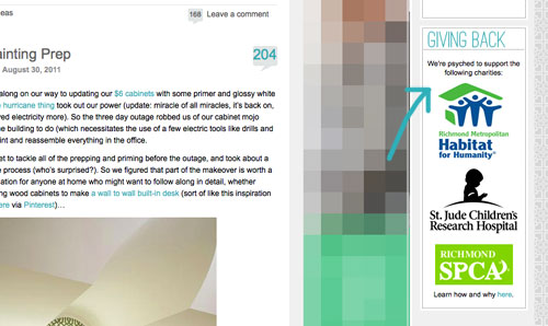
6. We added a Giving Back button to share the love for three charities that we’re thrilled to support, each of which were chosen because they represent stuff we love (homes, kids, & dogs). We make an annual donation of $1,000 to the Richmond Habitat For Humanity along with $500 to St. Jude Children’s Research Hospital and $500 to the Richmond SPCA (and we definitely encourage others to check them out – you can donate here, here, and here or find a local Habitat for Humanity or SPCA in your area here and here).
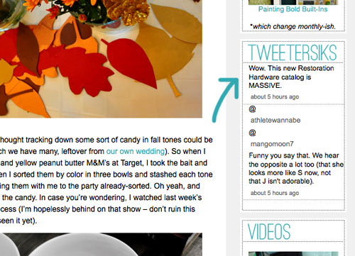
7. We retooled a lot of other buttons that have always been on our sidebar (like the House Crashing one) with some updated pics/type/colors. But that’s more decorative slash fun than functional. As is the new Twitter button which now goes by the name of Tweetersiks. Oh yeah, we officially out-punned Mr. Tom Petersik (my dear old dad).
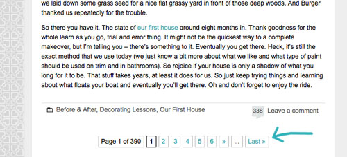
8. Oh and we were inspired (by Kate over at Centsational Girl) to add a nice thorough pagination capability (so you can click back to the very first post in our archives, you know in case you have a year to spare reading 2,000+ of them).
So there it is. Of course we still have a bunch of stuff on our blog-to-do list, so here are just a few things that we’re hoping to roll out in the next few months (or years, you know how long these things can take us, haha):
- Completely “renovate” our Projects page so it has some images instead of just a ton of crazy links (can you believe we’ve tackled over 500 projects?)
- Update the designs/header on the Mood Boards and Room Gallery pages (since they’re still rocking the old tan stripes)
- Add about 100+ other makeovers to our Room Gallery (we have so many amazing Reader Redesigns in our archives to toss in)
Should keep us busy for a while. And we do have our $6 cabinets to finish. Might switch back over to DIY for at least a little bit. Web stuff is kind of fun (when you’re in the zone), but there’s nothing like paint under your nails and sawdust flying. Hope you guys like the new look. Has anyone else done a little site tweaking lately? Any new color schemes or functionality that makes you giddy in that “it’s 2:52 am and we’re still working on this post way?” Not that we are. That would be irresponsible parenting.

Maureen @ This (Kinda) Old House says
Love this new look!!! Light and airy and much more “you”. Hey, I have a question. When you guys started blogging, did you already have a bunch of projects done? Or did you kind of jump into the blogging while you started the renovations? Just wondering.
YoungHouseLove says
We started blogging right before our kitchen makeover began- just as a way to share the updates with our friends and family members (instead of bomb their inbox with daily updates). We didn’t have any plans to blog as a job or anything, so we just posted things real-time as they happened. We liked that method so much we still do it now. Haha. Guess we only know how to blog one way. Haha.
xo,
s
Brittany (Eating Bird Food) says
The new layout is fabulous. I really love the main background design. So fun1
liz says
I love it, guys. So fresh, so functional, so personal – so you! Great work.
Shreya says
Its gorgeous!
Pretty and organized – I love it.
Mandy says
Oh I’m so happy to see this! I had an urge just the other day to dig back to your early/first posts – it’s like you guys read my mind. YHL 2.0 rocks!
Also – seeing The Big C in the things you’re digging right now made me :). I highly recommend Game of Thrones if you’re a premium on demand junkie like myself.
YoungHouseLove says
We’ll have to check that out! I keep hearing the girl who is naked all the time with the long hair looks like me (esp in real life with dark hair) so that could be… awkward? Fun?
xo,
s
Lauren M says
LOVES IT! Picture me saying that like Anthony in Sex and the City, when Charlotte is trying on wedding dresses.
YoungHouseLove says
Ooh big moment. Picture me twirling and smiling into a full body mirror.
xo,
s
Liz says
I love it! I also love how personal you made it. After reading your blog for years now, I knew the symbolism behind every object up there. So sweet and sentimental.
Mandy S. says
Hey guys, LOVE the new layout!! Gotta say though, at first I was like WHAT??? but now I’m digging it. Always good to have a change, and I like all the extra stuff we can now peruse.
Oh and Sherry, when I was at Michael’s getting my canvases and Mod Podge (still haven’t gotten to get the acrylic medium, may go today) I saw that they had little craft kits for wooden animals that you can get, kinda like your cardboard rhino. I immediately thought of you when I saw them!!
YoungHouseLove says
I want one!! Thanks for the tip – I’ll have to check it out. Maybe Clara can “help” me make one.
xo,
s
Mandy says
They have them on sale, at least they did last week. I will go pop in today and let you know what I find. They have a really big assortment of them, but I can’t seem to find them on their website…
YoungHouseLove says
Thanks Mandy! I’ll have to check them out the next time I’m in there loitering. Haha.
xo,
s
Rebecca says
Hey guys! New layout looks great! Some file types like png and alpha files are not properly supported in all versions of IE, which is why some viewers are only seeing turquoise (I’m assuming that’s the background color you set). Try using a different file type like a jpg for the header and that should clear it up. Hope this helps! PS. IE is the bane of any coder’s existence, but you can install something called IE tester, so you can see how it will look in all IE browsers and know if there are any issues. Sorry to ramble, nerd speak does that to a girl :)
YoungHouseLove says
THANK YOU THANK YOU THANK YOU! You have no idea how helpful that is.
Update: Oh man, our header is already a jpg, so we’re not sure why it would’t work. Sad face. Any other ideas?
xo,
s
Ami says
Um, love it! (After I got over my initial paralyzing shock that my favorite blog was gone when I first pulled it up!) Why you wanna do that to me? The background is guh-orgeous! Some impressive programming/HTML (whatever-the-heck) skills you’ve got there. And adore all the extras added, paint colors, etc. Greatness!
Tessa says
Woot! I’ve been wondering if you might update your blog color scheme to match your new, adventurous decor palette. Looks great! I think I miss the big picture of your house though… Change is hard ;)
Candice says
love the blog redesign! i feel like i’m sitting in your living room, haha :)
maybe you could remind your RSS readers to subscribe to the young house life blog as well, since it has its own feed? might be helpful so they don’t miss out.
YoungHouseLove says
Thanks Candice! Good idea! I’ll update the post to say that!
xo,
s
Bree says
I love the changes! It’s definitively a fresher look, and before I even started reading this post I had clicked on the new source list and paint color links. Thanks for adding those! So glad you add a pagination, too. I was actually trying to find a way to start at the beginning just yesterday but eventually gave up.
tjack432 says
I love that you added a lifestyle blog to the blog and the new header is so cute. I have one suggestion that is maybe here already and I missed it or is in the plans.
1. Can you label your posts? Like this one would be called “blog housekeeping” or something like that. Kitchen posts would be labeled “kitchen” random posts “random.” That way I can click on that link at the bottom of the post and all the links to the kitchen redesign would pop up instead of clicking on each one individually. I know that would take a long time to do though.
2. Could you guys have a first to last or last to first order button that we can click? That way we can read the kitchen redesign from the 1st post to the last post without scrolling all the way to the end and reading it in reverse order. Or we can just read all 2000+ blog posts in order.
Here is one blog that follows a similar format for inspiration:
http://apracticalwedding.com/
At the very bottom they have a button to sort oldest to newest and I think you can also sort oldest to newest in each category.
YoungHouseLove says
1. Oh yeah- we do label our posts into things we call “Categories” (this one is under “before and after” and “blog banter”). You can search by category by clicking the category tab down on the button with our faces on it on the sidebar. Hope it helps!
2. Thanks for the suggestion! We’ll ave to check out that blog you linked to and see if we can figure it out!
xo,
s
Tamryn says
simply put, I dig it! Well done :)
Cat@BudgeBlonde.com says
Ahh! I love the LIfe section so much!!!
Jen @ Bungalov says
The new design looks great. Just LOVely. I LOVe the background you designed with the hearts and the collage of those things meaningful to you all. Awesome job!!! Can’t wait to see all the other changes you mentioned.
Adriane (aka the greenhorn) says
Oh.my.goodness. I LOVE THIS. Love like fat-kid-loves-cake love. Also, like a skinny adult loves cake…c’mon, cake is delicious. I loved your old site design but no need to get used to this new one, I’m an instant fan. I love that you tackled it yourself, and I’m not all surprised it took so long. Excellent job. Congrats!
Missy says
I haven’t read through all the comments, so I might been the lone voice of dissent. haha. I definitely love the color changes and better organization. The only thing that I don’t like is the header. Maybe I just need to get used to it like you said.
I’m super excited about y’all changing up the Projects page! I always have difficulty clicking around to try to find what I’m looking for, so I’ll be waiting for that one!
Sandy says
Soooooo cool!!! Love it! But … why is Clara’s little head slightly cut off? Is it me?
YoungHouseLove says
That was just the angle of the picture when we snapped the photo from above (we didn’t mind things getting a little cropped here and there- we’re keeping it casual, haha). Hope the bean doesn’t mind!
xo,
s
Missy says
I work from home with my home and work computers in the same room. I looked on my work computer which has to have IE7 and the header didn’t show up. Then I looked on my home computer in IE8 and it showed up just fine. Maybe someone else already told you that — I didn’t read 267 comments to find out! :)
YoungHouseLove says
Thanks for the tip! So IE8 seems to work, but IE7 is still having issues. Hmm. Hope we can get to the bottom of this!
xo,
s
Tina says
looks great guys!! i love the new colors, it’s very refreshing. :)
i also love the new header and that everything is meaningful to you somehow.
great job!
p.s. i love the new young house life, did that take over the Burger blog?
YoungHouseLove says
Yeah, we figured since Clara never had a blog and Burger never posted on his, we should create a site kind of like we use Flickr (where we can just post pics and little snippets of life like an online album) – and so the idea of Young House Life was born…
xo,
s
Grazielle says
I love the new changes. It is definitely lighter and more airy (if that’s possible in a blog, lol). A true breath of fresh air. Especially love the Young, House, Life part!
Whitney Dupuis says
LOVE the new look! It’s so fresh and modern. Funny, considering it was always a blog, and therefore, modern…
Anyway, great job! The top header is brilliant.
liz @ bon temps beignet says
LOVE the little heart patterned background and header. And I can’t wait to see what turns up in the ‘Life’ catagory. y’all know we love to see the ‘behind the scenes’ stuff!
I was wondering, do y’all happen to have the *original* header still? Like the VERY first header you ever used?
YoungHouseLove says
The funny thing is that our original header was just a blue box with the blog name in it. That’s it. It looked like something from the 1800s. Or at least the 80s. So bad! I’ll have to see if we can track it down for old time’s sake.
xo,
s
liz @ bon temps beignet says
and I jus noticed each little heart pattern is made up of two big hearts (Sherry and John) and two little ones (burger and Clara)…..adorable
YoungHouseLove says
Haha- we’re the big ones and they’re the little guys.
xo,
s
LauraC says
I’ve wanted to ask that for about a year and a half now. I thought it would fit in their blogiversary posts. Glad you did.
YoungHouseLove says
Yeah – that might be a fun blogiversary post. A look back through the ages. Haha.
xo,
s
Jane @ the Borrowed Abode says
LOVE. IT. :)
Reenie says
Lookin’ good :)
Meagan says
Ya’ll are amazing! So impressed.
And now that you’ve linked up with 3 of my favorite chairities. wow! I wish I could put ya’ll in my pocket. seriously.
Amanda L says
I thought I was on the wrong site this morning and/or YHL was no more (say it isn’t so?!?!), but to my relief it was just an ol’ blog makeover. I’m loving the new style, it’s very Petersik and so 2011 (as opposed to so 2000 late – cue the cheese factor). Looking forward to testing out all the new changes and what else is to come!
Kristin says
Great job!
The new blog style is really beautiful. One thing I will miss is the old font you used in the header, but the new one is nice as well, and sometimes you just HAVE to change!
I also had a major breakthrough with my PhD thesis this morning, so being able to browse through the new categories after a couple of days of hard work was really nice.
Well done!
sangeetha says
Love the new look!
Sarah says
Yay! I love it! Although I think we all secretly hoped Sue the Napkin would be your new background ;)
Kay says
You guys! I love the changes and you are always up to something. I am on my way to the redesigns for inspiration as I need to start making some room changes.
Meghan, UK says
Oh WOW. The new look is completely fabulous. I particularly love the new background – unique, cute and elegant, all in one. So great to see new colour brought on to the site, and seeing your ‘kids added to the banner :) Yay for you!
RC says
I like the new look! Congrats!
I just want to let you know that on Safari 5.0.5 all of the text when I click through on the categories like paint colors, where we got it, etc. is HUGE compared to the body text of the blog entries. So probably some missing css code or bug?
YoungHouseLove says
Thanks so much! Here’s hoping we can find the root of that issue asap! Also, we’d love if our missing header in some versions of IE would pop up! Haha.
xo,
s
Mona Alicia says
It looks great where I’m at, I love the fresh new colors!
Beth says
I love the new look! Not sure if it’s my computer or what, but I can’t see the header :(
YoungHouseLove says
Thanks for the heads up. We’re working on it as we speak! Here’s hoping we can iron out that glitch soon!
xo,
s
liz says
Love it!!!
Jess G says
The background is my favorite part, hands down! I LOVE IT! I’m thinking I need to find a bunch of hearts and somehow make a similar pattern on this funny wall/alcove in our house. Hmm… will hubby think I’ve lost it?
Sarah @ w30 says
Love it! So cheerful and a great reflection on your the way your lives/blog has evolved. Plus I love that the color scheme comes from Miss Sue-the-napkin, no? :)
Sarah @ w30 says
Can’t stand the grammer issue in my statement – *lives have* and *blog has* … uhg.
YoungHouseLove says
Oh yes- she’s always the inspiration!
xo,
s
Jessica says
I love it! It’s so modern and fresh!
Gretchen @ Honey, I Shrunk the Gretchen! says
Looks fantastic — love the lightened up look!
L says
Likin’ it — MUCH easier to navigate, and yes, it feel lighter and more “you-y”. Great job!
Patricialynn says
I like it – but I’m kinda surprised there is no bumblebee in the banner. I was looking all over for one!
YoungHouseLove says
If only we could have gotten one to stay still while we snapped the shot! We just took pics of items we had- haha. So sadly… no bee.
xo,
s
Kate says
Oh my gosh!! I love it so much and I’m so stoked about the new Young House Life!! You guys are the coolest! :)
Laura says
It looks so awesome! Love the color scheme. The new layout and colors and photos are definitely more reflective of you guys. I had actually been wondering if you were going to change it!
Roberta says
Love the fresh new look and the great navigation improvements…always an issue for all of us bloggers. So hear you on how long it takes to do these techy things as well. I changed my blogs from two to five this last year and I’m still going back and fixing links and posts…it never ends…lol Like the new banner but the only critique I have is that…unless you know your history or you describe the design behind your banner in an “about” page…new blog readers will not get any of it. I know (think?) that you were kind of going for a time line/life map display/effect but it really doesn’t “represent” Young House Love. This banner really represents Young House Life. A simple photo of you guys holding Clara with your dog in front of your house would be much clearer. Or perhaps a logo? PLEASE don’t be upset…I give my opinion only and so understand how personal your blog and banner is and how hard you work on it in an effort to please your readers as well as yourselves. I’m just thinking in long terms of marketing/branding YHL. Hope this helps, fondly, Roberta
YoungHouseLove says
Haha, no worries at all Roberta! We think YHL has always been about us (our family, our wedding, our dog, our road trips, our anniversaries) along with all of our DIY adventures. Even the tag line is “one young family + one old house = love.” Which is why we agreed when people commented to say that our header (or even a picture of us in front of our house) might be a little impersonal. We just wanted something a little more DIYed, meaningful, and “collected.” There will definitely still be a whole lot of Burger/Clara/life stuff on the main YHL site – just as there always has been (Young House Life is just bonus stuff that we used to shove up on flickr where most folks couldn’t find it). I completely agree that new people might not get all the meaning behind everything in the header, but hopefully if they stick around they’ll make some sense of it! And it just feels more fun than one big house pic with our cheesing mugs for now. Haha. We’re having a little blog-header rebellion over here.
xo,
s
Kristen says
LOVE THE NEW LOOK!
I had the same problem with the header in IE 8.0 – quick fix, just hit the Compatibility View button (looks like a ripped piece of paper) to the right of the address bar and the header will pop up!
YoungHouseLove says
THANKS SO MUCH FOR SHARING THAT! I wonder what isn’t compatible about our header in certain versions of IE. Such a mystery! Hope this helps those who can’t see it though!
xo,
s
Kristen says
I was determined … there was no way I wasn’t going to get my YHL fix!
YoungHouseLove says
Haha- I love it!!
xo,
s
Samantha Rambo says
Love the new background! We are reformed “earth tone” painters. We purchased our house a little over a year ago and all common areas are dove gray and everyone loves it. It is a work in progress as well.
I am also glad that the site didn’t go down since I read your blog twice daily. It is a good little distraction and gives me great ideas.
YoungHouseLove says
It’s a small miracle (maybe even a big one) that we didn’t crash this morning. We got a little close, but we made it through!!!
xo,
s
Christina says
IN LOVE
I was sooo shocked this morning, but I love the new layout…and I am super pumped about Young House Life!
Looks amazing, way to go!