Yup, after months of working on a little behind the scenes blog makeover (not kidding, this stuff literally takes us months) we’ve FINALLY let ‘er rip. Like any project, there were unexpected delays: mysterious coding glitches, inexplicable site crashes (thanks for your patience on those, btw), an earthquake and even a hurricane to round things out. But before we let another excuse get in our way, we decided to just go for it. It’s not 100% done. It may crash the site again. There could be a blizzard next week. Who knows.
It’s actually surprising to us that we haven’t done this sooner. We’ve had the same exact blog look/background/layout since the spring of 2008 (if you can believe it). It seemed silly that we’ve been through so many room re-paintings, furniture re-arrangings, and even a move to a whole new house… but hadn’t so much as changed the background pattern for three whole years. So it was definitely time. It just sort of felt like we were wearing old clothes that didn’t quite fit anymore. So although we know there are probably folks out there who will miss the old look (we’re sentimental creatures too) we’re excited to finally put on a fresh new outfit.
Here’s a little bit of what we were hoping to accomplish with the new design:
- Update the look (colors/patterns/typefaces) to be more reflective of our design choices in the new house
- Make the header more inclusive of the things we blog about (folks kept saying it just represented the “house” part of our name)
- Lighten up a bit, since the old color scheme was feeling a bit dull & heavy at moments
- Improve navigation and help you guys discover content more easily
- Overall just make the site feel fresher, more 2011 and less 2008
So this is what our amateur web designing skills came up with. So far we really love it, even though there are definitely things we’re still trying to finesse. We’ve been tweaking it for the past several weeks, so we’re kinda used to it by now – but we understand if some of you are still skeptical of the change. Think of it like rearranging a room or painting a wall – you might just need to give it a few days to get used to it.

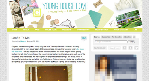
When it comes to the actual header, we photographed a collection of objects that had special meaning to us on white cardstock outside (you know we love keeping things personal). In case you can’t figure it all out on your own, here’s the meaning behind each item:
- Photostrips have always been something we’ve enjoyed, hence their appearance at our wedding
- Clara and Burger are as much a part of this blog as any DIY project, so their picture was a must
- A little wooden “C” block for Clara and a small bone-shaped dog treat (on the other side) were another way to tie them in
- Sherry and I met in 2004 when we lived in NYC, so the little wooden skyscraper and taxi cabs remind us of those early days
- We’re cheap. So we save our pennies. Hence the change, which actually adds up to seven cents – which is a lucky number of ours (plus the dates on each of the pennies are 2007, which is when we started this little ol’ blog)
- We live in (and love) Richmond. So we tossed in a little Richmond magnet. Represent.
- Paint swatches and fabric samples = our idea of a good time. So we picked a few that felt like our current house/style
- There’s not a much more sentimental object than the key to our house (although we altered the tip of it in Photoshop because we’re paranoid)
- Of course we also squeezed in a photo of our current house (had to have that happy yellow door in there somewhere)
- A white ceramic rhino is kind of our mascot at this point (at least behind Burger and our dearly departed ceramic dog).
When it comes to the background, we actually created that as an homage to our previous logo (you know that little YHL heart? the background is actually just a gazillion of those laid out at all different angles to make an abstract-ish pattern). And as for the actual functional changes that we made, here they are:
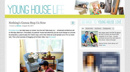
1. We added a new side-deal called Young House Life (see the “Life” title under the header on the right?) to serve as sort of a “mundane everyday happenings area” where we mostly share Clara & Burger pics/videos along with behind the scenes blog stuff and other odds and ends that aren’t beefy enough for a dedicated YHL post over here (you know we love to over-share). But don’t worry, it doesn’t mean Clara, Burger, and other life stuff (vacations, anniversaries, etc) will suddenly be gone from the main site. Those things have always been a huge part of who we are, so they stay. Just think of Young House Life is a little “bonus footage” spot. Oh and it has a separate feed address for you to subscribe to as well (if you’d like to get those updates on your reader).
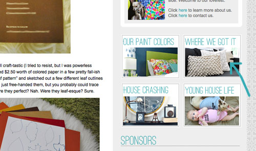
2. We finally made a paint color page about all of the ones we’ve used in this house and linked to it from our sidebar (like this one that we made for our first house).
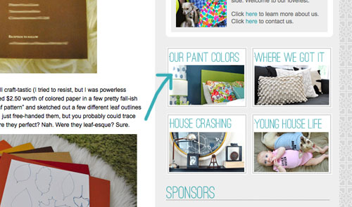
3. We also made a dedicated source list for where we got nearly everything in this house (like this one that we made for our first house) and also linked that up on the sidebar.
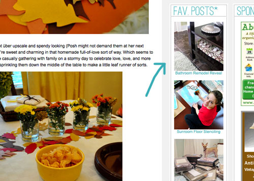
4. We tossed in a Fav. Posts button, also on the sidebar (with little thumbnails and links). We intend to update it every month or so with new faves (since we’re fickle folks and because we’ve also heard from a bunch of readers who’d love to see more archive stuff, but aren’t sure what’s worth digging around for).
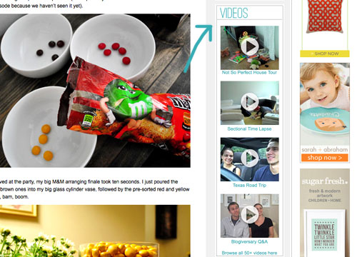
5. We also added a Videos button on the sidebar, which shows thumbnails of a few of them. All of our videos used to be accessible from the bar under the header, but we moved some other stuff up there and thought videos could breathe better down below – so now you can access them all by clicking the link at the bottom of this button.
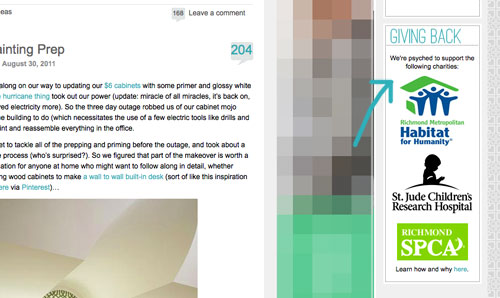
6. We added a Giving Back button to share the love for three charities that we’re thrilled to support, each of which were chosen because they represent stuff we love (homes, kids, & dogs). We make an annual donation of $1,000 to the Richmond Habitat For Humanity along with $500 to St. Jude Children’s Research Hospital and $500 to the Richmond SPCA (and we definitely encourage others to check them out – you can donate here, here, and here or find a local Habitat for Humanity or SPCA in your area here and here).
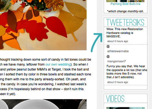
7. We retooled a lot of other buttons that have always been on our sidebar (like the House Crashing one) with some updated pics/type/colors. But that’s more decorative slash fun than functional. As is the new Twitter button which now goes by the name of Tweetersiks. Oh yeah, we officially out-punned Mr. Tom Petersik (my dear old dad).
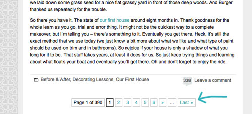
8. Oh and we were inspired (by Kate over at Centsational Girl) to add a nice thorough pagination capability (so you can click back to the very first post in our archives, you know in case you have a year to spare reading 2,000+ of them).
So there it is. Of course we still have a bunch of stuff on our blog-to-do list, so here are just a few things that we’re hoping to roll out in the next few months (or years, you know how long these things can take us, haha):
- Completely “renovate” our Projects page so it has some images instead of just a ton of crazy links (can you believe we’ve tackled over 500 projects?)
- Update the designs/header on the Mood Boards and Room Gallery pages (since they’re still rocking the old tan stripes)
- Add about 100+ other makeovers to our Room Gallery (we have so many amazing Reader Redesigns in our archives to toss in)
Should keep us busy for a while. And we do have our $6 cabinets to finish. Might switch back over to DIY for at least a little bit. Web stuff is kind of fun (when you’re in the zone), but there’s nothing like paint under your nails and sawdust flying. Hope you guys like the new look. Has anyone else done a little site tweaking lately? Any new color schemes or functionality that makes you giddy in that “it’s 2:52 am and we’re still working on this post way?” Not that we are. That would be irresponsible parenting.

Tiffany says
LOVE!!! Congrats!
Casey says
So funny…I was just thinking the other day that I was surprised you two hadn’t changed your background stripes to gray to match your house. And then you went and one-upped my thought, ha ha. I think it looks amazing!! I already thought your site was organized, but I do think it’s even better now (and I love the direct link to baby center too!!)
Ann L says
LOVE the new look, the colors are great and the lay-out (for me) is much more intuitive. The only thing I’m missing is the header—it’s just solid blue/teal when I load your page, so hopefully that’s just a problem on my end and I’ll be able to see it soon! – Ann
Kelly says
I love it, it’s beautiful! I am totally digging the colors, very fresh and modern. Keep up the great work!
Nicole H says
It’s amazing what a little fresh ‘paint’ can do to a web site! I completely agree the last design felt dark and not as representational as the current one. Of course it takes a new design to often really realize that. Looks fantastic- I love all of the new changes!!!
Kristin ~ Bien Living Design says
I’m one of those who doesn’t usually like change, but this is SO MUCH BETTER than the last design! Kudos!
Michele says
This looks amazing! Great job. It is fresh and fabulous.
Kelley says
Love it, homies!
Amber says
I love the new facelift! I’m not able to see the header yet other than seeing it in today’s post. Maybe it will show up later :)
Katie says
I love the new layout!!! Do you mind sharing the name of the font you used for the title in the header?
YoungHouseLove says
The Young House Love part is Ostrich Sans and the tagline is Apple Symbols. Hope it helps!
xo,
s
mary says
Sorry, I can’t go through all the comments since I’m at work but all I have at the top is the big blue box.
YoungHouseLove says
We’re working on it! We think it’s an Explorer glitch, and hope to work it out soon!
xo,
s
Kathi says
I had that problem this morning, but when I came back this afternoon, I could finally see the header…
YoungHouseLove says
Oh thank goodness! John’s going to be so happy!
xo,
s
Michelle N says
I thought I was in the wrong place this morning! I said what the heck…then realized I was in the right place. Looks great guys, good job! There’s nothing wrong with a little change every now and then. I love it!
Staci @ My Friend Staci says
Absolutely superb. I adore it. The color scheme is so bright and fresh; it totally reflects your new house. I especially like the little heart motif in the background. If I were you I’d paint a tile with the pattern and hang it in your collage hallway :)
Jennifer (iffles) says
LOVE the new look. I didn’t notice the background was the YHL heart until you pointed it now and now I’m lovin’ it even more! Awesome!
If we follow the rss feed, will we get the Life section, too, or is there a separate feed for that?
YoungHouseLove says
That’s separate (just because we wanted to give people the choice to get those little personal updates), but you can subscribe under the header on that page. Hope it helps!
xo,
s
Jen says
Love, love, love the redesign (or the tru renewal as wacky Real Housewife of NYC Ramona Singer might say). You two crazy kids keep up the great work!
YoungHouseLove says
Bwahahaaha. Comment of the day. Any Ramona Singer reference = comedy gold.
xo,
s
Caity says
Whoa! I thought I was lost…but after looking through it all, it’s amazing–fresh and bright!! Very you guys. Nice job!!
Abby says
HIP HIP HOORAY!! I’ve always wanted to go allll the way back to the beginning (I found ya’ll in May). But it just took too dang long to click so far back.
Everything looks great! Keep up the amazing work :)
Julie says
totally lovin’ the new look/style!!! maybe I can take inspiration from you guys, mine’s way 2008 so 2000 late (heehee)ahem seriously it is. I just can’t figure out exactly what i want…
Megan @ Are We Wed Yet says
It looks amazing ya’ll! I’m always amazed at how much work it really takes to make a site look great. Now, if you need me, I’ll be here putting this “pagination capability” to use! :D
Dennis says
It looks so great guys! Congrats…I know it was a lot of work.
Lindsey says
I like! Header is a bit bright and washed out on my screen… rhino nearly indistinguishable… but I have faith you will work out any gnarly stuff!
YoungHouseLove says
Thanks Lindsay! We’re learning how different colors really are according to your computer, so we hope to tweak things so they look good for everyone (if possible, haha).
xo,
s
Amanda says
Love the Young House Life link! Great for when I have the attention span of a goldfish! lol! Such a great place for little snap shots of life! Love it!
rachael says
I LOVE IT!! As soon as the header came up I thought I typed in the wrong site address and then I saw the house in the corner and I got so excited!!! I can’t beleive how pretty it is! And young! Great work guys!! Also, I read all the archives and I started in February and just finished last week. Phew! Thats alot of writing you two have put in. Isn’t the blogs anniversary coming up soon too? I just started reading in January so I’ll actually be a “real part” of it this year! So happy for you!
YoungHouseLove says
Yes! We have a big blogiversary coming up next month and we have so much planned for you fine people. Haha.
xo,
s
JennyB says
Wow! It looks terrific! I’ll have to MAKE myself go back to work. It’s going to be very hard:)
Molly Ishmael says
Love it! Nothing like a fresly painted room err website.
Ashley says
Love it! I really love the background using your YHL hearts! You guys get an A+!!
Emily says
Where’s the “Nothings Gonna Stop Us Now” post that is shown as a screen shot?? Did I just miss it or have you guys not posted it??
Emily says
Nevermind!! I found it under LIFE!
Zoe Feast says
Hey…congrats on the new design, as a professional web designer I know all the hard work that has gone into creating it. Browser compatibility issues are a real pain in the rear end. I am going to take a look at your code and see if I can work out what is going on with Explorer and your header
YoungHouseLove says
Thanks so much Zoe!!! We love you for that!!
xo,
s
Zoe Feast says
I am running your site through a browser test, I have not been able to reproduce the problem people are seeing yet, so this should tell us if it is limited to a particular version of Explorer. I will send you the login info by email so you can see the results
YoungHouseLove says
We heard from someone else that it might be because our header is a png (so it’s not loading in IE7, but seems to work in IE8?). So we’re planning to try to make it a jpg asap and hope that works…
Update: Oh man, it’s not a png. It’s already a jpg. No idea why this is going on. Boo hoo.
xo,
s
Zoe Feast says
hate to tell you this but actually your header is already a jpg…the issue actually with the navigation bar…weird I know. Login to the browser test page I emailed you and you will see.
YoungHouseLove says
Yeah- I just posted an update. No idea what’s going on. Sadness. Any other ideas?
xo,
s
Zoe Feast says
take a look at the #nav elements in your css. I think that is where the problem lies
YoungHouseLove says
Thanks so much Zoe! Is there anything we should be looking for? We’re kinda of dummies about this stuff…
xo,
s
Zoe Feast says
try making the css as simple as possible, adding a height tag may help…I have to pop out to a meeting right now otherwise write some code for you ASAP. If you have not fixed it later on today give me a call.
YoungHouseLove says
Thanks a million! Might just call you if we can’t figure it out. We’re desperate. Haha.
xo,
s
Cindy says
Looks great, you guys! I love the new light new look, and it sure was really weird to click over to comments and see your responses in blue boxes. haha
“Tweetersiks” cracks me up.
Congratulations. xo
Jasmine says
FYI
On your “Our Paint Colors” page, Living Room is listed twice-once with a photo of the dining room and once for the actual living room. :-)
YoungHouseLove says
Thanks Jasmine!
xo,
s
Dana says
aaahhh!! crazy town! I almost didn’t recognize the blog. Looks great :)
Amyella says
Looks fabulous, fresh and clean! I love it!
erica says
cute! but you forgot to include a can of ORB in your banner! :-P
YoungHouseLove says
Seriously!
xo,
s
Melissa Breau says
LOVE the new design – just one thing; someone had mentioned things were light and sort of hard to read. The only thing I’m getting as light and hard to read is the nav bar–the yellow is super light on my computer so it’s hard to read the white type! Ack!
But seriously loving the background and the header image… everything feels fresh and light and fun..
YoungHouseLove says
Thanks Melissa! We definitely hope to make a few easier-to-read tweaks (we had no idea how varied things like colors would look on other screens)!
xo,
s
Amanda says
When I clicked over today I thought I was in the wrong place, than I saw all your pretty faces in the header and had look everything over. It took me a minute, but I did catch on to your background hearts! I’m so glad you kept them! I love that little heart. :) Your header is great & bright! I loove it.
Also, all the changes and add ons are great, and very representative of who you are and what this blog is. So congrats to that!
Abby says
Looks great! I love the tiny YHL hearts as the new background.
Can I be honest? I feel sorta sea sick when I look at how crooked the house picture on the right is. I get the randomly strewn about idea of the header but it just seems to be at more of an angle than the other items.
YoungHouseLove says
So sorry Abby! Didn’t mean to make you sick! We just laid everything out randomly and took a pic, but maybe if we update the items down the line we can cut down on the angle for ya!
xo,
s
Veronika says
I knew something was up yesterday when I saw that your comments are showin up in blue background!!
I love the new design! It’s so light and fun! And every single detail is genius, the YHL hearts, the pennies… reminds me why I love your blog so much! It’s all about the little things!
love, love, love!
Mabell says
I LOVE the update! It looks great. Like many others have said, at first I thought that I had gone to the wrong site, but your post was the welcome i needed to officially feel “at home”! Thanks for the breakdown!
PS. Just as a heads up, I think your font got a little messed up in a couple of the new links (or maybe just my browser? – Safari) Pages like “Where we got it”, “Our Paint Colors”, and “House Crashing” are in a Bold font, instead of the one you use on your page.
Excited to see the progress you make on those office cabinets!!
YoungHouseLove says
Thanks for the heads up! Off to tell John.
xo,
s
Abby says
OH! Just noticed the aqua color when you reply instead of the old greenish color. LOVE IT!
YoungHouseLove says
Haha- we’re fancy.
xo,
s
Erika says
Love the new look – fresh and bright!
Sarah mc says
love it! Great work. Your time and trouble look amazing!
Audrey H. says
You two did a great job! I especially love the header. It’s perfect for this site! And I hate change so that’s saying something.
YoungHouseLove says
Aw thanks Audrey!
xo,
s
Dana says
And, I’ll add that I love the type face. I’m a sucker for clean san serifs.
Veronika says
ooooh and I see some grellow on the page too! How smart, but there’s not much blue in your house yet although Sherry did pin blue cabinets against grellow walls so are you giving us a hint?
Ghenet says
I love everything about it! The colors are so fresh and the header and new life page are awesome. :D
Milly says
This new look is really great! The colors are really cool. I see other people have had issues with the header, which I can’t see either, but it makes me glad you guys included a snapshot of it in your post. Love it!
Claudia says
it looks AWESOME, and it looks like you guys, now. the background is fabulous. ok, i’m going to stop gushing now.
Donita says
I love the fresh new look. I could spend hours here. Great job as always guys. :-) Your site is one of my first stops on the internet, each day…..now I will be here a lot more. ;-) So happy that you added the life tab. Have a great *lack of sleep* day. HEE HEE I’m a night owl, so I feel your pain.
Katie says
It’s BEAUTIFUL! I love it so much. I am always amazed at just how much you guys can get done, especially with many of the projects spanning the same time periods. All those projects, a blog makeover, a book in the works, and a happy family? You guys are great! Thanks for sharing so much of your life with the world.
Katie says
Love the new look & layout. Stylish & fun. Well done team YHL :)