Fall is in the air, which is probably what inspired us to toss together this warm and texture-rich dining room mood board:
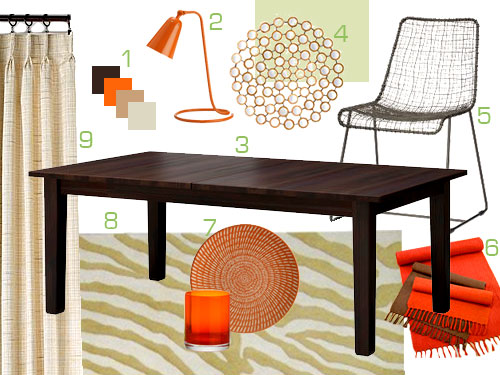
1. We love this warm, spicy color scheme full of rich chocolate browns, chic oranges, soft olives, and a range of tan and creams tones along with hits of hammered gold. If you’d like to add another hue to the mix, moss or even lime green (like the color of the numbers in the mood board) can also be peppered in with a few accessories. And speaking of green, we’d love to see the walls go a soft khaki olive color (Benjamin Moore’s Dune Grass) like the rectangle of hue behind the number 4 in the board above.
2. One of these sculptural orange lamps on either side of a buffet would add ambiance as well as a shot of interesting color and shape to the whole room- plus they’re on clearance for just $29.
3. This chunky and rich solid wood table from Ikea is a steal at just $399 (it can seat 6-10 people thanks to two extension leaves).
4. This gorgeous hammered gold circle mirror is huge (and on sale!). It will pair beautifully with the crisp hits of orange (gold and clementine look so great together) so we picture it hanging above a buffet with those two orange lamps on either side of it.
5. These textured woven chairs will help to create a nice layered look (as opposed to choosing chunky wood chairs that match the table). Plus we love how the airy and delicate woven chairs play off of the hefty and solid table to create a nice unexpected but balanced effect.
6. These linen runners from World Market remind us of a cozy fall scarf, so we’d love to see the orange one placed down the center of the table to break up all the wood and add a fun dose of color (which will tie into the lamps on the buffet and some plates and glasses that we’ll mention next).
7. Dinner with friends and family members would be fun served on mixed and matched plates and glasses in our color scheme. Like these patterned plates (on clearance for just $1.95) and these Mad Men-ish modern glasses (for $3.95).
8. This olive toned zebra rug (nearly 50% off) is worldly and cool, plus at 8 x 10 it’s easily big enough to be placed under a large table and still allow everyone to pull out their chairs without worrying about the back legs being off the carpet.
9. These cream curtains (on clearance) would add softness and even more texture- or anyone who loves a good DIY project could whip up some homemade curtains from drop cloths sold at Home Depot or Lowe’s to save some serious loot (just google “drop cloth curtain” to find a bunch of online tutorials on the subject).
So there you have it. An orange spice dining room full of texture, shapes, materials, and layered and lovely interest. Anyone out there itching to add a little fall flavor to their dining room? Or use this palette in another room? Along with olive and lime green, do you have other accent colors that you love to see with orange? Navy could be really posh looking too. Oh the possibilities…
Psst- Looking for oodles of mood boards? Search them by color or by room right here.

Mike @HA says
Thanks for the mood boards! They’re always so inspiring! Great fall mix :)
Amanda @ Our Humble A{Bowe}d says
I love orange with a peacock blue, similar to our sofa pillows:
http://ourhumbleabowed.wordpress.com/the-grand-tour/
Nicole says
I have to say that I really enjoy these “generic” mood boards, and the color palette on this one has me aching for fall. I am such a sucker for zebra print; I love that the rug is sort of muted, but still has that fun flavor.
Allison says
Fall is my favorite and I love this mix of warm colors! My favorite piece this time around is that rug. Fun and zebra-y, but toned down enough to be played off as a neutral piece.
Oh, and I like the lightness of those chairs. Makes me wish I didn’t have wooden chairs to match my wooden table.
Laura (Blogging Over Thyme) says
I love fall colors! I couldn’t help but see this bedding and think this would be a perfect addition to the mood board:
http://www.anthropologie.com/anthro/catalog/productdetail.jsp?subCategoryId=HOME-BEDDING-QUILTS&id=093371&catId=HOME-BEDDING&pushId=HOME-BEDDING&popId=HOME&sortProperties=&navCount=260&navAction=top&fromCategoryPage=true&selectedProductSize=&selectedProductSize1=&color=095&colorName=MULTI&isSubcategory=true&isProduct=true&isBigImage=&templateType=hybrid
liz @ btb says
love the rug and mirror
Jessica @ How Sweet says
I love the orange – our living room is done in browns, greens, blues and oranges!
JMB says
LOVE the orange! An underappreciated shade by many, I think. We have a very nuetral bedroom, so to spice it up a bit, we’ve added pops of orange everywhere from pillowcases to throw pillows, to baskets and candles, to antique, orange Carnival Glass.
JMB says
Oops! Meant neutral…not nuetral!
Beth says
THANK YOU for making mood boards a regular feature!
Martha says
I love this mood board! I have a very similar dining room table and would like to get some fun comtemporary chairs to replace the matchy-matchy ones I currently have. Thanks for the inspiration!
Krystal says
This mood board has me itching for fall! I never cared much for the color orange, which I think is partly due to my high school’s colors being a catastrophic combination of orange and kelly green, but I’ve found myself gravitating towards it lately.
Lyn says
Love these mood boards and your source lists. I’ve been looking for curtains and a dining room table and really dig this look.
Also, when I saw the chairs you picked out, it reminded me of these on sale at Urban Outfitters that I’ve been eyeing ($50!):
http://www.urbanoutfitters.com/urban/catalog/productdetail.jsp?itemdescription=true&itemCount=80&startValue=1&selectedProductColor=&sortby=&id=18124396&parentid=SALE_APT&sortProperties=+subCategoryPosition,&navCount=196&navAction=jump&color=&pushId=SALE_APT&popId=SALE&prepushId=&selectedProductSize=
Ashley says
Drooling over those chairs! I think I’m on a hunt for a cheaper version!
Tiffany says
Love that mirror it is so unique
XOXO,
http://outfitidentifier.com/
jacki says
oh my wordy! I love the colors! I wish I can re-do the house again, ugh!
Kelsey D says
One of my favorite mood baords so far! Keep them coming! :)
Tera says
Love it. :) And I can attest that Dune Grass is the perfect neutral shade of green (after painting my dining room three times to find the right color)!
Suzie @ cupcake monkey says
Nice picks! I love orange in the fall!!
We have orange pillows that have a red pattern on themmixed with cream throw pillows in our espresso-colored living room…I love the color combo!
Jill Stigs says
Love it! My favorite color trio is burnt orange, olive green and dark brown.
ALittleBite says
A perfect mood board for the beginning of the fall! I especially like the mirror. Thanks for the inspiration!
Rebecca (Craving Simplicity) says
Love the mirror!!
j says
Love the pops of orange!
http://pearlsandgreentea.blogspot.com/
Flynn says
mmmm! i’m actually taking a break right now from painting an end table with behr’s mango madness (also my favorite snapple; coincidence? i think not). orange is just so cheerful. where the table will go, we’ve got mostly muted teals otherwise. i think the mango side table will give the room a vivid focus. thanks for the inspiration, as always.
priscilla says
The William Henry Miller Inn in downtown Ithaca, near the commons. A wonderful interesting old hose with a great innkeeper.
Mara says
Just have to say we have the Stornas in the chocolate brown stain that was discontinued by IKEA earlier this year, we got it for $199 and it’s amazing! We LOVE it and it’s super easy to pair up with a variety of chairs. It can also seat up to 12 if you put chairs on the ends. :)
Lindsey d. says
Love turquoise with orange!
Jessica says
I’m struggling with a similar color scheme in the bedroom, need to find more inexpensive pops of orange. Dark wood furniture, orange artwork, cool neutral gray bedspread. I’m thinking a pop of orange in a throw pillow on the bed, but can’t find just the right one without going boring and solid.
Sally says
I dig the orange. And your new mood board gallery is awesome.
I am sad that you guys aren’t doing custom mood boards anymore. Looking at how you worked with existing furniture and room configurations was a big draw. Hopefully you’ll get more reader redesigns with awesome room makeovers!
Constance says
This might be my favorite mood board that I’ve come across. Well done!
bindc says
Orange, lime green, brown and black is the color palette for my living room. I love it!!!
KimB says
our living room mixes that same burnt-orange pop with a few others…
yellow-green (yes, like the crayon), mustard yellow, and the neutral backdrop is a bunch of tan, beige, dark rich brown. Also some pops of white… I know it sounds crazy, but we were inspired by artwork we got on a trip to Costa Rica, and it makes the room very “warm”. :) loving your mood boards lately! so many great ideas.
Sarah says
LOL. We had those curtains when I was a kid…in the 70’s! I guess it really IS all cyclical.
chrystie says
OOh I love this. We moved into and decorated most of our new place last fall so we naturally gravitated towards oranges and browns. Now it’s just turned into a wonderful color pallete to add accent colors to as we go through each season!
Paige says
My husband would be ALL OVER this room. Orange is his favorite color!
Katie @ Katie Beth Interiors says
These are the colors of our family room and I am loving entering fall because of it!
Deborah says
Really enjoy the mood boards. Just a thought- I would love to see ideas for centerpieces for the dining room table, either in the mood board or a separate upcoming post. (especially since the holidays are around the corner)
I love your decorating ideas!!!
YoungHouseLove says
Hey Deborah,
We have some fun table setting posts and videos in our archives, and we definitely have table scape and holiday entertaining/decorating posts in the hopper. Stay tuned!
xo,
s
Angela B says
I usually avoid orange – but I love this! Probably because the orange touches are paired with my favourites – greens and dark woods.
Daria says
Love the mood board! Orange is my favorite color. Inspiring, thanks for posting!
hi-d says
I love that color palette. I’ve been on this sewing pillows kick recently for our living room and have combined – green, brown, orange, teal, mustard yellow, etc. The colors make me happy! :)
Carole says
I like the colour combo, although I’ve never had the guts to try orange! Red seems to be as wild as I can go :)
Have you noticed that the CB2 webpage is making liberal use of orange paired with a dark grey (I clicked over there to see those neat-o chairs in the mood board.) It’s a very striking colour combination!
YoungHouseLove says
Ooh orange and gray is nice. Off to check it out!
xo,
s
Judy says
We have this exact dining room table from Ikea! Love it. It’s super-solid, and honestly with both leaves in you can easily seat 12.
daily decorator says
Thanks for the heads up about that Pier1 mirror being on sale. I have had my eye on that for quite some time! ~Tracy
Kristi W. says
We have that Ikea table and love it. It’s a great price for the quality.
YoungHouseLove says
It’s amazing to hear so many people vouch for that Ikea table (and to hear that it seats even more people than advertised). Thanks so much for sharing your experiences with any products that we include in our mood boards! It definitely should come in handy for anyone who’s debating whether or not to buy something.
xo,
s
candace @ thecandace.com says
I’m loving that rug with the pops of orange! Great job with this mood board!
OwningSingle says
This is truly a mood board after my own heart. My kitchen/dining room is painted orange and I recently painted my cabinets a dark chocolate. I have a similar dark wood table from Ikea, the Bjursta table (that I scored on craigslist for $150). I liked the one you have a little more but it was a little too long for my space. I also have round wall decor on the wall similar to what you have but not mirrored. I love this. Have you guys snuck into my house?
bridget b. says
nice. this would also make a good home office mood board. i think i just may try it.
Erin B. Inspired says
I love the rug! And pops of orange.
Anna says
I love the circles mirror and the pops of orange. It’s such a happy color!
I use drop cloth curtains in our Living Room and love them:
curtains.
Stacy says
Can I tell you how much I LOVE the fact that you guys are including Pier 1 items in your generic mood boards? I work for them, and I am a huge dork about spotting P1 things on websites/TV shows/etc. And I have that mirror, and it’s great. And all it needs to attach to your wall is one of those little c-shaped monkey hooks.
YoungHouseLove says
That’s awesome Stacy! We’d love to team up with Pier1 for a giveaway so if you have any connections there feel free to drop our name! We know YHL readers are loving that mirror…
xo,
s