The deed is done! Rockport Gray is all up in this hizzy.
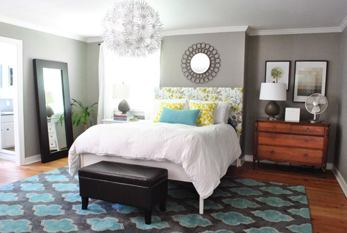
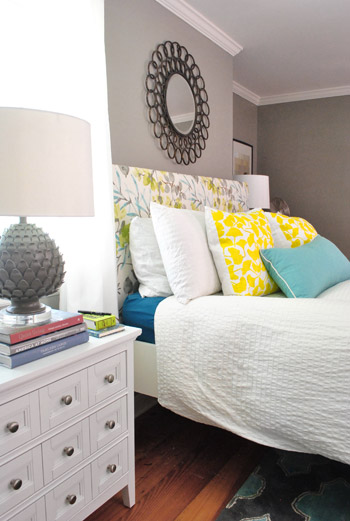
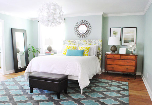
We love how much more things like the extra thick crown molding and the trim around the doors and windows pops now that the color is deeper and more… sleepy? Can you describe a bedroom color that way? In love.

It’s such a mutating color. Sometimes it looks lighter and grayer.
And sometimes it looks moodier and more mocha.
We think it looks especially good with our cheap-o Ikea curtains (Vivan panels for $9 a pop) and other crisp white things, like this old side table from our first house’s den and the white lamp shade on our floor lamp.
So yeah, we likey the new vibe in the bedroom.
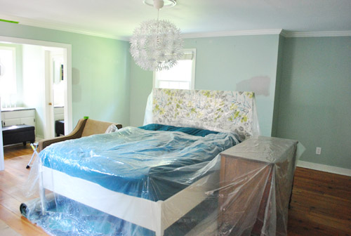
Basically the room looked kind of soft and sweet with the light gray-blue walls before…
… but they were kinda similar to the walls in our first house’s bedroom (which we did love, but after 4.5 years with it we thought it would be fun to try something different).
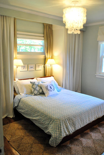
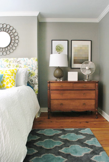
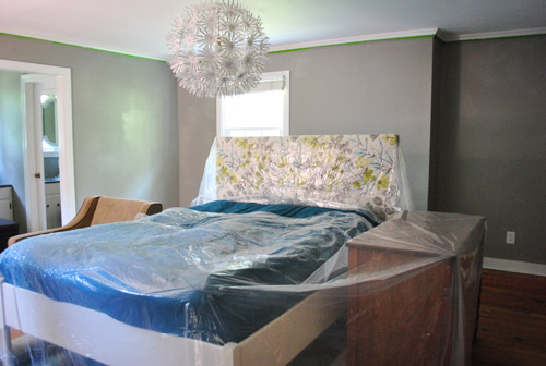
It also felt a little too blue when you factored in the blue in the rug, the headboard fabric, etc. We just wanted something with a little more oomph. See how these side by side shots show how much more the molding and the fabric on the headboard pops? Now they stand out and say I am molding/headboard, hear me roar.
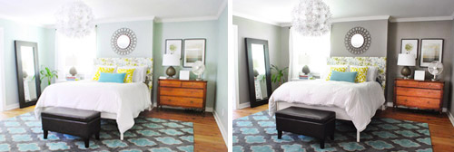
These vertical images might help you see the molding effect more easily (since they’re not as small). Doesn’t the trim almost look like it has been beefed up and whitened in the picture on the right? It’s all thanks to the contrast that the deeper and less airy color brings. Seriously, I didn’t repaint the molding or anything.
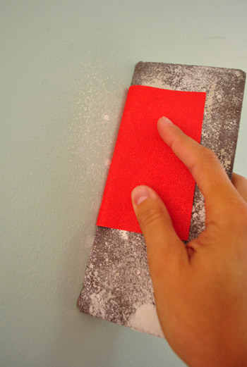
As for the process, we basically spackled any nail holes that we weren’t going to be using anymore (like the ones that used to hold the art up over the bed when it was on the other wall) and then sanded them so they were smooth.
Then we moved a lot of stuff out of the room, and covered the remaining furnishings that we pushed into the center of the room with plastic drop cloths):
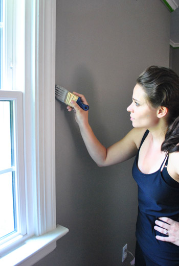
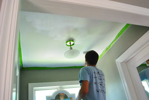
We taped off the crown molding too (since on a step ladder I’m less steady handed). But I can freehand all the trim around the windows, doors, baseboards, and outlets without tape – so that saves us time and tape.
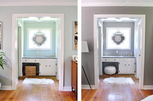
It’s amazing what an instant difference the new paint on the wall was. But it took us about five or six hours of prep/painting to get to that point. It’s a big room (16 x 16′) and we were also painting the entire sink nook (which is like another small room that’s attached with tons of windows and doorways to cut in around). So we just put on some music and got down to business. Painting business. Not funny business.
There was some of this (I’m the cutter-inner in the family and John is the roller):
And some of this (we actually painted the ceiling above the sink nook a color for the book photoshoots back in January, so we finally got to repaint it back to white while we were doing the walls):
As we mentioned, the room is 16 x 16′ – and we actually used less than a gallon of paint for this entire paint job (including the sink nook). Maybe around 2/3rds of one? Benjamin Moore paint (this was Rockport Gray in their Natura base, which is VOC free) has great coverage, so when we used Olympic to paint this room for the first time we used the whole gallon since we needed two full coats, but this time we only needed one coat and a few touch ups as a second coat instead of a full second application. Oh and we went with an eggshell finish for anyone wondering (it’s nice and matte but still a bit more durable and wipe-able than flat paint would have been).
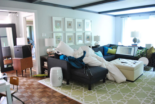
There was still the same amount of house chaos even though we only needed one coat of paint this time. Because of course when you paint a room, at least one other room looks like complete insanity since all of the stuff from the room that you’re painting gets dumped in there. Like our living room in this case:
For those wondering where Clara was, her grandparents graciously offered to take her to the playground, lunch, and the library while we got this done. So thankful! We’ve definitely painted rooms while she napped and it has worked (like the bedroom when we painted it the first time) but it’s usually just a lot more choppy because we both work hard for the two-ish hours that she naps and then one of us has to watch her while the other one works (ex: I continue to cut in while John watches Clara after she wakes up) and then we switch (I watch her while he rolls).
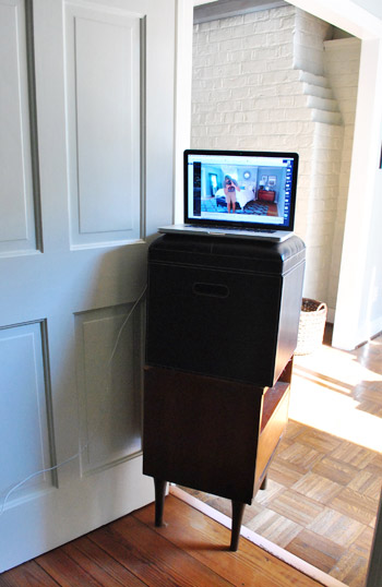
Here was our little setup to catch the process on our laptop’s camera (which has a longer battery life when plugged in than our Flip HD, which can only record for an hour). Oh yes, we’re high tech around here. There was ottoman on side table action (we used iMovie to make the video, which comes free with most Macs and has easy settings to speed things up):
So whoop, there it is. Darker, moodier paint that makes us wanna sleep. Haha. And kinda makes us want to paint a whole lot of other rooms in darker tones since it’s amazing how much more substantial the molding looks. But when we stop to think about it, ultimately we like the balance in the whole house’s current palette, which consists of:
- some light neutrals – like the soft gray in the living room and dining room
- some happy tones – like the grellow in the kitchen and the light pink in Clara’s room
- some deep saturated colors – like the dark teal guest room and the back of the dining room built-ins
Should be fun to see what colors we end up with in the completely untouched sunroom, playroom, hall bathroom, and guest bathroom though. In the meantime, what are you guys painting? Anyone diving into darker colors? Or lightening up with something soft? Feel free to name your favorite wall color of all time – it’s always interesting to hear what you guys are loving.

Nadia says
Love it! Does the color have any blue in it? I’ve been looking for a nice rich grey for our bedroom ever since painting it moonshine a couple years back because moonishine reads really light blue in our room. Pretty, but not what I’m looking for. After seeing some pics on some other blogs, I was kind of really liking the look of black(!!) walls, but can’t seem to convince the ol’ hubs…boo! Oh well. I did however paint all the window and French door sashes in that room black after seeing your house crash not long ago and LOVE it!!! And my favorite color so far is BM Classic Grey. It’s a great white/grey that doesn’t read blue at all! Love it, but want something darker for the bedroom.
YoungHouseLove says
I wouldn’t say there’s much blue in it at all (mostly just gray with a mocha undertone). Hope it helps!
xo,
s
Elizabeth E says
That is good to know! We have gray all over our house and it reads light blue:( Thanks for the Classic Grey tip!
Stephanie says
LOVE the grey walls. How weird – we just painted our spare bedroom grey after I re-did a dresser in a mustard yellow and thought grey would be the perfect room to put it in.
Ok – but don’t hate me – in your first picture of the new room, I covered up the rug with my hand, and I like it so much better without the rug. I LOVE the rug – don’t get me wrong – but just not in there. I feel like the bedroom has a softer vibe than that rug is giving off… and along those same lines… I really can’t get behind that light. It seems so cheapy in a room that otherwise looks more sophisticated and adult. To me – it just screams dorm room. I definitely think it could work in a dining room or somewhere (I’ve seen great examples on Pinterest), but it’s just not doing it for me in that room. Of course – it’s your room and I get that. Just my (unsolicited!) advice.
YoungHouseLove says
Thanks Stephanie! Thing are known to move around in our house (rugs, lights, pillows, art, etc) so you never know where we’ll end up!
xo,
s
Megan says
I love the room now! It looks great and does make it look better for sleeping. :)
Jodie says
I looooove it! It looks really good, you guys. I can’t believe how much more the color of the floor and the bedside dresser pop. :D
Sue says
Love it!! I painted my bedroom Martha Stewart Cement last year which is very similar to your colour. I find it so calming.
BoredAtWork says
Oh man. I want to go to the playground, lunch and the library.
susan says
Looks great!
We are moving this fall, so no more painting here-and I LOVE to paint. Walls, trim, canvas-it’s all good.
We’ve done most of this place a very neutral pale cream, with MS Timothy Hay in the kitchen-a greyed green.
Our next place will be white ( hopefully venetian plaster ) with black doors-a trend I am seeing a lot now, but one I have liked for a long time via older European decor.
Brenda says
The gray makes the room feel really sophisticated and cozy. Love it!
Jennifer says
I’m giggling at Sherry’s “shaking the paint can” cameo in the video, b/c that’s how I tend to mix up the paint and then my husband always rolls his eyes ’cause then we have to wait for the bubbles to settle before we can start painting, but it’s so much more fun than stirring with a stick!!
Sarah says
LOVE the color! It looks so great with your headboard, although I think the rug distracts from the subtle beauty of the pattern on the headboard. Great room reveal, Thanks :)
Chris says
Yes, the paint is nice and all, but I agree with the previous commenter – loving your softer hair! ;)
Lindsey says
Wow! This is one of my favorite changes that you’ve made. The grey looks great! Amazing how a little paint can make such a drastic difference. Is there a reason you decided to go with the Benjamin Moore paint over Olympic this time?
YoungHouseLove says
We used Ben Moore paint over a year ago when we painted the cabinets in our office, again when we painted the kitchen cabinets, on a bunch of book project, and in our master bathroom (which is also Rockport Gray). So I think over the past year the quality and coverage has been winning us over! It’s more money for sure, but it’s durable, high quality, and saves us time (one coat instead of two in our giant bedroom was pretty darn awesome). We loved Olympic too though, it just felt a bit thinner and needed more coats. So it’s all about how much you want to spend (both money and time-wise).
xo,
s
Suzy says
Love the color!!!I have been pinning colors on Pinterest with those pretty grays in it for our office. Love how the wall color makes the rug pop even more. Another great transformation for not alot of money!!! YHL rocks!
Kim says
We have Porter Paints Olive Gray in our living room, kitchen, and dining room ( it’s all one big space). It’s a really great neutral.
YoungHouseLove says
Sounds so pretty!
xo,
s
Dana says
I’m in love with that color! It really makes the white things pop, and it seems like the darker, richer color would be a really soothing retreat for a bedroom.
Jill Stigs says
Just moved into a new apartment that is painted in semi-gloss white and quite frankly I love the lightness of it. BUT….I do need some color, so I am going to paint 2 walls(not calling them accent walls because I hear that is outdated?) Benjamin Moore’s Fall Harvest (which is a burnt orange) and the kidlet (13 yr. old daughter) is getting all 4 walls in her bedroom (which is 16′ x 11.5′) in Sherwin Williams Dovetail.
Now seeing this, I think I will buy a sample pot of Rockport Gray to see how it looks in her bedroom.
Your bedroom looks wonderful!!
Joanna says
Really great contrast with the new grey color. Makes everything else POP.
Courtney @ One Fine Wire says
I love the grays and mocha’s…well done. Your room really does look refreshing!
Katie C says
i really like this change. generally i like all your color choices, but ever since you got the rug i have been looking at the photos and covering the walls and then covering the floor and i liked each piece but could not really enjoy the gel together. but this really lets both the rug and the walls stand out. (not that my opinion really matters, it’s YOUR house…) anyway, this is making me wish i was out of apartments even more now!
lindsey says
nice work guys! it looks great and i love the moody vibe.
i must have gotten your painting energy via ESP because i too jumped on the paint the bedroom (finally!) train this weekend. our house has chair-rail about 1.5 feet down from the top of the wall all the way around the perimeter of the room, which creates a nice architectural detail. in our other bedroom we painted deep green up to the molding, leaving the upper portion white. for our bedroom, i painted the walls stone lion (SW grey/brown) and the upper bit + ceiling a rich blue (SW riverside). it was daring and scary, but i like it. a lot. let’s hope my hubby gives the old stamp o’ approval when he gets back from his research in greenland!
YoungHouseLove says
Wahoo! It sounds awesome and I’m sure hubby will love it!
xo,
s
Leah says
I love the color!! Looks fantastic!
Nora says
Love the color swap. Makes total sense with the new headboard fabric. Would love to see a new “down the hall shot”, as that point of view looks so good with the furniture layout. Just curious…you seem to find two fab options and run with them. I have over 8 colors for my laundry room (in the grey zones). I slapped on one and it looks light purple and turns the grey tile to teal..Help. How do you guys hone in on the right combos? I’m thinking I’m totally not getting the “under palette”. Sigh.
YoungHouseLove says
Check out the House Tour page! Just uploaded one (granted it’s really far away and not really centered on that doorway since it’s more about the frames). As for undertones, we always hold swatches up to items (like tile) to see how it effects them- it’s amazing how much of a difference they can make with furnishings and tile/textiles. Hope it helps!
xo,
s
how2home says
Love the song that you guys put on for the video, its pretty awesome! You guys are such a great duo! I love the light blue before but i love the grey even more! We have a similar color on our wall, its such a great color :) Matches everything we have. LOVE IT!!
Kiki says
I love the grey! Everything pops and I actually like how the grey looks with the wood floor…even if you want to stain it someday. Looks great! I’ve actually been thinking of painting my room grey, and now I feel sold on the color.
Kristin says
I am so in love with your living room. I mean your bedroom. I mean your kitchen. I mean ALL of them!
The video was awesome!
KathyL says
Perfect change. For me, and probably only me, when i see a light blue I think of a little boy’s room, which is what I painted my son’s room when he was small. So when you repainted to gray, it became an immediate adult room. I liked your room before, and never even thought, kids room color, until I saw the before and after side by side. My brain said “adult room” and I wasn’t even ‘thinking’ about it. weird how color does that. Anyway, its stunning.
rachael says
I love the grey!! I loved the blue, too. Everything you guys do is just perfect. I love that you make your house reflect your personalities. Also, I am going right after this to amazon to pre-order your book. I’m dying for November. Just dying.
YoungHouseLove says
Aw, you’re so sweet Rachael!
xo,
s
CohoesMom5 says
I wouldn’t call the color “sleepy” but I would call it “dreamy”. My middle son’s room is dark grey on the bottom of the walls, light grey on the top of the walls and the ceiling, with a bright orange stripe around the middle of the walls (he loves orange but I refused to paint the entire room orange)
Laura says
LOVE IT!!!! Makes me want to see what colors we can change in our house, as I can’t believe what a big difference that ended up making for your room!
Jen V says
Love the color change. We (meaning I) just repainted one of our bathrooms a very similar (if not the same) color. The previous color was yellow which was too bright for the room and I came across an “oops” can of Benjamin Moore when we were picking up paint for another project. I LOVE the change…especially with our slate floors!
Kristy Swain says
What a cool video!! What a neat idea. The room looks so good! I LOVE that color. What a good move – really improved an already great room. Can’t wait to include it on my greige post.
Wrenaria says
Gorgeous. Good decision. That color really arms up the room and makes it look cozy and inviting. Love it.
Emily says
I love the color. You guys are painting pros. I must say Sherry looks like a model in the cutting in picture (the hair looks fancy for painting).
YoungHouseLove says
Haha, I can’t believe how many people like that bad curl in my hair from the humidity. Not cute in person at all! It’s one swoop away from looking like an Elvis faux hawk!
xo,
s
Ashley @ sunnysideshlee.com says
I LOVE IT!!! It looks awesome guys!! What a great change!
Kayla says
I like it a lot. And I loved the old color, but this is definitely more bedroom-y in my book.
J says
Love it! Seriously, huge transformation.
I’m obsessing over black lately. My kitchen and living room both have black and white walls. Can’t get enough black in my life. Gone are the days of khaki walls and in are dramatic blacks and greys.
Veronika says
First of all i luv the new look!! Total awesomness!
Second (this one’s for my girl $erdog!) i saw your bedroom rug on Nate! He used it and said that he “loves it”!!!
Yay!!!
YoungHouseLove says
Wahooooo! Love us some Nate B.
xo,
s
smart momma says
haha! i just finished watching your 2-minute video!! it just makes me laugh to see a fast-forward video, cute :) you guys definitely were faster than Edward!
i love how it turned out – pretty!
Ashley@AttemptsAtDomestication says
Love love love! It looks so awesome! I’ve been experimenting with moody colors lately and I love it!
Ally says
Forgot the fancy hair, look at that flat washboard stomach!
Way to rock the painting duds, $herdog! :)
xox
YoungHouseLove says
Haha, I would definitely not describe my stomach as flat washboard but I’ll take it! Hahah.
xo
s
Stacy Lovoy says
As an avid painter/diyer I too have my method down pat…but for the life of me I can never figure out why I ALWAYS have to
apply 2 coats…even if I am not going from dark to light…just a different “shade” of the same color family…I ALWAYS have to do another coat which means more time and more money on paint! Do yall have that problem being the pro painters that you are? I use a 3/8 nap on my roller because I like a smooth,flat finish…could that be my problem?
YoungHouseLove says
We always use a roller for smooth surfaces and have just found that 99% of the time we need two coats but sometimes the quality of the paint makes a difference (ex: Ben Moore is thicker so it seems to have better coverage). Hope it helps!
xo,
s
Caitlin @ Desert Domicile says
I love it! Perfect shade of gray :)
I’m in the middle of painting an old console table and the color isn’t what I was expecting so I’m going to try experimenting with mixing my own color! Fingers crossed it works haha
Julie says
Just a question… I noticed that when John taped off the crown moulding, he did it in small pieces instead of in a continuous piece along each wall. I usually do a long piece – do you find the small pieces work/hold better?
YoungHouseLove says
Our old house is so wiggly that smaller pieces are more accurate so we don’t get big slices of color that don’t follow the lines of the molding. Hope it helps!
xo,
s
Tom Corliss says
I really do like the wall color change. It is a soft and cool color but yet it really shows off the color in the rug better now. Great job. We are in the process of adding trim to all of our interior doors, then painting they all high gloss black for richness. Will post article and pics when finished. Thanks for your continued great style tips. We are just about finished with our DIY video library update. We have 0ver 900 diy videos on 54 Home and Garden subjects, check it out. http://homeinformationguru.com/?page_id=1685
Anna says
Love it! It looks grown up and sophisticated and changes the colour of everything in the room. Even the dresser and floor look different!
Amanda says
Love it. Our master is a fab mocha/olivey gray and I love how the color mutates throughout the day. Have you ever considered barn door(s) over your sink nook doorway now that the furniture has moved around? I’m itching to do some myself, but with casters and galvanized pipe instead of traditional slider hardware. Cheaper and more interesting!
YoungHouseLove says
Yes, we thought that would be really fun! Not sure if we’ll ever really use it though, since we love the light that comes in from that window over the sink and wouldn’t want to block it.
xo,
s
Amanda says
With frosted glass! Ohhh, now my brain is ticking, except I need my barn door to cover a patio slider that faces west and takes a heat beating in the summer.
Kelly says
I like it! And Sherry, you look like you lost weight! Jealous!
Julie says
I LOVE it! Wow, the room looks so different! I’m currently trying to find the perfect gray for our nursery. This color is definitely a contender! I will have to pick up some swatches! :)
Janet says
The new color is beautiful. It really makes the new headboard pop. Love it!!
Sherry says
It looks beautiful. It’s actually the same colour as our master bedroom but ours reads darker since we don’t have the same great light in the pacific northwest that you do. Mark off another great job :)
Sherry