Q: First of all I love your site. It inspires me to fix up my own home (you make it look so easy!). But if there was a class called Paint Picking 101 I would be getting a big fat F. So far every room I’ve painted in my new house is either too bright, too dark, too dirty looking and just plain ugly. I’m having the worst time finding a perfect tan tone and I’m even messing up colors like light blue and cream, which I never thought was even possible! Do you have any foolproof colors you can recommend? A favorite blue? Cream? Tan? White? Yellow? Gray? I know natural light and other factors can change the way paint looks substantially so it’s probably not 100% foolproof, but I’d love to know your favorite paint colors so at least I have a shot of living in a house that doesn’t make me feel like a total paint failure! Thanks so much for your help! – Meagan
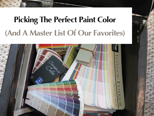
A: Picking the right paint color can often be a doozie, so don’t get down on yourself! Take comfort in the fact that repainting, while annoying, is super inexpensive and it can instantly transform your room from wrong to oh-so-right in an afternoon. And thanks to the transformative power of paint, we’re the proud owners of an entire storage ottoman full of paint decks and swatches. Name any color or any brand- it’s all in our little paint chip library of sorts. But although we have quite a slew of selections we still find ourselves reaching for some tried and true favorites again and again when it comes to doling out room recommendations.
As you mentioned, paint colors can look very different under different lighting circumstances, but for the most part there are a bunch of practically error-proof tones that we find ourselves recommending again and again. Some of them are bright and fun (better suited for only one wall or even a punchy piece of furniture) while others are classic and serene- perfect for an entire room or even an entire home. Here’s the swatch suggestion scoop:
White- Benjamin Moore Decorators White, Glidden Dove White, Behr Cascade White, Sherwin-Williams Alabaster.
Cream- Glidden Antique White, Sherwin-Williams Creamy, Benjamin Moore Muskoka Trail, Benjamin Moore French White, Benjamin Moore Natural White.
Red- Benjamin Moore Million Dollar Red, Glidden Red Delicious, Behr Firelight, Valspar Fabulous Red (great for a front door- might be too bright for inside).
Pink/Coral: Sherwin-Williams Comical Coral (shown below), Benjamin Moore Wild Aster, Sherwin-Williams Animated Coral, Behr Be Mine, Behr Silk Sheets, Behr Coquette.
Brown- Benjamin Moore Branchport Brown, Benjamin Moore Woodacres, Benjamin Moore Stampede, Sherwin-Williams Cobble Brown, Sherwin-Williams Van Dyke Brown (shown below), Behr Traditional.
Yellow- Benjamin Moore Hawthorne Yellow (it is the be-all end-all of yellow paint, which is notoriously hard to get right).
Green- Glidden Fennel (no longer available for swatches, but still in the computer so they can whip it up for you), Glidden Celery Sticks, Benjamin Moore Mosaic Glass, Benjamin Moore Hibiscus (great for a cheerful kid’s room with white trim and brown furnishings), Benjamin Moore Soft Fern, Benjamin Moore Silken Pine, Benjamin Moore Sweet Pear, Benjamin Moore Dune Grass, Sherwin-Williams Lime Granita.
Purple- Glidden Silver Plum (no longer available for swatches, but still in the computer so they can whip it up for you), Glidden Delicious Plum (amazing eggplant color for a front door), Glidden Black Tulip (the deepest moodiest purple-black that’s dripping with drama) Benjamin Moore Nosegay, Benjamin Moore Violet Pearl, Benjamin Moore Iced Lavender.
Blue- Glidden Gentle Tide (no longer available for swatches, but still in the computer so they can whip it up for you), Benjamin Moore Quiet Moments, Benjamin Moore Saratoga Springs, Restoration Hardware Silver Sage (it has green undertones but looks blue-gray in most rooms), Behr Pensive Sky, Behr Flint Smoke, Behr Grand Rapids.
Navy- Benjamin Moore Spellbound, Benjamin Moore French Barret, Benjamin Moore Hudson Bay, Sherwin Williams Grays Harbor, Sherwin-Williams Naval.
Black- Glidden Onyx Black, Benjamin Moore Graphite.
Tan- Glidden Sand White (no longer available for swatches, but still in the computer so they can whip it up for you), Glidden Water Chestnut, Glidden Cafe Latte, Benjamin Moore Baja Dunes, Benjamin Moore Davenport Tan, Behr Harvest Brown.
Orange- Benjamin Moore Beverly Hills, Benjamin Moore Lion Heart, Benjamin Moore Corn Husk, Sherwin-Williams Marquis Orange, Sherwin-Williams Mandarin (shown below).
Gray- Benjamin Moore North Hampton Putty, Benjamin Moore Light Pewter, Benjamin Moore Stonington Gray, Benjamin Moore Nantucket Fog, Glidden Silver Dust.
Beige- Benjamin Moore Clay Beige, Benjamin Moore Green Brier, Sherwin-Williams Ancient Marble.
Greige- Benjamin Moore Tapestry Beige, Behr Ocean Pearl.
Oh and a word of warning: you don’t want one of each of these colors in your house! Here’s how we learned that a tighter color scheme can make your home feel bigger, more open, and a lot more cohesive and welcoming. Of course it doesn’t have to feel expected or monochromatic since you can bring in different accent colors with art and accessories in each space to make them feel unique and interesting!
And a second word of warning: Paint colors look different in every room (due to lighting and other ever-changing factors) so we just suggest grabbing a bunch of the swatches above and bringing them home to see which ones look best on your wall. We can’t recommend a specific color for your specific situation with any great accuracy since we have no idea how it’ll “read” in your home (your eyes will be much better than ours since we’re not right there in your space). Just tape up a variety of swatches and pick the one that looks best to you (and get a few test pots of paint if you’re still not sure)! That really is the best way to get it right every time.
What about you guys? Any words of warning or paint color advice? Do you have some favorite hues that have worked out wonderfully for your casa? Any that were terrible that you’d love to warn others about? Let’s all help Meagan out by dishing the paint picking dirt.

Amy says
Hey guys!
I’m coming back for one more paint rec (you helped me pick an awesome color for our small bathroom) and now that I’m on my third different living room color, I’m reaching out to you. Please help!
Our living room has many windows, but is still fairly dark (we live in a very wooded area), we have a red couch and a red striped chair (mixed with beige, golds and tiny hints of green in the stripes), I recently bought light beige sheer curtains (to replace some heavy – more red(!) drapes) in the hopes of lightening things up. Now I’m looking for a simultaneously bright and warm color for the walls to keep things light and cozy (is it possible to be both??). The trim in the room is a dark walnut and we have a red brick fireplace in the room.
As I’m writing this I’m realizing how much red is in there. We have no plans to change the furniture and my hubby will never green light painting the fireplace, so I’m hoping there is a magic paint color out there!
YoungHouseLove says
What about a soft sage color. Would be so pretty!
xo
s
Andrew Host says
I totally agree, using colors wisely can improve your home so much better and also create a farm feeling of wellbeing inside your home.
Andrea H says
Hi guys! I know you are SUPER busy, but I’m dying to ask your thoughts on a paint color. We used Glidden Gentle Tide in our downstairs hallway and it leads up the stairs and through the upstairs hallway. It’s beautiful and we love it. I was going to continue it into our master bedroom, but it seems like a bit too much blue. We like our bedroom to be light and airy. (Btw, we also have Gentle Tide in our small downstairs bathroom and playroom – funny how it looks like 3 entirely different shades of blue in each room. Loving them all). Anyway, since the Gentle Tide swatch is unavailable, I’m wondering if you think a lighter shade on the swatch would be a good master bedroom color (and what color would that be?), or if I should try something else? Our walls in the house are light creams and blues with white trim throughout the house. I would appreciate any input! Thanks sooo much!
YoungHouseLove says
Oh man I wish I still had that swatch to tell you. What you can do instead is ask for a “half tint” of Gentle Tide, which means they’ll add more white and make it half as bright/dark. We also love Ashen Tan by Benjamin Moore with Gentle Tide. Such a great combo :)
xo
s
Bethany says
I have exhausted the paint samples for Sherwin Williams and can’t seem to find a gray that works in our kitchen…I currently have about 10 samples on the wall:( I have decided to try Benjamin Moore and got some of the Cliffside Gray which is way too blue and lighter than what I would like. What I am searching for is a Gray that is not too light/not too dark, and goes with my current flooring which has some brown/gray undertones. It seems that all the Greige colors that I have tried look tan on the wall, but the grays go blue…could you point me in the right directions for a great grey:) Thanks!!
YoungHouseLove says
Everything reads differently in different lighting situations, but maybe try Gray Owl?
xo
s
Andrea H says
So I did the half-tint of Gentle Tide – it looks WONDERFUL! Thank you!!! I have been painting my butt off this summer and my paint colors throughout the house are finally the way I want them – without having come across your website a few months ago I never would’ve made these changes. Thank you for teaching me how to decorate!!
YoungHouseLove says
So glad! Congrats Andrea!
xo
s
Amy says
Help! My husband and I bought a new (construction) house – so I am trying to pick out paint colors. Our settlement date is 7/31 and I would like to get the house painted asap since we have a 2nd baby coming 2 weeks after settlement. Therefore it’s been really hard to pick colors without actually being in the house. Here’s what I have so far – any input would be GREATLY appreciated!!
Foyer/Upstairs Hall – Revere Pewter
Living Room (flows out from the foyer) – Brandon Beige
Dining Room -(connected to the dining room with half wall) wallpapering a salmon color
Office (somewhat part of the foyer area) – Nantucket Fog or Brewster Gray
Kitchen – Revere Pewter
Sunroom – (comes off of the Kitchen) Whythe Blue
Family Room – (Very open space – connected to Kitchen by 3 or 4 foot half wall) Looking for a lighter color to go with Revere Pewter or maybe something different altogether. We don’t have any furniture for the family room yet.
The sunroom has a greyish/beige tile. The foyer/kitchen are a light to medium colored hardwood. And the rest of the space is a warm stone colored rug (called Warm Stone). I think the carpet has more yellow in it than I’d prefer. I was hoping to stay on the cool side with our color scheme…
Thanks so much for any help!!!
YoungHouseLove says
For the sunroom try Quiet Moments, and for the Office we love Nantucket Fog! For the family I’d go with Reverie Pewter again (we like repeating colors for flow) or Edgecomb Gray which is just a tad lighter but complementary. Good luck!
xo
s
Amy says
Thanks so much for your input! Sorry one more question.
Would you switch things up & do edgecomb gray in foyer/upstairs hall/ kitchen then do darker in fam room (& thinking about doing the same in liv rm) with revere pewter? I guess my question is would you do a darker or lighter foyer compared to rest of space.
Thanks again!!!
YoungHouseLove says
Yes, that would work too! You could do either and I bet it would be gorgeous!
xo
s
Laurie says
Help! My husband and I have been in a stalemate for the past two months trying to figure out a paint color for our basement and the staircase that leads down to it. Just when we thought we may have figured out a color, the guy at the BM paint store talked us out of it. Here’s the low-down: It is about 800 sq ft. of living space with low-ish drywall ceilings (white) and white baseboard trim. We are putting in a light tan rug and have a couch that is almost exactly the same color as BM’s Sandlot Gray. The rest of our house is Moonshine and definitely is more on the modern/eclectic side. We were hoping for a neutral (but not boring) color.
YoungHouseLove says
I’d go with Edgecomb Gray. It’s not really gray (more like a very very light sand tone) so it would be great in a basement but still let the white trim pop. You could also do Quiet Moments (a super soft gray-blue) for something less tan but still really neutral (it goes with everything). Good luck!
xo
s
Celia says
We have natural maple cabinets in our kitchen and over the years they seem to have yellowed. I am looking for a creamy white to paint our kitchen backsplash that will go with natural maple cabinets and white appliances. (My daughter is dismayed that we have white when “everyone else has stainless!)
The maple seems to have yellowed in some places so I wonder if we should pick a white that is creamy but doesn’t read yellow because I want to downplay that yellowness if that makes sense. Another option would be to paint the cabinets white and get a dreamy, serene kitchen space but that seems to be a bigger project than we can tackle now.
YoungHouseLove says
Hmm, how about Edgecomb Gray? It’s a soft beigey cream (sort of like a white sand beach). Hope it helps!
xo
s
Hannah says
Hi!! Do you have any suggestions for accent colors to go with hot pink? I’m in a toss up between painting the walls hot pink or neutral :/ I also have a very large window in my room which is the only reason I’m considering painting the room hot pink ;) Which would you recommend?- hot pink or neutral? Thanks so much!!
YoungHouseLove says
I think I’d do a neutral (soft tan or soft gray would both look awesome with hot pink) and then you can add fun hits of hot pink in pillows, art, accessories, etc.
xo
s
seattle_sweetheart says
I love your blog, and what a great color list! If we hadn’t just purchased a house with an open floor plan I’d be all over that list tomorrow :-D
As for which paint companies can color-match other manufacturer’s colors……..Most paint lines are derived from the same base and colorants which are manufactured overseas, and most can be color-matched to each other pretty well as they all use the same basic products. On the other hand, Benjamin Moore manufactures all their paint (basic chemicals, bases and colorants) from scratch, right here in the US. And because they manufacture literally everything themselves, it differs substantially from most other manufacturers. It makes a true color match nearly impossible, so if you’re super picky (me) it’s worth ponying up the extra cash for a few gallons of BM so you don’t have to repaint!
Jessica says
I am in a similar spot as some of the other commenters! My house is a new build so I have to choose 3 paint colours from Benjamin Moore without actually seeing the completed house. The Kitchen/Dining/Living Room are basically all open to each other. Then there are two bedrooms & 1 master bedroom/ master closet & 1 bathroom. I feel lost on which colours will go together. Is it better to have the room a solid colour or have an accent wall? What are some colours that would go well with Revere Pewter? I don’t like anything dark/ heavy colours. I wanted a grey (revere pewter) and then a grey/blue (quiet moments?) and then another accent colour (?)
Dining/Kitchen/Living Room/Hallway: Revere Pewter
Master: ?
Bedroom 1: ?
Bedroom 2: ?
Bathroom: ?
Colours I’ve looked at/like: Revere Pewter, Quiet Moments, Gray Horse, Colorado Grey, Coventry Grey, Storm, Cape May Cobblestone.
Any advice would be great!
YoungHouseLove says
Hmm, there are lots of ways you could go, but how about:
Dining/Kitchen/Living Room/Hallway: Revere Pewter
Master: Quiet Moments
Bedroom 1: Edgecomb Gray (this is a soft sand color that goes so well with R.P and Q.M)
Bedroom 2: Reverie Pewter again (I love colors that pop up in a few places for a nice cohesive whole-house feeling)
Bathroom: Colorado Gray
xo
s
Kari says
Love your blog!! What exterior color would you suggest for a plain looking ranch house that had brownish red gutters and soffit? I started to look at some grayish tan tones but I feel like they have lavender undertones to them. We would repaint our trim also. Thanks!
YoungHouseLove says
Hmm, maybe a medium gray? Like Rockport Gray? I’d get a sample of that and see what you think!
xo
s
Kari says
Thanks! I will definitely give that a try!! Any suggestions on window trim color or front door color with the rock port gray?
YoungHouseLove says
I always love white trim and maybe the door could be white as well? Or a deeper chocolate color to tie into the shutters?
xo
s
Lisa lavine says
Hello! I am looking for a yellow or yellow/gold for a family room kitchen combination. I have a dark taupe in our bedroom and a house has touches of blue green…pumpkin and grey accents. I need a beautiful yellow that isn’t too over wheeling, but enrich and inviting. I appreciate any help,,,thanks
YoungHouseLove says
Hawthorne Yellow for sure (by Benjamin Moore). So pretty!
xo
s
Lisa says
Need to redo kitchen color – South facing windows with a ton of light during the day. Faces open family room painted a C-2 color “Turkish Market” – reddish-brick tone. Looking at SW Favorite tan #6157 and SW Camelback #6122 – also, have Scarecrow (BM 1041) off kitchen. All BM “White Dove” trim and ceilings – Entry hall into kitchen has natural grass cloth. Decorator is recommending one step down from Scarecrow which is “Spice Gold” BM 1041, Brunswick Beige BM1061 or Sherwood Tan BM1054. HELP….I’m at a loss right now and painter is coming Monday a.m. I’m mainly interested to see if others have used the SW colors with success. Thanks for any tips!
YoungHouseLove says
Any SW users with advice for Lisa? Maybe try google images and Pinterest to see them in other rooms (lighting changes colors so they won’t always look like that in your home but they can give you a bit of an idea).
xo
s
Kelsey Williams says
Thank you so much for this list! After four months of searching, we are going with Glidden’s Dove White!
Megan Cramer says
I know this is a long shot because you guys are probably not checking this post anymore but I thought I would give it a try anyway. I need some help with a color for my front entry way hallway. I live in an old craftsman that still has the wood trim(we are leaving it that way)that is a great cherry/walnut stain color. The rooms are all separated by french doors and transoms but it has a nice openish feel to it anyway. So here where I need your help. My living room is sw perfect greige and my dining room is sw distance which is a great darker blue color. The hallway in question runs along both of these rooms from my front door back to the kitchen and I have no idea what color to paint it. I tried a color a few shades lighter than the perfect greige but it ended up looking the same and I hate it. I want the colors to flow but the hallway needs to be warm and inviting and possibly a little brighter. I was thinking about trying cream next what do you guys think?? Help!!!
YoungHouseLove says
Yes, cream sounds really pretty! I’d bring home a bunch of cream swatches and tape them up and see which one you like (bring them into nearby rooms to see how they work with those colors too).
xo
s
Julie Reed says
We have a log home with a regular stick frame/sheetrock basement. Our trim is all pine. My daughter just moved out and now I need to repaint and decorate downstairs. Would you have any other color suggestions to go with the wood trim and light tan/cream carpet?
YoungHouseLove says
Soft sage colors and celery tones are really nice with cream and wood trim, so I’d bring home a bunch of those swatches to see what you like.
xo
s
Gloria says
Hi! I know you guys have so much on your plate right now with the new baby, but I was wondering if you would have any updates to these colors since this original list is almost 5 years old. Maybe new ones you love or colors that replaced old favorites? For example, ones that weren’t available anymore when you wrote this post, did you find a new current color or more recent one to replace those? Love your site!!
YoungHouseLove says
That would be a fun update post!
xo
s
Pookie says
Having recently painted all the rooms in our home, I did great picking color until it came to our home office. Hubby wanted it to be man cave-ish and he picked yellow (I know, right??)
I bought Ben Moore Butter and it turned bile green in that room, then BM Weston Flax, still too strong. After a total of FOUR yellows we finally nailed it with Ben Moore Ylang Ylang!
Then I realized that I was really looking for a cream with only a hint of yellow, which flows great with our coastal color palette. Everyone who sees it asks about the color and loves it! Paired with super white hi-gloss closet doors, crown moulding, casing and baseboards it really is a lovely tranquil calming butter yellow!
Pookie says
Oh I forgot to mention that we have manly black furniture in the office along with manly large black-framed TV and movie posters, and manly filing cabinets etc in case you were wondering. About my husband, you know. And he has a manly job in construction. Ahem, well, yes the office turned out beautifully and we both love it :)