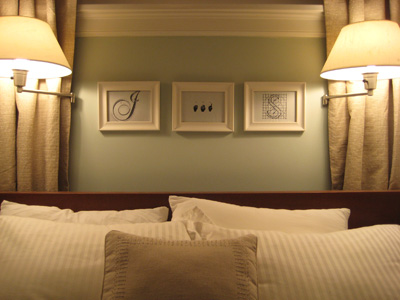
Let’s talk about bed letters. (Did I just make a “bed wetters” pun? Gross, I did). Now that we’ve all moved past my fourth grade humor, let me tell you why. It was the perfect way to introduce the answer to a question that we’ve been asked a lot lately: What’s in those three frames above your bed?
The answer: “J and S.” Call it a monogram or, more functionally, our designated sleeping arrangement, but either way this fun little take on our initials was all Sherry’s genius. She simply found three differently designed letters (a curvy spiral staircase inspired J, a sign language A-N-D and an architecturally drawn S). Then she framed them separately above our bed to fill that long, awkward space under our long, awkward window.
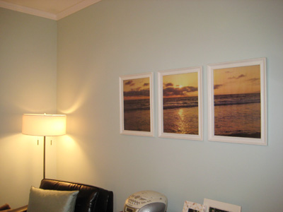
While we’re on the topic, the opposite side of our bedroom boasts another three-framed art piece. And this one’s my creation. Back when we first painted the bedroom blue, we looked for some “warm” art to cozy it up. We struck gold with a sunset photo I took in Santa Monica on our very first vacation together.
Having only struck metaphorical gold, however, the three-frame design was actually inspired by our tiny budget. Sizing the image across three 11″ x 17″ Ikea frames was the economical way to create big impact on that wall, especially since we got the images printed at Kinko’s for cheap (around 50 cents each). And now every morning we wake up to the sun and the sea. It’s like an ocean view on a budget.
Despite both being simple projects, they’re two of our favorites – and have literally hung in there for almost two years. Which is practically a lifetime considering how often things change around here.

Leave a Reply