Woo to the hoo. Our bedroom horse art arrived, so we’re back to share the whole how-to-affix-them-to-canvas adventure. The title might have already given it away, but even though they arrived on Monday afternoon (spoiler alert) it took two attempts to get ‘er done in this instance.
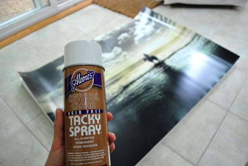
First I went with the ol’ spray adhesive route (for $4 from JoAnn with a coupon), since I used this for anything and everything back in my art school days (it was like the duct tape of our world). It’s usually a great candidate since it’s acid free (which means it’s good for not ruining prints) and it’s listed as “all purpose” and “permanent” right on the label.
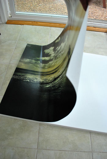
It was as simple as spraying the back of the poster (while it was upside down) along with the front of the canvas and then starting at one side of the canvas and lining up the corners and sort of rolling the print down to adhere it as I went. I was able to do it all myself (without any John help) and even snapped this pic midway through. Girl power.
Oh and I did this in the sunroom since I could seal off the fumes from the rest of the house while wearing my mask and opening the doors and windows to the outside world and running the fan (it’s stinky stuff). So if you ever dabble in spray mounting it’s great to do it outside or in a highly ventilatable space like a sunroom or screened in porch.
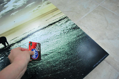
But back to my method. After laying my poster in place, I gently used a credit card my Kroger card to smooth things out (gentle is the key word, you don’t want to end up with scratches or dents):
Then I did the same thing with the other guy:
Wham, bam thank you ma’am. Or so I thought. I hung them with pride and marveled that it only took about twenty minutes to attach my prints to my canvases. I may have even done that thing where you clasp your hands together and shake them on either side of your head in a victory dance of sorts. Can’t confirm or deny that.
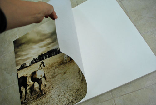
And then tragedy struck. Ok that’s a little dramatic. More like things slowly became un-stuck. Boo hiss (my dad always says that and I crack up). I noticed that they were looking a little wiggly and less taut before bed, and within about 12 hours (by early Tuesday morning) there were actually big speed bump looking separations between the print and the canvas. I should have taken a picture but I was too worried/annoyed/bummed to remember to document it. It was the butt crack of dawn and I kinda thought all was lost. Oh well, I did mention at the end of my horse art post on Monday that I could royally mess this project up. Do I know thyself or what? Maybe it just wasn’t meant to be. But I gave a little tug at the corner of one print and happily learned that it was actually really easy to peel the prints right off of the canvas so I could essentially start all over again. The horse photography gods must have been smiling down on me.
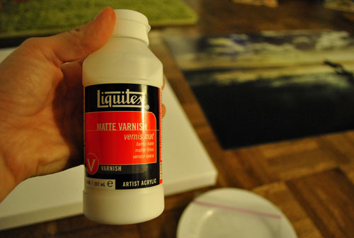
So next it was on to method numero dos. This time I googled around for a more “heavy duty” technique that was a bit more reliable and commonly recommended. I found this and this, which both suggested using acrylic medium as glue. The kind that I grabbed was Liquitex Matte Varnish from Michael’s (for $3 with a coupon):
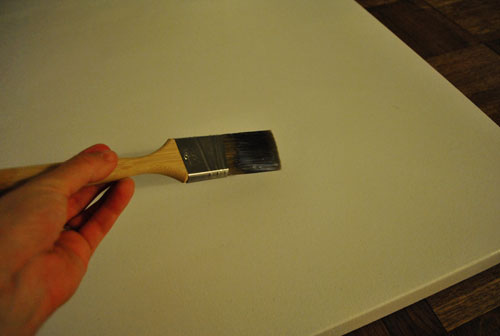
I brushed a thin and even coat onto the surface of the canvas…
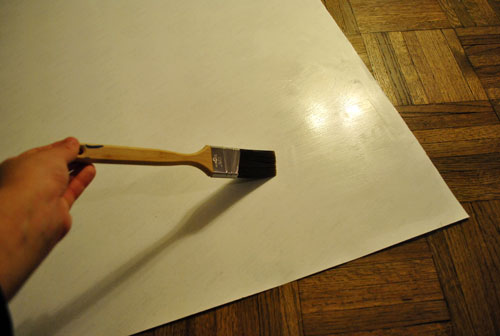
… along with the back of the poster…
… and then stuck them together using the same method as I did with my spray mount, although for some reason I needed John’s help this time. So maybe have an extra person on hand to help you line up corners and keep your print from folding or getting crinkled as you go. Specifically I had two corners and John had two corners and we placed my two corners down first and sort of rolled the rest of the print down (like the second pic of this post while using the spray adhesive) and that seemed to be a great way to avoid bubbles or crinkles. Some small air pockets did occur, but I was able to work them out from the middle of the canvas towards the edges (gently with the palm of my hand). Oh and some folks can have a reaction to acrylic medium (we didn’t, but noticed it said that on the container) so wearing thin latex gloves while touching the corners and placing the print might be a good idea.
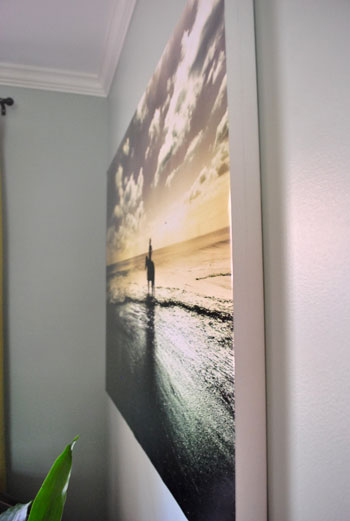
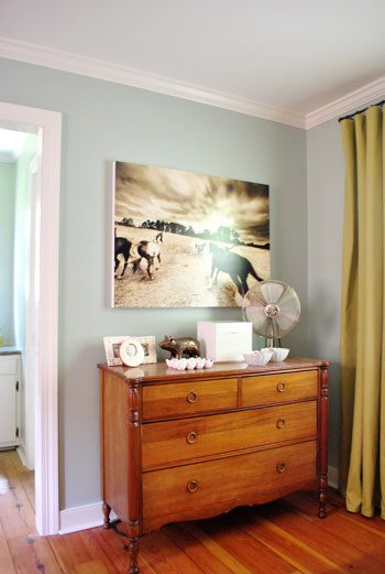
Sorry we didn’t snap any photos of this step (all of our hands were in use) but here’s the finished – and very secure – result after we adhered both prints with the Liquitex varnish and then laid them flat for a full 24 hours to cure (I didn’t want them to buckle or slide off the wall while they were drying). We’ve both taken a few steamy showers in the adjoined bathroom over the last few days and they really appear to be stuck for the long haul this time (after spray mounting I could tell they might be a bit wiggly, but they felt a lot more cured and hardened about 12 hours after I used the acrylic medium). Sweet. Of course I’ll keep you posted if it all comes crumbling down. But so far, so good.
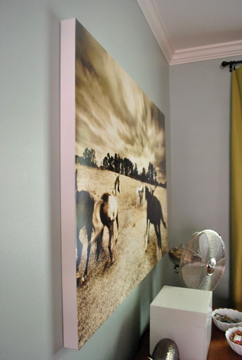
As for the sides of the canvases, I debated painting them charcoal or deep brown or even using some metallic paint, but opted to just leave them white for now. The clean look works for us (it ties into the white trim and the mirror hanging above the sink between them). And as for covering the front with something (like acrylic medium or Mod Podge) we decided that we liked the smooth print-like finish for now too. But if anyone at home is planning to use something like acrylic medium over your print or poster I’d recommend testing it out on a tiny area first, just to make sure it doesn’t make anything cloudy or runny (although I’ve heard it’s usually great – just call me Captain Careful).
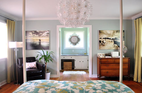
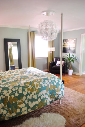
We did switch the sides that we hung them on (from my original photoshop rendering), since J liked the one on my side more and I liked the one on his side more. Now we can each wake up and see our favorite prints from our side of the bed (J’s is the beach one and mine is the wild horses one). Sidenote: We realized that we switched “sides” when we moved, and finally figured out why. No matter where we live, I subconsciously prefer to be on the side furthest from the door. I guess I feel more cozy and nestled that way. Weird, huh?
One of my favorite things about the prints is how luminescent they are. That soft glow is definitely something that our rough little photoshop rendering didn’t account for, which is why some people might have been turned off by how much harsher they looked in that “guestimate.” Or they might just think horse art is weird. Which is valid (I know not everyone is on the Equine Train with me). I’ve always had a strange animal fascination – I just graduated from My Little Ponies and Popples (remember those?) to ceramic and photographic versions.
In money news, each poster (found here and here) would have been $169 to get ‘em printed on canvas to the size that I wanted and I was able to DIY each one for just $64 a pop (including the poster and the large canvas). So I saved over $200 bucks. Here’s hoping it sticks.
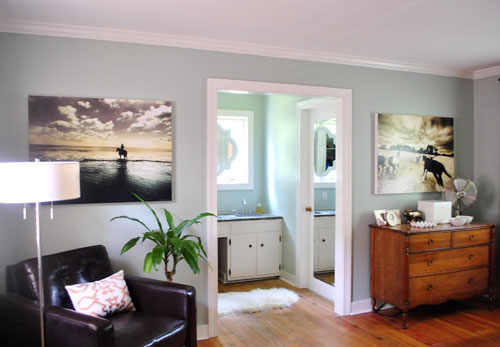
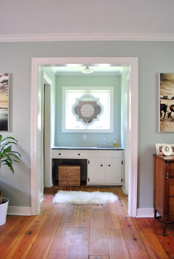
And now for a money shot of the sink nook. My least-favorite-to-favorite place in the house. We really like that the light & airy nook is a nice counterpart to the moody horse photos (we thought lighter/softer art might be a little too sweet and matchy-matchy for our tastes, so we went for something a little wild to contrast the big white mirror).
As we mentioned in the original poster post on Monday, we know these prints are a bit of a departure from our first house’s beachy, light, and airy (and sometimes very “safe”) style. And that art is definitely one of those in-the-eye-of-the-beholder things. In general, we’re having a lot more fun taking risks in this house (although every time I think I’m going to shock & repulse my mom she ends up liking it, which is totally throwing me off). Embracing the Just Gotta Do You School Of Decorating (which is taught by Queen Latifah in my mind) has allowed us to be more true to ourselves, and our house already feels more special and more like us.
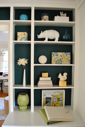
One brave-for-prudes-like-us choice seems to somehow fit right in with the next one, and it gets easier to trust ourselves as we go. All with minimal nail biting and second guessing, which was a constant occurrence at our first house. I’m not going to say that we’re never nervous (just the idea of saying that makes me nervous), but lately we’ve had some luck doing the whole “what’s the worst that can happen?” exercise and it has always been something not-that-bad (ex: we’ll get new art, we’ll repaint, we’ll return something, etc). Which are all things worthy of ending up with a house that we love – so we get all Thelma & Louise and hold hands and drive off the cliff together. Oh and one more I’m-kinda-freaking-out tip: it’s always nice to look back on other bold-ish choices that we’ve made since moving here when we need a slap of it’ll-hopefully-be-worth-it confidence, like the painted backs of the built-ins in the dining room (which were so much more of a visual payoff than leaving them white)…
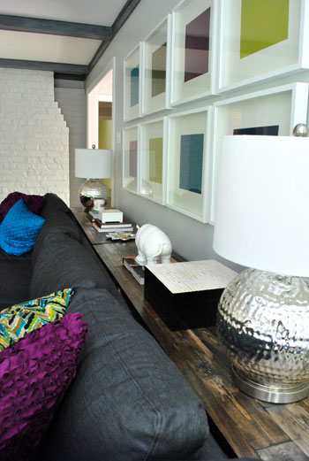
… and the still-in-progress contrast-y dark-beamed and dark-sectionaled living room (we were ready to try something beyond the white beams and the white slipcovered sofa in our first house’s den)…
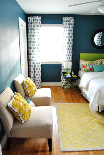
… and the deeply saturated guest room (which is kind of moody but still happy and fun)…
To us, our little ponies in the bedroom just seem to fit right in with the photos above. It feels like home.
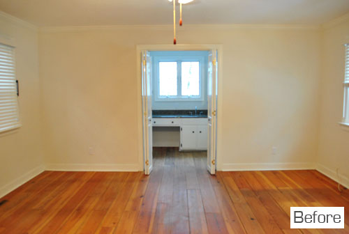
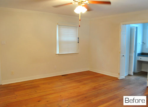
And it’s so crazy to think that it looked like this five months ago:
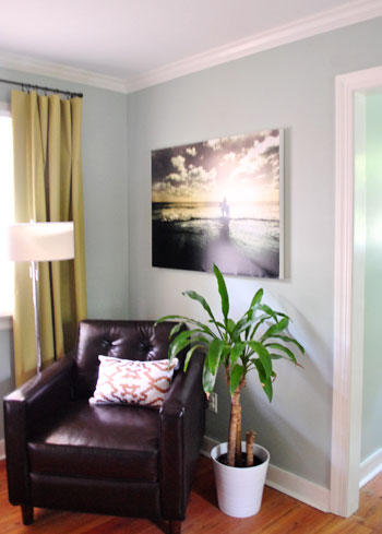
You thought I’d wrap things up with those before shots, right? Nope. Still babbling. Because the other day I had this thought that I wanted to share with you guys: although all of the risky-bid-ness that we’ve been experimenting with is definitely fun, one thing that we never expected was that it would work so well with the softer and more calm “moments” in our house, like the serene white-framed hall art gallery:
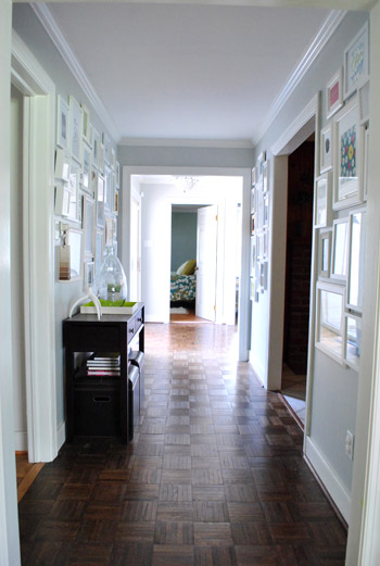
We’re learning that it’s not all or nothing. Areas of color and contrast seem to go well with (and balance out) the less bright and saturated spaces. So going bold in one spot doesn’t mean your whole house necessarily needs to be saturated and stimulating. It’s as if those quieter zones seem to temper things (like our white-on-gray frame gallery which leads to our more colorful and contrasty bedroom). A little of Column A, a little of Column B if you will.
In short, we’re definitely still “students” who are just figuring things out as we go. Wax on, wax off. Diving in and having fun and embracing the whole trial-and-error and why-the-heck-not approach seems to work when it comes to inching towards a place that feels like us. Yes, this is another one of those yay-you moments where I encourage you to go for it and play around and be brave and have fun – all in the name of landing on something that you couldn’t love more. After all, it’s only paint/art/bedding etc – so it’s likely something that you can semi-easily undo if you hate it. So quit horsing around (aww yeeeeah, a last-line-of-the-post horse pun) and just go for it. Can I get a yeehaw? No? Alrighty then.
Psst- Here’s an awesome post all about taking risks from The Nesting Place. She says it a lot better than I do, so… what she said.
Psssst- Is anyone else in total denial that Oprah is over? I can’t bring myself to delete her last episode from our DVR, so I guess it’ll sit there a while. Maybe for twenty fiiiiiive years.

Leave a Reply