We usually feel pretty confident in our ability to pick a paint color. But something about choosing the perfect gray color for two major living areas in our house made me extra nervous (we’re going to use the same color in the future dining room, main hallway, and living room for some nice continuity). Sherry had a field day ribbing me about my paint paralysis. I was literally second-guessing every swatch we looked at. “Sure, I like it… no I don’t, I hate it.” Yeah, that was me.
I blame my neurosis on having selected a hideous gray tone to paint my middle school bedroom (I picked it because I liked the name – Cannonball or Cannon Smoke or something else that sounded like blowing stuff up). In retrospect it was too dark, cold, and prison-like. Fortunately I warmed it up with a bright red Looney Tunes rug and Tasmanian Devil throw pillows (don’t be jealous). But somehow I don’t think that’s an acceptable solution this time around.
So I convinced Sherry (who was a lot less gun-shy than I was, she kept saying “let’s just pick one and DO IT!”) that we should buy paint testers and try out a few colors before committing. She recommends this option all the time to nervous-about-painting readers, so it wasn’t too hard to convince her that we should give it a whirl at least once. So we narrowed it down to our top three similar-but-different-enough-to-help-us-make-a-decision contenders:
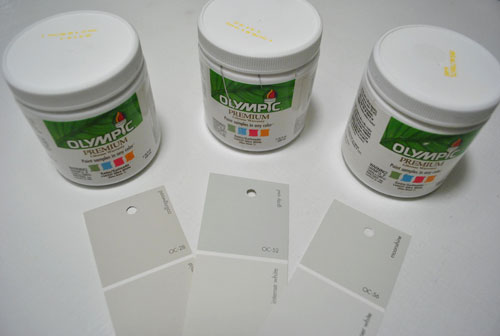
They are, from left to right: Collingwood, Grey Owl, and Moonshine (all Benjamin Moore colors mixed in Olympic Premium No-VOC samplers from Lowe’s – which are about $2.50 a pop). Of course, in an effort to prove her paint-psychic abilities, Sherry called her favorite before even breaking out the paintbrush. Can you guess which one it is? Hint: it rhymes with “spoon mine.”
Here they are in the future dining room, painted in that same order (with Collingwood on top and Moonshine on the bottom):
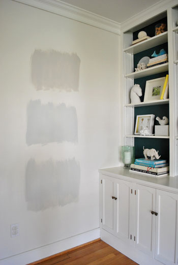
We just did one coat with a paintbrush (it had great coverage) doing our best to keep the edges feathered so when we eventually paint over everything we aren’t left with slightly raised squares where we tested (which is why we didn’t use painters tape to make perfect squares that also might be visible after we paint over them).
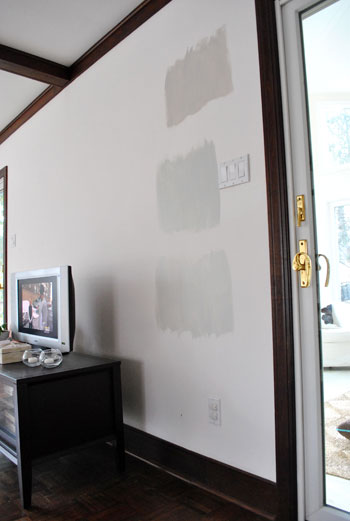
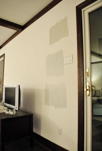
And ever the overachiever (or just someone who loves to paint), Sherry finally embraced the test square method and went ahead and painted big swatches in the family room too. One set near the TV…
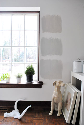
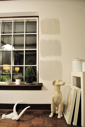
…and another set next to the big window (since it gets a different amount of daylight).
After all, one of the great things about these testers is that you get to see what certain colors look like throughout the day and in varying amounts of daylight and artificial light. We do this with the small paint swatches too, but it certainly was nice to judge a color from across the room for once.
Speaking of different lights, here are all of the colors again at night when things are much yellower from the artificial light (they’re all painted in the same order as listed above, by the way):
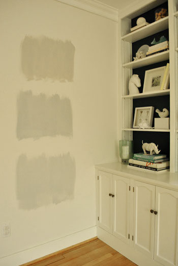
So after a couple of days I finally admitted that (say it with me) Sherry was right all along. Moonshine, the one on the bottom, is by far our favorite of the bunch. Collingwood (the top one) almost won us over, but it’s so warm/tan that it reminded us a lot of Glidden’s Sand White, which was in our first house’s living room and office. We love that color, but it’s not gray enough for what we want this time, so in the spirit of doing something fresh and new we crossed it off the list. And Grey Owl (the middle one) read as too green/blue in our house’s light, so we worried it too might not immediately read “gray” and instead might be “muddy blue-gray” which is what we had in our last house’s bedroom and kitchen.
Moonshine is probably the “purist” of the grays we tested, and it almost has a soft shimmery quality to it – like there’s some silver mixed in. We’re excited about it because it’s definitely dark enough to make the moldings pop (especially once we paint the ones in the living room white) but it’s not too bright or saturated to compete with bolder curtains, art, and accessories that we plan to introduce. Now we just have to cross our fingers that we can find the energy to paint the two largest rooms in our house… and the hallway that connects them. We actually started the job today- but with baby & blog duty going on at the same time, it might take us a few days to get ‘er done. We’ll share pics as soon as we’ve got ’em though!
Have any of you used the paint tester method to choose a color? Did it confirm your feelings or send you in a totally new direction? And dare we ask how long the test squares stayed up before the room finally got painted completely? Ours were up nearly a week, but we could totally see how that could turn into a month (or a year) if you still weren’t 100% sure which way to go…

Megan says
The top grey was the one I would have chosen too! We’ve done the same thing in order to choose the right one. Multiple rooms, multiple times a day.
Can’t wait to see the finished product! :)
Jordan says
<3 it! I would have chosen Moonshine also. It seems like the most consistent throughout even with the different lightings. I am excited to see it on the wall (the entire wall.)
Happy Humpday!
-Jordan
kristen anderl says
I did the same thing when trying to find the perfect sage green. Our kitchen, dining room, and living room all share walls so the color we picked had to look good in every room, and I was very indecisive!
I had about 10 color squares painted on the wall of each room. My friend’s mom came over and asked, flabbergasted, “WHAT ARE YOU DOING?”
Elisabeth says
Yep, I’ve used the paint tester method several times, and it works out pretty well for me, I think, although my boyfriend is all, “You are addicted to sample paints! Why are there random squares all over the house?” For example, here’s my cracked-out craft room:
http://www.flickr.com/photos/9838696@N02/4775549847/
And I had a lot of trouble finding a decent gray for my boyfriend’s home office. Gray is tough:
http://www.flickr.com/photos/9838696@N02/4552492841/
I’m really digging the Moonshine! I’ve been a big fan of your blog forever, so I’m really happy to see that you used the paint tester method as well.
liz @ btb says
Love moonshine!
I had the paralysis too. It’s no fun. I had 6 different colors on my walls for about 5 months and JUST a few weeks ago finally picked a color…
http://bontempsbeignet.blogspot.com/2010/07/summer-to-do-list-painting-paralysis.html
Amy says
We’ve had some chips up on our wall for about a week now. We started with a dozen (!) and have narrowed it down to three. I think I’m going to get some test paint for the first time. The husband never agrees to paint in the winter, so the test patch will be up until we can open the windows!
We were ahead of the grey curve and have had it in our living room since we moved in in 2001. We’re staying grey, but going for a more silvery-blue shade now.
Cait @ Hernando House says
We painted samples before doing the trees on our living room wall, and ended up going with the swatch we chose originally – Valspar Mountain Pass. Looking forward to seeing your spaces when they’re all painted!
Nichole@40daysof says
I’ve done it that way and on squares of drywall from Lowes. That way I don’t have to worry about painting over it.
I liked Moonshine!
Sara says
Typo Alert! Change we to we’re….(we going to use the same color in the future dining room, main hallway, and living room for some nice continuity)
Sorry, I can’t help myself!
YoungHouseLove says
Thanks Sara!
xo,
s
Rochelle says
I like Moonshine too- umm..the color…well, actually…
We painted our staircase Lightening which is a silvery grey and I love it!
Courtney says
We usually tape the larger one-color swatches to the wall and live with them for a while. We did just buy three of the test size cans though, so we could paint a tree on the wall of what is soon to be our son’s nursery. They’re the perfect size for smaller projects.
Erin says
Love Moonshine! It reads as a nice, pure, true gray! I think gray is the toughest color to select because so often it reads as pastel blue or purple or even tan – and you never know until you get it on your walls.
And we’ve definitely done the paint sample/swatch thing, multiple times. In fact, my office right now has had a splash of Restoration Hardware’s Silver Sage behind the door since last June. I need to do something about that!
Viv says
I like your choice. It really is amazing how different a colour can look in different lights.
Lauren says
Ugh. I have been trying to pick a grey for my kitchen for literally six months. It’s so hard- I will just keep painting swatches and see what happens!
beth says
we move in a few days and I made a visit to the BM store a few days ago. I have an embarrassing # of test pots in my possession.
Great job picking the color. Can’t wait to see how it goes!
Ashley @ Simply Creative Things says
Can’t wait to see it all completed! I’ll have to keep that color in mind for our guest bedroom where I was leaning towards a gray color.
Jennifer Laferriere says
Hey, I used Porpoise from Behr. It’s a great all over neutral. But a trick that a designer friend gave me is that you want to look at the darker shades on the paint chip and make sure that you don’t inadvertently pick a shade that is too blue, green or purple. staying with a more neutral true gray is best. I can`t give you any advice since with the screen, I wouldn`t know which is actually best! :) Good luck!
Katie says
A note about gray from an artist. I love gray. Something to keep in mind: when you put gray next to another color, it will naturally pick up its opposite on the color wheel. Example: Gray next to yellow will look purplish. Gray next to blue will look more orangie/warm. Yes, I said “orangie”. Good luck!
Kymberly says
Let Burger decide.
audrey says
Love the color you guys chose for the walls! Cant wait to see the end result ;)
carolyn says
I love the one you picked! Funny, I just walked in the door from a HD trip with a fist full of gray swatches. Yum!
And yes, I have 3 paint swatches painted in my bright orange kitchen none of which I’m willing to commit to. Even though I thought I hated the orange, it’s grown on me over the past few years…
Elizabeth says
When I was choosing a gray to paint my kitchen/dining/living/entry/hall area (which is all connected) I painted samples on some foam core and moved it around to see the colors in different areas at different times of the day.
And YES…doing this makes you choose different colors than those you like on the little swatches, especially with gray. Some were too blue, too green, too PINK!
I ultimately went with Benjamin Moore Revere Pewter colormatched into Sherwin Williams Superpaint. (I am apparently not on the no/low VOC bandwagon yet.)
I also painted all the vaulted ceilings in those areas…and the woodwork…still don’t know where I found the energy, must have been the inspiration from you guys since I completed the painting in about three days ALL BY MYSELF!
Alicia Cummings says
Hi Elizabeth,
Any chance you can share the formula and or the name of the SW paint color matched from BM Revere Pewter. After much thought I have settled on BM Revere Pewter, but my painter cannot get it (Utah) and wants to use SW. THANK YOU!! Alicia
Oona says
I love the Moonshine, definitely the right choice. (Not that you need my approval or anything, lol).
Our house has quite an interesting fireplace, all pastel quartz. I decided the way to go was to paint the room a super pale pink. The Mr. wasn’t having it. We went through three tan testers, a pale yellow, a bright blue, and finally two different pinks before he realized pink was the right choice for us. But those swatches stayed up for… I think 3 months before we came to a decision.
Rita says
I absolutely recommend this method! When I wanted to paint the master bedroom, I couldn’t decide between 3 different colors. Because my initial choices were wrong, I ended up getting several shades of each color before I was done. If I’d gone just with the paint chips, I would not have chosen the right color. I spent nearly $50 on samples, but I would have spent much more if I’d painted the whole room the wrong color.
Sadly, the walls looked crazy for months. It took me so long to choose a color, school started before I could get the walls painted and I had to wait until winter break. (I’m a teacher.)
julia says
Why didn’t you test the one you had in your recent moodboard for the new living room? I think it was soft pewter? I’ve seen you recommend that one a lot before. Any reason you changed your mind and didn’t test that one?
Also, I’m thinking of painting a room in my house gray with wwhite trim. I decided to do the painter tester method and did the color matching with Lowe’s Olympic paint (BM color). I have to say the paint Lowe’s mixed is similar but definitely not the same color as the BM paint chip. I even went into the BM store and the colorist confirmed what I was thinking – the Lowe’s paint has some purple undertones that aren’t in the BM paint. (fyi – the color I had color matched was soft pewter). Are you at all concerned that you paint isn’t an exact match with the BM colors? I googled around and read that paint matching is rarely exact…
Anyway, I can’t wait to see the finished rooms! Or even just a finished wall :)
YoungHouseLove says
Hey Julia,
We love that color but when we held it up in this house (as opposed to our first one) it looked too brown like the Collingwood one. Just felt too similar to Sand White (which we love, but have already done). As for color matching, our Lowe’s actually has the Benjamin Moore formulas in the computer, so they’re not scanning something, they’re pulling up the exact formula for a great match at your request. Hope it helps!
xo,
s
Rachel @ The Avid Appetite says
Love the gray choice! I’ve been wanting to do gray in my big loft, but am so worried about it looking cold a prison-like too! I do like Stonington Gray by BM, but not sure if it’s too deep a tone. Can’t wait to see what colors you use to complement!
bex says
Oh my goodness! We did the swatch thing for pretty much our entire house. GIANT blocks of paint all over, in a multitude of colors. Our friends would joke that we should just keep going with other colors and make the rooms polka-dotted. :) Har har.
I’m in love with your Moonshine! We did the gray-all-over-the-biggest-rooms-of-our-house thing, but it ended up looking a little more blue than we wanted. BUT, there’s no way I’m repainting our vaulted-ceiling great room (which is living, dining, and landing – plus hallway and part of the kitchen!) and entryway. It took five people five hours to do it. Never. Again.
sleigh says
Olympic actually has a a color called “going gray”, that we used in our bathroom. But its more of a blue then a grey. ;)
JenM says
When I bought home the paint chip samples, my husband said “all 3 look exactly the same color.” After we purchased paint tester samples and did the 3 color blocks he had to admit the colors were very different. We were so excited about the color we picked we started painting the bathroom straight from the tester, then ran right back out to the store and purchased more paint. It was only a small bathroom though, if it had been an actual room would’ve definitely taken a while. I love when you do a paint swatch post b/c I use it as proof that I’m not the only person who use the “tape a million swatches of similar color all over the room” method!
Bill says
I think the testers are a great way to see what color you like, but I do have a warning for others. Go one room at a time! haha. We picked 1 potential color for our kitchen, bedroom, office, and bathroom and put the tester on each one about 6 weeks ago. So far, we have the kitchen painted! (Luckily, we liked the only color we chose). We weren’t sold on the other colors so we still just have kinda-squares of paint on the walls in those rooms. We did go back and get two other colors for the bedroom and now know what we want in there, so it will be the next to be painted. I think you were smart to pick three colors to try and stick to one room (or rooms that are going to be the same color)!!
Krystal says
Can’t wait to see the finished product!
When I was getting ready to graduate high school, my parents went crazy with renovating for my open house. Think a new living room, dining room, kitchen, privacy fence, driveway, and professional curbing around the garden beds/landscaping…completed in one month’s time. It was madness, madness I tell you. I had to take prom pictures in the bathroom because it was the only section of house not invaded by home reno.
Anyways, my mom had planned all along that she wanted to paint the three rooms (they’re all connected by big, open doorways) a color called Pumpkin Butter by Behr. She loved how it looked in my aunt’s home and couldn’t wait to put it on the walls. But what looked like tan with hints of yellows and oranges in my aunt’s open concept/white trimmed house, actually read as bright gold in our closed in/oak trim home. In came the paint testers…Puppy Paws was too “poop” looking, Terra Cotta was too “brick red”, and on and on it went. By the time my mom finally settled on a nice dark & saturated green that screamed “THIS IS THE ONE!” the test wall had been painted precisely 37 times (because who needs a test patch when you have enough in that little can to paint a WHOLE WALL?!) And my mother wonders why I worry for her sanity…
Shannon B. says
Thank you thank you for this post!! I’m thinking cool grays, blues and greens for our house palette and gray is the most neutral yet most difficult shade for me to pick! This really helps!
P.S. Our floorplan is very open – do I have to use the same color in all the rooms that open up to one another? Is there a rule-of-thumb on painting different but complimentary colors with rooms so close?
YoungHouseLove says
Hey Shannon,
You can definitely keep all rooms that open up to each other the same color for tons of continuity and flow, or you can define each room and visually break them up a bit by choosing colors that complement each other well and layer nicely. We’ve seen it done beautifully both ways, so there are no rules. Good luck!
xo,
s
Emily says
I’m thinking about painting my studio grey in an attempt to make it feel more sophisticated, can’t wait to see how your walls turn out!
Blog is the New Black says
Grey owl!
Megan says
Thank goodness for this post! Greys can be so tricky! We have been trying to find THE perfect shade of grey for our bedroom for the past two months… and twelve (yes, twelve!) sample colors on the wall later I think we settled on Metro Gray by BM (colors we tried included BM Silver Fox, BM Gray Owl, BM Light Pewter, BM Gray Cashmere and BM White Dove – not too mention Restoration Hardware’s Slate and Glidden’s Granite Grey). I really, really like Moonshine on your walls – might have to pick up a sample!
melanie says
Perfect! I love it! Just painted my living room and dining room the same gray color. It is so clean and lovely and really makes the white trim, the colorful artwork and decor pop! Great choice.
HollowSquirrel says
Yay, that was my pick!
Now quit typing and start painting! ;)
bridget b. says
i’m SOOO jealous of your bright red Looney Tunes rug and Tasmanian Devil throw pillows. all i had growing up was a bright red bunk bud, teal carpets and mauve walls.
yeah, gray is a pretty hard color. a few years ago i painted my bedroom gray to match some of the undertones in a bedspread that i had and it turned out totally different than i expected from the swatch once i got the whole room painted.
there’s so many different undertones that can really make a difference in the final look, not to mention in different lighting changes. i’m having flashbacks just thinking about it.
Miranda says
You guys are too patient for me. I would never be able to do tests and wait to decide which color REALLY is the right one. Infact, just an hour ago or so, I went to buy new bathroom paint. I had already gotten a shower curtain and just need to find a paint color that would suit it. However, I couldn’t decide which of a few greens or tans would look best with it. So, after contemplating for about 15 minutes, I chose one and hopefully it will look great. I am by far WAY too impatient to buy three, paint them, wait to decide, and go back and buy more and THEN finally paint. So far, I have painted almost all of our new house and have only had to repaint one wall. Yay!
-Miss Impatient
Dawn says
LOL!!! I saw this and HAD to laugh. When we were living in our tiny rental house in Texas, I wanted to paint the livingroom green. Wasn’t sure of the color so I did just like you two did all over the livingroom and down the hallway even. Let’s just say, those “test” colors stayed up for almost a YEAR before I finally was able to get my then husband to commit to a color. I don’t even think he liked the color he picked,…it was one I was going to pick anyways, but he was tired of the “swatches” all over the house. He said we looked like “hillbillies” with all the different colored green splotches all over the house.
LOVE the color you guys picked. I was hoping you would pick something with some green undertones to match up with all the teal and turquoise and the dark bluish-green you chose for the back of the shelves. And you did! LOVE it! Can’t wait to see the house painted…:)
JMJE says
I just did this. I wanted to paint our spare bedroom/craft room green. So I bought three samples. I’m glad I did because one ended up being way darker than I though. And the other two were way more yellow. So I went back to Lowe’s and bought two more. I finally picked one and am pretty happy with it. My mom has had three pieces of paper taped up to the wall that were painted with paint samples in her guest bedroom (my old bedroom). They’ve been up there for about a year. I guess she hasn’t decided yet.
Kristen @ That Hoosier Girl says
We painted our bedroom gray and I 100% love it.
We definitely had giant paint patches up in our kitchen and living room for a good month before we finally chose one and got the job done!
Renee says
I am totally with Bex! Our home is very open concept, so we wanted to go with a gray that worked in the main living areas. We were torn between BM’s Abalone and Silver Fox which we had matched to Behr’s Premium Plus Ultra. So glad we did the paint testers because Silver Fox actually looked green on the walls!
Ultimately the gray reads a little more blue at night (it’s the perfect colour during daylight!) than we thought it would be, but after 2 12-hour days we wont’ be painting the hallway, kithen, dining, living room, stairwell and vaulted ceiling family room again! Maybe in a couple years!
Felicity says
GIVE IT UP FOR GRAY!!! WOOT, WOOT! I was obsessed with gray when we bought our house last year. It was SO bright that gray was the only “color” that would work for me (it’s a color in my book). We went with iced cube silver, which is a slightly bluish gray and looks kind of nautical-ish. Does that make sense? No, probably not. I just wanted to avoid any yellow undertones. Anyhoo, I like the center and bottom ones, but I think moonshine looks the best in the darker corner. Your living room will soonshine with moonshine!
Lindsay@Tell'er All About It says
OMG – I do the same thing ALL the time! I always pick up the paint testers because I’m so indecisive when it comes to colors – currently we’re trying to pick out grays, too! Gray is tough!
http://tellerallaboutit.wordpress.com/2009/12/03/i-like-the-color-but-its-a-little-too/
Glad I’m not the only one who has indecisive color issues :-)
becky says
Count me in for the “I left our swatches up for a year” group. We were also looking for the perfect gray, though I definitely wanted silvery blue undertones. I was all set on Glidden’s Quiet Rain. It had been decided for … um … months. The day before I finally bought the paint, I started thinking it was too blue. I went online and out of nowhere picked a new color, only having seen it on other people’s blogs. Color matched Behr paint to the new color, went home, and slapped some on the walls. It looked a little too greenish at first but ended up being the perfect gray/blue color. It is Stonington Gray by BM. I lucked out there, but to anyone else I’d recommend actually using the testers on the wall and going with the color you choose in the first place. :) I love Moon Shine (the color!) too and can’t wait to see the rooms painted!
Stephanie Phillips says
When picking a paint color for my kitchen I went through at least 7 or 8 samples before finding one I liked. The process took three weeks, but the final swatch was only on the wall for a day before I finished the whole room. At that point I was just ready for closure!
Lauren says
We have definitely used this method when we (mostly my husband) have been unsure about a paint color. I completely understand the challenge in picking the perfect gray….it probably took us a month to pick the final color for our living room!
Also, I laughed at the pictures by the window. It looks like the bull lost the fight and the greyhound is looking smug, basking in the glow of his victory over the bull :-)
YoungHouseLove says
Hey Lauren,
I know, right? My animal friends are trying to kill each other!
xo,
s
Charlotte says
I used paint testers but still I didn’t get the right blue hue that I wanted. They didn’t have enough variety in our local store, especially when it came to testers. Still, the result is ok, I wish we had your stores in Germany. Here everything is smaller. Except the bakeries.
ALittleBite says
Love the color you chose! But I might be biased since we painted half of our apartment a similar color… it looks amazing with white trim!