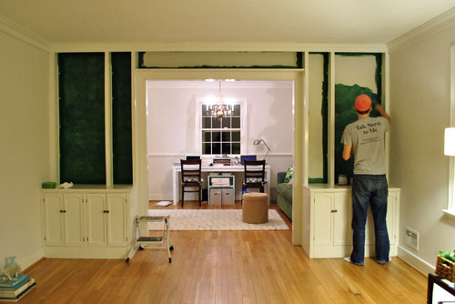
We’re back with the after pics of our freshly painted built-ins. As we mentioned in the last post, we went with an inky blue color with hints of green called Dragonfly from Benjamin Moore’s Affinity line (color matched to Lowe’s No-VOC Olympic paint for the bambino). We only needed a quart, and since we used objects that we already owned on the shelves this entire built-in makeover only ran us $10.97. You can read more about how we planned the shelf placement here. Oh and here’s a poorly lit progress pic from last night, just for fun. Yes John’s shirt does say “Talk Nerdy To Me” on the back. I love it.
But here’s what you really care about. The bookcases all painted! Picture us twiddling our thumbs while we waited for them to fully dry so we could put the shelves back on and load them up.
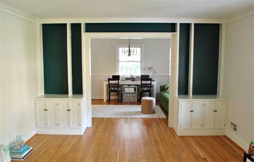
Of course by then it wasn’t as bright in our north facing room (hence the slight color variation from the last pic) but we LOVE it. It’s bold and high contrast and nothing that we would’ve have the guts to do in our last house.
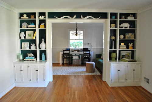
We’re enamored with the color because it’s super moody and it reads as greener or bluer or darker or lighter depending on the time of day and the angle that you glance at it.
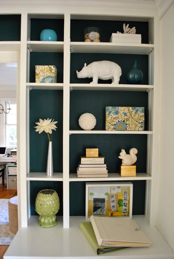
And of course all of my white ceramic animals (and other not-kid-friendly-so-I’m-glad-they-fit-up-there treasures) really pop against the saturated background color (which also makes the cabinets look crisper and whiter by comparison).
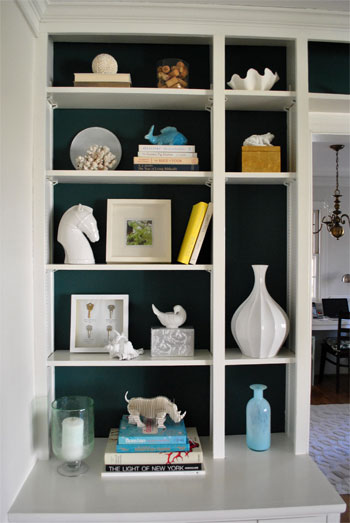
These two pics are probably the most true to life when it comes to the color (but of course how you see them really depends on your monitor):

Mr. Rhino (and his ceramic twin on the other side) likey. And we do too. Especially for under $11. In fact we love the color so much that we plan to work it into other parts of the house when we can (you know, to try to keep our whole house color scheme cohesive but not too “yawn”). We’re thinking it might be the perfect color for the base of the future island that we’d love to someday add to our kitchen – and would even work on a bathroom vanity. Should be fun…
Psst- Learn how we made those two fabric covered boxes on the right side of the shelf here.

Lydia says
You guys ROCK!!!! I check your site daily and constantly show my husband “look what Sherry and John are doing now” You guys inspire me to be bold and take changes with our home.
Alyssa @ Perpetual Blind Date says
I love the dark color behind the bookcases! Brilliant and Bold! I’m so afraid of color but I love what ya’ll have done!
LKS says
Thanks for the tip! Once we *finally* decide on a color for our bathroom, we’ll try it out!
Kara says
I love it! I’ve been contemplating painting the backs of our white built-ins for awhile now, but am still waffling on what color to use. I tend to change out some seasonal decor on our shelves several times a year, so I’m wondering if most colors would clash with seasonal items and I should stick with a neutral. But I adore the color and the way it makes your decor pop.
KathyG says
I think the top of that back wall of your office would look great the same color!
Sarah L. says
I absolutely LOVE the blue!! It makes suck a difference. You guys make me want to add more bold colors to my home!!
Raven says
That is the exact color I have been searching for to use in my master bath and the fact that the name is Dragonfly makes it doubly perfect as I have a dragonfly tattoo. Anyway, I looked at Benjamin Moore online and the swatch looks horribly green, would you mind terribly sharing the formula info on the top of the can for the color match mixture in the Olympic Low VOC? That’s the brand I have in my master bedroom already and what I was planning on using in the bath anyway, I would love to be able to get it.
YoungHouseLove says
Hey Raven,
It just looks green online but we promise it’ll look exactly the same as our walls if you get the name brand or get it color matched. There actually was glitch with our label (there’s a break in all of the printed lines so we can’t read any of the formula or brand details). So sorry we can’t help out but don’t worry about your monitor color!
xo,
s
Minnesotamom says
I loooooove it! That is the way I’m hoping my color turns out for our master bedroom (It’s Benjamin Moore Polished Slate). Yummy, I tell ya!
Caroline says
Okay, I’m still scrolling up and down to see the “before” and “after” comparison. So dramatic! I love this.
Rosie says
Doesn’t it freak you out to sit with your back to the open doorway????!!!
Other than that, I LURVE the contrast.
YoungHouseLove says
Hey Rosie,
Nope, doesn’t bother us. We’re planning to add french doors down the line, but even without them it’s a nice spot for the desk. We like to look out into the kitchen on our left and out the front window to our right.
xo,
s
Kaitlyn says
What a difference a little paint makes! Beautiful job! Makes me wish we had built-ins too!
Susan A says
Today on Elements of Style, Erin spotlighted designs from stylist/interior designer Estee Stanley… http://www.elementsofstyleblog.com/2011/01/design-crush-estee-stanley.html
Check out the photos — she used a similar color for shelving in the dining room shot — great taste guys!! Now I want built-ins! :D Thanks for the inspiration!
Marelis says
Wow that looks great! I’ll admit I was a bit nervous at first…lol. I absolutely LOVE LOVE this color though. I agree it definitely makes the white ceramic animals pop.
Averill (Odi et Amo) says
LOVE it guys. I’m a sucker for white objects set against dark backdrops though and this is seriously fabulous (as is that color!).
Alicia says
Love the color you chose. I think you should find a matching spray color and paint that brass chandelier to make it look like a pretty color’ed plastic. Make it look a little more modern.
Something like this: http://3.bp.blogspot.com/_WSgV9lu-d5g/TMe4zRL_CTI/AAAAAAAAG04/9mVJitwjb78/s1600/apple+green+chandelier+3.jpg
Sarah says
This color is great- I totally love it! It makes the items on the shelves pop, but isn’t on such a big area that it makes the room too dark. L-o-v-e.
Shannon says
I love the moody color! It goes great with the couch as well. Will you pull this color into your office too?
YoungHouseLove says
Hey Shannon,
Since the sofa is a similar color we won’t put it on the walls, but art and accessories might be in that general color. We’ll have to see where we end up..,
xo,
s
Erika says
The color looks wonderful and really makes everything on the shelves come to life. I have been toying with this idea for our family room built-ins too, but I’m still trying to figure out the overall color scheme for that room. I wonder if it will look right with my colorful (neutral) pottery, as opposed to your white scheme. Hmmmm…??
Amanda says
I love how anything with a head is pointing towards the middle to draw the eyes in and not out…I learned that as Editor of my college paper. Sounds like you guys were taught the same layout lesson :-)
Kelsey Geist says
I LOVE the color!!!! Jealous!! Now I want a built it bookcase!!!!
It looks beautiful!
Hey, question. I am getting ready to re-upholster my dining room chairs… do you guys have any tips for this? It’s my first time and I am scared!
Thanks!
Kelsey @ lollipopsandlife.wordpress.com
YoungHouseLove says
Hey Kelsey,
We have a tutorial about that on our Projects page (see that tab under the header?). check out the Furniture section. Hope it helps!
xo,
s
Sarah says
Love the color on the shelves, so classy and beautiful! I have a question about the Olympic No-VOC paint. We are wanting to purchase No-VOC paint for our nursery, but the guy at Lowes told me the Olympic paint starts out No-VOC, but once you add color to it, VOC’s are added!? He said the whole no-VOC thing is kinda BS. Have you ever heard this? I’m confused.
YoungHouseLove says
Not true anymore. Olympic reformulated so their colorants (even the ones for color matching) are 100% no-VOC! So worth it!
xo,
s
Paula/adhocmom says
I’m soooo impressed that you guys are getting so much painting done with a baby! Our living room is currently HALF painted. By the time we get the kid put the bed we are so tired. I’m emailing this to my husband right now for added inspiration. Ours is three. It’s tricky.
jbhat says
Tall, dark and handsome indeed! Love the color VERY much, and love the removal of the shelf. Genius, John.
jbhat
Rachel K. says
Looks fantastic! It really makes your collection of items pop. I really love the shell shpere things (if thats what to call them :))… where can I find them?
YoungHouseLove says
Hey Rachel,
We got one from Kohls and one from Michael’s. I call them “shell balls” but that’s not a technical term. Haha.
xo,
s
Sarah says
love love love this:) This is definitely close to my design style…bold and saturated color with lots of white/neutral accents! I have been dreaming of a laundry room this color next to bo;ld white cabinetry and fancy washer and dryer! Great JOB!
tiffany says
love, love, LOVE the color and all of your
white ceramic animals!
Julia G says
Great looking bookshelves! My husband just built some built-in bookshelves in our living room and I needed some inspiration for how to decorate! Although we will actually put real books in there, I want to jazz it up with some other decor. Thanks for the great ideas!
Also, I have to brag because our built in bookshelves look so awesome…and my husband surprised me by working on it during the week I was gone on a girl’s cruise. Here they are on the blog that we started to keep our family/friends from all over updated on our home improvement projects:
http://tadahouse.blogspot.com/2010/12/built-in-bookcase.html
MaxK says
The best thing about you two is how you can make even the most mundane task seem so utterly charming and even fun!
Congratulations on your bold new colour. It’s looks very sophisticated and terribly grown-up. Well done!
xox, mk
April in CT says
Showed my hubby the picture of your very cool updated bookcase and he asked “Is that a mustache..what is that?” Oh, he’s so very observant. *sarcasm*
YoungHouseLove says
Hahaha- must be a guy thing! John calls it the mustache too!
xo,
s
Sammy says
LOVE IT! You picked the perfect teal color… next time I’m gonna paint anything, it’ll be on my list :)
Handy Man, Crafty Woman says
wow, love that color! I love built-in book shelves like that. We had some shelves in our prior house, with a cabinet down below. great for storage!
Jen_nifer says
Fabulous colour choice! I think a hit of this colour would go well with your new duvet colour in the bedroom too.
Carrie H. says
Love it! Can’t wait to see what silvery grey you choose for the walls!
Candice Price Silver says
Love, love, love. Currently designing some white ‘floating’ shelving for an awkward little corner that we have in our kitchen, and you’ve totally inspired me to go for a bold colour behind. I was um-ing and ah-ing, but now it’s settled – thanks! I’m confident it will now go from a strange, empty little corner, to a real design feature.
Liis says
I’ve loved your blog ever since I discovered it about 2 years ago. Your previous house was so cosy and had this real home-feeling and oh so American style (if a Northern European like me thinks of american interior style, then pretty much exactly your house comes to mind). When you wrote that you’ll try to introduce more extreme color solutions to your new house, I was a little sceptic about it and thought of maybe a shade stronger beige or smth. But this is WOW, thumbs up. This new color really looks like you’re on the way for something more interesting and edgy than just cute and cosy (not that these two would be anything worse). Love it! And hoping to see some more interesting, surprising and maybe not so safe color solutions.
Greetings from freezing cold Estonia.
Melissa says
I’m seeing some interesting books on your shelf… which leads me to ask: if you could share your top three go-to decorating reference books, which would they be?
I’m guessing that depending on whether John or Sherry responds to this questions, we might get entirely different answers :) Or maybe you guys are so good now that you don’t even reference books anymore?!?
Thanks for sharing!
Melissa
YoungHouseLove says
Hey Melissa,
Here’s a post about that for ya: https://www.younghouselove.com/2009/03/lucky-seven/
Even though it was written a while back, they’re all still or favs.
xo,
s
Heather K. says
Thank guys! This is exactly the inspiration I needed to tackle a display for my entertainment center!
A says
That is really a great color.
Sarah@Style&Centsability says
I love the color you chose. So different.
Sometimes I think we should have painted ours (below) but it is the only white wall in our entire house:)
http://styleandcentsability.wordpress.com/2010/04/28/in-follow-up-the-built-in-process/
Chrissa says
I love it! And, Sherry’s ceramic animal collection.
I had been trying to come up with a way to display my own, because I have a budding collection of white and aqua ceramic “stuffs” but I love how these are arranged. It’s such a fine line to be artsy and not too chotsky. You walk it well :) xo
Amanda says
Besides adoring your blog in general, I’m totally encouraged by your ventures into color. I tend to gravitate towards color, so while I swooned over your old house, I just couldn’t figure out how to do the monochromatic thing. Your new look – with more pops of color – fits a lot more with my natural style, so posts like this one give me great ideas for how to apply my color-love. Thanks!
becky says
i am on the edge of my seat waiting for the transformation of this house! i love the more moody and bold color choices you are making this time around.
Julia says
I just looked at the dragonfly chip at my local paint store. I can’t believe the chip is the same color as what you painted in your bookcases. The chip looks like a dark green. It really doesn’t look blue at all to me. The color in your bookcases looks like a dark blue maybe with hints of teal in it (but not a dark forest or hunter green like the chip). Would you say the color looks totally different than the chip or is it just my monitor? I would be afraid to use that green in my home if I was going for more of a dark blue/dark teal.
YoungHouseLove says
It’s definitely a dark teal color in our house (as much blue if not more than green). But colors read differently in different houses (and never look like they’ll look on the wall in the paint shop). Hope it helps!
xo,
s
Sima says
I will definately have to check out this paint color. I have been trying to find something similar to the color you used but the swatches weren’t quite right. I am thinking of painting my powder room in a similar color. The bookcases look great, and I love your choice of accessories. It shows you are thoughtful about what you buy as it looks very well put together. I try to be the same way and not buy things that won’t work with my style of decor. The color really makes your accessories POP. Just love it…
Terry Moore says
Dramatically beautiful. Terry
Lydia says
I LOVE that color! It looks fabulous against the white.
Stephanie says
We JUST painted an entire long accent wall in “Dragonfly” this past week! We did it in Benjamin Moore Aura paint. Great minds think alike :-)
misscorinne says
Love the color! We’re about to paint our new bedroom something similar and seeing how great it looks here makes me not so nervous to go with a darker color.
Margaret says
Looks great, just wondering what those curly white objects are above the doorway?
YoungHouseLove says
They’re two long ceramic horns but John loves to call them “the mustache.” Haha.
xo,
s
Megan Elizabeth says
It looks gorgeous, I am in love with the colour!!!