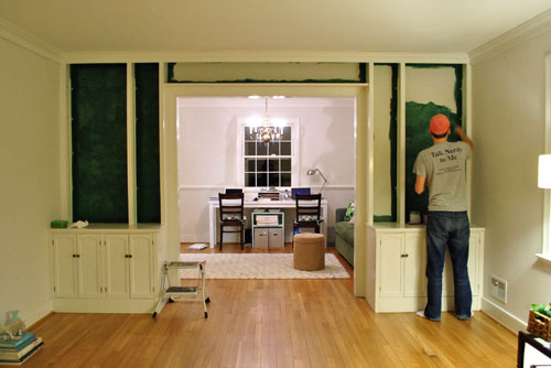
We’re back with the after pics of our freshly painted built-ins. As we mentioned in the last post, we went with an inky blue color with hints of green called Dragonfly from Benjamin Moore’s Affinity line (color matched to Lowe’s No-VOC Olympic paint for the bambino). We only needed a quart, and since we used objects that we already owned on the shelves this entire built-in makeover only ran us $10.97. You can read more about how we planned the shelf placement here. Oh and here’s a poorly lit progress pic from last night, just for fun. Yes John’s shirt does say “Talk Nerdy To Me” on the back. I love it.
But here’s what you really care about. The bookcases all painted! Picture us twiddling our thumbs while we waited for them to fully dry so we could put the shelves back on and load them up.
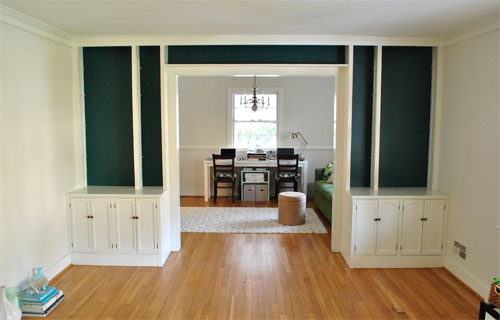
Of course by then it wasn’t as bright in our north facing room (hence the slight color variation from the last pic) but we LOVE it. It’s bold and high contrast and nothing that we would’ve have the guts to do in our last house.
We’re enamored with the color because it’s super moody and it reads as greener or bluer or darker or lighter depending on the time of day and the angle that you glance at it.
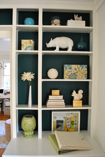
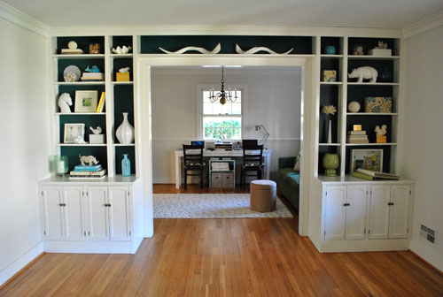
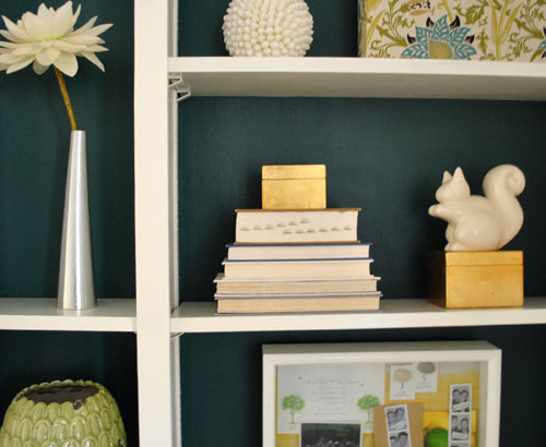
And of course all of my white ceramic animals (and other not-kid-friendly-so-I’m-glad-they-fit-up-there treasures) really pop against the saturated background color (which also makes the cabinets look crisper and whiter by comparison).
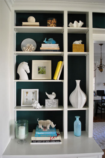
These two pics are probably the most true to life when it comes to the color (but of course how you see them really depends on your monitor):

Mr. Rhino (and his ceramic twin on the other side) likey. And we do too. Especially for under $11. In fact we love the color so much that we plan to work it into other parts of the house when we can (you know, to try to keep our whole house color scheme cohesive but not too “yawn”). We’re thinking it might be the perfect color for the base of the future island that we’d love to someday add to our kitchen – and would even work on a bathroom vanity. Should be fun…
Psst- Learn how we made those two fabric covered boxes on the right side of the shelf here.

Amanda says
I have a question about the vases covered in cork and then fabric. I actually did this project myself with a small square vase and it turned out great but now I’m stumped about what to put in it. I seem to remember you guys had a plant in one of yours… did you ever have a problem with the vase having no way for water to drain out? I’m considering putting a plant in the one I made but I’m worried it will just die due to lack of drainage.
YoungHouseLove says
We’d slip a pot with drainage holes right into it, so the vase acts like a saucer and the plant still drains (just be sure not to let water collect in the bottom of the vase). We use Ikea panters without drainage the same way (with a pot with holes slipped inside). Hope it helps!
xo,
s
Steph @ BirdHouse Family says
Never got the chance to say how much I love this. I am painting one wall of a room a similar color and I can’t wait to see how it will turn out!
Jessica Fielhauer says
I have a question about your experience with Olympic’s no-voc paint. I picked up a gallon but I’m finding it covers very poorly. I’m taking a room from primer white to a burnt orange and it seems i’ll have to do four coats to get a consistent color. How many coats does it genearlly take you guys to complete a paint job with this brand? I must say my experience thus far has been fairly disappointing. :/
YoungHouseLove says
All the paint that we’ve ever used (Glidden, Olympic, Valspar, Mythic, etc) seems to take two coats for even coverage. We haven’t noticed anything sub-par about the Olympic No-VOC stuff since it has called for the same two-coat formula in all instances so far (even when it came to the super dark bookcase color). But colors like red and orange are famous for calling for 4-5 coats, so that might explain it. Of course paints like Benjamin Moore will usually give you more coverage and might save you a coat of paint in some instances, but they’re a bit pricier so it’s really a question of how much you want to spend for the added convenience. Hope it helps!
xo,
s
Rian says
I love it! I think i might do something similar for my cabinets. I had a question – when you say that you matched from Benjamin Moore – what do you really have to do? Do you take a sample from Benjamin Moore over to Lowes? How does it work? As you have probably guessed I am new to the whole DIY thing – but at the same time am very interested in learning!
Thanks,
Rian
YoungHouseLove says
Hey Rian,
You can just walk up to the paint desk and ask if they have certain formulas in the computer (they had all three formulas of the ones we used in this post in the computer at our Lowe’s) so we didn’t even need to bring the swatch. But we did anyway, just in case they didn’t have them in the computer (since they could then scan the paint swatch and make as close of a match as possible in any brand that we requested). Hope it helps!
xo,
s
Julie says
Hi guys,
I have a very similar project in process with my built-ins, although lucky me – I’m starting with some awful dark wood. At any rate, my question is about the sheen of your accent color. I’m using semi gloss white for the bookshelf, cabinet doors etc, and am either going to do grey or olive green for the back wall of my cabinet. Yours looks very matte, did you use eggshell? semi-gloss? or what, for your bluey-green color?
Thanks!
YoungHouseLove says
Hey Julie,
We used satin. Seemed to work really well!
xo,
s
Erin says
What would you think of this color for bedside tables? I hate matchy-matchy bedroom sets, and I’m looking for something sophisticated to coordinate with an espresso wood bed, gray walls, white trim, and deep yellow and white bedding (we’re currently using old white bar stools from our last apartment!). The color looks stunning with the yellow and white on your shelves, but I’m concerned about it being a bit dark next to espresso wood and gray walls.
YoungHouseLove says
Sounds amazing! We say go for it! And share pics on our Facebook page when you’re done- haha.
xo,
s
Brooke says
Would you recommend this in a small bathroom? We have a window and there isn’t a closet door. I was envisioning painting the walls of the built-ins and having baskets with our toiletries. I don’t know how to do it though? The cabinets and sink are white, the walls are a pale blue/aqua and the shower curtain/towels are chocolate brown. My accent color is a cheery yellow. I have candles, a small floral arrangement and pics of my son in a rubber ducky robe on the walls. What color would you recommend? I’m afraid the yellow wouldn’t be high enough contrast and that the blue wouldn’t have a good effect either since the walls are the same color. I’ve consider just adding brown woven/wooden blinds as well. What would you do?
YoungHouseLove says
It definitely could work in there! As long as you have white trim and white accessories and fixtures it’ll be nice and fun! Maybe switch out the shower curtain and towels for white? Or just see how it looks with brown and go from there. Good luck!
xo,
s
WishboneWinner says
Excellent! Great color choice. The color looks like it may shift given the lighting, which is wonderful and mercurial. Also love your Adler rhino. Very nice.
WishboneWinner says
On closer look, maybe it’s not J. Adler. Still, a very beautiful collection of pieces.
YoungHouseLove says
That’s actually from ZGallerie (cheaper! hah). Love him!
xo,
s
HB says
Brilliant with perfect item placement!
Danielle D. says
I’ve newly found your website and have fallen head over heels! You and John really know what you’re doing. I can’t wait to see you two transform this new house into a masterpiece. As for your shelves, I LOVE the teal color behind the built-ins. It’s very dramatic yet elegant! And I love to see that those fabric cork boxes worked well into it.
The question I had for you was, what’s the shadow box of keys on the left side of the bookshelves?
Chau says
I love it! Our den is really dark with no natural sunlight at all. We are thinking of painting it a different color [the walls are khakis right now…], what color do you think will be the best to bright’n it up?
Thanks!
YoungHouseLove says
A soft warm green like celery or artichoke would be light and lovely. Or anything else that you love (just bring home swatches and see what you like when you hold it up). Good luck!
xo,
s
Ashley says
I am renting a condo that has two large built in book cases. All of our walls are white and the bookcases are a light oak-ish wood color. Do you have any ideas on how to transform these bookcases so that they are the focal point of the room instead of looking drab? I love the idea of the back of the bookcase a bold color but since I’m renting I can’t do anything permamenant here. Ideas?
YoungHouseLove says
Just get large pieces of poster board or even foam core and cut them to the side of the back of the bookcase and paint them! You can even wallpaper them or wrap them with cool wrapping paper. That way you can slide them in so they look like the back of the bookcase and add lots of interest and fun but they’re 100 removable!
xo,
s
Kara says
I just painted my built-ins slate teal and I’m totally in love with it. I posted about it today. Thanks for giving me the push to go for it.
http://juneandbear.blogspot.com/2011/05/painted-built-ins-small-change-big.html
YoungHouseLove says
Wow! What a gorgeous change. Love it so much!
xo,
s
sue says
Love the color for the builts ins. Have you painted the room yet? It looks very cool in color. I am trying to figure out a paint color for a north facing living room and am having the most terrible time. I am looking for a warm cream or warm tan or warm khaki (if there is such a thing) with a light reflective value aroun 55-65…any suggestions? What are your paint color plans for your north facing rooms?
thanks!
YoungHouseLove says
Nope, in this post we didn’t paint the room but we since have (a soft gray color by Ben Moore called Moonshine). If you’re looking for a warmer neutral, Water Chestnut by Glidden is an awesome one to try. Hope it helps!
xo,
s
Rochelle says
OK, been lurking here for a while, and I LOVE your posts. Thanks for sharing. Thought I would be so clever and re-find this post so I could find the answer to my question, but horror! You seem to have left off one, tiny detail! You know we are paralyzed without every detail from you! Is the wonderful inky blue that was color matched from Ben Moore to Olympic in flat? Semi? Satin? Thinking of doing the back of our built-ins a dark brown (to coordinate with the taupe walls), and ran into a pretty good color on the mistint rack at Lowes, but it’s semi-gloss. The rest of the built-ins were done with semi, as trim often is, but I’m worried it would be too glossy for this look (yours look beautiful and like they suck you in – not reflect light back). But $6 is a good deal for the paint. Thoughts?
YoungHouseLove says
It’s satin! Which is just one step from semi-gloss so I think it could work. If you already have the paint I would just go for it and see how you like it! You could just do one corner or something to test it, but my guess is once you have everything on the built-ins in front of the back (where the light doesn’t hit directly) it won’t be obviously glossy at all!
xo,
s
Cali says
Hello YHL!
I was wondering if you could tell me where you got the two plates/sculptures/white ceramic squiggly things above the door. I have a really long window and one bookcases on each side and I LOVE this idea! I need to have it!
I love your blog, I check it out everyday!
YoungHouseLove says
Those are from Pottery Barn a while back. They’re actually ceramic horns. Maybe try ebay?
xo,
s
lrlockwood says
OK! so I must admit I have been stalking the horns you have laying on the top shelf across the entryway to your office… Are they Kudu horn inners? Where did you find them?? I NEED them. Any info would be helpful.. Thanks in advance. OH, yes.. I LOVE the way you have decorated your shelves, so eclectic
YoungHouseLove says
They’re ceramic horns from Pottery Barn a while back! Maybe try ebay?
xo,
s
lrlockwood says
oops! nevermind! saw the last post from July! Thanks
Penny Smith says
Thank you for this idea! After seeing this-in our new (old) house, our palette is mushroom taupe, bright green and a teal-and I was looking for a way to add a pop to the familyroom, since I decided on pretty subdued paint (for me) since it is painted paneling… there are built ins… yours came to mind. So my teal will live here too!! :) Thanks! :)
YoungHouseLove says
Aw, so glad!
xo,
s
Leslie says
That color is amazing! Really stands out with the white. Beautiful!!!!
Michelle says
When I was reading this I thought the title was “Teal, Dark and Handsome”. Just realized that it is Tall, Dark and Handsome. LOL
I know this is an older post, but I am planning on painting the backs of our white built ins a color like Ben Moore Bella Blue. Do I need to prime the backs of the bookcases first? Or just get painting with the blue??
YoungHouseLove says
Hahaha- teal dark and handsome would have been awesome. How did we miss that? As for priming, it should work fine without it (might take an extra coat of paint, but a quart of paint should do the whole job easily either way). Hope it helps!
xo
s
Jane says
I am so late coming to this party, but I followed the link from one of your recent posts and I am so glad I did! That blue/green color is beautiful! I have to ask, what are those curvy white porcelain things over the door? They look like horns or snakes to me and they’re brilliant.
YoungHouseLove says
They’re faux horns (made of ceramic) on sale from Pottery Barn a while back.
xo
s
Madeline says
I LOVE the painted built ins. I rent and have about 30 shelves to style, and feel like everything is white and just blends in. Im really thinking about fabric, paper, or something else removable in the back to make things pop!
Here is my attempt: http://createbakecelebrate.blogspot.com/2012/10/create-better-looking-built-ins.html
YoungHouseLove says
Oh yes, something along the back would be so much fun! We did a removable idea in our book (wrapping paper adhered to foam core that slides in)- so that could be a no-commitment idea!
xo
s
Trish O'Riordan says
What sheen did you use?
YoungHouseLove says
I think it’s satin or eggshell. Hope it helps!
xo,
s
Julie says
I don’t know if you’ll see this, but I have a question about painting these bookcases. I think we have the same type of hardware in ours that hold up the shelves. Our bookcases are very dark wood that I want to paint white to make our tiny house seem larger. Did you paint the hardware? If yes, was it hard to get the paint to adhere well? Thanks so much for your help!
Julie
YoungHouseLove says
We actually didn’t paint that plane of the bookcase (the hardware is on the sides and we painted just the back plane) but if we were painting the whole thing we would have painted over the hardware and I think it would have stuck ok. Hope it helps!
xo
s
Katie Smith says
Hi guys! I am not sure the chances you check this but i’ll try! Would you be able to tell me where you got these shelves/cabinets? Looking to tackle something like this after reading a page in your book :)
YoungHouseLove says
Thanks Katie! These are actually built-ins that came with our house, but you can get a similar look using shelves from Ikea (like their Billy Bookcase series). Hope it helps!
xo
s
Katie Smith says
holy cow! i cant believe you actually replied. you all rock.. no wonder you have a zillion fans. thanks!! xo
YoungHouseLove says
Aw thanks Katie, you’re so sweet! Good luck with everything!
xo
s
Brittney Everett says
I love this. I’m looking for curtains in this colour! I even looked for material to make my own and can’t find what I’m looking for. I considered creating my own pattern on http://www.spoonflower.com, but for now that’s not in the budget.
YoungHouseLove says
Have you tried maryjos.com? They used to sell this fabric really cheaply!
xo
s
Lauren says
YOU ARE ON YAHOO! I immediatley came here to tell you….even though you might already know. I felt like it was a picture of my house and I got so excited to tell everyone! I’m such a weirdo haha
http://shine.yahoo.com/at-home/putting-fun-functional-7-ways-statement-home-decor-150800428.html
YoungHouseLove says
No way! Thanks for the tip Lauren!
xo
s
Holly says
I love this! I have a somewhat awkward space in our kitchen. the previous owners enclosed the carport and, as a result, there was a window that needed to be filled in. It i the size of a window with very shallow shelves. The kitchen is a light blue and I was thinking of painting the back of the shelves a navy blue. How do you think that would look??
YoungHouseLove says
So pretty!
xo
s
Terri says
I love that dark color on the walls! It’s so hard to get the right color the first time. I had to paint a wall 3 times one time to have it come out like I wanted it. Love it! Will need to try this; thank you!
Leigh Anne says
We have built-ins at our new house, but the bracket system for the shelving in a gold tone – blah! Did you all paint yours white, or did you have a different system for the adjustable shelving? Thanks!
YoungHouseLove says
Yup, we just painted it to blend in!
xo
s
Jennifer says
Quick question. I am painting a wall in my daughter’s room Tropical Teal from Benjamin Moore. I have done two coats and the tone is different in one section of the wall. How can I paint to get the color even on the whole wall? I have never used a bold color before to paint a wall and this one is giving me fits. It was a light pink previously, so I did not use primer. Also the paint is paint and primer in one. With other colors, the touch ups have blended nicely, but that is not the case for this one. Any suggestions as I know that you use bold colors on walls? I appreciate your feedback. Thanks!
YoungHouseLove says
So strange! Maybe wait for it to dry completely and apply one more coat? If that dries and still looks strange you might need to use a primer.
xo
s