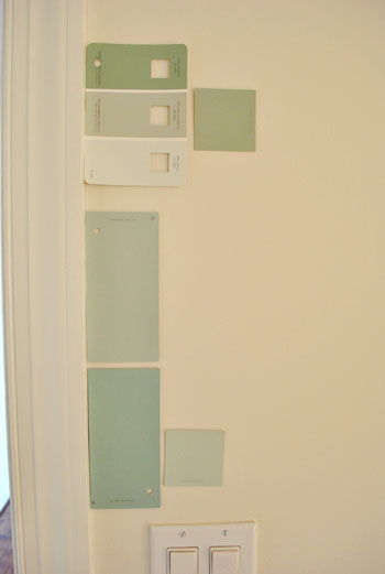
That’s the name of the new bedroom color. It doesn’t exactly roll off the tongue, but it does look pretty good rolled on the walls. We finally made a decision to go with the middle band on the Valspar swatch at the top of this photo (though we got it color matched to Olympic’s No-VOC paint in a satin finish). We liked that it was green and a bit more saturated than a color we’d choose for our last house.
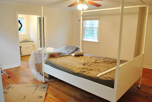
Here’s one last look at the room paint-less (and mostly furniture-less). Oh yeah and look at poor semi-disassembled Ed the Bed. We had to remove one slat on the top so that he could slide forward into the middle of the room without hitting the fan while we painted around him.
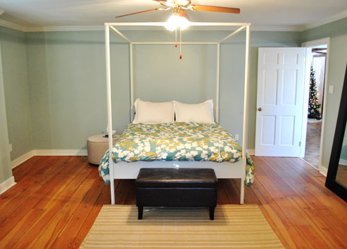
And thanks to the magic of the internet, here’s what the room looked like around five hours later after two coats of Sweet Caroline Club Carolina Inn Club Aqua (we never got the name right a single time that we tried to remember it) on the walls. Amazingly we only needed one gallon (we’re not used to rooms this big so we totally expected to run out and have to do that annoying go-back-to-get-more thing in the middle of the project).
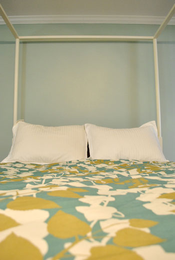
It’s definitely somewhat reminiscent of our last bedroom color (Glidden’s Gentle Tide) but it reads a good deal darker and greener in person, so it’s definitely a step towards our vision of a bolder color scheme when it comes to this house. We debated going a lot darker or brighter when it came to the walls, but ultimately decided that we didn’t want the wall color to be the star of this room. So keeping it somewhat subdued leaves room for colorful curtains, art, and even some painted secondhand furniture if we decide to go that route.
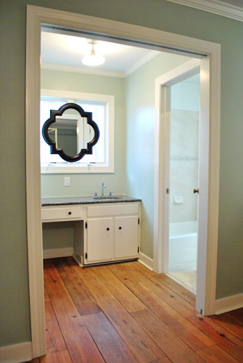
We actually hesitated before painting Carolina Country Club Inn Carolina Inn Club Aqua in the bathroom nook because we thought we might want to go darker, lighter, or bring some other accent idea in there (decorative wallpaper? a tone on tone stencil?).
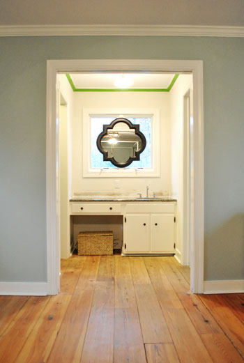
But since our goal has been to de-emphasize the bathroom-ness of this space and help to better connect it to the main room (so that it visually makes sense instead of sticking out like a sore thumb) we went for the cohesive look and used the same color on the walls in there. Good old Caroline County Aqua Carolina Inn Club Aqua. Oh but we used a semi-gloss finish for extra wipeability since it’s near a sink. Don’t mind the fact that it looks lighter in the pics (it doesn’t in real life- must just be the lighting).
And yes, we’re still talking about painting the mirror everything from gray to white. We go back and forth between leaving it and letting the room evolve a little more before doing a thing and whipping out the paint brush and getting ‘er done later today. Whatever we do, we’ll share pics when we do it.
The color on the wall is also reading a bit light in these pics. We’d definitely describe it as something in the “mid-range” (not light but definitely not dark). You can see from the swatch in that top pic that it’s definitely not super subtle, but it’s also not ultra saturated. We actually really love that we landed in that middle-ground area. Everything from the crown molding to the trim and even Ed the Bed really pops, but it’s not too much that it would compete with bold curtains, art, and other stuff that we can’t wait to mix in. Oh and Ed’s poppage is a bit more evident in the first pic of the painted walls above though. Scroll scroll scroll.
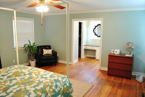
None of the furniture placement is permanent (heck some of the furniture itself may soon be replaced, like that old ikea dresser from our guest room above). But at least it’s starting to feel like a our bedroom. Sherry has this big idea to get two secondhand dressers that “go but don’t match” and refinish them (or paint them a bold color) and then place them on the walls on either side of the bathroom doorway for some nice balance – and some his & hers sock and pj storage. Then the chair will probably go live in the corner to the left of the bed as you face it.
Oh and speaking of going but not matching, we like how Cape Carolina Canaveral Carolina Inn Club Aqua picks up the color of the duvet nicely too, without being perfectly plucked directly from the fabric itself (which we think could have been waaaaaay too much).
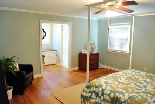
Actually, you can better see how saturated the walls are in this shot with the lights off (so it doesn’t read as yellow on camera). Oh and the walls/duvet look a bit more true to life here (see how they kind of work with each other without competing or looking too flat?).
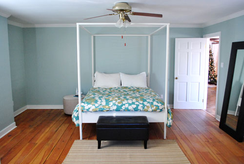
And yes, that’s still our Christmas tree in the background. It’s on the list.
Anyway, it feels GREAT to have this room painted because it was a big leap towards making “the new house” feel like “our new house.” And consider us as having officially caught the painting bug. We’re thinking one of the big living spaces might be next. If only we could settle on a color…
Psst- We’re spilling one of our favorite money and space saving baby secrets over on BabyCenter. Oh yeah and there’s a video of Clara screaming over there too. Good times.

Allison says
The color looks great and I love the organized comment changes. It makes it easier to find the comment that you guys respond to (since those are usually the ones I skim through to read!)
Blaine says
Great call on the Carolina Country Club… eh… whatever it was. Looks lovely, just enough color to make Ed really blossom! It also lets your lovely floors shine even more. As someone who’s stuck with linen white apartment walls, I’m quite jealous.
jessica brown says
If you travelled south a little to god’s country you could visit the real carolina inn. It’s a beauty!
Aleaha says
I love your blog I read it almost daily! If you are looking for some inspiration for those dressers your are thinking about reclaiming, check our Rebel.reclaimed. on Facebook. It’s a charming little shop in my town that gives me so much inspiration everything time I go in. You also might find some ceramic animals that catch your eye :)
Phoebe says
Yay! That was my favorite swatch out of all them. I wish I could paint my walls, but alas, I’m in a rental and I don’t know if it’d be worth it.
Rachel says
Do you need to keep a window open while you paint with VOC paint? I’d live a different color on the walls of our bedroom, but had resigned myself to waiting until spring.
Thanks, Rachel
YoungHouseLove says
Hey Rachel,
We crack the windows when we’re done to speed up drying, but during painting we just usually have a fan running (if that). It’s definitely not as fumey as the regular stuff! Sometimes we can’t even smell it when it’s wet (in progress) unless we leave the room for a while and go back in. And once it’s dry it’s odorless for the most part.
xo,
s
Katie says
I think it should be encouraging that you picked a color similar to the accent color on your blog (behind the title, for example); it’s refreshing to realize how naturally we’re drawn to certain aesthetics!
Jooly says
I love the room color! So beautiful and it really works well to highlight the bed. I cannot wait to see how the rest of the house progresses.
I am still not so keen on the mirror on the window, since it looks a bit awkward to me.
Sarah J. says
love the color of your walls!
my vote is paint the mirror frame white. i think it would give it a nice visual illusion of being part of the window (kind of a modern take on a cut glass window from the turn of the century) and help that space feel less bathroom-y. but that’s just me. :)
Kate says
Hey –
I love the paint you chose and the many pictures – it’s great to see everything coming along!
I also wanted to offer a suggestion for photography that is totally changing my world. For Christmas I got the White Balance Lens Cap – you can get it at photojojo.com. Basically – all you need to do then is set your camera to custom white balance, take a quick picture with the new lens cap on and then – MAGIC! Your pictures will come out with truer colors and you won’t have to do a lot of messing with it to get there. I’m in love with it and thought it might help as you’re struggling to show all your great new paint colors.
Thanks for bringing us along on the ride – I love seeing your new house come along!
YoungHouseLove says
Hey Kate,
Thanks so much for the tip! We’ll have to check it out!
xo,
s
Tarnya Cook says
I just found a post on Houzz featuring your mirrors, they look fab here too.
http://www.houzz.com/ideabooks/162551/list/Hot-Pattern–Quatrefoil-is-Back-and-It-s-Beautiful
YoungHouseLove says
Too funny! Love it. Thanks for sharing!
xo,
s
Joy says
Love the color, the duvet, and the mirror on the window. Gorgeous.
LindseyR says
All your “Caroline’s Country Club” mentions were so funny! Great choice! You must feel so accomplished crossing that off your to do list!! Must make the house feel so much more YOURS now as well. Thanks for sharing…great job as always!
Kay says
The Carolina Inn is a historic inn in Chapel Hill, NC that’s dripping with Southern charm and grace. It’s very beautiful and a popular wedding venue. Makes me miss my hometown…
Alison says
Wow looks great! I love the color, really enhances the comforter.
Jorja says
Sorry if you’ve already answered this…
In one of your earlier posts on types of paints, you said you guys generally pick flat paints for most of your rooms (aside from kitchen and bathrooms). Curious why you picked satin for your bedroom? We moved into our first house yesterday and excited to paint this weekend! :)
YoungHouseLove says
Hey Jorja,
Since using satin on Clara’s old nursery we learned that it reads just as un-shiny as flat and it’s more wipe-able so we figure it’s win-win. It’s definitely what we’ll be using throughout the new house, especially since our wee one is about to be running around soon!
xo,
s
Jeanette says
So I’ve tried to get our local Lowes to color match a Valspar color to the Olympic no VOC paint and they won’t do it. They say they can’t because they are contracted with both. Did you not run into this problem with your room or Clara’s room? It will be for our nursery so it’s really frustrating. Thanks!
YoungHouseLove says
Hey Jeanette,
We never ran into this problem (so crazy!!!) but we did learn from a commenter that if you do, the recommend just cutting out a square from the chip you want to match and taping it to a blank piece of paper. That way they just match the square of color and aren’t focused on the words on the paint swatch. I’m not sure why they’d be so strange about matching all of a sudden at certain locations but I hope it works out for you!
xo,
s
Liz says
LOVE it! Great colour choice!
Breeanna says
That window above the sink would be annoying! Good choice on the mirror.
http://www.abrilliantmelody.com
GreenInOC says
LOVE your reply, cracked me up!!
I was just curious what your view of pocket doors were – design wise.
I have one in my master too, but it’s on a side wall. I personally don’t care for it but I would like to replace it with a pocket door with a frosted glass insert.
Funnily enough, I thought that it would require knocking down a wall to get the pocket door out and replacing it until I read your post about how you fixed yours in Casa de Petersik Number Uno.
I’m sure you’re laughing at me but I really didn’t know!!
YoungHouseLove says
Hey GreenInOC,
We love pocket doors! Except when they break. But really, we think they’re such amazing space openers and you know we love open living so we love that they basically disappear when you want them to. We do think that installing them is a different ballgame than fixing them though (even removing and rehanging all that trim was a pain in the arse, and to install the track inside the wall, there is some significant drywall removal that needs to occur). A frosted one sounds amazing though! Send pics if you accomplish it!
xo,
s
Ashley says
When are you going to start updating your House Tour with “after” pictures? This might not be the final product, but it definitely seems like an after!
YoungHouseLove says
Hey Ashley,
In a bit. We thought about doing it but it’s odd to have a second stage of some rooms and only a first stage of others, so we’re thinking maybe in another few months we’ll have most of the rooms painted with some semblance of furniture and we’ll post updates across the board!
xo,
s
Alicia says
Love the color you have choose, the room is very nice, you are doing a great job!
mel says
Beautiful room, our ensuite is almost the same colour and I painted it 14 years ago :)
Can I ask if you will be keeping the white timber blinds? I am ready to replace my old curtains and would love white shutters but the expense is a little off putting. Have been toying with the idea of white timber blinds.
YoungHouseLove says
Hey Mel,
Yes, we love those! We’ll definitely add curtains for drama, but we’re loving the functional light blocking & clean look that they give us.
xo,
s
Jane says
Love it, very soothing. What were those previous owners thinking with all that white?? All that lovely crown moulding forced to hide in a sea of whiteness!
alison says
Great choices for your new home. I’m can’t believe how quickly you are accomplishing all these different tasks.
Lauren @ Meet My Ugly Baby says
With that title I thought you were trying to sell us a timeshare.
You’re welcome to spread your love-painting-bug virus all over my apartment.
Jessica says
It looks like you were up very early this morning! Some of your comments are from almost 2 A.M. and another at 6:22 A.M. Sounds like a typical night for me! (a 2-yr old and 4 mth old!) :)
YoungHouseLove says
Hey Jessica,
We actually retrodate our comments in an attempt to keep them near the questions they relate to so people can hopefully see the response instead of losing it. So I’m thankful to say we were fast asleep at 2 and 6 am. We would LOVE to have threaded comments so we no longer need to manually adjust the timestamps but with our comment volume we just can’t make it work without the comment box completely disappearing. It works on posts with 500 comments or so, but anything over 2K (giveaways) go bonkers because the pagination and the threading don’t seem to be able to work together so everything disappears. I’M BEGGING SOMEONE, IF YOU HAVE ANY IDEAS HOW TO FIX THIS I’D NAME OUR NEXT CHILD AFTER YOU!
xo,
s
Laurelia says
I’ve got the painting bug too. I can’t believe this was only one gallon of paint. My question is, how do you estimate how much paint you will need? Where do you buy your paint to get the best price?
YoungHouseLove says
We get our paint at Lowe’s because we like their no-VOC Olympic stuff (it’s also really affordable). As for how much, we just buy a gallon and hope for the best!
xo,
s
Andrea says
LOVE the new bedroom color! It works really well with the floors and bedding. I wish I was patient enough to put the swatches on the wall and live with them like you guys – it would save me loads of money!
A question for you: How do you find the no-VOC Olympic compares in terms of coverage to other brands? I got away from using Olympic a few years back because it seemed to take so much more paint to cover a surface (thus it always ended up more expensive than just ponying up a few extra $$ for Valspar or Behr). Wondering if it’s improved at all? TIA!!
YoungHouseLove says
Hey Andrea,
We find it compares to Behr and Glidden. Always takes two coats but looks great.
xo,
s
Jen says
Very pretty! Really makes the white trim pop! Are you planning on hanging something behind the bed? I feel a nice painting or something! No? I am not a decorator I could be wrong LOL
YoungHouseLove says
Hey Jen,
Oh yes! We have a ton of stuff we still have to add in there slowly! We’re far from done, but we’re taking it slow and saving up as we go.
xo,
s
Alissa says
Hey, I was wondering about your paint in the bathroom nook. I remember reading Katie Bower’s post about replacing her counter and having the white caulk line between the vanity and wall color – and commenters were suggesting painting the caulk.
So, did you guys paint your caulk? My mind is struggling with the idea of how to paint caulk – which is usually curved enough to extend onto both surfaces – and have it still look good. Don’t know if that makes any sense…
YoungHouseLove says
Yup, we painted the caulk so it’s less obvious and the sink looks more like a piece of furniture.
xo,
s
Meredith says
Oh wow, I LOVE the coloring after seeing the last “lights off” picture! Absolutely beautiful.
PS- I agree with previous commenters that setting your white balance will be a huge help in getting things to photograph more like you see them in real life. I KNOW it’s intimidating (I still don’t do it unless I notice a huge issue), but I promise it’s really simple once you get the hang of it…the lens cap thingie is fun, but totally not necessary!
Laura says
Question about jumping from flat to a satin finish. Why did you skip over the choice of an eggshell finish?
YoungHouseLove says
We randomly picked satin for Clara’s old room and liked it so we stuck with that. We hear they’re super similar though.
xo,
s
Allison H. says
that color looks great!! job well done!
crystal cole says
Why am I so intimidated by paint…it does amazing things!
Debbie says
Not to sound like a groupie or anything, but I love love love your blog! When I saw your new uber-fabulous duvet, I convinced my husband to buy me the same one for my b-day. We now are in the “wall painting stage” of our bedroom. I like the green that you chose for your walls, but I was hoping to bring out the blue of the bedspread. The two bottom paint chips you had on your wall were really pretty. Do you think that either of those would match the duvet? And, if so, could you give me their names? Thanks so much! Your blog is awesome and completely inspiring!
YoungHouseLove says
Yes! We think all of those would work with the duvet. They’re Rainwater and Tidewater by Martha Stewart at Home Depot. Go get ’em tiger!
xo,
s
Monica says
OOOOooohhhh…that color looks srumptious!! This room is already coming together so nicely…and I’m LOVING being able to follow step-by-step rather than the “tada…look what we finished!”
Emmely says
I love your blog and ALWAYS love your DYI makeovers…but…I think you should paint the mirror in your bathroom white to make the transition from mirror to window much smoother :) Would you consider doing this?!
YoungHouseLove says
Hey Emmely,
Yup, we mentioned that we’re mulling over that possibility both in this post and the mirror hanging post. It’s definitely on the table!
xo,
s
Jade says
I love this colour. It’s so clever how it complements your bedding. It’s funny how just painting the walls has transformed the room. I love it when a good plan comes together!
Jeanette says
Have you ever used Dutch Boy Refresh paint? It is no VOC and supposedly eliminates odors for up to a year. Just wondering on the coverage?
YoungHouseLove says
Hey Jeanette,
Haven’t tried that yet. Anyone have any info on that for Jeanette?
xo,
s
nerr says
i just love how it all turned out. such a pretty color! and the crossed out paint color names cracks me up every time!
Lauren says
I went to Home Depot the other day looking for Glidden’s Gentle Tide (for my kitchen). I couldn’t find it! :( Do you think it has been discontinued? oh no!
YoungHouseLove says
Sadly it has been! But they still should have the formula in the computer so just ask them to look it up. Benjamin Moore’s Quiet Moments is very similar too, so you can always color match that swatch. Good luck!
xo,
s
Navy Bean says
It looks fantastic!! You guys never cease to amaze me… how do you have so much energy?! You just moved in and already you’ve tackled a plethora of projects! Well done!
karen says
Oh yah!! That colour is perfect! I could fall asleep in that room!
Avone says
I’d leave the mirror black if you’re keeping the counter. It balances the darkness of it. I’d add a super cool thrift store chair under the vanity, painted in a glossy black and covered in a fabric that coordinates with (but not matchy-matchy)the duvet. maybe the same you settle on for curtains? but, this isn’t my blog ;-) Love your ideas and your mid-century-but-affordbale style!
Claire @ Claire K Creations says
I love it! It matches without being matchy matchy and looks so fresh with the white trim.
Jenn from The Mustard Seed Blog says
I absolutely love how it turned out! What a great statement it makes with the contrasting white bed and trim without screaming out as too blue or green.
Karen P says
http://www.colorcharts.org — You’re probably already aware of this site but I ran across it while reading another blog
http://granvillehouse.blogspot.com/2009/06/great-paint-resources.html
— The following is taken directly from the site as an explanation for how to use it.
It is a database of every paint imaginable and this is how I use it:
I love Restoration Hardware’s paint colors, but I don’t have one within 5 hours. Let’s say I really want to paint a room in silver sage. So, I go to Colorcharts, type in silver sage at the top in the search box, and lots of companies come up. I click on Restoration Hardware, then silver sage, and a box comes up that says “match this color.”
Then, you can see that Benjamin Moore’s Gray Wisp is a 95.2% match. I do have a Benjamin Moore store though. Yay!
This would come in really handy when a paint has been discontinued (like Gentle Tide – Benjamin Moore’s Swept Away is a 90.1% match and Martha Stewart’s Mineral Green is a 90.5% match) and you get requests for suggestions.
I’m just bummed that I can’t find a match for Valspar’s Bonsai!
YoungHouseLove says
Hey Karen,
Love it! Thanks for the tip. We’ll definitely have to check it out!
xo,
s
Jen says
Wow, that is beautiful! Great choice, and it looks terrific in the bathroom, too.
So far as the Christmas tree, all of the Catholics I know insist the Christmas season doesn’t officially end until the 15th, so…enjoy the sparkle for a few more days. ;)
Claire says
This is random, but your Valspar swatch card looks really similar to mine (http://www.flickr.com/photos/rockinfree/4839917796/in/set-72157624365281796/) that we used when painting last summer :)