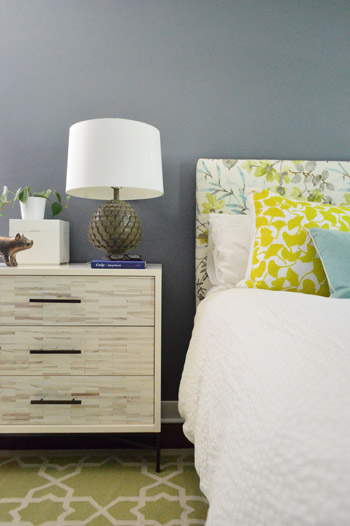
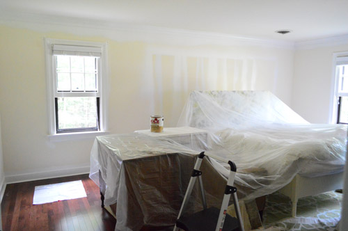
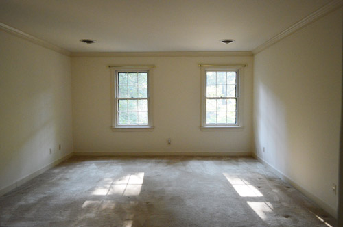
Since it’s a large room full of light furnishings and crisp white trim and doors, we thought it could handle something deeper than the soft blues, grays, tans, and browns in our palette above – especially since we love enveloping colors in the bedroom. Oh but of course we’re just getting started in here so ignore things like:
- the missing window treatments
- the art-less walls
- the bare ceiling (paint or even painted textured wallpaper like this might be fun eventually)
- the lack of a ceiling fixture (can’t wait to add one)
- the furniture placement (it’s just plopped down where it’s been since we moved, except for our new dresser – although that’s not in it’s final resting place either)
- those benches at the foot of the bed (we’d love to get a single bench, hopefully from a secondhand shop that we can reupholster)
- the two off centered windows on the wall to the right of the bed (more on the plan for those in a minute)
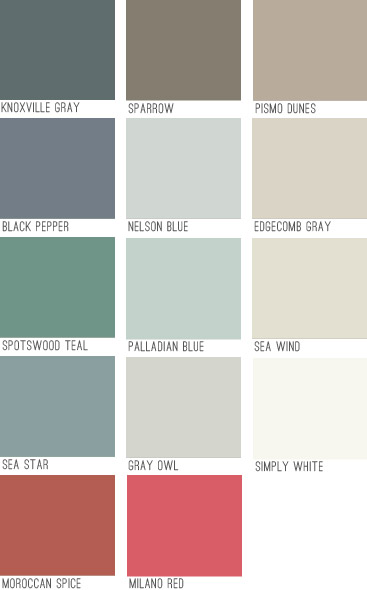
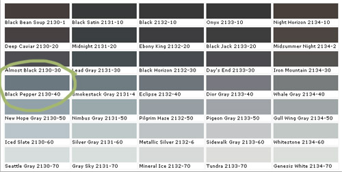
Black Pepper is definitely not as dark as a black tone would be, and actually has a lot of navy undertones but almost looks flatter and more faded. It feels really really sophisticated in person. Might be our favorite dark color to date. Here it is with a bunch of other swatches since that seems to help show undertones and values better online (somehow comparing it to nearby colors gives it context instead of just seeing that color in a vacuum).
To prep the room, we just pushed everything into the center of the room and covered it with a protective drop cloth. We have been painting with hardwood floors for ages, but if you’re worried about dripping on those you can cover those as well. We’ve found that when we wipe up a rogue drip right away it comes right up, and even if we miss it and it dries we can “pop” it up with our nail, so that helps.
After prepping, we did one coat of tinted primer first, just to help us with coverage, cover those lines that were on the walls from spraying the doors before we installed our floors, and to make sure the color would look as true and rich as possible. We went for a no-VOC primer called Kilz Premium from Home Depot (they tinted it for us knowing we’d be painting with a dark blue-gray color). The primer definitely wasn’t as sophisticated looking in person as this photo (it looks less chalky and little-boy-room-ish here) but in person we couldn’t wait to get some paint over that primer.
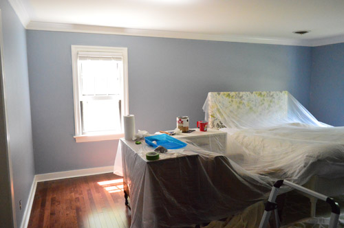
Here’s the difference in the tinted primer and the real color going on:
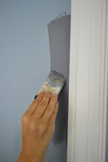
We only needed one coat of the Black Pepper (we used no-VOC Natura paint by Benjamin Moore) for full coverage, which is pretty rare for us since we usually need at least two but I’m sure the primer made the difference. Although the three twelve-paned glass windows in here took five coats applied by hand (two of primer and three of paint) along with a razor-scraping session at the end to clean them up, so this bedroom is a prime case of you win some, you lose some.
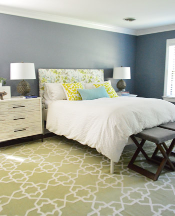
We went with an eggshell sheen which is nice for a deep color. It’s pretty matte looking which I think adds to the chic-ness of it. I like that it’s bold and that it’s a color, but not anything too crazy. It falls back and lets the headboard and the rugs and the pillows do their thing without feeling too meek or invisible. It sort of straddles the line between “dark neutral” and “still makes a statement” if that makes sense.
We came to that solution when we were thinking about how it’s a bummer that those two windows on the back wall aren’t centered – but we realized that if we added some built-ins along the wall with the bed on it, they suddenly would be centered and the whole room would have a lot more function and balance.
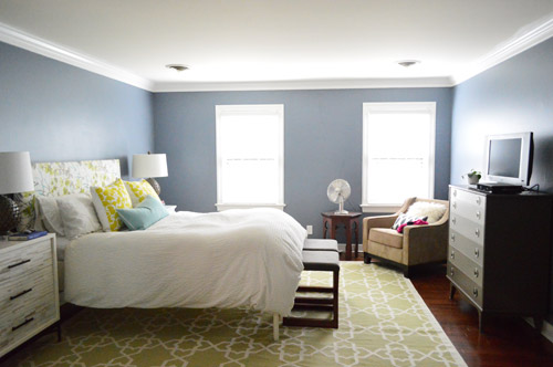
So that’s on the agenda down the line in here. In the meantime we’re just enjoying the moodier wall color and how it makes all of the crown and trim pop. It’s amazing how much of a difference some fresh flooring and paint can make. Even though we still have a big ol’ to-do list in here…
Anyone else making friends with a new paint color?

Starr @ The Kiefer Cottage says
Gorgeous color choice. I love darker tones!
Theresa says
Pepper usually makes me sneeze but this time it made me smile. Very relaxing color and a great neutral. Night night.
Wendy @ New Moms Talk says
Lovely color. It’s similar to what the hub and I were discussing for our bedroom, but he prefers lighter.
Yesterday we learned to double check the paint that goes into your cart on busy days. My in-laws (who both have Parkinson’s) picked up the pre-mixed paint at a big box store, but the employee put the wrong paint in their cart.
They didn’t discover it until after they got home, which meant the hub and I headed back to exchange yellow for Swiss Coffee.
I’m sure we all know to check and double check, but sometimes we have faith (rightfully so?) in store employees. Yet, yesterday taught us all to be a little more careful with paint!
YoungHouseLove says
Oh no, that stinks. Such a great tip just to double check – especially since the store can get so busy and things can get mixed up!
xi
s
Brittany says
That happened to me this past Friday! Thankfully I checked before I walked away or the lady helping me did, and she realized she’d made it for one shade lighter than I requested. Well her mistake ended up working in my favor. A normal can was around $30, she asked me if I wanted the paint cans she’d messed up on because she’d be marking them down to $5 a pop. So I ended up with two more gallons one shade lighter for a total of $10 (and possibly will get them for free with Lowe’s $5 rebate on paint & primer). So another room/hallway will be painted for pretty cheap!
YoungHouseLove says
That’s lucky!
xo
s
Rebecca | the lil house that could says
Looks great guys!
Samantha Cobos says
Love it!!! Super similar to our beach house masters – http://www.flickr.com/photos/53708038@N05/8513530436/in/set-72157632856651152/lightbox/
YoungHouseLove says
Such a charming place!
xo
s
Sarah says
I love this color! I just panited my newly rennovated master bedroom a similar color, Sherwin Williams’ Serious Gray. I was a bit unsure of the bluish undertone as our room isn’t completely furnished yet but yours looks so nice I’m excited to finish ours up!
Tandra@Little Houses Big Dogs says
That color looks amazing! I just love your dresser and hints of green and yellow just pop! I’m so afraid to pick darker colors because our little house is dark enough. Yes we’re thinking a light blue or linen for our bedroom. Thanks for being trendsetters Petersiks!
Robin @ our semi organic life says
Love the color! We just moved to a new RVA house this weekend and am so excited! I would love to paint (something rental friendly) and we have bookmarked your BM 2013 color picks!
YoungHouseLove says
Congrats on the move Robin!
xo
s
Jordan says
NICE! I love the moody gray with the blue undertones…it looks fabulous!!! I did my first painting-as-a-homeowner project yesterday and took my bathroom from a gray that had green undertones to it to a bright and happy pastel yellow. It took three coats of paint + primer, but I looooove the new feel. Bright and cheery is better than moody for first thing in the morning, right? ;)
YoungHouseLove says
Sounds awesome Jordan!
xo
s
Julianne says
I’m loving the new colour! You guys are really good at choosing colours that work well together. Envious! I can totally appreciate how the wall colour pulls out and compliments the tones of your headboard & accessories without being matchy-matchy. Nice one! :0)
YoungHouseLove says
Thanks so much Julianne!
xo
s
Amanda E says
Lovely color! In person, are you happy with how it plays with the rug? In the photos they seem to fight with each other a bit.
(Also, typo alert, you meant “you win some, you lose some”)
Love you guys! Hope it doesn’t feel like I’m nitpicking!
YoungHouseLove says
Thanks for the typo tip Amanda! All fixed! As for the rug, we love how the it goes with the walls in person (the headboard has both tones and really ties them together). I especially think when we have those white built-ins going on it’ll balance everything out too.
xo
s
Laura @ Rather Square says
I really like the moodier dark tone for the bedroom. It kind of makes it feel like dusk/nighttime in there… good for getting you into sleep mode!
Danielle says
Love it!I’m a big fan of deep, dark(er) colors – especially in a room that gets a lot of light. And like always, I can’t wait to see what you do with the rest of the space!
emily @ go haus go says
Great paint choice! Looks great with the deeper tones of the tile on your new dresser too!
Lindz says
I love it! I’m DYING to repaint our master in something a bit more chic and moody. The paint color now is a cross between a plastic turquoise easter egg and country blue… shudder. 5 years ago it was my favorite ever and now it’s so not. Husband is tired of me repainting (I’ve done the living room twice, guest bedroom turned nursery once, kitchen twice, laundry room once, every room in our finished basement twice) so I’m either going to have to do it on the sly while he is out of town or learn to love Country Easter Egg again… and I just realized he’s going to be out of town this weekend. Hmmmmmm…
Brittany says
Wow! What a huge difference. I love the idea of built-ins — those will be great. Crisp white built-ins against that wall color? Wowzer!
Steph says
90% of this post I’m thinking “what an awesome color. I love the way the headboard looks with it.” Seriously, it looks great & built ins are such an awesome idea.
The other 10%… “I’m kind of obsessed with Dior Gray.” I’ve been trying to find a way to paint my room purple without it looking like a childs room. And that color looks a little purplish on my computer.
YoungHouseLove says
Ooh yes, google “Dior Gray” and lots of gorgeous rooms will come up! It seems to be a favorite color of many, so I think it’s a great pick!
xo
s
Steph says
Oh god, I’m never getting any work done today. Thanks, Sherry! :)
YoungHouseLove says
Haha!
xo
s
Cheryl says
I have Dior Gray. It is rich and nice with a magenta undertone. It stays gray in my space and compliments all of my purples and burgundies nicely.
betty (the sweaty betty) says
oohhh! love this rich color. I have a similar color on the majority of my walls in my house. its so rich and elegant, but lets everything else shine as well!
Amanda says
You guys are on the Benjamin Moore Homepage, very cool!
YoungHouseLove says
No way! Thanks for the heads up!
xo
s
Tyra says
Looks great! The windows look 3337539872 times bigger.
Gwen says
Beautiful!
Our master is actually a really similar color – Dark Storm Cloud by Behr, and we absolutely love it. In fact we have similar wood floors and crisp white trim, as well. We’ve had the room this color for several years now, and not a day goes by that I don’t walk in that room and think, “aahhhh.” It’s soothing and cozy and like you said, walks that fine line between classic and contemporary.
Great choice!
YoungHouseLove says
Thanks Gwen! Your bedroom sounds lovely!
xo
s
Karen L. says
It’s always so funny to see the way they name paint colors! Love this color and the direction you’re thinking of taking your “boudoir”, including balancing the two windows with built-ins, something I’d never have thought of. Guess that’s why your blog is so refreshing and instructional to folks like me!
Theresa M. says
That is a great color that I never, in a bazillion years, would’ve picked. There is so much I love about it but I’m just not brave.(Though I am brave enough for color throughout my house but it’s always the lightest shade on the paint card.) All the furnishing come to front but the room color doesn’t fall back. Very nice choice. Hope you had a calm 3 day weekend.
Maggie S says
Great color!! I loved the chart showing it in context. That would really help in choosing paint colors –did you find that on the Ben Moore website?
YoungHouseLove says
I actually found that by googling the color name and clicking “images” – I was looking for rooms that were painted that color, but the chart popped up and it was so helpful!
xo
s
becky dodson says
so is black pepper a legit BM color? if i’d like to get some mixed, that is…
YoungHouseLove says
Yup, it’s their color.
xo
s
Dizee says
Nice!!!!! I love your color schemes!
Mary | Lemon Grove Blog says
Beautiful! I’m a total scaredy cat when it comes to color (I usually lean neutral) – so I LOVE to see others totally rock it. You’re giving me some courage here – it looks gorgeous!
Lori @Vintage Charm Restored says
Oh I love that color!! Beautiful!! And love Benjamin Moore!!
Megan says
We just painted our master sparrow last week and love it! It’s dark and moody without being cold at all. I’m happy to see it was one of your finalists. I love dark bedroom colors, great pick!
Lisa says
Looks amazing! Love the direction you are going. Where did you get that bed side dresser? It looks so sharp.
YoungHouseLove says
Thanks Lisa! We just blogged about that on Friday.
xo
s
Jordan says
TINTED PRIMER?!? Wow, I wish I had known about that before I used two coats of Kilz and FOUR coats of paint to cover my ugly brown front door! (it’s also a 12 pane glass door… I almost cried)
But, thanks to patience and your sharing of the Pantone paint line, my new front door is now Pantone Haute Red and I’m about 99% positive it would pass Sherry’s “strokability” test! I know I’m in love :)
YoungHouseLove says
Haha! Strokability test approved. Sounds like such a pain but a gorgeous outcome. Congrats Jordan!
xo
s
JMK says
In the paint area at our local hardware store there is a display showing 4 primer/paint combinations. Tinted and untinted primer with one and two coats of paint. The only one that actually matches the red paint chip is the tinted primer with 2 coats of paint. It’s a visual that’s worth a thousand words. They sell separate primers tinted for medium and dark colors (the store folks will tell you when you need each, and fyi – the tinted primer for red paint is bubble gum pink!)
Liz says
I think built-ins would look great in your bedroom! I love the wall colour too. It looks similar to Behr’s Flint Smoke, which I have in my bathroom (however, I think Flint Smoke is a bit lighter/blue-er).
KarenH. says
I love a darker color in the bedroom and I love THAT color particularly. I wonder–did you happen to find any evidence that there had originally been built ins in that room? It just seems so random to offset the windows to start with that I wonder if there had been something there originally.
YoungHouseLove says
We didn’t find any evidence of them – even with the carpeting ripped out. I think the windows were placed so they’d look centered on the front of the house, but inside it meant they were shifted to the right in the room. The windows in Clara’s room do the same thing (shifted to the left though) just so they’re centered on the house’s facade from the street.
xo
s
Holly P. says
Wow and WOW! So gorgeous, love thar color!!
Sarah says
We just bought a 3000sq ft home and the whole thing needed to be painted. Taking our inspiration straight from you guys, we painted the master bedroom Rockport Gray… and we liked it SO MUCH that we painted all the interior doors in the house that color, too. <3
Lindsay says
I love this color! Does it have a blueish undertone or is that just my monitor?
YoungHouseLove says
Oh yes, it definitely has sort of a faded denim undertone. Not like super dyed denim, but flat and sort of grayed out.
xo
s
Jennifer says
Yes! My little sister bought her first place (woohoo for a 21 year old owning a home!) and we’ve been helping her renovate it from top to bottom. Day 1 was the bedroom color, day 2 was the bathroom, day 3 was the living room and dining room, and after a short break, we came back for two days to lay down wood flooring and paint the kitchen.
Thank GOD for Valspar’s color love guarantee… she picked a color that was reminiscent of leftovers from Barney’s dinner… and is now a gorgeous grey. (Graceful Gray from Behr, matched into Valspar) It is gorgeous, and frames her white cabinets so nicely. Thanks so much for all of your inspiration- her home is quickly on the way to being gorgeous and homey. :)
YoungHouseLove says
Sounds awesome Jennifer!
xo
s
Stephanie says
My husband and i just bought our first house. First thing we did was remove old wallpaper and paint in our living room. Now we’re experimenting with some other colors in the rest of the house. Painting is definitely giving our rooms new life. Love your color choices.
Mary Beth says
Me me me! I am best friends with a new colour!
lol… just did our kitchen in Gray Horse, and I love it so much it’s making its way into the living and dining room too!!
http://hystericallyeverafter.com/2013/08/31/i-feel-pretty-so-pretty-thats-my-kitchen-singing/
Paint is just the best invention EVAH!!!!
: )
YoungHouseLove says
Looks awesome, Mary Beth! Tanks for sharing the link!
xo
s
Megan @ Rappsody in Rooms says
Wow! That’s a great color! I have never really seen a room painted that color before. It’s fun how it goes with all of your old furniture! Can’t wait to see the progress in the bedroom!
Kiri says
Amazing how some fresh paint and furniture can make a room look bigger! Your room in the after picture looks 2x bigger than the before pic.
Christina P (NS) says
Looks great, we close on our new house next month so we are in the colour picking process.
Our new MB has the same layout as yours with the windowed wall, opposite has doors to closet and en suite and then two long useable walls, our dilemma is that we have a ‘traditional’ bedroom set with his and hers dressers (big tall boy and long ladies) and only one wall to put them on as the bed/nightstands will go against the other.
I think it will look awful with them both on the same wall – do you have any ideas/solutions for this?
Thanks!
YoungHouseLove says
Hmm, can you put part of the set in another room to break them up so they’re not all in there? Maybe post a picture on our Forums to see if folks have ideas? They’re smarties over there!
xo
s
Kate says
We just bought a house with 2 (small) bedrooms and a guest house. The bed, nightstands and tall dresser are in our bedroom and the long dresser and a couch are in the other bedroom. We were debating sharing the dresser and closet and switching out seasonally but the bathroom is between them so it works perfectly and I feel like we have a big master suite.
Crystal @ 29 Rue House says
I love the color! And speaking of benches, I was at the New Haven, CT Peabody Museum yesterday with the family (it’s a small scale version of NYC’s Natural History Museum) and I thought to myself how cool it’d be to have one of their old wood benches at the house.
Hilary says
I love the color y’all picked out! It looks great :)
Lauren says
Love the color! When you talk about built-in’s, is that something you guys will tackle on your own? We just got a quote on built-in’s for our living room and it was very expensive :) Would love to tackle on our own, but not sure.
YoungHouseLove says
Yes, we’d love to add them on our own!
xo
s
Kristen says
This is an awesome color (I prefer dark colors in the bedroom because it feels cozier) and I love the idea of built-ins. I’m excited to watch this space transform!
Elise says
YES! I was hoping you’d pick Black Pepper for the bedroom! It looks gorgeous. And I love the timing of this post because I spent the weekend trying to decide whether I should be brave and paint our office in Benjamin Moore’s Normandy. :)
YoungHouseLove says
Do it! Do it! Do it!
xo
s
Jodie says
Love love love it! I have an accent wall in my office painted this exact Black Pepper color, but it looks so much darker in my small room! Funny how colors transform from space to space : ) Can’t wait to see the rest of the rooms!
Diana says
The color does look fantastic, I’m such a fan! I love the drama. Ever since that peacock blue, you’ve really made some tremendous choices. I tried darker colors in my house, but it’s such a shady lot it didn’t work out very well unless I had every light on all day long. $$$ = no bueno.
Also, after you guys started tackling your trim (especially in the foyer), I had a “girl, get on that already” moment. After 3 years, I finally finished unifying the paint job on the trim and doors in my house. Which required hours of sanding, caulking, new door knobs and hinges, fixing mis-aligned doors and mortise locks, the works. And whoever painted before me used some cheap paint that would peel off in strips! If I ever find the guy…jk, I’m much calmer now, and I’m so freaking happy about how it looks all crisp and white (New England 1940s, lots o’ bold trim). Now I’m finishing up painting the walls (plaster, so patching, sanding, patching and sanding again…ugh) in a soft gray, sort of like the Moonshine you had in House #2. It’s LR to stairs to hallway, so needed to be neutral and light. Though how I’m going to reach to the ceiling in the stairwell is still a mystery, haha.
Thanks for being my comrades-in-paintbrushes. You’ve inspired me for years, helped keep my chin-up during my DIY stumbling, and given me courage to figure out what I like. Thank you!
YoungHouseLove says
Aw thanks Diana, you’re so sweet! And we have one of those tall stairwells now and we’re the same way – how the heck are we going to get up there?! Will keep you posted!
xo,
s
tess says
When painting a 3-story stairwell, to get to those high up corners, I improvised with duct taping a brush to a very long poles, (I first washed the walls and ceilings the same way, rag on a long pole). I didn’t have a ladder with variable height legs, if I had, would’ve been too terrified anyway. It took a long time, lots of days when son was in preschool, a coat of primer and 2 coats of paint. It came out beautifully though, used Benjamin Moore Palladium Blue (HC 114) if memory serves– a soft blue green gray.
YoungHouseLove says
We used that tape + pole method when we painted our last house’s lofted sunroom! Gotta love MacGuyvering things in a pinch.
xo
s
Caroline says
Beautiful!! Very elegant, and I love the way it plays with the colors in your headboard.
We repainted our master bedroom this weekend, too. We used a color called Amazing Gray (Sherwin Williams), and we think it is pretty amazing! My tricky husband installed crown molding and it’s like a whole new room. So happy!!
ErinY says
So not that it matters for you guys, but I’m just curious- when you create built ins and it eats into the floor space does that technically mean your house loses square footage? I rent, so I have no clue about those things!
YoungHouseLove says
Typically it’s measured from wall to wall I think (like in a kitchen they seem to measure from backsplash to backsplash instead of from the outside edge of the cabinets since that’s still usable square footage for storage and prep-space, etc) – so I don’t believe it’ll affect that. We’re planning to finish the storage area over the garage so that will add some square footage down the line, which also helps with peace of mind I think!
xo
s