When Ashley excitedly sent along her living room photos after our big mood board makeover we couldn’t wait to share them. Here’s her letter:
Well here they are… our AFTER pictures! We love the mood board that you put together for us. It completely helped us in getting the look we wanted. We’re so happy that we replaced most of our hand-me-down furniture with more modern (yet inexpensive) pieces. We (and when I say “we” I really mean my hard-working husband!) repainted, installed new baseboards, had new floors put in, and used your help to bring our 1968 ranch up-to-date! We are excited to share the pictures with you and your readers! Hope you enjoy. – Ashley
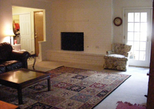
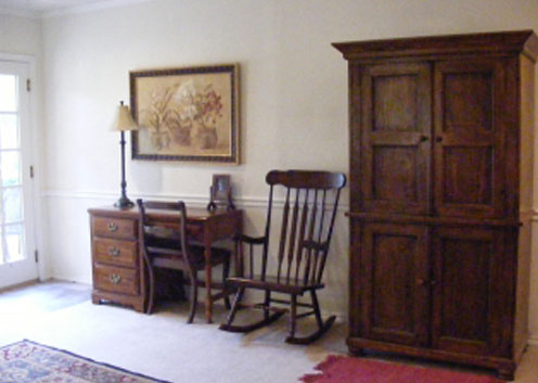
But perhaps we should refresh your memory with the before pictures first:
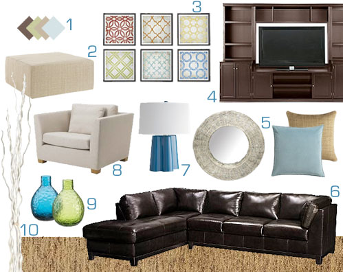
And here’s the mood board we whipped up after Ashley came to us for some help bringing her room up to date with some crisp and current furnishings and accessories (check out more mood board details here):
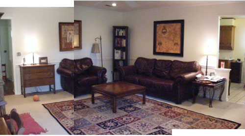
Now for the big reveal. Here’s what Ashley’s living room looks like after her big mood board makeover:
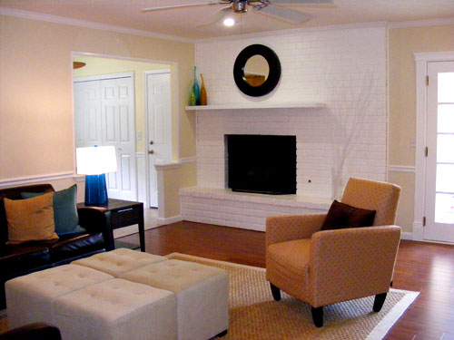
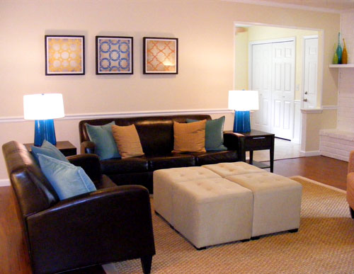
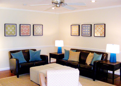
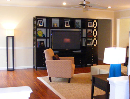
Isn’t that amazing? It looks like a totally different house, right? Of course the new hardwood floor paired with those freshly painted cream walls make all the difference in the world. But bringing in rich leather and dark wood furnishings along some lighter upholstered pieces, a large textured rug, and some pops of color in the lamps, art, and glass vases on the mantel really added a ton of definition and vibrance.
And it’s funny to note that the fireplace was already painted white in the before photos but it formerly felt anything but crisp. Yet somehow with the new updates in place it fits right in and feels oh so fresh. And even though the room has a large dark entertainment center and two deep toned leather sofas it still feels open and airy thanks to the lighter walls, ottoman, rug, and accent chair. We’re loving the balance of light and dark paired with some nice splashes of color. Oh and getting back to that awesome ottoman, we can totally picture it full of trays of treats while entertaining- or even just occupied by a big Monopoly board for the family to gather around. The whole space really is super inviting.
So now we’ll take a moment to toss out a huge THANK YOU to Ashley for sending us her gorgeous mood board after pics. We totally do the happy dance any time they pop up in our inbox. Didn’t she and her husband do an amazing job bringing the mood board to life? What’s your favorite part? We’re loving the colorful table lamps and art that add interest and a splash of happy to their newly transformed space. So let’s all shower them with praise for being so wonderful and sending us their pretty after pics. And here’s hoping that more Design Dilemma after photos will be landing in our inbox very soon…
Update: We sadly can no longer find the time to take on client commissioned mood boards (and just whip up general inspiration boards instead) but if we ever reinstate them we’ll make a big announcement on the blog!

nita says
very nice!!
Stephanie says
YAY! Ashley!!!
I love seeing this because I have dark leather couches and I am constantly feeling the need to lighten this room up-this showa me it really is possible!!
Great job! I love it!
nic says
Gorgeous!
I note that while many of the items are not the exact ones you had recommended (the chair, sofas, TV unit and mirror look to be different) they followed the colors and “style spirit” of the mood board and so it looks wonderful!
YoungHouseLove says
Hey Nic,
Yup, that’s totally what it’s all about. We love being a springboard and helping people to get the ol’ ball rolling. That way if they opt for a sofa and loveseat combo instead of a sectional or want a different media cabinet- perhaps a bit higher end than the steal that we hunt down- we always encourage them to do what works for them! And usually after seeing how the colors, furnishings, and accessories work together in our mood board they have the confidence to make those adjustments to end up with a room that they love in the end.
xo,
s
Amy G says
What a great transformation! It looks like a picture from a magazine ;)
Miki says
This space looks great and the transformation is amazing! I like the TV unit the homeowners picked even better than the one suggested in the mood board.
Laurel says
Wow! What a transformation! This may be one of my favorite B&As ever!! I’m so excited for you, Ashley!
Beth says
Hurray for afters!! It’s so interesting that you made that comment about the fireplace. I had to go back to the before pictures, because in the afters it looks redone. But it wasn’t! What a great transformation.
Erin says
Ditto what Nic said! It really has the same feel as the mood board even though they chose different pieces.
Liz says
Could Ashley (pretty) PLEASE (with a cherry on top) tell us where she got those 4 white ottomans???
Thank you!
YoungHouseLove says
Hey Liz, Jennifer, and Steph,
Here’s hoping she stops in with that info soon. Stay tuned…
xo,
s
jennifer f says
wow what a difference. amazing!!! where did you get your media center. and those lovely ottomons?
Steph Stimson says
They did a wonderful job! I love the colors…I’m going to bookmark this mood board makeover for my own living room. ;) Would love to know what flooring they used…that is exactly what we are looking for to update our own 70’s ranch floors that are currently covered with 30 year old berber (ick). Keep up the great work & can’t wait to see The Bean when she arrives soon!
Ashley @ The Design Thief says
I LOVE seeing design dilemmas solved! Great job, Ashley! Your new living room looks fantastic!
Laura says
I can’t believe how much bigger and brighter it looks. Great job to both parties!
Amy says
Oh, I am hoping she can tell me where she got that entertainment center from! its exactly what i’m looking for to use in my own living room transformation!
Hilary says
Could Ashley please tell us where she got her entertainment center too??? The room looks fantastic!
Jean says
This transformation is gorgeous. Congratulations to Ashley and her husband for carrying out all the work and to you and John for designing the mood board. You and John have a really great eye for this. I wasn’t so excited by the lamps in the mood board, but in the room they’re stunning! Actually, they’re my favorite part of the room.
I’ve been dreaming of replacing carpeting in our den with wood floors. I’d love to know how much these wood floors cost, installed.
Teresa says
this is just lovely….great after and I like the personal spin on the original mood board. good job.
Jessica @ How Sweet says
Love the new look! It is so clean.
Stephanie @ Geezees says
Looks Gorgeous!!
D says
wow…looks awesome! Good choice with the entertainment center. I love that the detailing on the side matches the style of the artwork on the walls.
Laura @ youngDCliving says
Wow! That looks SO much better. I love how you decided to put together four small foot ottomans as the “coffee table” instead of choosing one big great one. More versatile as well! Are those the exact same lamps as in the mood board?
YoungHouseLove says
Hey Laura,
Yup, they’re the exact same Crate & Barrel lamps from the mood board. Hope it helps!
xo,
s
Laura @ youngDCliving says
PS. I think the link at the bottom of the post isn’t working! Just wanted to give you a heads up ;)
YoungHouseLove says
Thanks for the heads up! It seems to be working on our end. Anyone else having trouble with that link on the bottom of the post?
xo,
s
kelly says
Beautiful! I love seeing the afters! They did a great job! Thanks for sharing!
jessica says
Looks great! You know what’s funny about the fire place? I thought the white was new, and I went back to the original to see what it looked like before! Amazing!
Jen says
Looks beautiful! I’d like to know where the sofas and end tables came from. I love them!
Rachel @ The Avid Appetite says
I absolutely love this color palette! It’s so crisp yet the color pops so beautifully!
julia says
Looks so bright and cheerful! I like that they picked a sofa and loveseat so that they could have two matching blue lamps. I also love the mirror over the fireplace – we have the same one and also have a white brick fireplace.
Meredith says
This is a great before and after! A different rug made a world of difference alone!
I agree with the previous commenter that this is a great example of taking your suggestions, and purchasing similarly colored and styled items. It’s like What Not to Wear–they don’t necessarily buy exactly what’s on the mannequins, but just try to follow those “rules” to buy what suits their own personality!
amy says
I don’t mean to be negative – but I hate that they got rid of the beautiful antique wardrobe and the old rocking chair. Those pieces had such character! I think they could have been mixed in with the modern pieces to create a unique look. But I have a big heart for old furniture…
Sandra says
I FREAKIN LOVE “AFTER” POSTS!
Thank you a million times, Ashley!
Carole says
this is a *great* before and after–I agree that Ashley took what was a great mood board and was able to make it work with slightly different items that kept with the spirit of the design.
I like the art display…I wonder what it would look like if she hung them in two rows of three (over the larger sofa), or maybe hung them slightly lower? I always tend to hang things too high, I wonder if other readers have any thoughts about this?
Amanda says
This is absolutely gorgeous! You have such a talent for design and the homeowners did an excellent job of carrying it out! Thank you for all of the inspiration and help, and hopefully someday will get to use your design services for our Army quarters!
Erin @ Domestic Adventure says
That turned out just perfectly! Beautiful and such a drastic, drastic difference.
Beth says
I checked the link at the bottom – didn’t work for me, either.
Jennifer says
A huge thank you to Ashley for sending in the after pics!! It really looks great! My faves are the framed art pieces, rug, wall color, and the chair!
Dana @ House*Tweaking says
What a cheery lil’ place now! The small pops of turquoise and gold really give it some personality. Great job, Ashley! Thank you, thank you, THANK YOU for following through and sharing your results. This is NOT helping my desire to replace our carpet with hardwood. Ashley – would you care to comment on where you got your hardwoods and if you installed them yourself or had them installed? I would appreciate it!
Miranda says
Laura is correct. The link to the Portfolio Page is not working for me, either.
YoungHouseLove says
Hey Miranda and Beth,
That’s so strange! We’ve checked it on both of our computers (PC & Mac under different operating systems) and that bottom link still works for us. Is it working for some people but not all? Anyone else have success clicking the link on the bottom of the page? Anyone else having an issue? Here’s hoping it’s just a glitch that irons itself out since we’ve triple checked the coding and all seems to be well on that front.
xo,
s
Michelle says
This is amazing. It looks like a brand new house. My favorite part is the wall art. Love seeing the after shots and how the homeowners interpreted your ideas.
JoDi says
Amazing job! They defnitely captured the spirit of your mood board and gave it their own flair!
elizabeth says
This looks great!! Wish you would do this more often, seeing the finished product helps so much as opposed to just seeing the mood board.
YoungHouseLove says
Hey Elizabeth,
We share our after pictures as often as we receive them! We know how much people like seeing the follow up photos so we always request them from our clients when we send our mood board along (although we understand that it may take a while to repaint, order furniture, etc). Anyway, rest assured that we’re not withholding after pics and we always look forward to receiving and sharing them!
xo,
s
Laura says
Great job! Can you let us know where Ashley got her Entertainment Center from? We are in the market for a new one and we LOVE that!
YoungHouseLove says
Yup, we’re hoping that Ashley drops in with that info (along with everyone else’s answers) as soon as she can. Some people have busy work days and can’t check the blog as often as others, but stay tuned for those details which will hopefully be coming along by the end of the day.
xo,
s
Christy says
OMG…this mood board was the reason I got that media center and we get soooo many compliments on it…looks exactly like the Pottery Barn Logan one but much cheaper from JCP…we love it!
The Virginia House says
You all did a great job with the mood board. It fit their room so well. They did an awesome job incorperating it all. Great post!
katie says
This is one of my favorite mood boards so it’s exciting to see the finished product!
I loooove those prints although I might have to figure out a cheaper DIY cause they’re not really in my cheapo budget. Any ideas? Stencils?
Very fun room… nice work!
YoungHouseLove says
We’ve seen similar stencils at places like Michael’s and Ben Franklin so you can totally DIY something if you’d like. Send us after pics!
xo,
s
Nichole@40daysof says
It looks amazing! Love the floors and how light and bright everything looks now.
http://40daysof.wordpress.com/2010/04/19/new-art-and-guidelines-for-picture-hanging/
betty in munich says
I loved how they took the spirit of the mood board and yet made it a little bit their own. Well done! Would be fun if they would let us know how long it toke from getting the mood board to finished new and improved living room.
YoungHouseLove says
Hey Betty,
Well, we sent them their mood board in September, so it was a while back, but considering they redid other rooms in their home and made major changes (like replacing the flooring) it seems like that timeline wasn’t too bad for a totally transformed house full of new features and furnishings. Hope it helps!
xo,
s
Brigid says
I always love your moodboard posts and get so excited to see the after photos. It’s always interesting to see how the homeowners take your suggestions and moodboards and interpret them in new and slightly different ways to make the project even more personalized.
The link is working for me, hopefully it was just a little glitch that has fixed itself!
Tia says
Portfolio link works for me!
I love the pops of color in this makeover. The blues look great against the dark furniture!
YoungHouseLove says
Thanks so much Tia and Brigid! So glad it’s not being glitchy anymore. At least we hope not…
xo,
s
stylefyles says
the four ottomans pushed together is such a great idea! I love how they can function as one, or separate pieces for extra seating!
Jennifer S says
It’s a beautiful room, but I just can’t get past the leather. It ruins it for me. I don’t understand how your use and suggestions of use of leather jive with your eco-friendly philosophy. It just doesn’t make any sense to me.
Just do a general search on the web, and you’ll see countless articles and studies on the pollution and adverse effects on the environment created by the leather and tanning industries.
It’s something to seriously consider. No matter where you stand on animal rights, the leather industry is no friend to the environment. No doubt about that.
Thanks.
YoungHouseLove says
Hey Jennifer S,
We’re hired by our clients to give them a room that they’ll love, and in order to do that we adhere to the parameters that they set out for us about what can stay, what can go, what colors they like, and what materials they’re looking for. As you can see if you click back to the original Design Dilemma for this space that we posted back in September, Ashley’s letter clearly stated that she wanted a leather sofa and loveseat set or a sectional, so that’s what we delivered. Many people love leather upholstery for easy clean up, the rich look that it adds to a space, the durable and the classic material, etc. And others love white slipcovered sofas. We say to each his own! Decorating is definitely a highly personal thing, so we believe in supporting people’s right to choose what they want to surround themselves with so their home feels perfect and beautiful to them.
xo,
s