We’re not sure how many of you are knee deep in a turkey somewhere (wait, that sounds terrible) but there’s nothing we like more than a group brainstorming session, so if you’re around, Wendy would love your suggestions. She has an exterior issue and she’s ready to dive right in (you know what that means… after pics! Hopefully really soon!) so here’s her letter:
I’ve been a YHL reader since house #1 and I’m so excited that you’ve started this group advice feature! I have a problem I hope you and your readers can help with. We’ve lived in our home for about four years, and the front needs a major paint job. It’s a two-story brick house, and the trim is peeling and in desperate need of re-painting, but we keep putting it off because we can’t figure out the color! I’m not a fan of the off-white color, and our style is not particularly traditional, though that is the style of the house. We have an HOA so we can’t go too crazy, but I’d like to inject some fun color somehow to give it more appeal and personality. Maybe a bright front door?
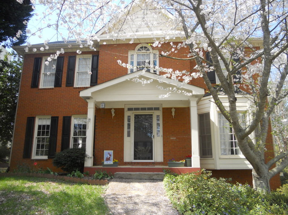
The one thing that has me tripped up is that our brick is more orange than red. I’d love to hear what colors might work with that for our door, shutters, & trim. I have great fantasies of one day painting the brick, but for now I would love some advice for working with it as-is. Thanks! – Wendy (and Mike, Lucas, and Jackson) Note: for anyone who wants to play around in photoshop, just click the image above this paragraph to enlarge it – and you can share your creation in the comments by linking to it on a free photo-sharing site like Flickr or Pinterest.
After staring at that before photo for a while, I dragged it into photoshop to see what stuck. Here’s what I did first:
- Made the off-white trim white (this wouldn’t be scary or dramatic, but it’s a little crisper and less traditional, since it sounds like Wendy leans that way – and let’s face it, the HOA probably won’t go for something like blue trim)
- Added a glossy red door (it sounds weird to pair orange-y brick with a red door, but we did that with our first house and for some strange reason it made the brick seem less red/orange by comparison – sort of like how if something looks yellowed but you put a super yellow object next to it, it almost looks white by comparison). We used Fabulous Red by Valspar and loved the look in a nice shiny semi-gloss. It’s bold but still really classic.
- Planted a whole mess of red tulips out front (it would add even more color without annoying the HOA)
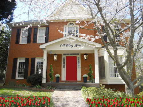
- Hung some nice oversized porch lanterns (something like these on either side of the door would look nice and weighty)
- Put some potted plants on the porch
- Added a scripty house number over the portico (spelling out the entire address with black metal numbers and letters could be really charming if there’s room)
- Painted the porch steps a nice neutral mocha color (just to neutralize that red top step)
For my second go, I:
- Tried a rich navy tone on the front door (like Regatta by Sherwin Williams or Hale Navy by Benjamin Moore)
- Went deep charcoal-navy with the shutters (like Rock Bottom by Sherwin Williams – since some people are suuuper anti navy door + black shutters, painting the shutters a few shades darker than the door, so they’re still deep but not quite black should do the trick)
- Hung some sweet and simple house numbers on top of the portico
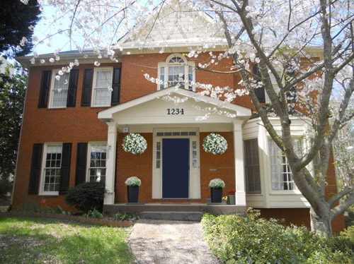
- Added hanging flower baskets on either side of the door
- Put two clean-lined planters on the porch
- Painted the porch steps a nice neutral mocha color (just to neutralize that red top step)
This one is a “squint a little” solution since the photoshopped shutters aren’t perfect, but this time I:
- Went white with the shutters (just to see how they’d look with the white trim)
- Added a spring green color on the door (that’s usually a pretty foolproof-yet-fun choice since there’s SO MUCH green in nearby nature that it tends to tie into that instead of looking like it’s out of left field. Of course this is photoshop, so it doesn’t look as real and layered as it would in real life, but it hopefully gives Wendy an idea so she can hold up some swatches in real life and just see what she likes – maybe try Lemon Grass by Behr and go from there?)
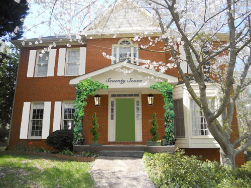
- Brought back the lanterns from my first rendering
- Added topiaries to the porch for height
- Tossed in some greenery to grow up those porch columns (Wendy can just ask what creeping plants don’t harm brick or wood at a nursery and see what they recommend)
- Hung the address above the door (this time I went for the scripty look with the numbers written out)
- Painted the porch steps a nice neutral mocha color (just to neutralize that red top step)
A few other options that came to mind were that Wendy could…
- go for dark charcoal shutters, white trim, and a glossy plum door
- try a robin’s egg blue door with navy shutters and white trim
- add window boxes for more color and interest
- hunt down a really great old doorknocker and doorknob for the front door
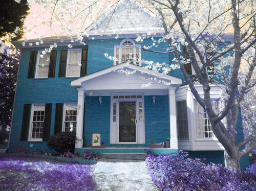
And just for fun, here’s Clara’s suggestion. She told me to do purple bushes and grass with blue bricks. Clearly she wasn’t following the “keep the brick as-is” directive. Ah, to see through the eyes of a child…
Do you guys have any votes or ideas for Wendy? Are you Team Red? Team Navy? Team Green? Team Edward? Team Jacob? There are tons of other ways she could go, so she’d love to hear everyone’s ideas. Picture me passing you the baton – er, the mic? The keyboard?
Psst – Got a particularly tricky spot or a dilemma in a certain area of your house? Please submit at least three photos of the space along with a quick sketch of the floor plan and a short description about what has you stumped to advice@younghouselove.com.

amanda says
I love EVERYTHING about option #1!!! Nice work!!
Julie says
What about something like this….http://www.ontarioarchitecture.com/Victorian.htm
Second house down, pretty light blue shutters, door and trim, offset by some navy thrown in.
Jen says
I agree with the reader who said white shutters to balance things out. And I have to agree with the teal door too, but mostly just because it’s my favorite color right now.
Becca G. says
I vote for the navy door! I think red doors are so common these days, and one reason it looks so pretty is because of the bright red tulips…but even if you do seasonal flowers (mums in the fall, etc..) you won’t ALWAYS have pretty colorful blooms.
Cathy says
I love the navy door with the crisp white paint and flowers – it is so welcoming!
Jill says
I’d play off the red brick with it’s compliment and go with a deep, rich British Racing Green on the shutters and front door. Then highlight everything with copper/brass numbers and lanterns. Then I would add window boxes in copper to the bottom left windows. As they age they would patina beautifully. Lots of pretty green ivy spilling over.
Jill says
And crisp white for the trim.
Jaimee says
I wish this had come up a few weeks ago! We also have orangey brick and have been struggling to come up with paint colors. We ended up doing a dark bronze for the trim, a dark grayish green (SW Garden Gate) for the gables and soffits, and our front door is a bright fuschia! Our house is a mid century ranch (so not as traditional as Wendy’s) but it is still a color scheme that is not too “out there”. And I personally think warmer bronze works much better with this brick than harsh black but you still get the same general feel. Best of luck!
Isabel says
I am Team Purple grass but since that probably won’t fly with the HOA, I’ll go Team Red (I am also Team Edward, Team Eric and Team Peeta). I can’t decide though if I like the hanging baskets or the lanterns better. Maybe if oversized lights could be placed to either side of the door, the baskets could work too? I also love the idea of window boxes as per another reader’s suggestion. Another nice trim color idea could be a soft gray, it would play really nice with the black shutters and the red door. Because my house is white, I painted both the door and the little windows things (yeah, that’s a technical term!) in red to make them stand out (storm door included!). That may not work in this case with the red, but maybe it could with navy or green? Good luck! Can’t wait to see the afters!
Amandelin says
Team…Clara, actually. I really love that blue brick.
Melissa says
What about a white-wash finish on the house with pale turquoise shutters and door? There are a few of those around here that I love!
Melissa says
http://spaghettiandspraypaint.com/the-challenge/
Sarah says
I think the green makes the orange orang-er.
I LOVE the navy option. I also think a peacock color in place of the navy door, but with the same white accents, would look great.
Overall NAVY NAVY NAVY is my choice of the three.
Naomi says
Beautiful suggestions! I am loving option #1 but would switch out the red door for a navy one! A navy door with red tulips and porch lanterns would be my pick!! Good luck!
Danielle Purtle says
Team green! I love how it looks with the orange brick! Also team Clara, because we have purple bushes. You’ll have to tell her about diamond loropetulum! Bright all year!
Now stop your posting and rest–it’s the Holidays! Happy Thanksgiving, sweet family! :)
alg (amy) says
I’m TEAM CLARA!!!!!
I swear you guys are raising the next great, outside-the-box, artist/designer there! I always LOVE her ideas — so whimsical, yet classically rooted and with an uncanny understanding of the nuance behind good technique… Once her sensibilities have matured a little bit, I honestly think she’ll set the design world on fire. For real.
YoungHouseLove says
Aw alg, you’re so sweet! She’s a pretty awesome little artiste! Although I think I’m biased…
xo
s
GreenInOC says
I vote for Clara’s idea and not just because she’s adorable, it looks great!
However, since there is a leave the brick alone directive, I vote for #1, love the red and all the other touches in that rendering!
Renee says
A great aqua blue door would work great with the orange undertones of the brick! You might even go wild and paint the shutters the same!!
Dena says
What’s wrong with me that I like the blue house version the best?!?
Callye Lawrence says
Navy! Navy! Navy! (I like the vines growing up the porch though as well)
Audrey says
I like the Red door the best.
I have redish (with tan) brick at my house and have thought about painting my front door. And my daughter’s and I have decided to TARDIS Blue… now if i can just find that color……….
Laurel G says
Definitely love the option with the red door. I always think that using three colors on a house makes it look so much more high end.
Lucy S says
I have to say that CLARA’s idea is the best! The house looks pulled together, purposefully elegant and different, but not in an “the owners were on drugs or hated the neighbors” kind of a vibe.
It shouldn’t surprise me that Clara has the knack!!
Amy V says
This older blog post from the Nester shows how she and her husband re-did the exterior of one of their homes using paint. It looks fantastic. It is in a similar style to yours, although you might like the traditional/French feel to their home.
http://www.thenester.com/2007/12/i-can-always-find-something-to-complain-about.html
YoungHouseLove says
Isn’t that an amazing before and after?! I love her blog!
xo
s
Marianne in Mo. says
I like the white shutters, it balances the bay. Like the green door too, but that’s because it’s my favorite color. I think with white elsewhere, any door color would work. I also like a bright persimmon colored door. That would tie into the brick color also. Definitely need pots and plantings to give welcome around the front.
BreeAnn says
I prefer the Navy front door and charcoal shutters. The Red front door is way too traditional for my tastes. I love the contrast the dark door and shutters against the bold brick and crisp white trim.
The change I would make would be to go even more modern and clean lined with the house numbers and porch decor.
http://www.pinterest.com/pin/206110120419470830/
Denise says
My second choice (after Clara’s) is the green- just because red and blue are pretty common.
one of the other 300+ commenters may have already mentioned it, but there is a product that allows you to freshen/change the color of the brick with dye rather than paint: http://www.dyebrick.com/index.html. it may be worth a look when you’re ready.
happy thanksgiving!
Kari says
I favor the navy.
Kimkay says
Team navy!
Kirsten says
Clara! What a little designer in the making.
I’m love the green door version, it looks so tranquil.
I’m also moving into an orange brick home (2more sleeps. Eeeek) and never knew about brick dye, so loving these brainstorms I’m finding out so much info. My plan for my orange bricks was a grey/blue trim and bright blue door for pop which may work here too.
Can’t wait to see what you do and eagerly await the after photos, good luck.
Kaija says
I like the green version best! The white shutters lighten up the house nicely.
I would definetely tie in the cornice somehow… Maybe adding a star, or a birdhouse or even a clock! Or just painting it a color that ties in with the door or shutters.
Jen says
What about staining the brick as opposed to painting it? Then the change is more subtle.
Ofelia, from Mexico City says
I really love Clara’s suggestion! Blue and purple, my fave.
Jana says
Ok, I think I totally missed the boat here but when she said she wasn’t a big fan of the off-white I assumed she meant the trim and the siding on the bay window and the peaks. That was never addressed in this post so maybe I misunderstood. Maybe she should get rid of the shutters (less formal) and paint the window frames black. But then I don’t know what to do with the siding….maybe a grey color. Then she could accent with colorful annuals and accessories.
Jillian says
Clara might be on to something…
Jill says
My suggestion is to volunteer for your HOA. You can’t count on it always being easy-going, depending on who gets on the “Architectural Review Committee.” We lived with one for 10 yrs, and it started out really easy-going, but then new people got on the committee… By the end, there were only 5 colors you could paint your shutters/door, only one outdoor light you could use, only one style of doorknob. They made my neighbor replace his brand new $150 doorknob bec it was the wrong style. They made lots of people repaint their exterior (including us, only 2 yrs after doing it) – bec it was not one of the 5 colors. Just a word of advice about living with an HOA. Volunteer now so you can set the tone!
Linda says
Great point! I’m on my condo board, and we’re always looking/hoping for volunteers. It’s always good to get a range of opinions – and the other side is that you gain a better understanding of how the board arrived at a decision that may seem pretty draconian at first.
That said, I’m on team navy assuming it goes with the neighborhood.
And, happy Thanksgiving to everyone, and especially the Petersiks for welcoming us into their ‘family’ – and wishing John, Sherry, Clara, the Bun, and Berger, and their extended families health and happiness.
YoungHouseLove says
Aw thanks Linda! Happy Thanksgiving to you!
xo
s
Catherine says
I think Clara’s version is the best! Seriously love that blue brick idea. :)
But, seeing as they can’t do that, I vote for a navy door with grey shutters. Maybe even a lighter tone of blue like a turquoise? I agree about changing the off white to crisp white too. Much nicer. Can’t wait to see what she decides!
Kevie says
I think your house is great! What if you…
1. Went with a white door?
2. Painted the door frame and windows framing the door black?
Out of the options provided, I like the red door. And I definitely loooove the tulips. But I think you should do a mixture of colors or something like red tulips and white daffodils.
Definitely don’t paint the brick, it’s great and classic as is. I do vote for changing the address from script words to simple numbers.
Good luck! And happy Thanksgiving!
Shannon R. says
Okay, so my picture is a little rough, but I think you’ll get my idea! I like the idea of 2 tone shutters, with the bright red door, box-y lights, and pops of color in the flowers!(Which is easily changeable!) I did the trim all stark white and navy in the shutters. Just an idea http://www.flickr.com/photos/110018177@N06/11092204844/
YoungHouseLove says
Cute!
xo
s
myamogabi says
I know this isn’t an option, but I really like the blue bricks, AKA Clara’s suggestion! It made the white trim pop! If this is a no go, I also like the scripty house number and large lanterns from house #1.
gayle says
I hate the red door, the navy door and more than that I hate the green door and the blue brick. I can’t even think of any of the other suggestions, but the door seems to be the sticking point. You see that first!
Michelle says
I am partial to the navy door with the white trim. I also like the bigger lights in Sherry’s first rendition. The shutters would look nice with the navy or charcoal. I too like the idea of doing the steps in a mocha color.
Sherri says
I have to go with Clara’s suggestion. Love the blue, minus the purple bushes. I’m on Team Clara.
mary jane says
Charcoal trim goes well with orange brick. some dark and some light toned charcoal so it is not too dark overall. I think a kelly green door would look great
Stacey says
I like that blue door too, I think new lanterns and blue hydrangeas with that would be great. Love the white shutters, or a charcoal with a blue undertone to bring cohesiveness. Good call on painting the steps!
Anna Cheung says
The red really pops and looks great. The porch is begging for some space fillers as well so adding a couple of tall plants and layering in a few smaller ones would really add to the overall look of the space. If red doesn’t work, why not try a teal blue/green color not as dark.
Sarah says
Thanks Sherry and thanks for submitting this Wendy! I have the same issue with the orangey brick. I’ve been wanting to paint my front door plum but have trouble with the trim/shutter colors. That’s a great option and the navy mock-up is lovely too. I’ll be pinning for future reference. Any tips for working with the roof color (since that’s not an easily changed feature either)?
YoungHouseLove says
I would get some test pots of paint and paint big pieces of poster board with anything you’re considering and tape it up on the house and step back and see how it looks with the roof. Good luck!
xo
s
Minnie says
I like the red door!
Georgia says
My initial thoughts were to tone down the trim with maybe a subtle charcoal grey (very light) and still keeping some of the white on the flat surfaces facing the street.. I love the navy blue door with the charcoal shutters as I think it makes the house look very grown up and sophisticated.
alexandra says
I like the charcoal shutters with white trim and plum door. I am a sucker for purples.
Lisa says
I love both the navy and green, but I would also paint just the inset wood of the porch roofline to match or coordinate with painted bay windows? The cream is pretty but a little heavy. Seems like there should be some way of dragging color over to the bay windows?
Jenny says
Is painting the brick an option at all? If so – I’ve seen some beautiful houses where the brick has been painted white or navy. And then it could be fun to play with the front door and shutter colors! That might be a very expensive way to go, however.