We’re not sure how many of you are knee deep in a turkey somewhere (wait, that sounds terrible) but there’s nothing we like more than a group brainstorming session, so if you’re around, Wendy would love your suggestions. She has an exterior issue and she’s ready to dive right in (you know what that means… after pics! Hopefully really soon!) so here’s her letter:
I’ve been a YHL reader since house #1 and I’m so excited that you’ve started this group advice feature! I have a problem I hope you and your readers can help with. We’ve lived in our home for about four years, and the front needs a major paint job. It’s a two-story brick house, and the trim is peeling and in desperate need of re-painting, but we keep putting it off because we can’t figure out the color! I’m not a fan of the off-white color, and our style is not particularly traditional, though that is the style of the house. We have an HOA so we can’t go too crazy, but I’d like to inject some fun color somehow to give it more appeal and personality. Maybe a bright front door?
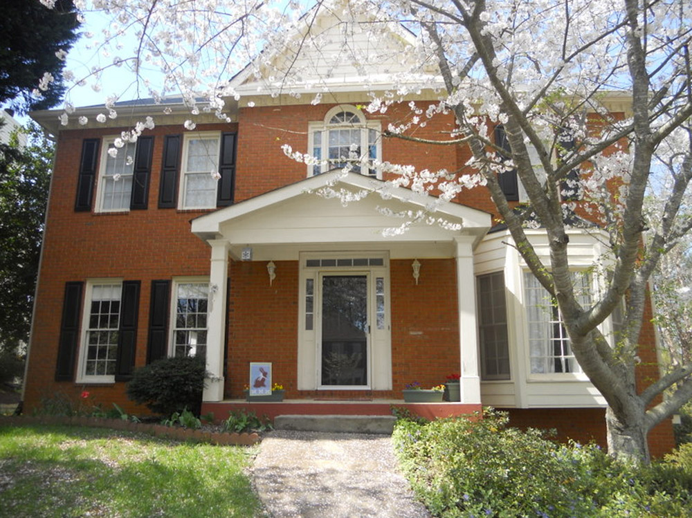
The one thing that has me tripped up is that our brick is more orange than red. I’d love to hear what colors might work with that for our door, shutters, & trim. I have great fantasies of one day painting the brick, but for now I would love some advice for working with it as-is. Thanks! – Wendy (and Mike, Lucas, and Jackson) Note: for anyone who wants to play around in photoshop, just click the image above this paragraph to enlarge it – and you can share your creation in the comments by linking to it on a free photo-sharing site like Flickr or Pinterest.
After staring at that before photo for a while, I dragged it into photoshop to see what stuck. Here’s what I did first:
- Made the off-white trim white (this wouldn’t be scary or dramatic, but it’s a little crisper and less traditional, since it sounds like Wendy leans that way – and let’s face it, the HOA probably won’t go for something like blue trim)
- Added a glossy red door (it sounds weird to pair orange-y brick with a red door, but we did that with our first house and for some strange reason it made the brick seem less red/orange by comparison – sort of like how if something looks yellowed but you put a super yellow object next to it, it almost looks white by comparison). We used Fabulous Red by Valspar and loved the look in a nice shiny semi-gloss. It’s bold but still really classic.
- Planted a whole mess of red tulips out front (it would add even more color without annoying the HOA)
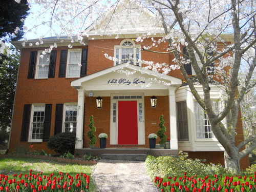
- Hung some nice oversized porch lanterns (something like these on either side of the door would look nice and weighty)
- Put some potted plants on the porch
- Added a scripty house number over the portico (spelling out the entire address with black metal numbers and letters could be really charming if there’s room)
- Painted the porch steps a nice neutral mocha color (just to neutralize that red top step)
For my second go, I:
- Tried a rich navy tone on the front door (like Regatta by Sherwin Williams or Hale Navy by Benjamin Moore)
- Went deep charcoal-navy with the shutters (like Rock Bottom by Sherwin Williams – since some people are suuuper anti navy door + black shutters, painting the shutters a few shades darker than the door, so they’re still deep but not quite black should do the trick)
- Hung some sweet and simple house numbers on top of the portico
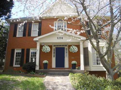
- Added hanging flower baskets on either side of the door
- Put two clean-lined planters on the porch
- Painted the porch steps a nice neutral mocha color (just to neutralize that red top step)
This one is a “squint a little” solution since the photoshopped shutters aren’t perfect, but this time I:
- Went white with the shutters (just to see how they’d look with the white trim)
- Added a spring green color on the door (that’s usually a pretty foolproof-yet-fun choice since there’s SO MUCH green in nearby nature that it tends to tie into that instead of looking like it’s out of left field. Of course this is photoshop, so it doesn’t look as real and layered as it would in real life, but it hopefully gives Wendy an idea so she can hold up some swatches in real life and just see what she likes – maybe try Lemon Grass by Behr and go from there?)
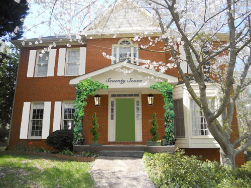
- Brought back the lanterns from my first rendering
- Added topiaries to the porch for height
- Tossed in some greenery to grow up those porch columns (Wendy can just ask what creeping plants don’t harm brick or wood at a nursery and see what they recommend)
- Hung the address above the door (this time I went for the scripty look with the numbers written out)
- Painted the porch steps a nice neutral mocha color (just to neutralize that red top step)
A few other options that came to mind were that Wendy could…
- go for dark charcoal shutters, white trim, and a glossy plum door
- try a robin’s egg blue door with navy shutters and white trim
- add window boxes for more color and interest
- hunt down a really great old doorknocker and doorknob for the front door
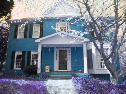
And just for fun, here’s Clara’s suggestion. She told me to do purple bushes and grass with blue bricks. Clearly she wasn’t following the “keep the brick as-is” directive. Ah, to see through the eyes of a child…
Do you guys have any votes or ideas for Wendy? Are you Team Red? Team Navy? Team Green? Team Edward? Team Jacob? There are tons of other ways she could go, so she’d love to hear everyone’s ideas. Picture me passing you the baton – er, the mic? The keyboard?
Psst – Got a particularly tricky spot or a dilemma in a certain area of your house? Please submit at least three photos of the space along with a quick sketch of the floor plan and a short description about what has you stumped to advice@younghouselove.com.

Monica says
I absolutely love the blue house with Purple bush/flowers.
I thought bright yellow door or green one.
Naomi W. says
I love the green door with the white shutters. Regarding the storm door issue – if you need a cross breeze in your home, I would suggest changing the side lights on either side of the door with windows that could be opened. That would give a great breeze with good security.
dawn says
Sherry, you got some mad photoshop skills.
Years ago I lived across the street from one of most beautiful houses. Truth be told I choose our apartment because of the view of the house. It was orange with dark green trim. I would never of thought to put the two colors together but it was stunning. So I would like to see dark green trim. I also agree with the lighting and adding greenery.
Sara says
I have to say, as I was reading through the door dilema, my first thought was to suggest Navy and when I saw your rendition – that’s totally the way I would go, though I think it’s probably the most traditional leaning of the three options.
Sara says
Although the red is bright and cheery, i LOVE the dark blue door! It just makes the whole house seem very cool and comforting.
Susan says
Love the navy and the red is lovely too. I’m not a big green fan in general, but what about a bright teal? Something really bright like a peacock blue/green? I think the charcoal shutters would work with this too. And Clara’s idea was awesome – that blue just pops and looks like a gem!
Abby says
Beautiful house! I would go with the GREEN DOOR/WHITE SHUTTERS option. Fresh, yet a little different than the usual, classic red door.
Tiffany says
We have an orange-brick home, and we recently went through this “what color to paint the trim and the door?” dilemma. Everyone suggests green with orange brick, but that always screams “carrot” to me. Long story short, we decided on something light-grayish-smokey-blue; I liked trim in pictures that was light-smokey-blue against orange brick, but the exact color we picked reads more sea-green-blue and less gray than we anticipated. So beware the outdoor light and how it makes color look! Maybe someday we’ll repaint…
For your home, I was playing around with colors on orange brick, and I agree to make the off-white trim white. I love both the navy and the red doors. Are you allowed to paint your shutters? I think that dark navy on the shutters with a happy red door would look lovely, but I’ve never lived in a historic home and do not know the rules regarding shutters! Good luck!
Melissa says
I love the brick, but I’m drawn to say that the brick should be white or off white and the shutters and door should be navy. Then spruce up the yard with some seasonal colored flowers. I think it would be gorgeous.
Sarah says
I don’t know if anyone has suggested this idea, but what about whitewashed or white brick for the exterior? Also, on the bay window roof, you could add copper! I see a lot of homes in my neighborhood with that and it is beautiful. Maybe pale green shutters? Good luck!!
Lindsey says
I like the blue door with red coming in 2nd place. Clara house is cute too, she already has an eye for design:)
anne says
Just want to say Happy Thanksgiving to you three. Your blog is one thing I’m thankful for, I get so much enjoyment from it. So thanks!
Anne
YoungHouseLove says
Thanks Anne! Happy Thanksgiving to you too!
xo
s
Kerry says
We just painted our front door Benjamin Moore’s Heritage Red. Love it so much!
Alison O says
I wouldn’t have really consciously noticed the red top step enough to think about changing it, but that’s one of those small details that makes such a big difference to the overall look! It’s like cleaning a few marks off a wall; they aren’t big in and of themselves, but they manage to throw off the whole room in a way you might not be able to pinpoint at first.
Dawn says
What a gorgeous home! It is beautiful as is, but here’s my suggestion to add some real curb appeal. I would definitely go pure white with the trim, then paint the siding a medium-dark warm gray to emphasize the trim work and balance out the black shutters on the left side of the house. I would also use black as an accent in the house numbers, porch lights, door hardware and trim, and possibly even the soffit color to highlight the dental molding and add that bold contrast across the whole exterior. It will keep your eye moving around instead of drawing attention to one space. Then I would paint the door robin-egg blue to compliment the orange hues in the brick, and add a softer blue to the porch ceiling as well.
A few other changes I would make would be to line the sidewalk with brick to bring that warm color down to the base, add some large planters on the porch to break up the bare brick, and to change out the planter bed retainer with gray stone to balance the new gray siding on the right of the house. It would be so beautiful!!
Here’s a link to my rendering of the ‘after’ house with these changes. :) http://designingdawn.com/wp-content/uploads/2013/11/after-big1.jpg
YoungHouseLove says
Looks great Dawn! Thanks for sharing!
xo
s
Dawn says
And a little more in depth description of why… because clearly that comment wasn’t long enough, haha. :) http://designingdawn.com/ill-get-in-on-that/
YoungHouseLove says
Love you for getting in on that!
xo
s
Jill M says
Almost exactly what I photoshopped, but yours looks WAY better! I think the shutters would look great if they were the same color as the siding! Great work!
Robin W says
I like all of Sherry’s ideas but this one is probably at the top for me, although it would take quite a lot of work. Also, I think any door color would look good with this rendering.
Sheri says
I love the blue door! I had wanted red, but when my next-door-neighbors (who have the same house plan and facade that we have)painted their shutters black, like ours, they also painted their door red. So, I’ve been looking for an alternative to avoid looking just like them. This might be it! Thank you!
oh Holland says
Clara’s by 10 orders of magnitude. It’s spectacular. No other choice should even be entertained!
Rachel says
TOTALLY on Team Clara here! This girl’s got some design brilliance here!
Heather says
Me again!
Here is the link my photoshop example :)
http://www.pinterest.com/pin/227783693626849685/
YoungHouseLove says
Really pretty! Love that!
xo
s
jenna says
My first thoughts were – blue is complimentary to orange and that flowers would really make the house pop. That said I love both option 1 and 2 and all the accessories that Sherry added.
One other thought was to go away from the white trim and go darker similar to this: http://www.cape27blog.com/2013/05/its-not-white/
http://www.cape27blog.com/2013/05/shes-moody/
Not my blog, but I love what she did with the darker tones. I’m not sure how close the brick is to yours, but just a completely different direction/idea.
Ann says
I love the navy, too.
What about a color for the trim, like a green or a grey? Less uber-traditional than white/off white. I liked these images: http://www.pinterest.com/pin/108438303499919321/
http://www.pinterest.com/pin/216313588323629626/
http://www.pinterest.com/pin/122089839868670915/
Holly says
I totally had fun with this one. The biggest impact no matter what the do to the House is going to be the lawn and the flowers. the reason it seems so hum drum is because everything is the same tone. If you make the image black and white it all just blends together.
In this one I stained the brick a greige color and painted the door a pretty bright blue! It balances out all the hot tones.
I (badly) painted all the trim bright white, but left the shutters black. I love the contrast. Pretty over flower flower boxes in hot colors adds a punch and lots of lovely blue hydrangeas grounds it. Brick walkway pavers, and some large lanterns round it all out.
She looks like a whole new house!
http://i117.photobucket.com/albums/o43/Aedammair-Kitsune/before-big_zpsb0496619.jpg
YoungHouseLove says
Holy cow! It totally is a whole new house!
xo
s
Keryn says
Here’s what I would do: http://i44.tinypic.com/e6998h.png
Blue door (if allowed by HOA) with Black surround to tie in shutters, fresh coat of white paint on the rest of the white, paint the front of the top step (currently a brick red-color) black, add 2 more bushes to left hand side for balance. Replace sconces with something bigger + black, add pavers to pathway for crispiness, add taller plants (little trees here) to front porch for color, and then I greened-up the lawn because everything always looks better with a fresh green springy lawn!
YoungHouseLove says
Really fun rendering! Thanks for sharing!
xo
s
Vanana says
my immediate choice was the Blue door and Charcoal shutters, but i have to say the version with the white shutters really balances the bay window. The bright green door with greenery on the columns and in pots really feels right for a more contemporary spin on a traditional house. i would love to see the brick with a limed finish-then the color choices would change dramatically.
Kellie says
I love the look of the house with the navy door!
haverwench says
I want to mix and match. Take the color palette and simple house numbers from option #2, the hanging lanterns from #1 and #3, the topiaries from #3, and all the red tulips from #1. There, perfect.
Sherrie Albrecht says
I have to say after seeing Clara’s version, the other options look so blah. That was a great shade of blue used for the bricks – I really loved it with the white trim and black shutters and door. With the unpainted brick, I would have liked to have seen Robin’s egg blue on doors and shutters. I would also have liked to have seen bright yellow just for the door (also could add yellow daffodils to the lawn)
Lindsay says
I wish you had fleshed out the plum door idea, that is my favorite in theory. I like the navy in the photo choices.
Pia says
Go Green! White shutters looks soooo much better than the dark once and then the happy green. Totalt My choice.
Kelli says
I love the white shutters. The black shutters are so traditional. I didn’t love the green door, so I would think about navy.
Nichole K says
I’m having way too much fun!! Here are three (imperfect) options I uploaded to the forums after playing around in photoshop. Sherry, I liked your red door, porch light and plant additions in your first rendering, so I started there.
I also liked the white shutters to balance out the bay window but I wanted to break up all of the white trim by adding a darker color in the triangles above the portico and on the 2nd floor. (My inspiration was the YHL house darkening above their portico.)
http://forums.younghouselove.com/discussion/2418/three-more-options-for-wendy-s-design-delema-on-yhl-today
Can’t wait to see what Wendy and her family decides!
YoungHouseLove says
Love those! Thanks for joining in on the fun!
xo
s
Tirsa says
I vote for the all white trim and window panes. This would open up a host of possibilities for the door. I’m not a huge fan of red doors, but I really like the green. Our house also has orangey brick and I painted our front door a very deep teal (almost navy like) and we love it as it really pops even through the all glass storm door.
Here’s a similar color: http://www.sherwin-williams.com/homeowners/color/find-and-explore-colors/paint-colors-by-family/SW6503-bosporus/
Elaine says
I love the navy option! So chic. I think the plum idea would be beautiful too. I’d be tempted to paint the sidelights and top window over the door the same color as the door to give the illusion of a large double door entry. I think your home is grand enough to pull that off and it could look really stunning. Can’t wait to see the afters!
Bonnie says
I vote for the green door/white shutters. I have a similar front porch and we have crisp white benches on either side of the door. I can’t tell if you have room for benches or maybe rocking (or not) chairs. I think this spring I’m going to spice it up a bit and paint them a bright yellow, or blue, or teal… who knows!
Victoria says
That orange-ish brick looks good with the style of the house, but must be pushed back to the background. Playing with the image I’ve noticed a crisp white trim + the black shutters + good lighting and plants in porch – the storm door = layered look + contrast + mission accomplished :D
About the entry door color? Nearly every one I’ve tried looks good, so whichever catches Wendy’s fancy should look gorgeous… and I can prove it!
psst… I’ve “stolen” doors from the webs, as that storm door didn’t let me play, thus why each is different ;)
– Light blue door: https://lh6.googleusercontent.com/-dAydMKLleN4/UpY58z_19nI/AAAAAAAAA5s/1ss6U0_LAZQ/w782-h586-no/Wendy+baby-blue.jpg
– Deep red door: https://lh6.googleusercontent.com/-QfyvofU1ZEA/UpY52Ku4k6I/AAAAAAAAA5c/amr1A_44rtc/w782-h586-no/Wendy+deep-red.jpg
– Happy green door: https://lh5.googleusercontent.com/-Y43HSCrGn1k/UpY55rU1COI/AAAAAAAAA5k/R0RpxJuEfz4/w782-h586-no/Wendy+happy-green.jpg
– Teal door: https://lh3.googleusercontent.com/-dTYC-eEEJas/UpY6AW44nEI/AAAAAAAAA50/JmjOVNugHbg/w782-h586-no/Wendy+moody-blue.jpg
– Deep green door: https://lh5.googleusercontent.com/-hLhXserRMDc/UpY6DoTRTQI/AAAAAAAAA58/1F4tmIK36Lw/w782-h586-no/Wendy+moody-green.jpg
– Plum door: https://lh3.googleusercontent.com/-8E8z1GsCBuU/UpY6G9-25LI/AAAAAAAAA6E/WWePg0R4QsM/w782-h586-no/Wendy+plum.jpg
– Yellow door: https://lh5.googleusercontent.com/-iWoH6IrQCaI/UpY6KQM6txI/AAAAAAAAA6M/3fmVO47isZE/w782-h586-no/Wendy+yellow.jpg
YoungHouseLove says
These are all so much fun! Thanks to everyone who’s sharing renderings and links and suggestions for Wendy! Can’t wait to see where she ends up!
xo
s
Megan @ The Brick Bungalow says
What about a dark gray? I’d almost think about painting all the white windows a dark gray with a fun colored shutter, or just do white with black shutters and a fun, colorful door (like navy). We have a brick house and we keep it with white only because I don’t want to have to paint it if/when I got sick of a different, non-white color. But front doors are definitely the place to have fun! And flowers, flower pots, lighting, etc. would be a great splash of color.
Zuzanna says
Here is my suggestion:
http://www.pinterest.com/pin/146930006566478981/
I was inspired by Clara’s idea. I used wisteria plants to frame the porch and the door became lavender with some lavender plants out front.
Some bright yellow accents could be used as well.
Forgive me my photoshop skills ;)
YoungHouseLove says
Really fun! Love all the ideas guys! Thanks for playing along!
xo
s
Sammy says
I think my favourite is the red door =) And it may be a bit bold,, but I LOVE the blue house!!
Tonya says
Love Clara’s choice, but if that isn’t an option then definitely the navy. The other colors make the house look more orange.
Nikki says
Team Navy!!! For sure!
Nicole says
I LOVE the red combo.I think I might add some of the mocha/greige from the porch floor into the trim somehow. Maybe just painting the area behind the house numbers, and bright white on all the rest of the trimwork. I think a big ole pewter door knocker would help set the door off and tie in some of the darkness of the shutters. Love the house! Lots of possibilities!
LibraDesignEye says
Hola! Here’s another option: dark trim -in a green gray that will look super with the orange brick. BM Night train http://www.benjaminmoore.com/en-us/paint-color/nighttrain
with the deepest tone on the shutters – bm quarry rock
This is a green-blue-green gray – so for the front door, you can always do the same gray as the quarry rock, but I like the historic bm yorktowne green
http://www.benjaminmoore.com/en-us/paint-color/yorktownegreen
Straight blues just make the orange jump off – but green-grays make it feel quiet and historic. Love all the fun of playing with color . . .love the numbers over the door . . . and love the juxtaposition of classic architecture with modern art and furniture inside – go Wendy!
Laurel says
I love using the numbers or letters in the entablature (the triangle parts) . The bright plantings work great too. I am a neutral kind of girl, but what if you did a soft to medium gray on all of the trim and then a door the color of Sherry and John’s or paint inside the entablatures and the shutters a taupe color and leave the window sashes white with a strong black or charcoal door and huge black lanterns and planters on the porch with bright plantings of purple grasses, red and yellow flowers, etc. (and definitely the tulips!) Good luck and as long as you love it and it feels like fun to you it works. (I like Sherry’s navy and red suggestions best)
JR says
She could lime wash the brick rather than paint it. That is a really common treatment on traditional houses in my area. The bottom photo at this link has an example. http://www.birminghamhomeandgarden.com/Birmingham-Home-Garden/Editors-Notes/Blog-2013/2013-Historic-Hollywood-Home-Tour/
Victoria says
I love the white trim and red door but all of them are beautiful. I too am struggling with finding a good color for my front door with my brick home. My brick is a little more red than Wendy’s home and I am thinking of going with a yellow door – like BM Hawthorne Yellow. Still not sure.
Melanie says
My last home was also an orangy-red brick that I hated, but couldn’t paint. I did all white trim, mid-dark taupe shutters, and a lighter green door. It worked really well.
I can’t wait to see the final picture!
OMG-YHL says
I’m loving the navy option! So sophisticated and fun. On another note, Sherry and John–would you consider doing a Photoshop tutorial at some point to show us how you do things like change the color of the grass and bricks in Clara’s fantasy option? I’m relatively good with photoshop, but I would love to hear your tips and tricks!
YoungHouseLove says
Sure! That was mostly me just dragging the little “hue” toggle bar in the hue/saturation setting.
xo
s
jennifer says
The house is beautiful! Whatever you decide, the house has great bones and will look awesome!
Erin says
So I had some time on my hands…
I added some pendants from Restoration Hardware and topiaries from Ballard Designs. I also painted the front step, the front door and shutter colors. I tried choosing colors that would enhance the tone of the brick, not make it obnoxious. What do you think? Yellow/Navy combo, Navy/aqua combo or Navy/green combo? I can’t decide!
http://www.flickr.com/photos/erinrodriguez/11089420453/in/photostream/
http://www.flickr.com/photos/erinrodriguez/11089211465/in/photostream/
http://www.flickr.com/photos/erinrodriguez/11089210605/in/photostream/
YoungHouseLove says
So much fun! Love those!
xo
s
Rebecca says
Definitely Team Red! It catches my eye faster and is more interesting than the others. The lanterns really make a huge difference also. Nicely done!