We’re not sure how many of you are knee deep in a turkey somewhere (wait, that sounds terrible) but there’s nothing we like more than a group brainstorming session, so if you’re around, Wendy would love your suggestions. She has an exterior issue and she’s ready to dive right in (you know what that means… after pics! Hopefully really soon!) so here’s her letter:
I’ve been a YHL reader since house #1 and I’m so excited that you’ve started this group advice feature! I have a problem I hope you and your readers can help with. We’ve lived in our home for about four years, and the front needs a major paint job. It’s a two-story brick house, and the trim is peeling and in desperate need of re-painting, but we keep putting it off because we can’t figure out the color! I’m not a fan of the off-white color, and our style is not particularly traditional, though that is the style of the house. We have an HOA so we can’t go too crazy, but I’d like to inject some fun color somehow to give it more appeal and personality. Maybe a bright front door?
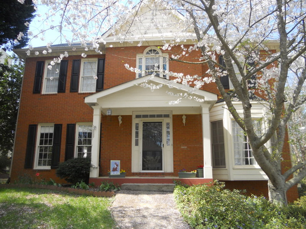
The one thing that has me tripped up is that our brick is more orange than red. I’d love to hear what colors might work with that for our door, shutters, & trim. I have great fantasies of one day painting the brick, but for now I would love some advice for working with it as-is. Thanks! – Wendy (and Mike, Lucas, and Jackson) Note: for anyone who wants to play around in photoshop, just click the image above this paragraph to enlarge it – and you can share your creation in the comments by linking to it on a free photo-sharing site like Flickr or Pinterest.
After staring at that before photo for a while, I dragged it into photoshop to see what stuck. Here’s what I did first:
- Made the off-white trim white (this wouldn’t be scary or dramatic, but it’s a little crisper and less traditional, since it sounds like Wendy leans that way – and let’s face it, the HOA probably won’t go for something like blue trim)
- Added a glossy red door (it sounds weird to pair orange-y brick with a red door, but we did that with our first house and for some strange reason it made the brick seem less red/orange by comparison – sort of like how if something looks yellowed but you put a super yellow object next to it, it almost looks white by comparison). We used Fabulous Red by Valspar and loved the look in a nice shiny semi-gloss. It’s bold but still really classic.
- Planted a whole mess of red tulips out front (it would add even more color without annoying the HOA)
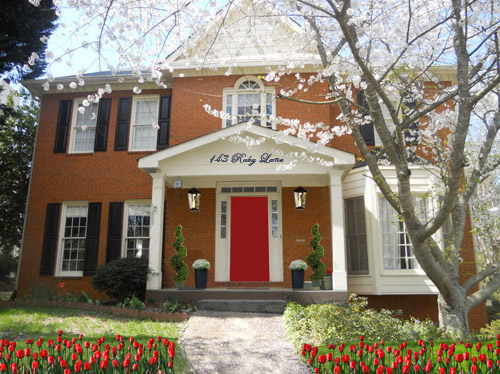
- Hung some nice oversized porch lanterns (something like these on either side of the door would look nice and weighty)
- Put some potted plants on the porch
- Added a scripty house number over the portico (spelling out the entire address with black metal numbers and letters could be really charming if there’s room)
- Painted the porch steps a nice neutral mocha color (just to neutralize that red top step)
For my second go, I:
- Tried a rich navy tone on the front door (like Regatta by Sherwin Williams or Hale Navy by Benjamin Moore)
- Went deep charcoal-navy with the shutters (like Rock Bottom by Sherwin Williams – since some people are suuuper anti navy door + black shutters, painting the shutters a few shades darker than the door, so they’re still deep but not quite black should do the trick)
- Hung some sweet and simple house numbers on top of the portico
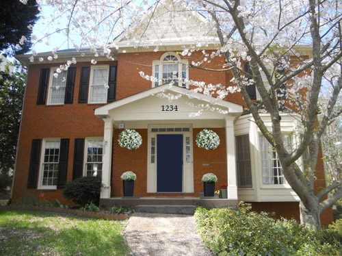
- Added hanging flower baskets on either side of the door
- Put two clean-lined planters on the porch
- Painted the porch steps a nice neutral mocha color (just to neutralize that red top step)
This one is a “squint a little” solution since the photoshopped shutters aren’t perfect, but this time I:
- Went white with the shutters (just to see how they’d look with the white trim)
- Added a spring green color on the door (that’s usually a pretty foolproof-yet-fun choice since there’s SO MUCH green in nearby nature that it tends to tie into that instead of looking like it’s out of left field. Of course this is photoshop, so it doesn’t look as real and layered as it would in real life, but it hopefully gives Wendy an idea so she can hold up some swatches in real life and just see what she likes – maybe try Lemon Grass by Behr and go from there?)
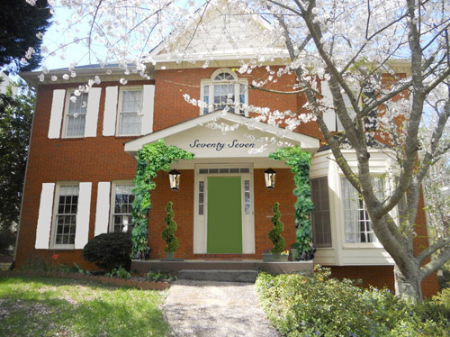
- Brought back the lanterns from my first rendering
- Added topiaries to the porch for height
- Tossed in some greenery to grow up those porch columns (Wendy can just ask what creeping plants don’t harm brick or wood at a nursery and see what they recommend)
- Hung the address above the door (this time I went for the scripty look with the numbers written out)
- Painted the porch steps a nice neutral mocha color (just to neutralize that red top step)
A few other options that came to mind were that Wendy could…
- go for dark charcoal shutters, white trim, and a glossy plum door
- try a robin’s egg blue door with navy shutters and white trim
- add window boxes for more color and interest
- hunt down a really great old doorknocker and doorknob for the front door
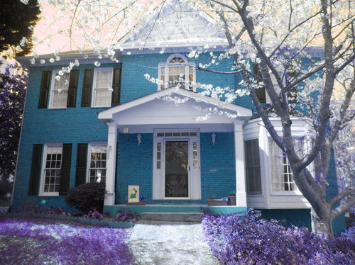
And just for fun, here’s Clara’s suggestion. She told me to do purple bushes and grass with blue bricks. Clearly she wasn’t following the “keep the brick as-is” directive. Ah, to see through the eyes of a child…
Do you guys have any votes or ideas for Wendy? Are you Team Red? Team Navy? Team Green? Team Edward? Team Jacob? There are tons of other ways she could go, so she’d love to hear everyone’s ideas. Picture me passing you the baton – er, the mic? The keyboard?
Psst – Got a particularly tricky spot or a dilemma in a certain area of your house? Please submit at least three photos of the space along with a quick sketch of the floor plan and a short description about what has you stumped to advice@younghouselove.com.

Jennifer says
the Navy!! when I was reading the red I was thinking Navy in my head and was glad to see that was your #2. I have a brick house with burnt orange shutters and a yellow front door. and I do a lot of orange,lime and blue pots out front. what about choc. shutters with navy door? white trim, yellow/red pots?
Ashley says
What about painting the trim an olive color?
http://www.pinterest.com/pin/122089839868670915/
And doing window boxes under the upstairs windows to match:
http://www.pinterest.com/pin/60657926203475036/
You can really see what it would look like with orange brick here:
http://www.pinterest.com/pin/471189179734172193/
http://www.pinterest.com/pin/313703930264649272/
Either paint the shutters to match or remove them completely.
http://www.pinterest.com/pin/75716837458049176/
http://www.pinterest.com/pin/166492517444565420/
http://www.pinterest.com/pin/254594185157055421/
Casey says
I LOVE these ideas, Ashley — beautiful!
Laura says
I like the white shutters the best because it balances out the bay window on the right.
Julie says
Orange and blue are perfect compliments on the color wheel, so I vote for the blue door. It would look nice with white shutters and trim. I hate the red, it’s too close and seems like a total clash. Green would look nice too, but I would play with the shade a bit.
Lil says
I LOVE the navy mock up. It made my heart sing. I also liked the topiaries you used in a few of the renderings…and the largish lanterns. I definately prefer the non-scripty house numbers…and maybe not on the portico…maybe on the front door? Full of opinions, huh?
My first thought when I was reading the “requirements” and description of the orange brick was a blue door…as orange and blue are complimentary on the color wheel.
Pretty house. Good luck!
Diane says
Love the green door and white shutters. It does have a calm look plus I think it toned down the orange of the brick.
Before long we’ll have YHL&C! Keep the imagination rolling Clara!
Kelly says
Well, Clara’s is obviously my favorite! (I really do like the blue brick color and who wouldnt love purple grass!)
As for Sherry’s ideas, I LOVE the Navy door with the numbers above and the darker step!
Mary says
I like Clara’s the very best, but my second pick would be the green door :)
Vivian says
I’m loving the navy option … with the dark blue shutters. I think whatever landscape colors she chooses would work great with this option.
And, of course paint the porch ceiling light blue ….
Happy Thanksgiving, all!
Jen S. says
I love the navy!!
Janine says
I would actually do *ducks* an orange door with brass/gold or black hardware. A bold orange can be very modern, but can look from the street like an incredibly classy traditional look as well.
I looked up orange doors on pinterest and they aren’t pumpkinny at all, they look great. For Wendy’s house, I might go a very yellow-orange, to match the existing cream trim.
Laurie says
The red door will help neutralize the orange a little but be careful on the shade of red. You want to keep the red on the orangish side. If your red has too much blue, it won’t quite work with the brick.
Find a paint chip that is close in shade to your brick and hold that next to your reds to see the one that is going to work.
I would shy away from the blue door (even though I adore blue doors) because blue and orange are opposite each other on the color wheel so you might get more pop than you bargained for.
The green is darling but it will play up to the orange. That’s kind a cool so it is up to you if you. A door color is fairly easy to change so I say, have fun!
In the end, I vote for Clara’s suggestion. I’m sure the HOA will agree.
Jennifer R. says
Team Navy!
I love the Navy option because it would not require a lot of landscaping and looks more modern than the Red.
The red definitely looks better than the current colors but is just so predictable. Everyone has a red door now it seems and I just don’t like it with the orangey brick. The tulips are lovely but not very practical unless she loves gardening. That many tulips will look like a patch of weeds for 3/4 of the year just for some prettiness in the Spring.
The green is beautiful and gives a quirky charm but growing creeper plants takes too much patience for me. It also may not fit in to HOA standards. I think Navy is the way to go! Just make sure you choose a bold enough navy so it doesn’t look black behind the storm door!
audrey says
I like the red personally. My parents had a colonial house growing up and I loved the red door. I’m quite partial to topiaries too. Good luck!
Jennifer R. says
After giving it another thought – would you even be able to tell navy from black if it’s behind a storm door? I mean from the street I think it would look black. If the storm door is staying I would go with the bright green :)
Shauna says
I like the red and the blue but to me the red seems very typical/ traditional for that style house. What if you took a few elements from the red and traded them out with the blue? Like having the door and shutters blue but then for the front porch keeping the oversized porch lights and the scripty house address up top with the potted plants. Also I think the planted red flowers in the yard would look pretty with any of the options. The mocha painted porch works well too. Looking forward to seeing after pictures!
Jill says
Wouldn’t the brick look most red next to a yellow or an orange door, then?
And most orange next to a red door?
I don’t actually mind the tone of the brick, but if she’s looking to make it look redder, I think the red door is the opposite of helpful.
The yellow-green door does a good job of making the brick look redder by comparison, though. Turquoise (because it also has a lot of yellow in it too) might as well.
I also liked the white shutters for how they balanced the bay window.
Whatever she does, I vote for tulips of some color. They are charming!
YoungHouseLove says
I think a lot depends on undertones in the red that you choose for the door. I wasn’t sold on a red door for our first house (since it had orange-red brick) until I noticed a few neighborhood houses with the same brick we had + glossy red doors, and somehow the purer brighter red just made the bricks look less intense by comparison. I think some reds might bring our the orange though, and others might balance it out if that makes sense.
xo
s
Trish says
So on board with the blue door! Very crisp, not too out there, but really eye catching. Nice job Sher-dog!
Jayme says
hahaha! Please always include Clara’s suggestion from now on! Love it!
I love a mix between the first two…love the navy door and dark shutters but with the address written out on the portico! Can’t wait to see what Wendy chooses to do!
Christina says
Navy, for sure. Very classic.
katherine says
I love the Clara one! You could spraypaint the grass the way Beijing does sometimes. (Though they go for green.) Or even get some mad scientist to clone some fluorescent green genes into the grass. It would glow.
In the spirit of unrealistic ideas, I wonder what all black trim would look like. I think it’d look nice against the brick and wouldn’t compete with the blue grass.
Connie says
Are there neighborhood houses that have painted shutters, doors, or porches that Wendy likes? On some of our design requests through the HOA I’ve noted that whatever we’re asking for is “just like the one previously approved for Carol.” Maybe it helps; maybe it doesn’t but if you’re refused at least you have proof that someone else has done it and it should have been approved.
YoungHouseLove says
Great tip!
xo
s
Laura says
I vote for #1 or #2. I love the door + tulip combo, but the navy looks so rich and elegant. Can’t go wrong with either choice.
Bailey says
I love the idea of the creeping ivy going up the porch columns – that looks beautiful!
Bailey
http://akabailey.blogspot.com
kalibrooke says
I love the navy door — it’s truer to the style and era of the architecture. I’d do the planters in a “pop” color, though, so it still has some bright curb appeal. Beautiful house!
Laura says
Btw, “143 Ruby Lane”… LOVE it. Hooray for beeper codes!
YoungHouseLove says
Beeper codes forever!
xo
s
Kendra says
Sherry, are you using Photoshop to help with the ideas or another design-like website?
YoungHouseLove says
I’m using photoshop, although I hear good things about Gimp, which is free!
xo
s
Angela says
I vote for the navy. I think it would allow more flexibility to mesh with whatever the colors are in nature at the time.
Sandy says
The first thing I thought when I looked at the picture is, “blue and orange are a beautiful color combo!” I like the idea of a darker midnight blue shutter with a lighter blue (maybe hedging toward aqua) door. You could landscape with yellow tulips instead of the red like in the first picture and that would be gorgeous. Very warm and welcoming yet modern and fresh.
Mary Cole says
Hmm I love the blue Door option. I see I’m the odd mad out but I think the red and green both look clashy/not good
Cara says
Team Clara I would paint the brick but I also like the navy door. Complimentary colors always work.
Molly says
I love the red! I had kind of the same issue with the orange color brick on our house. I went with Stratton Blue and I love it! It could work for you too I think… It’s very close to John and Sherry’s front door!
JoAnne Beck says
Personally,I wouldn’t fight it. I would freshen up the trim with a brighter white and paint the door and shutters a beautiful glossy black. All the creative effort and color could go into light fixtures, porch accessories, and landscape.
Barbara says
Agreed – Bravo!!
Elizabeth T. says
Love those lanterns, house number and the navy door! I would also make planting beds to line the walkway, or extend the bed on the left side and bring that one down the walk. If there is no tree on the left side (hard to tell) that would balance out the heavier right side. What a beautiful home, good luck with whatever you choose to do!
Elizabeth T. says
But since your question totally was not about gardening, I just vote navy door. :) I can’t help myself, love planting.
Sarah says
I love a combo all three myself! I think it would look a little more modern with the navy door but still charming if you combine it with the ivy from the green door and the address spelled out from the red door. And I’m totally on the side of Navy and Black! I know it isn’t traditional, but I can’t help but go against the norm. ;-) Good luck Wendy!
Lady ID says
I am definitely Team Red. It’s a nice pop of colour. I also like the white shutters. Maybe they can do both.
Debra Shatto says
I was thinking that crisp white trim would be great, and on the window inner frames a Charlston green/black color. I like the idea of a traditional front transitioning into a more updated interior-always a wow factor. The shutters could also be the charlston green/black and the front door almost any color, a springier green, red or yellow. The front door is so much easier to repaint or experiment with since it’s a smaller job than trim. I’m wondering about what color I would do the framming above the portico, probably white. I think one light with balanced planters and pretty house numbers would look good. I just couldn’t let vines go up anywhere on the house itself since it can really cause havoc with wood or brick. Gorgeous house and the curving sidewalk to door is especially nice. Best of luck.
Anne Phillips says
Dark Charcoal shutters with a deep hunter green door. Just one shade “brighter” than the 80’s version. Pop while maintaining the traditional look of the house. Also, love the painted floor idea.
Matt says
I vote red door, white trim!
Lesley says
This designer says the red door!! I could see a bright, yet subtle yellow too.
Katherine says
I love the red door version. But strangely enough, I’m really drawn to the blue house look. Don’t think that I would be able to find purple grass, but the blue brick is awesome!
Kristen says
Mix and match — I love the lanterns from the first, blue door from the second, and white shutters from the third!
Also – curious if any of the past dilemmas have updated you on what they’ve done? :)
YoungHouseLove says
We’ve heard from all of the past homeowners that they’re working away, but it has only been a few weeks so we don’t think photos will hit our inbox just yet. I definitely can’t wait to share them as soon as they do!
xo
s
Kristen says
Alright, I did my first attempt at photoshopping for a dilemma – which is extremely difficult using the free browser photo editing programs haha.
http://i42.tinypic.com/2gw6xx4.jpg You get the idea :)
YoungHouseLove says
So much fun! I love that Kristen!
xo
s
Kristen says
Adding some ground lighting along the walkway would be fun too! Maybe something like this – http://img.diynetwork.com/DIY/2013/03/04/CI-kichler-lighting_stake-landscape-lighting-path_s4x3_lg.jpg
or http://img2-3.timeinc.net/toh/i/steps/landscape-lighting-toutX.jpg
:)
MJB says
What color is the roof? Take that into consideration as you pick paint colors for the facade.
I think any would look great. Sometimes clean and fresh is more important than which color. Spiff it up with paint and more landscaping, and you’ll love whatever decision you make.
I happen to be a fan of unpainted brick. It’s so hard to undo once it’s done. Colors come and go in fashion so play with the easier-to-change features. A lot of people like the red tulips, but really, any colorful landscaping will make a huge difference. Maybe you can find some purple Clara bushes :)
Beth Ann says
What about painting the white on the side light thingers surrounding the door the same color as the door (red or navy gets my vote)? That way even with the storm door on (I am a storm door gal, the sunlight and cross breeze feel so good and I open up my front door and leave the storm door shut, I feel like it says “I am home! Come on over for a visit!” to friends and neighbors)
Megan says
I’m loving the navy blue. I think it is homey, and it makes the tree in front with the white flowers pop too! :) IT depends on which style fits the inside of your house? I love the more homey rich navy blue. :)
Morgan says
I love the plum door, charcoal shutters, white trim idea!
Do not paint the brick! It will be a pain and costly when it comes time to repaint in the future. Now you have fairly low-maintence brick…don’t add to long term costs!
Ashley says
Wendy, Love the Navy door! Definately has my vote.
J&S. Had a last minute work trip to Richmond and have been here for three days. Loving your town so far!
YoungHouseLove says
So glad! Welcome to RVA! Sorry about all the rain!
xo
s
Béa says
Here in the Netherlands where 90% of the buildings are made of bricks, I’ve come to the conclusion that the two colors (used combined or separate) that compliment best bricks are beige and purple. So personally, I’d say beige trimmings and purple shutters and door. Or aubergine door to be right between navy and purple!
Good luck!
Tania says
Of course Clara has the best idea, but I am partial to the green door and white shutters- that’s what we have going on (even if the shutters are super ugly and iron and I am biding my time to rip them down). We have a similar color tone brick wise, so if a picture would help Wendy this is how ours look: http://www.runtoradiance.com/2013/05/13/simple-spring-spruce-ups-part-three/
I love the look of the vines you added but a word of caution vines are breedig ground for roaches and other pets (our exterminator said). Super sad because we had beautiful vines up the side of our house and had to rip them all out to kill the bugs. Boo bugs.
Michelle W says
Team Navy! Love the crisp house numbers and hanging baskets on each side of the porch.