We’re not sure how many of you are knee deep in a turkey somewhere (wait, that sounds terrible) but there’s nothing we like more than a group brainstorming session, so if you’re around, Wendy would love your suggestions. She has an exterior issue and she’s ready to dive right in (you know what that means… after pics! Hopefully really soon!) so here’s her letter:
I’ve been a YHL reader since house #1 and I’m so excited that you’ve started this group advice feature! I have a problem I hope you and your readers can help with. We’ve lived in our home for about four years, and the front needs a major paint job. It’s a two-story brick house, and the trim is peeling and in desperate need of re-painting, but we keep putting it off because we can’t figure out the color! I’m not a fan of the off-white color, and our style is not particularly traditional, though that is the style of the house. We have an HOA so we can’t go too crazy, but I’d like to inject some fun color somehow to give it more appeal and personality. Maybe a bright front door?
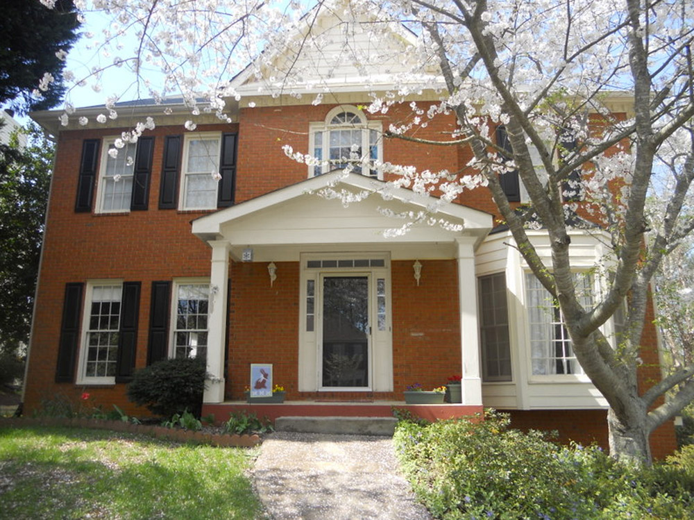
The one thing that has me tripped up is that our brick is more orange than red. I’d love to hear what colors might work with that for our door, shutters, & trim. I have great fantasies of one day painting the brick, but for now I would love some advice for working with it as-is. Thanks! – Wendy (and Mike, Lucas, and Jackson) Note: for anyone who wants to play around in photoshop, just click the image above this paragraph to enlarge it – and you can share your creation in the comments by linking to it on a free photo-sharing site like Flickr or Pinterest.
After staring at that before photo for a while, I dragged it into photoshop to see what stuck. Here’s what I did first:
- Made the off-white trim white (this wouldn’t be scary or dramatic, but it’s a little crisper and less traditional, since it sounds like Wendy leans that way – and let’s face it, the HOA probably won’t go for something like blue trim)
- Added a glossy red door (it sounds weird to pair orange-y brick with a red door, but we did that with our first house and for some strange reason it made the brick seem less red/orange by comparison – sort of like how if something looks yellowed but you put a super yellow object next to it, it almost looks white by comparison). We used Fabulous Red by Valspar and loved the look in a nice shiny semi-gloss. It’s bold but still really classic.
- Planted a whole mess of red tulips out front (it would add even more color without annoying the HOA)
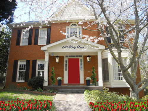
- Hung some nice oversized porch lanterns (something like these on either side of the door would look nice and weighty)
- Put some potted plants on the porch
- Added a scripty house number over the portico (spelling out the entire address with black metal numbers and letters could be really charming if there’s room)
- Painted the porch steps a nice neutral mocha color (just to neutralize that red top step)
For my second go, I:
- Tried a rich navy tone on the front door (like Regatta by Sherwin Williams or Hale Navy by Benjamin Moore)
- Went deep charcoal-navy with the shutters (like Rock Bottom by Sherwin Williams – since some people are suuuper anti navy door + black shutters, painting the shutters a few shades darker than the door, so they’re still deep but not quite black should do the trick)
- Hung some sweet and simple house numbers on top of the portico
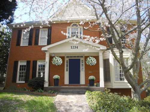
- Added hanging flower baskets on either side of the door
- Put two clean-lined planters on the porch
- Painted the porch steps a nice neutral mocha color (just to neutralize that red top step)
This one is a “squint a little” solution since the photoshopped shutters aren’t perfect, but this time I:
- Went white with the shutters (just to see how they’d look with the white trim)
- Added a spring green color on the door (that’s usually a pretty foolproof-yet-fun choice since there’s SO MUCH green in nearby nature that it tends to tie into that instead of looking like it’s out of left field. Of course this is photoshop, so it doesn’t look as real and layered as it would in real life, but it hopefully gives Wendy an idea so she can hold up some swatches in real life and just see what she likes – maybe try Lemon Grass by Behr and go from there?)
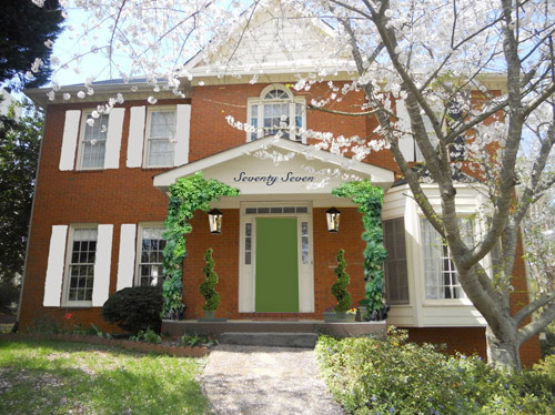
- Brought back the lanterns from my first rendering
- Added topiaries to the porch for height
- Tossed in some greenery to grow up those porch columns (Wendy can just ask what creeping plants don’t harm brick or wood at a nursery and see what they recommend)
- Hung the address above the door (this time I went for the scripty look with the numbers written out)
- Painted the porch steps a nice neutral mocha color (just to neutralize that red top step)
A few other options that came to mind were that Wendy could…
- go for dark charcoal shutters, white trim, and a glossy plum door
- try a robin’s egg blue door with navy shutters and white trim
- add window boxes for more color and interest
- hunt down a really great old doorknocker and doorknob for the front door
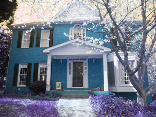
And just for fun, here’s Clara’s suggestion. She told me to do purple bushes and grass with blue bricks. Clearly she wasn’t following the “keep the brick as-is” directive. Ah, to see through the eyes of a child…
Do you guys have any votes or ideas for Wendy? Are you Team Red? Team Navy? Team Green? Team Edward? Team Jacob? There are tons of other ways she could go, so she’d love to hear everyone’s ideas. Picture me passing you the baton – er, the mic? The keyboard?
Psst – Got a particularly tricky spot or a dilemma in a certain area of your house? Please submit at least three photos of the space along with a quick sketch of the floor plan and a short description about what has you stumped to advice@younghouselove.com.

kimberly helton says
I like the red door with tulips. The blue door is also very pretty and it would look great with white tulips (I love tulips! lol)
Holly says
Oh, the navy version looks divine!
JR says
I recently did some front door dreaming on my business blog and featured this brick tone. I suggested Benjamin Moore, hale Navy (HC-154) for the front door and BM Greenbrier beige (HC-79) for trim, shutters, soffiting, fascia, etc. I would get rid of the white/off white completely, it’s so… expected. while beige isn’t exactly groundbreaking, the slight green hint in this neutral will probably pick up the mortar colour, making everything look very seamless.
With polished nickel and weathered rust metal tones for hardware, lighting, urns and blue hydrangeas, Wendy will be the talk of the neighbourhood… In a good way.
KathyL says
Yes, I’d like to see that photo shopped with the beige trim, and your door, then beige trim with my olive door.
JR says
Interesting thought, Kathy! The olive door would also be a very nice choice. Maybe Boreal Forest, AF-480? and as a fun option, Cat’s Eye, 2036-10
Bren says
Ok, so I’m “Team All-Over-The-Place.” I LOVE the white trim, love the shutters. The house seems bigger with the shutters and I love the brick painted (maybe not purple? ;) I’d definitely put in big lanterns. Being that it’s time to decorate for the holidays, testing out a few things could be awesome. Maybe a red door, tall Christmas trees in square pots around the door. That way, you can see how you like it. If the red door’s not working, paint it after the holidays.
wendy says
The portico seems way wider than the door itself, so I’d want to fill in some of that space somehow. The first thing that comes to mind is to do a trellis at the front edge of the porch, and along the sides if you want. It wouldn’t have to be very wide, just enough to visually beef up those columns. There are tons of cool designs you can find online, so don’t settle for that boring “hide the underside of the deck” stuff.
I also like the idea you had of painting the steps/floor of the porch. Maybe even stain the sidewalk to match.
Leisa says
Love the white shutters, they make the house look happy.
And the green door works well – like a beautiful Irish lady (house) with fiery orange hair (brick) and shiny green eyes (door). Perfect.
Dawn Garstka says
Charcoal gray brick, white trim and shutters, red door. Love the lanterns and the script numbers as well as a neutral step and topiaries.
Michelle | Birds of Berwick says
I like #2! It’s a simple and quick update, but the navy door really adds a striking touch of elegance to the house!
Leah says
I love all the options – great job Sherry! I personally would go with the white shutters and green door. To me it makes the home look less traditional. But I don’t think you can go wrong with any option! Cute house!
Jenny says
I’d take a little from each of them: charcoal shutters, spring green door and red plantings. I would choose something other than tulips though because they’ll only look good for a couple of weeks. Just google “red perennials” and you’ll get a ton of options.
Christy says
My first instinct (before seeing the suggestions) was to make the door navy!
Kelly says
WHITE SHUTTERS! YESSSSSSSSSSSSSSSSSSSS!!!!!! It totally balances the house by making all of the windows jive with the lovely bay window!
Deb says
I love the red door! I suggest painting the shutters a medium or dark grey instead of black though. And building out those plantings in front of the windows – more shrubs/flowers would be a big improvement.
Uma says
I think the red option complements the house most. It has a look of grandeur and so classic.
Emily says
TEAM CLARA!
Stacey says
The first thing I notice is that the left side of the house needs to be balanced out with the right (the bay window appear to weight down the right hand side of the home). I’d plant a tall tree on the left corner, perhaps one that has colorful blooms at certain times of the year to solve the balancing issue. On the front porch, replace existing light fixtures with larger gas burning ones (move them down some too) and a couple of large planters where you can plant annuals for color. And a cool color front door with some updated hardware would be nice. There are secondary projects that eventually could happen: new sod and fixing the cement steps. It’s a beautiful home!
Diane says
I think I like Clara’s the best!
Crystal says
To my surprise, I like the green door option the best, although I’m not totally crazy about the white shutters.
Angie says
Love the red door the best! If painting were an option, I think it would look great painted white, with the finish looking more whitewashed, where the original color shows a bit. Good luck!!
Meg says
Wow, for once I have no opinion – LOVE them all! Great job, Sherry! Can’t wait to see what she picks. And a happy pre-Thanksgiving to everyone!
Radhika says
I love Clara’s version of blue bricks! she is going to be a designer/home decorator. she has an eye for it. Love your last option. But if HOA wouldn’t go for it (I don’t see why) I would go for navy blue door and dark shutters.
julie kellogg says
I have a peach colored brick house & have been in the same dilemma so i have scouted A LOT of brick home pics to see what would work. Although it wouldn’t look good on my brick, yours looks like the right color for a deep charcoal trim with a deep almost bluish forest green for the door & additional architectural accents. I believe i had googled exterior colors with brick & had seen it on a row house that had been completely updated. Just an idea that kept some integrity of the style (like yours) but brought it into the present! hope u find something u love!!! good luck
Karen F says
Team Navy!
leigh says
I have to say paint the house white with black shutters. Then a nice pop of color with the door. Some really nice xlarge flower pots would fill that space too. Anyway just my opinion
Erin says
#3 but with a red door and black shutters. It will be fresh, inviting, and retain the classic lines of the home’s style.
Angie Chrisman says
I like the green door but with black shutters I think
Teri says
I really am loving the blue front door. The color of the brick is already a reddish orange so you need something to complement that. The blue looks great I’d also get fun with the landscaping and add personality to the front porch.
Lindsey says
I love the navy option… I agree that the red door option clashes too much with the orange-toned brick. I would suggest also painting the shutters the same navy as the door. I think it would make the look more cohesive. I would also do the ivy up the columns… so pretty! :o)
Jen says
Team blue, all the way!
Have any of the previous reader redesign posts provided any updates and pictures? I’d love to see what they chose and how things are going?
YoungHouseLove says
We’ve heard from all of the homeowners that they’re working away, but they just started a few weeks ago so we think it’ll be a while until afters roll in. Will definitely share them when they land in my inbox though!
xo
s
Amanda says
Option #3, but with darker shutters. Maybe gray to match the front porch steps?
Susan says
Great ideas, especially the large lanterns and tall topiaries to fill those negative spaces. Charming house!
mary says
I think blues and greens work best. I would get rid of the dark painted shutters. Why create maintenance by painting the brick? If you paint it, I would paint it a neutral.
Jessica says
Navy is my favorite for sure! While I love the red idea, tulips actually have a VERY short blooming period in comparison to other flowers/bushes, so that beautiful burst of red would only last a few weeks out of the entire year.
Michelle says
I have a neighbor who changes the door color every 6 months or so. Their house is traditional (much like yours), but you can tell with the Edison style lights and FUN door colors they are not traditional. My favorite colors thus far are lime green, turquoise, and canary yellow (the purple was unique, but the HOA didn’t agree). You can change flowers to compliment the door. With your door being recessed a “pop” color wouldn’t scream as much. I agree with All white trim. You could even do navy shutters if you wanted something other than traditional black :) have fun with it!!!
Jill says
Love this color scheme best, picking up the mortar color looks great. I’ve seen it done. Also think it is interesting how different color schemes highlight different parts of this gorgeous home. Like the pretty bay windows on the right. It isn’t as noticeable in some of the photoshopped ideas.
I would love to see the inside of this pretty house.
Amy E. says
i love the “squint a little” option 3. i like the lightness of it all being white. plus, white is very modern, even when brick is involved. and you hit the nail on the head with that green door. green’s my favorite color.
practicality may say “white will be harder to keep clean” but i think keeping it crisp is small effort to pay for lightening up the facade that much. really having the white shutters and trim would lighten it up enough that probably any door bright color would work.
HeatherB says
I think they were all great, Sherry!
Considering (1) red and purple are my favorite colors, (2)I’m planning on doing a similar blue for my front door when we paint in the next month or two, and (3) I’m not a big fan of green–I surprisingly really liked the green door the best! I think it just felt fresh and bright, exciting but not in your face. And while I generally lean toward dark shutters, the light ones were perfect.
I do support the white trim no matter which combination is chosen for the rest. I know a lot of people are doing color on the trim, but personally I never really like that look. Just my opinion.
And painting that step is a great idea. And an address on the portico (I think I like spelled out street number the best). Both excellent additions.
Happy Thanksgiving!
Ashley says
I think the navy shutters with white trim and a robin’s egg blue door would be pretty. I am just really into navy on home exteriors lately! I can’t get over how much of a difference just painting the steps a dark but neutral color made in your photoshop renderings, Sherry! That was a great idea. The lanterns and planters on the porch made a big difference too. You’re good! Excited to see where this one ends up.
Jennifer says
I really like the way it looks now. The only change I would make is to paint the door peacock blue. I would get creative with the plantings for more color and personality. I like the idea of painting the brick. An off white color with black shutters would be beautiful.
Lisa @ Double Door Ranch says
Team Clara all the way! I still have Catching Fire on the brain, and her house looks like it belongs in the Capital.
I really like the Navy idea with charcoal shutters, planters on the porch, but I’d bring in those lanterns too. And plenty of brightly colored flowers to spike it all up.
Mary says
I’m with Clara, I love painted brick! Maybe not blue, but she has great instincts:)
Marcia says
I really like #1 and #2. If I were to add one more color scheme it would be something like this: http://www.pinterest.com/pin/187814246932988284/ http://www.pinterest.com/pin/253327547759545644/ or this http://www.pinterest.com/pin/263249540692430009/. I have similar colored brick house so I know exactly what she is going through!
natosha says
Soooo Pretty!!!
Anna says
That Clara is a genius. Keeping to the rules, though… I quite like the green. It’s different. The plants in particular.
Marlena says
Team Navy! And of course, Team Clara, too.
Cara B says
I’m digging the red door and the lanterns (oh the lanterns!) but I also love the navy door…
Carol says
I like your first rendering with the white trim and black shutters, but I like the spring green door. I would consider painting the siding in the upper gable, and the gable over the door- maybe a light grey or putty.
Sue says
Love the Green and white shutter! So fresh looking.
natosha says
Team navy!
Bonnie says
I love the navy door (probably because we have one too), and I also love the idea of window boxes. Some revamped foundation plantings probably wouldn’t hurt either.
Martha says
one solution to trip color with brick is to pick a color the shade of the mortar used and lighten it if necessary but keeping the same color- some mortar is tan, some is gray! The white trim is soooo stark! Once trim is painted, just about any front door color would work