Now that my bun in the oven is totally “out” (there’s nothing like announcing it to the world at large) I’m liberated to admit things like “lately I’ve been reading nursery decorating books.” And my favorite one so far is Feathering The Nest by Tracy Hutson. But wait, don’t tune out yet all of you non-baby people…
Because not only is it packed with gorgeous eye candy (much of which is totally green and intentionally geared towards stimulating baby’s brain and keeping children’s safety in mind), it also has lots of interesting researched information, like a detailed write up about the impact of color. And it’s not just baby-skewed. Many of the color studies were performed on grown ups too, so imagine our surprise when we read things like “couples argue most in yellow kitchens.” Here’s an eye-opening rundown of each color and what some studies suggest that it means to the people around them (all according to Feathering The Nest):
Red-
- increases energy and enthusiasm
- generates excitement
- instills confidence
- associated with energizing organs, blood circulation, and the senses of hearing, smell, taste, vision and touch
- recommended as an accent since it’s intense
- might hurt a person’s ability to settle down or concentrate for extended periods
- an occasional bold stroke of it can encourage attention to detail
Orange-
- cheerful, bold, daring, spontaneous
- creates a sense of adventure
- encourages confidence and independence
- takes creativity and enthusiasm to new levels
- stimulates the lungs, respiration, and digestion
- reputed to increase milk production in new mothers and boost the appetite
- may elevate IQ as much as twelve points
Yellow-
- the most visible color
- sparks optimism, enlightenment, energy, creativity
- stimulates mental activity and memory
- said to encourage expression and communication
- believed to heighten mentality and strengthen muscles
- can assist in concentration, memorization, visualization skills, speaking, and writing
- some research showed babies cried more in yellow rooms
- other studies also found that couples argue most in yellow kitchens
Green-
- said to be the most refreshing color and the easiest on the eyes
- brings peace, rest, hope, comfort, balance, and harmony
- creates a sense of safety and security
- good for preemies or infants with gastroesophageal reflux syndrome
- strengthens and preserves eyesight
- alleviates depression, nervousness, and anxiety
Blue-
- perceived as a constant in our lives since it’s the color of the ocean and the sky
- soothing, calming, tranquil, peaceful
- may encourage individuals to be trustworthy, committed and dependable
- is used to help babies with respiratory distress syndrome
- decreases heart rate
Purple-
- a rich uplifting color
- provides a sense of calmness
- promotes inner strength
- inspires creativity and artistic talents
- is associated with respect and spirituality
- may calm a colicky baby and foster peaceful sleep
- provides a soothing effect on the ears, eyes, and nervous system
Pink-
- sweet, calming, innocent
- pink symbolizes youthfulness and softness
- it’s often associated with kindness
- said to heal sadness
- allows individuals to get in touch with their feelings
Brown-
- deep connection to the earth
- has natural and organic components
- is believed to afford a sense of stability and wholeness
- a very grounding color
- provides a feeling of order, reliability, and protection
Black-
- a submissive color
- makes a room appear smaller for a cozy, stabilizing feeling
- promotes a sense of bring grounded
- strengthens the ability to focus and gain a sense of self
White-
- a pure and joyous color
- symbolizes cleanliness and new beginnings
- aids in clear thinking and encourages clarity
- generates a sense of balance and harmony
- is associated with speedy healing
- a common color to treat depression
So what do you guys think? Does it have you rethinking any color choices you’ve made in your home? We’re relieved to hear that blue may encourage people to be trustworthy, committed and dependable since it’s our bedroom choice. Whew. And how about that yellow kitchen bombshell? We’ve seen tons of them and they always seem so cheerful. Let’s talk about color… and how it makes you feel.
Psst- This post includes an affiliate link.

EvaBabeDesigns says
We use a mint green for Eva’s room since we weren’t sure if she would be a boy or girl. I added a simple bird stencil and it really made the room complete. http://picasaweb.google.com/margiejosh/Pregnancy2008Album#5247100713060741346
YoungHouseLove says
Cute stencil! I’m sure Eva loves it!
xo,
s
Aimee says
My mom studied color impact in the 90’s, and we have avoided yellow for our kitchen AND bedroom ever since. Better safe than sorry! ;)
Kate says
I’m so excited to hear about the baby design books. Any more recommendations??
I find out the sex of my baby on Tuesday, and get to start finalizing my decorating plans. I am definitely planning on green walls (I’m looking for a medium grassy shade).
Thanks for the tips and congrats on your bun! :)
YoungHouseLove says
Hey Kate,
So far that’s the only one that we flipped through and really connected with, but stay tuned for more recommendations as we continue on this crazy ride to parenthood!
xo,
s
valerie J. says
Hi Sherry,
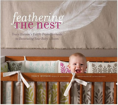
This is unrelated to the color chat bouncing around, but I couldn’t help but notice the 2 child safety hazards on the cover of “Feathering the nest”: a puffy crib bumper and large ties…both are no-no’s. I used a CozyWedge bumper that seems much safer, but still gives a traditionalish (that’s not a word, but I’m making it one) bumper look. Puffy crib bumpers are being banned in Australia since so many babies suffocate each year from them. Design is nothing if it isn’t safe and functional for those enjoying it.
Happy baby-bump time…treasure every minute of it. :)
YoungHouseLove says
Hey Valerie,
Have no fear! We’re completely aware of the dangers of crib bumpers and drop side cribs and all the other no-no’s as of late. We believe that the book came out before bumpers lost favor (for a while docs thought they were safer than letting kids roll into the bars) so hopefully that explains the cover. Trust us when we say it’s full of great safety tips and tons of inspiration to create a stimulating and nurturing room for baby! And of course we recommend taking child safety classes and reading up on of-the-moment children’s safety tips (far beyond just reading some nursery decorating books for that info) to learn about all the latest do’s and don’ts to keep those little ones happy and well. Safety first! Hope it helps.
xo,
s
Jennifer says
I absolutely love that nook in the picture of the “green” room. how fabulous is that! I hope if I ever have a house it will have one of those.
Jackie says
I totally agree with the green. My kitchen/living room is a green called “wheatgrass” and it’s SO calming, yet lively.
Keeps me happy!
I’d be interested to hear what they say about Grey. That’s the color of our master bedroom.
Kristin @ Domestic Ease says
Absolutely MUST put this book on my wish list!!! Thanks so much for sharing!!
And, I adore the psychology behind colors–I think it is so true! As an art teacher, my kiddos love learning about how they can use color to express their feelings.
Blessings!!
Addie says
What did it say about gray? I once read that gray “inevitably leads to loneliness and despair.” And that was right after I painted all the public areas in my home a beautiful gray. I love it, though. I heard David Bromstad say once, “Gray doesn’t get picked very often. It’s kind of a misunderstood color. A lot of people think gray is very cold. But to me, gray is the most soothing color there is.”
YoungHouseLove says
Hey all you gray-lovers,
The book didn’t specifically talk about gray at all (we included every color that they profiled) but upon a bit of google research, gray is regarded as:
-a neutral, balanced color
-a cool, conservative color that seldom evokes strong emotion
-can be seen as a cloudy or moody color
-is considered neutral because gray doesn’t contrast with much of anything
-associated with the practical, timeless, middle-of-the-road, solid things in life
-too much gray leads to feeling mostly nothing; but a bit of gray will add that rock solid feeling
-some shades of gray are associated with old age, death, taxes, depression or a lost sense of direction
-silver is an off-shoot of gray and often associated with giving a helping hand, strong character
Interesting, eh? Hope it helps!
Sources: about.com, colortheory.com, precisionintermedia.com
xo,
Sherry
meryl rose says
We’re currently remodeling our spare bedroom to be my art room and I was convinced I wanted blue and had a few samples on the wall but felt too calm and relaxed every time I went in to do work so I switched to orange instead. These color descriptions hit SPOT ON for how each color made me feel, I’m glad I made the switch for a creative, enthusiastic, inspiring space
ashleybailey says
Interesting that green is safety and security, two things I do enjoy having and/or feeling!! And almost every room of my house has some shade of green!! :) haha (mostly lime to muted lime colors) :) ha Guess that’s why I’m drawn to it!
Laura says
Wow I enjoyed reading this. I really like psychology attached to a lot of things. Colors symbolizes a lot of things and choosing one might eliminate the advantages of other colors. That’s the reason why I always wanted to paint my walls with different colors! :)
heather says
I love this book too. It is one of the only books I referenced when designing my nursery.
Do you happen to know where I can find the rug shown in the image below the green list in this post? I love it.
Thanks (and congrats!).
YoungHouseLove says
Hey Heather,
All the photos except for the first image of the book are actually from http://www.benjaminmoore.com and they do have source lists for their rooms so we hope you can find that info over on their site! Happy hunting…
xo,
s
Kat says
Congratulations! I don’t know if you remember me, you came to our house with Dan some time this past year. Looks like we are due the same month as you.
You might enjoy touring the Waldorf school for some inspiration — I saw their kindergarten classroom at the holiday bazaar a few weeks ago, and it was very warm and inviting. I wanted to move there. The walls are kind of a mottled pink/orange, and the furniture is all very natural and wood.
YoungHouseLove says
Hey Kat,
Of course! So nice to hear from you again. And congrats on your baby on the way! Thanks for the Waldorf school inspiration idea. We’ll have to check it out!
xo,
s
Stephanie M says
We painted our living room “hot chocolate” a couple months ago and love the warm, cozy color! Plus, just knowing it’s called hot chocolate makes me want to cuddle up with a blanket on the couch. So I definitely agree with the notes about brown, and also with those written about blue and yellow since I can think of rooms I’ve had in those colors. Our bedroom is light blue as well… and the color was called “sweet dreams.” The final decision between colors always comes down to its name for me. I fall for marketing…. !!! I do the same thing with nail polish :)
I think it’s just a coincidence about the yellow kitchen and angry couples….
Keeley says
I don’t know about how the colors are affecting him, but our son’s nursery is green on top with white and orange irregular stripes on the bottom (think geometric cartoon zebra stripes) and he was always staring at the stripes in the beginning (we think because of the contrast) – he seemed to like it!
Jessica says
Hmmm. I just bought 2 gallons of yellow paint for our bedroom. Well, the book said kitchens, right? Only kitchens? No fighting in yellow bedrooms?
YoungHouseLove says
Hey Jessica,
Nope, technically no mention of an adult bedroom although it did mention that thing about babies crying in yellow bedrooms along with the kitchen thing. Hope it helps!
xo,
s
Michelle Goertz says
Great looking book… will have to check it out now that we’re trying for our 2nd kiddo… and we need to paint our entire duplex since we moved. *sigh* Just got the old one where we wanted it, and had to move. The trials of renting.
Our son’s nursery (before we moved) was a buttery yellow. It was warm but not too bright, and I never noticed he cried any more than in any other room of the house or in his new nursery (which was already painted pigeon poop grey when we moved in and makes MOMMY and DADDY want to cry! I’m waiting for my school break in Jan. to repaint… Soon soon!)
I have a cool pale grey blue in my bedroom and it’s so calming – and I normally don’t like blue. I highly recommend it! (Benjamin Moore Silver Crest)
And to concur with other readers… there IS NO better color for the outside of a house than yellow! Our friend is a realtor, and she said a yellow house sells before one of any other color every time.
Tylyn says
i love this! good to know! :D any ideas what color you’re going to do with your nursery?
YoungHouseLove says
Hey Tylyn,
Yup we have a few different color ideas for the nursery (and a bunch of swatches up on the wall in there) but we won’t be revealing them for a little while! We have a full bathroom reno to complete by the end of the year and then we’ll move onto the nursery and share all the dirty details then. Stay tuned…
xo,
s
Jessica from We Took the Bait says
Never underestimate the power of color! I’ve also found that having a cohesive color scheme throughout our house – lots of tans, beiges, light greens, and light blues – has done wonders for my mood. It sound cuckoo, but when we had each room painted in bright and contrasting colors our small house seemed really broken up and mismatched. Over the past year we kept all the same furniture, but toned down the walls and marveled at the way everything just seemed to open up and flow together.
YoungHouseLove says
Hey Jessica,
We had the EXACT same experience with our little house. Here’s that old post: https://www.younghouselove.com/2007/12/watching-paint-dry/
Isn’t it funny how a cohesive home just can’t help but make you feel happier and calmer?
xo,
s
Lynn says
Thats funny, because it seemed like my husband and I argued less when we had a yellow kitchen. I love the kitchen yellow! Its so bright and cheery. We moved 4 months and we still have a white walled kitchen in the new house. It seems to be the trigger of many tifts! LOL
Benjamin Moore Chestertown Buff is going up this weekend in the kitchen. :)
Brandy says
Yay for our blue bedroom :-) we’re thinking of painting our kitchen red (in contrast to the ALL WHITE cabinets)… thoughts?? :-)
YoungHouseLove says
Hey Brandy,
Color is a really subjective thing so we think that if you’re digging the idea of a red kitchen with white cabinets than you should definitely go for it! Here’s a post we did a while back with all of our favorite paint colors in it (so you can see which reds we’re loving). Hope it helps and happy painting!
xo,
s
Nicole says
The thought of orange (raising the IQ) may be nice but I don’t know if I could walk into a bright orange room everyday! I have heard of green’s calming effects. That is most likely what I would personally go with…
Lauren says
I’m not thinking about kids and I’m not sure they’re in my future but I still love this post!!!! More like this please!! thank you!
Emily says
that’s really interesting! i think colors match personalities as well… for example, green is my favorite color and i am a peace loving, harmony crazy gal, and my bf is a free spirited artist who loves deep purple… hmmm… very cool stuff!
Jaimie says
I see a lot about nurseries designed to ‘stimulate’ babies’ minds, but my goal for a nursery was the opposite: to calm and soothe. My young son is only in his room for changing, sleep, and reading stories so I didn’t want it to be an invigorating place. Besides all that, young children don’t need extra stimulation in order to develop: just the regular sights and sounds of a loving home are stimulation enough!
YoungHouseLove says
Hey Jamie,
Good point! One fun tip from the book was to stencil some sort of chic little border right above the baseboard around the room so it’s right at baby’s eye-line when he or she is playing on the floor. That way when your baby is being fed or sleeping in his or her crib there’s nothing too stimulating, but there’s that little shot of color and pattern for when baby’s on the floor at play. We thought that was a fun new idea!
xo,
s
Venessa says
Excellent post! Soooo informative! Thank you!
Val says
Just to chime in on the whole grey thing from earlier — I think that about 80% of my work wardrobe is grey. I end up buying it all the time just because it seems like a more versatile neutral than black. But then, I’m a banker, so it cracked me up to see that it is associated with taxes. Who knows? Maybe I subconciously thought that grey made me look more serious and “bankerly…”
Amanda says
I really hope the study about yellow kitchens is not true!! I just (as in last week) had my kitchen and living area (all one big, open space) painted a very light shade of yellow! I’m praying that there will be no arguments in any of the rooms.
Jaimie says
That is a cute idea! I’ve flipped through that book in the bookstore before and agree that it is lovely, and has lots of good ideas that would work in rooms other than nurseries.
Stephanie says
Sherry,
A. I just discovered your blog (I think I might be the last person in the whole world to find it) and it is AWESOME. I could spend hours looking through your past content. Hours!
B. Congratulations on your pregnancy! Motherhood is magical, life-changing, miraculous. You are going to love it. When are you due?
C. I know you will probably create an awe-inspiring nursery because decorating is what you do, but bear in mind that babies don’t actually need “rooms” nor will they have a preference about “theme” or anything like that. In fact, my husband and I have two little girls and both slept in OUR room until they were about 9M. It was wonderful that way. I wouldn’t change it for anything.
I look forward to reading through your blog and getting to know you better.
– Stephanie
YoungHouseLove says
Hey Stephanie,
So glad you found us! I’m due in May and can’t wait! Here’s a post full of all the pregnancy details that we’ve shared so far: https://www.younghouselove.com/2009/11/youre-a-curious-bunch/
Hope it helps!
xo,
s
Amy E. says
color definitely makes ALL the difference! when we first moved into our house, there were at least 9 different colors on the walls of the room we decided would be our home office. that’s right NINE!
check out our before and after (and some color palette gushing) and see for yourselves: http://entegans.wordpress.com/2009/12/12/dewdrop-duck/
SilverMoon Dragon says
I think the problem with yellow kitchens is so many people go for the brightest of bright tones – after all, it is a kitchen, and you don’t need to sleep in it. But as it ‘encourages expressions and communication” perhaps those unhappy couples are being *too* encouraged?
I just read a book on colour therapy, and along with positives, my book listed the drawbacks associated with too strong or too much of each colour (‘too much’ probably varies from person to person too!)
Too much yellow can lead to strong outbreaks of ego and excessive thought. They did say that a bright yellow kitchen would be a good spot for children to do their homework, with pops of grey to tone it down.
JessP says
Dear YHL: I’m writing with joy to report that at last, after years of big, frustrating painted swatches on the master bedroom walls-I. Picked. Out. A. Color! Talk about a game changer. I don’t think I realized until now that my inability to decide on a wall color, coupled with the swatches everywhere was making me sad. Even though there’s so much more to do in the room, the walls are beautiful.
In the YHL spirit of disclosure, I picked out a Valspar color called Fairmont Penthouse Stone and had it color matched by Sherwin Williams. In my large, west-facing MB, the color reads more gray, which is what I wanted. The white crown molding (which disappeared before) now pops. It’s a great neutral.
Thanks for all the interesting and informative painting tips. I think I’ve read them each twice in the last year! Love the ceiling medallion you added above Clara’s chandelier in today’s post.
YoungHouseLove says
Wahooo! Congratulations! We’re doing the happy dance for you. Woot!
xo,
s