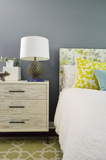
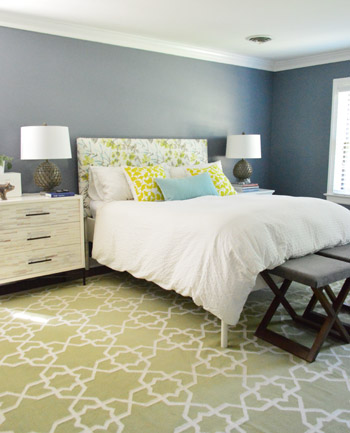
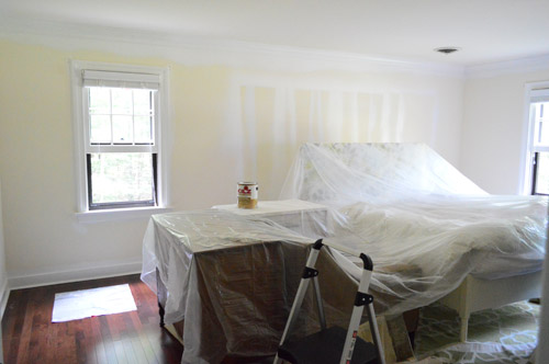
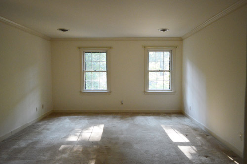
Since it’s a large room full of light furnishings and crisp white trim and doors, we thought it could handle something deeper than the soft blues, grays, tans, and browns in our palette above – especially since we love enveloping colors in the bedroom. Oh but of course we’re just getting started in here so ignore things like:
- the missing window treatments
- the art-less walls
- the bare ceiling (paint or even painted textured wallpaper like this might be fun eventually)
- the lack of a ceiling fixture (can’t wait to add one)
- the furniture placement (it’s just plopped down where it’s been since we moved, except for our new dresser – although that’s not in it’s final resting place either)
- those benches at the foot of the bed (we’d love to get a single bench, hopefully from a secondhand shop that we can reupholster)
- the two off centered windows on the wall to the right of the bed (more on the plan for those in a minute)
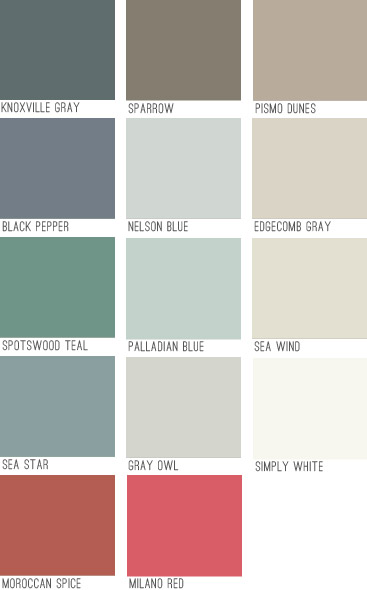
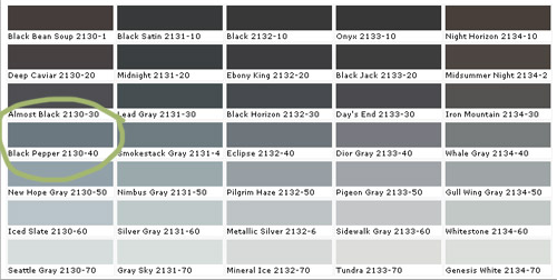
Black Pepper is definitely not as dark as a black tone would be, and actually has a lot of navy undertones but almost looks flatter and more faded. It feels really really sophisticated in person. Might be our favorite dark color to date. Here it is with a bunch of other swatches since that seems to help show undertones and values better online (somehow comparing it to nearby colors gives it context instead of just seeing that color in a vacuum).
To prep the room, we just pushed everything into the center of the room and covered it with a protective drop cloth. We have been painting with hardwood floors for ages, but if you’re worried about dripping on those you can cover those as well. We’ve found that when we wipe up a rogue drip right away it comes right up, and even if we miss it and it dries we can “pop” it up with our nail, so that helps.
After prepping, we did one coat of tinted primer first, just to help us with coverage, cover those lines that were on the walls from spraying the doors before we installed our floors, and to make sure the color would look as true and rich as possible. We went for a no-VOC primer called Kilz Premium from Home Depot (they tinted it for us knowing we’d be painting with a dark blue-gray color). The primer definitely wasn’t as sophisticated looking in person as this photo (it looks less chalky and little-boy-room-ish here) but in person we couldn’t wait to get some paint over that primer.
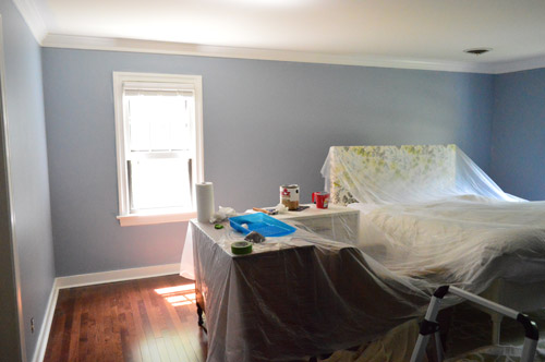
Here’s the difference in the tinted primer and the real color going on:
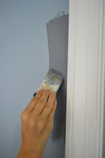
We only needed one coat of the Black Pepper (we used no-VOC Natura paint by Benjamin Moore) for full coverage, which is pretty rare for us since we usually need at least two but I’m sure the primer made the difference. Although the three twelve-paned glass windows in here took five coats applied by hand (two of primer and three of paint) along with a razor-scraping session at the end to clean them up, so this bedroom is a prime case of you win some, you lose some.
We went with an eggshell sheen which is nice for a deep color. It’s pretty matte looking which I think adds to the chic-ness of it. I like that it’s bold and that it’s a color, but not anything too crazy. It falls back and lets the headboard and the rugs and the pillows do their thing without feeling too meek or invisible. It sort of straddles the line between “dark neutral” and “still makes a statement” if that makes sense.
We came to that solution when we were thinking about how it’s a bummer that those two windows on the back wall aren’t centered – but we realized that if we added some built-ins along the wall with the bed on it, they suddenly would be centered and the whole room would have a lot more function and balance.
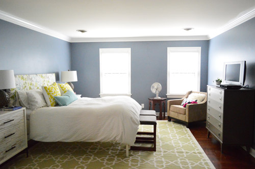
So that’s on the agenda down the line in here. In the meantime we’re just enjoying the moodier wall color and how it makes all of the crown and trim pop. It’s amazing how much of a difference some fresh flooring and paint can make. Even though we still have a big ol’ to-do list in here…
Anyone else making friends with a new paint color?

Lisa says
Love your Black Pepper! Just painted our son’s bathroom Sherwin Williams Scanda, a rich blue with a bit of purple undertone. It looks so good with crisp white trim. I’ve always been a Benjamin Moore girl, but I love the “Coastal Cool” palette by SW. Makes it easy to help all of the rooms in our house flow!
Tiffany says
Love the richness of that color choice!! That is now in the running for my living room! Ive got white trim, lots o light, and a beauty of a fire place with a white mantle that i think it will go great against! but i think i’ll either only do the fireplace wall or three of the living room walls in somwthing this dark. What complimentary colors in the beige/mocha family would you recommend if I were to do a wall in a different color to lighten the look up a bit. Thanks for the inspiration my husband will curse you and our vaulted ceilings later!! Muwahahahaha
Amanda Castro says
Absolutely beautiful color pallete you guys have chosen! Very much what I’d like to use for my own apartment someday soon. Thanks for the inspiration!
lauren says
My husband and I are having a baby in December and I’m making a quilt for the nursery. We recently purchased Benjamin Moore’s Italian Ice Green. It’s so light but has just a touch of mint. While we were painting I kept telling my husband, “I’m craving Mint Chocolate Chip Ice Cream now!” We are going to go with Ancient Ivory in our living room and Aspen White in our guest room. Should be done in a couple of weeks which makes me very happy. Nothing like a fresh coat of paint to make the place home!
Emily @ Life on Food says
I see you always prime but I was paint shopping this weekend and the guy at BM said that paints now don’t need it. I was fully intending to prime and now I am confused. Thoughts?
YoungHouseLove says
We actually only prime if we’re going from super light to dark or super dark to light, otherwise we don’t find we need it.
xo
s
Janessa says
So love this color! It was one of the 4 samples I picked out for our master bath do-over (the first blue just wasn’t gray enough). While I ended up going with New Hope Gray (also from BM and the next color on the color preview swatch), Black Pepper came in a very close second but it’s already in the “approved color palette” for our office in the new house.
Elena says
Love the color! My husband and I have been vacillating between blue and gray for our bedroom and this may have tipped the scales … We recently discovered our love for bright walls when we painted a breakfast nook Tantalizing Teal by Sherwin Williams. Almost the color of a Tiffany box. :) Colors bring such great cheer to a home!
Kirsten says
I love it! I really liked how bold you went in your last house, and I can’t wait to see what else you have in store for the new house.
I thought I was sure about my living room color, which was Really Teal by SW. I got some swatches on the wall and while I like it, I’m still not sure about going that bold. Thanks to this post today, I’m thinking of BM’s Sea Star. It looks like it’s enough aqua to satisfy my color needs, but has enough green to not clash with my sofa, which is a really greenish shade of pewter. After living with white walls for so long, I’m excited to be able to paint again and want something dramatic and sophisticated in my living room.
Ana G says
We just painted the exterior of our house Black Pepper this summer. LOVE it! And it looks fabulous in you master, too!
YoungHouseLove says
Ooh I’d love to see a picture! Sounds awesome!
xo
s
Selina says
Love love LOVE IT! Pardon my enthusiasm but I just painted my kitchen a similar dark gray. With white cabinets, a white countertop and white tile floor, I didn’t want to play it safe like the previous owners did by choosing ivory…it was just bland. Friends warned me, insisting dark gray was too bold (I believe the word “cave-like” was used) but I stuck to my vision and it now looks fantastic! It’s a dark color but it doesn’t act like a color. It just fades into the background like neutrals do (which is why we love them) yet still provides a contrast many spaces desperately long for.
Linds M says
I love it! :-) typo- did somebody said (say?) built-ins.
YoungHouseLove says
Thanks for the heads up Linds!
xo
s
Luciana Torres says
What year was your house built in?
Thanks!
YoungHouseLove says
Late 70s/early 80s.
xo
s
Katie says
Really?! In my head I always assumed 50/60’s with a 1980’s renovation. Must just mean your home is timeless. :)
YoungHouseLove says
Thanks Katie! Our first two houses were 50s/60s, so we love that era too!
xo
s
Sophie says
Love the new colour! So great!
I have a question for you guys today, how did you figure out what your style is? I have so many pictures saved to my computer of things I like but they’re all so different. I feel like one day I want neutral and calming and the next day I want something bright and bold, the next day something really quirky and ‘out there’. How do you figure out what direction to go in with your new place? Thanks!!
YoungHouseLove says
I think it’s definitely an evolution that happens over time. Our first house was really neutral and tone on tone, then we fell for touches of happy color and our second house was more modern and we took more risks. Now in this house I think since it’s a classic colonial we’re drawn to images from homes like this with the same windows and molding and they’re sort of a mix of neutral and classic with some fun in there too. Just go one step at a time (pick a wall color you love, then move on to curtains you like, etc). Building a room slowly like that seems to help!
xo
s
Jill Pinkham Nelson says
My new favorite paint color is Revere Pewter by Benjamin Moore. I’ve used it recently in my laundry, kitchen, entry, and master bath. It’s gray, but not too gray, and blends perfectly with the natural linen I used for the master bedroom duvet. I would describe it as a taupe-y, stone-ish gray. Love it!
YoungHouseLove says
We’ve heard such great things about that color!
xo
s
Cindy says
Ooo, I reeeeally like this color! xo
Kylie Helm says
I absolutely swoon over the dark color! In our Master Bedroom we did something similar with a smokey taupe color because of how many windows it had. Its such a fun switch up, right?!
Kylie
ashley says
Yesterday I returned a board at Home D for $14. Then the paint gods shined upon me and in the Oops section was minty, & a light minty. Let’s call her Baby Minty. They were both BehrPremium (my fav). I only had to shell out 56¢ for both gallons- and heel clicked the whole way to my minivan.
YoungHouseLove says
Nice!
xo
s
Crystal Breen says
LOVE the color! We chose a dark plum for our master and everyone thought we were crazy, but you’re right- it feels warm and enveloping in person. You four (Burger and Clara totally count) are such an inspiration my husband and I started blogging our own home adventures. If you have time I’d be honored for you and any readers to take a peek at our site! You can find us at: http://breenplantation.wordpress.com/
YoungHouseLove says
Aw thanks Crystal! Off to check it out.
xo
s
Paige @ Little Nostalgia says
Love it. It’s elegant and tasteful, but so much more interesting than a lighter color would have been.
We’ve been getting to know our white paint REALLY well. I just painted our cabinets and the room looks completely different. Like, mind = blown.
sarah m. dorsey says
LOVE the paint color!! The West Elm dresser looks great too!!
Karen says
Gore-juss!!! I want to one day use that color (or darker even) on the outside of my (imaginary) home. With a red door. Wouldn’t that just pop? Unicorns would be frolicking in the front yard, too, the day I’d be able to afford my own house. Sigh. In the meantime, I enjoy watching your home transformation!
YoungHouseLove says
Haha! Gotta love a little unicorn frolicking.
xo
s
Ginny @ Goofy Monkeys says
I basically always want to repaint everything. I love changing colors!
I actually just did the kitchen last week.
I love that bedroom color! It’s gorgeous.
Laurin @ Be Well Body says
Your new dresser fits that space so well – I thought it was ultra-modern when you posted a picture of it last week but seeing it in the room really works! Definitely worth the splurge to take the room to the next level!
YoungHouseLove says
Thanks Laurin!
xo
s
Maureen says
Looks great! Also, it inspired me to go with the darker gray I had been considering for my bedroom. I was going to wimp out and go with the light gray, but I love the contrast with the white trim!
Lauren says
Great color! Reminds me of newsprint!
Lara says
You guys are AMAZING! I log in each day with much anticipation to see what’s going on in your neck of the woods!
I love this color choice!! Any thoughts on how it would work in a bedroom that only gets direct morning light? (I’d love to use it in mine but your room looks really bright ) This may sound strange but I was also hoping it would make my 14x19x9′ bedroom feel smaller and cozier ? Any thoughts?
Keep on bein’ incredible!
YoungHouseLove says
I would bring home a swatch or even a test pot to see how it looks. Hope it helps!
xo
s
Christy says
I’ve recently fallen in love with Ben Moore’s Soft Chinchilla. From the name, you’d think it was a soft brown, but it’s actually a lovely deep, dusty Tiffany blue. My color preferences are changing as I get a bit older…where I used to prefer pale blues and soft yellows, I’m now attracted most to dusky teals and greens or slate greys and silvers.
Jen. says
I love that color, too!
Sarah F. says
Oooh, I love that color! I would love to go with a deep grey-blue color for my bedroom walls, but our duvet cover’s primary shade is too close to that. I think it would make everything too dark and muddy. Maybe something like that metallic silver on the big swatch set though. I love the idea of grey for the walls, white is too bright for a night shift worker and I want it to feel more cozy in there. :)
Emily says
Gorgeous. That looks similar (similar feel, anyway) to the color we painted our bedroom in the house we just moved from — we loved it!
Jen. says
That is one beautiful bedroom. So pretty … serene, adult, just lovely. Definitely not an awkward middle stage here, and you’re not even done with it. I’ll be interested to watch as you consider doing built-ins around the bed. I’ve had the same thought for the wall our bed is on.
caroline [the diy nurse] says
I am LOVING the dresser as a side table! It’s one of my favorite “tricks” although our room isn’t big enough to pull it off. The paint really finishes the room so much more too. Can’t wait to see more progress :) [although you don’t need much more!]
Bethany W says
YES! My husband and I started painting our first home, and we just fell in love with Gadget Grey by Dutch Boy for our living room. Our dining room was inspired by your color pallet and is now Palladian Blue by Ben Moore. I just can’t believe how a coat of paint turned our house into OUR home :)
julia says
ooo, i like it! i remember knoxville grey was on our charcoal colour paint list for our striped hallway & bathroom … though i can’t remember if we actually ended up choosing it or not! ps love your before and after shots!
xo julesinflats.com
Gabby says
Living in Knoxville, I can attest to the gray! I’m just praying there’s no “Knoxville Orange” as a paint color out there. You’d need sunglasses indoors. :)
Christine S says
The paint color looks amazing!!!!!! I am currently deciding on a paint color for my “oh so dark and dreary” family room. No mucho natural light = blah……… I have heard that more heavily saturated paint colors can warm up a space but I’M SCARED to do anything to dark……………DOES ANYONE HAVE ANY POINTERS? I will take all the advice given….Thanks
YoungHouseLove says
I would bring home a bunch of paint swatches and then tape them up and see what you like. Then go to the store and get a test paint pot of the three favorites and paint test patches on the wall. Check them out at all times of day and see which ones you like best! That should help you picture things and give you confidence.
xo
s
Lisa in Seattle says
Christine, we were thinking about painting our family room (also with very little natural light) a saturated color such as a rich brown or muted green. Once we narrowed down which small color swatches we liked best, we bought half a dozen BIG pieces of foamcore from Michael’s and some test pots of those few colors. Then we painted the foamcore and tacked them to the wall (walls, actually – our light varies from place to place in the family room) and lived with them for a few days. For us, only by covering a whole wall with a potential color can we decide if we can live with it. Turns out we couldn’t – a whole room of saturated color was just too much. Sure, we put extra effort and expense into wrangling big pieces of foamcore, but it was better than trying to guess from small swatches *or* have to repaint over big patches of brown or green. (We ended up with Martha Stewart’s “Toasted Marshmallow” which works as a nice neutral, amps the cozy glow of what light we do have, and plays nice with the furniture, carpet, fireplace, etc.)
Kathy says
One thing that helped me figure it out was push-pinning up a yard of fabric in a color I was considering instead of the paint swatches. One time I even hung a blanket up. Really helps to see how (for example a navy) might play out in the room when it’s alllll over the walls.
YoungHouseLove says
Great tips!
xo
s
Christine S says
Thanks for all the great tips! I especially like the foam board idea…………how cool! Well I guess it’s off to the paint store :)
Carla says
Built-ins along that wall are going to be gorgeous. What a great way to center those windows and anchor your room.
I can’t wait to see it.
Anna says
Hi! Love the color! Since one of your windows is so close to the seam of the wall, are you thinking of putting up a valance or roman shades instead of panel curtains? We have the exact same dilemma in our house. Valance curtain options are so limited and roman shades are so expensive! Still trying to decide what to do…would love to hear what you are doing!
Thanks!
YoungHouseLove says
I’m not sure yet! I think once the built-ins are done we’ll see. Maybe fabric roman shades (like the one over the window seat in the inspiration room) might be fun?!
xo
s
Lisa E says
Here’s an inexpensive option:
http://une-bonne-vie.blogspot.com/2011/03/how-to-turn-mini-blinds-into-roman.html
Amanda says
Awesome color! Makes all of the other colors in the room pop. Great choice (as usual ?)
Amanda says
I meant :) lol
YoungHouseLove says
Haha, I figured it was an emoji or emoticon thing!
xo
s
Jessica T says
I love the color!!! I’m trying to pick out a nursery color now and want it to be a mature, grow old with the baby, color. I was looking for a gender neutral “blue” if thats possible and was leaning towards Charlotte Slat…but now I’m thinking this pepper color is in the running! Choosing a paint color is the most exciting, challenging, and crucial part to making or breaking a room (which I know you guys can understand…my husband; however, is over the conversation and me making pit stops at B. Moore to bring home some more swatches haha #hormonalpregnantladyproblems).
Geertrude says
That looks wonderful! Now you have me doubting my plan to paint our office walls plain white. Your colored walls all look so pretty. But since our office is only 60 square feet (or less),needs to hold two people working and has only one smallish window I guess white would be the smartest choice. I’ll go and find myself another room to paint a darker color ;-)
YoungHouseLove says
We did our half bathroom white. It’s awesome for a small space for sure!
xo
s
Linda says
I love all your color choices so far and look forward to watch the built in come to life!
Today I’m going to paint the window sills in my kitchen and before I start I thought I should double check with you guys to see how you have done this job. My husband is adamant that I use a paint stripper first and then a paint stripper after wash followed by a light sanding and then a primer and finally paint. I searched through your old posts this morning and so far have been unable to find anything stating to do this type of process. Do you think I could just lightly sand and prime and paint right over the existing paint? Our sills are not perfect, but do have a few drip spots from the previous owner. Also if the existing paint is oil based, which we don’t know, what application should we use? I would appreciate any help you can give me and sorry this is soooo long.
Thank you ever so much!
YoungHouseLove says
Oh yes, we do a lead paint if we’re going to do any sanding (always important!!) and if it’s clean we sand and then use a good primer like Zinsser or Kilz (use an oil-based one to allow you to paint the trim with latex paint, since that works as a “neutralizer”) and then follow that with semi-gloss latex paint.
xo
s
Stacey says
Beautiful transformation! It really hits home once you see the before and after pictures at the end of the post. Loving the paint color!
Jen says
I love this you guys!!! Im obsessed with the colour combo that is going on with the rug and the walls. Its always funny how sometimes putting a warmer shade on the walls can make a room look so much brighter. Im so excited to see where you guys go with this!
Joseph says
I was thinking, “Do not tell me you plan on moving a window!” Haha, built-ins are a genius way of dealing with that issue. I don’t know what architects are thinking of when they design things like that. I mean, I understand the windows need to be evenly spaced on the outside, so shift an inner wall so it doesn’t look ridiculous inside. Then homeowners don’t have to wonder what the designer was smoking…
GreenInOC says
Spicy in the boudoir!
I’m obsessed with your new dresser and the wall color seems to really do it justice.
Leigh says
We painted our living room walls a warm gray last weekend, Creek Bend by Behr. We used the primer/paint blend so two coats were perfect. We stopped by Verve this weekend, and had so much fun! Found two mirrors and a lamp from the antique center right around the corner! Enjoyed a late lunch at En Su Boca and loved the fish tacos and street corn and those sweet potato fries! Thanks for sharing on fb!
JoannaBanana says
OMG…Pilgrim Haze is the most random and hilarious paint color name. I guess the Native Americans were too generous with their peyote!
Penni McNamara says
That dresser is a STUNNER! WOW! So cool to see it “in action”. I love it! (and the wall color too!)
YoungHouseLove says
Thanks Penni!
xo
s
Suzy B says
Gorg! as usually you guys are hitting every mark in the new house. Love the color & that dresser – no words!
Shelley @ Green Eggs and Hamlet says
That pin that you linked to of the cozy bed nook with built-ins recently came up in my Pinterest feed from you and I repinned it to my master bedroom board. I’m trying to convince my husband that we should have built-ins and a window seat so I’ll definitely be using your projects as justification/illustration. Thanks!