Q: Hi guys! I was snooping around your blog to try and find a floor plan of your new home with the colors you used for each room (like you did in the post from Feb 24/2010) but I didn’t find one! I would L-O-V-E to see what your new house looks like now, with a visualization of the color scheme per room. Is this possible, or am I asking way too much? HAPPY NEW YEAR by the way! – Danielle
A: Oh yeah – we’re way overdue on that! So when Danielle submitted that comment here, we officially bumped it to the top of our to-do list. We did one of them for our first house, and it was fun to see how our paint colors have evolved over the years. So without further ado, here’s our current house’s color palette as it stands now (we still have to paint the guest bathroom and the spare room). It’s not too easy to see all of the colors (ex: the back of the dining room built-ins are dark teal, but it’s not as easy to see those little slivers of color in the image below as well as the office stencil and Clara’s closet stencil) but it was fun to play around in photoshop and make an updated floor plan for this house’s paint picks so far. Note: click here for a full list of these paint colors.
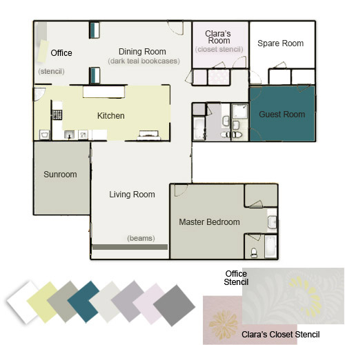
The cool thing we’ve realized is that most of our rooms with brightly colored walls tend to have a few more neutral choices to balance things out (ex: our greeny-yellow walled kitchen has white cabinets/counters and a soft gray backsplash with brown cork floors). And our rooms with more neutral colors on the walls tend have more color added in with brightly patterned curtains & pillows, geometric rugs and bold art, painted furniture, etc. But we’ll get to that a little more in a second.
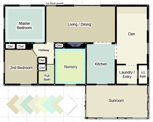
First, just for fun, here’s our first house’s color palette. We still seem to love blues and greens with a fair amount of neutral tones, but we traded in the creams and tans for soft and taupey grays and added plums, pinks, and warm yellow-y green to keep it from feeling too cold. We’ll always have a special place in our hearts for the “sea glass” colors of our first house though. Especially in a smaller home with some pretty tiny rooms, keeping things flow-y and neutral was really helpful when it came to making it feel open and airy. Our current house is larger, so a few hits of color among the other more toned down walls make us happy (and don’t seem to chop things up as much as they could in a smaller floor plan).
We’ve actually seen lots of pretty homes with the same exact color on every wall of the entire house (whether it’s a crisp white tone, a soft tan color, a taupey-gray, or even something more daring like celery, yellow, or a muted blue-gray tone everywhere). Meanwhile we’ve also seen a ton of gorgeous homes with a different paint color in every single room. We tend to fall right in the middle of that spectrum, preferring to use a handful of colors in a few different spaces.
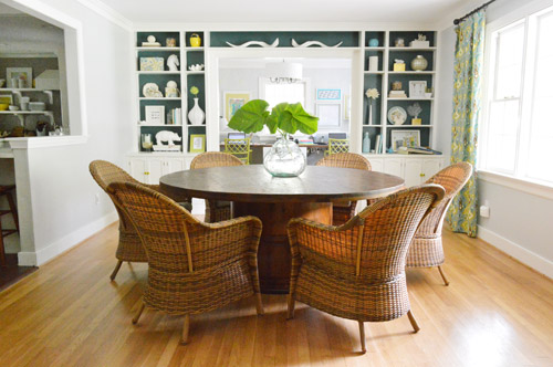
I think we like to reference a few over-arching wall colors in a few different places just so there’s some sort of flow and relation among the spaces, but not too much straight up cloning going on (thanks to varying other items like rugs, art, pillows, curtain fabrics, etc). For example, we have the same soft grey tone on the walls in our living room and our dining room, but the dining room has deep teal paint on the back of the built-ins to differentiate it, and also has colorful curtains and a bright yellow door…
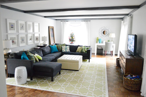
… meanwhile the living room has a green geometric rug, colorful pillows, and softer tone-on-tone curtains with dark painted beams. So we’ve found that in rooms where we have softer or more neutral walls we layer in more patterns and colors than the rooms with brighter walls (like our kitchen).
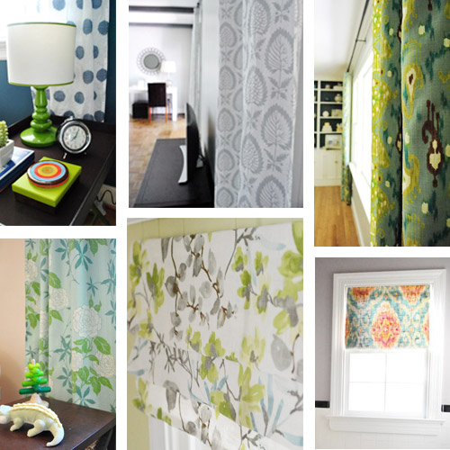
Maybe the biggest change? Our first house had white curtains in every. single. room. except for Clara’s bedroom. So one major difference here has been that we’ve embraced more colorful and patterned curtains in nearly every room.
Bold color was definitely less present in our first house. Comparing our color-coded floor plans above might make that pretty clear, but it’s even more evident when you actually look at room shots. While our first living room was softly layered with tone on tone colors…
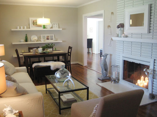
… our current living room (the pic above this one) definitely has more pattern and color going on (bright pillows and vases, a larger geometric rug, etc) as well as more high contrast choices (dark beams and a dark sofa).
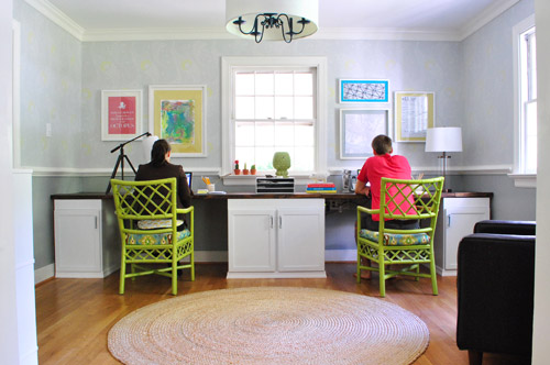
Another place we tend to bring bright color into our current house would be art and painted furnishings. See how the green chairs and bright wall of art in the office really liven things up? Yet we have neutral tones in there to add balance, like the white cabinets, wood counter, and natural jute rug.
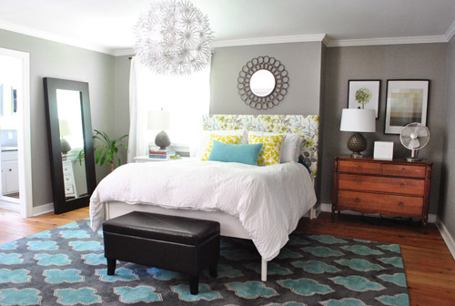
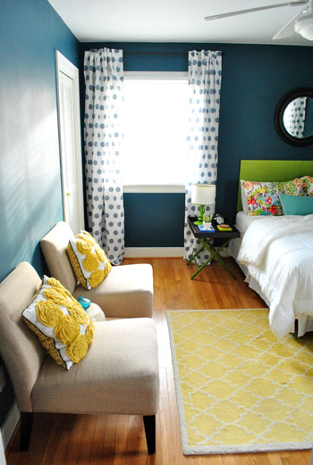
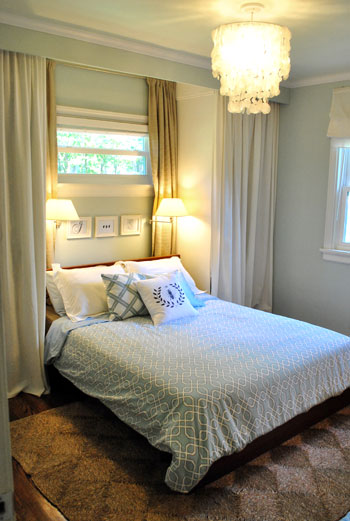
And of course things like the homemade headboard in our bedroom – and guest bedroom – add some interest, pattern, and color along with a few more bold and geometric rugs:
The green headboard from our guest room above was also in our first guest room, so we were inching towards our current color preferences back then, but we definitely kept it more toned down in there with neutral tan walls, plain white roman shades, no rug, etc.
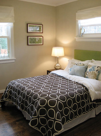
Just for fun, here’s a picture of our first bedroom to compare with our current bedroom shot three pictures up. It appears as though our love of cozy bedrooms has remained (especially with pretty chandeliers and breezy white curtains) but we’ve definitely turned up the dial with brighter pillows, a patterned headboard, and a bold rug in our current house.
We still have moments of calm tone-on-tone color here though, just to balance those hits of bright hue that occur almost everywhere else. For example, there’s our sink nook…

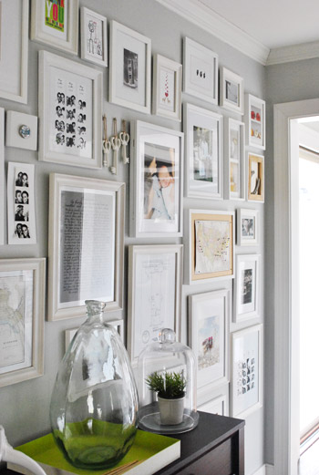
… and our hallway of frames…
… and our laundry room. There’s some soft avocado color on the walls, but the rest of the room is pretty neutral (white cabinets and shelves, a natural-toned light fixture, white appliances, cork floors, etc) since it’s such a small space and we didn’t want it to feel cramped.
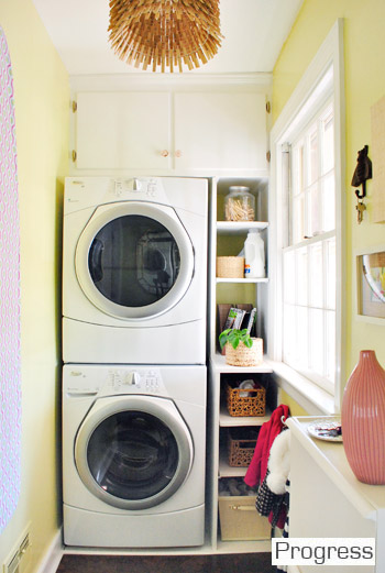
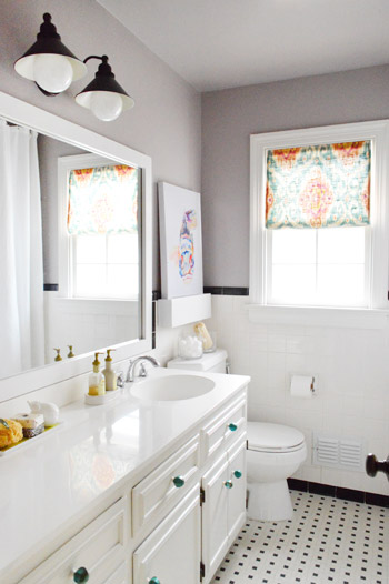
Actually if you look back at the commonalities among those three spaces that I just mentioned, they’re all small – so I think that’s definitely a factor when it comes to how much color and pattern we add. And then there are rooms that are a bit larger, like the hall bathroom, which got a plum undertone in the grey paint (it’s subtle but definitely noticeable in person) and some bright art along with a colorful window treatment and some teal knobs on the vanity.
So there you have it, a meandering brain dump with a much overdue floor plan of our house’s color palette. It’s nice to stop and examine these things occasionally because then we can look back on them (posts like this are essentially a time capsule for us, since pages like our House Tour are constantly being updated – so all the in-the-middle stuff gets bumped out). Welcome to our time capsule.
How do you guys like to decorate? Do you prefer one or two paint colors throughout your entire home? A different color in every room? Or a handful of colors that reoccur in a few places? There’s definitely not one right answer, so we’d love to hear how you guys like to color your world!
Psst- For a more exhaustive tour of our first house followed by all of the before & afters of our current house, click here and then here.

Leave a Reply