What is it about painting that makes me feel all frenchified and beret-worthy? Anyway, I finally got around to painting one of the giant (and deeply discounted) 40 x 30″ canvases that we scored for $23 from Michael’s thanks to 50% off with an additional 25% off on top of that (more details about how that happened at the end of this post). Ever since discovering this inspirational poster design from here (thanks to my good friend Pinterest) I knew I wanted to adapt it a bit. You know, go wide instead of vertical and have some fun with a few $2 paint samples from Lowe’s (total spent on paint: $9 for three pots which I then mixed with white craft paint that I had on hand to create a ton of different tints of the same few hues).
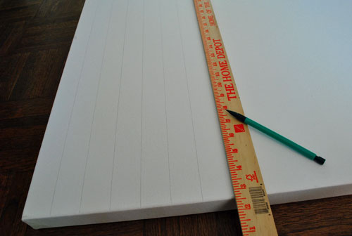
First I used a yardstick to space out equal vertical lines (I just used the width of the yardstick itself to keep things even) which I drew with a pencil:
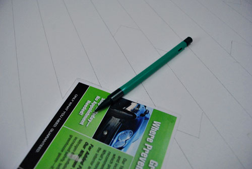
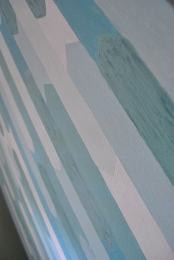
Then I used the corner of a little card that we got in the mail (from an oil-change place) to create those angled peaks to mimic the prism-like shapes from my inspiration.
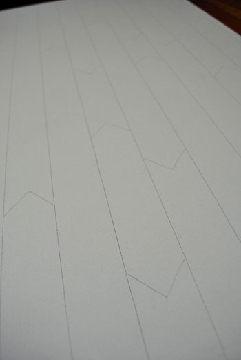
Then I just filled each shape in with a variety of shades of blue and green (all derived from the three test pots of paint from Lowe’s and some white craft paint to make some of the shapes lighter). As for the specific paint colors, I used testers of Tropical Waters, Embellished Blue, and Thermal Spring by Behr. Here was what I was left with at first:
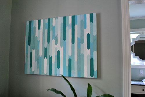
It was fun and kind of high-energy, but the contrast was a little too much for me. So my foray into painting reminded me why I love painting so much: you can always paint right over it. So I mixed up a much lighter shade of greeny-gray and went over all of the darker green parts for a much more subtle tone-on-tone effect. I ended up here:
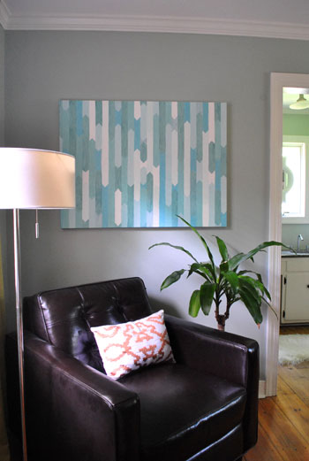
I love the imperfect lines and painterly brush strokes and the varied shades of the same few tones. The only thing I don’t like is the location. It just doesn’t feel right in our bedroom since the walls are a similar shade (and we thought the tone on tone look of the art might layer in nicely but it’s feeling a bit too monotone-ish and blah for us). So we’re thinking we might hang it in the dining room once we have a nice big buffet or console to go under it near the front entryway. Or it might end up somewhere else entirely. Just not on a soft blue-green wall. I guess I just like tone on tone art that’s not also on a wall of that tone. Go figure.
I went into this project expecting it to take an evening or two and it actually took a while longer (maybe four or five two-hour sessions) but in the end I almost didn’t want it to end. It’s just fun to paint again. Maybe I’ll tackle something else soon. I hope so. Have you guys painted any canvases recently? It totally took me back to my high school and college days (I took every art class my high school offered and then went off to art school in NYC for college- where I somehow ended up with a BFA in Advertising Design). Although using the paint pots from Lowe’s definitely made me smile since I’m used to paying five million dollars for oil paint (ok, that’s an exaggeration, but it wasn’t always cheap for a broke college kid).
And speaking of art school, that’s where a drawing professor of mine dubbed me “the narrator of life.” Apparently I’d just sketch and jabber on about everything as it happened (ex: “oops, I dropped my charcoal” or “now for the foreground” or “yikes, it’s noon already”). I sound really annoying right? Thankfully most of it was under my breath. My teacher had to lean in and ask what I was saying, which prompted me to realize that I was actually saying things out loud (I was in the zone, I knew not what I did). That “narrator of life” nickname embarrassed me at the time, but now I find it hilarious that my actual profession is essentially to narrate my life. Who would’ve thought. Maybe I should hunt down that professor (on Facebook?) and tell him where I ended up. Just don’t tell him I used house paint instead of oil paint. Scandalous.

Leave a Reply